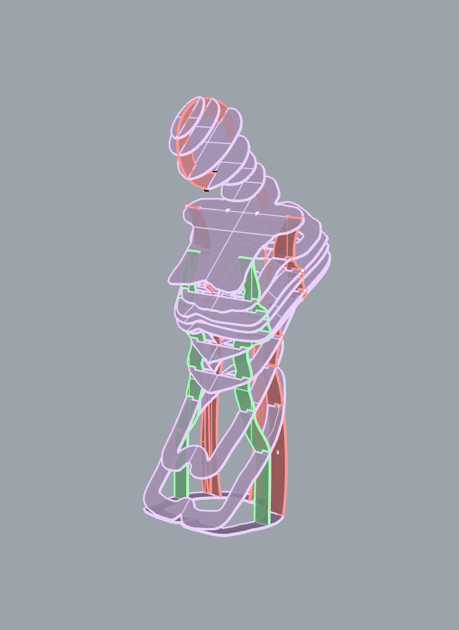
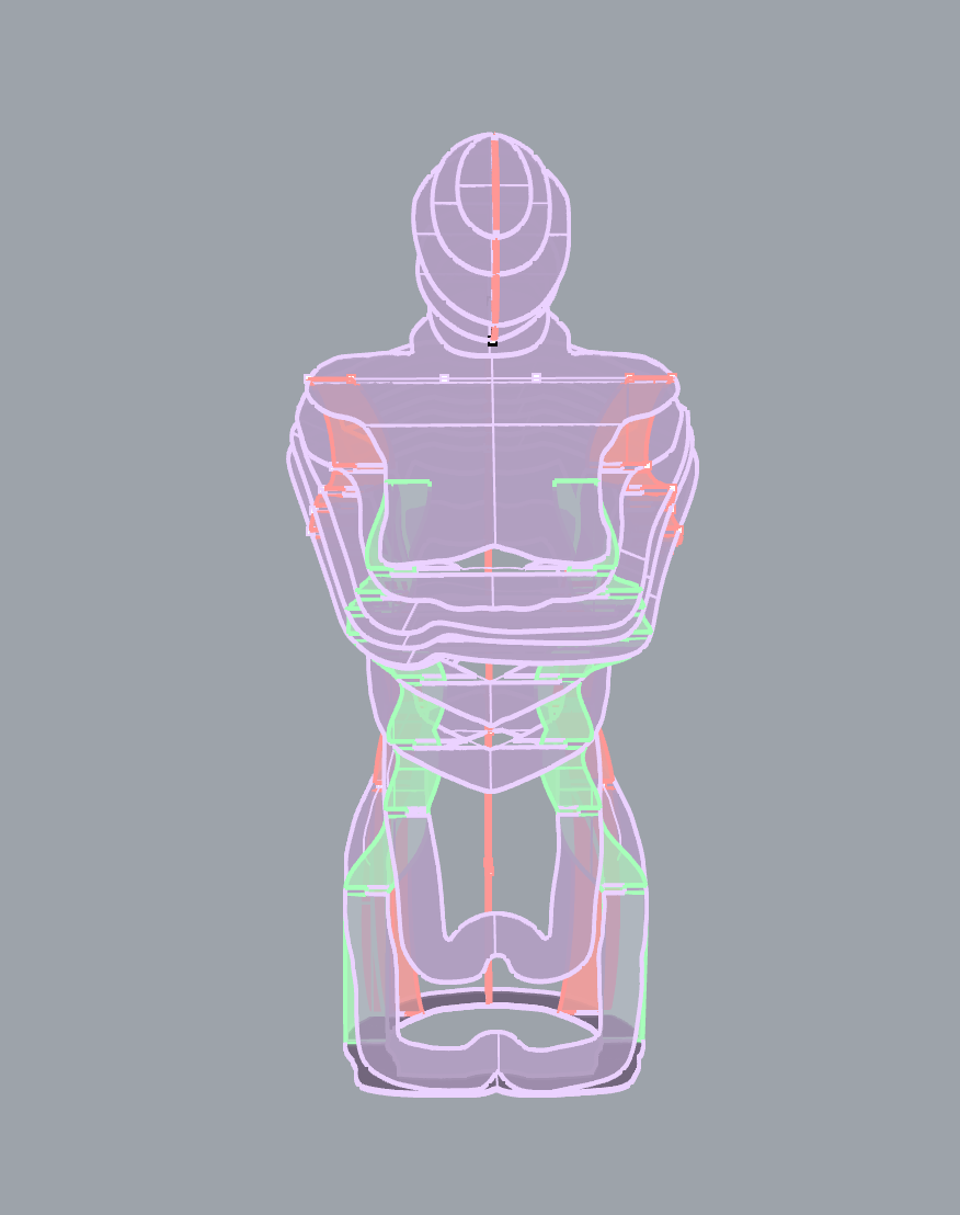
Once I had the basic form of the body from the manikin, I started to edit and enhance it. The file looks a lot like a manikin, which makes sense, as it is a manikin. I want it to look like a more human form though, so I want to add arms. I thought a lot about the position of the arms, and how they would effect the vibe of the piece. If I had the arms hanging straight down, it would take away the beautiful curve of the body, and turn it into a rectangle once it was plastic wrapped. I didn’t want the arms to be folded over the chest because I needed that space to put the text. I decided that if the arms were in a cradling position it would be best. This idea is like the form cradling itself, reflecting inward.
Once I got through all the crazy technical work of adding arms, the form looked like a bust, and not a human, so I decided to add legs. I didn’t want the form to be standing up, because I knew that that would just become a nightmare to balance and assemble. Thinking about the structure, I wanted to play it safe, and keep the figure close to the ground, this way it is much easier to make it structurally sound. I decided to make the form kneeling, this way it connects back to the homeless theme.
Once I got through the crazy technical work of making the legs, I added a head. The head was very tricky, because it was a balance between what looked good and leaving enough room so someone could put their hand there to put the note in the chest. After a lot of finagling to get the perfect angle, I went through all the crazy Rhino work to make it a reality. I added some slanted pieces that would sit on top of the spine piece to create the dimension of the head. It is hard to get the slanted pieces to attach to the head. They cannot slide in the way the other pieces do because they need to attach both at the front of the head and the back. After a lot of thought of cutting the pieces in two, or making large slits in the pieces we decided that it would be best to slide the slits up from the bottom.
Once the form was complete visually, I had to revamp the support pieces so that it could accommodate the new shapes. The knees shoot out a lot, so I had to add another side support. I don’t mind the extra side support, but I don’t need it. I haven’t decided visually yet if I want both supports or just one.


 Kate Reed
Discussions
Become a Hackaday.io Member
Create an account to leave a comment. Already have an account? Log In.