After taking a step back and looking at the chest plate design for Invisible, I realized that it didn’t quite match the rest of the sculpture. As a whole, the sculpture has a very sleek look; all the angles match and it is very linear. When I put the organic chest plate on top of the sculpture, it just didn’t seem to pop. The chest plate I designed was fluid and natural in feeling, and the design of the sculpture was more of an apple store feel.
I decided to completely start over with the chest plate design. After looking at some clear acrylic, I realized that it was almost too clear, and I wanted a textured chest plate to give it some dimension. I started to think about how I could add some texture using only a laser cutter and clear acrylic.
The laser cutter turns clear acrylic white when it is engraved. How are the word examples going to be able to be seen above the texture if everything is going to be engraved white? I briefly thought about engraving then filling in the engraved areas with a colored material, but that started becoming much too complicated.
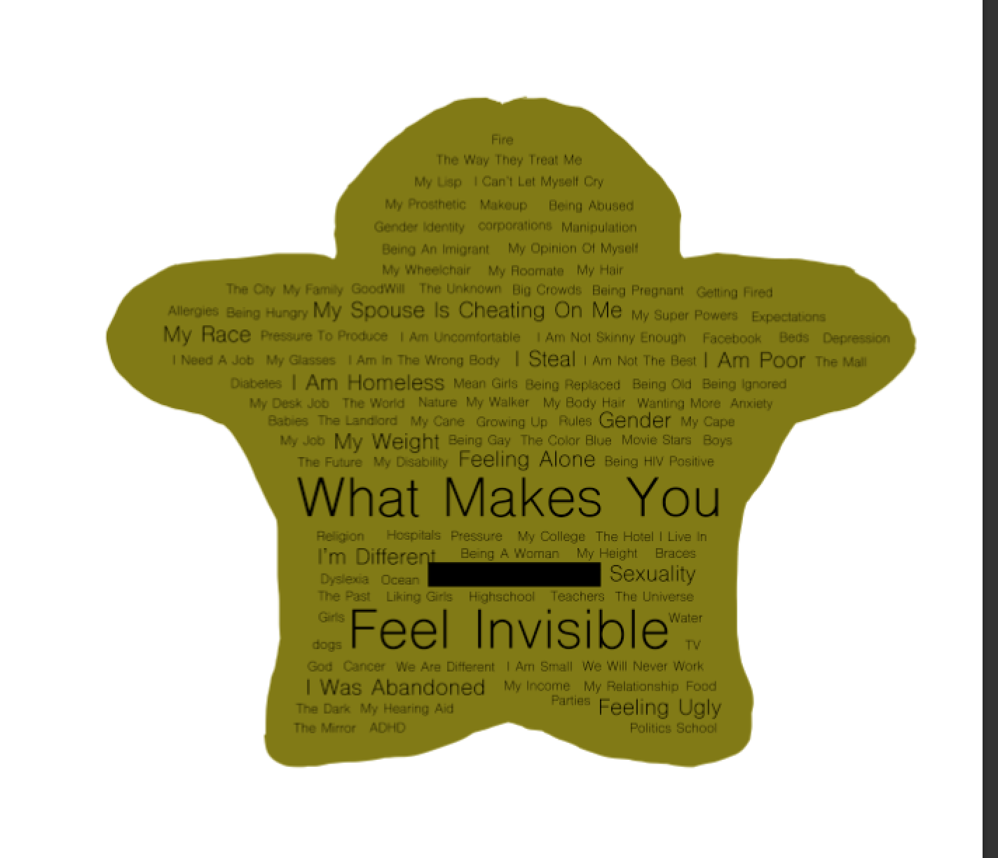
I then thought that if the problem is making the texture distinguishable from the words, why don’t I just make the texture the actual words? I started looking at word clouds and word cloud generators that create masses of words in a beautiful way. Instead of using a computer generated word cloud, I decided to make one myself.
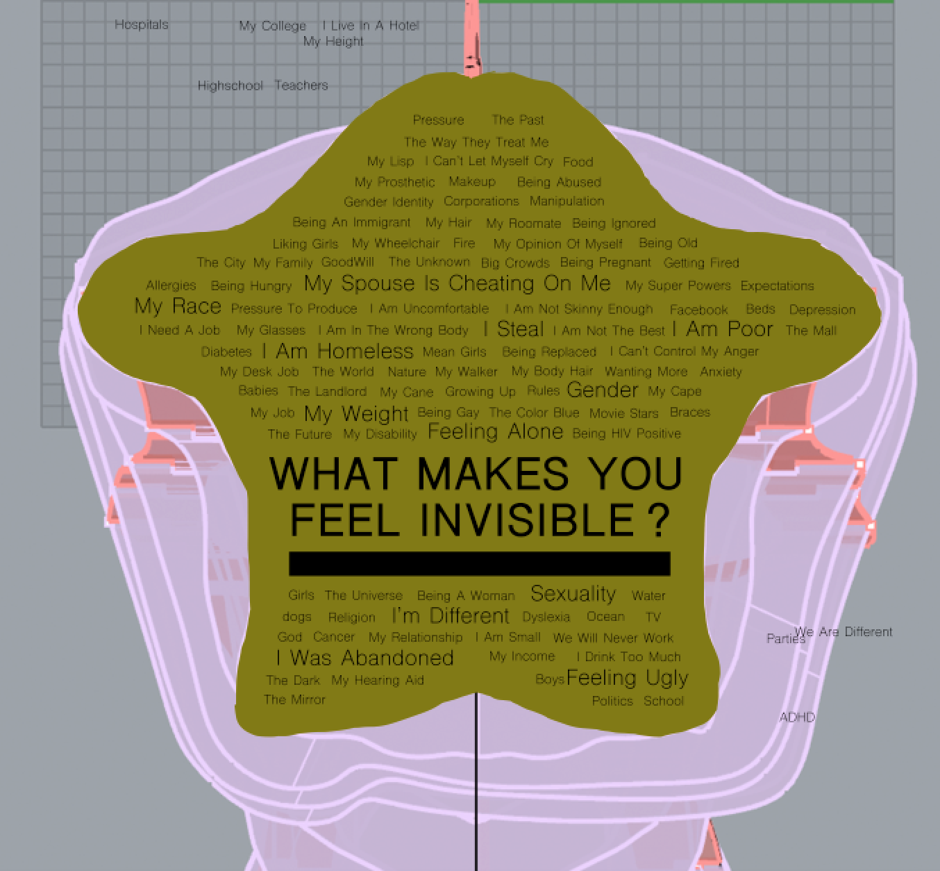
I went into Photoshop and started thinking of as many invisible examples as I could. I asked everyone around me what made them feel invisible, so I could get as many real answers as I could. Then I started arranging the answers on the chest plate so that they would all fit evenly. I put answers that came up more than once in a bigger font. My goal was to make this chest plate version for Invisible very angular.
Once I had my word texture made, I had to rethink the slot where people would put their answers in. I first had the slot placement in the middle of the question, “What makes you feel invisible?” but after feedback from my community, I decided that I should move the slot underneath so that it felt more connected. I also decided to make the slot really long, because it looked better graphically. In this version, I added a question mark on it just to make the spacing work out better.
With the chest piece design complete, I moved it from Photoshop into Illustrator, and then into Rhino and started preparing the acrylic to be etched.


 Kate Reed
Discussions
Become a Hackaday.io Member
Create an account to leave a comment. Already have an account? Log In.