This is a kind of "behind the scenes" of how I made the entry video.
To clear a few things up, it looks amateurish because it is. I don't have Sony Vegas or any other such software, and I certainly don't have a camera that can take high quality footage.
I used OpenShot video editor for all the video editing (I couldn't stand using Windows Live Movie Maker), and I used MS Paint for the logo and captions.
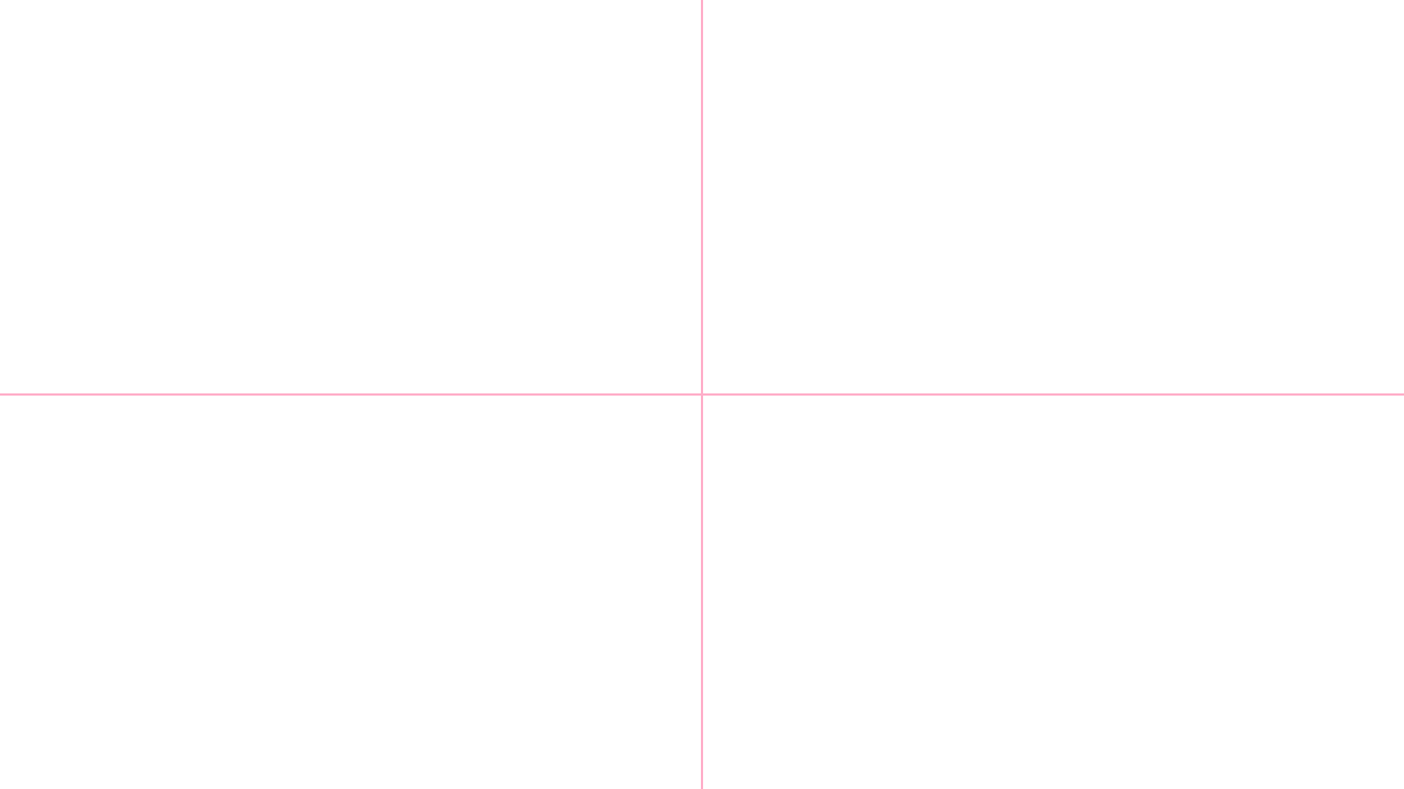
After taking all the footage with my camera, I looked at the EXIF data to see what resolution it was, and used that as a guide to what size the captions and logo should be. I then set the size of the canvas in MS Paint to 1280 x 720. Next, I found the centre, using 2 pink line, each being 2 pixels thick.

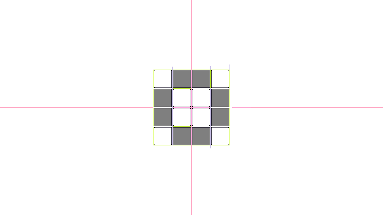
I then created a series of blocks, all 60 pixels by 60 pixels, with 4 pixels spacing between them. I then marked the ones to be removed in grey and I rounded off the corners of the blocks to be kept. This was all done by hand (save for some copying and pasting), as I was unable to find a large image of the Hackaday 2016 logo. I guess you could say its pixel art to the next level. P.s. the other coloured lines are just reference markers that I use to keep track of distances.

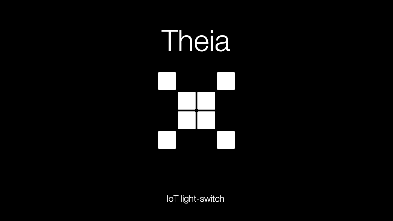
I then proceeded to remove the coloured lines and unnecessary boxes, and colour the background black. I also used a grey colour on the corners of the boxes to make it look rounder (pixel art trick). I went to my project page, hit "F12" on my keyboard and went into the CSS to check what font was used on the title (Helvetica Neue). I then downloaded and installed said font so I could use it from within MS Paint to create the title and subheading above and below the Hackaday Prize 2016 logo.

All-in-all, it took me a around thirty-ish minutes to make the logo - I'm pretty proud of it as well.
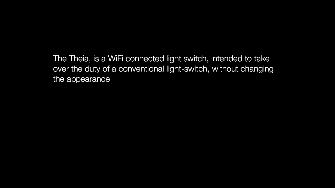
The slides were made in the same manner, with the same font, with the textbox retracted from each side by 200 pixels to make it look nice and centred.

Discussions
Become a Hackaday.io Member
Create an account to leave a comment. Already have an account? Log In.