 lion mclionhead
Not just avoiding every X11 replacement of the last 30 years but avoiding the god awful, giant cursors introduced in every distribution has become a lion quest. The modern, giant, antialiased cursors are really hard to position. The fact is the cursors in the original CDE always conveyed a power user. The cursors of old had a clearly defined hotspot which was easier to align. Lions especially miss the CDE hourglass cursor.
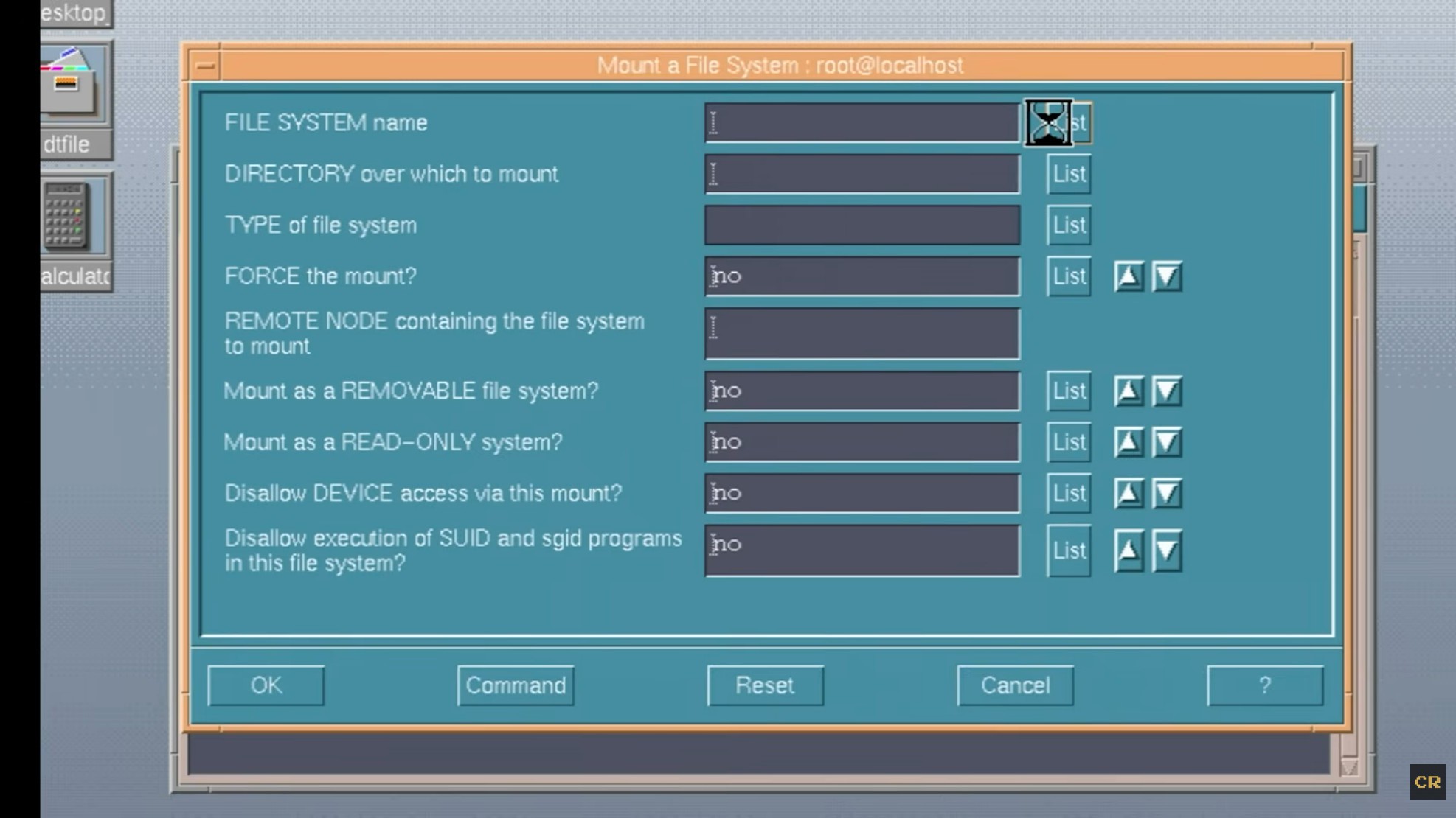
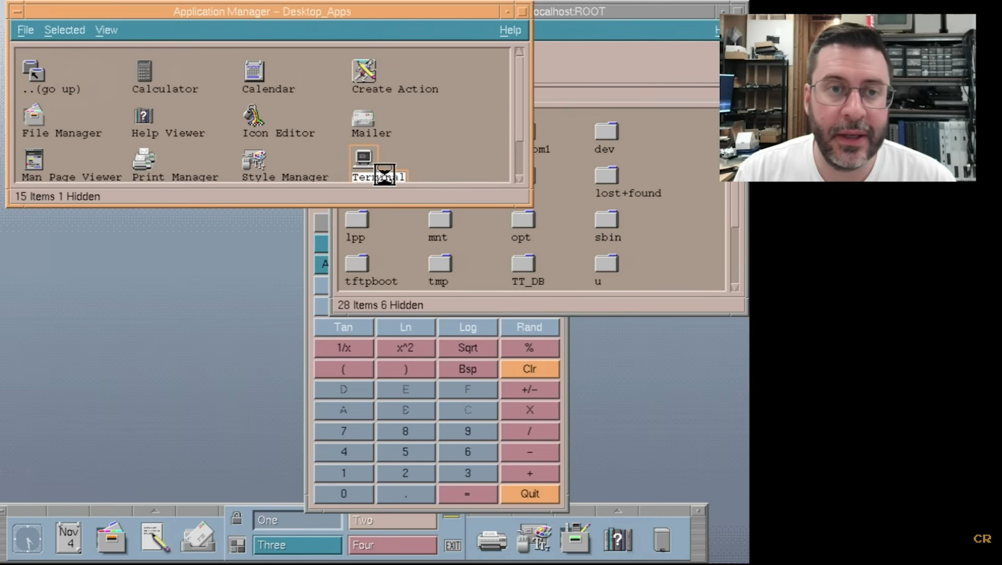
The original cursors in the 80's were small enough to manually type in with data statements. The left arrow would switch to a right arrow when opening a menu.
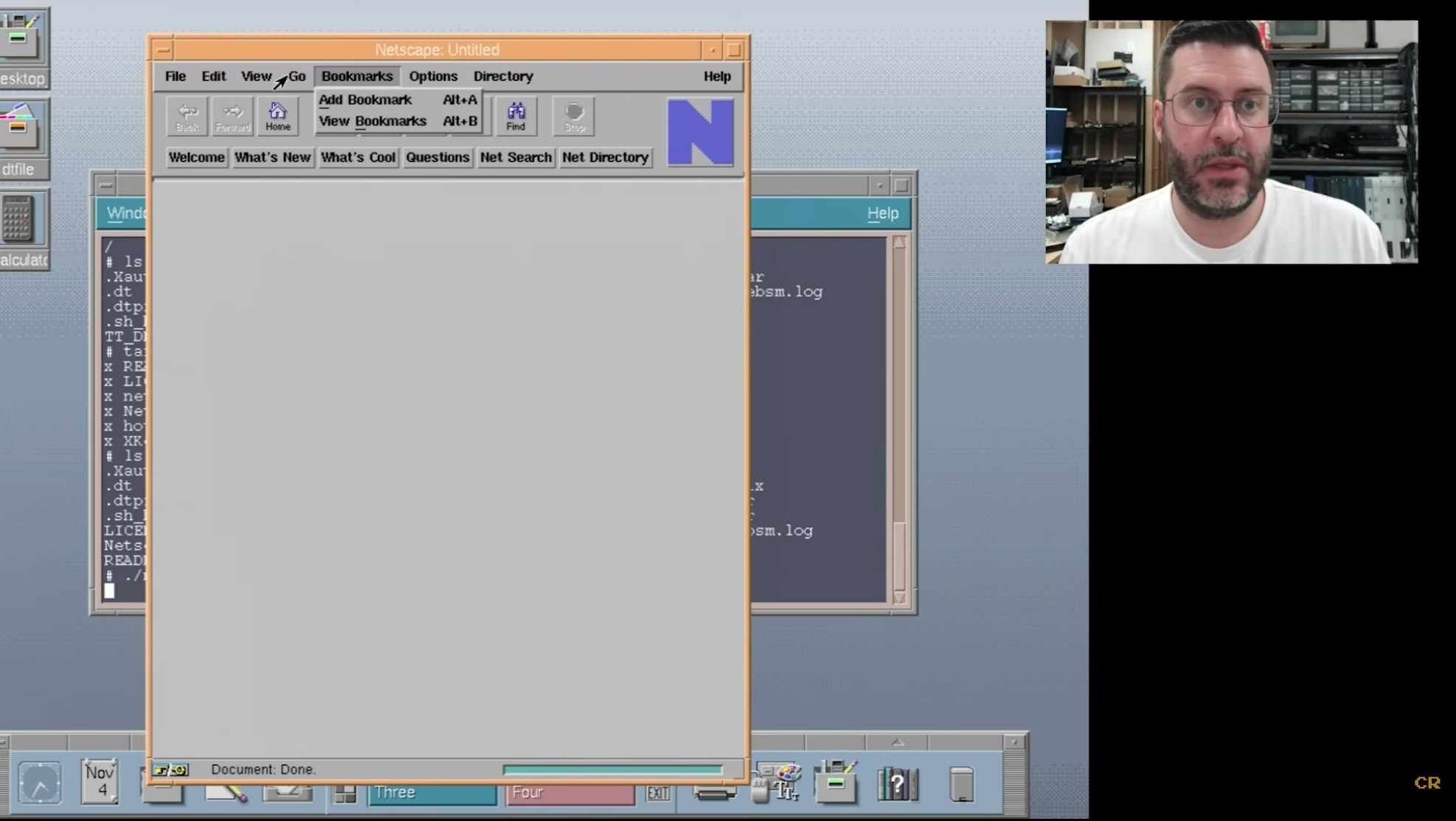
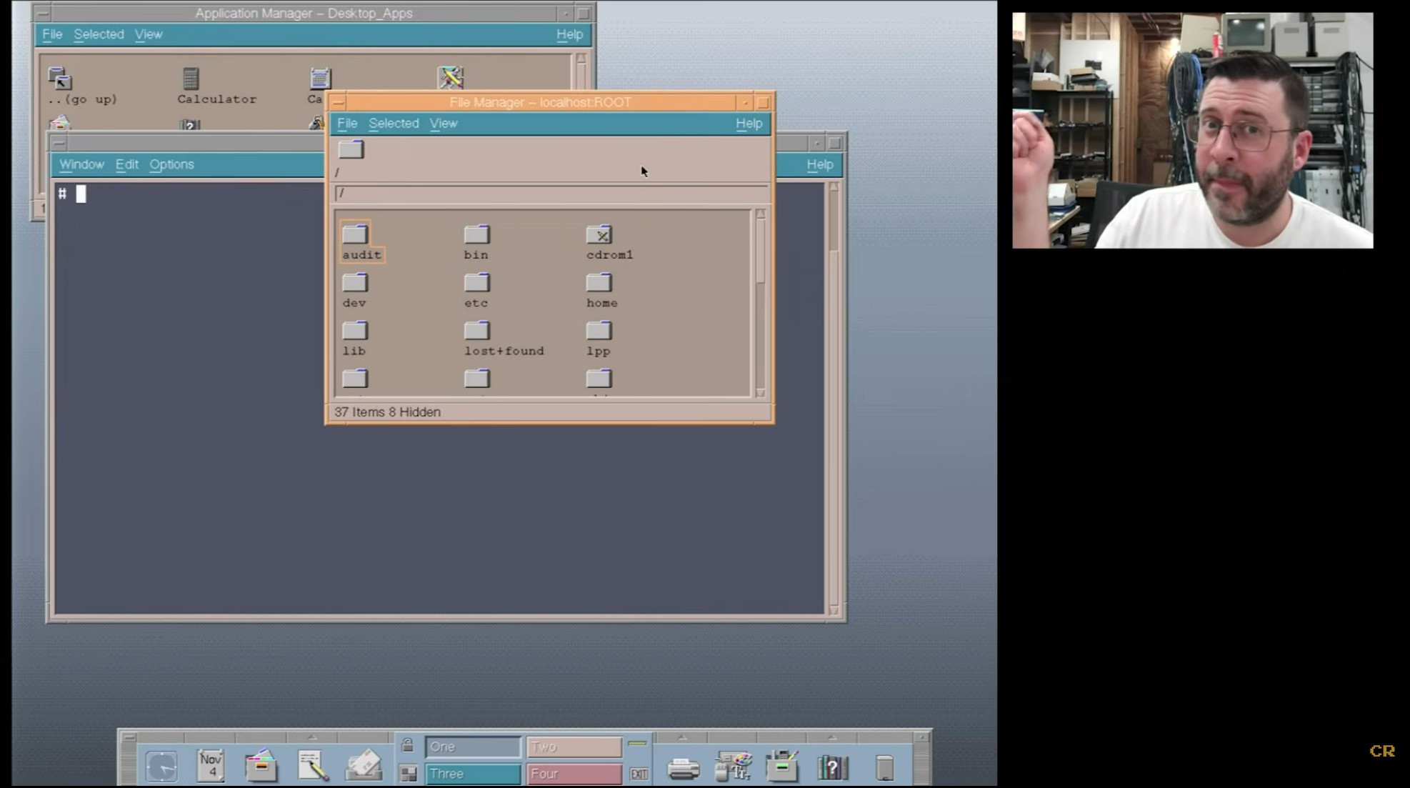
Modern xterm still somehow manages to use the original I beam, probably by defining its own cursor.
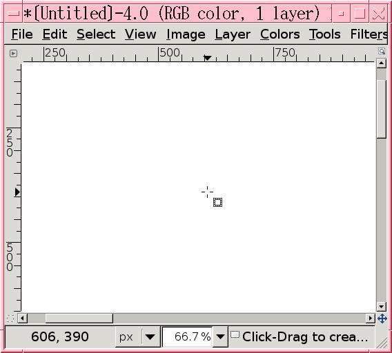
Gimp as of 2018 still defined its own crosshair.
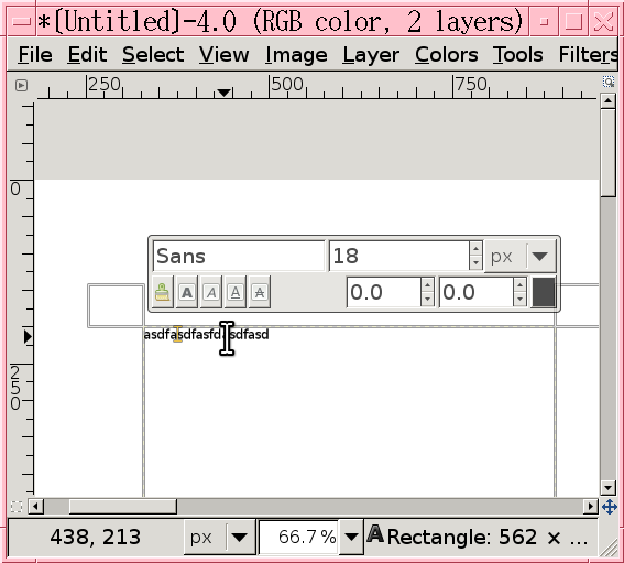
Text selection is hopeless.
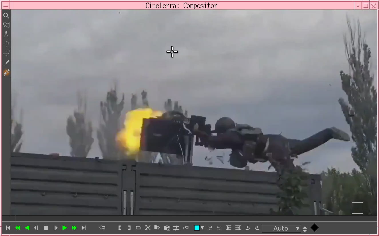
The modern crosshair is a meme.
The whole matter of selecting text makes lions wonder if a single pixel cursor or vintage crosshair would improve matters.
There was also the triangle of images paint.
-----------------------------------------------------------------------------------------------
By downloading https://github.com/ccxvii/cursorfont/ & putting it in /usr/share/icons
Then adding some bits to ~/.Xresources
Xcursor.theme: cursorfont
Then doing xrdb -merge ~/.Xresources
To undo the changes for regression testing, do xrdb -load /dev/null
It got the old cursors in certain programs. Cursors seem to be picked on a program by program basis now.
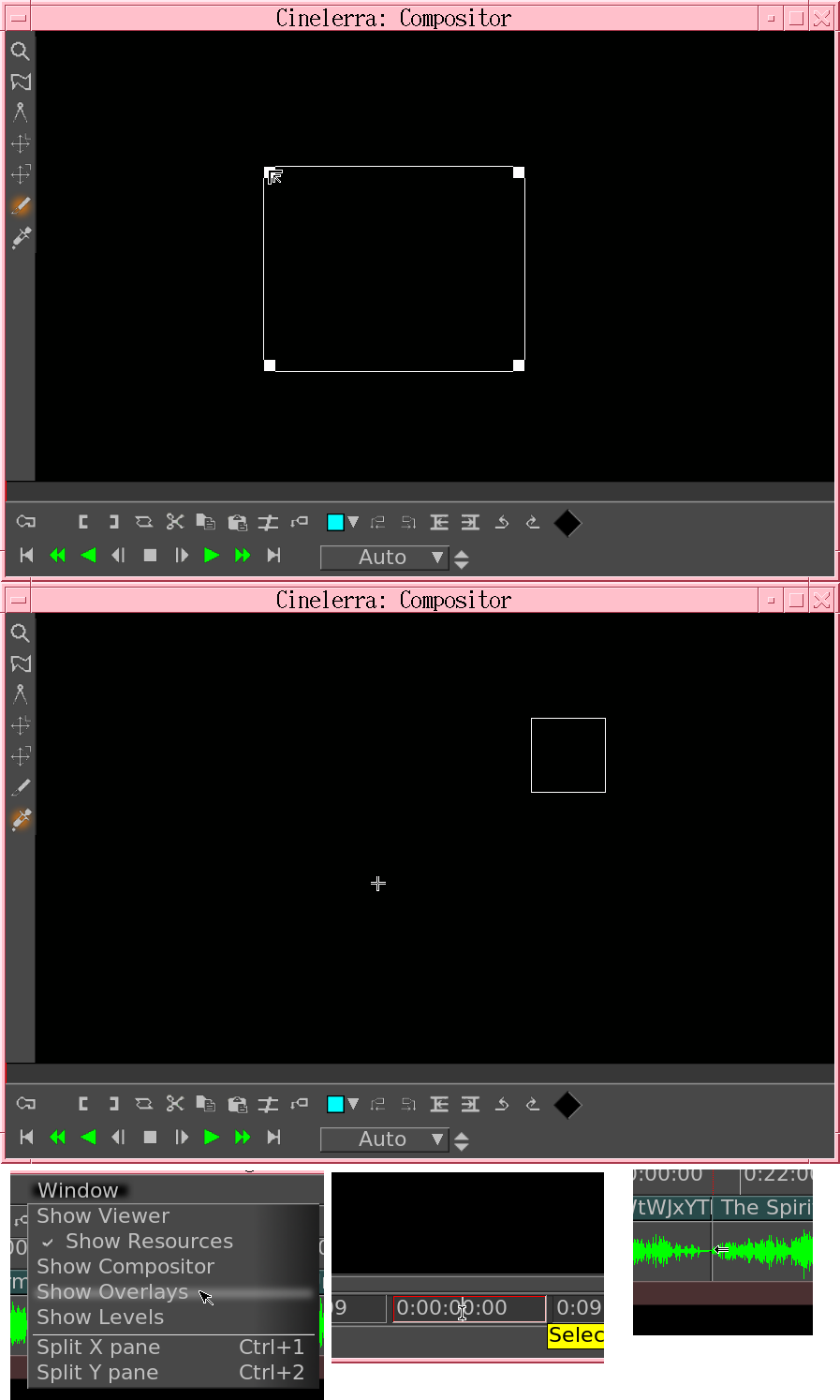
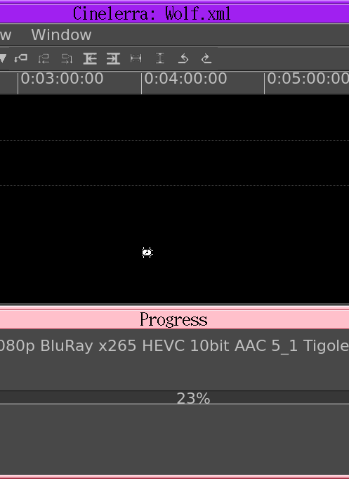
Helas, the cursor codes for the new & old don't match or the last 25 years might have added new bugs. The giant CDE hourglass remanes elusive. The crosshair isn't as appealing as remembered, though it's still more precise than what we have now. Selecting text is a lot easier, even though the cursor is comically small compared to 4k fonts.
Young lion actually wanted the IRIS cursors. They might have used a different left arrow. Old lions seem to find IRIS looking like a toy while HPUX CDE now looks higher end.
The HPUX hourglass continues to be closed source to this day. Replicated it from some gootube videos & the magic finally returned. Confirmed the original hourglass was really asymmetric.
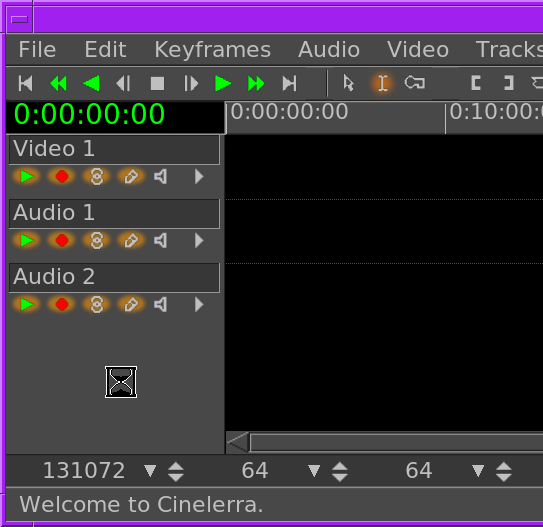
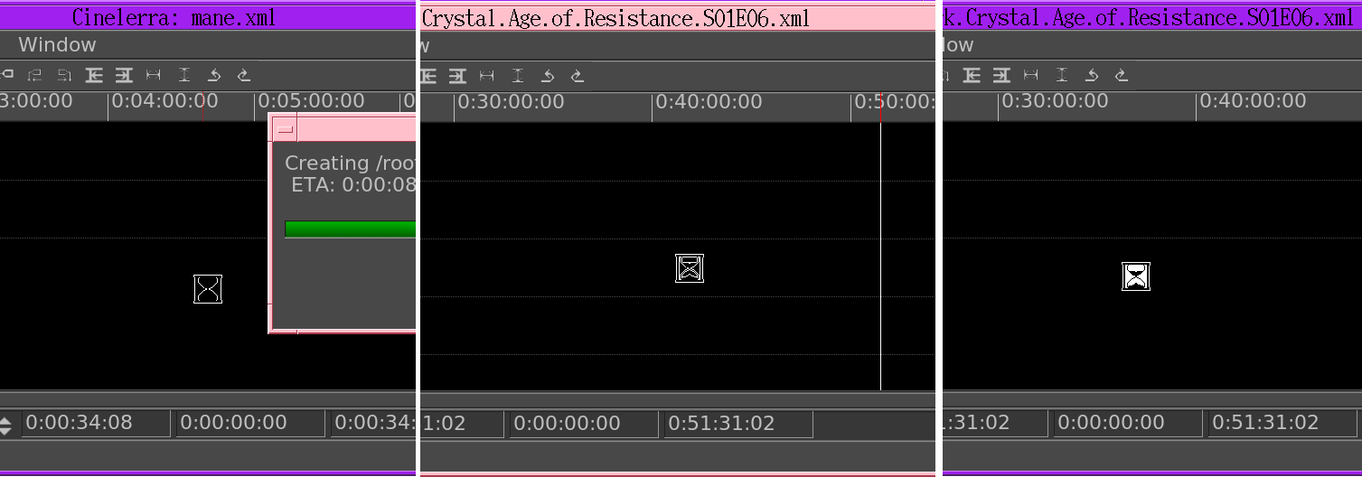
Helas, the original cursor is invisible on a black background. You can make it visible by filling in more pixels, but it won't appear as dynamic. Uploaded the files.
https://github.com/heroineworshiper/utils/blob/master/hourglass.cursor
https://github.com/heroineworshiper/utils/blob/master/hourglass.png

https://github.com/heroineworshiper/utils/blob/master/hourglass2.png
Like the cursor anomalies, there was a lot about HPUX CDE not to like. It was the interface forced on those of us who couldn't afford an HP at home, but given $20k of money of the time, we might have run FVWM. The original hourglass definitely makes it feel like a $20k machine. The original 72dpi cursors are a bit small in modern 140dpi, but using them makes lions ponder running everything at 72dpi.
The lopsidedness of the hourglass reminded lions that mid 90's UNIX variants were 1 off creations of small teams, just to get a bare minimum operating system on a single novel type of hardware. They weren't universal solutions like modern Linux. That made them very efficient but not very finished.
Discussions
Become a Hackaday.io Member
Create an account to leave a comment. Already have an account? Log In.