 the_3d6
After updating Android app so it stores all consequent beat times, detected on the device, we can build Poincare plots - for two consecutive beats, time of 1st beat is used as X coordinate, time of second beat - as Y coordinate, thus producing one point. A healthy heart has some variations in RR intervals, but they are relatively small, so Poincare plot looks somewhat like ellipse with long axis lying on X=Y line.
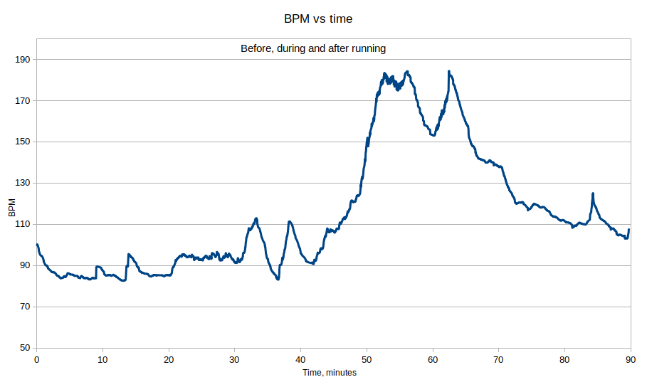
I've tested it before, during, and after running (it was a short ~15 minutes run). This is what I've got:

It showed a problem that wasn't obvious before: beat detector sometimes skips beats - and thus we see almost perfectly aligned series X=2Y and 2X=Y (and some traces of X=3Y and 3X=Y). In case of real heart problems, there could appear "clouds" in these areas, but they are far from such a perfect straight lines, so this is definitely a problem of detection algorithm. Will work on that!
Besides this problem, it seems to work really well. Here is a chart of BPM vs time (I've started run after ~50 minutes after I started recording, and during the run, made a pause and then short sprint - all clearly seen on the chart)
Discussions
Become a Hackaday.io Member
Create an account to leave a comment. Already have an account? Log In.