 Radu Motisan
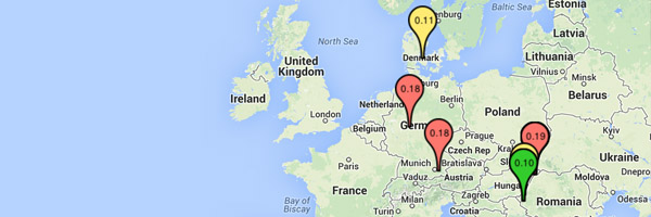
To make data visualisation more appealing, the map has been updated to show the pinpoints in colour, and with the last radiation dose value as a label. This value influences the colour of the pinpoints. Black are those offline, green are areas with radiation dose under 0.10uSv/h, yellow for under 0.17uSv/h and red for bigger doses. But these numbers are the very last values, that are non integrated (averaged) so for better indications click the pinpoints to open the detailed view where you can also see the trend for these numbers.
More here.
Discussions
Become a Hackaday.io Member
Create an account to leave a comment. Already have an account? Log In.