Hi there! Today I want to share some of our explorations into what easier testing could look like. Field Ready's current Quality Control processes mean that test plans are a mandatory part of each product's documentation, and help to ensure that each product they produce is of a high standard. However, we were wondering if it could be possible to produce a clearer set of testing guidelines for a product. To do so, we have tried to redesign the testing plan for one product. We had a couple of goals:
- Create a consistent structure for Field Ready's testing documentation across products.
- Be clear, readable and easy to follow.
- Be easy to generate through an automated tool, to ensure that the formatting of testing documentation doesn't become a chore, but is instead easy and accessible to people without graphic design training.
As always, this log is a snapshot into our current process: it doesn't represent a finalised vision but simply a stepping stone on our path - we welcome feedback and will iterate internally, as well as testing our concepts with Field Ready employees and manufacturers.
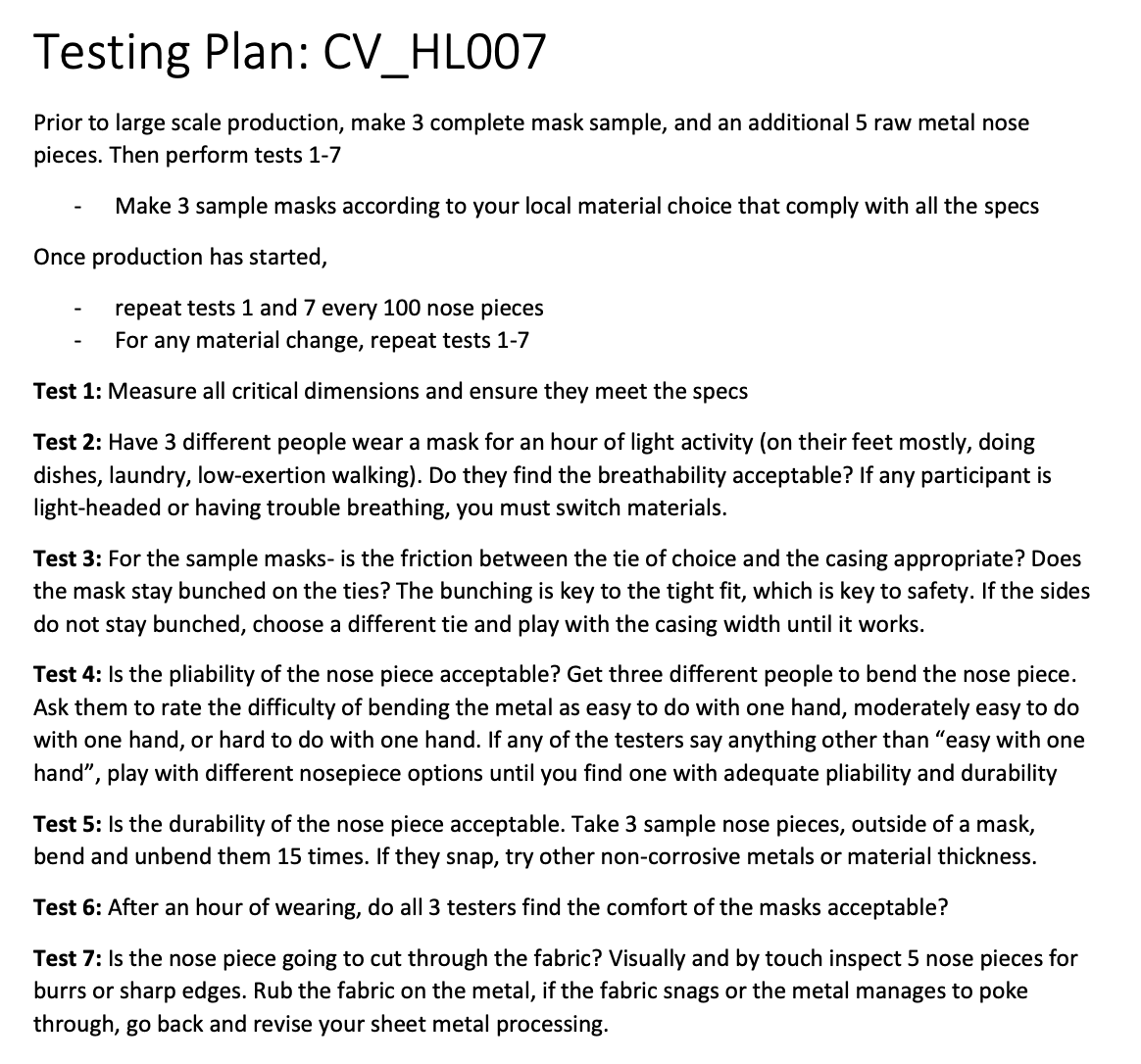
I started by taking an existing piece of documentation to work from. I chose a face mask design they've produced recently and worked from it. Here's the original test plan:

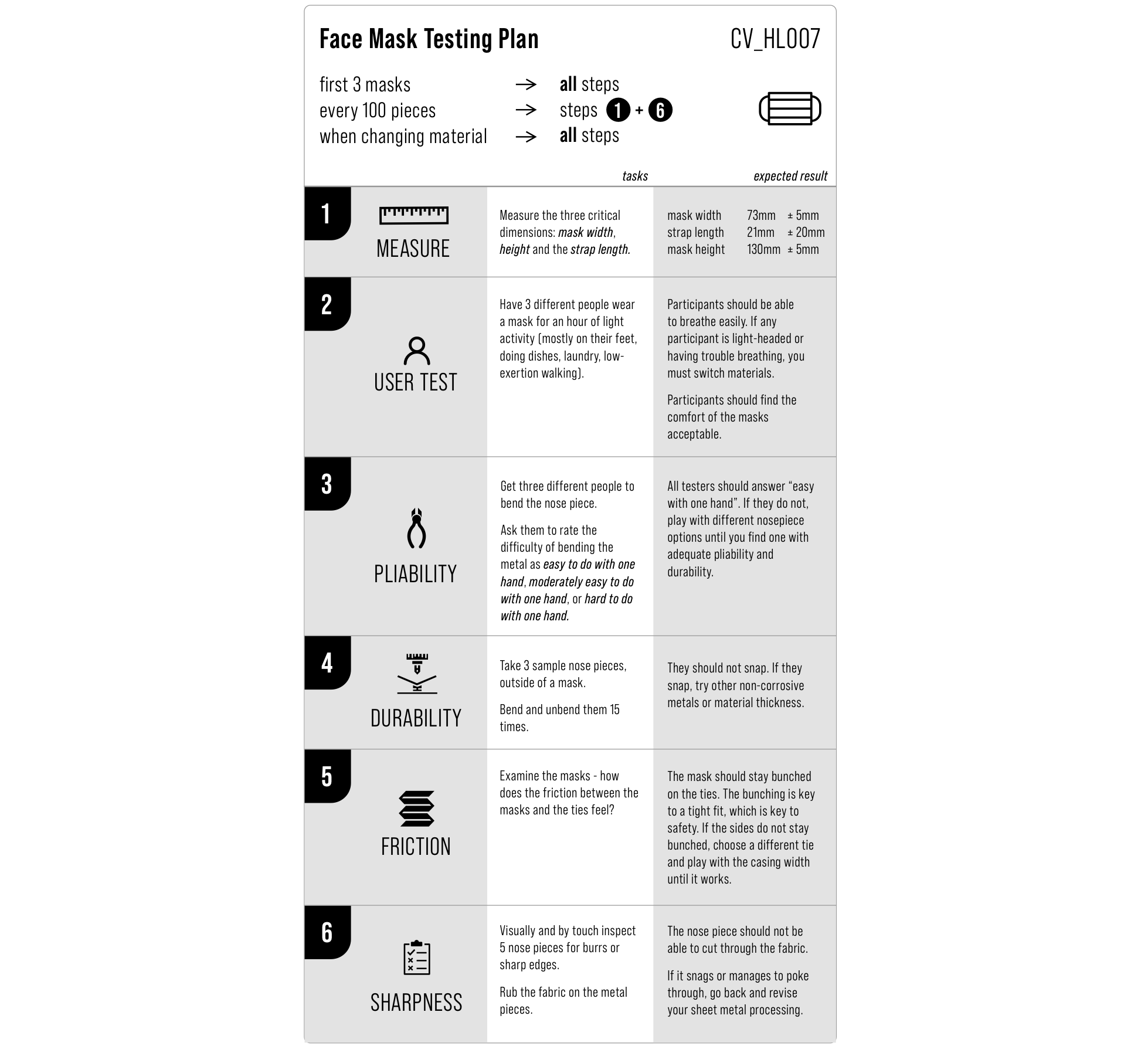
So - here's my attempt at an improvement [NOTE: THIS IS NOT AN OFFICIAL TESTING PLAN. It is a design mockup, and data is fabricated. Please do not use this for testing any products]:

What are some of the changes?
- The key dimensions are now listed in the testing plan, along with expected dimensions.
- Each task is clearly separated from its expected result
- It is more clear which steps need to be repeated at what times. (e.g., upon changing material, repeat all tests)
- Similar steps (e.g. user testing) are grouped.
- Iconography and clear separation helps testers to remember which task they're on and not accidentally skip over tasks.
- It would be relatively easy to automate the creation of this document
What are some downsides of the new approach?
- It does take up more space - but I want to try reformatting it so it can still be printed on a single side of letter or A4 paper.
- Without a tool, it does take more time to create. Hopefully this can be explored later in the project.
- It has not been tested by users yet, so any advantages are hypothetical and still need robust validation and exploration. We will be performing this over the next couple of weeks.
As always, pop a comment down below with your thoughts and comments!
 Tom Hartley
Discussions
Become a Hackaday.io Member
Create an account to leave a comment. Already have an account? Log In.