There have been several fine e-ink projects on Hackaday and I particularly like this one. I wanted something similar to sit on my desk but with a more minimalist feel and code I'm familiar with. The first step in my design process (if you can call it that!) is to first identify a series of desirable design features before I put pen to paper. Here they are for this project:
- Narrow/no bezel - Modern tablets and phones have got us all so used to the idea that screens should blend into the rest of the device that a protruding bezel immediately looks old fashioned.
- These e-ink panels have an elegant aesthetic, with a muted gray border and a mirror finish back, show this off!
- The screen needs to sit at a convenient viewing angle without a prop like a picture frame.
- The enclosure needs a simple, clean geometry with no features that distract from the screen.
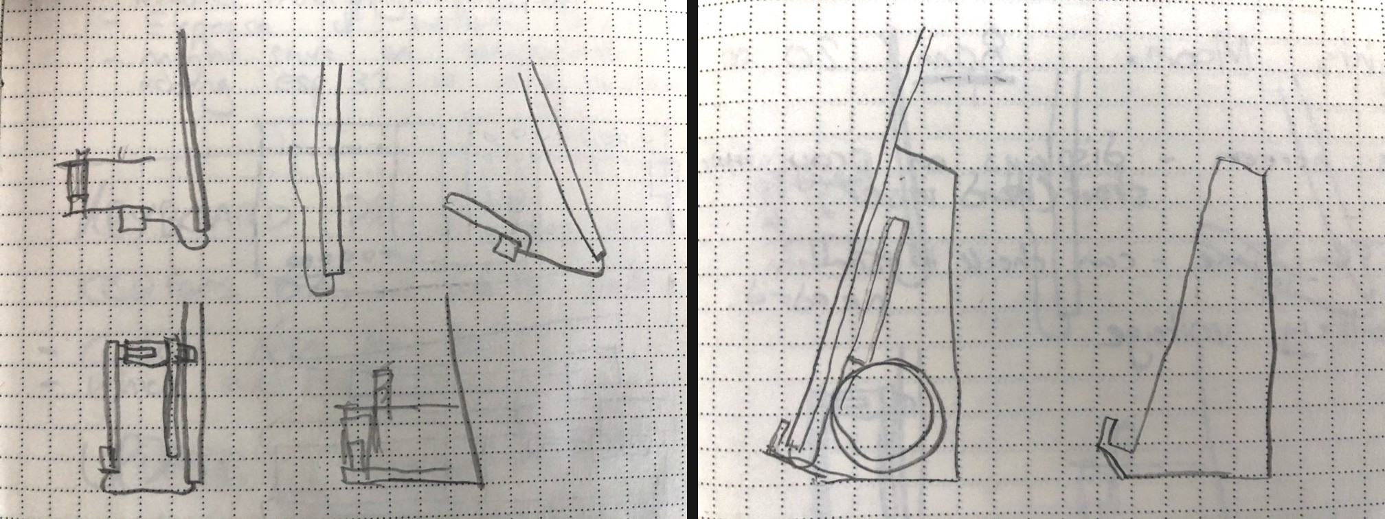
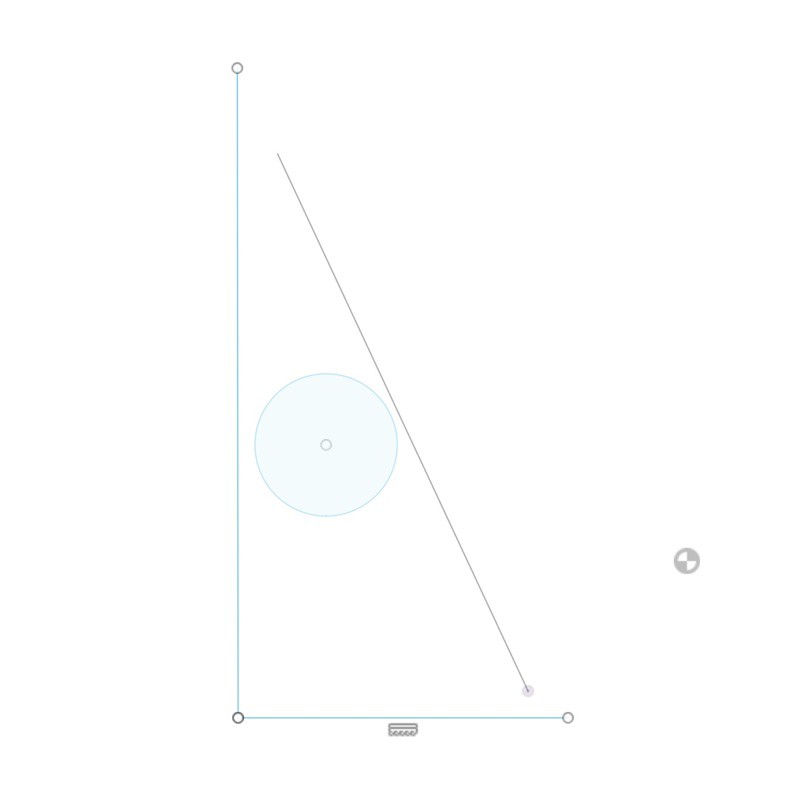
My initial sketches quickly ruled out a flat tablet like enclosure, but went instead to a monolithic stand which would both house the electronics and hold the screen at an angle. I transferred that sketch to Fusion360 and started to mess around with the geometry and finding an angle that looked right for the screen.

It then occurred to me that the stand could also give me a second screen angle by tipping it onto it's back, not really needed for this project but a nice feature to experiment with for the future. This pretty much established the back plane of the case as it needed to be deep enough that the screen would not touch the desk in that orientation.

So I had the angle of the screen and location of both the base and the back of the stand but no constraints for the sides or top. I also had an best-guess location for the battery. For the rest of the internal geometry I needed to know how my PCBs could fit and figuring that out led to my first PCB designing adventure which I'll cover in the next log!
 Jacob Tarr
Discussions
Become a Hackaday.io Member
Create an account to leave a comment. Already have an account? Log In.