Another week has passed and there are some big changes this time. Version 1.0 is getting nearer and nearer...
Button Highlights
The play and record buttons will now light up when they are active. This is to make them stand out more to show OPL Studio is playing and whether recording is enabled. It also makes the recording trigger stand out more in the melody sequence editor since the play and record buttons will now flash to indicate recording trigger has been set.

The Quad Synthesizer
Development on the new synthesizer module is progressing quickly. The main functionality is now ready and it's a matter of cleaning things up and working out the finer details. The UI has changed a bit. The textfield with the small button has been replaced by a bigger blue or gray button that is used to select a sequence and to show whether the sequence is active. Slots can also be empty now and in this case the button to enter the sequence editor will be grayed out with a stripe pattern.
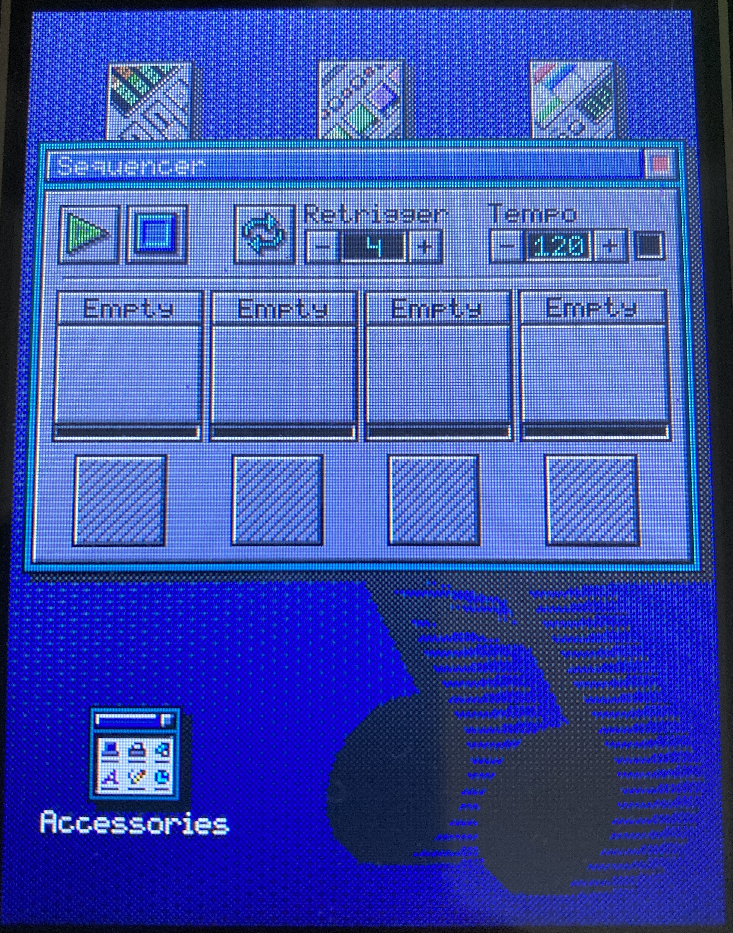
Sequences are added to one of the sequencer slots by clicking on the slot title. This opens the sequence selection dialog that's also used by the composer module and selecting a sequence will place it in the selected slot. A new feature of the selection dialog is that you can now also select empty sequences. Doing so will not only assign the sequence to a slot, but it also opens either the drum or melody sequence editor to record the sequence.
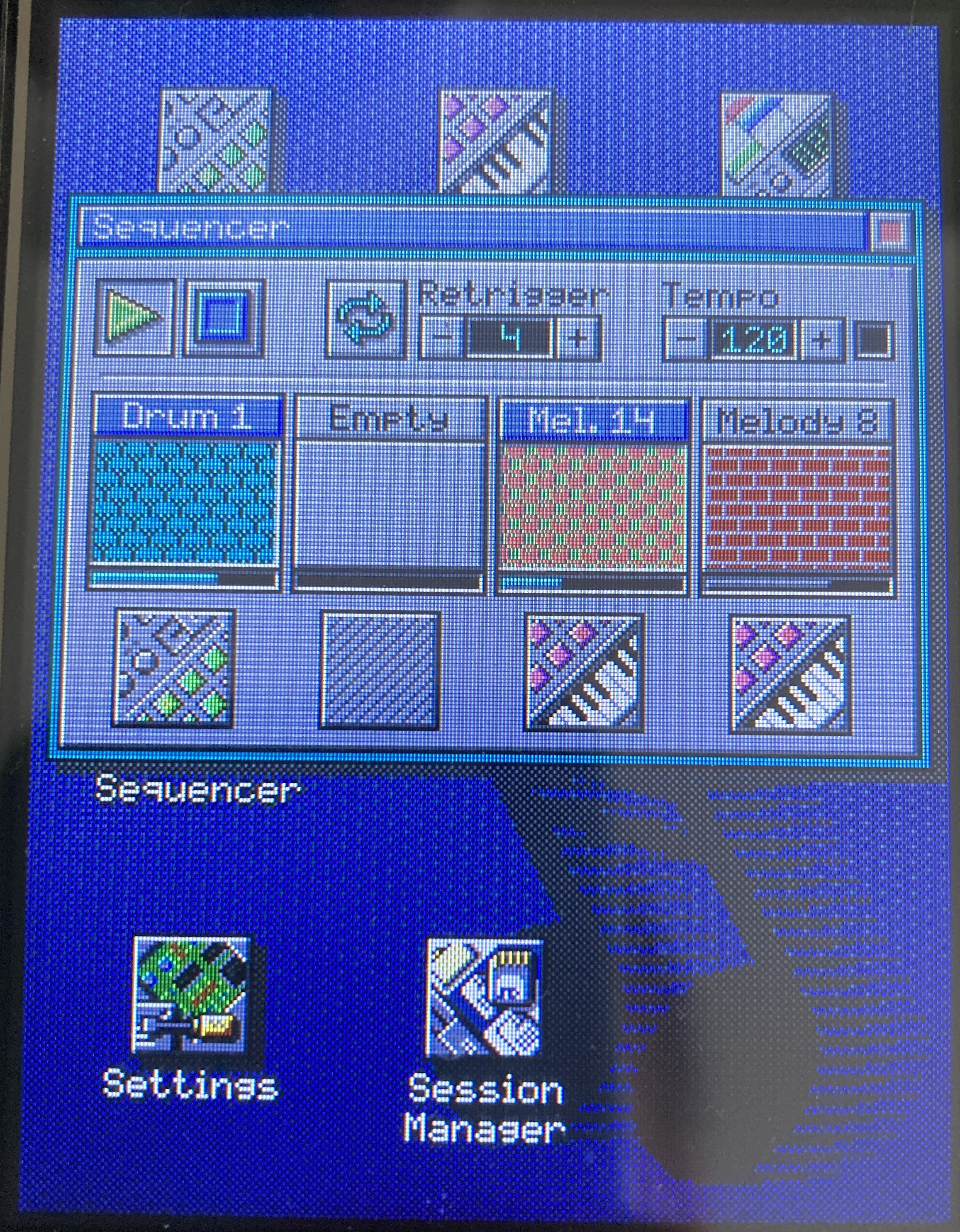
To finish off the new sequencer I have to make sure it's well integrated so there will be no hickups when it's playing in the background and you're navigating through the UI. I have to add the ability to save the state of the sequencer in the session manager. And I have to finish work on the retriggering.
Home Screen Cleanup
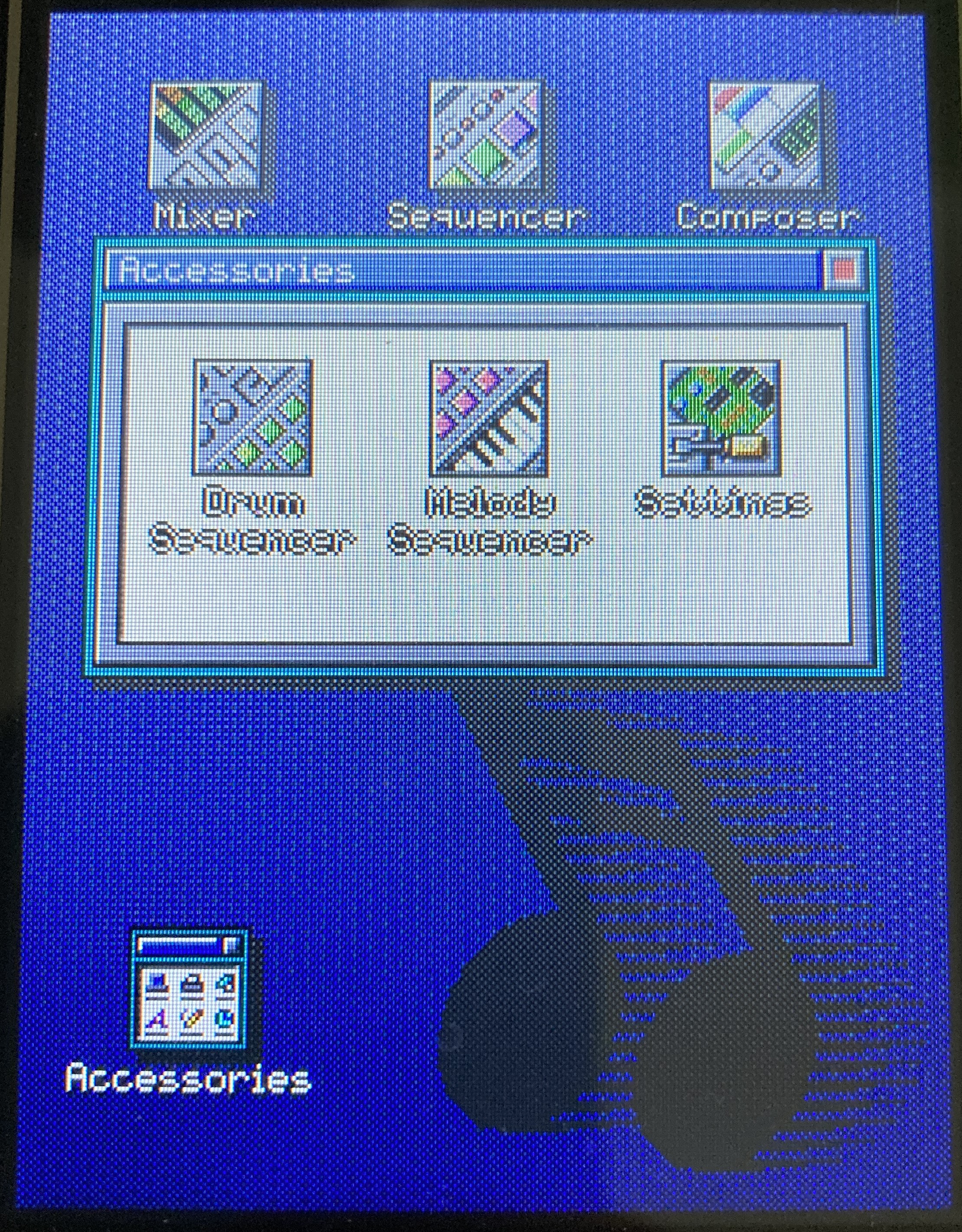
The home screen was getting quite crowded now I added the new sequencer module and besides I thought it would be confusing to have the sequecer, drum sequencer and melody sequencer all on the shame screen. But man I love those icons! It would be a shame to remove them. So what I did is that I added what you might call a program group on the home screen called 'Accessories' . This opens a new screen with the less frequenctly used modules: drum sequencer, melody sequencer and settings.
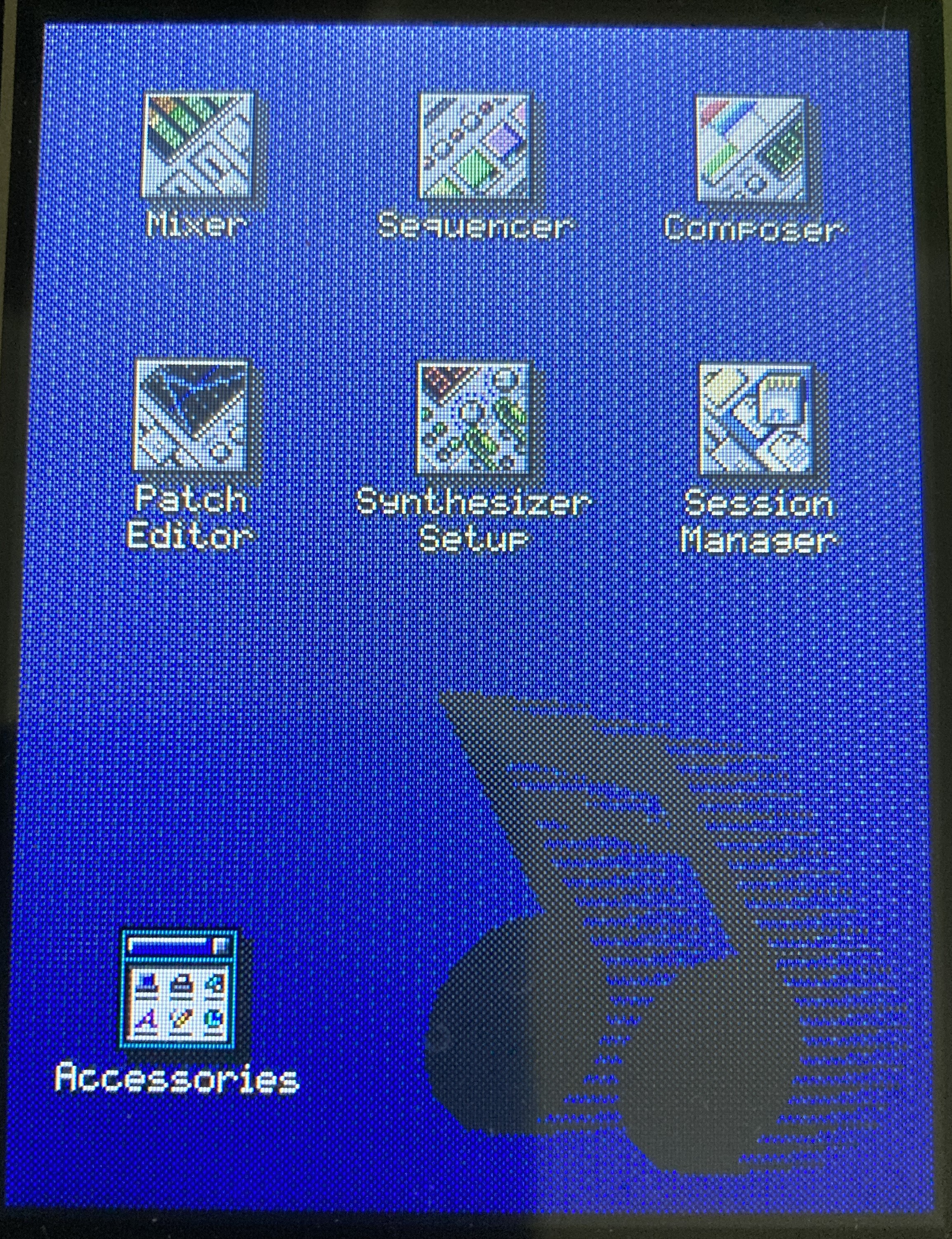
Moving the two sequence editors to this new folder makes sense to me since now they are more or less part of the sequencer module. Though it will still be handy if you want to work on a single sequence.
The Accessories group will be a convenient place as well from another module that I want to add later, post launch.
Lots of Fixes
And to round things up a lot of small fixes have gone in:
- Changing a parameter in the patch editor will no longer force the note to a C when a key is held down while making the change
- When pointer calibration is started MIDI playback and the sequencer is stopped. Notes are flushed to prevent buffering them to be play when normal operation resumes
- There was an issue in the composer module regarding loop cueing. Cue would only take effect every 16 steps!
- Sequence selection dialog now stops the preview when you unselect a sequence, but the preview function is still problematic in combination with the sequencer
- When you select a sequence with the same index in a different tab of the sequence selection dialog then the button now correctly shows that it's selected
- The composer module now also handles the new PolyMelody
- An error where the composer would only play 1/4th of the song and then loop is now fixed
- Hanging notes occurring when entering / exiting the patch editor have been fixed
- The patch editor will from now on only listen to notes played on MIDI channel 1, but it now also takes into account control changes on this channel
- The patch editor will no longer forget the patch that was being edited when you close it
- Closing OPL Studio settings no longer causes a repaint of an empty background
- Notes no longer get stuck in the patch linking module
 Maarten Janssen
Discussions
Become a Hackaday.io Member
Create an account to leave a comment. Already have an account? Log In.