 Joseph Eoff
The pieces are slowly coming together. I got my first heatmap view of the data this evening.
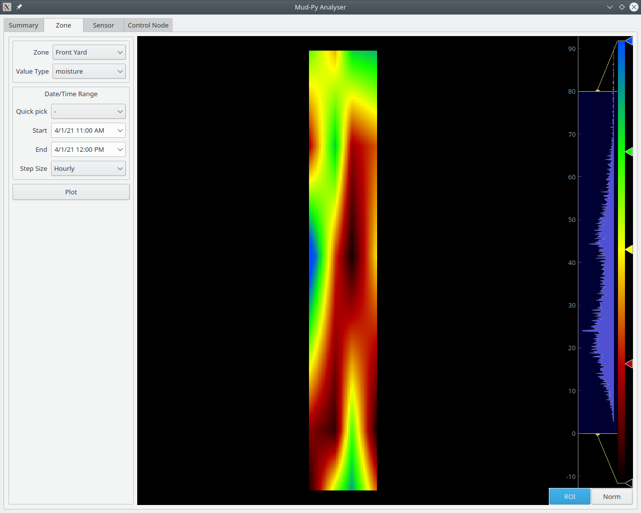 That's the distribution of soil moisture in my garden from 1 April, just before noon time.
This is the same day, but between 3 an 4 AM:
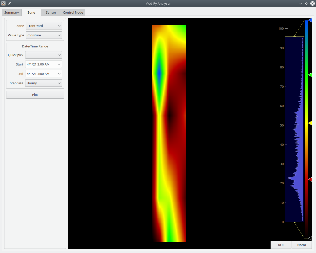 As you can see, the moisture changes over the course of the day.
I can also plot the other types of data:
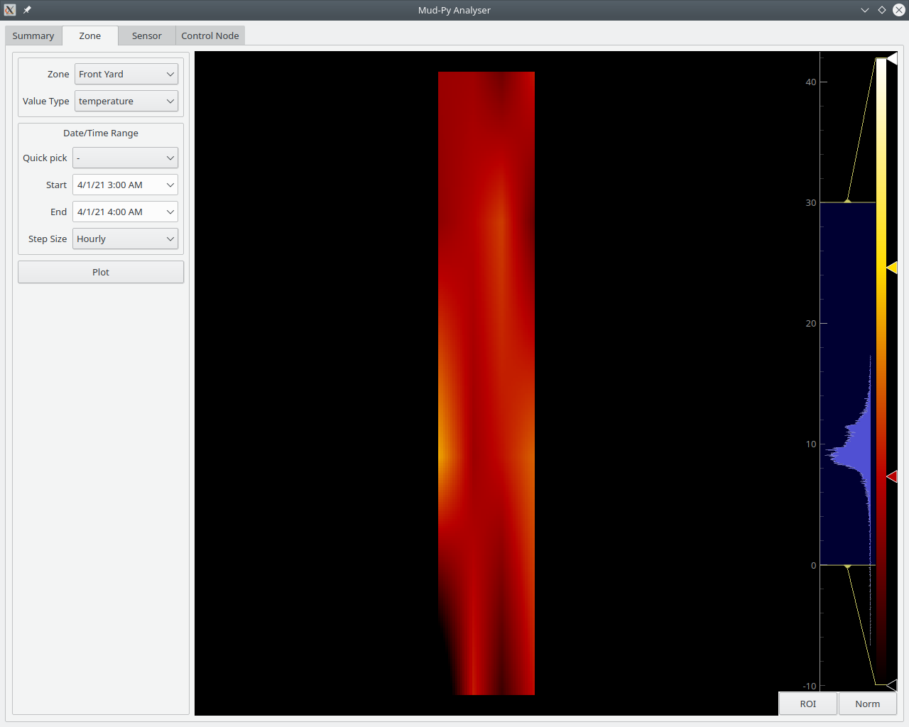
That's the temperature between 3 and 4 AM on 1 April.
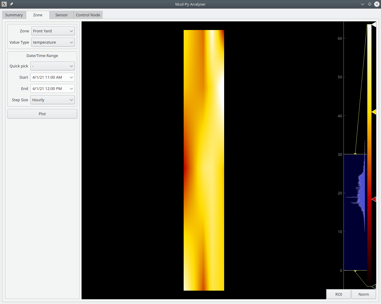
For comparison, the same day just before noon:
There's still quite a bit to do, but it is getting there.
I've got to group the data for the animation steps, and lots of other things.
It turns out that the pyqtgraph ImageView control that I'm using can accept stacks of images for time sequences - that'll make the animated displays easier.
I've got to find the source of some bugs first, though.
Things like this:
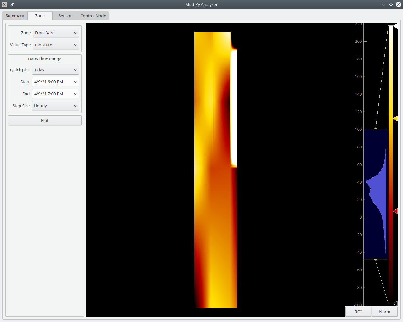
That's a soil moisture plot from this evening. It runs from -40 percent to way over 100 percent - but only on the heat map. The data behind it is all within the proper range (0 to 100 percent.) There's something tricky going on with the interpolation. I think maybe missing values cause the interpolation to freak out.
I'll look into that later this weekend.
Discussions
Become a Hackaday.io Member
Create an account to leave a comment. Already have an account? Log In.