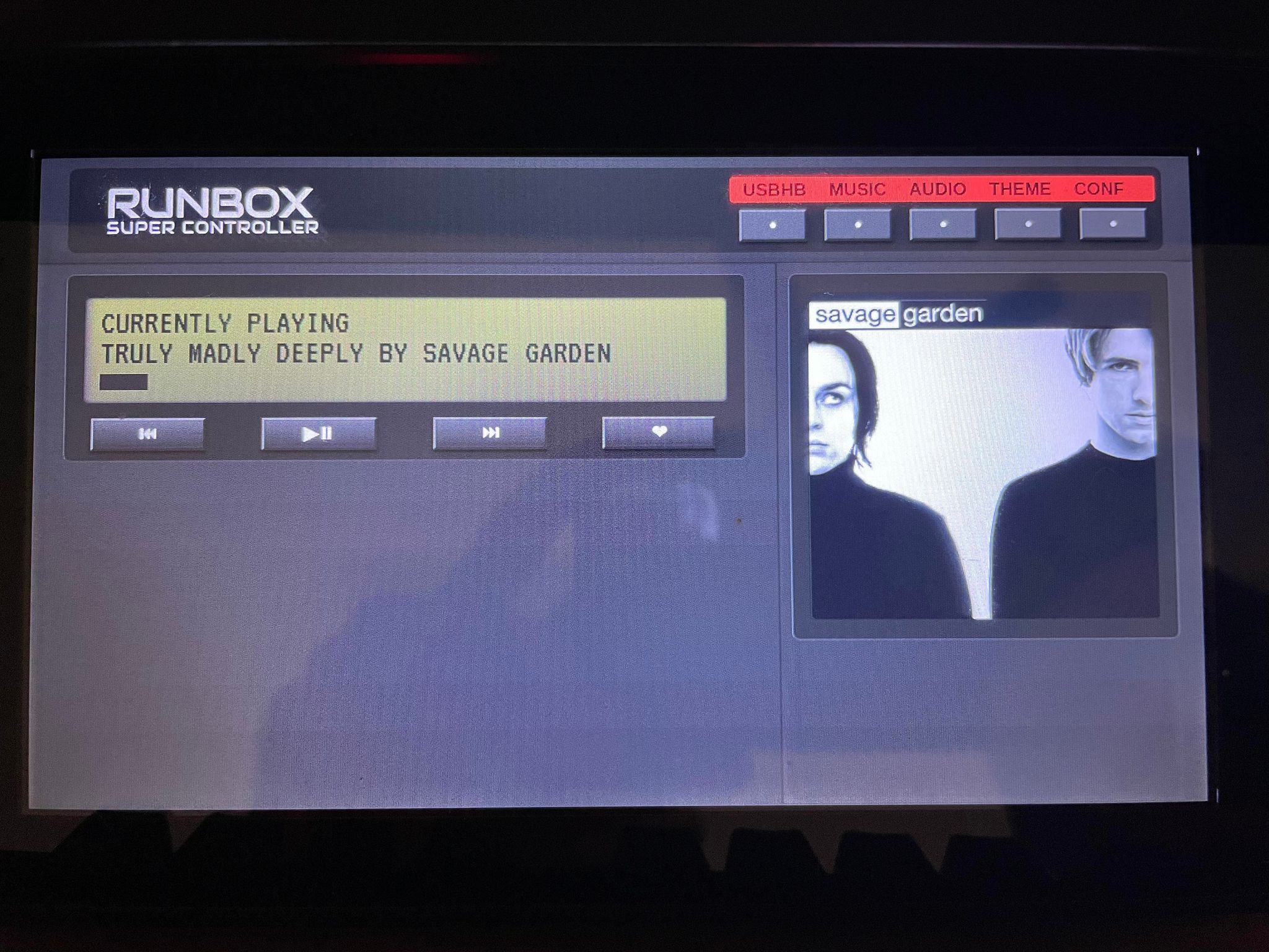
I had to find a way to "easily" add modules with different capabilities. Seeing as how this is built on HTML and JavaScript I had to find a way to do this without losing the USB on/off indications from a page refresh. I decided to utilize the DIVs to make everything south of the header-bar a sliding page. Each section within the DIV would contain a module such as Spotify and/or a hardware monitor. I began the testing with a basic Spotify "Now Listening" visualization made by José Manuel Pérez that I re-styled to try and match the theme.

This change of course brought on new challenges such as the slide navigation not actually sliding and the question of how one would log into their Spotify if they don't have a keyboard attached to their Pi? That last part might sound silly to some. Though one criteria I had for this project was simplicity. I want this to be as easy as possible for the end user - and clean.
Now I know there MUST be a better way of doing this rather than making it all on the same page and unfortunately until I come across it - this is what I have ¯\_(ツ)_/¯
So far the only real issue with this test is one cannot log into Spotify using a Facebook log-in /unfortunately/ due to Electron's built in security - from what I can tell. So next I will be looking into incorporating an on-screen keyboard on top of adding real Spotify controls and not just a basic visualizer.
Do you have suggestions? Tips? Better ways to do things? Please feel free to leave a comment!
As always I encourage everyone to fork the repo - add some code - and open a pull request!
 Matt G
Discussions
Become a Hackaday.io Member
Create an account to leave a comment. Already have an account? Log In.