So I decided to scan the Android smartwatch market to see if I can replace my aging Zeblaze Thor Pro and I thought that it would also be a good time to see what kind of variance there is in smartwatch screens these days.
UI Sketch
For starters, it seems I forgot to write a log about the UI design I started on the train from the Birmingham, UK TCT show.
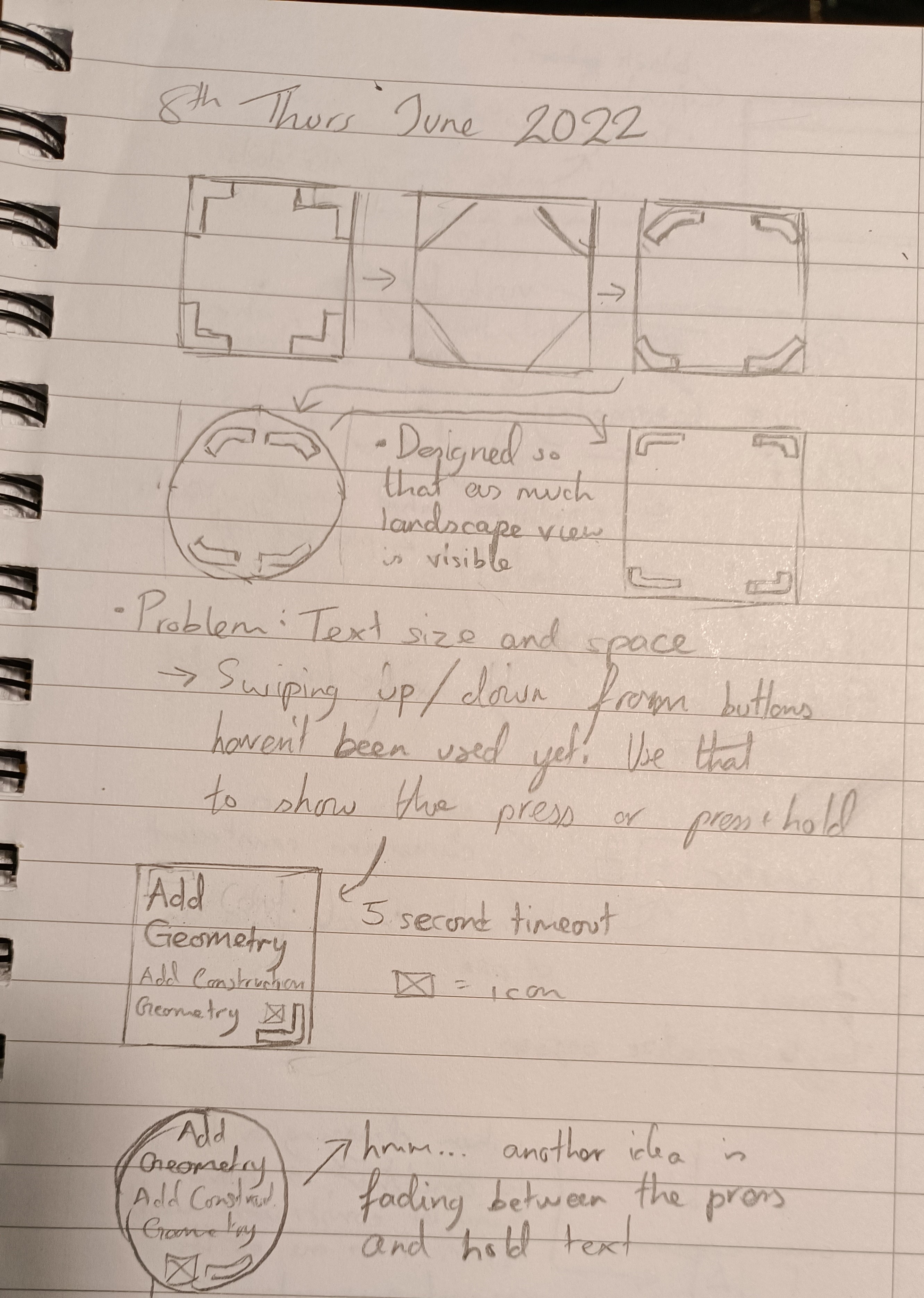
So the arrows show things like design progression. I'm thinking of a thick line that has a smooth bend when hitting the corners. As seen in this log, there would be a press and a press+hold function of the buttons. Then I thought about how a new user would think when they just started the app for the first time and added a swipe gesture to open a tooltip with a 5 second timeout.
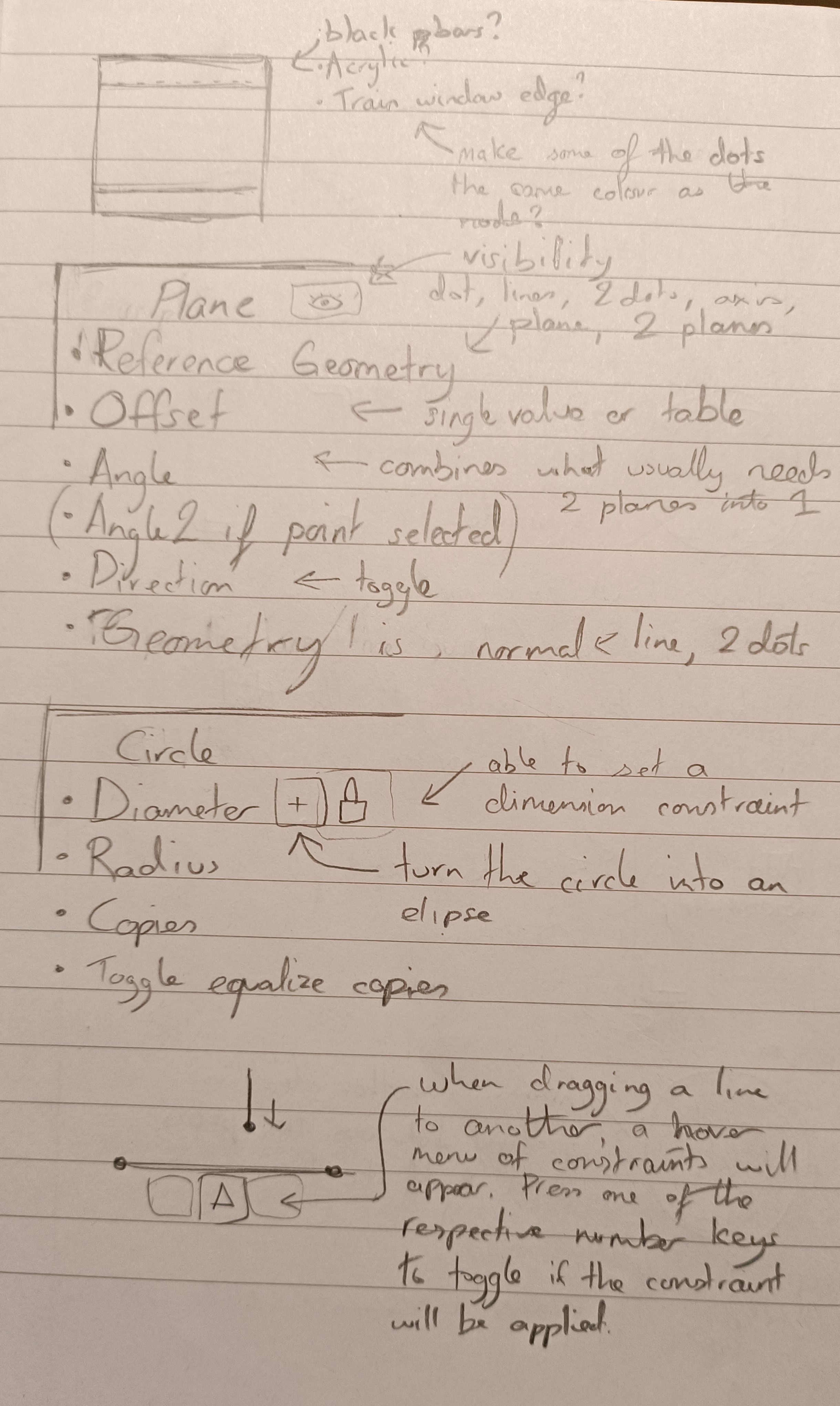
Then I started thinking about the look of the area behind the buttons. Should it be acrylic like Windows 10/11, black bars or maybe even something like the edge of the windows in the train I was in: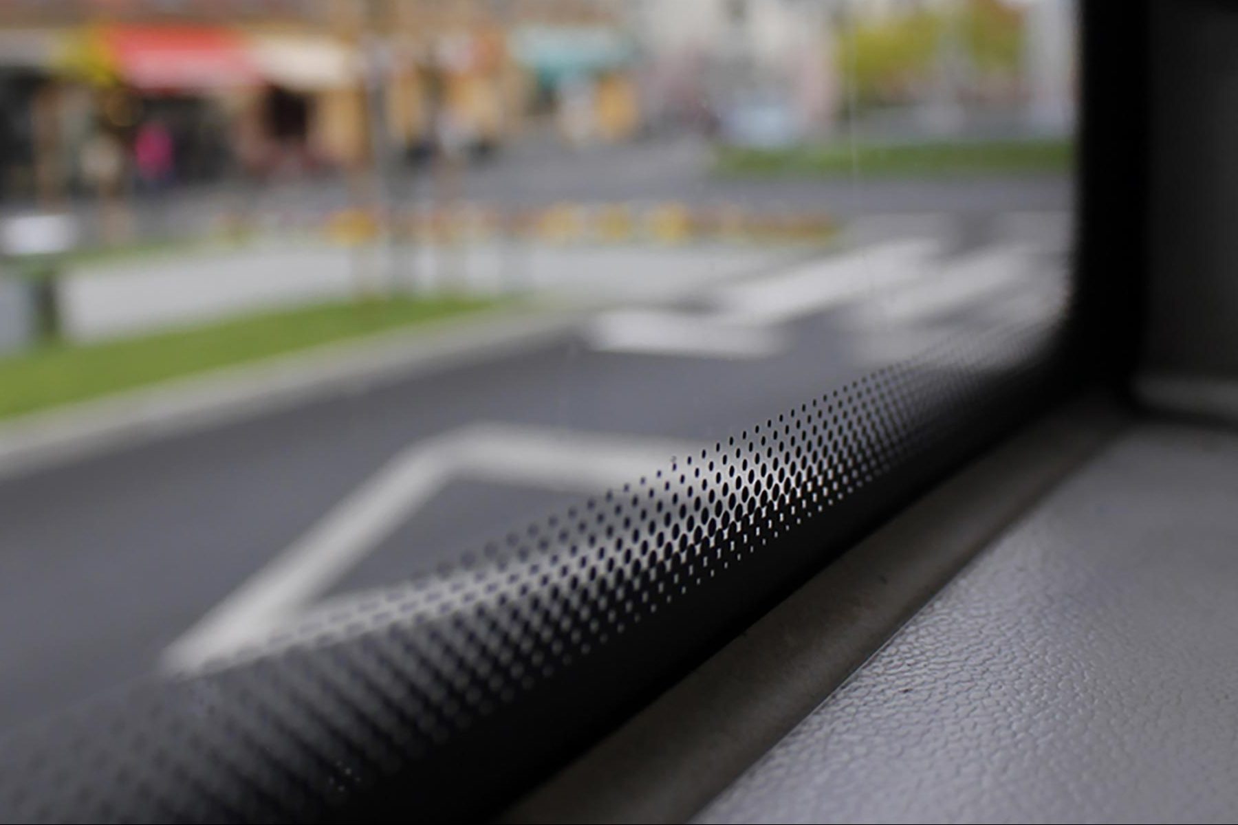 After that, I started thinking about some example nodes so that I could create a UI for it. There would be a lock button next to entries like "Diameter" which will set a dimension constraint without having to add seperate nodes.
I also thought of a desktop UI feature where the user could toggle what constraints to apply whilst something like a line was being dragged. For example, you want to keep the vertical constraint of the line you're currently dragging, but aren't aligned with the midpoint of the horizontal line below. The user should be able to press 2 on the keyboard to say to the software "I want to keep the vertical constraint, but also apply a midpoint constraint to the endpoint I'm currently dragging.".
Circular
The Thor has a 1.6 inch transflective display and is the only smartwatch I've ever had that preserves the time when reaching 0% battery. Due to that, and the fact that I was never all that keen on the round screen, I basically glossed over all of todays options on the market. It does seem that there are more 1.6 inch screen watches now compared to back when I got the Thor and 1.6 was the exception.
It looks like the common sizes are 1.39" for the smaller and/or older watches and 1.6" for the more flagship grade watches, and other than resolution they're pretty much all the same as far as the UI for enSweepen is concerned.
The only outlier is still the LEM X with its 2.03" screen and bottom chin. I do wish LEMFO came out with a new version that was a full circle.
Square/Rectangular
Now the square and rectangular watches have more variance. As far back as when Android was put in a smartwatch, and even before, there were watch phones like this:
 alongside square ones like this:
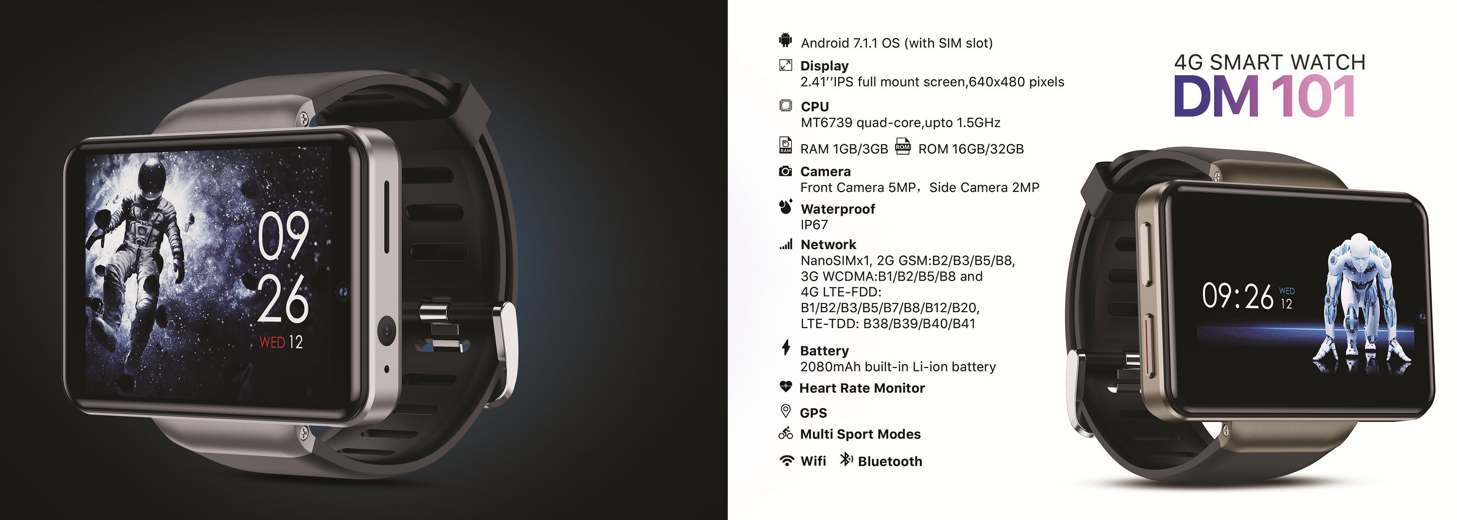
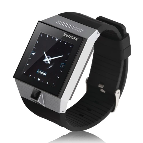 It still looks like most of the square watches today are 1.54" and either 240 or 320px, and that the large, rectangle ones have a 4:3 aspect ratio. Strangely enough, 3 out of the 4 large watches I've had broke at the strap (e.g. LEM T, DM98) and I hypothesise that the 4th one broke due to water getting in through a crack near the strap (Ticwris MAX), so it's probably for the best if I pass on the DM101:
 Searching some more, I found this very nice looking watch with an AMOLED screen:
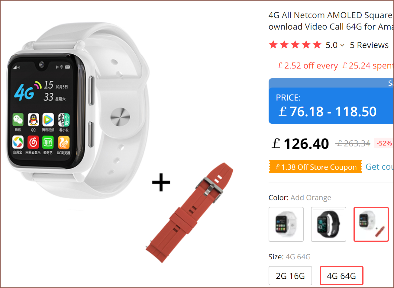
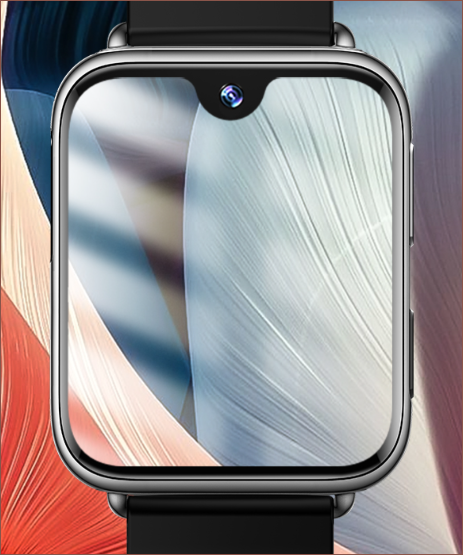
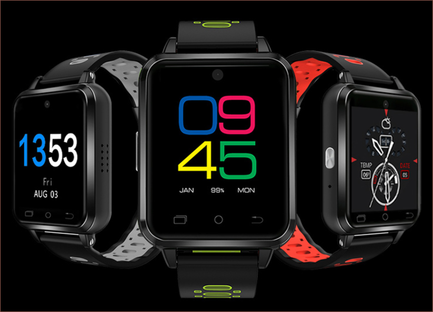
 I think it would look nice with the #Teti [gd0022], #TetInventory [gd0039] and #TEOSS [gd0037] all-white look I'm aiming for, and the screen is probably the single most important feature of a smartwatch. I've had the Finow Q1 Pro and while it was amazing on paper (one of the first 4G smartwatches, removable strap, capacitive buttons), it's 30fps (possibly lower), 240p screen completely ruined it.
 kelvinA
Discussions
Become a Hackaday.io Member
Create an account to leave a comment. Already have an account? Log In.