 WJCarpenter
This is a follow-up to my project log on screen captures. In the first draft of showing the UI, I used a photo of the device taken with my cell phone. I later replaced that with screen captures, which looked much nicer. For comparison, here is the original photo of one of the images:
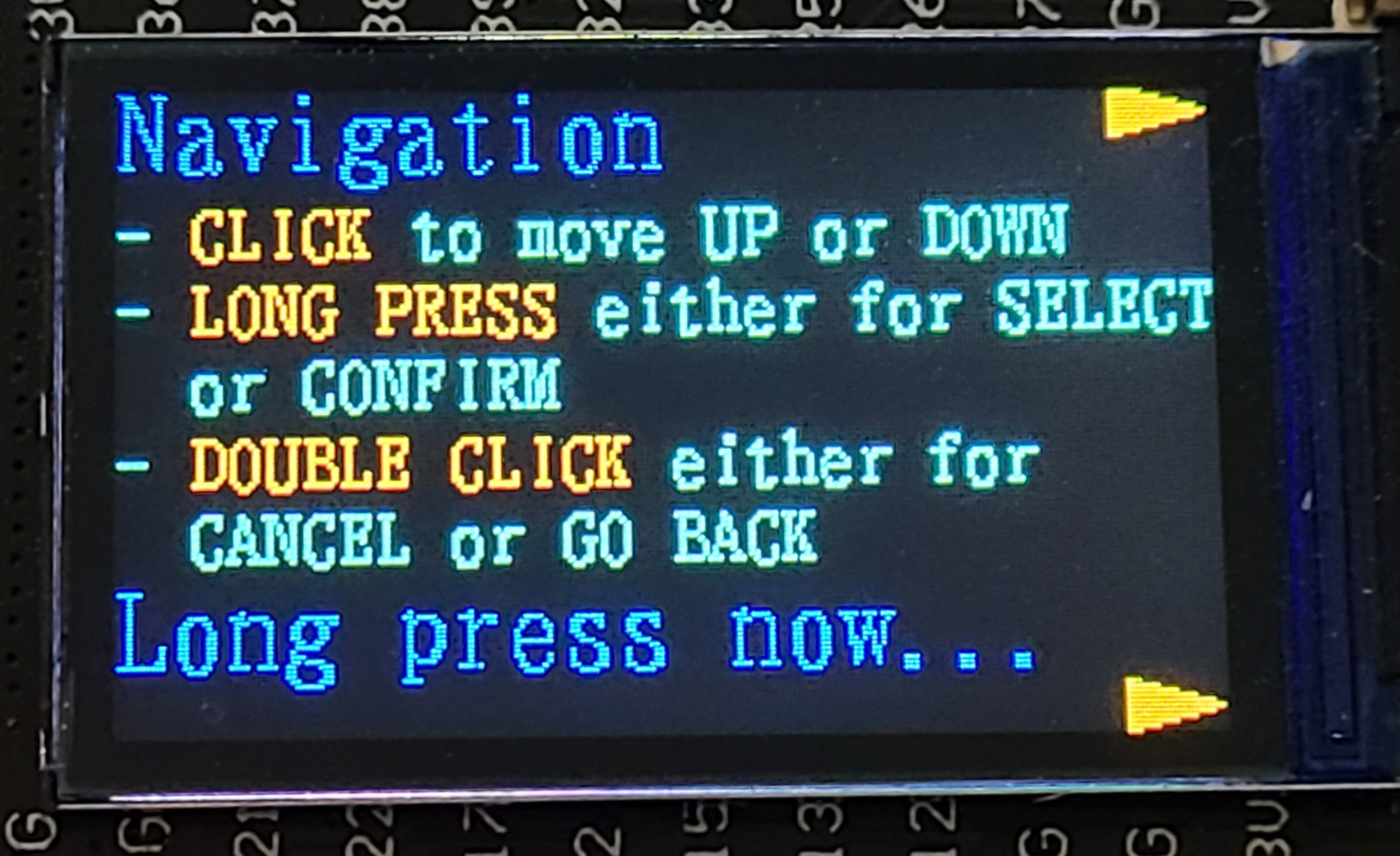
At that time, I was using the Mincyo fonts included in the graphics library repository. Here is that same screen as a screen capture:
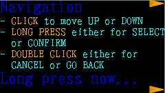
That's a much better representation, but it also shows more clearly that the Mincyo fonts have a slightly sloppy look to them. I had chosen to use the Mincyo fonts because serif fonts are typically easier to read than sans serif fonts. After seeing the look in the screen captures, I switched to using the included Gothic fonts, which luckily were of the same sizes. Here is that screen with Gothic fonts:

I've decided to switch permanently to the Gothic fonts because of the tidier look. It probably matters less than I think it does when it's being viewed on that tiny screen.
Discussions
Become a Hackaday.io Member
Create an account to leave a comment. Already have an account? Log In.