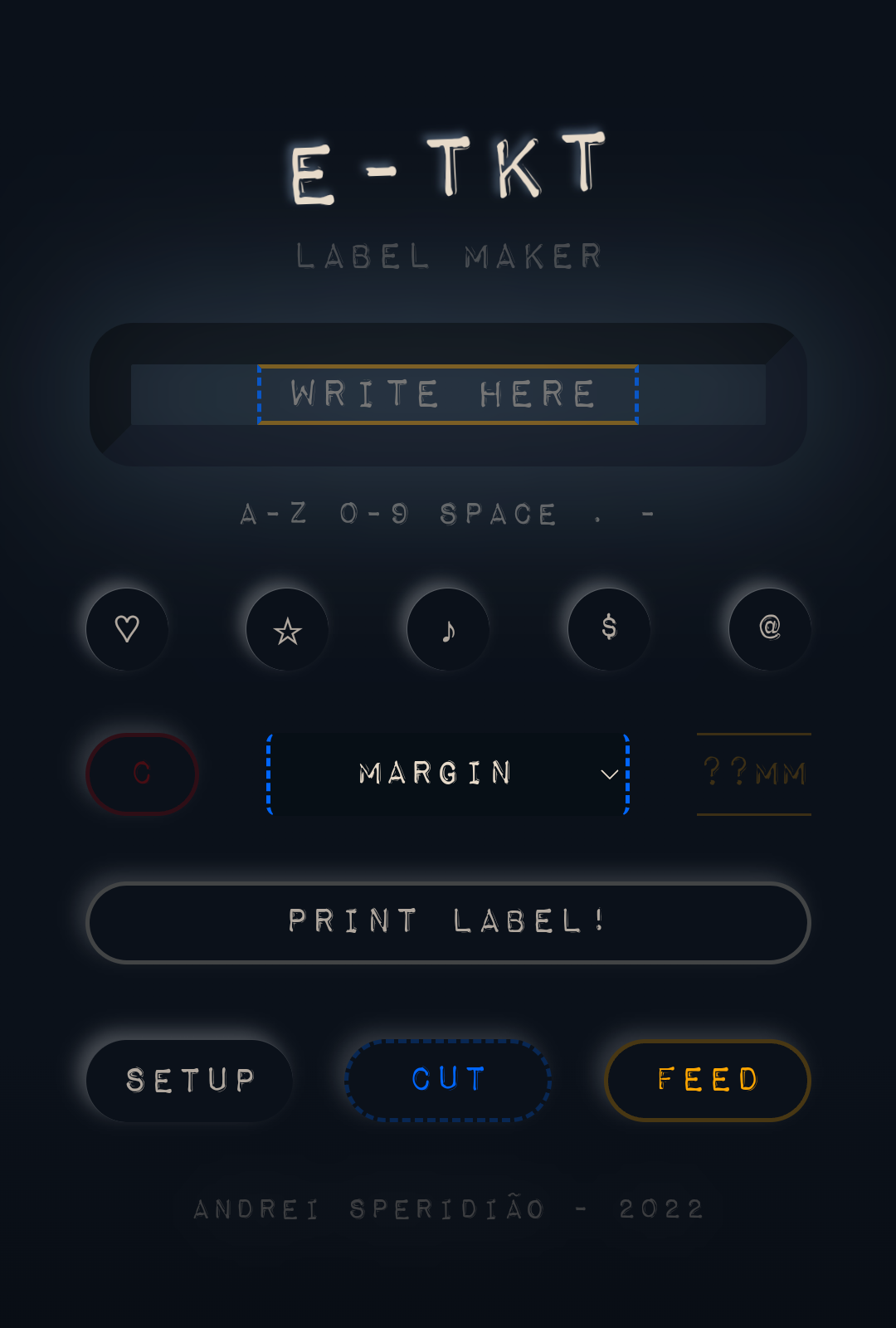
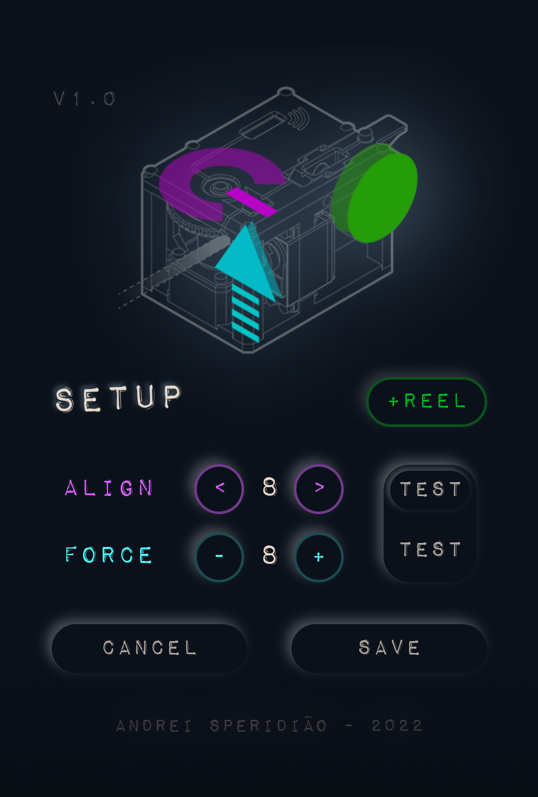
If you just want to see the final UI design for the app in detail, please scroll to the bottom ;)

🍷 Now for a conceptual and reflective update to discuss a bit about design...
First, remember that E-TKT is all about anachronism, which means it aims on manipulating the order things logically have/are occurring in an unusual way while presenting something odd but logically plausible. Think of "what could have happened if ______?"
Expanding that further on, I wanted to incorporate that approach into the digital interface accessed through the smartphone.
Physical informs the digital
Green characters on black, dull gray boxes, overwhelming gradients, shinny reflective icons and long shadows over colorful flat interface elements were some of the visual design trends we've been interacting with for the past 50 years (well, not all that time in my case :P ).
But there is a theme that resurfaces from time to time: skeuomorphism, which in a nutshell is the idea of emulating characteristics of original artifacts as ornaments in derivative ones. A well-known example is Apple iCal (calendar), which had leather textures in its interface to create familiarity with the traditional physical calendar that used that material for functional and aesthetic reasons.
 source: Ars Technica
Dieter Rams, an industrial designer best known for his Braun creations, had a great influence on Apple products, both physical and digital. That includes the ET66 calculator that inspired Apple's software version that came together with Mac OSX.
What should we keep?
When looking to the E-TKT device and more specifically its daisy wheel, I've got some "typewriter" vibes from it. And, there is no doubt that Olivetti came to mind as one of the major Italian design symbols of the XX century. My parents still have an 80s electric typewriter from the brand.
I've then remembered my industrial design classes when I first knew about Divisumma 18) and its simple and monolithic yellow aspect. It was designed by Mario Bellini in 1972.

source: MoMA
Apart from its great shape that was very contrasting to the bulky machines at the time, perhaps the most attractive characteristic is on the buttons that almost BEG to be pressed. That was well though by Bellini, that based it on anthropomorphic concepts, which means attributing human characteristics to non-human things.
The boundaries of our body are made of skin-covered meat. What is our touch to be sensibilized and actuated back with?
Well, displays are hard to the touch, but nowadays we can cheaply "borrow the screen" for things that are not critical, thus having a world of possibilities by using visual, audible and/or haptic cues to emulate the juicy physical stuff.
PS: as an "accidental" philosophical loophole, Olivetti was(is) based in Ivrea, Italy. Yes, the same place where Arduino got born many decades later.
...anachronism as tool for finding atemporal loopholes! 🤓
...wait a minute, but what about E-TKT's UI?
All of that to say that I have reached a final version for the user interface for the web app by extracting the essence of the concepts discussed above.
The color palette is now following a blue-yellowish duet. The buttons were rounded and for the color-coded functions, there is a light halo that glows when pressed.
A new addition is the setup screen, which I will talk a bit more in another update.


The soft pressing and illumination effects were both achieved by using pure CSS & JavaScript to minimize the data storage and transfer.

 Andrei Speridião
Discussions
Become a Hackaday.io Member
Create an account to leave a comment. Already have an account? Log In.