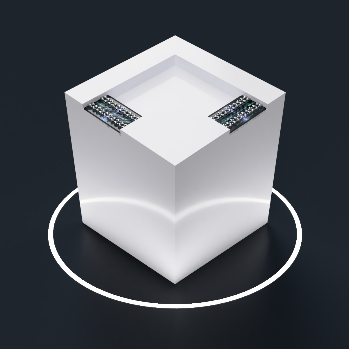
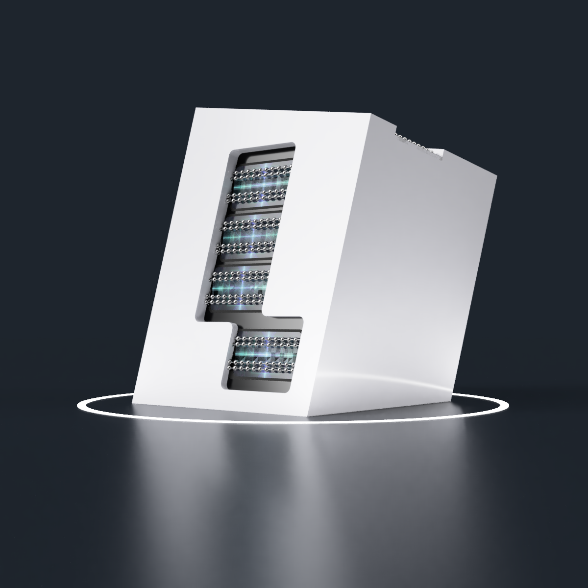
 [03:15]Me In The Past... I've done it. This is no alternate dimension. This new Tetrinsic design might actually have "all the benefits and none of the drawbacks", price and build time nonwithstanding. I've just had to increase the square to 92mm and move Thumb1 up 4mm.
I think the top face is the most "modern chizelled" design yet. The cutout is because I intend to use the inside ball-chain side for the thumbs, meaning that the tip of the thumb needs space. Since this is the main face I see, this is a very good position to be in. I'm also experimenting with different colours:
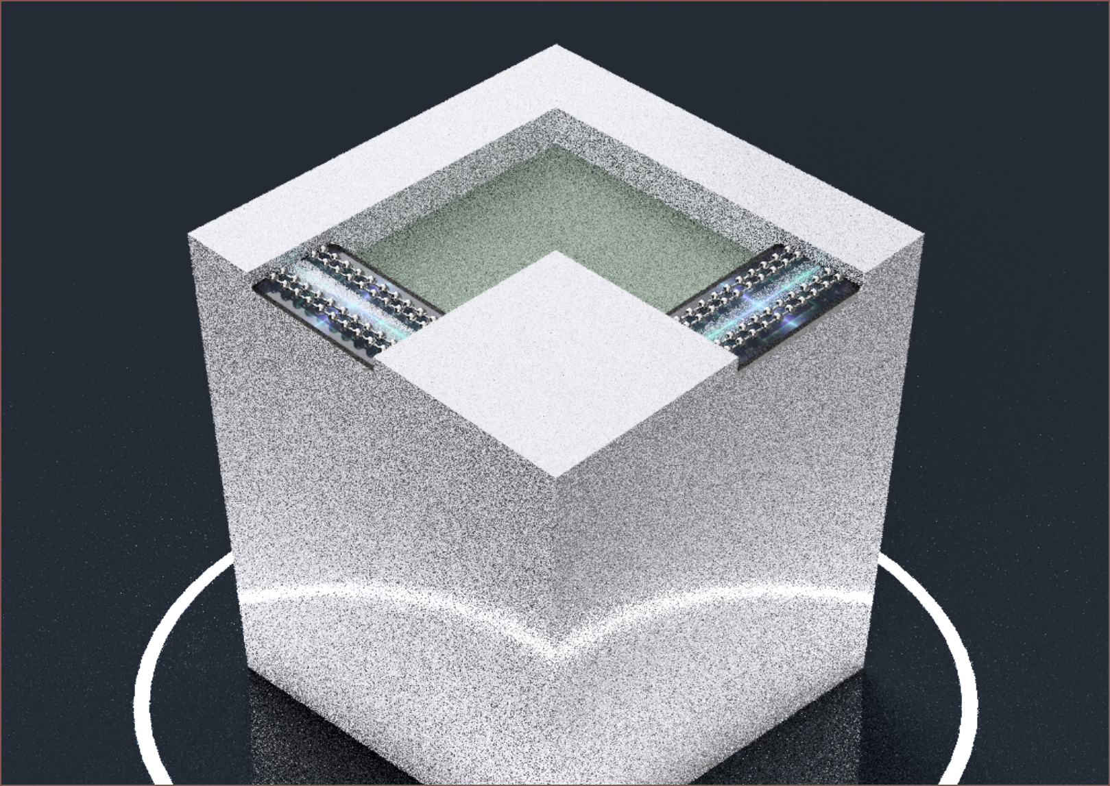
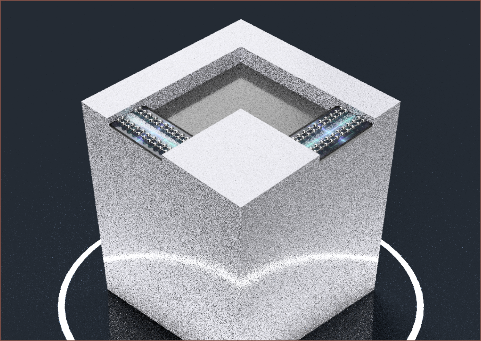 I think a grey would look the most calming without potentially clashing with a custom coloured Tetrinsic. I could get more exotic with the surface though, such as using an 8x8 LED matrix or a sparkly vinyl (see below). The OLED used in TimerSpy doesn't fit though. I also wonder if I should have both cutouts use the same material as it could improve consistency.
Oh and I just got this idea for the cutout which I think looks better:
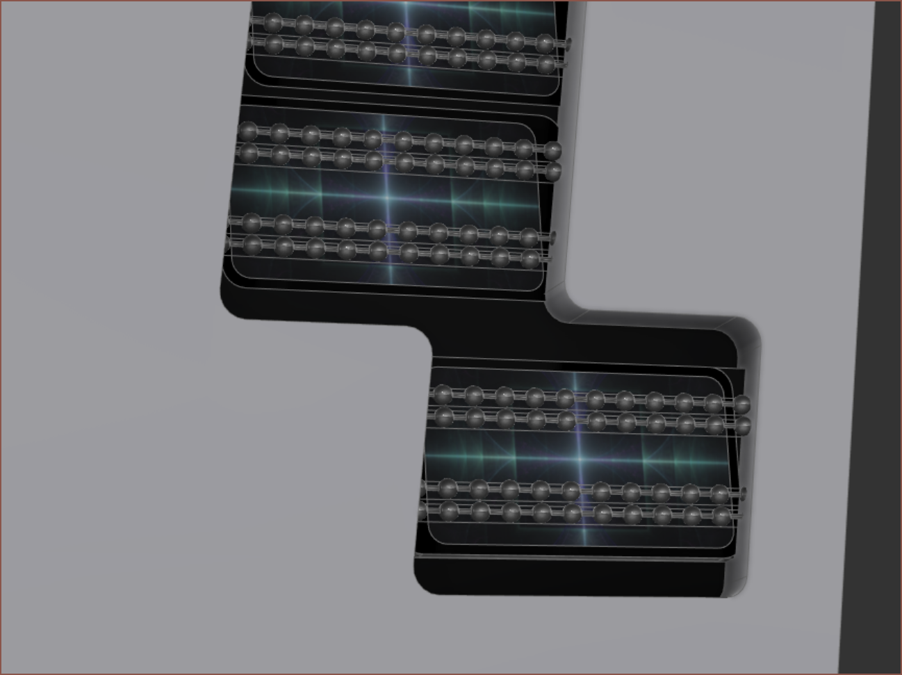 The whole bottom of the cutout is on the same plane.
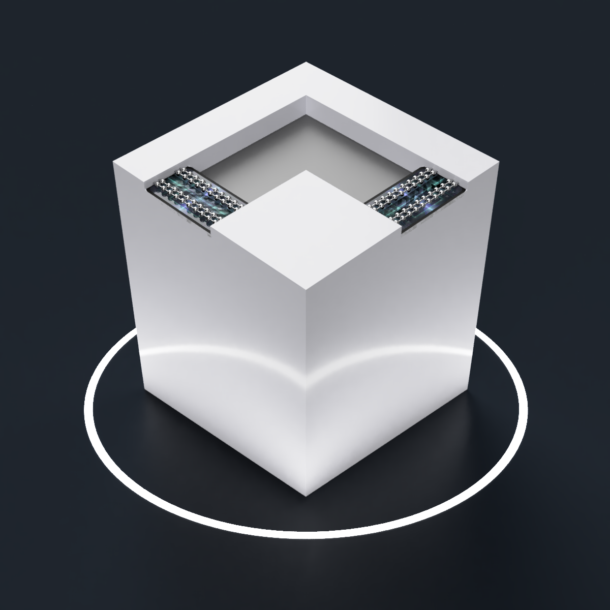
 Oh yeahhhhh... that's the professional concept render vibe right there. Now I just need to wait for the print to finish to find out if an ergonomic solution exists.
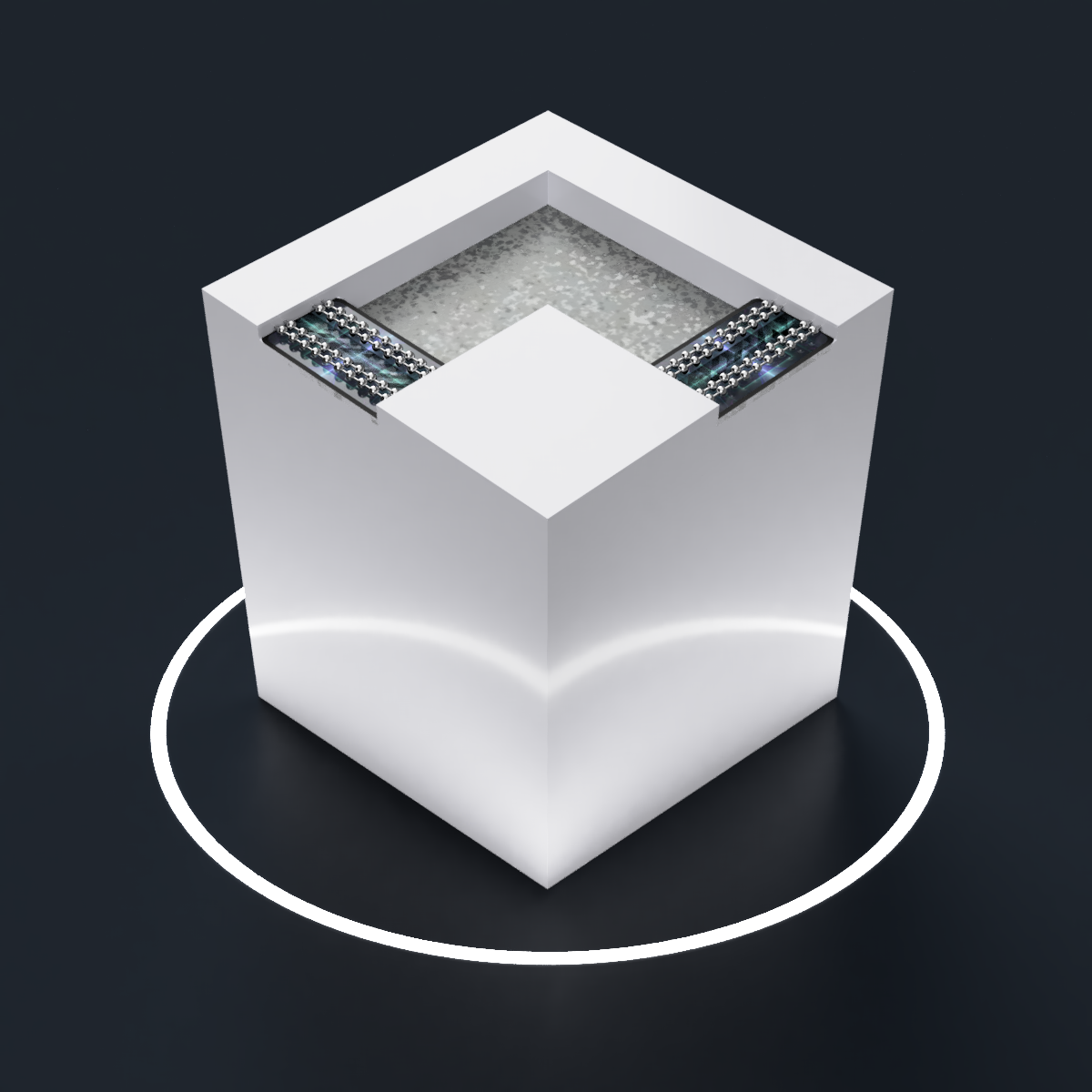
[03:40] I just darkened the galvanised steel texture and I think it looks very nice applied to all cutouts:
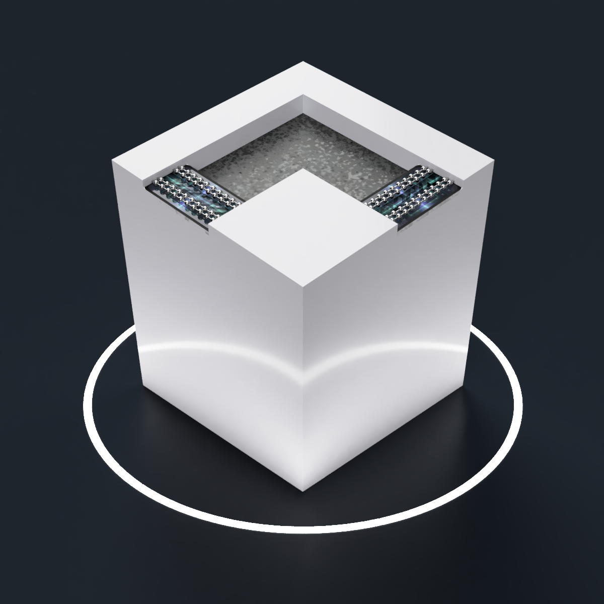

[05:45] I had to make the cutouts lighter. It just looked too dark and not calm-mindset inducing.
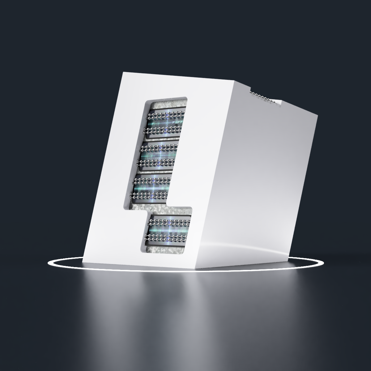
Solution mining... ends, in 18 days.
 kelvinA
Discussions
Become a Hackaday.io Member
Create an account to leave a comment. Already have an account? Log In.
I think I'm going to go with darker cutout materials after all.
Are you sure? yes | no
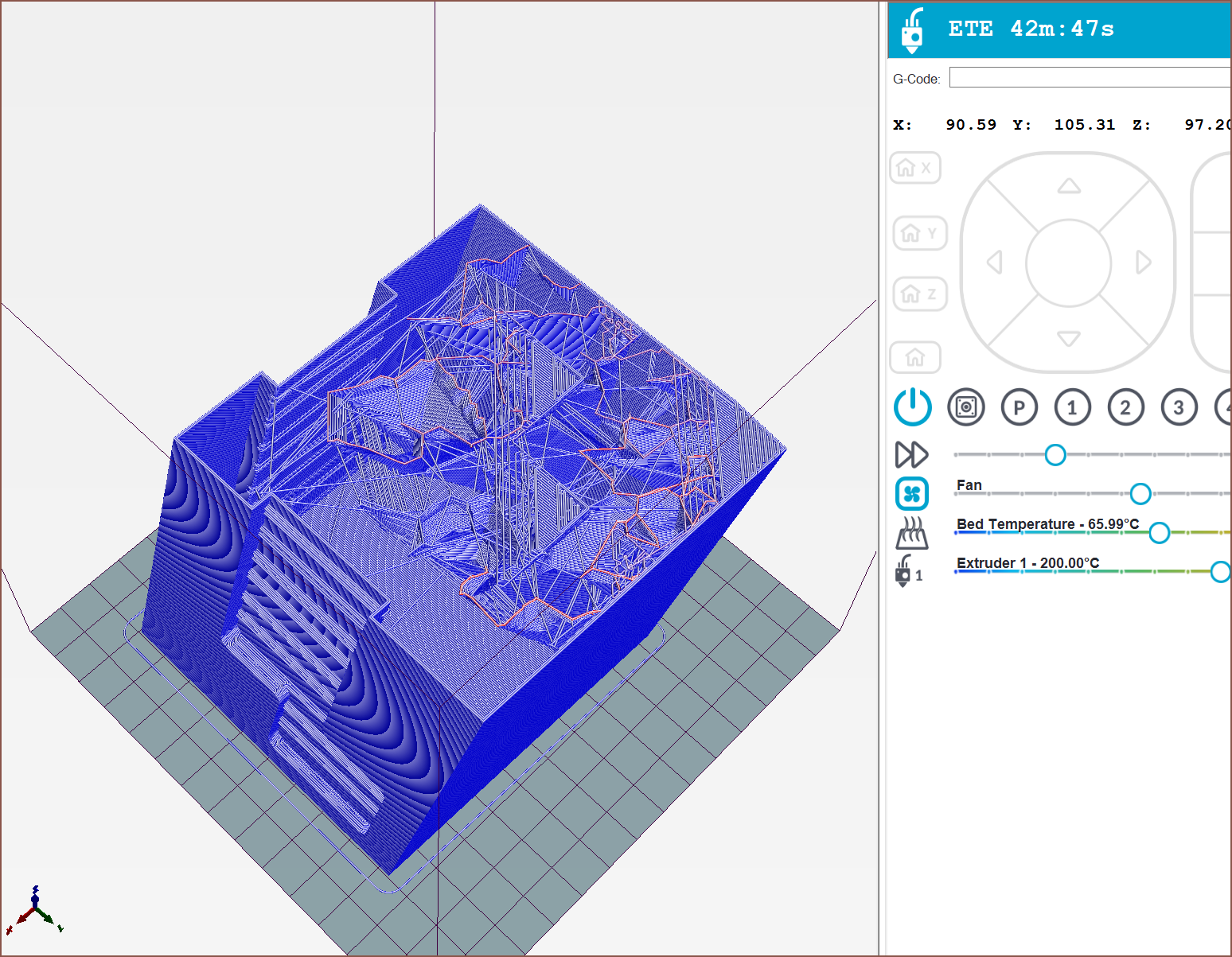
I'm trying the print now and the thumbs kinda work; I find myself using the outer chain more. The Tetrinsic might need to be angled so that the inner chain is higher than the outer one, but I don't think that would solve the issue (I'm trying the angle by tilting the print, and it's not working). Outer chain seems to be good enough for science though.
The fingers line up fine and tolerant to TestCut not being in an optimum location/angle. The cutout walls really help to "home" my fingers. Lastly, the top face design certainly looks better than any other concept print so far.
Thus, I think a solution... exists.
Are you sure? yes | no