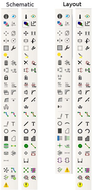
Since so many years I used to the old Icons. So I was surprised that Cadsoft changed them. But sadly, the new Icons look not good. I don't think they give the user the right message what kind of function is behind the buttons. Of course, there are still the tool tips when you move the mouse over a button.
Here is a comparison beween the new and the old:
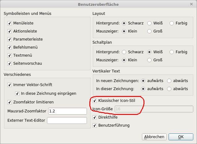
 If you dont't like, you can change it. In the Schematic or Layout Editor (doesn't matter), go to
Options -> User Interface

Choose "Classic Icon"
I run a German Version of Eagle, so my screenshots are in German, I apologize.
Discussions
Become a Hackaday.io Member
Create an account to leave a comment. Already have an account? Log In.