After we figured out our final solution, we spent several days building our first prototype. The main parts of our prototype are Pixel LED strips and an Freaduino Uno. To ensure the LED strip can map the light on keys precisely, we divided them into different parts and then welded them based on the distance between each key. My teammate Diwen and Lilin made the code for the Arduino. They found many example codes online with the functions we wanted and combined them based on our needs.
Although this prototype looks very rough, the main function that uses the light to tell users which key to play works and is ready for the first user test.
1st Prototype
The first user test's goal is to determine if our stakeholders can see the light to find the key precisely and can they use this way to learn the new music without read the score.
We contacted several stakeholders and successfully invited them to join in this prototype test. All stakeholders showed great passion for testing and positively shared their idea on the prototype. They provided some useful feedback for us to improve our project and what they also need.
Shortages:
- Still want to see the music sheet while using this product
- The brightness of the LED is too high
- There is no audio feedback to tell users when they interact with it
- The color of the LED make not have enough contrast for different kind of people(color blind)
Thanks to the feedback we got from the user test, we understand the needs of our stakeholders. Based on this information, we decided to add more functions to our prototype.
So in our next couple prototype, we added a keypad which allow users to select different modes while practice music.
We made and printed the stickers on each key to ensure our users could understand it easily.
- We considered the users’ learning experiences and separated the music into different hand modes. Users can practice the music either left or right hand based on their habits(key#1,2).
- After they feel confident, they can press both hands mode to practice the original music(key#3).
- To help users practice music easily, we added functions that allow them to change the piece's speed (key#4,5), so they can follow the light at a slow speed at the beginning and then speed it up later.
- Because our stakeholders mentioned that the brightness of the LED is too high, we allow users to adjust the brightness of the LED by pressing keys #6 and #7. We hope it can help users have a better practice experience in different environments.
- The keys with two different colors are different color modes for the LED. We chose colors with high contrast to ensure most users can use our product easily.
The interface part:
We also made an interface to show the music sheet while practicing the music and provide audio feedback based on users' actions.
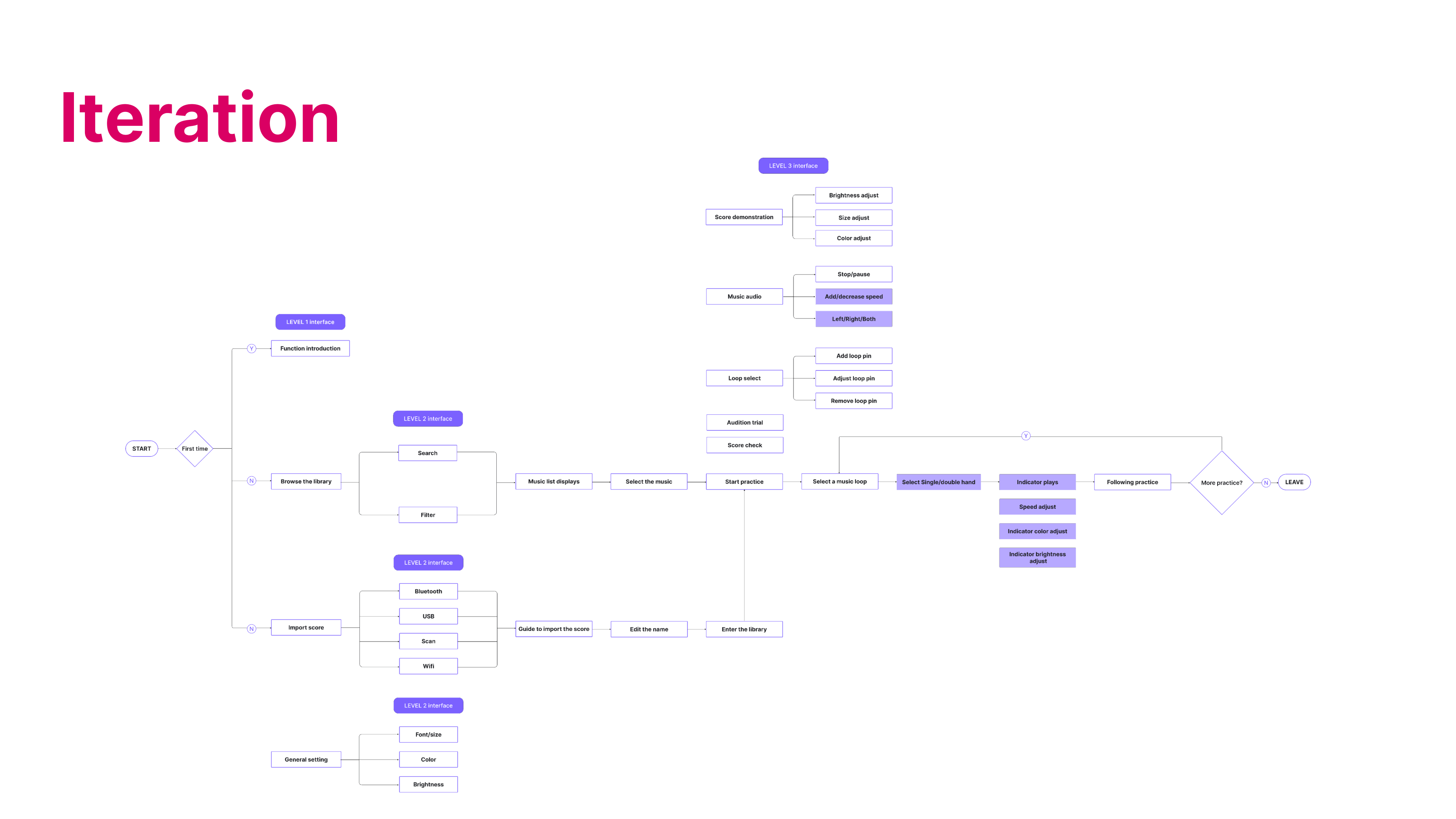
To make the user experience better and more inclusive for both VI and Not VI, we establish a UI workflow to try to add different functions to achieve. And we decided to focus on the home page, music selection page, practicing page, and setting page.

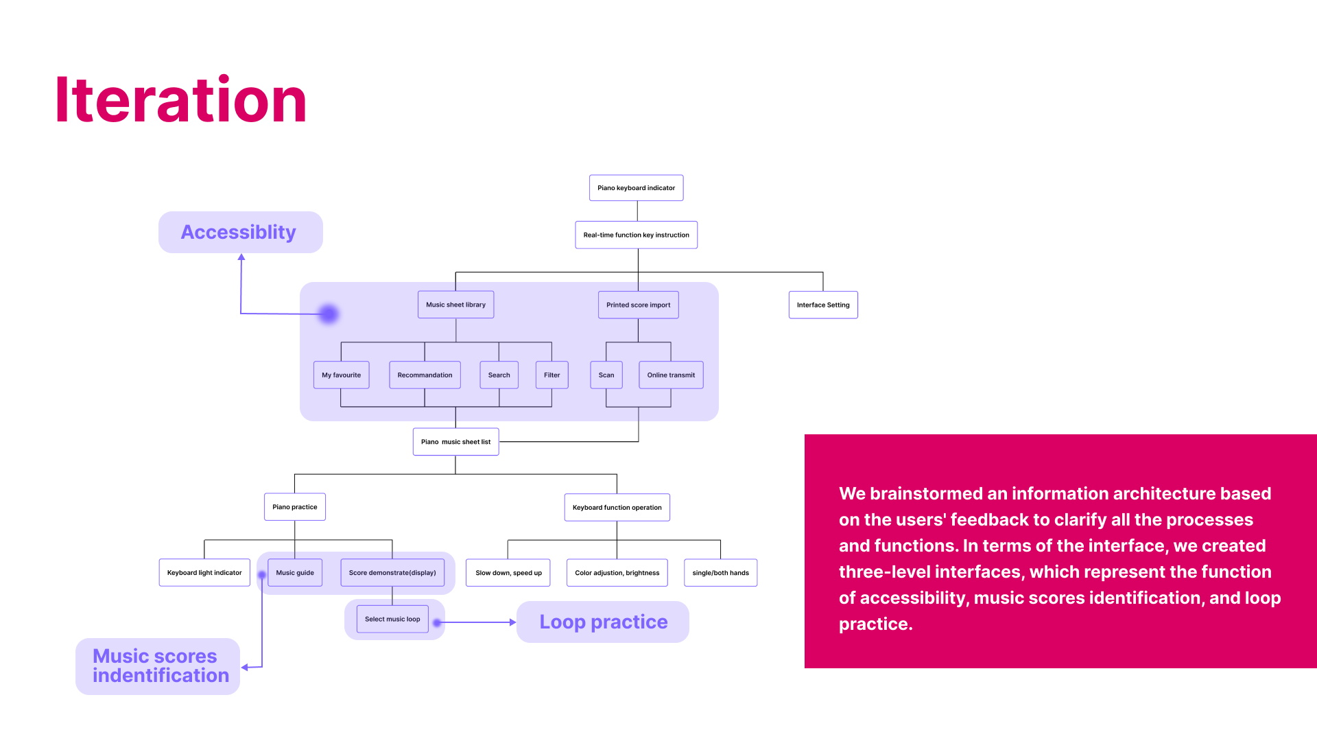
Based on the user flow, we built the information architecture, which gave us a clearer understanding of the design architecture of the UI interface.

With architecture information and workflow, we created the UI prototype using Axure. We simplified the content in the interface and made the buttons and loop marker large enough to ensure that our users could click on the information accurately. In addition, to assist people with different visual impairments in distinguishing the content, we have set up functions to adjust the light, contrast, and background color shift.

We invited our colleagues and visually impaired users to test it. After testing, most users found that our second prototype version satisfied their needs for learning and practicing piano. The new practice function allows them to select the music they want to learn and practice more efficiently. The animation of the scores also helps them to read and practice. They also provided some suggestions for our prototype. For example, adding an instruction on the interface to help the freshman to learn the essential operation. More auditory feedback on hardware and software interaction should be required. The contrasting background colors need to be made into a complete system, reducing the need for the user to adjust the background color.
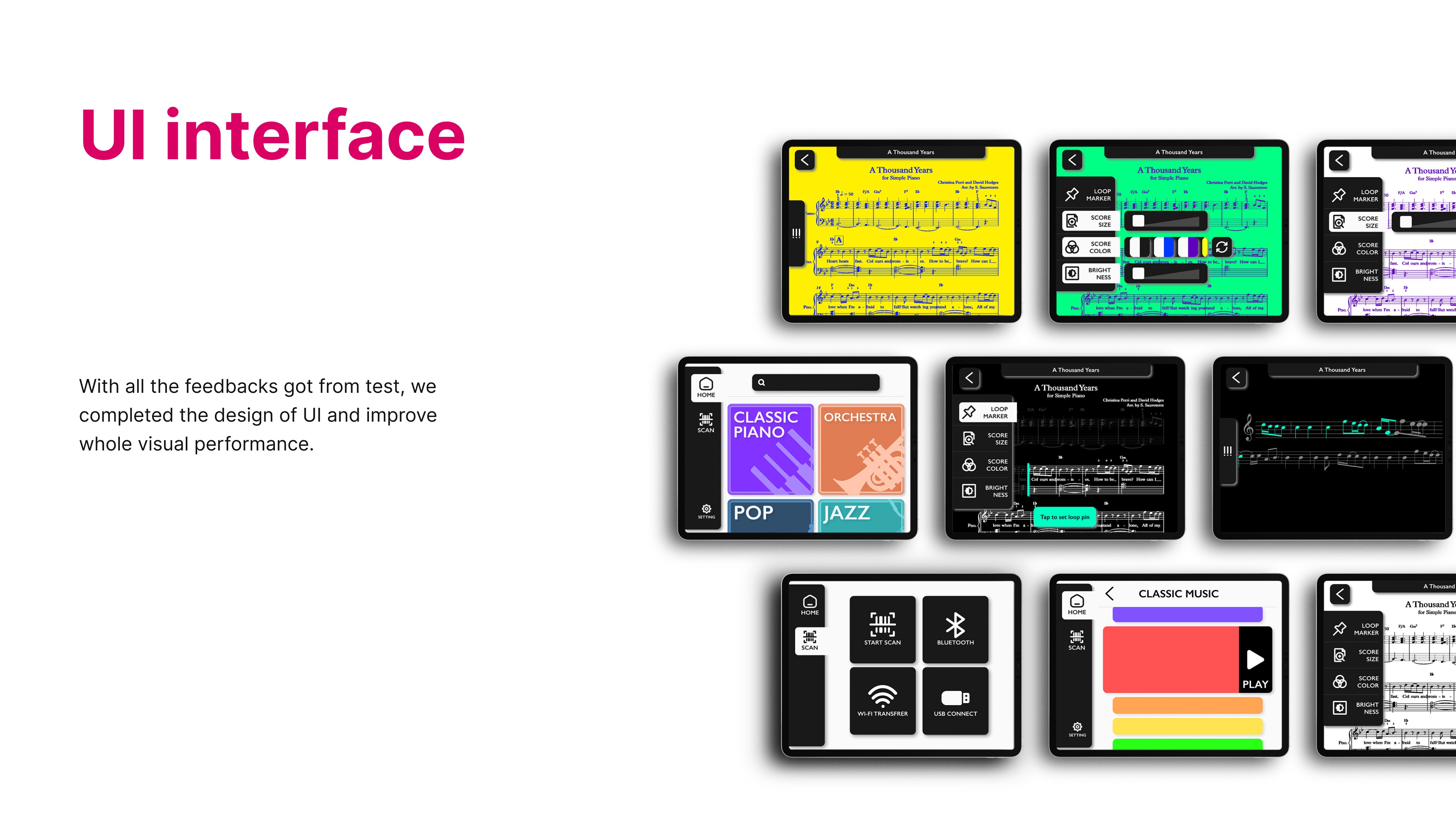
Based on user feedback, we completed the UI design by Figma and improved the visual performance. With a music library, score magnifying, score animation, and loop marker, the VI group can practice piano more conveniently. Because our stakeholders are sight loss, we decided to use minimalism as our design style and make the buttons as big as possible to ensure our users will not feel confused while using this interface. Meanwhile, limited information on each page could also help them to recognize and use the whole APP. The intense color contrast makes each button obvious.

After we added all this in our project, it is how it look like right now.
Lighting Score Functions video:
Lighting Score UI Design video:
Discussions
Become a Hackaday.io Member
Create an account to leave a comment. Already have an account? Log In.