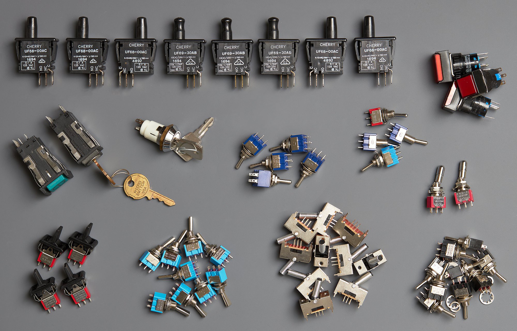
I'm a big fan of toggle switches and tactile human-machine interfaces: think swathes of switches on the control panel of an old mainframe, or the cockpit of an airliner. For years the vague idea of a binary data input panel has been kicking around my head, driving the occasional purchase of satisfying looking switches, but it never made it past the pragmatist that guards my ever-growing list of projects. Hackaday's Odd Inputs and Peculiar Peripherals contest in mid 2022 gave the perfect excuse to make something beautiful and tactile, without necessarily needing it to be any semblance of practical.
The only hitch was that I discovered this contest just 26 days before the deadline, and I have a full time job (not to mention a tendency to pursue very ambitious ideas). The clock was ticking to design, develop and build.
Experience-first design
At the outset, the only loose idea I had was an 8-bit physical input device, ideally fitting onto a piece of 50mm flat bar and interfacing via USB. I believe the initial thought was about inputting hex literals, acting as a kind of programmer's keyboard, but that rapidly turned into "why not allow sending any possible character?".
Before diving into technical details, I sat down with a bank of imaginary air-switches and buttons (complete with sounds) to figure out what it should feel like to use this device and what it needed to do. Between day-dreaming and sketching in Inkscape, I went through numerous iterations on layout: more switches, multiple rows of LEDs to show the input buffer, different placement of key controls. Lots of stuff that didn't feel right. I wish I'd captured some work in progress to show how much the idea grew during this stage - it certainly wasn't a single spark.
Eventually I settled on:
- 8x bit toggles, each, with a status LED.
- A "shift" action to left-shift by one byte (the bit toggles always control the least significant byte)
- A "send" action to send the selected value to the host and clear the input buffer
- A "clear" action to clear the input buffer without sending anything
The thing that bugged me was how to show an in-progress input to a user in a meaningful way. Rows of LEDs would be hard to understand at a glance. A 7-segment display would be readable, but seeing a hex value isn't very exciting. I'm not sure exactly when the idea to use an LCD screen with an actual preview arrived, but that was the moment the project shifted into its "all consuming drive to do the thing" phase.
With the size and layout roughed out, I stuck a print-out on some cardboard and attached real switches to get a feel for the spacing and the ergonomics of actually using the device:
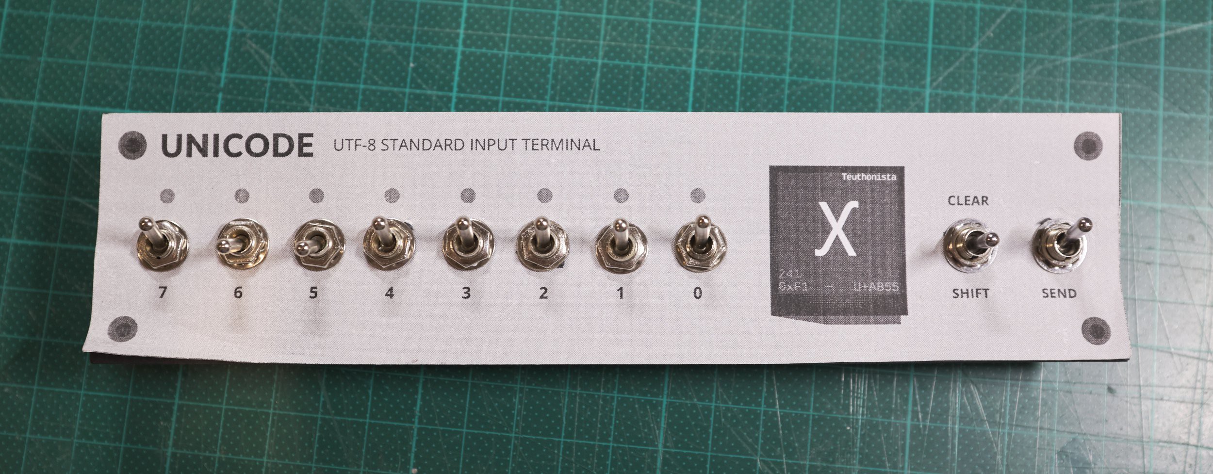
Visually I was going for "mainframe front panel". It's a happy coincidence that Unicode, the organisation and standard that defines what "any possible character" even means, is delightfully retro sounding. It's something I could absolutely see emblazoned on a room-size computer from decades past.
This mock-up lived on my desk for a few days and got plenty of thought-provoking twiddling, thinking through how different interactions could work. This resulted in a little more refinement:
- Added the concept of "shift lock" to keep shifted bytes across sends, toggled with a long-press of "shift"
- Added a "mode" action to change between different input/display modes
- Moved "clear" to a secondary action that requires a long press
With these changes and some extra labelling, the sketch of what I wanted to build was this:

The contents of the screen were rough at this stage, with little thought for resolution and software modes, but I was happy with the layout and needed to start the physical build.
Building the face-plate
This Hackaday competition happened to align with a weekend where I would have access to my Dad's drill press. Building this with hand tools should be possible given enough patience, but my attempt at doing this on the apartment floor was an absolute disaster. I quietly discarded that attempt as a practice run and packed some fresh aluminium flat bar in my luggage for the weekend.
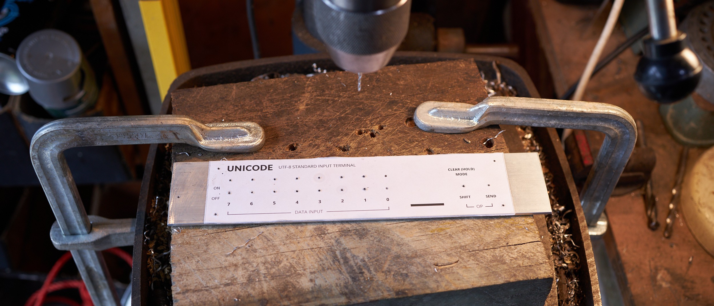
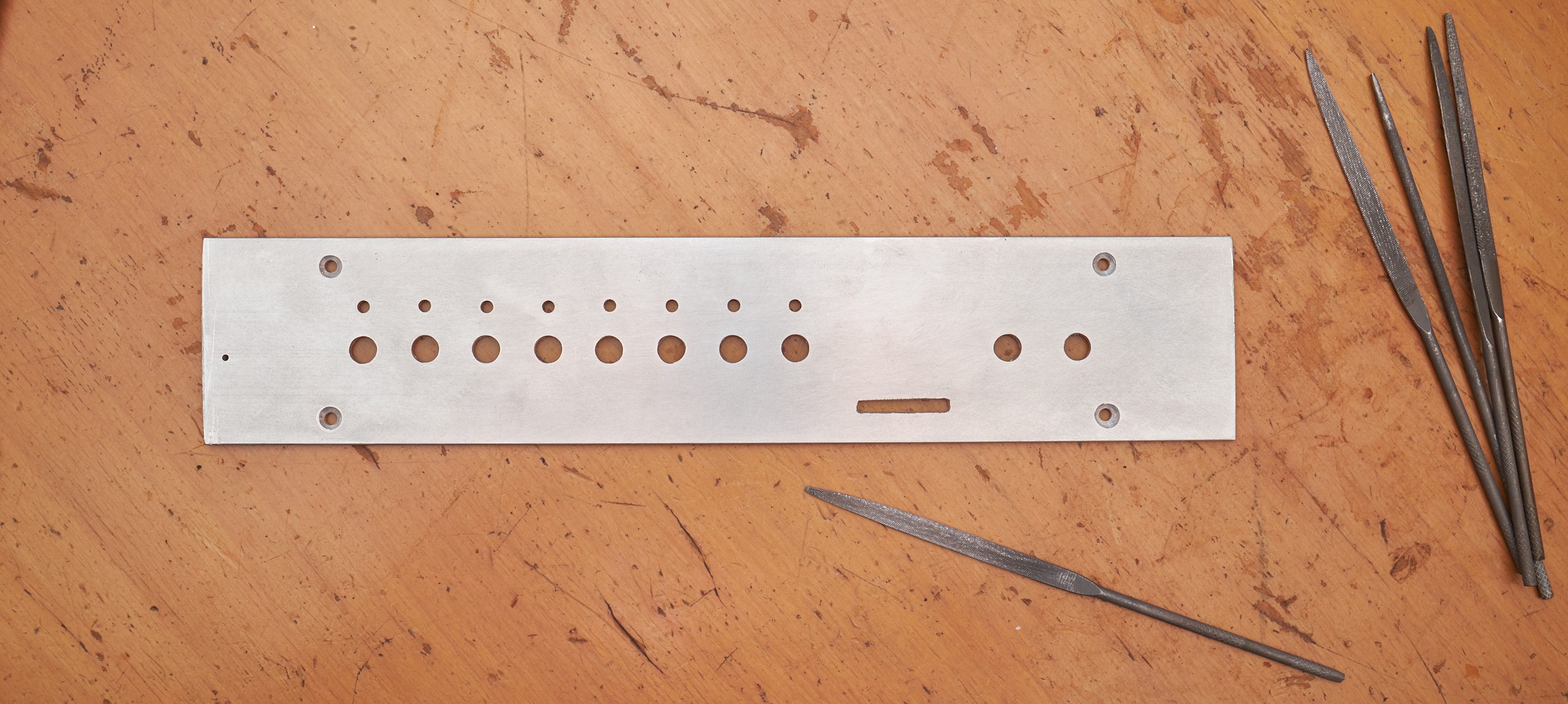
The method here is nothing unusual: isolate drill hits, print 1:1 scale (double checking measurements on the print, because all printers have a hard-coded vendetta), glue onto the stock, centre-punch, drill pilot holes and widen holes to spec. I wouldn't pass as a machinist with the level of precision here, but it's close enough for a visual feature:
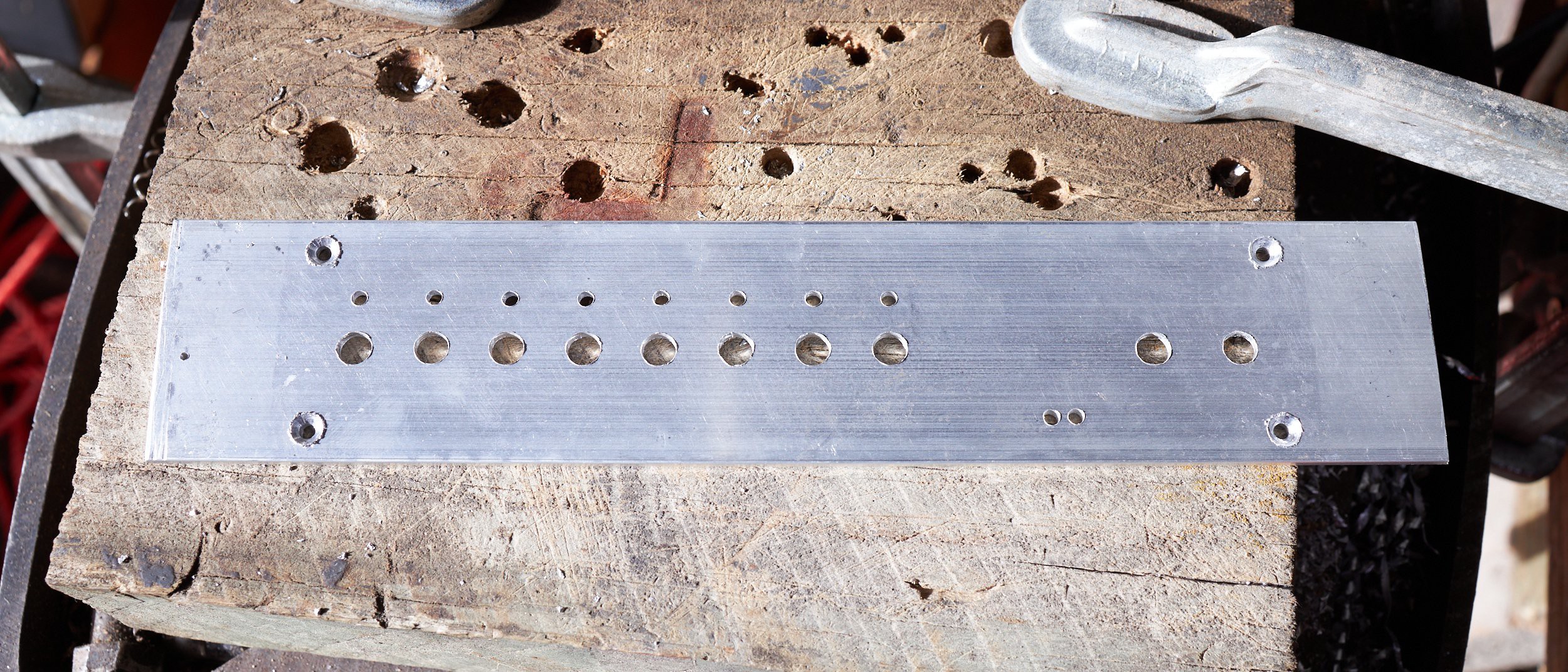
The slot started as a few holes which I opened up by hand with small hobby files and quite a lot of time. Only the bottom of the slot will be visible once the screen is attached, so it didn't need to be square on top:
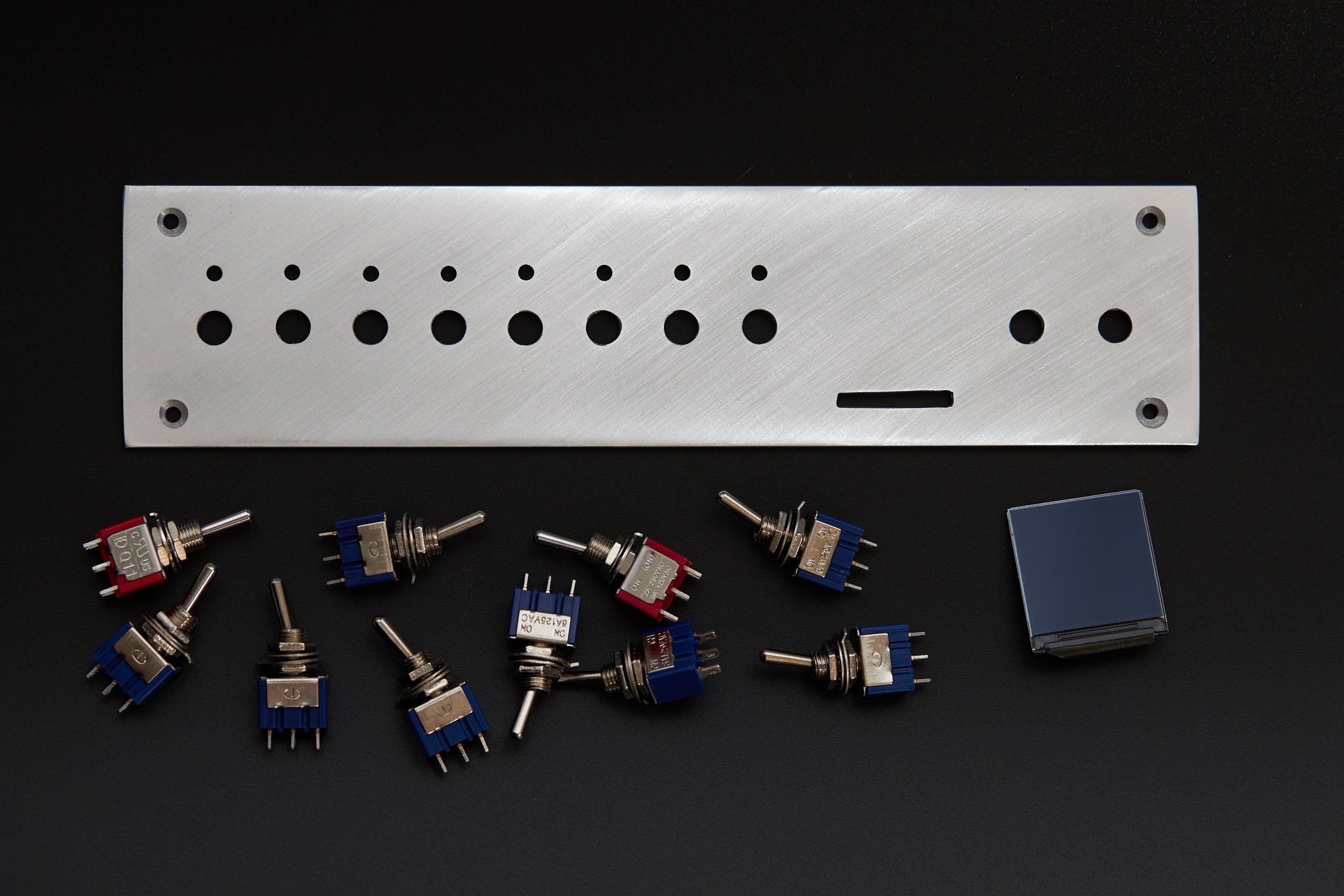
After trimming the stock to size, the front surface was wet-sanded to be flat (ish), then sanded in uniform directions for a brushed look. I pulled this finish off better in Hardware boot selection switch, which went to a finer grit. This face-plate looks harsher in comparison, but still sells the look ok:
For the face-plate decals in the design, I used toner-transfer directly onto the sanded aluminium. I'd experimented with this a while ago with decent results, and like the clean, screen-printed look it gives. It's essentially the same process (and pitfalls) as masking a PCB with toner transfer, just with more thermal mass.
To get the alignment right, I added markers slightly smaller than each hole to the transfer so they could be lined up by eye:

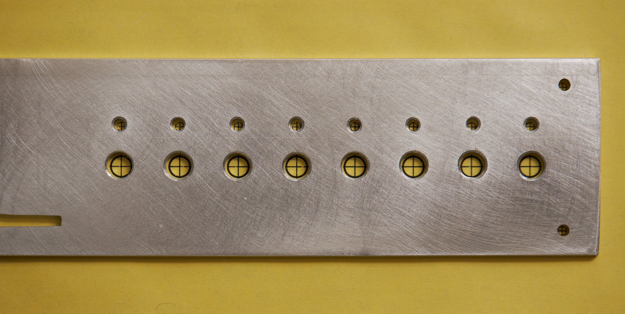
After a firm press with the household iron against a silicone mat, and some time to cool down, I was pleased with the result. The transfer had flaws like it typically does, but the alignment was excellent. Areas that didn't transfer properly ended up with a weathered look that works well for the era I'm emulating, so I opted to keep this first transfer:
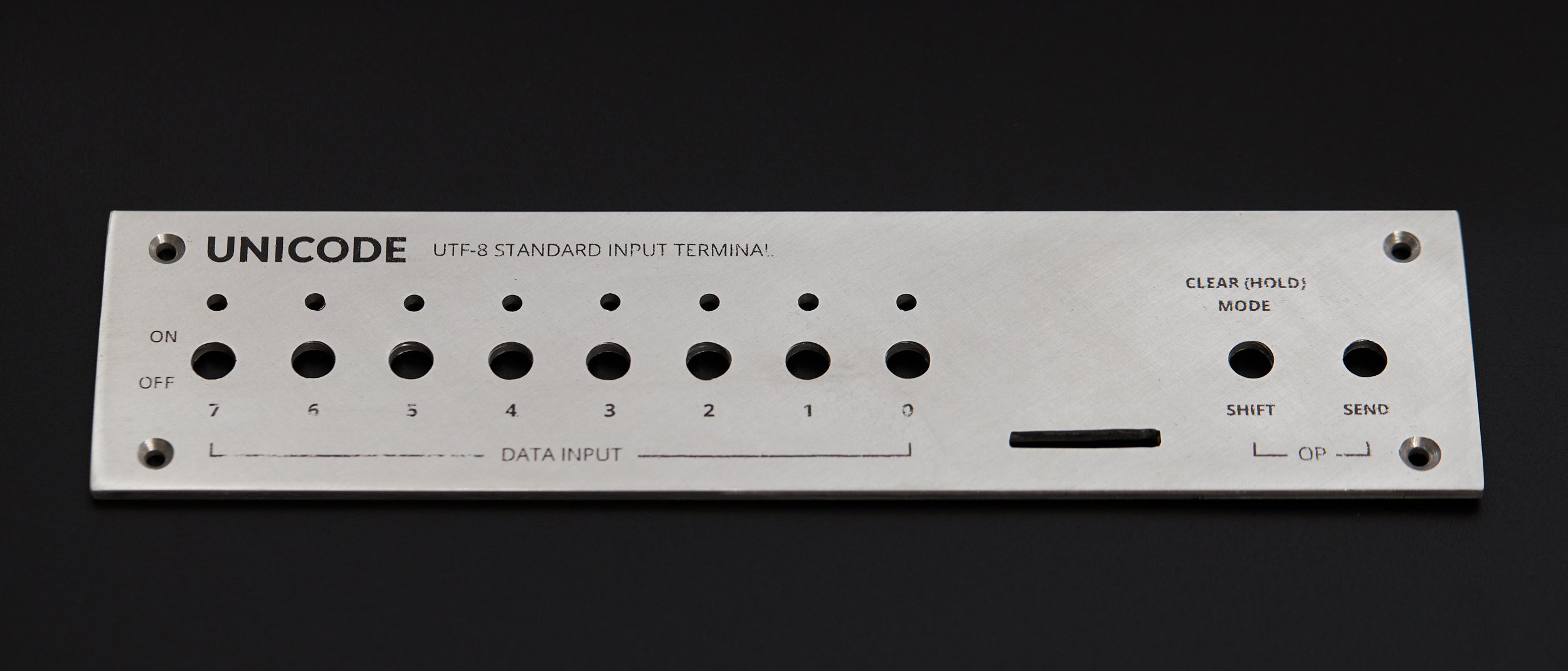
Luckily the largest visual element, the Unicode logo, transferred almost perfectly:
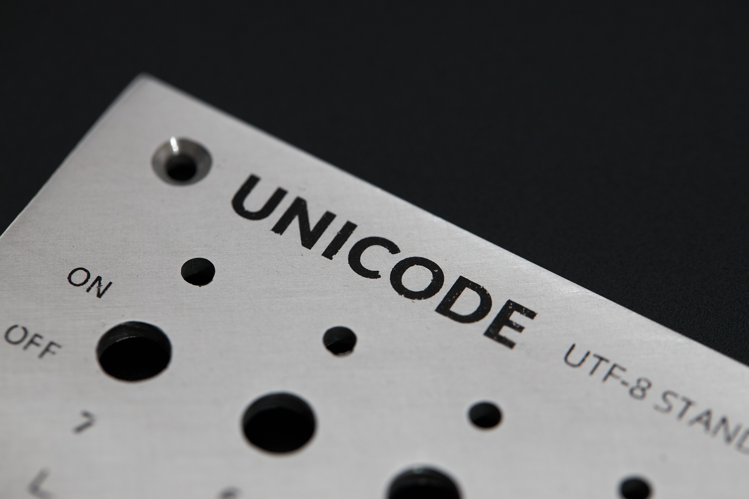
With switches mounted, it was really starting to clean up:
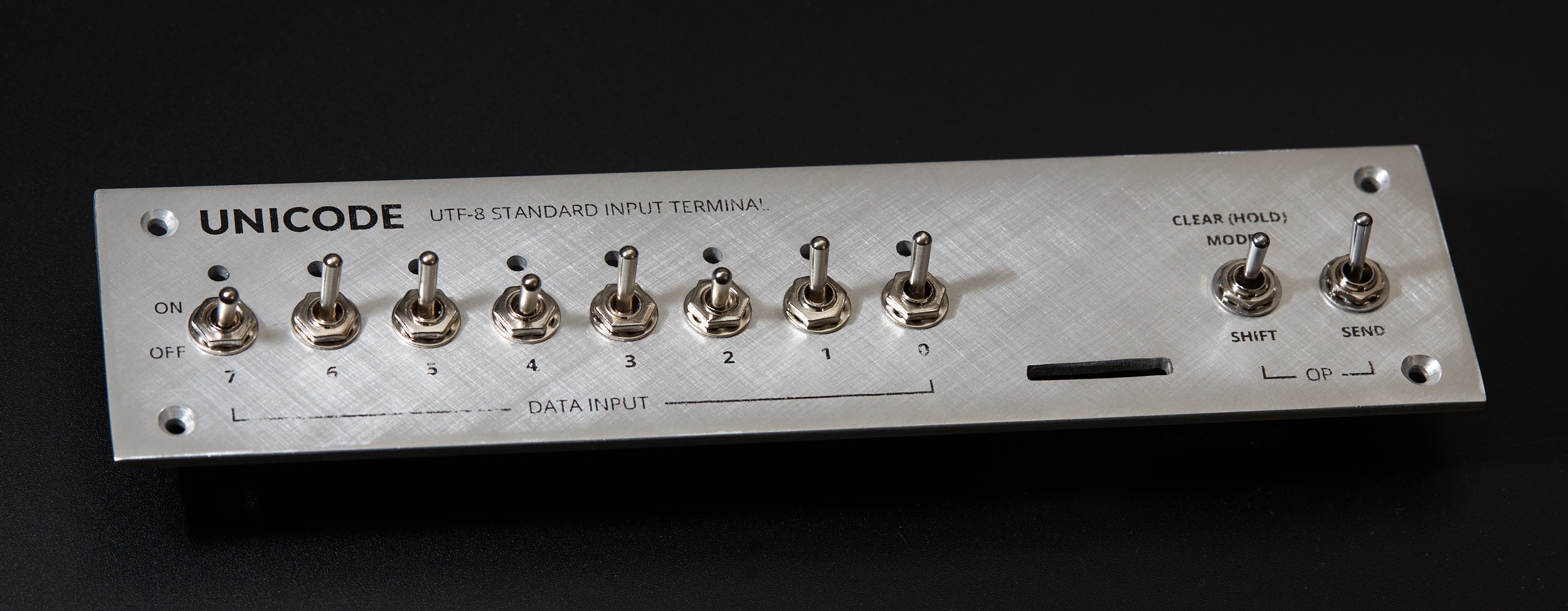
There are variables to experiment with in this transfer process, but I haven't done so here. A better transfer could probably be made with a flatter surface finish or a more even application of pressure and heat (like a book binding press with a heated plate, if that exists). Applying enough pressure by hand with a clothes iron was challenging to do without accidentally sliding and smearing the transfer. Applying the transfer before drilling could be done to help with alignment, but that would require extra care when working the part. The toner is firmly attached; you can't scratch it off with a fingernail, but anything that can scratch the metal will cut through it.
Codepoints, fonts and glyphs
Going into this project I had some general developer knowledge about fonts and Unicode, but I wanted to know more before making decisions about software and hardware. Here's all you need to know from my exploration:
Unicode publishes a table that assigns unique numbers called "codepoints" to names of symbols. For example:
- Codepoint number 65 (written in hexadecimal as
U+41) is "LATIN CAPITAL LETTER A" - Codepoint number 12371 (
U+3053) is "HIRAGANA LETTER KO" - Codepoint number 128526 (
U+1F60E) is "SMILING FACE WITH SUNGLASSES"
- Codepoint number 65 (written in hexadecimal as
UTF-8 is an encoding for representing a codepoint with 1 to 4 bytes, allowing for 1.1 million unique values. It's not important for understanding this project, but it's written on the face-plate so worth a mention.
Font files are primarily a map of codepoints to graphical representations, called glyphs, packed together with layout information. Notably, Unicode doesn't define any graphical information: that's entirely left to type designers.
Many writing systems need different graphical representations depending on context. Fonts contain layout rules to address this which can get very complex, but on the simple side allow for things like substituting a sequence of codepoints with a different glyph. If you've used emoji, you've probably used this feature without knowing it - Unicode leverages it (in these tables) to define numerous emoji without assigning unique codepoints to all of them. For example:
The codepoints
U+1F1E6(🇦),U+1F1F6(🇶) render as the flag of Antarctica when adjacent: 🇦🇶The codepoint
U+1F446(👆 up pointing backhand index), followed byU+200D(zero width Joiner) andU+1F3FB(light skin tone modifier) will render the same symbol with a different skin tone if your font implements Unicode 13 or higher: 👆🏻Some things you might expect to be a single codepoint are actually substitutions, like:
- "astronaut" (🧑🚀*):
U+1F9D1(adult),U+200D(ZWJ),U+1F680(rocket) - "pirate flag" (🏴☠*):
U+1F3F4(black flag),U+200D(ZWJ),U+2620(skull and crossbones)
*Hackaday's rendering seems to strip ZWJ characters - your font is probably working fine.
- "astronaut" (🧑🚀*):
See this text you're reading? Look at the letters. Every individual letter is a byte that was interpreted as a Unicode codepoint, looked up in a font file, drawn at the appropriate size and placed based on rules in the font. We kind of take it for granted that computers seem to render text so effortlessly, but there's a lot happening under the hood to convert text data into something we can read!
If you're interested in how text works on computers in general, Dylan Beattie's conference talk, Plain Text is an excellent and entertaining overview of how we got to where we are today.
Who's drawing all these beautiful glyphs?
Unicode 15 defines how to encode 149,186 different characters on a computer, but it doesn't provide any graphical information. My project couldn't exist without the considerable effort that's gone into the Noto Font project: a family of fonts released under the Open Font License which implements almost all of Unicode (>95% when the full CJK character set is ignored):
As of April 2021, Noto supports the most commonly used Chinese, Japanese and Korean (CJK) characters defined in Unicode Standard version 13, nearly all of non-CJK Unicode characters, and over half of the entire Unicode character set. (Noto FAQ)
Just like the text appearing on your screen is taken for granted, the people that design and labour over fonts we use on a daily basis probably don't get enough appreciation. Since my project uses the entirety of the Noto family, I'd like to say a very big thank you to everyone who has worked on and contributed to Noto to make it what it is. Your work is awesome!
So... how much of this is possible on a microcontroller, with a deadline?
From the moment a screen entered the picture, I was fascinated with the technical challenge of making an entirely self-contained device, able to preview fonts without any outside support. With a rapidly approaching deadline however, I forced myself to put this aside (kind of) and plotted out increasing levels of fidelity to have a chance of something functional being ready by the deadline:
- Level 0: Completely pre-rendered screens loaded from SD card, with burned in metadata
- Level 1: Pre-rendered glyph previews, but UI text rendered on-device
- Level 1.5: Able to switch through multiple input/display modes (hex, decimal, UTF-8, etc)
- Level 2: Render all glyphs and UI text on-device, but use a pre-computed index to look up which font a codepoint is available in
- Level 3: Index available glyphs on-device from arbitrary fonts on SD Card
- Bonus: Support multi-character sequences so more emoji can be accessed
I'm fairly sure the first few levels could be implemented on any microcontroller with a few kilobytes of RAM, but to do it all would require more muscle (or at least more building from-scratch than I'm willing to do). To give myself a fighting chance, I picked up a Raspberry Pi Pico for the first time and started experimenting.
Baking fonts to images (on a regular computer)
In parallel to the physical build, I was also chipping away at the software side of things. Before looking at an embedded implementation, I jumped into Python to get my head around accessing and rendering codepoints from font files. The fontTools module was helpful here, along with flicking through the OpenType Specification to understand structure and terminology (it's surprisingly approachable).
It didn't take long to have a script that could render outline-based glyphs, which is everything except colour emoji in the Noto family. The 240x240 screen might prove a challenge to fit UI into, but it's plenty of resolution to render any glyph:
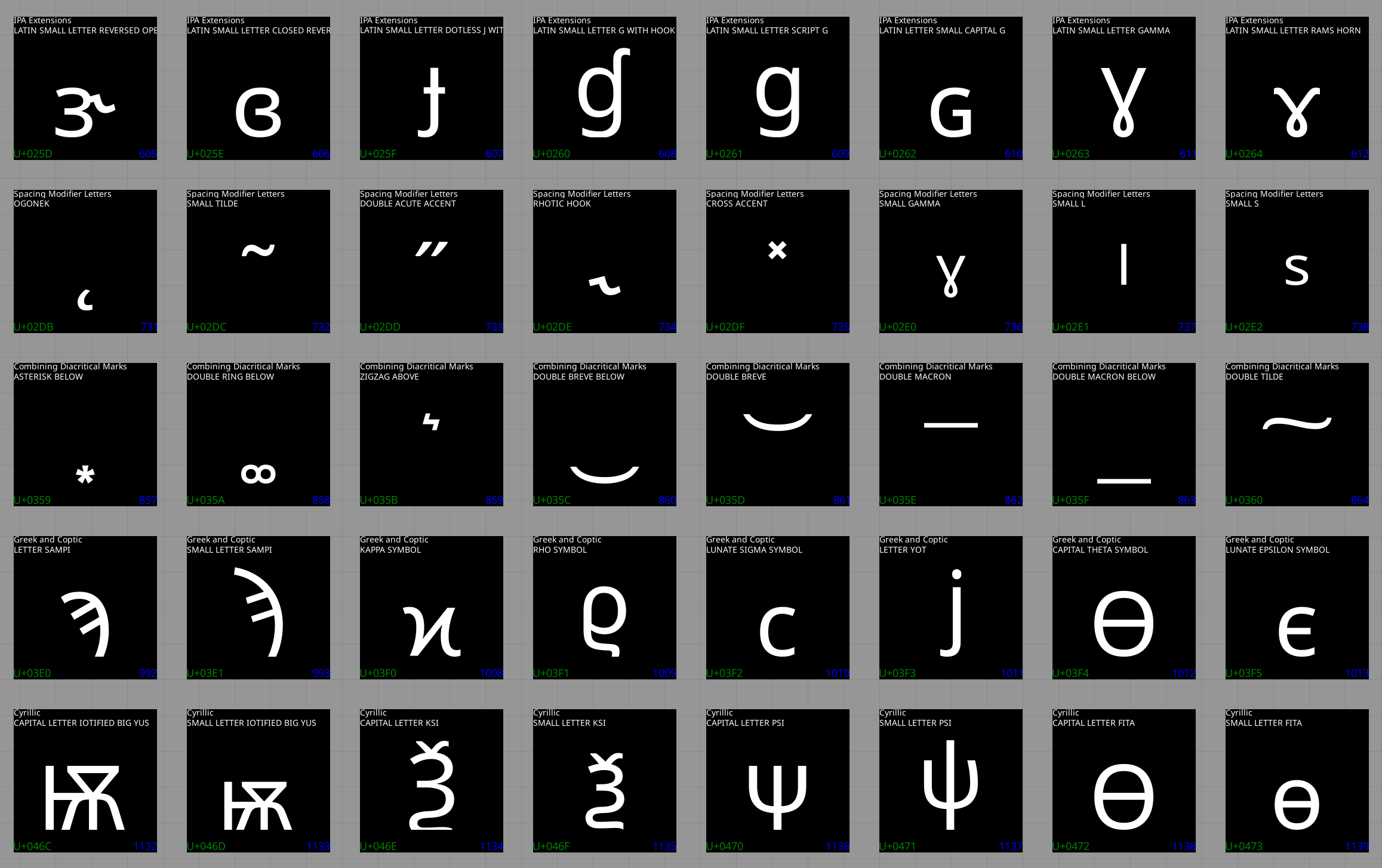
You might notice there's two lines of text accompanying each glyph. In addition to individual codepoint names, Unicode gives names to ranges of codepoints, called blocks. This is useful information to show in the UI, but it required a bit of processing first due to the significant overlap between block and codepoint names:
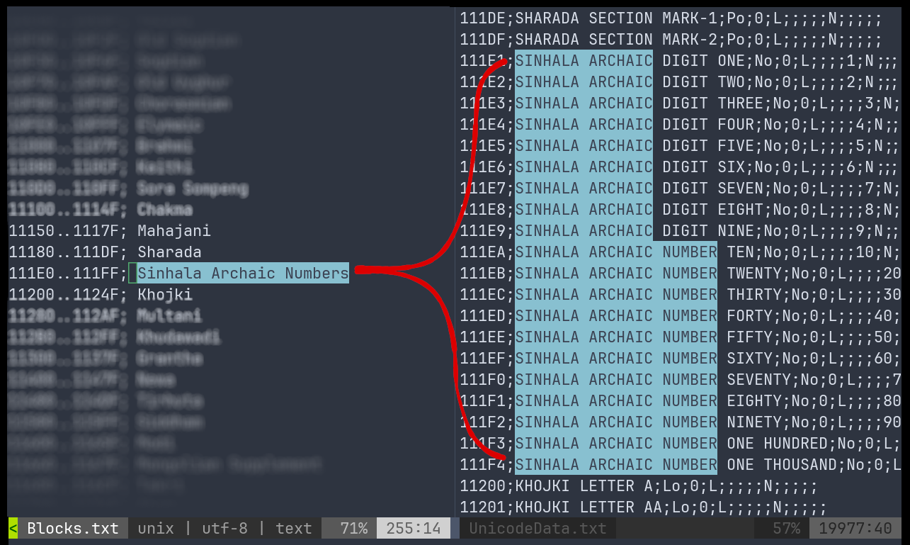
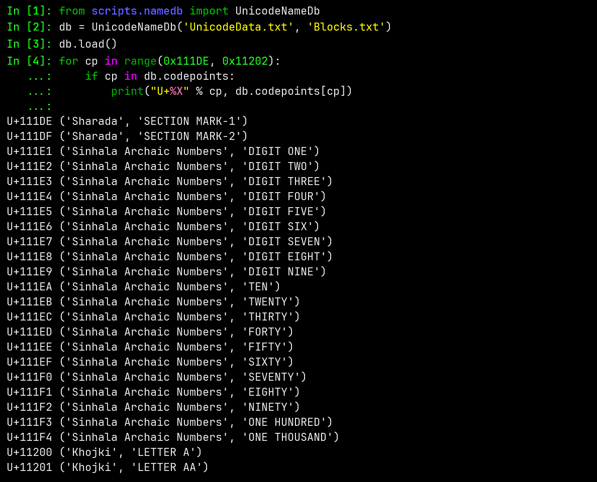
Cleaning this up was bread and butter Python work. After stripping the longest common strings and cleaning up a few edge cases, the codepoints from the list above can be more concise:
A brief escapade in Rust
Colour emoji rendering in Python was becoming a pain, with either high-level wrappers (or maybe my pace) starting to get in the way. I was interested in the possibility of implementing firmware for the Pi Pico in Rust, and the library fontdue looked promising. It would also be useful to start working on experimental code that could evolve into embedded code.
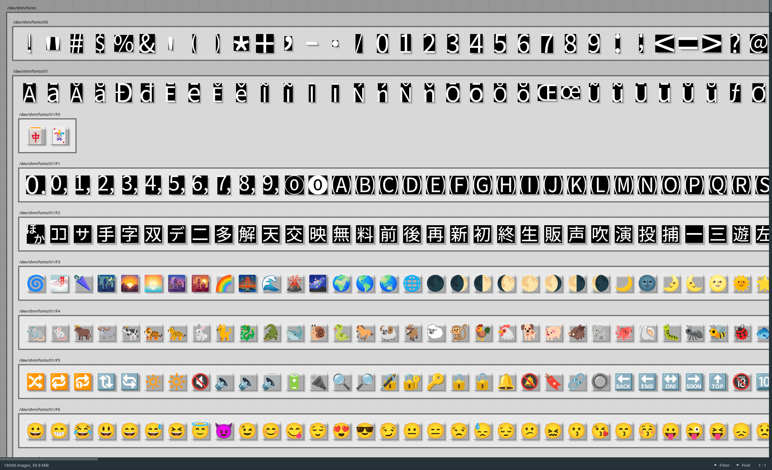
Getting something implemented on desktop to render both outline and colour bitmap glyphs was fairly straight forward after the initial learning curve picking up Rust for the first time:
It became apparent quickly however that many libraries don't hesitate to load a few megabytes into RAM or require passing whole fonts in memory without room for inserting abstractions. This is good for performance and simplicity on your average personal computer, but these choices unfortunately make a library unusable on embedded targets like the RP2040.
This work wasn't a loss though: I could now render all of the codepoints I needed to individual files, and with some SD-card-to-screen plumbing these images were enough to achieve level 0 or 1 on my fidelity list. Copying 50K+ files to an SD card was a little painful, but this approach allowed any codepoint to be located by simply splitting its hex value into a path: U+41 is stored in ./00/41.rgb, and U+1F60E is stored in ./01/F6/0E.rgb, etc.
With a hacky implementation of level 0 working, the next step was attempting font-rendering on the Pico using C and C++. Sorry Rust fans - I'll come back in another project!
The code from this section is available here.
Building FreeType 2 for the Pi Pico
FreeType is a font rasterisation library commonly used in Linux desktop environments. I'd seen hints of a few embedded projects with Espressif parts using it, so I moved my attention to what was possible on the Pico...prioritising technical intrigue for level 1 over completely wrapping up a level 0 build.
It wasn't immediately obvious, but FreeType is very friendly towards embedded systems:
- Supports custom input streams: a bit of glue code and you can wire in any kind of storage
- Only loads things it needs into memory, and only while it needs them
- Allows outline-based glyphs to be handled line-by-line, rather than only as a complete image buffer
- PNG glyphs (eg. emoji) can be supported by adding
libpngandzlibto the build,. These libraries are also very friendly to low memory devices, having originated in the '90s. Similar to FreeType,libpngsupports working one line at a time.
I couldn't find any other Pi Pico projects using FreeType at the time, so I just worked through adding it like any other C or C++ dependency. Normally it might be a pain to pull random libraries into an embedded project, but the Pico SDK's use of CMake makes it relatively simple to plug other CMake projects into a build. You still have to work through errors one by one and figure out a solution, but it wasn't too bad this time:

I'd already set up SD card access for reading images using FatFS for Pico, but some glue code was needed to connect FreeType to this non-standard API. It's normally very easy to open fonts in FreeType, but this relies on the operating system's file support under the hood:
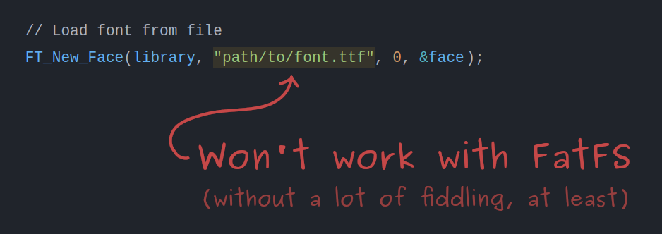
Figuring out custom stream support involved a lot of digging through the reference docs, but in the end the code was quite simple. I built on desktop to have memory guard rails until I'd worked out the API, then wrote the embedded version based on that. If you're looking for FreeType custom stream examples, here's the FT_Stream implementations from this project:
- Simplest possible FT_Stream implementation, using standard C file functions as an example.
- Custom FT_Stream implementation using FatFS (adds a bit of extra handling compared to above).
Indexing codepoints in fonts
When someone flips the binary input switches on this device, I want a preview of the selected character to show up immediately. There are a few challenges with this:
- Glyphs for different codepoints are stored in different fonts. We don't know which codepoints live where without opening every font and searching.
- A codepoint can exist in multiple fonts. How can we pick the "best" option?
On desktop, the first point would be a no-brainer to solve with a map:
// Codepoint to font lookup
// The largest codepoint needs 21 bits, so codepoints are stored as unsigned 32-bit values.
std::map<uint32_t, FT_Face> codepoint_to_font;
On the Pico however, you'd fit less than half of Unicode before running out of memory from the keys alone. We need a smarter solution.
There are a few things we can take advantage of to create a Pico sized codepoint-to-font lookup:
- The majority of codepoints in fonts are sequential. For example, a font for Basic Latin (ASCII) is very likely to contain glyphs for all codepoints from 32 to 126 decimal.
- Font files for different writing systems tend to focus on particular blocks of codepoints. Some supporting glyphs are scattered around, but the interesting parts are usually packed densely.
Factoring this in, we can map ranges of codepoints to fonts instead: storing only the start and end for each range. For the Basic Latin example above, this needs 48 times less memory for codepoints than a naive map.
Collecting ranges of codepoints also has the useful characteristic that we can compare range sizes to make a "best" glyph choice. A font with dense coverage somewhere is likely a better choice than a font with just a few codepoints sprinkled in the same area. This tactic also works to minimise the number of ranges stored.
Running this process on the full Noto font family creates ~5.5K ranges requiring ~49 kB in memory. This is well within the Pico's 264 kB of RAM, but it can be reduced further. We don't need accurate information about which codepoints are missing (since we can just ask the font later), so neighbouring ranges that point to the same font can collapsed together. This brings the index down to 799 ranges, requiring ~7 kB in memory.
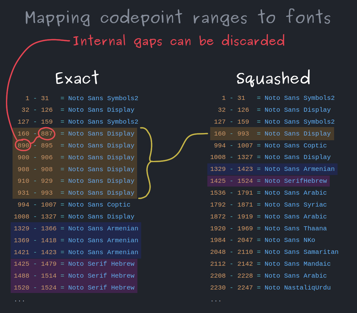
To keep the memory footprint down, the font for each range is stored as an 8-bit ID, but I've shown font names here for readability. The size of the index could be reduced further by only storing the start of each range, and implicitly continuing that range to the next entry in the index, but I haven't done this at the time of writing.
To find a codepoint in this index, a binary search is run for a range that contains the codepoint in question. Binary search is one of those things that comes up in computer science materials a lot, but most of the time other people have already implemented it for you. This is probably only the third time I've had to implement it in 12 years working as a programmer.
Pulling the plug on the contest
At this point I was actually running out of time. I was also very close to having font rendering working on the Pico.
To submit for the contest I would need to put my fun technical challenge aside and work until 3 AM to polish, photograph and document the level 0 build, which felt like it only crudely captured the concept. Here was my perspective about 8 hours before the deadline, when I needed to make a go/no-go decision:
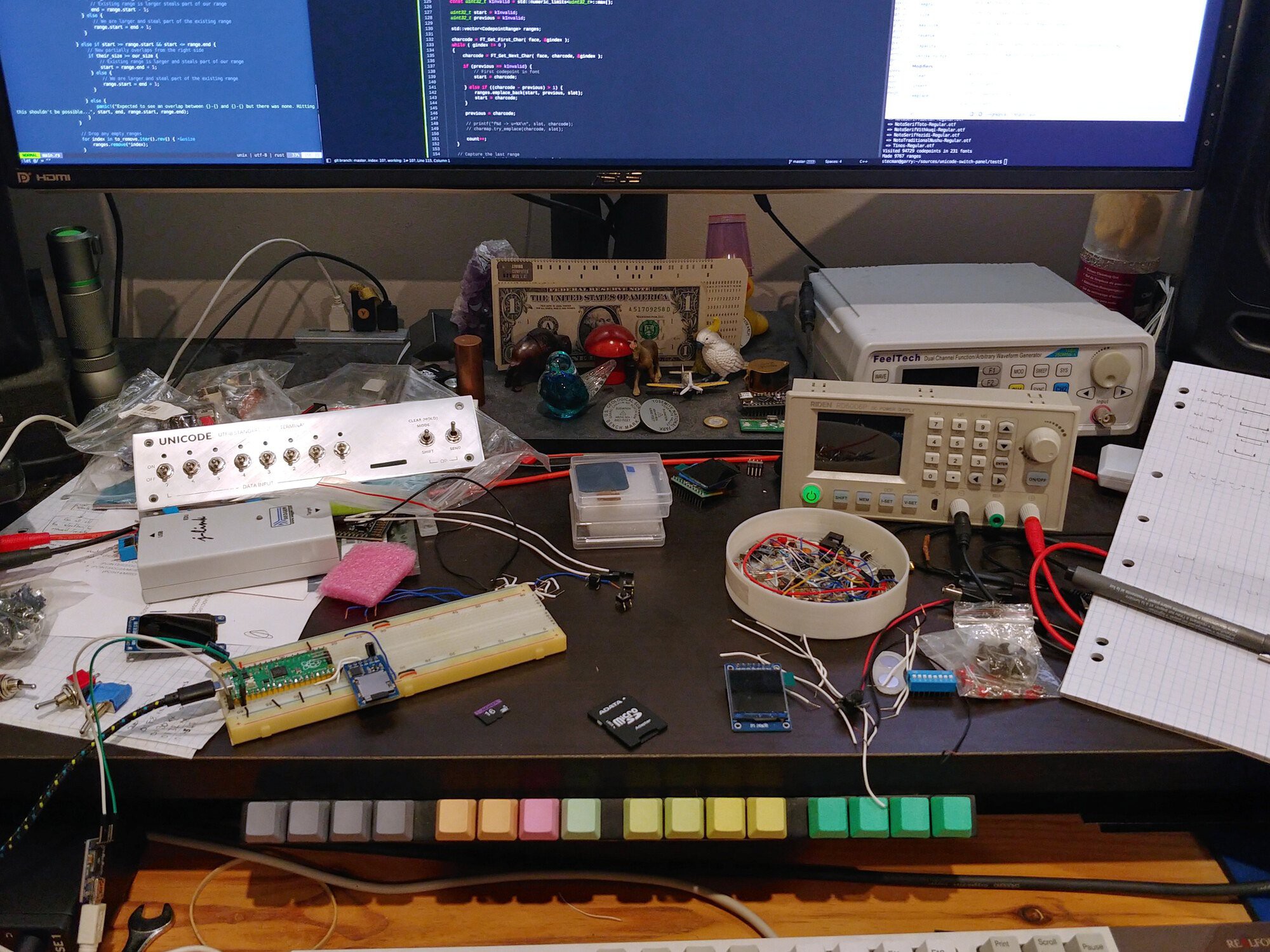
The low-stakes nature of the contest made it an easy call to take a good night's sleep over an all-nighter, and continue the project on my own terms. I probably could have submitted something and continued work, but writing and publishing articles is sort of how I let projects go. I enjoy the writing process (these articles are projects in their own right), and I tend to enjoy my projects because they're driven by interest and quality, rather than a ticking clock. Excuses aside, I had run out of time to achieve what I really wanted.
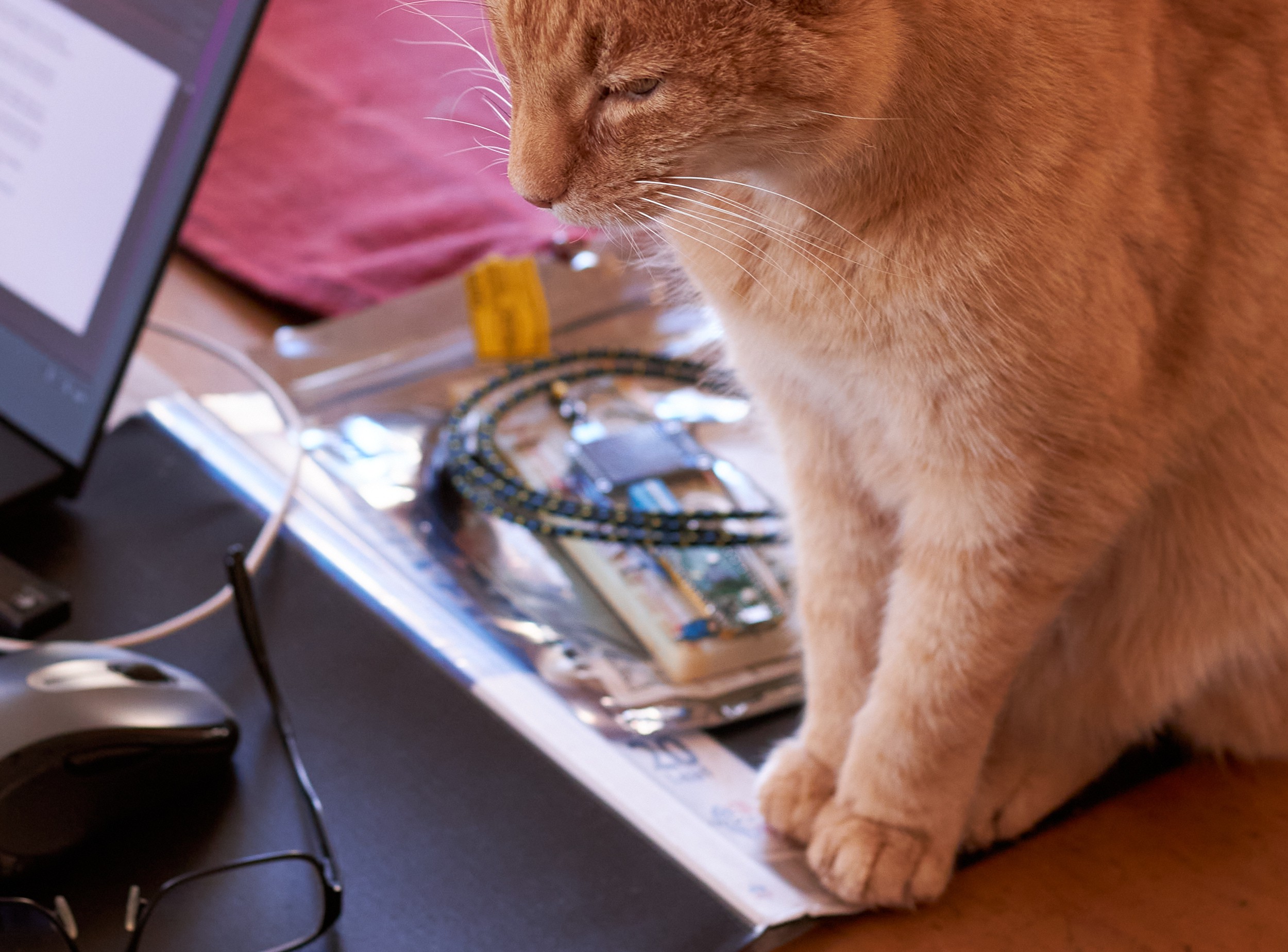
Once I abandoned the contest, photography and a consistent use of version control became much more common. Despite scouring my devices for content, the only electronics photo I found before this point was an accidental inclusion in cat picture:
TrueType font rendering on the Pico
A few evenings after the deadline, I had the Pi Pico indexing and rendering from font files on an SD card. I hadn't been sure this would work, so it was pretty exciting to see evidence the concept could be fully realised without major compromises.
A week later I'd ironed out most of the teething issues:
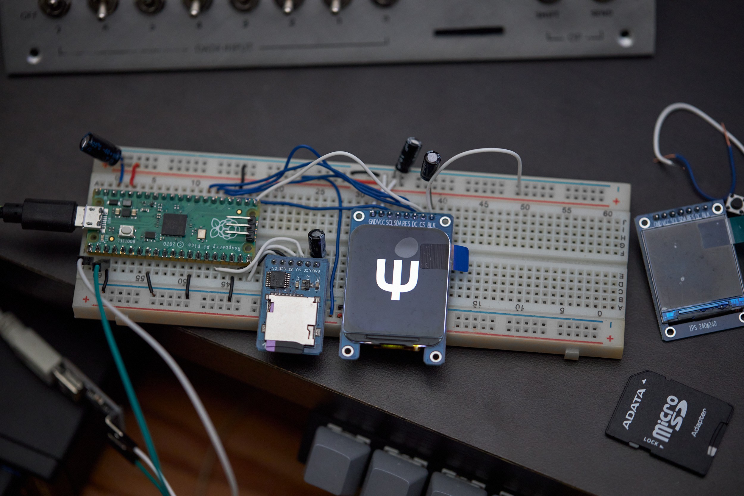
Here's video of the breadboard running through glyphs at this early stage. Note this contains flickering as the display is cleared immediately after each drawing each glyph.
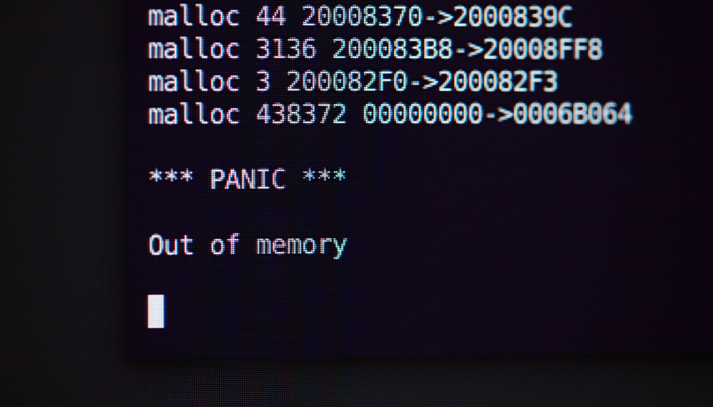
Getting this working on the Pico wasn't free from hiccups, but I didn't need to touch the internals of FreeType or anything crazy. It mostly just required patience, perseverance, and becoming very familiar with this friendly message appearing in the serial terminal:
For anyone else venturing into embedded use of FreeType, the most notable issues were:
- FreeType seems to need a lot more memory when working with OTF fonts compared to TTF fonts. Converting fonts to TTF helped reduce my memory exhaustion problems significantly (detailed in the readme). It's tempting to attribute this to TTF being designed in the 1980s for much lower memory systems, compared to OTF in the mid 1990s, but that's speculation.
- Some font files can require too much memory for the Pico to open. I experienced this with Noto Sans Japanese which contains 11K codepoints, and Noto Sans Sign Writing which contains only 669 codepoints. I'm unsure what the underlying issue is for each, but both of these cases were worked around by splitting the problem font into multiple font files (detailed in the readme).
To render large glyphs without needing an equally large memory buffer, I connected FreeType's line-by-line rasteriser directly to the display hardware. Use of DMA allows the majority of pixel pushing to happen in the background while FreeType keeps working to compute the next line. The end result is something that's plenty fast enough for interactive use. It's not an instant "swap" of what's on screen, since the raster process is slower than the display's update rate, but this doesn't cause any problems for this use case.
Designing software features
Throughout the project, I'd been writing a mock manual to figure out how the software needed to work from a user's perspective. This was done in markdown, but to go with the anachronistic device here's a rendering in the style of a 1980s technical manual:
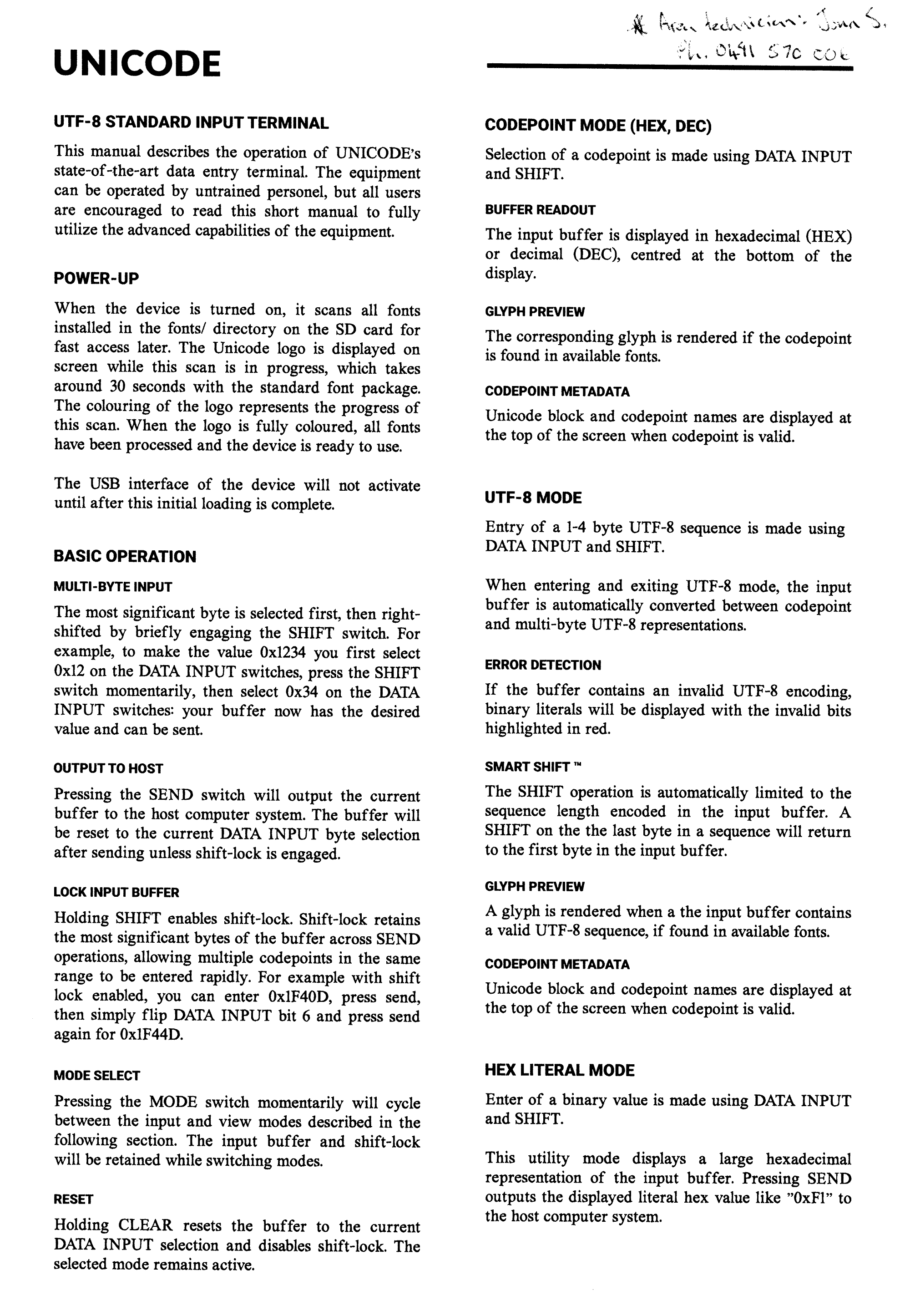
To get data into the host computer, I had wondered if Unicode could be sent using a standard USB Human Interface Device. Every USB keyboard announces itself as having the "Keyboard/Keypad" capability from the USB HID tables, and while browsing this document like a normal person I noticed a "Unicode" capability:

There's next to no information available online about this, so it's unclear if any major operating system supports it (or if any ever did). The "two-octet" UCS-2 standard it mentions predates UTF-8 by a few years, but it would still allow any codepoint to be sent:
UCS-2: two bytes for every character, enabling the encoding of the first...36,864 codepoints, straightforwardly, and other planes...with...escape sequences. — Wikipedia
I'm interested to try this later, but for the initial build I fell back to the Pico acting as a keyboard sending system-specific key sequences to input Unicode. This approach is needed as regular keyboards can't send arbitrary characters: they send a limited set of scan codes which are interpreted by the host's keyboard layout settings, and go through a slew of other layers before a character appears at your cursor. If the Unicode Page ends up being a bust, I'll look at implementing a driver to inject Unicode input.
Accessing Unicode metadata on the Pico
To show codepoint and block names on screen, I needed to get them into the Pico somehow.
I was only using a quarter of the 2 MB flash at this point, and with the total size of my processed names from earlier being only ~600 kB, it was logical to embed the data in the program. It was much easier to let the compiler handle indexing into a sea of strings, rather than find or make a database file that could be streamed off the SD Card.
To embed the name database in the firmware, I wrote some more Python to generate 36K lines of C code, which compiles to around 440 kB. This is run as part of the build and includes some light compression in the form of a common prefixes table:

I did investigate using zlib to store a more compressed database, but it would've added extra complexity and I didn't need the extra space. On the processed set of names, zlib gave a 4:1 compression, though that doesn't include any of the support structures necessary to locate a specific codepoint's name (which is the complicated part). If you needed the space, you might split the database on block boundaries and compress those chunks separately, since you can't jump into the middle of a zlib stream (as far as I could tell).
(This piece was done well before the deadline, but it fits into the story better here).
Building the UI
I didn't have a grand design for the user interface, but I knew the elements I wanted were predominantly text.
Loading fonts from the SD card was good for random access to 200+ fonts, but for UI I wanted a different solution. Hitting the SD card every time the UI wanted to draw wouldn't be ideal. To solve this I stripped down a couple of fonts to a minimal set of ASCII, and embedded those as binary blobs in the firmware. This way they can be directly addressed on the Pico's flash, which significantly faster than SPI mode SD card access.
This kind of file embedding also turned out to be useful for images, which I became slightly distracted by...who can resist a good loading screen? The animation below displays during start up to show the progress of font indexing from the SD card by number of files processed. This uses a single PNG image with some rendering trickery to make it fill up.
If you want to embed files in your own firmware, details of doing this with GCC are here. The project readme also has details on compacting fonts.
In the beginning, the UI was static metadata with some fallback text for glyphs that were missing or invisible. With tinkering on and off between mid July and December 2022, the UI gained value readouts, animated scrolling of long names, better error states, and eventually settled on a layout that worked for multiple view modes:
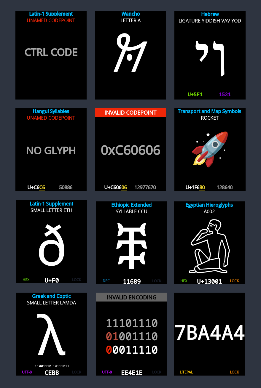
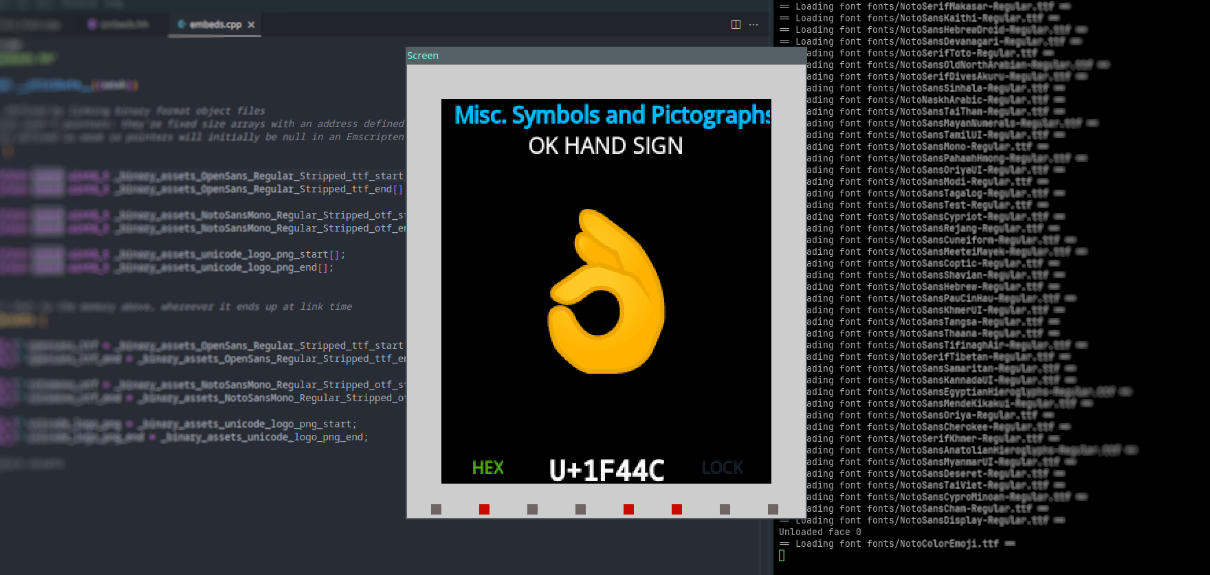
At the end of July I was getting tired of the long firmware upload and boot making it slow to work on the software. To make development easier, I added a "host" build mode using SDL2 to allow rapid iteration and debugging by running directly on the development computer. The screenshots above were taken using this mode.
Wiring it up
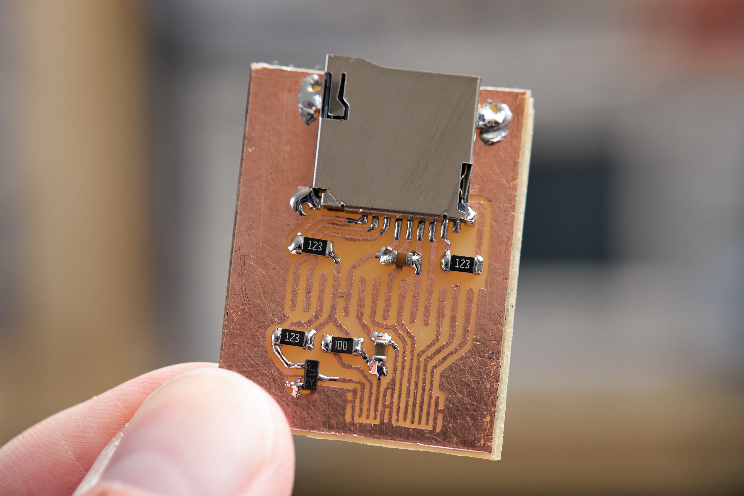
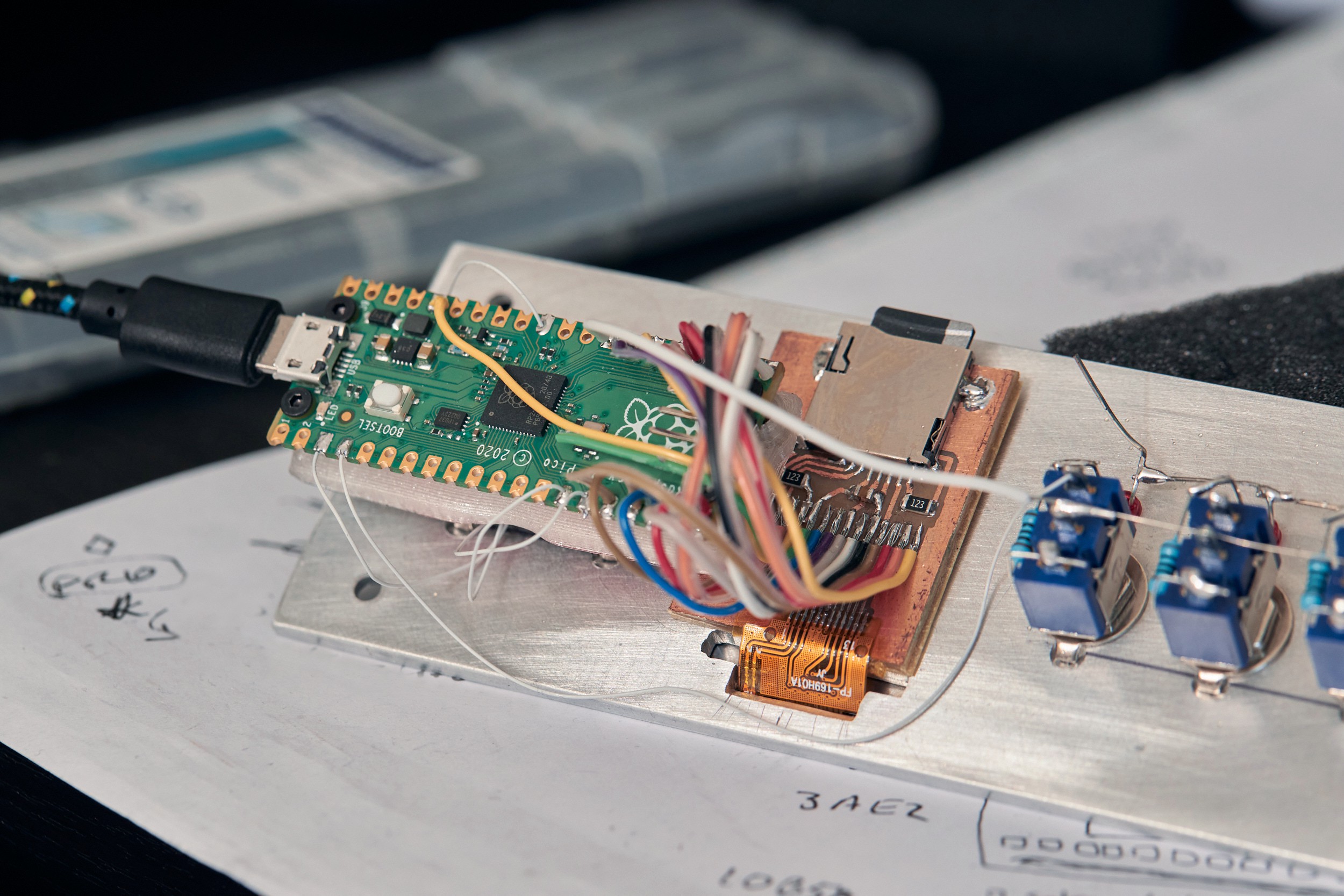
To connect the flat-flex cable from a bare display to the Pico and keep the wiring compact, I made a small single-sided circuit board that merged support components for the display and Micro SD card slot, with pads to solder a ribbon cable to directly. PCB manufacturing is incredibly affordable these days, but there are times I really only want one copy of a board. It's time consuming and kind of annoying to make boards in a small apartment, so I generally avoid it, but it made sense for this little wiring helper:
The Pico was attached to a 3D-printed sled to mount over the back of the "OP" switches. I did this to keep everything attached to the front panel, to give you something to push against when plugging in a USB cable, and because I didn't have a plan for an enclosure yet.
The display and PCB were carefully aligned, stuck in place with thin double-sided tape, then carefully soldered together. Once that was tested, all of the other point-to-point wiring was added:
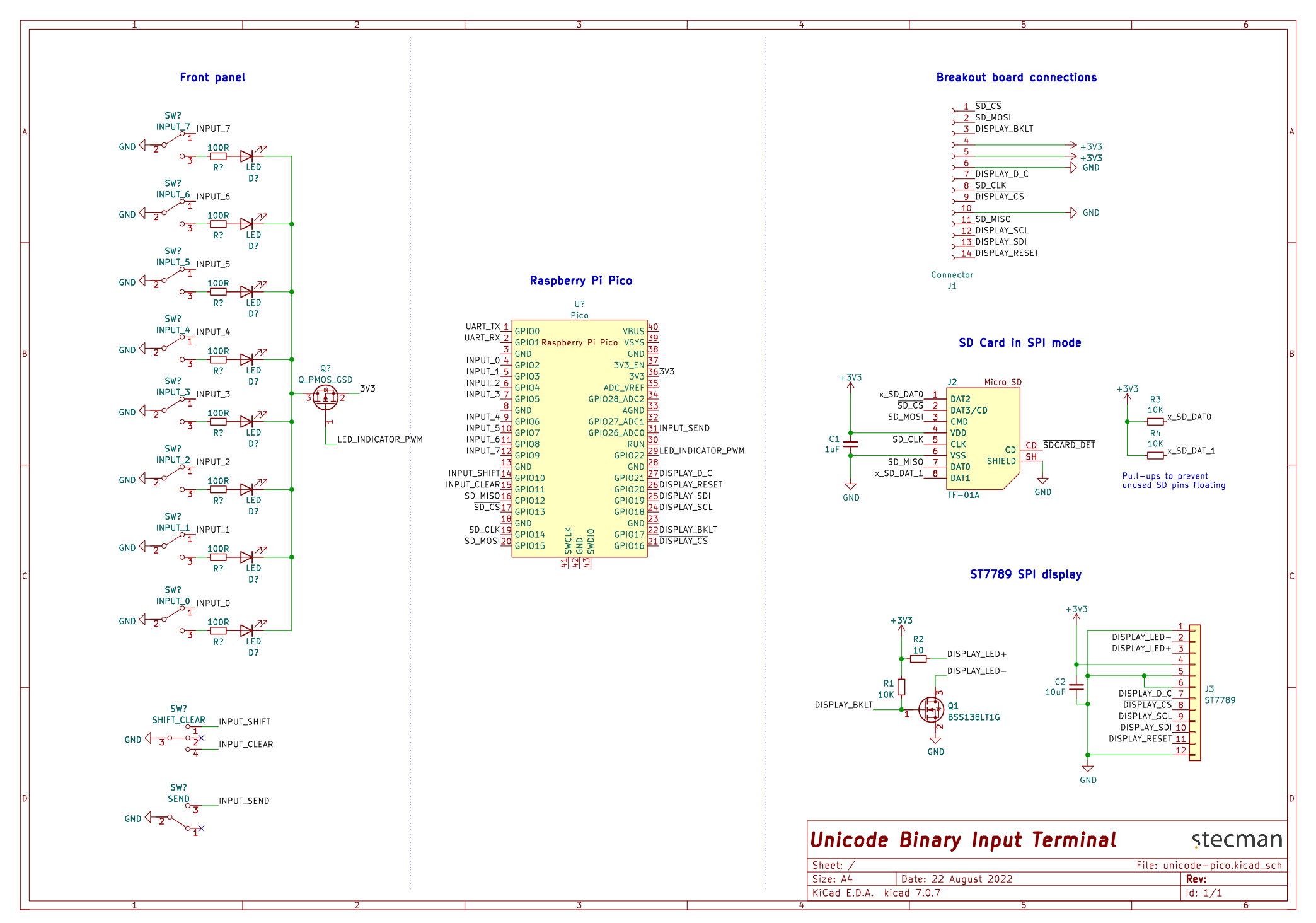
There's not much to the front panel wiring, but I drew it out in a schematic anyway to think through it. Click for a PDF version:
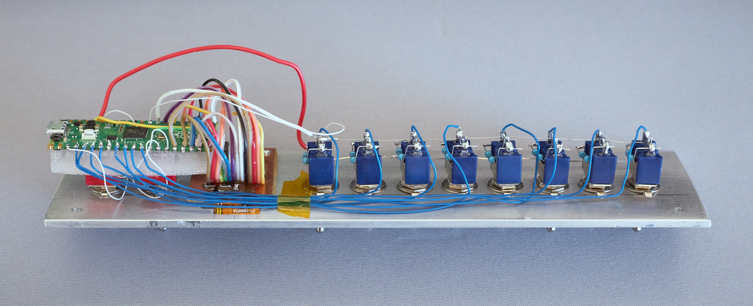
Here's a photo of those connections on the hardware. The only fiddly part of this was soldering a SOT-23 package to the LED power net (obscured, but it's what the flying red wire goes to).
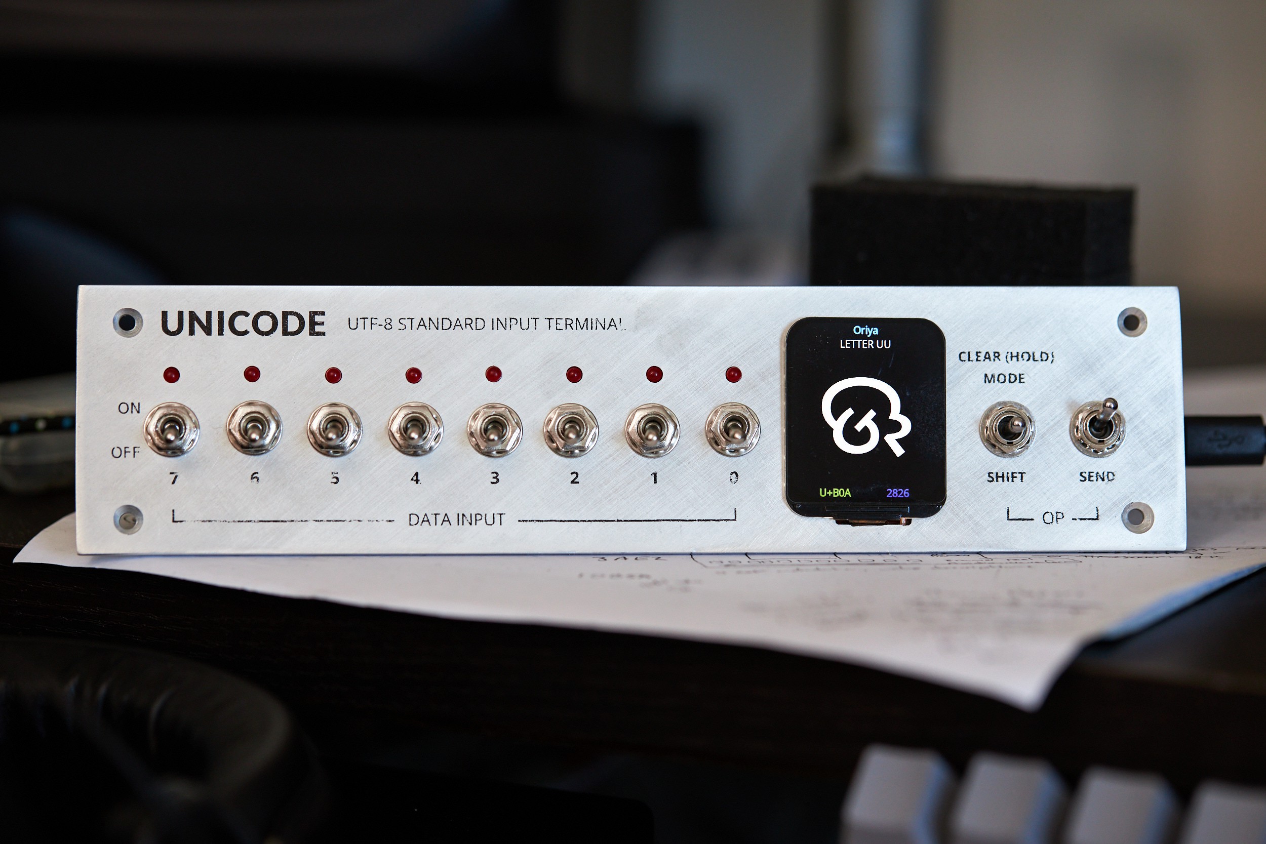
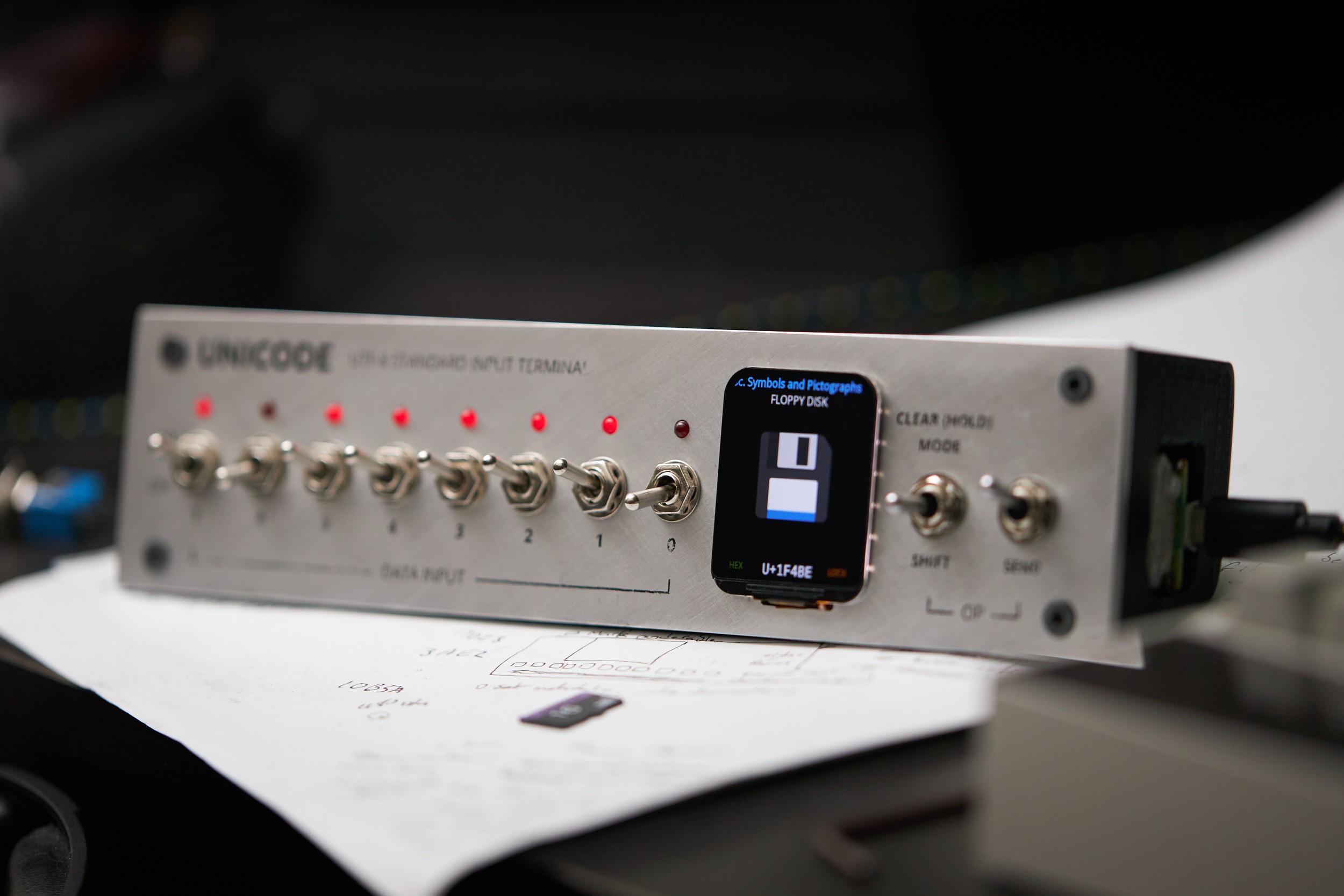
With everything attached, it was looked pretty bang-on to the illustration. The display just managed to squeeze into the space between the two banks of switches without looking like a patch job:
Giving it an enclosure
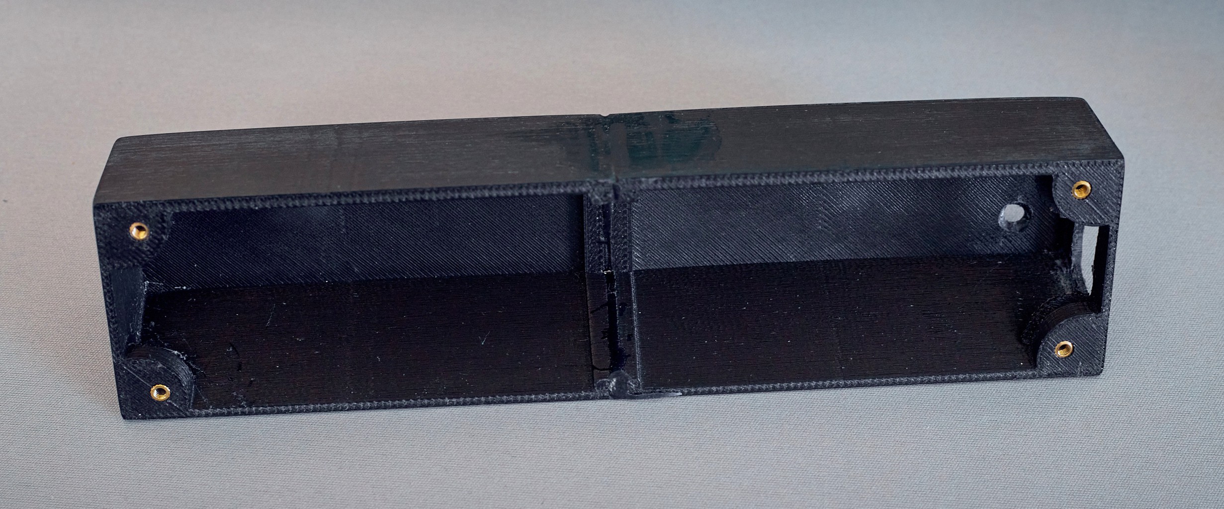
In December 2022 I was looking to wrap up the project, so I hacked together a basic enclosure in OpenSCAD to 3D print. This was designed to split down the middle, as my printer is ancient and has a very small build volume:
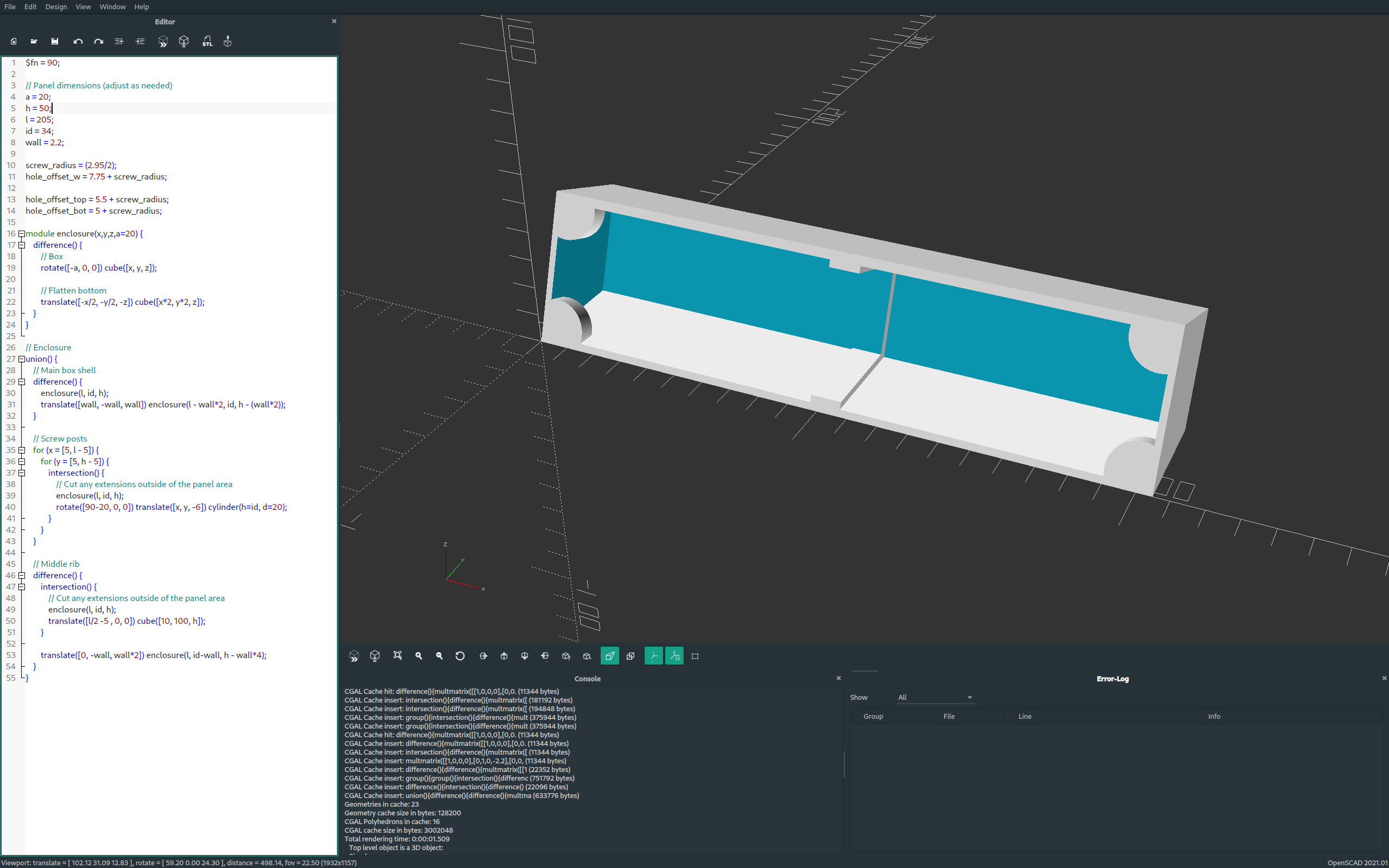
I was being lazy, so rather than building the USB cut-out into the design I cut it out after printing. This ended up being a large hole the Pico came almost to the edge of the front panel. Rather than mess with moving the completely wired-in Pico, I epoxied a small patch over this hole later with a precise cut-out for the micro USB port. A small hole was also added in the back and button glued in to make the Pico's BOOTSEL switch accessible.
The complete assembly
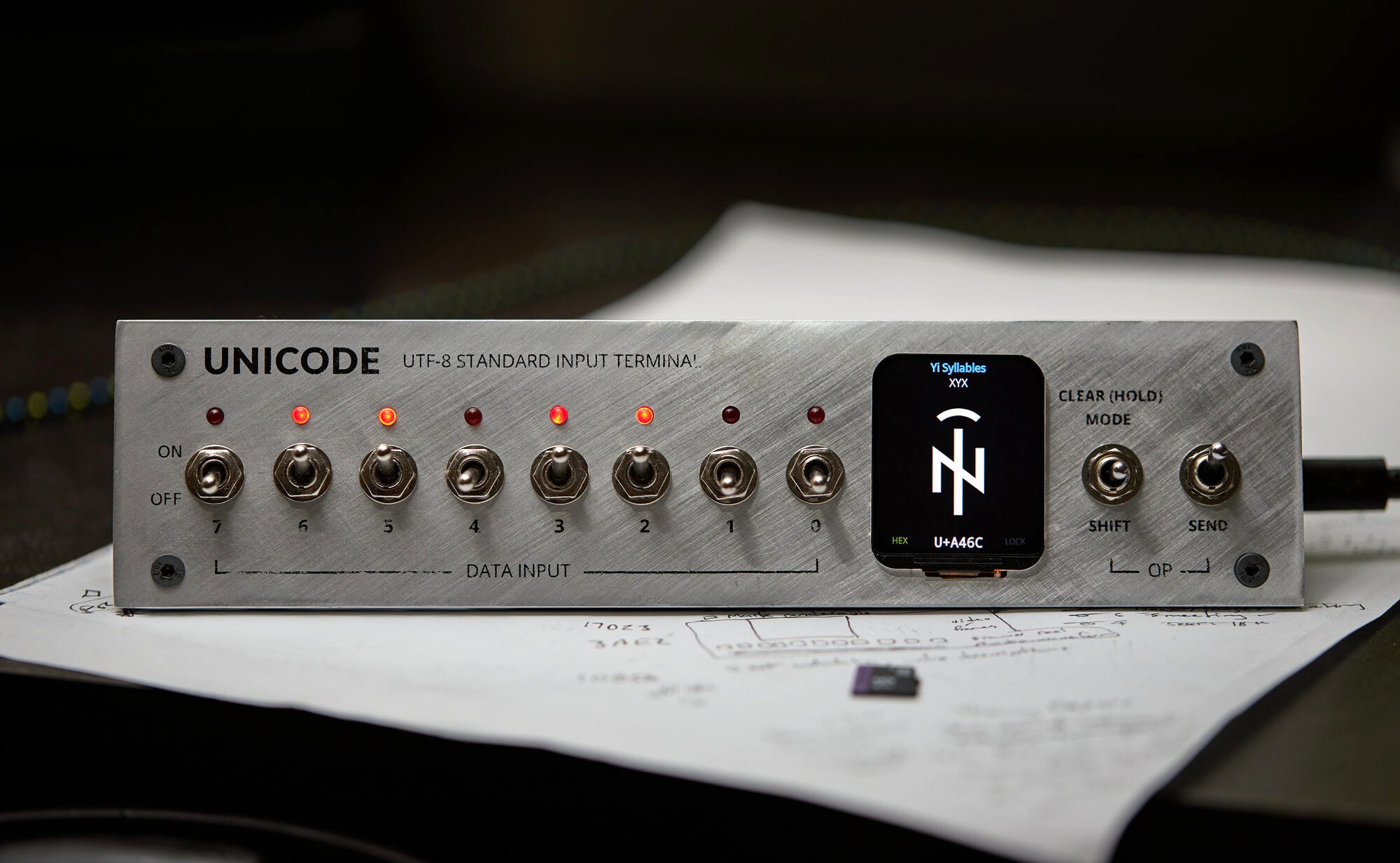
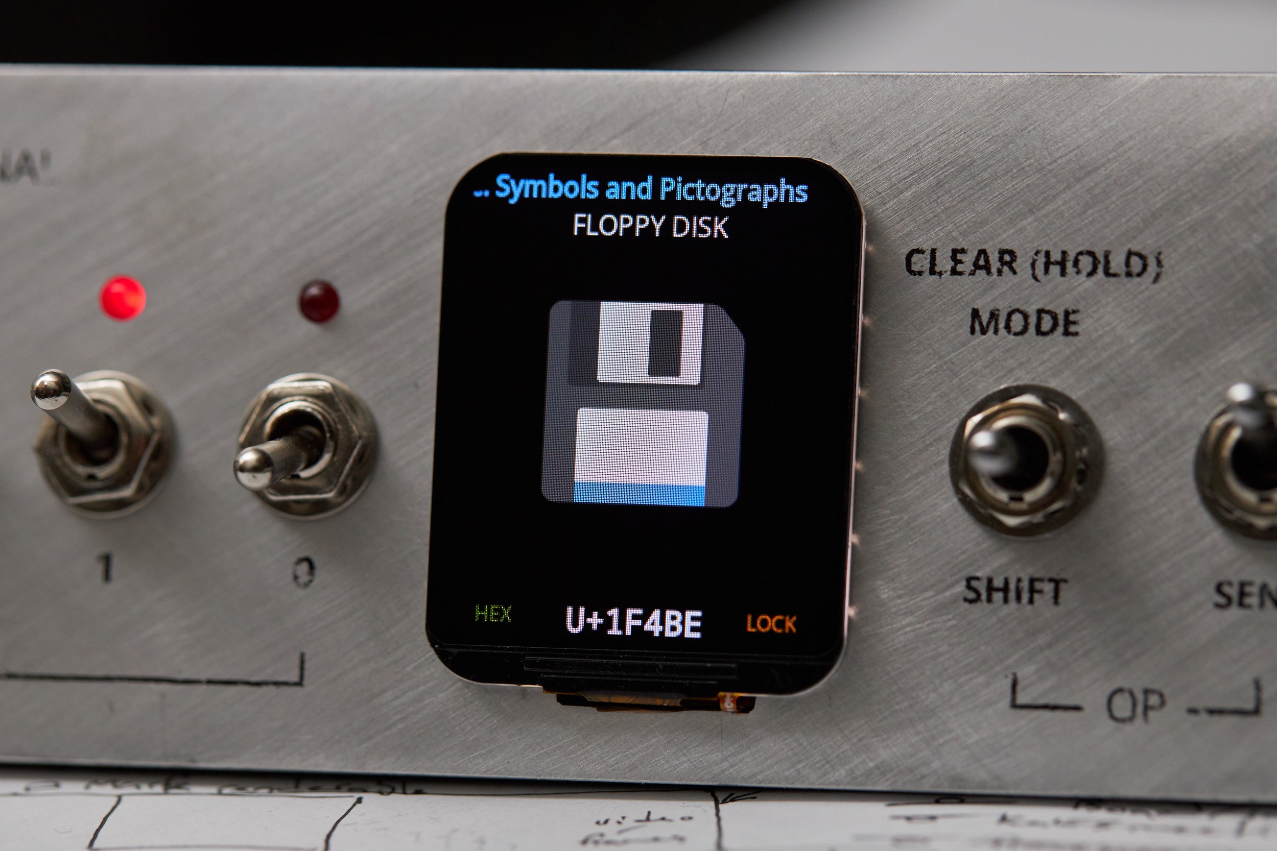
It may have taken an extra six months of tinkering beyond the deadline, plus another eight months to put this article together (2023 has been full-on with work), but I can very confidently say this project is done to the standard I wanted now:
Things that didn't work
Layout and substitutions with Harfbuzz
Harfbuzz is a text-shaping engine usually employed alongside FreeType - it handles the complexities of how to place and combine glyphs in different contexts. I had no problem adding it to the build, but ran into memory exhaustion problems trying to rendering a basic example. I originally concluded Harfbuzz was trying to load large parts of the font into memory, but I think this was jumping at shadows. Could do with further investigation.
SVG font rendering
Paraphrasing my commit message, the SVG version of Noto Color Emoji embeds a single 14 MB SVG that contains all glyphs, designed to be located using ID strings. Due to this organisation, it's not really practical to work with on the Pico, so I abandoned this work before finding out how lunasvg would perform on the Pico. The work I had done to register the SVG renderer in FreeType is in the linked commit if you need an example.
What's next?
I'm satisfied with the technical and visual state of the project for now, but there are some areas that could be tinkered on further:
- Support Windows and Mac OSX key sequences for Unicode entry, and prompt on the device to select the host operating system. Both Windows and Mac need configuration tweaks to support direct codepoint entry that isn't hamstrung. I wondered about automatically selecting the right shortcut, but OS fingerprinting by a USB device is a whole area of research and is non-trivial.
- Send input to the host using a different mechanism than keyboard emulation. This might start with investigating USB HID Unicode Page support, and failing that, implement a host driver to take input from the device and insert it at the cursor. A brief investigation into this suggested it might be easiest to do with a platform's clipboard API.
- Access glyphs hiding behind variation sequences (the "bonus" level). This needs custom code to read from the substitutions (GSUB) table in a font, as Harfbuzz is too memory intensive for the Pico. FreeType provides access to all tables in a font, but doesn't offer functions for reading substitutions. UI-wise I was thinking this might be implemented as another view where the shift key cycles through all substitutions that contain the codepoint in the input buffer.
- Rewiring the LEDs to be software controlled. This would allow things like blinking an LED to show where a UTF-8 encoding error is, and fun start-up animations to name a few. There are plenty of pins for this, it just wasn't a priority during the initial build.
- Switch from SPI to SDIO for even faster SD card access. The latest version of the SD card library I'm using seems to have support for this now.
There might even be things you'd be interested in adding! You don't need any hardware to run the UI, and I'm open to pull-requests. The code is on Github ☺
 Stephen Holdaway
Discussions
Become a Hackaday.io Member
Create an account to leave a comment. Already have an account? Log In.