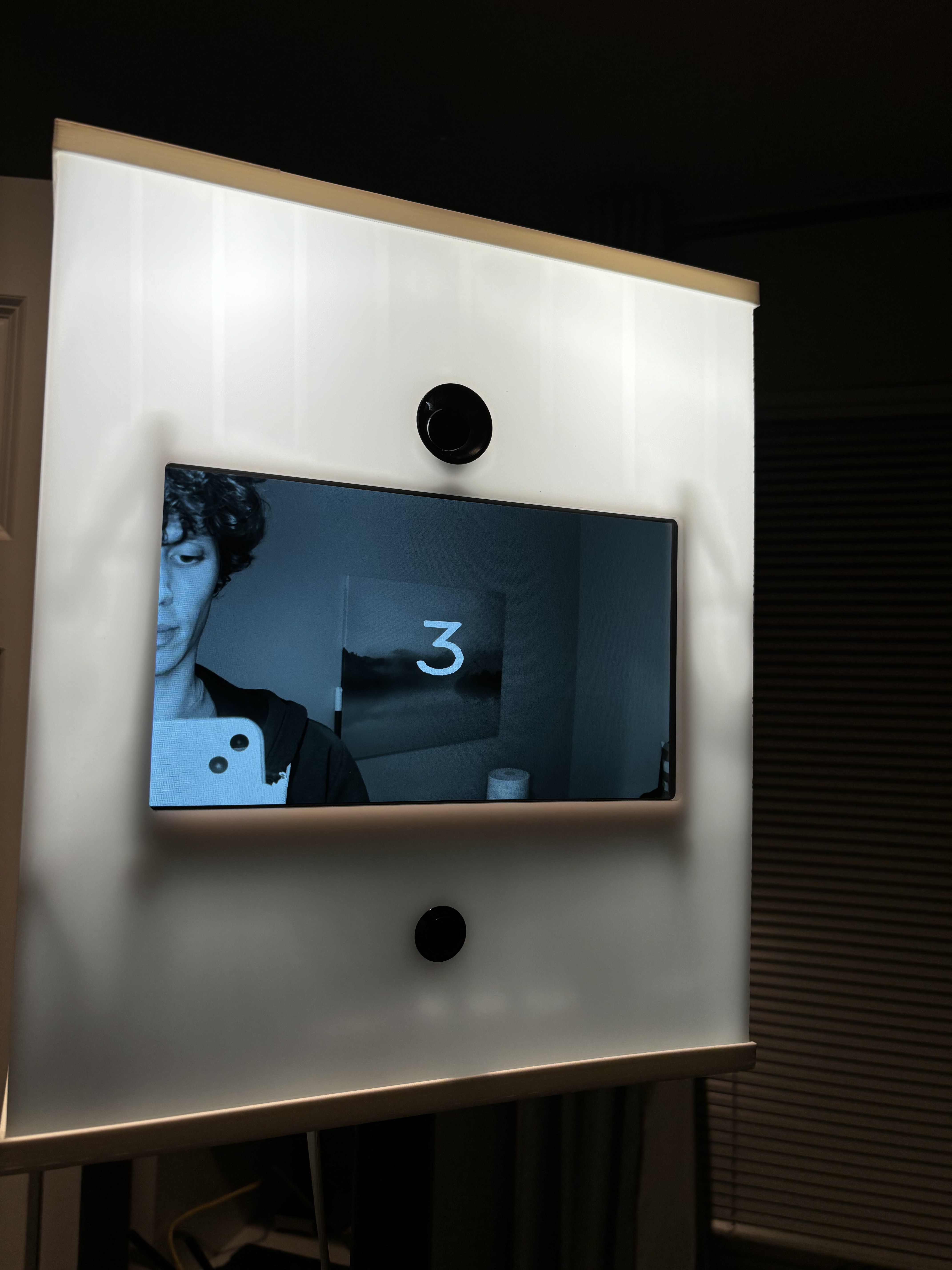
My top priority when designing the photo booth was that it have a straightforward and appealing user experience. I figured the simplest, most foolproof interface is one big button on the front. You press the button, a countdown starts over the preview on the screen, it takes a picture, and then you see the picture it took.


I made a few more arbitrary decisions to try to up the appeal.
- The last photo is displayed until the next person presses the button, so anyone walking by will see how great the people in the last photo look, and they have no choice but to press the button if they want to see themself looking similarly great.
- The whole thing is made out of semi-transparent white plastic, and the LED illuminators are always on so it glows. What's more enticing than a mysterious glowing box with a button?
- The preview and last photo display are black and white, because aesthetics. The images are still captured and saved in color.
Discussions
Become a Hackaday.io Member
Create an account to leave a comment. Already have an account? Log In.