Close
0%
0%

BUSY Bar — Productivity Multi-tool with LED screen

Productivity multi-tool and distraction blocker with an LED display, for your phone and PC. Open API. Fully customizable, smart home ready

Similar projects worth following
Productivity multi-tool and distraction blocker with an LED display, for your phone and PC. Open API. Fully customizable, smart home ready

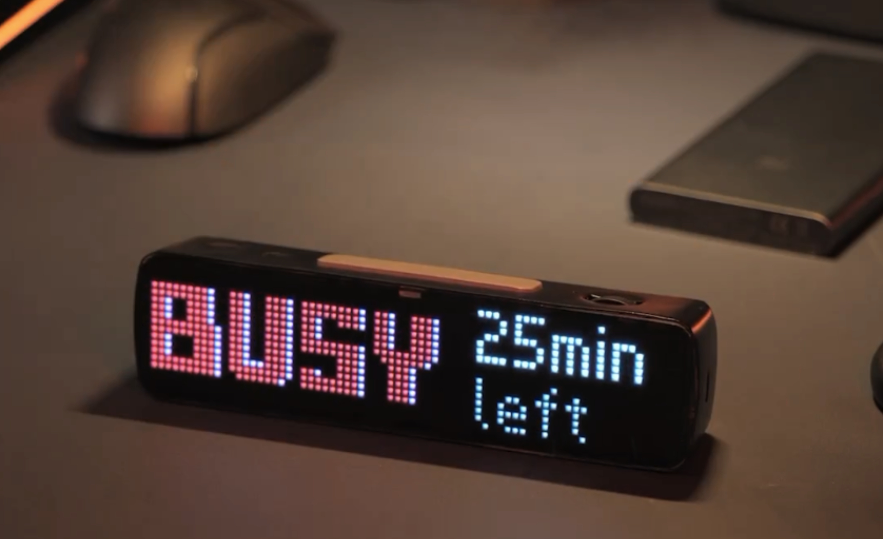
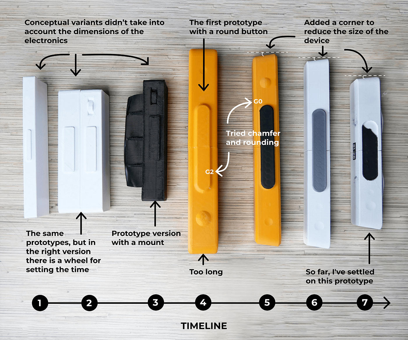
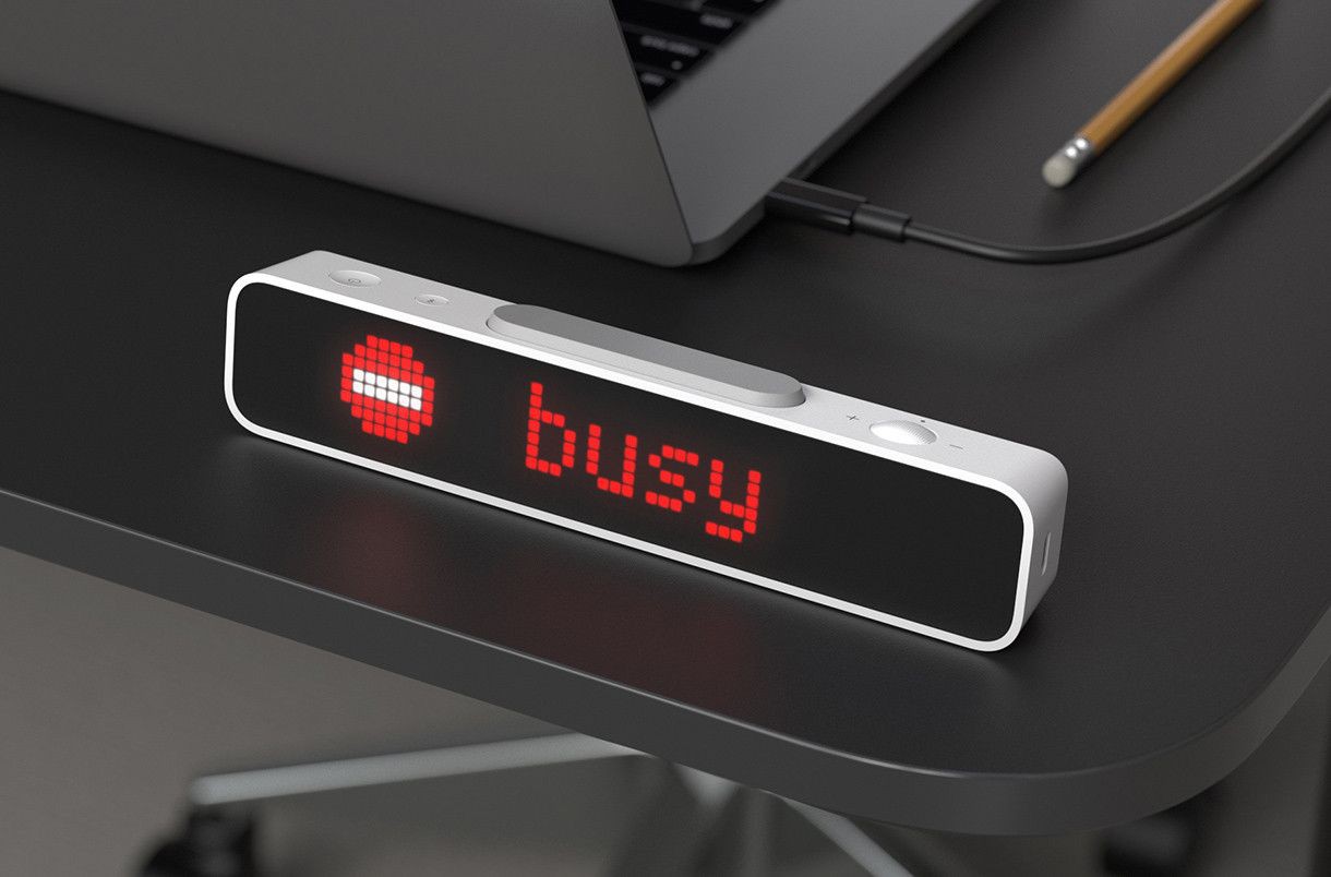
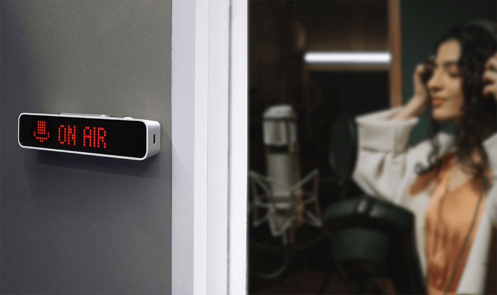
This project was born out of our own frustration with open spaces — there are just so many distractions that it's nearly impossible to focus. BUSY Bar is our attempt at creating a big “SHUT UP” button. When pressed, it uses physical displays and digital integration to silence the space around you, so you can actually get some work done.

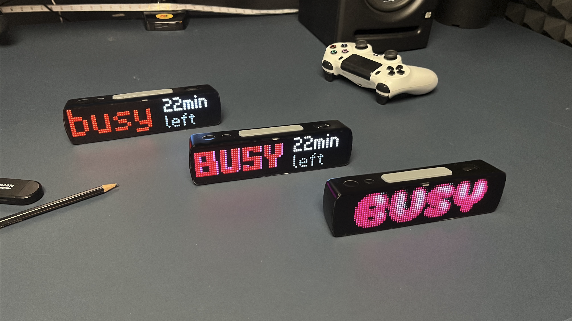
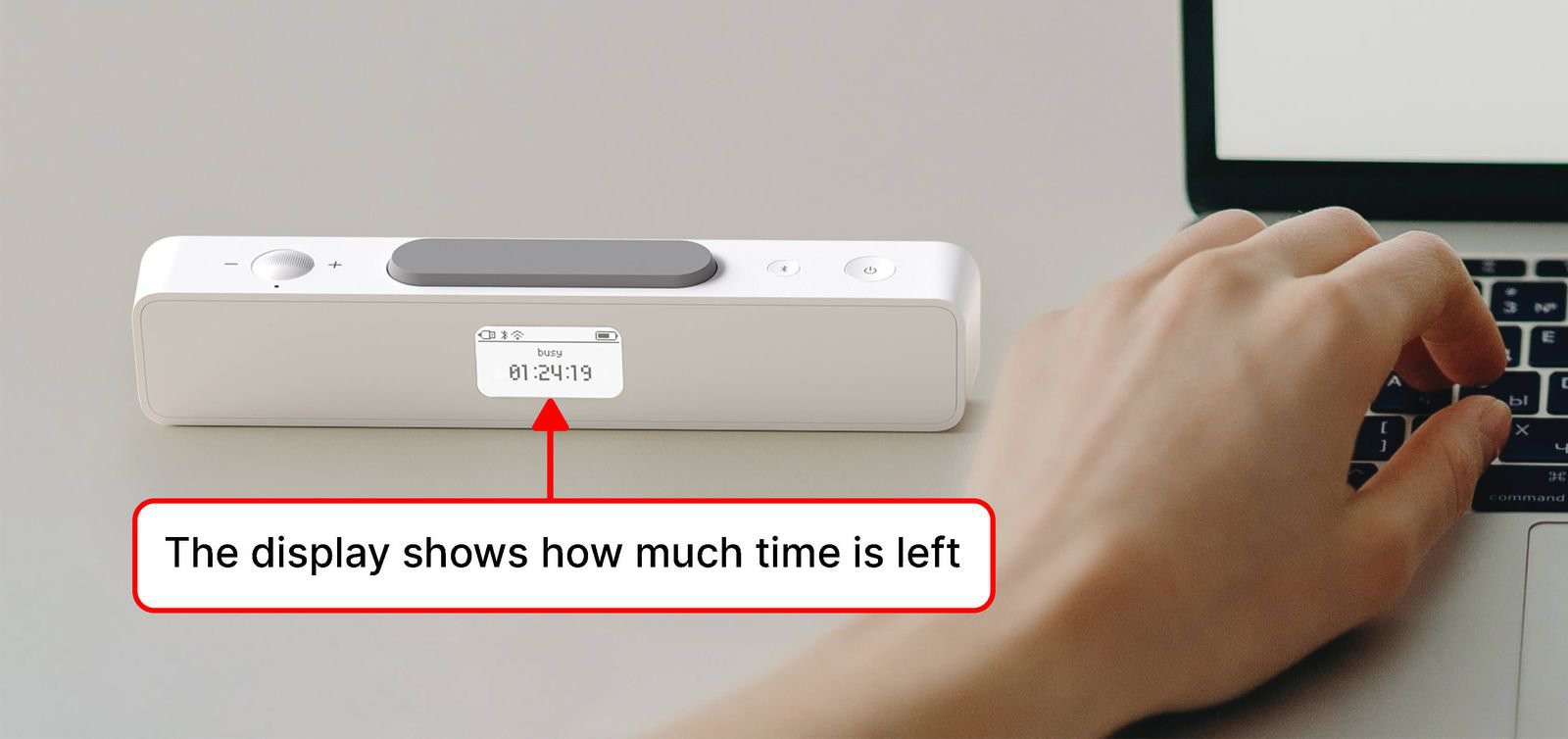
It’s also an advanced Pomodoro timer that helps you stay focused while working on large tasks by alternating between work and rest cycles. During work sessions, you can display a custom status on the screen to let others know that you’re busy and when you'll be free.

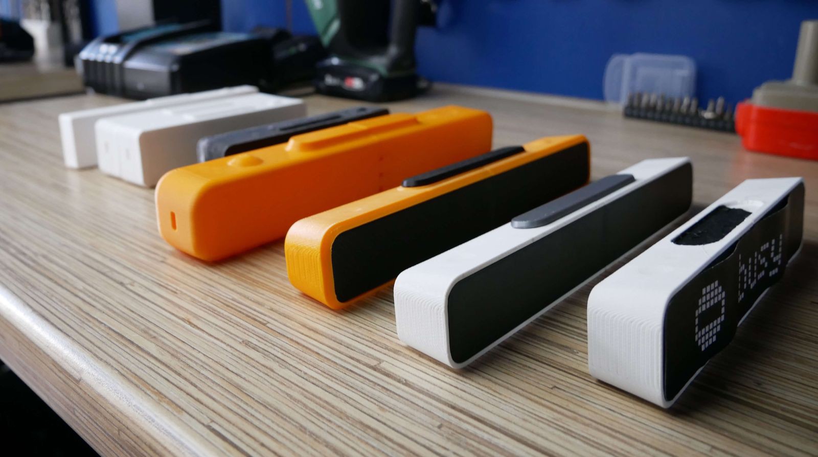
We have many more features planned and will come up with new ones as the project develops, so we invite you to keep an eye on its progress!

  • Electronics of the Prototype

    Ruslan Nadyrshin11/27/2025 at 10:31 0 comments

    The electronic hardware of the device includes a battery, a speaker, and three boards:

    • The board with the LED matrix (display)
    • The board with an ESP32 microcontroller, control interfaces, and a USB-C port
    • The board with an OLED display and encoder

    The boards interconnect via FPC (Flexible Printed Circuit) cables. We’re considering a more rigid connection through spring-loaded contacts.


    The design allows for a battery sized 17 x 120 x 20 mm. A lithium-ion battery of this size would have an estimated capacity of 3200 mAh. We measured the LED matrix’s consumption in a busy state with a timer, yielding around 135 mAh.

    Accounting for the ESP32 and OLED display’s consumption, we estimate a total current draw of 350 mAh per hour, allowing the device to display the status for approximately 9 hours without recharging.

    We will be ordering custom-sized batteries for the final device.


    The speaker


    We positioned the speaker on the side of the device and incorporated four small openings in the case to enhance sound clarity. Our tests revealed that there was no noticeable difference in loudness when using either 8 Ohm or 4 Ohm speakers.

    Due to the limited number of pins available to connect the ESP32 microcontroller, we decided not to include an external DAC (Digital-to-Analog Converter). Instead, we used a pulse width modulation (PWM) module built into the microcontroller and installed an external low-pass filter. Following the filter, we installed a D-class digital audio amplifier.

    While the sound produced is sufficiently loud, we did encounter some polyphony. We avoided using a buzzer so Busy Status Bar could have pleasant audio feedback.


    RS-485 communication


    The device is equipped with an RS-485 interface commonly used in industrial networks. We’ve allocated four pins for this: twisted pair, ground, and power. We’re considering its usage in the B2B segment for network panel connection or for creating an array from multiple devices. We haven’t decided on a protocol yet, but we’re planning to adapt according to market demands.


    Stay tuned


    If you enjoyed this project and its development story, follow for the latest updates and feel free to share your feedback.

  • What’s Inside the Device

    Ruslan Nadyrshin10/28/2025 at 16:28 0 comments

    The central element of the device’s layout is the chassis, on which the buttons, two boards, the speaker, and the battery are attached. The assembly with the chassis is placed in the body and closed with the display assembly.


    The display assembly


    The display assembly includes the following components:

    • LED matrix with a resolution of 16x72 pixels
    • A plastic mesh separates pixels and isolates the light emitted by neighboring LEDs
    • A diffusing film ensures consistent light distribution within each cell
    • The tinted front cover creates a uniformly dark surface, concealing the internals of the device


    In high-volume plastic molding production, achieving a thickness of the light-isolating grid’s walls below 0.6 mm can be challenging. The distance between the LEDs must be a minimum of 1 mm (a 0.6 mm mesh thickness and 0.2 mm tolerance to accommodate any errors around the LED). Knowing the size of the LEDs and determining the appropriate spacing between them, we were able to determine the final dimensions of the matrix and the device.


    Mechanics of the controls


    The device incorporates tactile buttons. To ensure uniform actuation of the large button, we have employed a principle inspired by the “spacebar” key on a keyboard: using a metal stabilizer, the button press is synchronized from all sides.


    Our large button worked, although we encountered an issue caused by the friction of the components. The 3D-printed parts had a rough surface, but a brief filing session resolved the issue.


    In addition to the buttons, the device also features an encoder wheel that requires pressing. We have incorporated a similar concept found in mouse wheels. On one side, the shaft is connected to the encoder, while on the other side, it rests on a micro switch that is triggered when the wheel is pressed.


    Mounting on vertical surfaces


    We added holes under the back cover to make it easier to hang the device on screws. This feature enables mounting the device on vertical surfaces, providing a stable and rigid installation.


    This solution works well, but comes with a few considerations:

    • You need to remove the back cover for access to the ports. Given that the cover is secured with clasps, there’s a slight risk of damage which could prevent the cover from fitting back in place.
    • The OLED display is getting exposed which could potentially lead to its damage.
    • The precision required to align the ports with the screws can sometimes lead to minor cosmetic damage to the device’s finish.


    Our design engineers recommend eliminating the screw holes and preventing users from disassembling the device, an approach that can minimize potential damage. Alternatively, we could design through-holes in the back cover which would require external plugs. This option would impact the design integrity and require an additional component, consequently increasing the cost.


    I consider incorporating magnets into the back of the device, enabling it to attach to a metallic surface. To make the magnet useful, we consider including a slim metal plate with double-sided tape in the package. The user would stick the plate onto any surface: door, monitor, or wall, and then attach the device to the plate. What do you think would be the better solution — the magnetic one or the one with holes?

    For B2B segment, we might offer a version without the rear display and with open mounting holes in the body. Leave a comment if you’re interested in that.


    Stay tuned


    If you enjoyed this project and its development story, follow for the latest updates and feel free to share your feedback.

  • New Design Revision

    Ruslan Nadyrshin10/20/2025 at 10:01 0 comments

    In the initial design, I envisioned a rectangular device with rounded edges that thin towards the back. The primary body color was white, chosen to contrast with the front screen and the large button on top of the device.


    In the refreshed design, we’ve curved the sides for a rounded look, making room for an internal speaker, thus augmenting its sleek and functional appeal.


    Leveraging compact LEDs, our device changed in size and shape — sleeker yet taller. LED rows have elegantly doubled to 16, with columns expanding from 64 to 72, amplifying resolution in a compact design.


    Keeping the large button’s form from the initial design didn’t harmonize with the device’s sleek lines upon hands-on inspection. Thus, the upcoming iteration will feature a subtly larger button with a rounded-rectangular shape, ensuring a seamless, unified design aesthetic.


    Comparison of the large buttons across the initial, current, and upcoming versions of the design

    Design of the indicator light and ambient light sensor On the back of the device, there is an indicator light that provides users with information regarding its active status. In the existing design, the oversized indicator opening and its uniform illumination posed challenges, as revealed by the prototype usage. The next iteration will introduce a refined, smaller, round opening for enhanced functionality and aesthetics.


    Design of the indicator light and ambient light sensor


    On the back of the device, there is an indicator light that provides users with information regarding its active status.


    In the existing design, the oversized indicator opening and its uniform illumination posed challenges, as revealed by the prototype usage. The next iteration will introduce a refined, smaller, round opening for enhanced functionality and aesthetics.


    We’ve installed an ambient light sensor on the device’s front for automatic LED brightness adjustment. The sensor’s window design is similar to the light indicator’s back window. However, after assembling the prototype, we found it to be too large, revealing the green color of the board housing the sensor. In the next iteration, the window will be smaller and have a different shape.


    Selecting a cover for the back OLED display


    There is a 1.16″ OLED display located at the back. It shows remaining time, battery level, and device connections. The display is underneath the back cover, and currently, there are two possible cover options:

    • A tinted-in-mass cover that hides the display frame when turned off. However, when turned on, its brightness needs to be increased for better visibility, affecting its lifespan.
    • A fully transparent back cover with a black mask applied, leaving only the display’s active zone behind the transparent plastic. This solution extends the lifespan but reveals the display frames when it is turned off.


    With the tinted glass, the rear surface appears uniformly dark when the display is off, while the masked option reveals the display frames, resulting in a mixed impression. Which option do you prefer? Currently, we lean towards the tinted cover without frames.


    Aha! Moment


    As soon as the prototype could work as a Pomodoro timer, we rushed to use it. It was very useful to start working on the UX. However, we knew that the device should spark joy.

    So we tested some nice lettering, and it was awesome!


    Left to right: v1.1, v1.2, v1.3

    Stay tuned


    If you enjoyed this project and its development story, follow for the latest updates and feel free to share your feedback.

  • Choosing LEDs For the Display

    Ruslan Nadyrshin10/16/2025 at 22:07 0 comments

    At first, my idea was to create a small standalone panel that could be easily carried in a backpack or pocket. The LED matrix determines the size of the device. Therefore, it was important to select compact LEDs that offer excellent brightness.

    The original matrix was 64x8 pixels: 2.1 x 2.1 mm LEDs at 1.6 mm apart. However, that size made the device non-portable. Here’s a comparison picture with our current, smaller prototype.


    During the selection process, we targeted LEDs smaller than 2 mm for a denser matrix and a more compact device. After considering options based on size, brightness, and cost, we prepared a comparison table for mass production.


    Part Number
    Size, mm
    Price for 1152 pcs
    Max. brightness
    Red
    Green
    Blue
    1

    P4-1010RGBTA1-0.4T-A

    1.0 x 1.0
    $26.68

    140

    400

    120

    2

    MHPA1515RGBDT-S

    1.65 x 1.55
    $46.89

    800

    1100

    130

    3

    18-038T/BDGAR6S1-S06/10T

    1.0 x 1.0
    $66.5

    94

    300

    60

    4

    NH-B1212RGBA-HF

    1.2 x 1.2
    $9.72

    58

    175

    25

    5

    NH-B1010RGBT-HF

    1.0 x 1.0
    $10.56

    35

    55

    10

    A table of potential LED options for the device, along with their prices at the time of selection

    We used a specially designed board to assess the brightness and color rendering of the selected LEDs: 8x8 pixel matrices for the selected LEDs, covered by a 25% transparent tinted film. We displayed various characters to compare brightness and color. LED No.2 was the brightest, but at a kit cost of $50, the retail price for a single BUSY Bar would start at $400. It does not work for us. LED No.1 was also bright and compact, but similarly unaffordable.


    Upon reviewing, we focused on options 4 and 5, differing in size and brightness. Eventually, option 4 was chosen, favoring size over brightness. After some bargaining with the manufacturer, we secured a $4 price for 1152 pieces. Having decided on LEDs, we can move forward to changing the design of BUSY Bar.


    Stay tuned

    If you enjoyed this project and its development story, follow for the latest updates and feel free to share your feedback.

  • APIs & Integrations, Bluetooth LE & Wi-Fi

    Ruslan Nadyrshin10/16/2025 at 21:58 0 comments

    We want to make the status bar as versatile as possible so that it can be integrated into your projects as well as smart and non-smart home systems. The device will support Bluetooth Low Energy and Wi-Fi to display your notifications, exchange rates, server status, the number of TikTok subscribers, and so on. We want to make the most convenient open API, perhaps supporting protocols such as MQTT.

    At the moment, the API is at the stage of high-level design. So we would like to know what you want to see in the API and what types of connections you would use. For what would you use this status bar?


    Stay tuned

    If you enjoyed this project and its development story, follow for the latest updates and feel free to share your feedback.

  • LED Matrix and Hardware

    Ruslan Nadyrshin10/15/2025 at 14:58 0 comments

    We were choosing a front display from ready-made variants, but no such displays would meet our size, pixel density, or price criteria. Therefore, we decided to make our own matrix on a custom board. To determine the size of the display, we tried to write “Busy” in the world’s main languages and see if the word fits. For symbols, 8 pixels in height is enough, and 64 pixels in width is the minimum value to fit the word “busy” in Czech — the longest variant among all. At this stage, the front screen matrix 64x8 pixels resolution was chosen.

    Prototype 64x8 pixel matrix with the longest word “busy” in Czech

    Here is the first test board with 2.1x2.1 mm diodes, with a 1.5 mm distance between diodes. Still, the display size, together with the body, turns out to be too big, which is handy to put the device in a bag.

    First test board with 2.1x2.1 mm diodes and a resolution of 64x8 pixels

    Now we are considering five different types of diodes with sizes from 1 to 1.6 mm. We plan to make test matrices of 8x8 pixels with different diodes on one board to check the brightness and choose the final version. At the time of writing, these test modules are still in production.

    It is expected that such a size of the diodes will increase the resolution to 80x16 pixels so that more information can fit on one screen, and the size of the matrix itself will become smaller. But so far, it is unclear how these super small RGB diodes will look in real life. Perhaps the community will suggest something. What types of small diodes would you recommend?

    Test board with 8x8 matrices with diodes of different sizes from 1 to 1.6 mm

    Block diagram


    The first prototypes were made on Arduino, but in mass production, it is planned to use the ESP32-S3-WROOM1 module. This module has Bluetooth LE and Wi-Fi capabilities, can fall asleep to save energy, has many peripherals, and has a low price tag. Perhaps we will switch to something like NRF, but ESP32 does its job so far.

    Device block diagram

    ESP32-S3-WROOM-1 module on the first device dev board

    Stay tuned

    If you enjoyed this project and its development story, follow for the latest updates and feel free to share your feedback.

  • Display on the Back

    Ruslan Nadyrshin10/14/2025 at 10:18 0 comments

    While working on the first prototype, it became clear that it was impossible to determine how much time was left until the timer’s end. It was required to turn the device to see the remaining time on the front display. With a kitchen timer, it is easier — you can quickly see how much time is left for work or rest. Therefore, we decided to add a small OLED or LCD on the back to indicate the remaining time and battery charge.

    The display on the back shows how much time is left before the end of the timer

    Initially, we wanted to use a backlit LCD display, but its contrast at a small size does not provide good visibility, so we settled on an OLED display with an I2C connection. In terms of display size, we chose between 0.96-inch and 1.33-inch options. The 1.33-inch variant has better visibility and more readable icons, so this variant was selected. We understand that an OLED burn-in is possible, but for now, we consider it the best option in terms of contrast. As a solution, an installed light sensor and brightness adjustment will extend the display’s life. If you think there are better options, please share them with us.

    OLED displays of different sizes for the back of the device — options with and without inversion

    Stay tuned

    If you enjoyed this project and its development story, follow for the latest updates and feel free to share your feedback.

  • Making It Small and Pretty

    Ruslan Nadyrshin10/10/2025 at 16:29 0 comments

    In the new design, the start button is large enough to press quickly without looking

    The status bar size was reduced to one line, which is enough to display the status and remaining time (pixel font 8x64 pixels). We did not find a ready-made matrix, so we decided to make our own. Due to the compact size, we wanted to be able to move the status bar from the outlet, for example, hang it on the door and activate the message DO NOT ENTER, so we decided to add a battery.

    We are still experimenting with the size and shape of the status bar. The first prototypes were smaller and thinner because they did not consider the electronics and the battery. The size of the newer variants is based on the electronics requirements and overall stability on flat surfaces.

    Seven prototypes of the status bar

    So far, we have made seven iterations, finalizing the shortcomings after each version: changing the dimensions, chamfers, and tilt angles. In the latest versions, the display is tilted so that a person standing next to the table can better see the displayed status. 


    Initially, there were ideas of making holes at the back of the status bar so we could mount it on a wall or door. But this idea was rejected because we needed a more straightforward way to mount the device. Now we have an idea of easily attaching and removing the status bar on vertical surfaces using a magnetic mount.

    Chronology of status bar design development: how the shape and dimensions changed

    The status bar form has been finalized. It is a white rectangle with a tinted plastic front panel that covers LEDs. As for the location of the USB port, there is no certainty yet. It seems correct to place it on the side, but it is not very handy when the device is mounted on a monitor. What do you think?

    Pre-final device design

    Mounting on vertical surfaces

    Sometimes I record sound in my room and don’t like it when my family members knock or open the door. To let my family know that I am busy, I wanted to be able to attach the status bar to the door of my home studio. To do that, I plan to install neodymium magnets inside the status bar casing and add a thin metal plate on double-sided foam tape to the kit. Once I glue the plate on the door, I can easily mount and remove the device.

    The status bar installed on the door will require periodic charging. For simple charging, removing and putting it back easily is vital. Therefore, using magnets and a metal plate to mount the status bar seems the best option.

    Mounting the status bar on vertical surfaces with magnets and a metal plate

    Stay tuned

    If you enjoyed this project and its development story, follow for the latest updates and feel free to share your feedback.

  • The Second Prototype with a Display

    Ruslan Nadyrshin10/10/2025 at 16:14 0 comments

    I decided to use a display indicating the remaining time and the “BUSY” status. For that, I used an LED matrix. The matrix size was too big, but only this one was in stock. Based on it, I designed a casing and printed it on a 3D printer.

    The device is activated in two steps. First, the wheel sets the time interval. Second, the start button initiates the countdown and displays the status. If you press the start button while the timer is running, it will stop the countdown. The previous time interval is saved, so if you press the start button, the last interval time will be displayed.

    The wheel sets the timer time, and the button starts the timer and displays the status

    I wanted a mechanical encoder (a wheel) to set the time because, in my opinion, the buttons are not so satisfying to press. Sometimes I change the interval time and want to keep the same tactile feel as a kitchen timer.

    Setting the time is as easy as a kitchen timer

    The start button has been moved to the top for convenience and stability. Due to its position, you can press it without looking, like hitting a button on a chess clock. This design was handier than any side buttons, toggle switches, or cable switches.

    I think the big button on top is an excellent idea. I have not seen this in other similar products. In other products, you need to press a button on the side or, if a button is on top, hold the device so that it does not fall and aim at the small button to press it.

    This prototype did its job, but there were drawbacks:

    • Low pixel density, hard to read
    • Poor visibility when sunlit
    • It takes up a lot of table space
    • Bad-looking (joints and screws stood out)
    • Need for an outlet

    Stay tuned

    If you enjoyed this project and its development story, follow for the latest updates and feel free to share your feedback.

  • The First Prototype Made of Cardboard

    Ruslan Nadyrshin10/10/2025 at 16:07 0 comments

    I assembled a lamp out of a cardboard box with an LED strip inside and a toggle switch. Experimentally, I tried to choose the size and brightness of the text so that a person could see the sign even at a distance when approaching my desk.

    Glowing text in a cardboard box

    The cardboard box did its job, but it turned out to be inconvenient: when turning it on, the box drove around the table and had to be held with my hand. To solve this problem, I also considered adding a button pressed from above. But due to the height of the box, it constantly fell over if the table was pushed. Obviously, it was necessary to either increase the weight or reduce the height.


    When will you be available?

    It turned out that just a text with my status was not enough. If something was urgent, people still broke through the sign and asked, “When will you be available?”

    It became clear that only text about my status wasn’t enough, so I decided to build a new prototype with a display and practical casing. The display would show my “BUSY” status and the remaining time for this status. The new casing would solve problems with stability and strength.


    Stay tuned

    If you enjoyed this project and its development story, follow for the latest updates and feel free to share your feedback.

View all 11 project logs

Enjoy this project?

Share

Discussions

Similar Projects

Does this project spark your interest?

Become a member to follow this project and never miss any updates