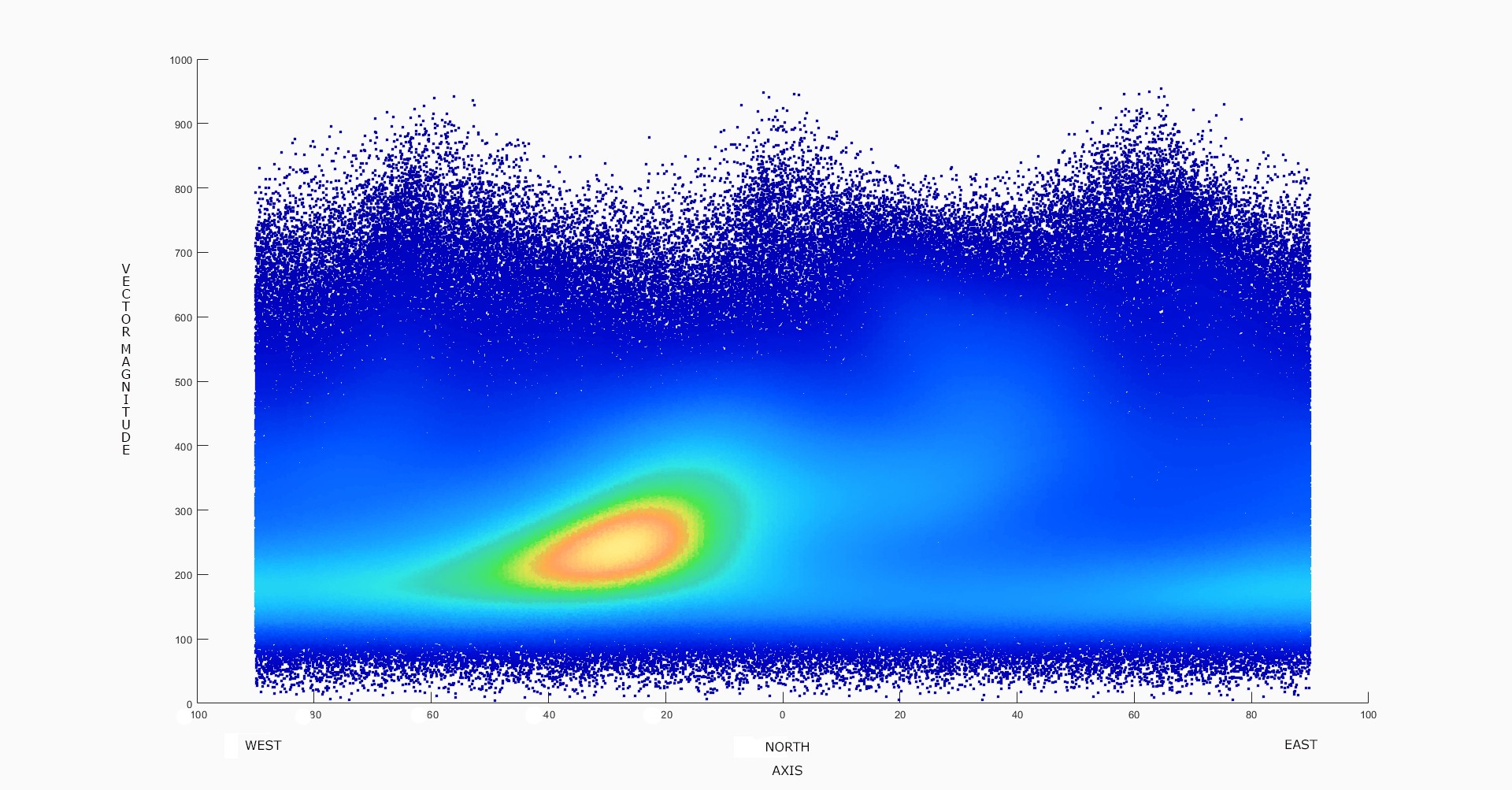
A density plot can give a better representation of the statistical distribution of the data points with respect to the compass axis. In this plot we are looking at axis of the surrounding noise vs. the vector magnitude of the noise at each time point. The data from 2 1/2 days from 12/24/20 to 12/26/2020 (967,873 time point rows by 13 data type columns) at the Yellowstone machine is represented here. The densityScatter function of Matlab assigns colors and contours to the data based on the density of the data points in the plot.
North/South is at zero degrees, East/West is at -90 and +90 degrees. The majority of the noise density (yellow and orange) is shown to be aligned in the general direction of the Yellowstone hot spot.
However, many of the higher magnitude points (axis from 30 degrees West to 60 degrees East) seem to be oriented toward the "Dillon" magma plume. Based on the work of others, this plume is believed to dive down through the crust on the East of our machine in a Northwesterly direction, from Yellowstone toward Dillon, Montana.
The possibility that the device is also detecting a component of low frequency noise from the turbulence of the Madison River itself has not been ruled out. The river runs roughly North/South and is located to the East of the machine. The river has been described as a "50 mile riffle" through the Madison Valley.

 Michael Doody
Discussions
Become a Hackaday.io Member
Create an account to leave a comment. Already have an account? Log In.