Short update this time, as life has intervened and I haven't had too much time to work on the project.
This week I updated the user interface concepts to be a bit more "modern" utilizing some google material design concepts and some cleaner lines. I like it and it should feel right at home with the devices of today.
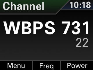
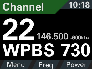
The Channel screen was updated to show more information as well as have better visibility on the rather small (2.2") screen.
Old:

New:

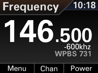
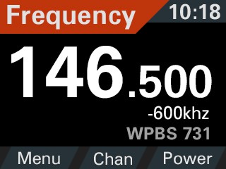
Same deal with the frequency mode. Better visibility and cleaner, sleeker look.
Old:
 New:
New:

That's it for this week! Stay tuned!
 Patrick McDonnell
Discussions
Become a Hackaday.io Member
Create an account to leave a comment. Already have an account? Log In.