 PK
PK
I wanted to add a logo with a tagline to VGATonic for some time now, a la @Blecky 's great logo for his SubPos indoor positioning system.
I wanted to make something which vaguely reminded me of the early 1990s and late 1980s. While stressing over how to create something in time to add to my video entries, I came across an excellent site for developing exactly this type of text logo: Textcraft. I highly suggest using them if you've got a similar project requirement!
Thank you to Textcraft for the logo generator; I feel this logo evokes just enough retro nostalgia to fit my product well. Also, thank you to my wife who turned me away from the bad looking color combinations, haha.
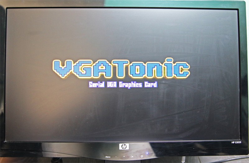
Here's what it looks like while displayed on VGATonic itself (640x480x8bpp, dithering):
Productization
One of the requirements for the fourth stage of the contest is a rendition of the 'productized' look and feel of the product:
"Post an artist’s rendition of the “productized” design/look and feel of the project"
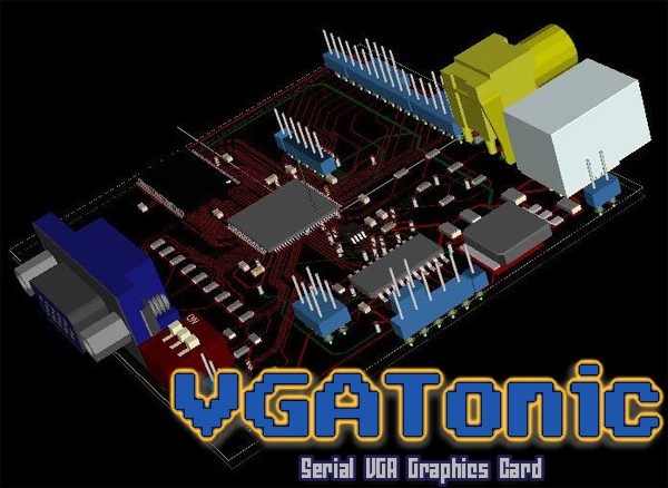
I have one 3D model (that's artistic, right?) from my initial KiCAD work last year which looks pretty good as, perhaps, a box cover/illustration (for a sufficiently technical audience):
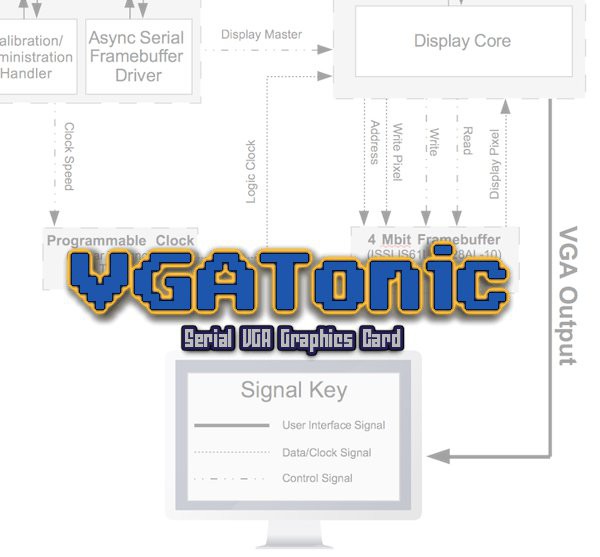
 For a move generalized audience, something cleaner and more web 3.0 like would probably play. Overlaying the logo on the design document comes out well:
As for the prototype video, I'll have it posted soon!
Discussions
Become a Hackaday.io Member
Create an account to leave a comment. Already have an account? Log In.
Ha thank you for the plug. The logo looks great!
Are you sure? yes | no
Yeah, it came out pretty well - I was afraid of what 8 bit mode would do to it, but it looks pretty good there too.
I was feeling pretty naked with my Courier New text every time I wrote VGATonic - this feels a little better, heh.
Are you sure? yes | no