 Alpha Charlie
New UI
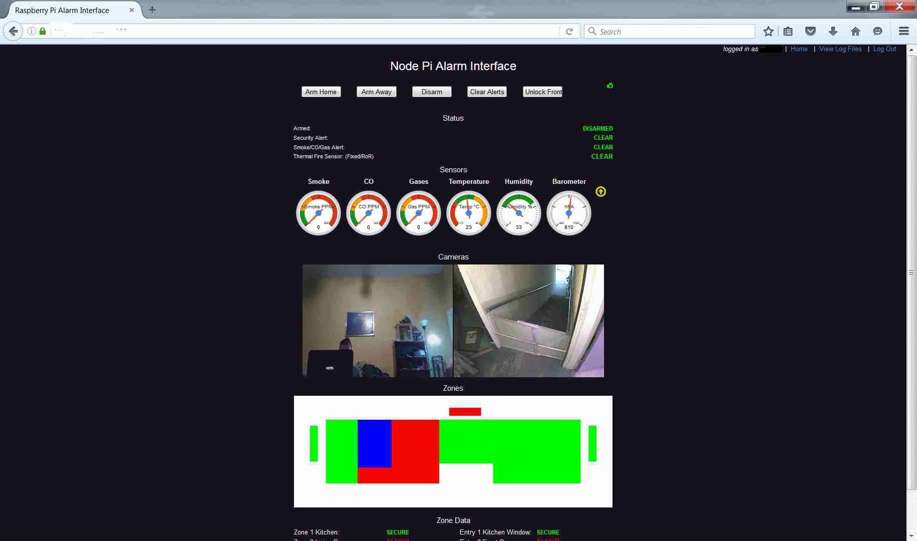
Above is a screenshot of the new UI design. It still uses Node.js but some things have been added. The text display of sensor data has been depricated in favor of gauge controls from Google Charts. This is part of a design trend in this application of using graphical data along with (or instead of) text as much as possible. The 6 gauges are labeled and color-coded and to the right of the Barometer, there is an icon which indicates whether the pressure is rising, falling or stable.
Discussions
Become a Hackaday.io Member
Create an account to leave a comment. Already have an account? Log In.