Everybody knows those insanely beautiful domotica projects where by interacting with a touchscreen in the wall or via a tablet (PADD), you can control lights, entertainment, security or just about anything else you want, all with interfaces that are entirely LCARS based. It's just like future we saw in the 90's when we watched TNG.
These Okudagrams have always fascinated me as both an esthetically interesting design and as a potential functional interface paradigm. Having dealt with interface design for over a decade now, I do realize the "problems" associated with functional LCARS interfaces, but the geek kid in me just can't let it go! I still wonder about the possible implementations and mechanics of such an interface system and I think this is the best place to share my foolish endeavor and possibly expand on it.
What is it?
In the real world an Okudagram is a meaningless fictitious control-surface designed with the sole purpose of looking futuristic, at which it succeeds quite well. the bridge of the TNG Enterprise still does not look very dated.
In the ST universe, the LCARS interface is an adaptive interface technology that anticipates and changes it's layout and functionality depending on the job at hand. If you need to boil an egg on the Enterprise (assuming the replicators were off-line), the interface would adapt from a refrigerator inventory utility to some egg recipe and timer functionality with a minimum of user-input.
An interface that could provide general and specific functionality by adapting preemptively is probably powered by some very advanced AI, the type of which us pre-WWIII humans have not even dreamed of.
So in fiction, the Okudagram is the result of a highly advanced system that constantly is designing it's own interface
The Okudagram compensator
Another problem with the interface as it is presented in Star Trek, is the high abstraction layer which is never explained. Like the transporter system depends on a Heisenberg compensator to work, the operation and interpretation manual for the LCARS system is conveniently missing. If we only knew what those seemingly random numbers on the buttons actually mean and do, we'd be able to halt-pause some of the TNG episodes in engineering and figure out how warp-drives, replicators and transporters actually work.

It was a very smart move by Michael Okuda, obfuscating the data into something arbitrary. Would it have read something about gravitons or the phlogiston, the futuristic element would have easily been lost after reality caught up with it.
Okudagrams in the real world
The Okudagram may not be all that functional and logical for real world applications and the suggested functionality could perhaps be entirely impossible. This, of course, does not mean I don't want an LCARS interface to interact with my house/car/server! Surely any Trekker/Trekkie feels the same way.
How to go about designing your own Okudagram panel for a project?
Well, however one wishes I'd imagine. Most projects I have seen online have one or several static LCARS pages that are mostly static images, probably designed in Photoshop. Others use some vector graphics or HTML implementation, sometimes animating the screen with roll overs and such.
What I found was that whatever the approach, it is quite hard to build an LCARS interface that is both pretty and somewhat usable for any given task.
If there is any hope of even being able to suggest an OkudA'esque functional type of interface, there has to be some form of GUI guideline that actually focuses on function instead of form.
Editor
In order to build, at least, consistent interfaces I made an editor that outputs the Okudagram as HTML. This makes alterations easy as well as animations and added functionality via Javascript.
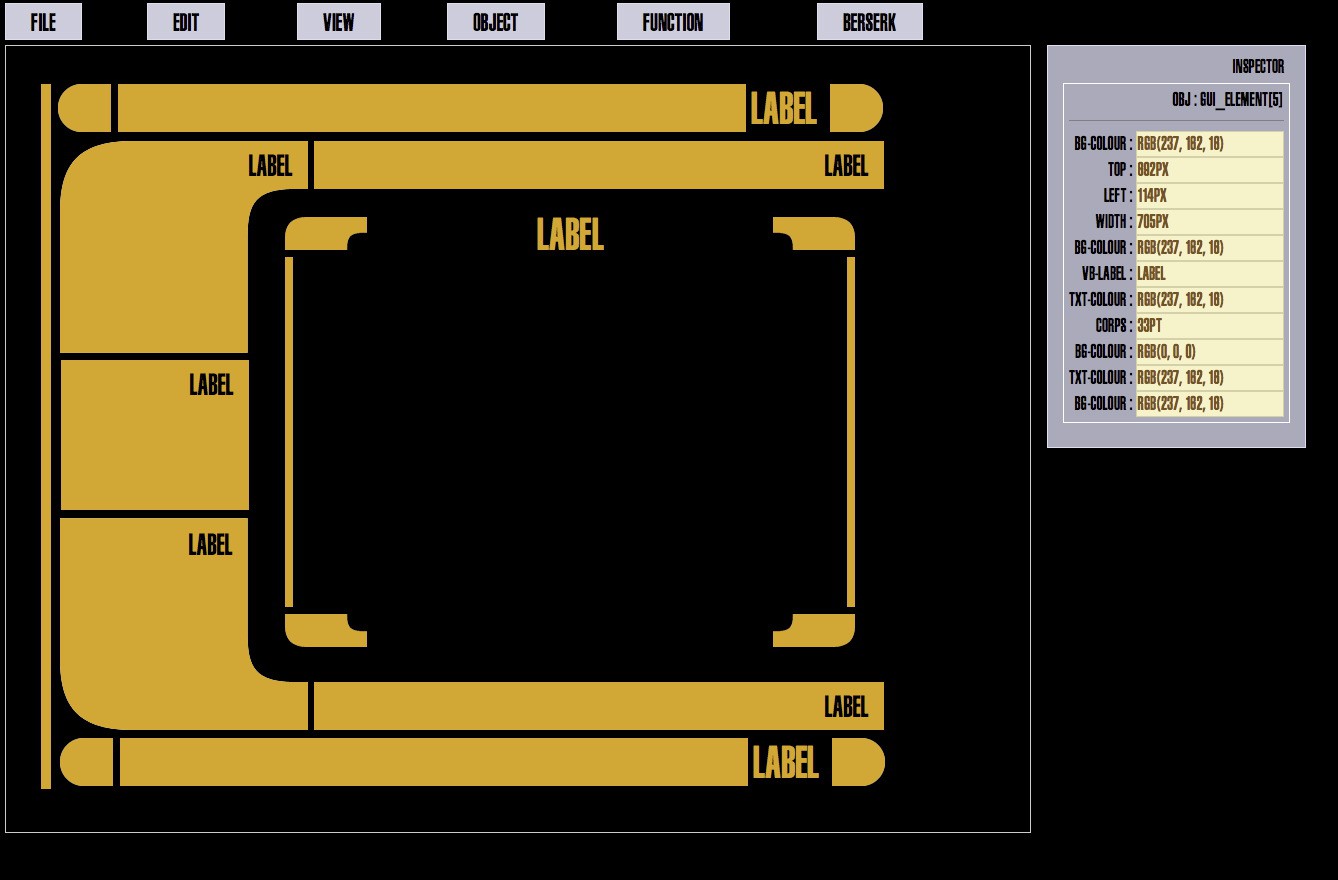
With the basic style elements, composite objects are build which can perhaps contain text, images, video or act as buttons or dials. Standerized panels and composite objects make it possible to morph between panels, suggesting this adaptive...
Read more » Timescale




 Owen Trueblood
 Casual Cyborg
 ehughes
Ok, I caught up with @ostropest and we were very easily able to work things out. It appears that he was trying to translate on his own, without a machine translation service, and that wasn't going too well for him ;)
What he was suggesting was that the interface colors be determined by the task at hand... for example, a calendaring sub-application might have its controls (etc) rendered in red, where a calculator might be in blue, and so on.
He does point out that this can make things a bit hard to read, and I agree. I also suspect that this would be a very non-canon use of color...