 Radu Motisan
It is still work in progress, but last time I was busy building a new dashboard for the CITY units, one that uses the existing API to iterate the available sensor streams, than plot them in a visually appealing form.
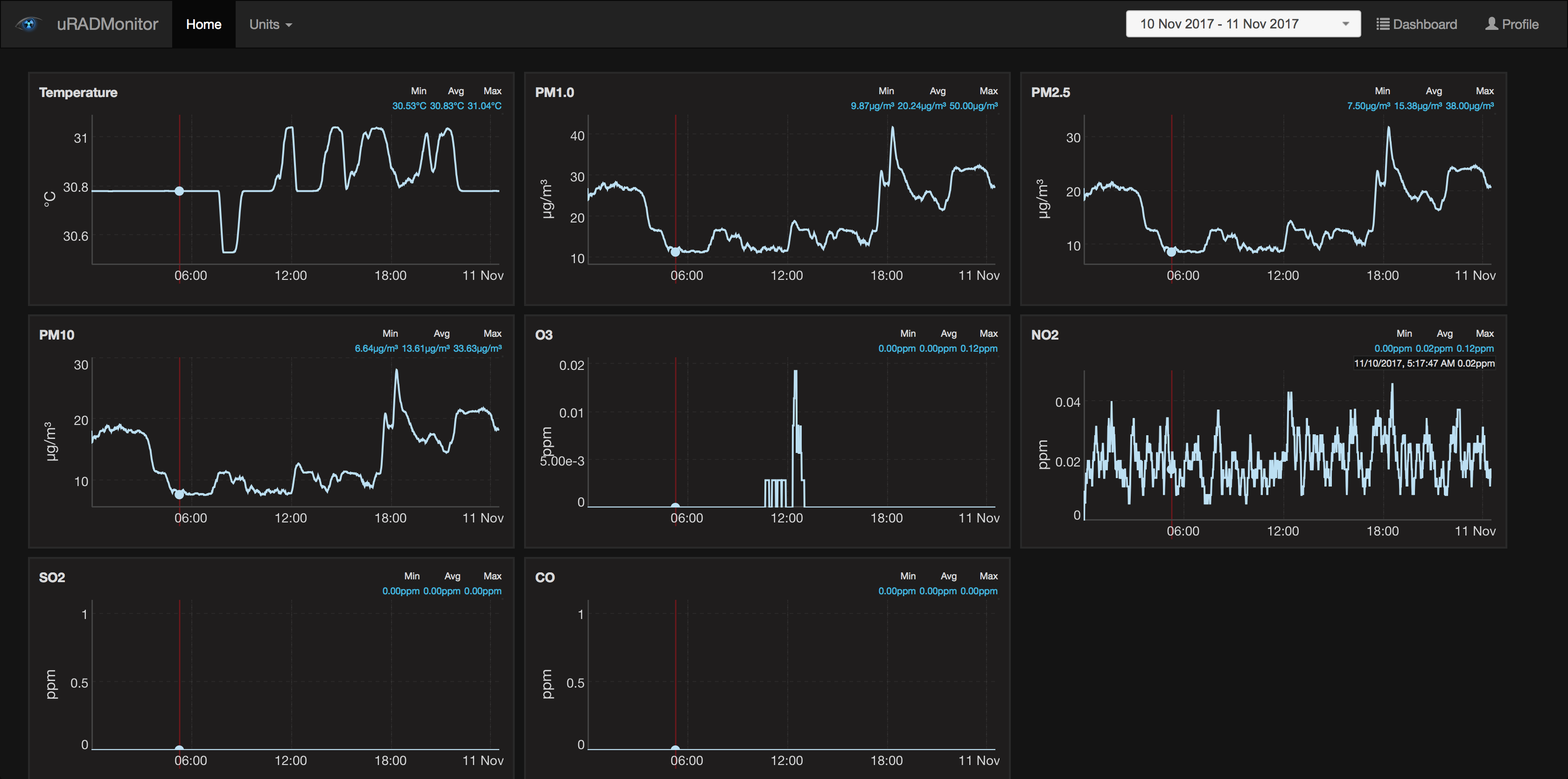
This dashboard shows all gases, as measured by the CITY hardware. The charts are dynamic and synchronised: You can zoom one and the rest will follow, to make it easy to check the data.
I also need to add some horizontal bars to indicate the legal limits for air quality. This way we'll understand the numbers easier.
More on www.uradmonitor.com/products
Discussions
Become a Hackaday.io Member
Create an account to leave a comment. Already have an account? Log In.