 Michel Kuenemann
The power/energy curve of yesterday December, 12th 2016 is the following:
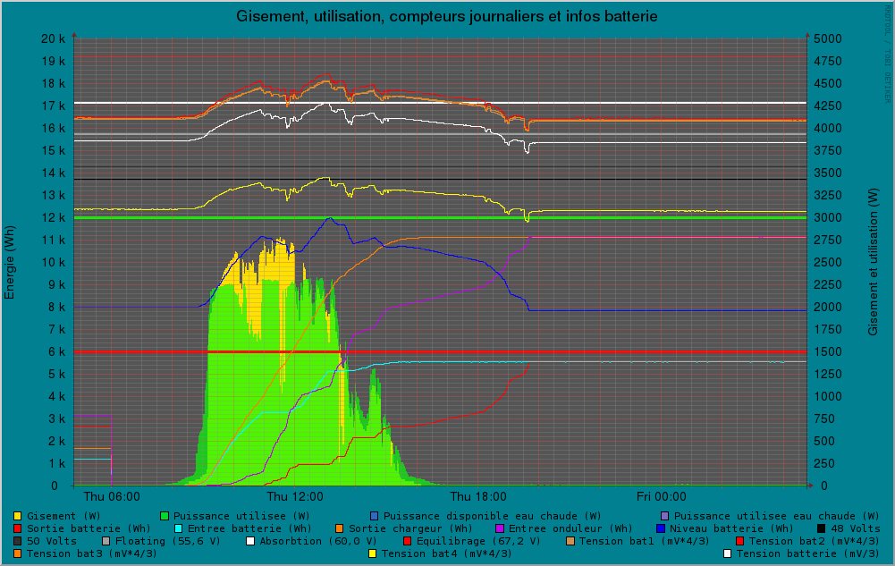
First thing: one can see that the most part of the available energy (yellow area) has been used (green area) by the PV system. That's very positive. The flat top of the green area is due to the charging current set to 40A. I will change this parameter to 60 A today (maximum of the charger is 70 A).
The battery state of charge (blue curve) has changed direction serveral times during the day, indicating a heavy and rapidly changing power usage.
The interesting curves are the following ones (all of them located at the bottom of the chart, below the thick green line ):
- Orange: energy delivered by the charger
- Magenta (pink): energy absorbed by the inverter
- Cyan (green): energy absorbed by the battery
- Red: energy delivered by the battery
At 8 AM, the state of charge (blue curve) was at 8 kWh (scale on the left)
The 4 energy curves were at 0 kWh.
At 8 PM, the state of charge (blue curve) was again at 8 kWh (scale on the left)
The Orange curve and the Magenta curve are both at 11.5 kWh approximately. That means that all the power delivered by the solar panels has finaly been used by the house.
The Cyan curve and the Red curve are also superposed at about 5.5 kWh. That means that from 8 AM to 8 PM, the battery managed to absorbe and deliver again the same amount of energy.
Among the 11.5 kWh delivered by the sun:
- 11.5 - 5.5 = 6. kWh were directly used by the inverter (approximately)
- 5.5 - 4 = 1.5 kWh were stored and delivered again by the battery during day time (approximately)
- 4 kWh were deliverd by the battery after sunset
The fact that the in/out curves are so nicely superposed at the end of the day shows the astonishing efficiency of the lithium technology. I never got this kind of curve whith the lead-acid batteries.
Discussions
Become a Hackaday.io Member
Create an account to leave a comment. Already have an account? Log In.