 OXullo Intersecans
Finding "the" way to user interfaces is always a daunting challenge to me.
Even more challenging, when the user is a kid.
After observing how glayer has been used in the last days, I'd spend some words about choices and outcomes.
I can't deny that a great deal of inspiration to the interface came by Tonies and Hörbert, two awesome music players for kids.
Tonies offer an intriguing interface based on an accelerometer (slap the sides to skip next / previous track or tilt sideways to fast forward / rewind) and two mechanical buttons for volume control behind their iconic ears (more info in this teardown). What renders tonies even more intriguing is the music selection process, that takes place with a token (a figurine with a builtin NFC tag), that is to be placed on a landing surface.
Choosing songs using physical tokens reminded me of what I was used to do, several years ago, when browsing for dusty tapes or vinyls. The covers were powerful emotional cues and any marking or imperfection couldn't but help to boost a feeling of ownership. Such perspective is long lost due to the now widely adopted subscription models of modern music providers.
"Tokenizing" a collection has two functions, IMO: first of all it restricts the search context, making easier to follow a mood path. We're human beings, challenged by the unbound amount of information we have constant access to. Sometimes less is more, availability doesn't necessarily imply happiness. Secondly, a token can be an open canvas that allows and might encourage customization, helping out in creating that lost sense of ownership mentioned before.
In respect to Tonies, I wanted the token to be cheap and blank. Obviously Tonies capitalize on the token themselves, while I didn't have to. The initial idea was to allow kid and mommy to personalize the token by painting them. In practice it didn't happen because the kid bound pretty quickly to the temporary icons I sketched over a shard of masking tape glued to the badges, but I still think it's a nice opportunity.
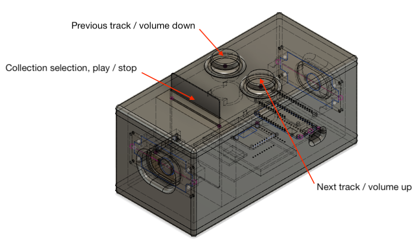
Regarding the buttons, I've always liked arcade builds and the ones ended up in Glayer are really pleasant to be pushed. They were also pretty functional to the shape of the player itself, being the blinking eyes of the greedy cat. I'm not sure if it's an issue of being old-fashioned, but there's nothing as simple and effective as the haptic feedback of a clicky button to me.
I wondered if a single button would had sufficed, relinquishing to the "back" control while complicating the volume selection a bit more than necessary. I personally like minimalism and a "one button ops" has always been a sort of motto of mine, but I've noticed the "back" button being used several times, or enough to justify its presence.
Discussions
Become a Hackaday.io Member
Create an account to leave a comment. Already have an account? Log In.
Hey @Tliliyou you can find the source code here: https://github.com/oxullo/glayer
Are you sure? yes | no
Thank you sir
Are you sure? yes | no
Bonjour monsieur
Est ce qu'il possible de donner le code source de l'un de ces deux applications ?
et merci d'avance
Are you sure? yes | no