 Lex Kravitz
-
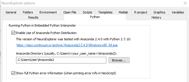
1Set up Neuroexplorer for use with Python
Go to Python tab in the Neuroexplorer options and enable Python. This script was tested with Anaconda 2.4.0.
-
2Place "pca_color_motion.py" in your Neuroexplorer "Scripts" directory
You can download this script plus a sample file in the files area.
-
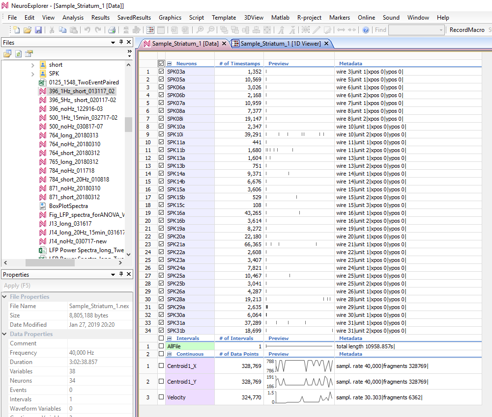
3Open a .nex file in Neuroexplorer.
The sample file "Sample_Striatum 1" in the files area is a good file to start with. Any file with spiking will work, and larger numbers of spiking channels (>10) will likely produce better results. The sample file has 34 units, as well as 3 continuous variables, Centroid1_X, Centroid1_Y, and Velocity:
-
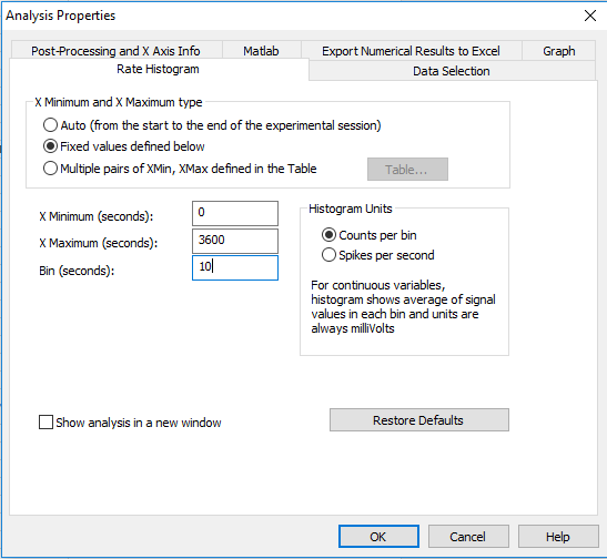
4Run the "Rate Histogram" and save a template
This analysis will determine how much data the PCA visualization includes, and what bin-width to visualize with. For example, to visualize one hour of data, you would set the X-minimum to 0, the X-maximum to 3600, and the bin width to 10:
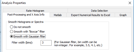
It may be helpful to smooth with a Gaussian filter (in the "Post-Processing" tab):
Run this analysis, and then click Template>Save As a New Template. Give it a name, you'll need to enter this name in the script in the next steps. There is a sample template called "PCA" in the files area.
-
5Open "PCA_color_motion.py" in the Neuroexplorer script editor
-
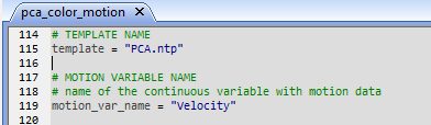
6Under "PARAMETERS TO MODIFY", you can change some parameters
The main ones you need to change are the template and the continuous variable you want to visualize in the PCA plot:
The template name will be the template you created in Step 3. If you want to change the length of visualization or bin width repeat Step 3.
motion_var_name requires a continuous variable. We made this script to compare neural state to movement, so in the sample file we use a variable "Velocity", which is the speed of the mouse.
-
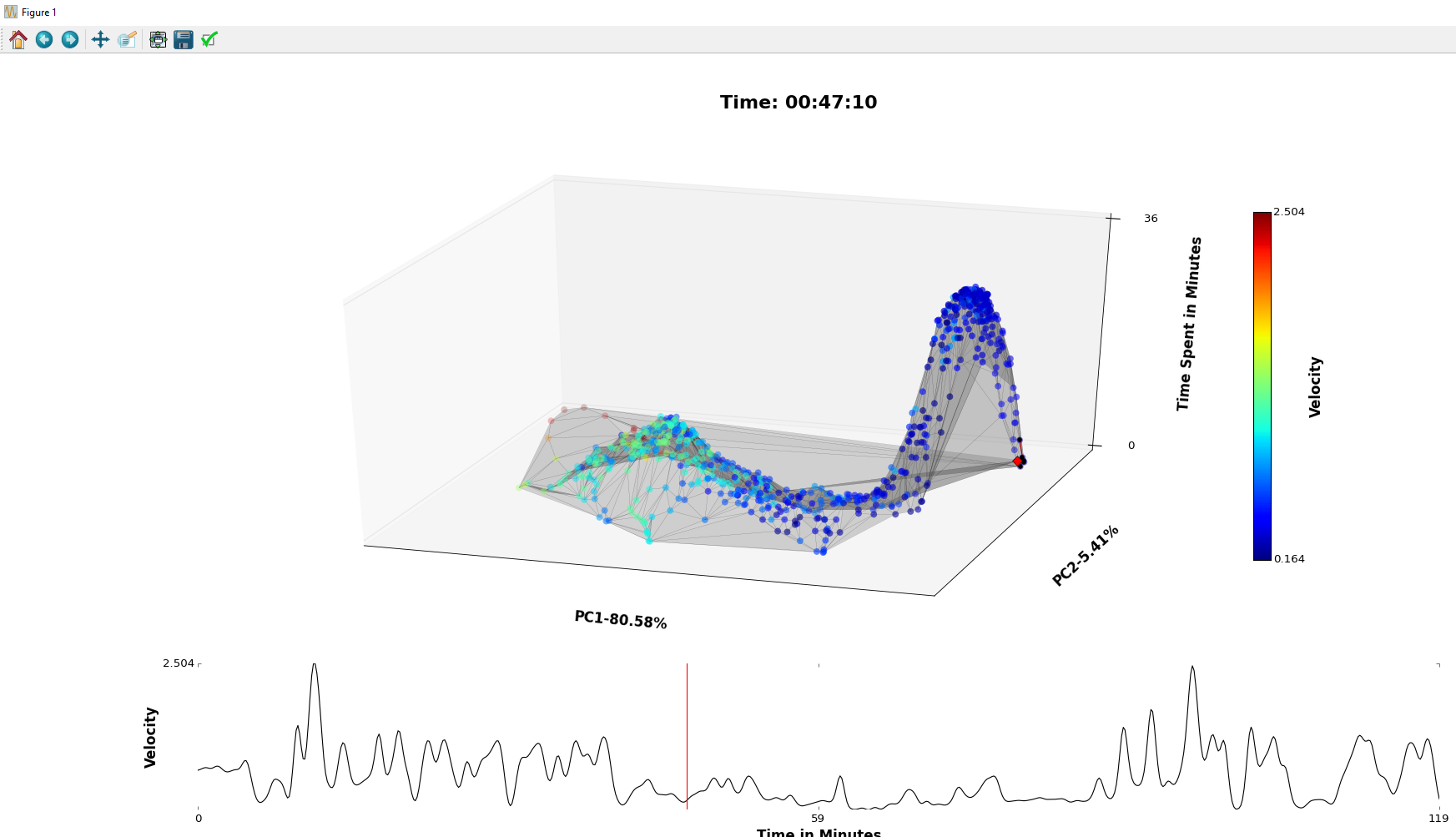
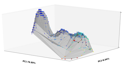
7Run the script!
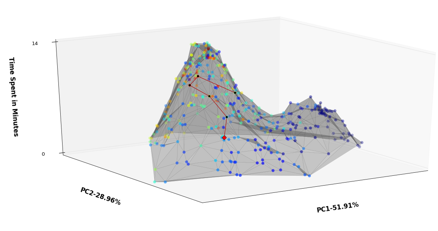
The script may take a minute or two to start, after which it will open a Figure window that displays the PCA landscape plot on the top, and the continuous variable (in this case velocity) below. It also color codes the continuous variable on the landscape plot. In this case, there are two main peaks in the landscape plot, and they appear to be associated with high or low velocities.
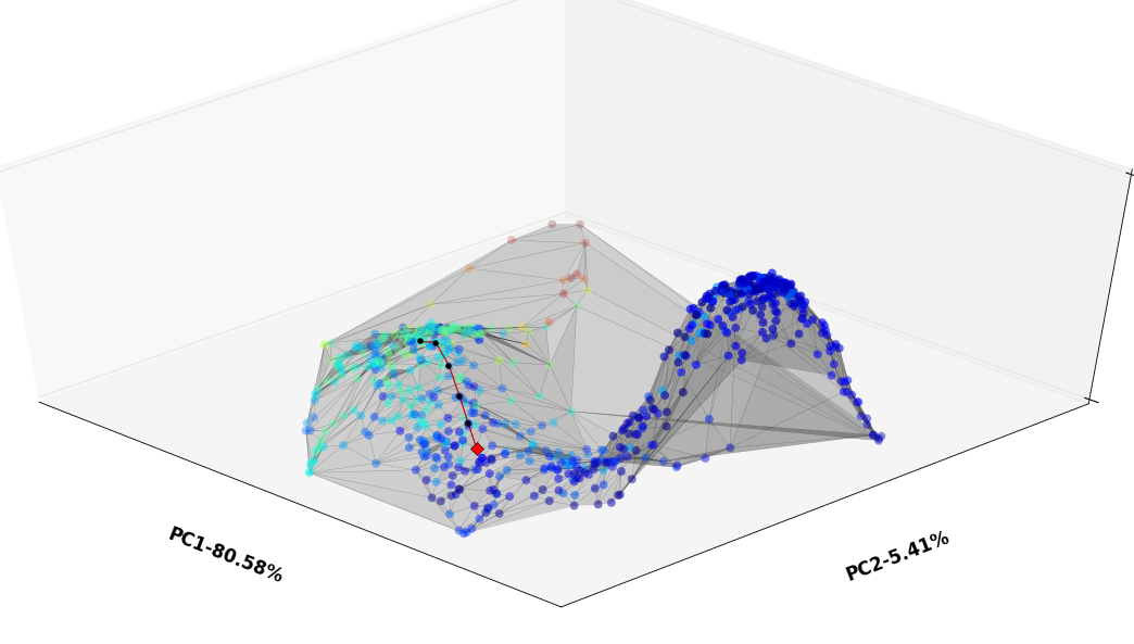
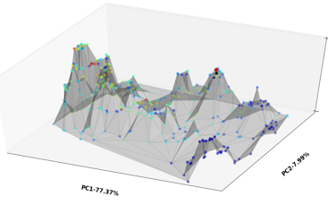
The figure is interactive, and you can scroll around for different views of the landscape:
-
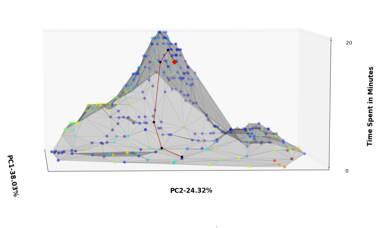
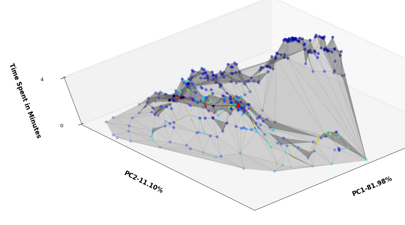
8Gallery
In other recording files, we have seen interesting landscapes, which may have implications for neural function.
Neural Landscapes
Visualize the state of neural populations across time
Discussions
Become a Hackaday.io Member
Create an account to leave a comment. Already have an account? Log In.