-
Editing your picture with XNview (quick, easy, free)
02/10/2019 at 15:00 • 0 commentsIntroduction
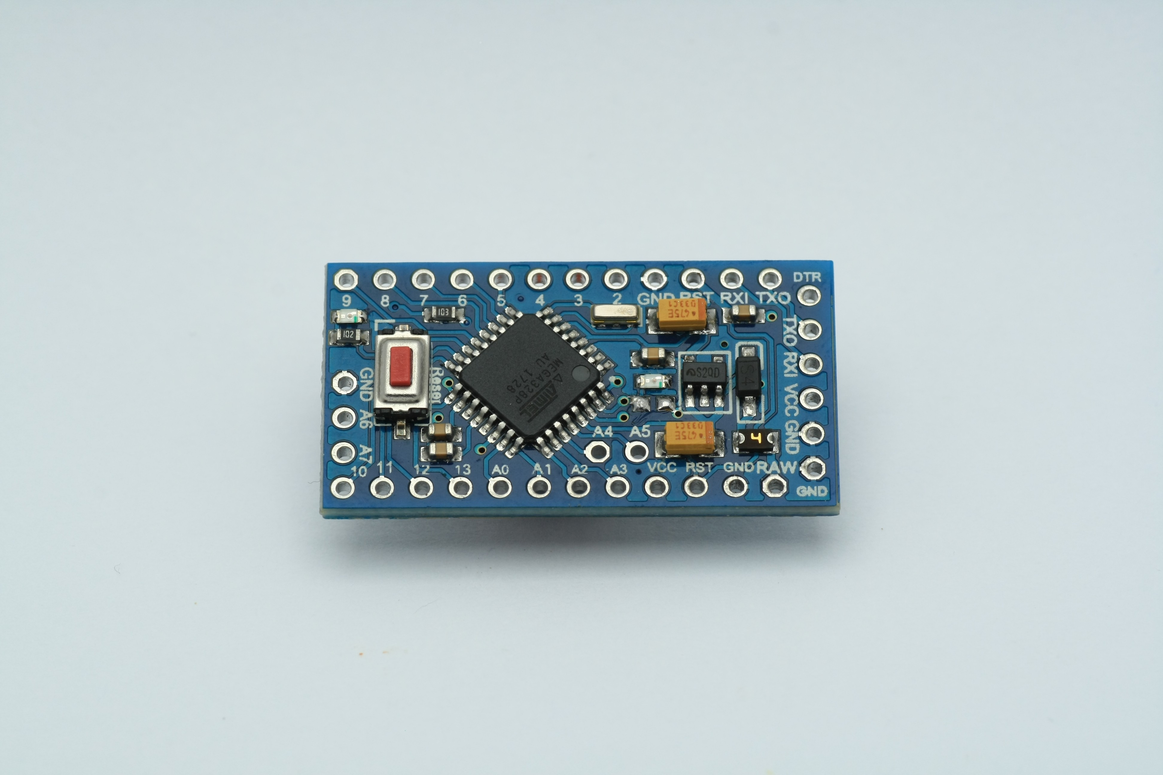
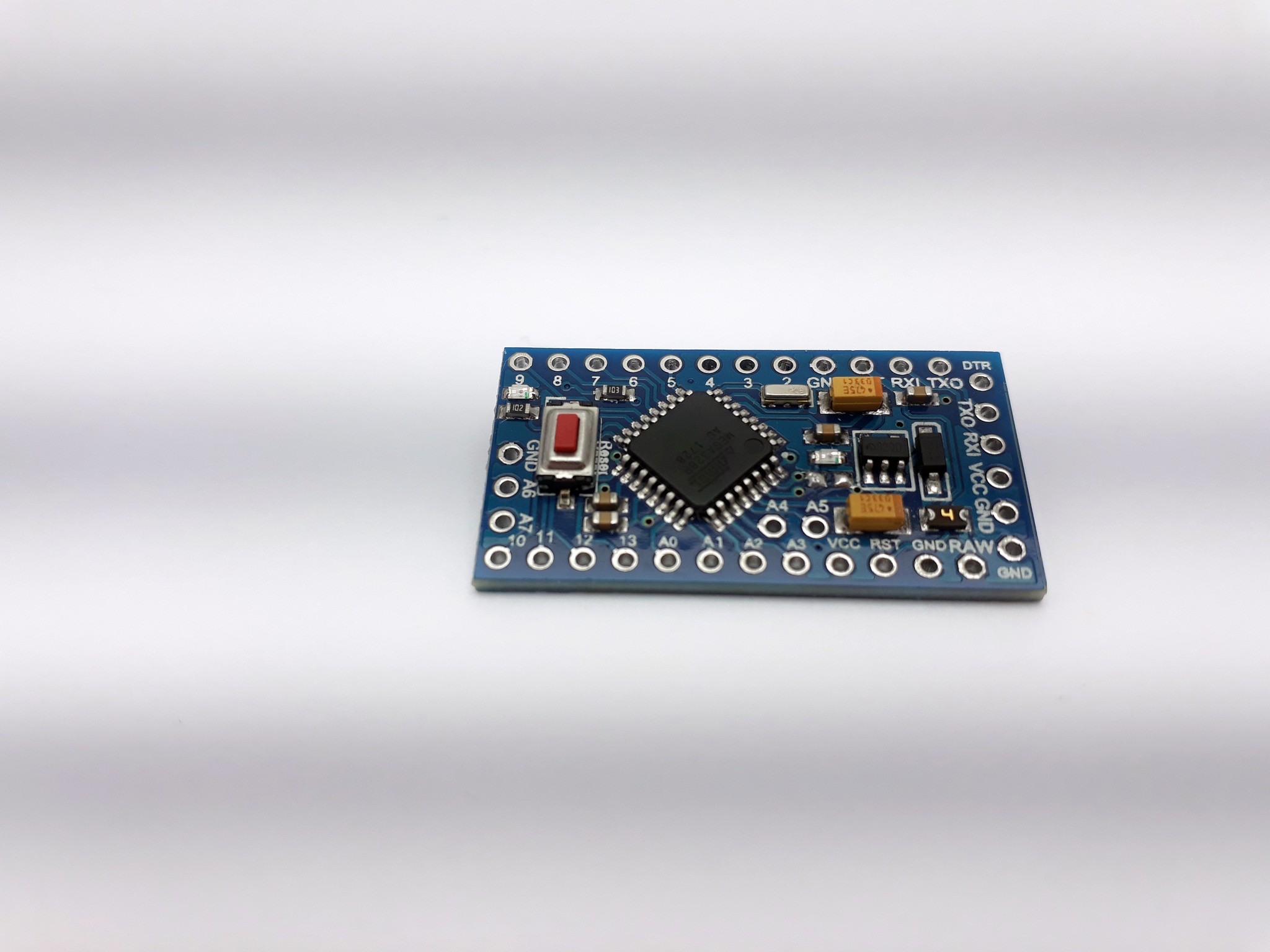
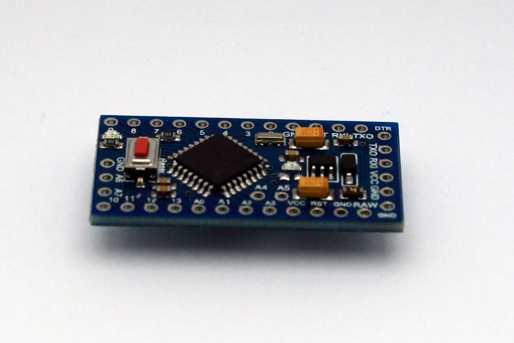
Here's our picture, uncompressed, out of cam:
F11, shutter speed 1/40s, ISO100, 90mm I decided to change the angle yet another few degrees to show more of the board.
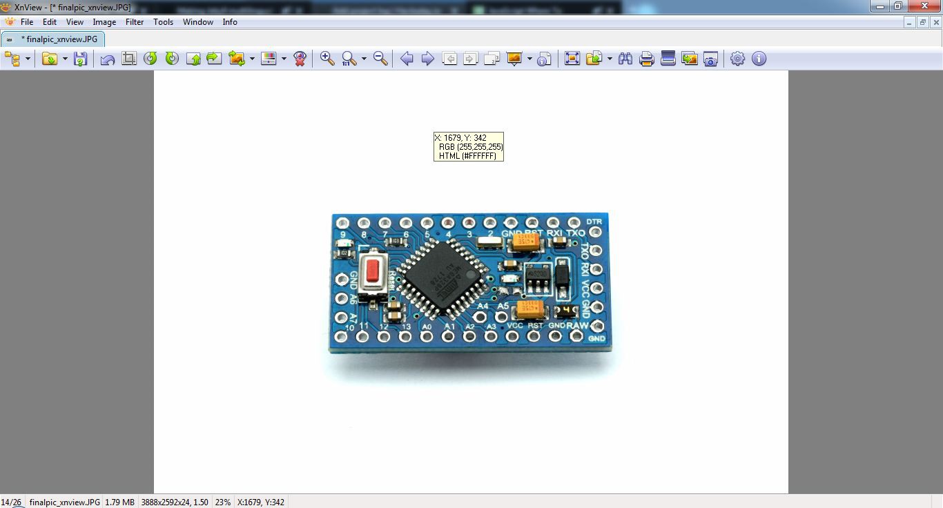
Our goal is to have the surrounding space pure white (RGB 255 255 255). In the above picture it is not yet white enough:
Option 1 - using the venerable XNview
XNview has a few options to get what we want:
![]()
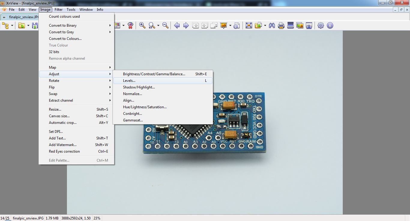
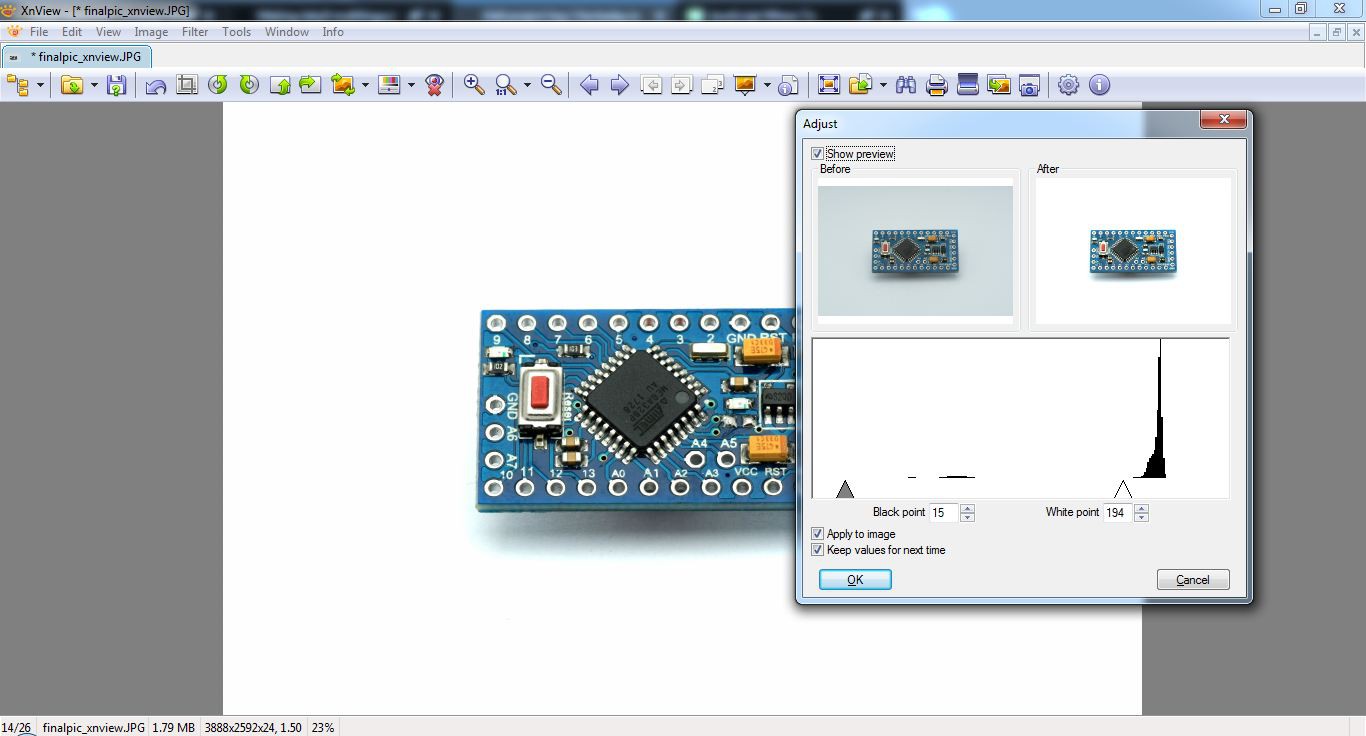
image - adjust - levels (or just press L) You remember the screen popping up? It's our histogram from earlier on the cams screen! We move the right triangle to a position left of the peak until the background gets all white:
![]()
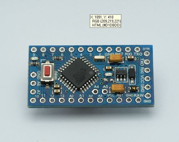
Using the color-picker (CTRL+SHIFT+I) we can make sure all the outer stuff is pure white:
![]()
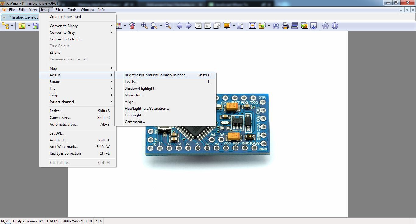
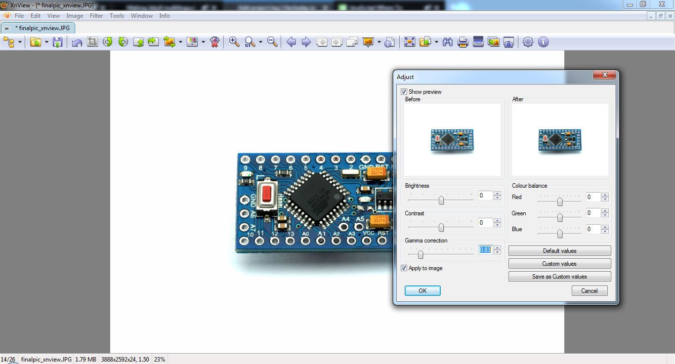
That's basically it. Now, it could happen that your object itself is too bright or dark now. You can adjust it here:
![]()
Use the Gamma slider to adjust to your needs. I tuned it down a bit to get more contrast:
![]()
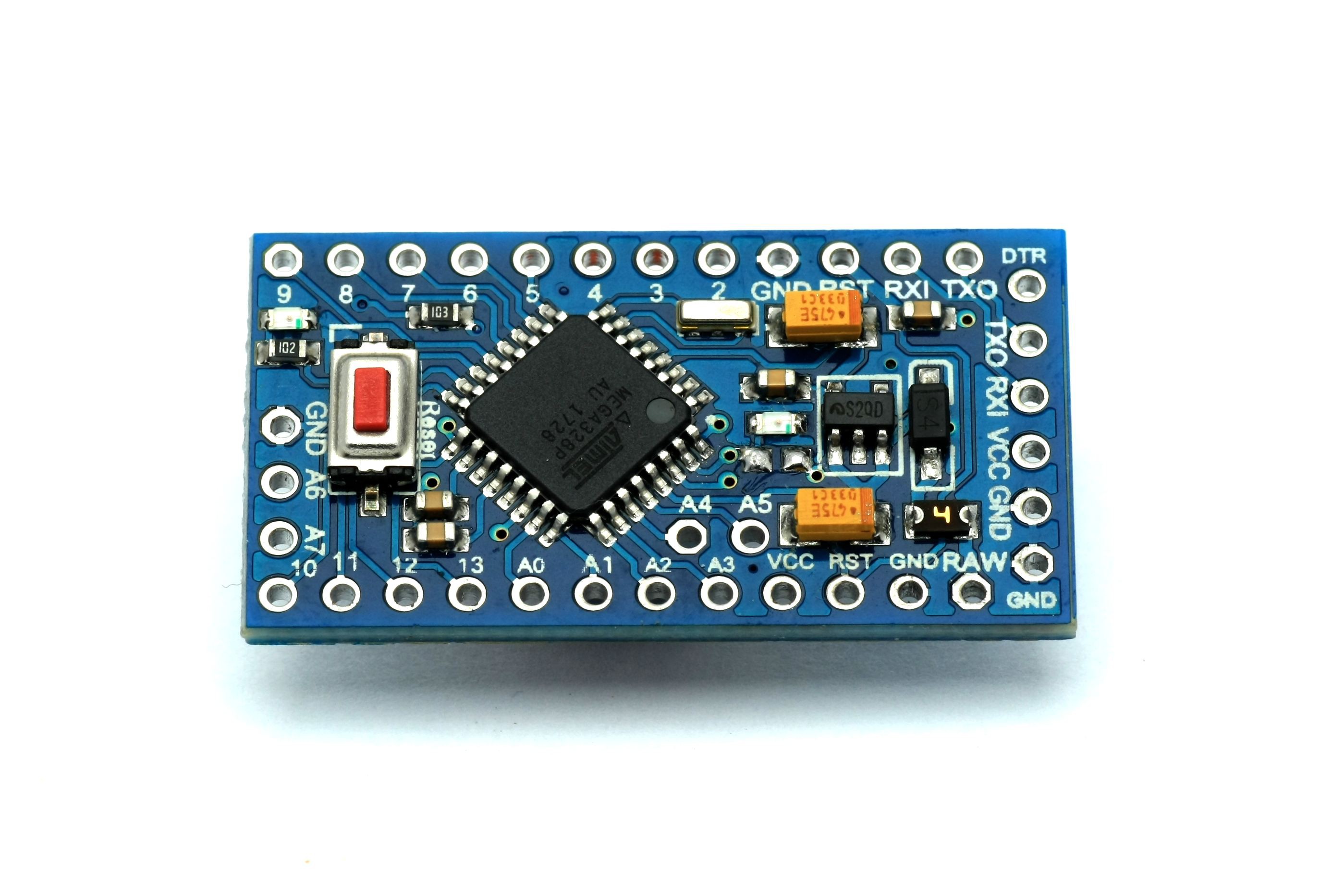
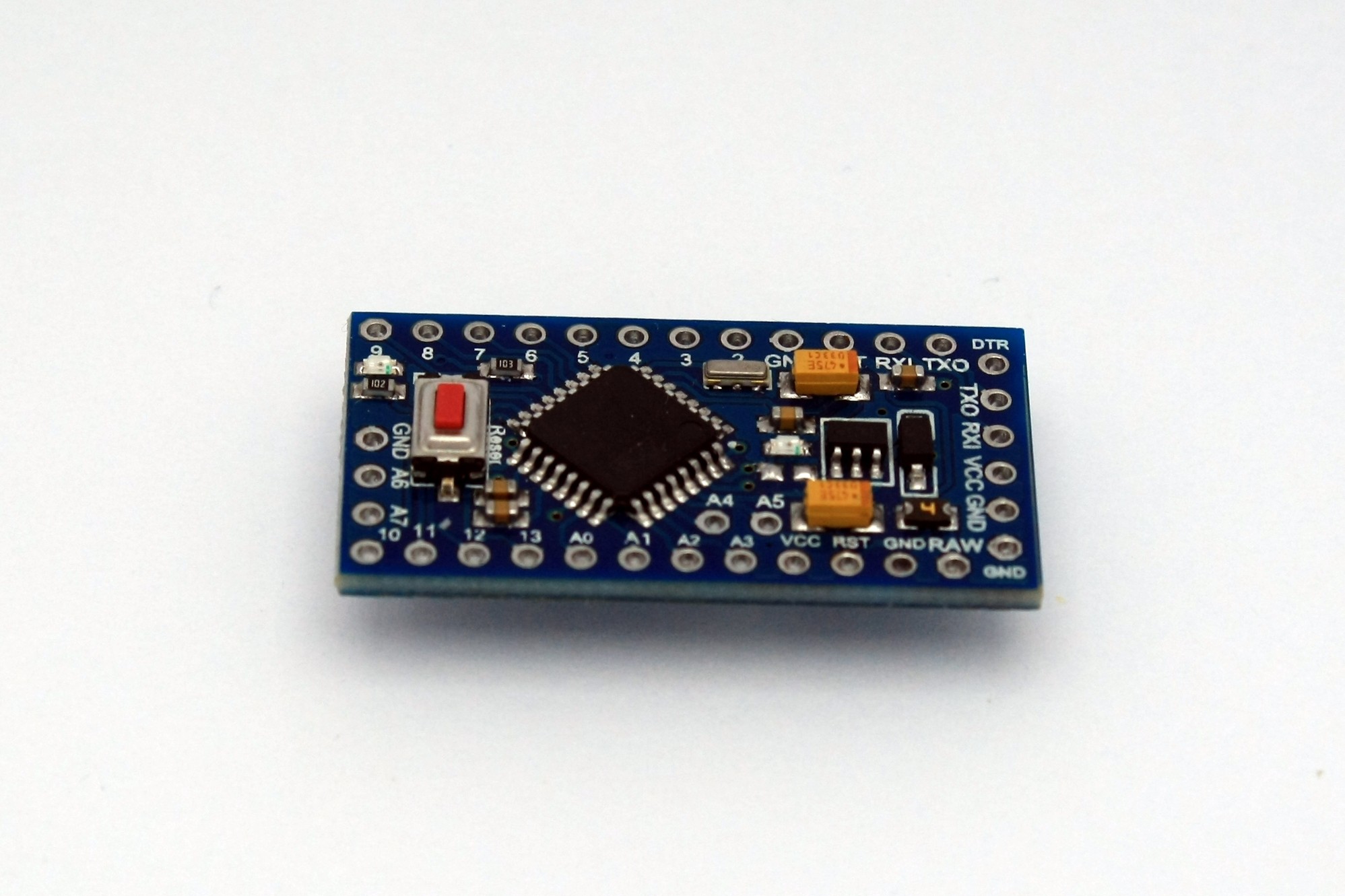
The final picture
So, after doing all that in a few easy steps, the result looks like this:
Easy enough, right?
-
Camera settings and taking the picture!
02/10/2019 at 11:42 • 0 commentsIntroduction
Let me say a few important things here:
- your camera doesn't matter (to an extent, see below for details)
- the software you need is free (famous Photoshop not needed!)
- correcting your out-of-cam pics is only a matter of a few seconds per picture
- only the absolute basics here! There's sooo much more to tell which is not part of this small mini-series.
Your camera
Cameras you could use include: your phone*, your old DSLR sitting in your shelf, all the recent point 'n' shooters, ...
Manual mode is absolute king for what we want to do here, but automatic modes work in most cases too.
It's nice to have the following features / add-ons though:
- histogram (info on your cameras screen)
- live-view
- tripod
*Some digital cameras have problems with horizontal banding, which looks like this (image taken with my cheap phone camera):
![]()
See the link in the above to see what causes it and how to avoid it!
Camera settings
Mode
We'll go with manual here. This means the automatic brightness of your cam is off and you can choose aperture and exposure time manually.
Don't be scared of this, your cam helps you by showing important info before/while taking pictures!
ISO
Even with an aperture of 11 and up (remember: the bigger the aperture number, the less light gets to the sensor) ISO 100 to 400 will always be enough. ISO 100 to 200 most of the time, really.
Refresher: ISO is the light sensitivity of your "film" aka sensor. The higher the number the brighter the picture at a given aperture with the downside of more noise in the picture (because of internal amplification and the sensor heating up).
Aperture
Just a few quick hints here: The smaller the number the less definition you get in depth in your picture.
As we photograph at an angle and the PCB laying flat we need the whole board to look crisp in our picture. I use F8 to F18 most of the time. It varies...
Exposure metering
Your cam uses sensors in different positions of the sensor to tell the brightness. It can measure in the middle, calculate an average of the whole picture etc...
Lens and focal distance
I use a Tamron 90mm F1:2.8 lens for my pictures most of the time. For this series I changed to the standard 18-55mm F3.5 - F5.6 (which is quite the standard for DSLRs which come with an lens in the box).
There's lots more to know here but it isn't too important for this guide.
Taking the picture
Exposure times are quite small (aka short) when using such an bright light, so you could take pictures by hand. My rule of thumb is: When exposure time is at least double the focal length, the picture will be quite crisp (without automatic stabilization that is).
Example: Your lens is set to 55mm, your shutter is 1/100 second. You can be quite sure to make a good picture. Of course there's a bottom line here. 1/25 or 1/50s exposure time is quite long which could get you a slightly blurred photo by hand...
It's just hard to reproduce some exact angle/position with different camera settings. So I use an tripod most of the time.
![]()
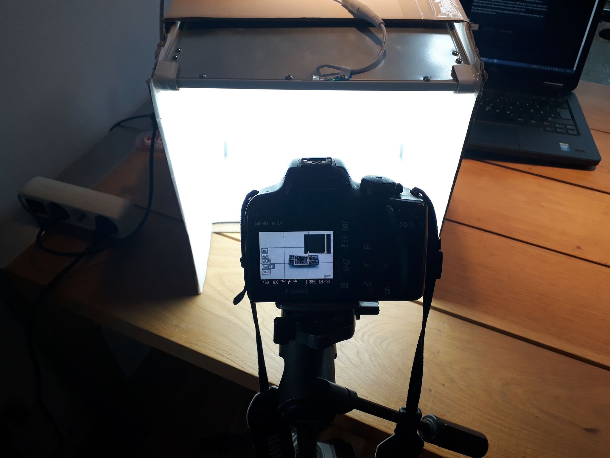
full setup ![]()
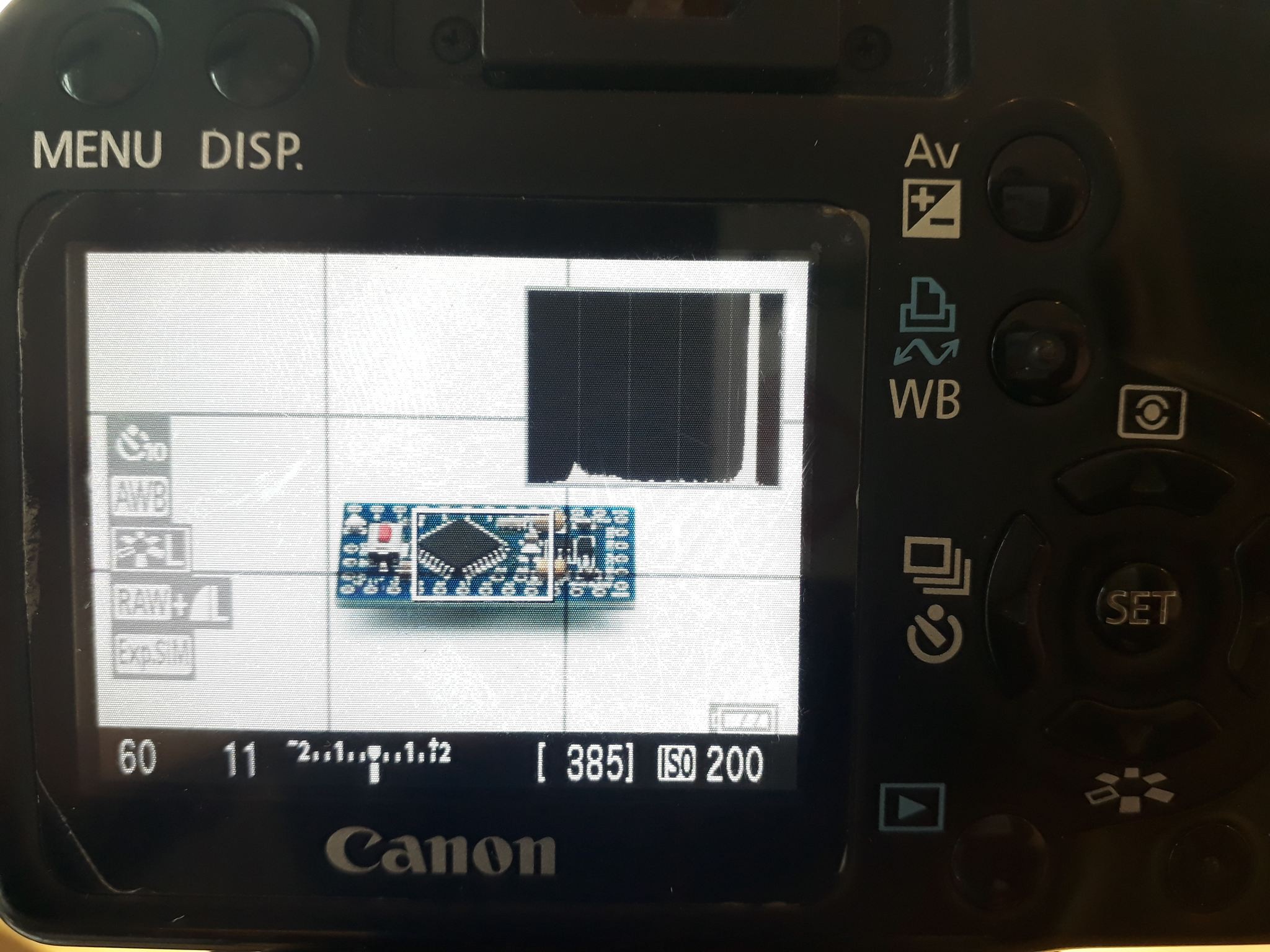
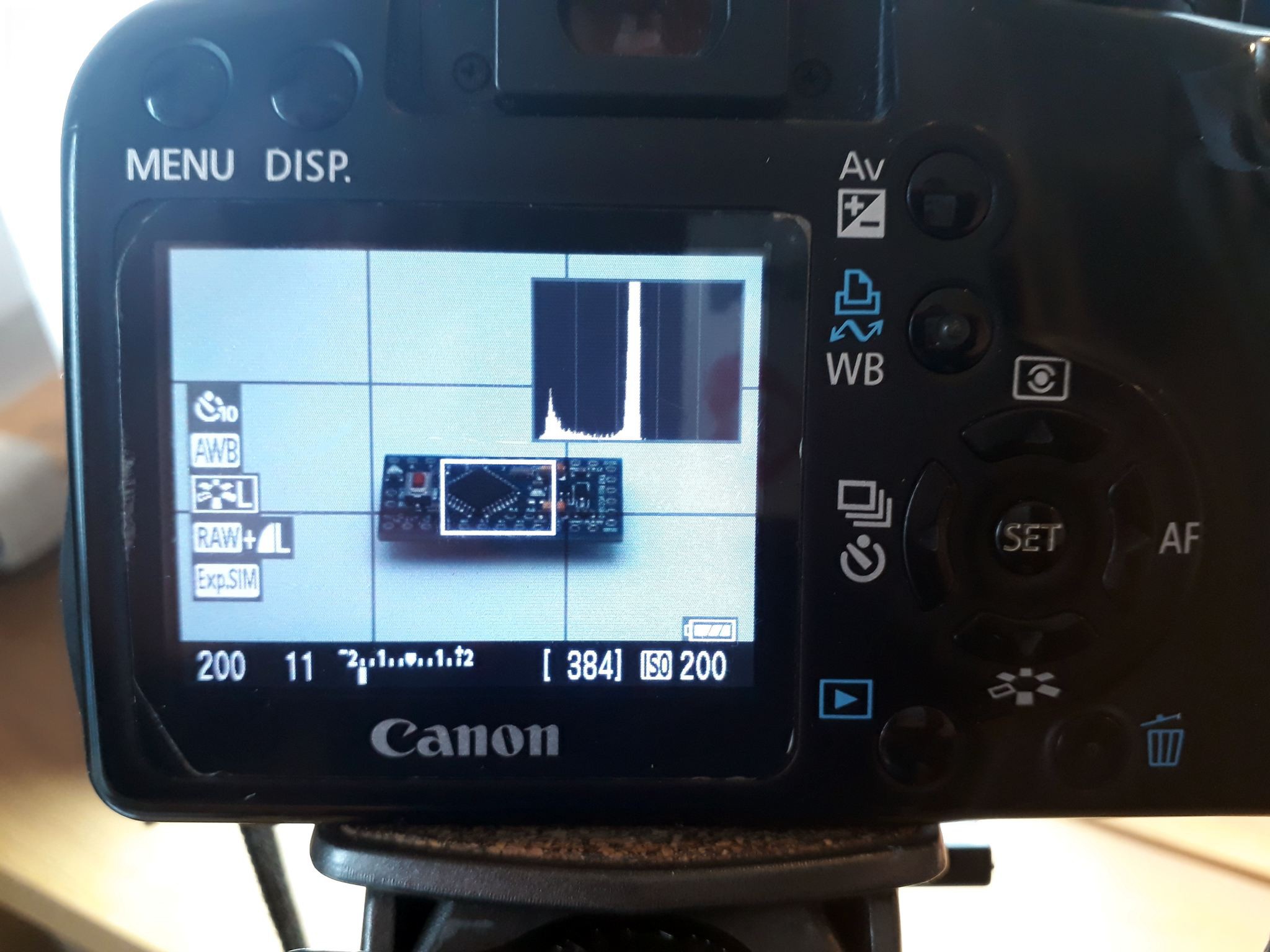
aperture F11, shutter speed = 1/60s Here you see the live view of the picture which has a balanced lighting (the mark in the bottom [-2 ... +2] bar is balanced). The histogram in the top right corner has a massive peak on the right side. It shows us that there is a lot of brightness in the picture. Important here is: there has to be black/blank space right of the peak! Here we see why:
![]()
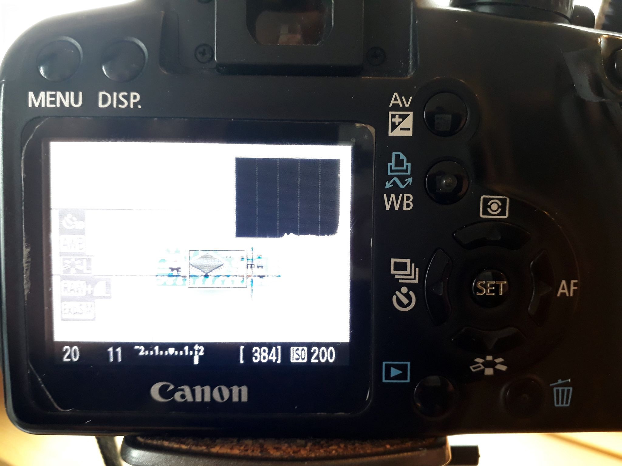
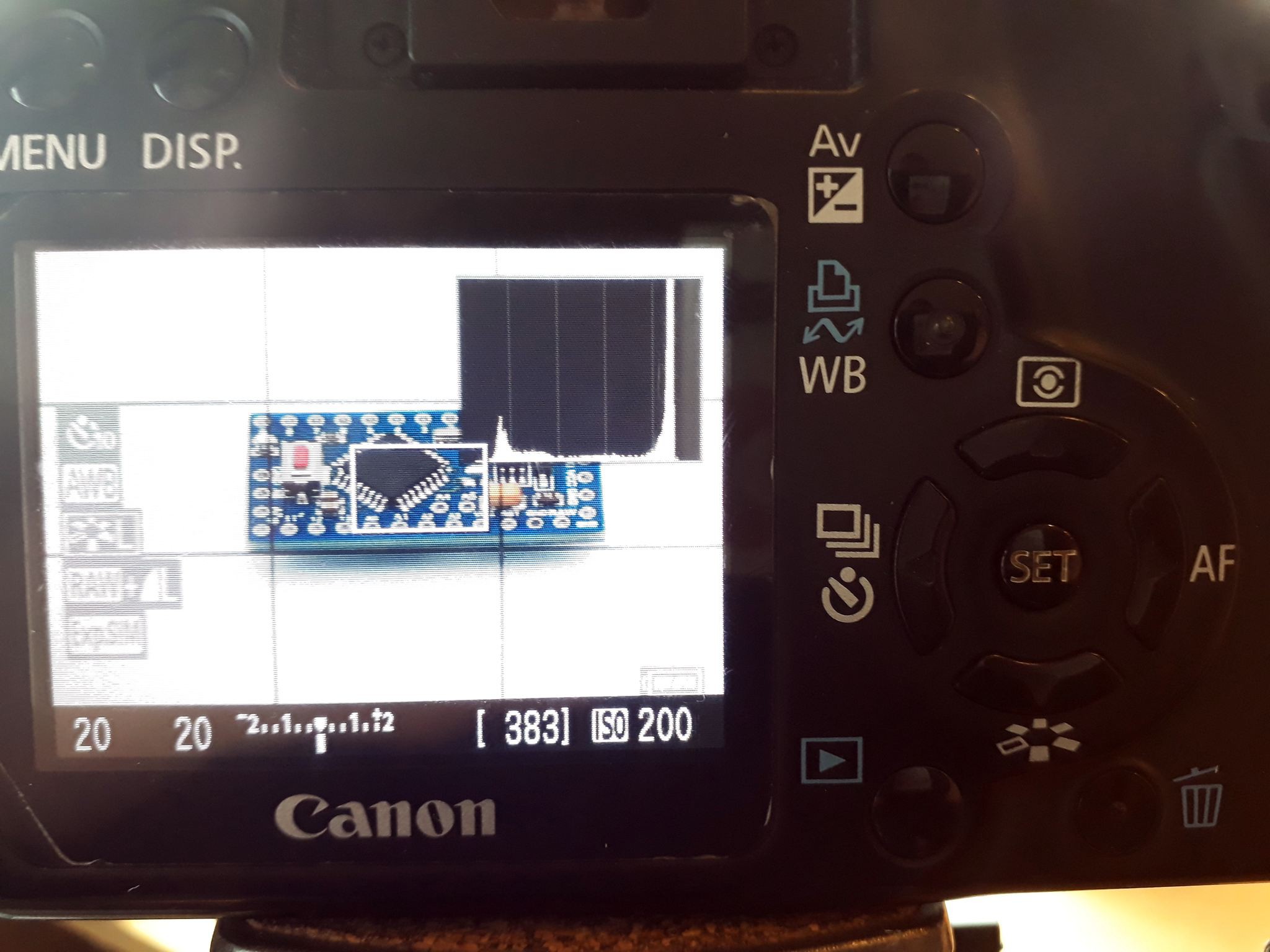
aperture F11, shutter speed = 1/20s (= longer than before) The histogram brightness peak is bound to the right side. The whole picture is too bright, there's no way to get a good picture this way. The other extreme is this:
![]()
aperture F11, shutter speed = 1/200s (= much shorter than before) This pic would be too dark. You see the mark of the "brightness bar" is close to the -2. No good!
So, now you can see the effect of the aperture (remember, the bigger the number, the less light falls onto the sensor):
![]()
aperture F20, shutter speed = 1/20s 1/20s shutter speed gave us an close-to-all-white picture with an aperture of F11. Now a lot less light comes through and with the lens at F20, 1/20s gives us an well balanced picture!
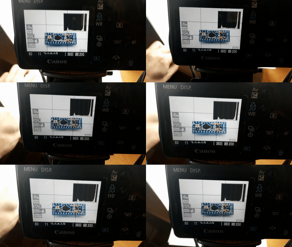
Remember the trick to avoid shadows? Keep an eye on the DSLRs display. Here's what it looks like in video:
![]()
It's just me lifting/lowering a sheet of white paper to reflect some light back onto the object. Also, the peak moves to the right.
-
Arranging your products
02/09/2019 at 16:43 • 0 commentsPreparations
It's good to know what you want to achieve! Here's a few things to keep in mind:
- get your product as clean as possible. Pics will show every spec of dust...
- have your angle in mind. You want your pics show all the important details!
- do you want a very sterile/flat picture or a more "organic" one with shadows?
- (...)
The making of
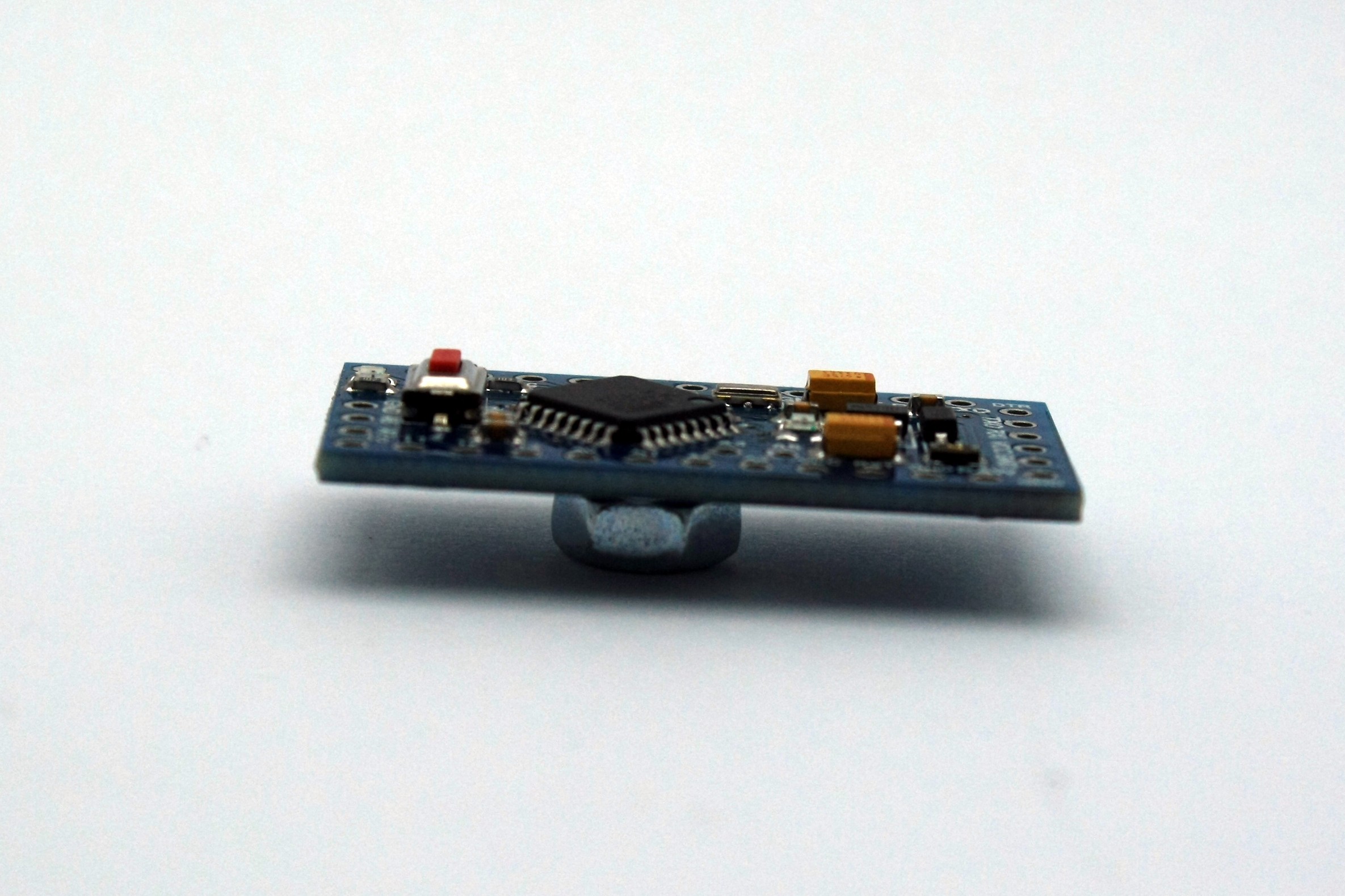
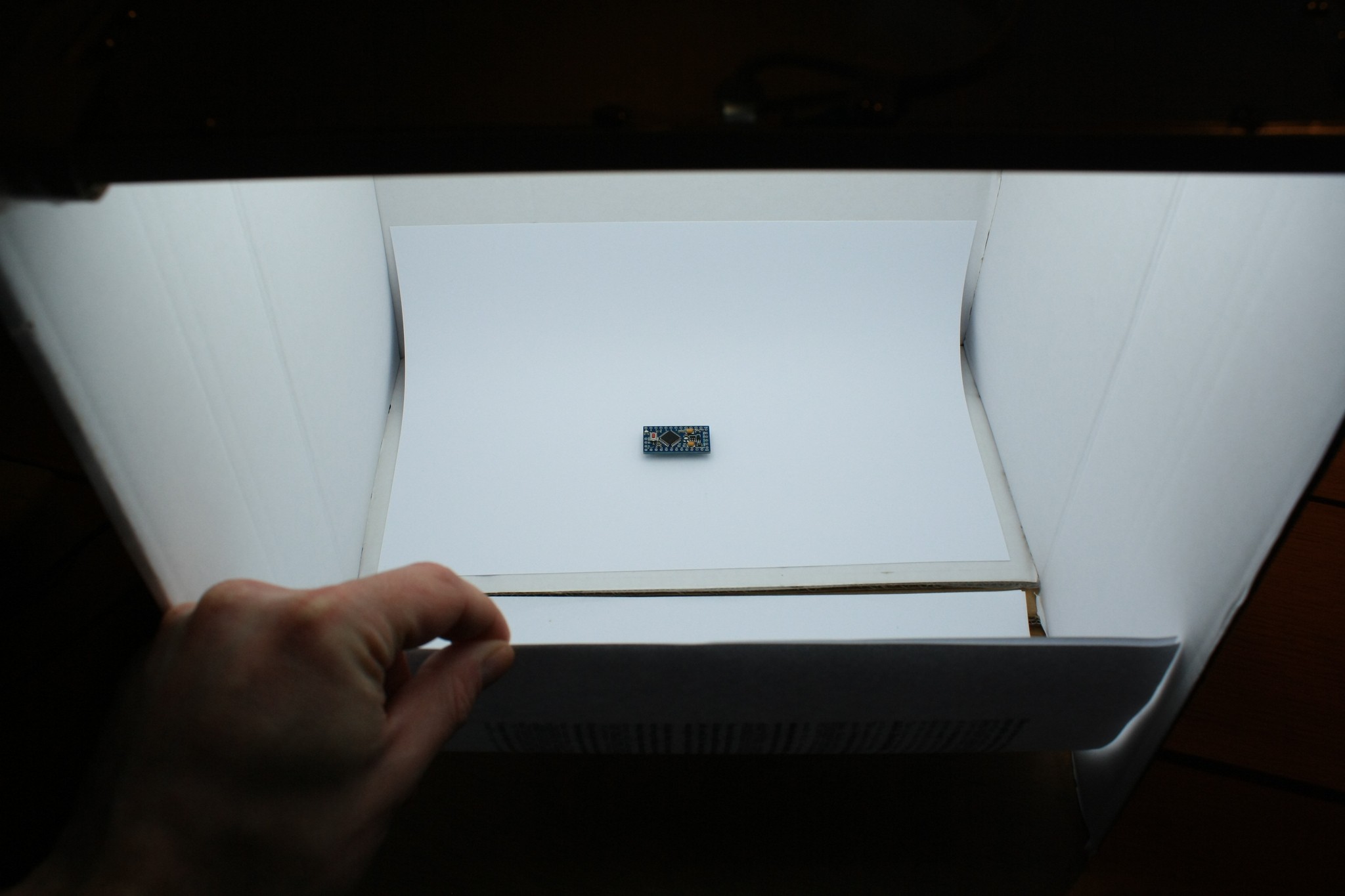
For my example we take an off-the-shelf Arduino Pro Mini clone. I wanted a "shop-ready" picture which shows the whole board but doesn't look like it was manually free-form-selected in an editing program (which often looks very unnatural.
So I set the board onto a M5 hex nut to get some distance for a bit of shadow:
![]()
Of course you don't want to have that thing in your final picture. So you take your pic from an angle where you can only see the board and its shadow.
This takes us to the next step:
Angle and shadows (and how to influence them)
Would you now snap a picture, it would look something like this:
![]()
Notice the strong and quite "hard" shadow? We want to change that into something more smooth:
![]()
Ah, this looks much better! How did I do this? It's easy. You need to brighten the front section a bit. I did it by simply holding up some white paper, thus brightening the front by reflecting light back:
![]()
-
Making the lightbox
02/09/2019 at 16:37 • 0 commentsIntroduction
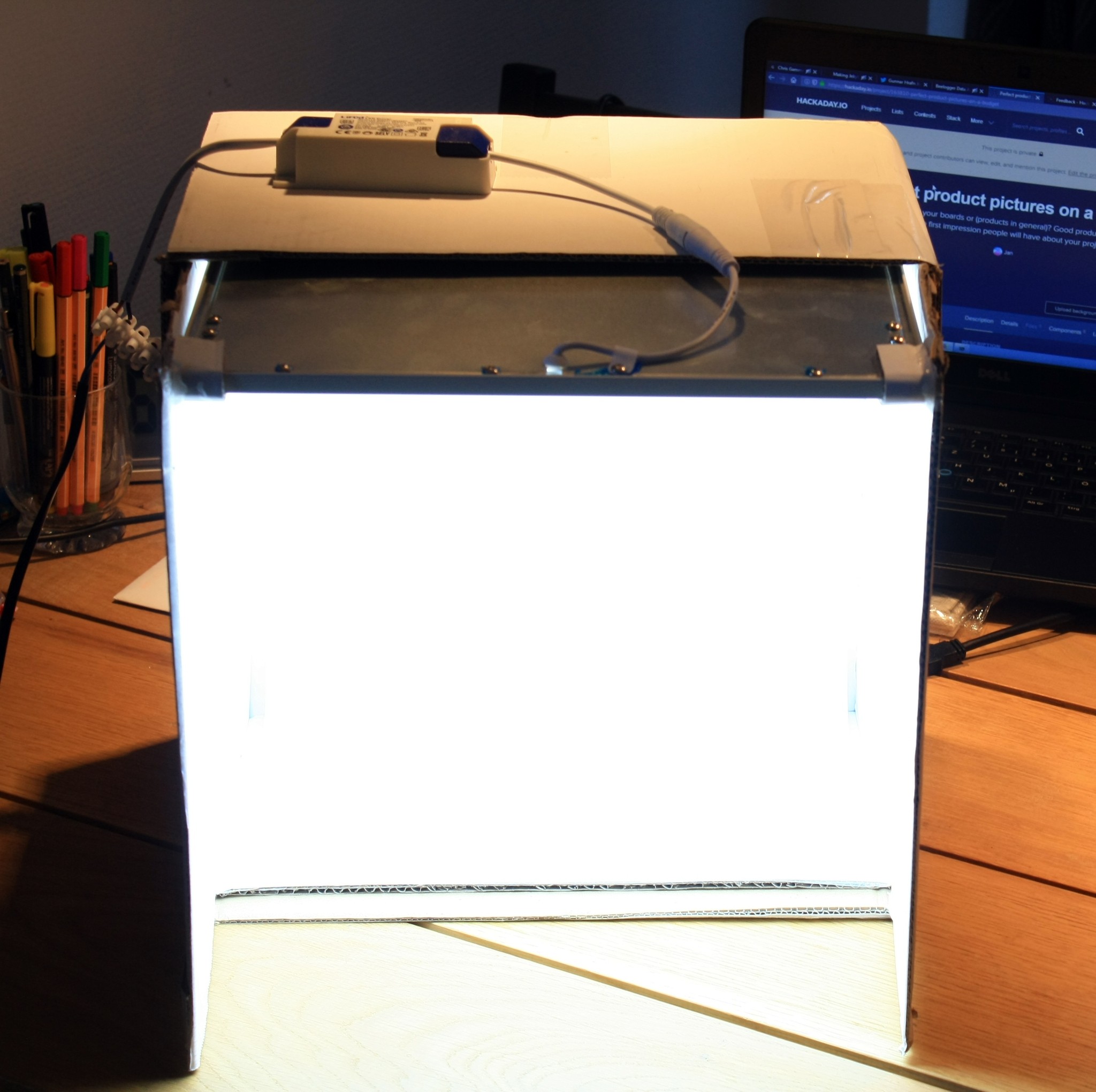
The lightbox is a really simple thing, it's no more than a cardboard box which suits your needs in size (bigger box for bigger products).
Many tutorials tell you to make huge cutouts in the side panes, glue some diffusing plastic sheet to it and point some kind of lamp to it to light the inside of the box.
We go a different route!
![]()
The box
Use whatever you have at hand and can easily cut into and work with. I used a shipping box which is white on the outside. I cut off 4 flaps and glued them white-side facing in back into the box.
You want as much white surface inside your box as possible.
The light source
I chose one of those cheap LED-tiles for lighting rooms as the only light source. It is mounted inside, at the "ceiling" of your box. Search for "LED ceiling panel" or similar on eBay or wherever and get one :)
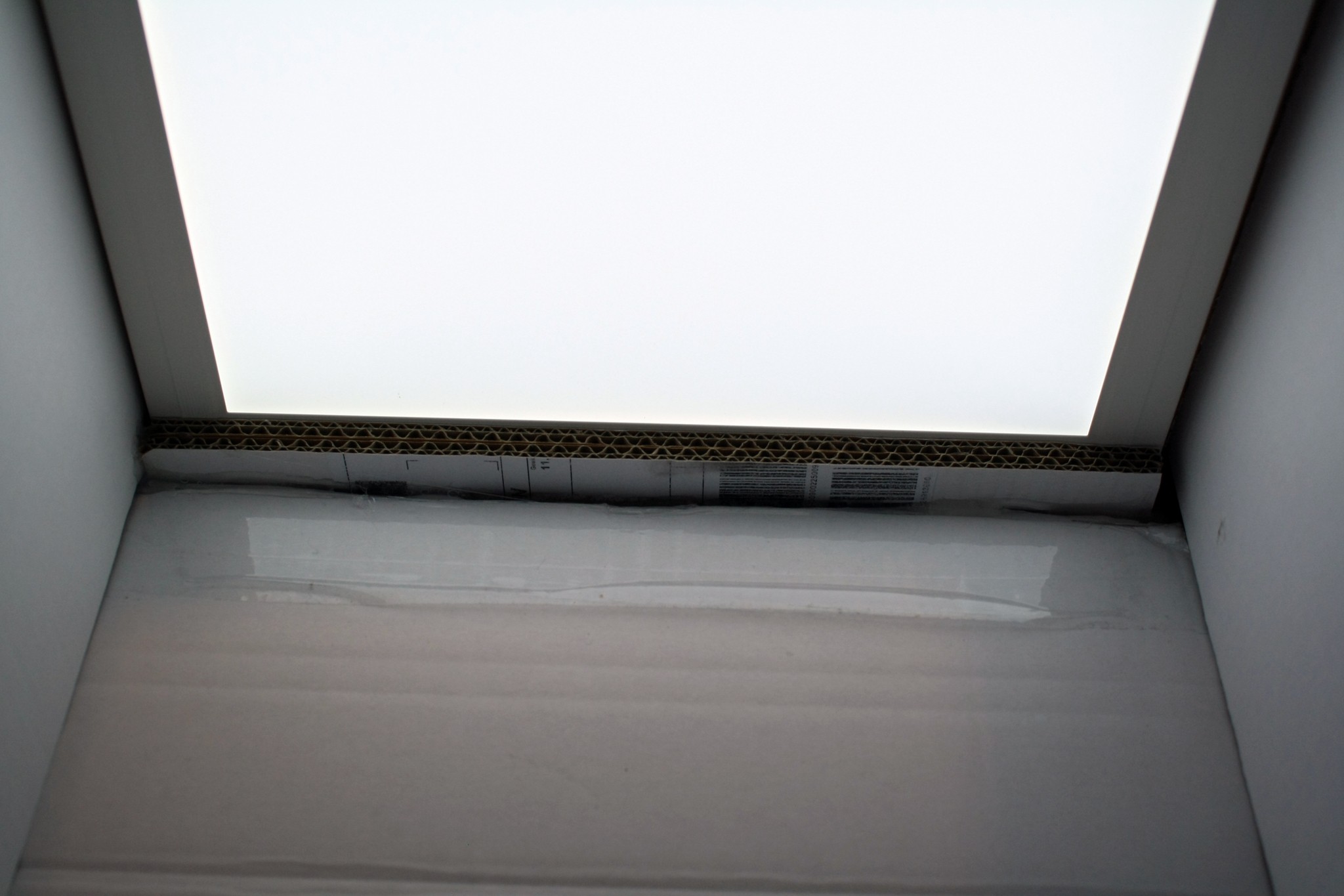
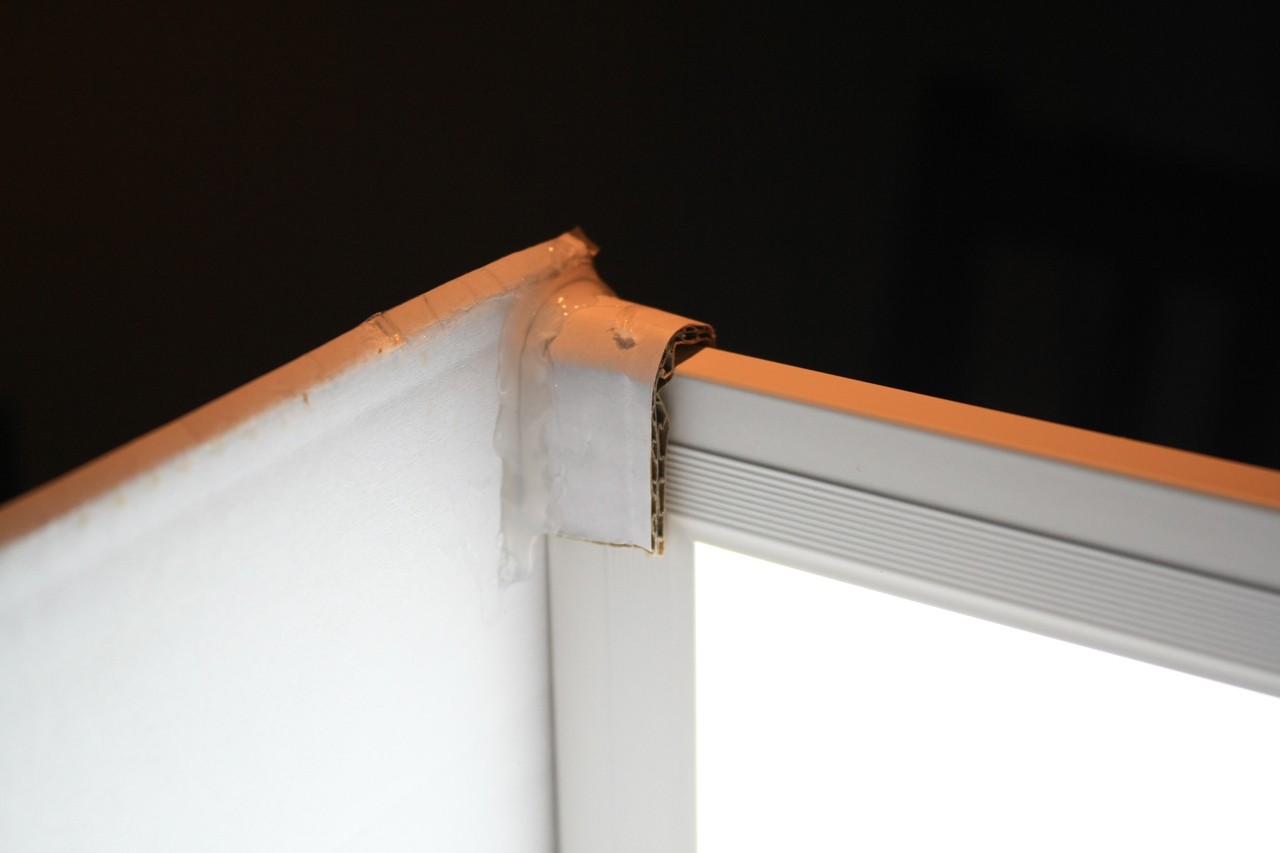
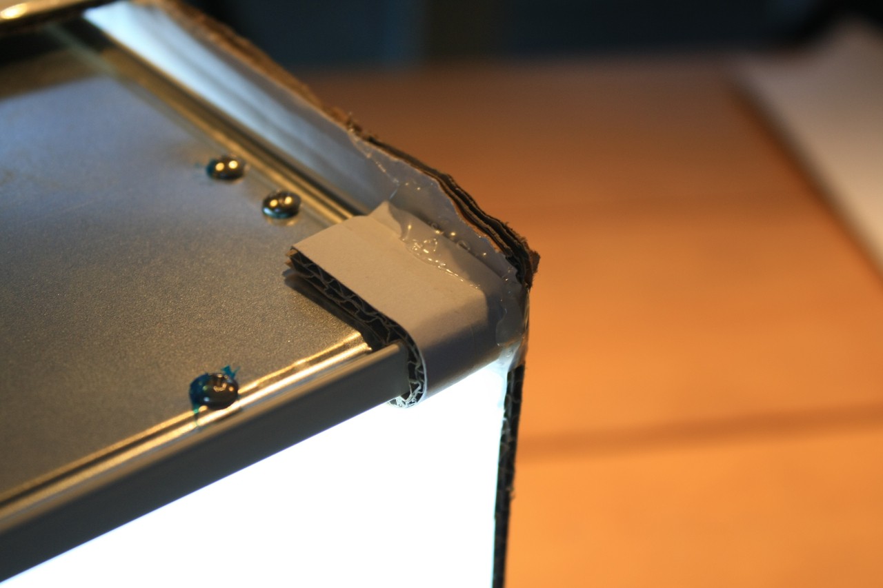
I glued some cardboard stripes to the back to make some kind of ledge for the panel to sit on. The panel is held in place by two "cardboard brackets" in the front of the box, so it can't fall down.
![]()
strip hotglued to hold the LED panel in place ![]()
"bracket" inside ![]()
"bracket" outside That's it. Really.
A few words on the light color: I chose 6500K, there are lot's of panels with 5000 to 5200K as well. They all work. Your camera does the white balancing anyway.
On a side note those cheap LED panels all come from China, no one knows what LEDs they use and if the have the color temperature printed on the box!
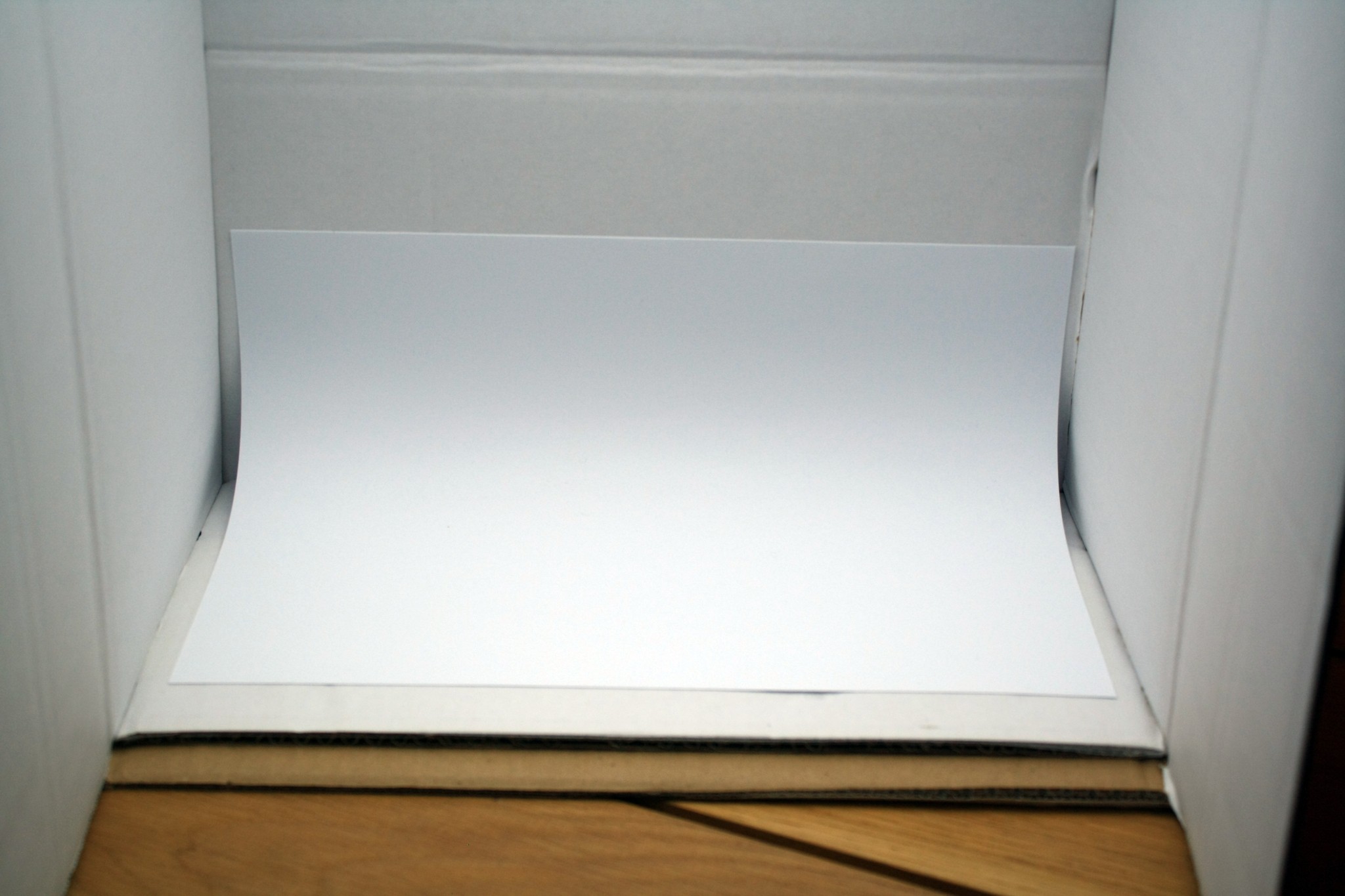
The "infinity" cove
This is just a sheet of white copy paper. It helps you keep hard shadows down to a minimum.
![]()
Perfect product pictures on a budget
Want to sell your boards or (products in general)? Good product pictures are the first impression people will have about your project!
 Jan
Jan