Benchoff
-
No gods. No masters. No frame buffers. No external libraries.
05/23/2020 at 19:31 • 1 commentA terminal requires a 'new line' command. Therefore, I need some way to move all the characters up one line. The conventional way to do this is to keep a circular array of all the characters on the screen, and whenever a new line character is sent (or pressed), I would redraw the entire screen.
No, wait, scratch that. The conventional way to do this is by selecting a display with a hardware scrolling function.
Alternatively, I could keep the entire display in a frame buffer and write it out constantly, shifting up one character line whenever there's a new line command.
The math: Keeping the contents of the display in memory as characters requires at least 1840 bytes (80 characters by 23 lines, because we don't really care about the top line of characters.) Keeping the entire display in memory as a bitmap requires at least 48000 bytes (800x480 at 1bpp, with some bitstuffing). Both of these options are onerous, so here's a way to scroll an entire display in 58 bytes.
---------- more ----------This is a demonstration of reading from the graphic RAM on the display. This display, with an NT35510 controller, has a significant amount of RAM, which the controller sends to the TFT panel. To write to the display, you don't write pixels, you write to the graphic RAM, with the controller doing all the heavy lifting.
The NT35510 controller has a command to read this G-RAM, which allows the microcontroller to 'see' what's on the display. If you can do that, it's a simple matter to scroll the display: simply read one column of pixels, and write it out again, shifting it up one character line. Therefore, an entire screen can be scrolled with just 460 bytes, as the display is 480 pixels tall, and we don't care about the top 20 pixels. With bit stuffing, the entire scroll function can be done using 58 bytes of a microcontrollers' data RAM.
Going furtherThe ability to access the G-RAM of the display opens up a lot of possibilities. For example, it is now possible to code Conway's Game of Life for this display. The naive implementation of GoL needs two framebuffers, or for this display 96kB -- one for the current display, and another to calculate the next generation. With this technique, I can code GoL in just a hundred or so bytes by iterating over the display like a few demoscenes. This technique can also be applied to other cellular automata.
Alternatively -- and I'm just spit balling here -- the ability to read and write to a very large bit of RAM means the display + microcontroller combo can become a Turing machine, with all the inner machinations completely visible. I'm not saying I'm going to program a Turing machine in this display, I'm just saying it's possible.
I would like to take this oppurtunity to say I am not aware of another graphics library that supports reading from G-RAM. The Adafruit GFX library doesn't support reading from G-RAM, the Arduino library doesn't, and the GLCD library doesn't. This technique is uncommon enough that it merits a Hackaday post (in-link).
-
Font Rendering Speed++
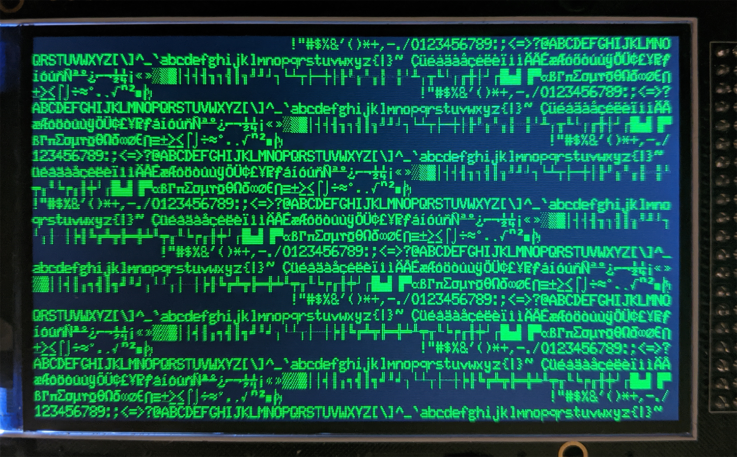
04/29/2020 at 16:45 • 1 commentOn the advice of someone who's actually helpful on Twitter I've spent the last few days finishing the font set (ASCII Extended code page 437, the old DOS extended ASCII with those weird 'box' characters), and optimizing the font rendering speed. First, the results:
---------- more ----------This is significant. Each of these runs reboots the display, shows the boot graphic, delays for one second, then loops through an ASCII table, displaying the character at an increasing address on the display. First one to finish wins.
The reason to optimize this bit of code was inspired by @fast_code_r_us, who has written a few things on optimizing text rendering on small displays:
My display is not serial, it's using an 8080-style bus, but the same thinking applies. Most graphics libraries are horribly inefficient. To draw a character (or a sprite, or whatever), an area of memory is allocated (basically a bounding box), and pixels are drawn one at a time, each time resetting the XY coordinate the microcontroller is drawing to.
In most graphic libraries, there is an edge case to make drawing faster: straight vertical or horizontal lines. If the bounding box is only one pixel tall (or wide), the microcontroller can simply stream pixels directly to the display.
Unfortunately most graphics libraries don't do this for text characters or sprites. For each pixel in a character, the microcontroller sends a command to change the x coordinate, the y coordinate, the second x coordinate, and the second y coordinate (we're defining a window here, remember), then it draws the pixel.
What should be one byte of data has suddenly turned into twenty-six bytes. This bit of code runs every time I want to change the active window of the graphics RAM:
void setXY(uint16_t x1, uint16_t y1,
        uint16_t x2, uint16_t y2)
{
    LCD_Write_COM16(0x2a,0x00);
    LCD_Write_DATA8(x1>>8);
    LCD_Write_COM16(0x2a,0x01);
    LCD_Write_DATA8(x1);
    LCD_Write_COM16(0x2a,0x02);
    LCD_Write_DATA8(x2>>8);
    LCD_Write_COM16(0x2a,0x03);
    LCD_Write_DATA8(x2);

    LCD_Write_COM16(0x2b,0x00);
    LCD_Write_DATA8(y1>>8);
    LCD_Write_COM16(0x2b,0x01);
    LCD_Write_DATA8(y1);
    LCD_Write_COM16(0x2b,0x02);
    LCD_Write_DATA8(y2>>8);
    LCD_Write_COM16(0x2b,0x03);
    LCD_Write_DATA8(y2);

    LCD_Write_COM16(0x2c,0x00);
}
That's sending 26 bytes for each pixel in a character. Across an entire display, that's a lot of wasted time. Instead of this, I'm simply setting the active window of graphics RAM to the size of a 10x20 pixel character, then streaming the pixel data out. The letter 'a', for example, looks like this:
// CHARACTER char: <a>  => int: 97 => hex: 0x61
{0x00, 0x0c, 0x00, 0x00, 0xc0,
0x03, 0x33, 0x00, 0x33, 0x30,
0x03, 0x33, 0x00, 0x33, 0x30,
0x03, 0x33, 0x00, 0x3f, 0x30,
0x00, 0xff, 0x00, 0x00, 0x00},
Just define the window in GRAM, stream the pixels out, and you have a faster display.
As for what the final display and font looks like, here you go:
![]()
Now on to the next task.
-
You can make a baby and a bitmap in nine months
10/16/2019 at 17:42 • 3 commentsThe last update for this project was a realization that a 'dumb' display would cost too much; the driver chip was too expensive, and if I didn't want to go with a driver chip, the microcontroller would be too expensive. The solution to this problem was to use a display with built-in graphics RAM, in this case a display with the NT35510 controller chip. There's a problem with this solution - no one has a driver for this display, or at least one that is portable to other (read: modern) microcontrollers.
...Which means I need to write a TFT driver. This took nine months. Here's the result:
---------- more ----------![]() ---------- more ----------
---------- more ----------![]()
While banging my head against the wall figuring out how to get the code to work, I did most of the remainder of the engineering on the mechanical and electronics. Results below:
![]()
![]()
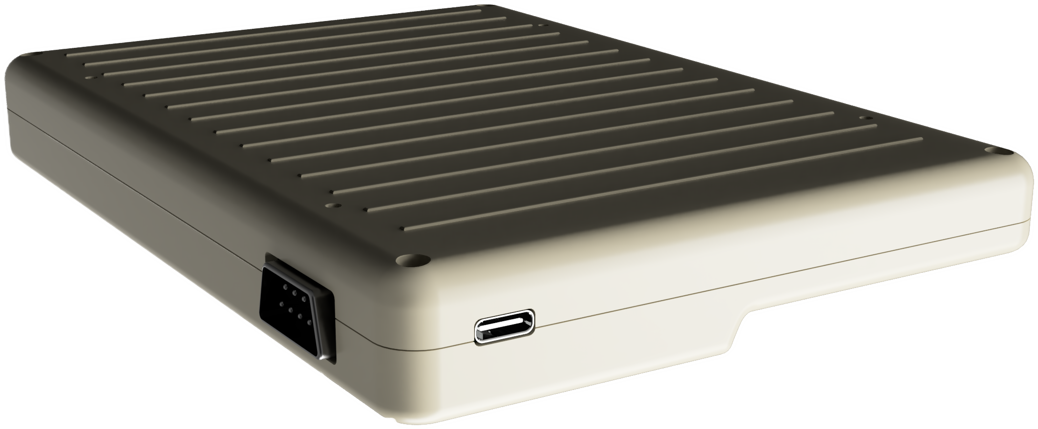
Of note are some small, 0.3mm high ribs on the back. This design feature is directly lifted from an old PowerBook, and it really breaks up what would otherwise be a featureless plane on the back of the device.
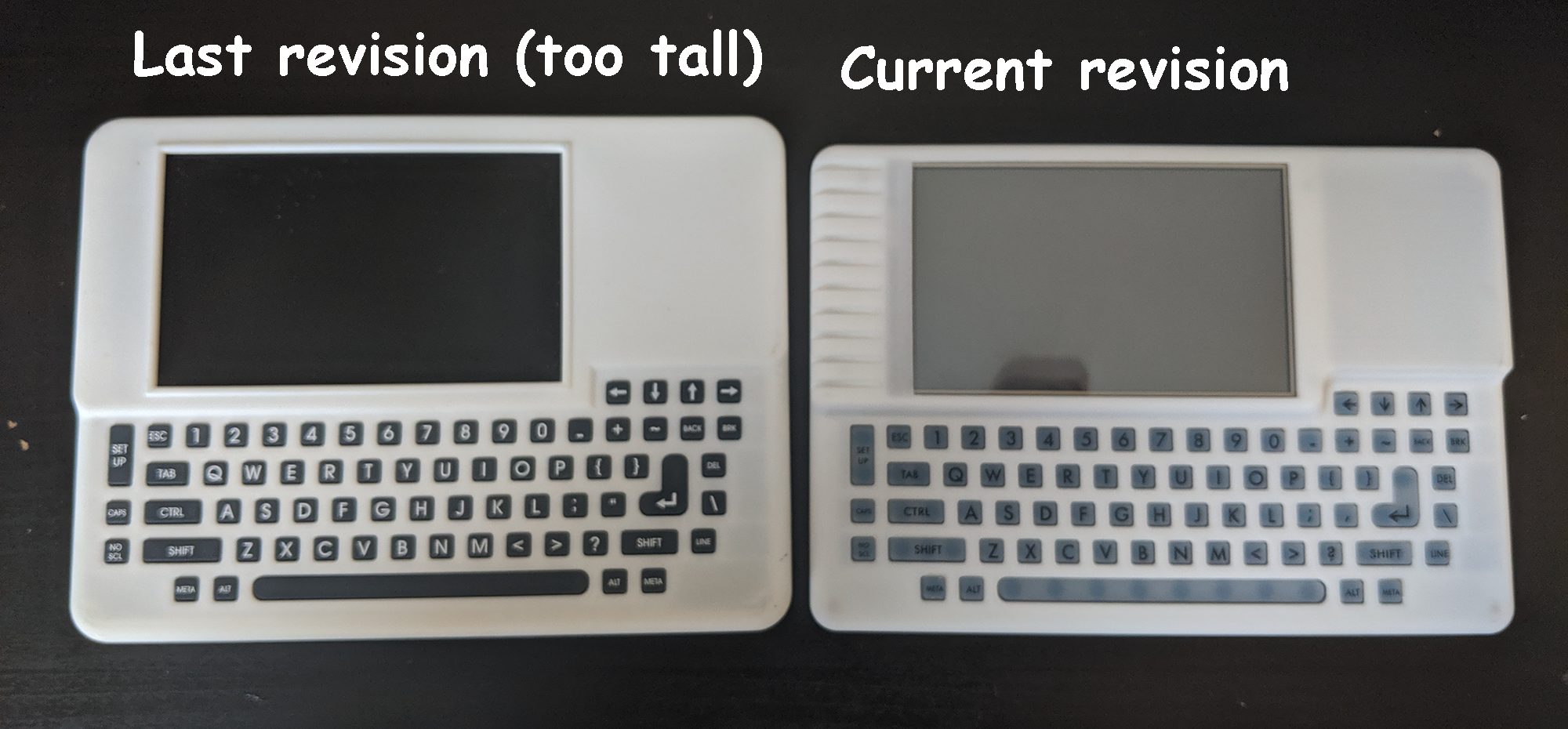
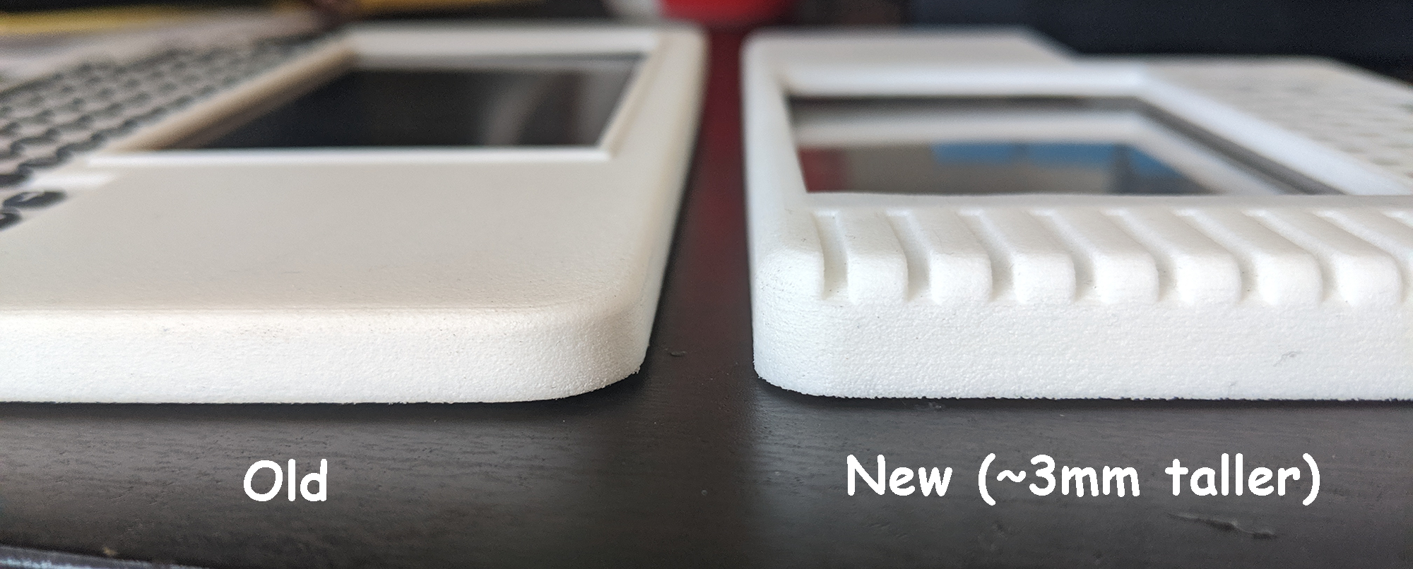
The last revision of the hardware was too tall, and now I have plastic that will fit in a flat rate shipping box. It's a little taller, which should allow for the Raspberry Pi expansion header. All in all, a sleeker enclosure.
![]()
![]()
This will be the last update until I have a reasonably complete prototype. The only thing left to do before that is wire up the keyboard. There's keyboard code to write, but that's just tedious, not actually difficult.
I would like to reiterate it took nine months to write this TFT driver.
-
Unit Cost And Economics
05/01/2019 at 04:12 • 3 commentsRight now, I have the schematic and design done enough that I can get some quotes and go through the actual cost engineering of the VT-69. The TL;DR, is that this would cost more than you would pay.
---------- more ----------
Electronics get cheaper as you buy more. This is a simple fact that one resistor from mouser costs ten cents, and a thousand resistors from mouser costs a dollar. It's like this with injection molding and silicone keyboards, too: the first silicone keyboard costs five thousand dollars, and a thousand silicone keyboards cost six thousand dollars. The more I can sell, the less it will cost. This is especially important when it comes to very small quantities, and no one in #badgelife that is sane is doing more than 1000 units. I did that, it was hell.
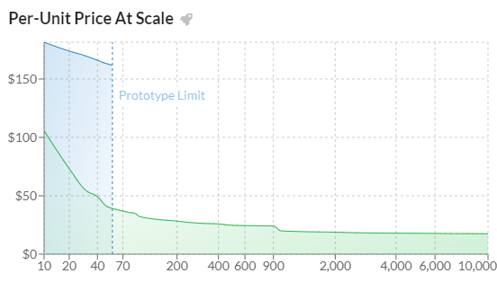
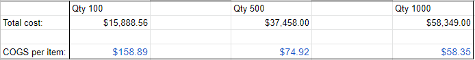
So we come to the unit economics of the VT-69. Here's the price graph for just the populated PCB:
![]()
One costs $220, and that doesn't include a keyboard, screen, battery, or really anything else. If I were to only make one, I would sell it for a thousand dollars.
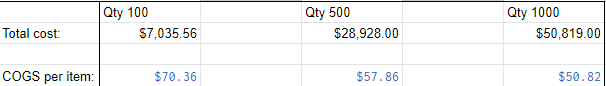
I'm going to cut to the chase here with the total cost of quantity 100, 500, and 1000:
![]()
Producing 100 units costs $16,000. Producing 500 costs almost $40,000, and producing 1000 costs almost $60,000. This is the cost of goods sold, and not reflective of any actual price. To look at that, you need a margin and I wouldn't be comfortable with anything less than a 30% margin (If I'm only building 100, I would need to charge $225 per badge for a 30% margin. For quantity 500, I would charge $107.03 for a 30% margin. For quantity 1000, the price comes down to $83). Your iPhone, for example, has a 60-70% margin. Take money transfer, logistics, and all that stuff and that 30% margin gets eaten up pretty quick.
Now, here's where it gets tricky. I know people aren't going to pay much more than $100, and I need a higher margin to put the money back into the project so I can manufacture the *back* of the plastic enclosure. I need to make a lot of these, and I need to charge a lot. Sorry.
I'm going to be straight with you: this is fucking expensive, and the only way that this will work is that the first 500 pays for the next 500, and then it's self-sustaining. This effectively means a 50% margin, meaning you would pay $160 per badge. I don't think that's going to happen. I just don't think the market is there.
I'm not saying Def Con is cancelled, but this is hard.
That said, the significant cost of this is in the tooling. The first keyboard cost four grand, and the thousandth keyboard cost a dollar. Stuff like that. Here's where it gets trippy. This is my cost after all the molding and tooling is paid off:![]()
That's reasonable. That's not bad. I can do that all day. I'd pull the trigger now if that were the case.
The entire goal of this project was to do a badge with silicone keyboards and a plastic bezel, simply because no one has done that before. Why has no one done that before? Here's your answer.
-
System Design, Previous Work
04/18/2019 at 17:21 • 0 commentsThe core feature of the Dumb Badge is to provide an 80x24 character display, with a keyboard, and a serial port. The first requirement of a high-resolution display is the hardest requirement, but there are many cell phone screens that will give you 800x480 pixel resolution, conveniently the same width as the display in a DEC VT100. The display is therefore the hardest part of this project, and demands specific engineering decisions. The purpose of this project log is to discuss these engineering decisions, while covering earlier work done by others.
---------- more ----------Driving The Display
There are no 80x24 character displays that are cheap and readily available. Therefore, the best option for the display is an 800x480 display from a cell phone, something that can be found through the usual retailers for a few dollars. These displays use a parallel RGB interface and requires significant horsepower to drive. At the bare minimum, an 8-bit color depth display requires 29 pins on a microcontroller, and a clock speed on the order of 20-50 MHz. This isn't unheard of in high-power ARM microcontrollers (the STM32F4 and STM32F7, for example), but it does necessitate a lot of memory for the frame buffer. Basically, you can't just drop an Arduino into a circuit and expect to drive a cell phone display.
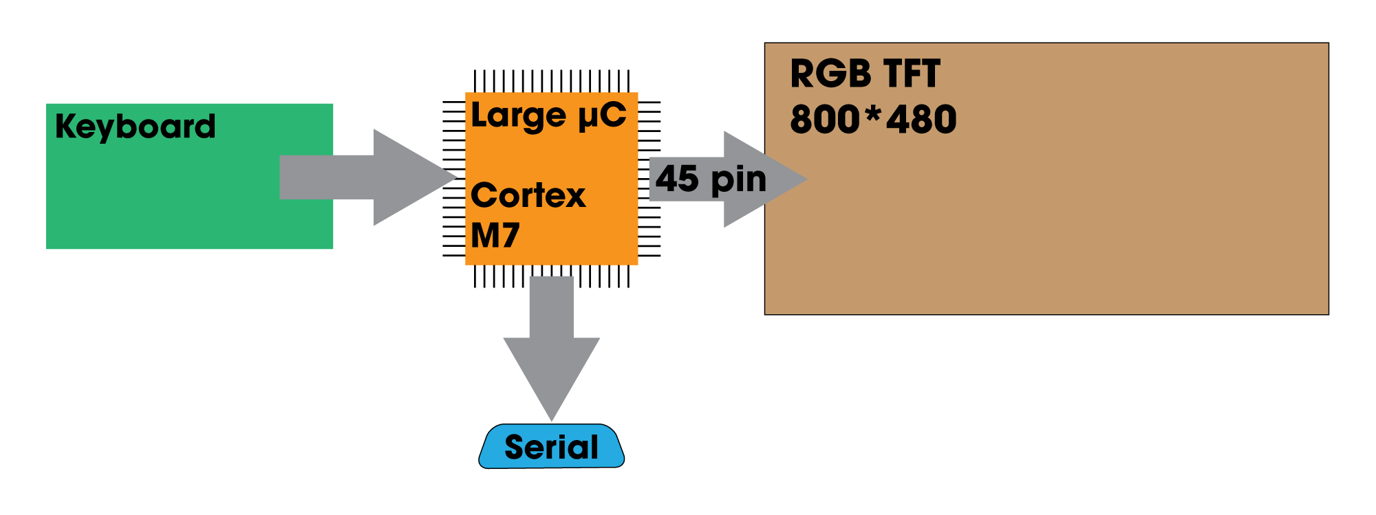
Previous work in projects like this have made the decision to use a high-powered microcontroller to drive a 4-5 inch display. The DIY-VT100 is the best example I can give in this case. This is a 5" display driven through an RGB interface, using an STM32F7. I could easily simply copy this design and add a silicone keyboard, but this is a cost-sensitive device. I don't want to spend the money on a $17 microcontroller, and this microcontroller is actually overpowered for what i need it to do; the DIY-VT100 spends most of its horsepower simply driving the display and refreshing the framebuffer. Here is a high-level system diagram of what this project would look like:
![]()
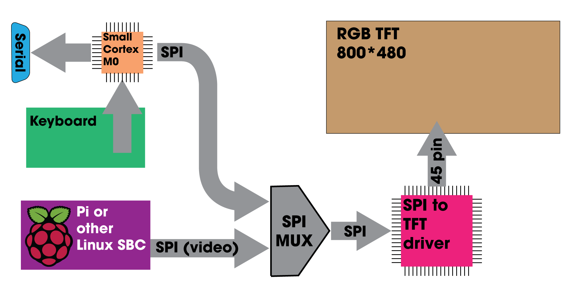
There is another option. There are several SPI-based TFT drivers available that contain the necessary RAM for a framebuffer and the hardware to drive an RGB display. These chips accept power and SPI, something every microcontroller speaks. Instead of using one large microcontroller, I could use a smaller microcontroller to emulate the VT-100 terminal, read keyboard inputs, and output to serial, while leaving the heavy lifting of driving the display to a SPI TFT driver. One such product is the Adafruit RA8875 driver board. A high-level system diagram would look like this:
![]()
In this system, a small, $2 microcontroller handles keyboard presses, the serial I/O, and sends the text-only display data to a TFT driver. Compared to the large microcontroller solution, this is the cheaper solution. A large microcontroller, like the STM32F7, costs about $15 in quantity one. A small microcontroller costs about $2, and the RA8875 driver costs about $7. That's nine dollars versus fifteen, and we have a clear winner.
But cost isn't the only reason I've chosen to go with a TFT driver over driving the display directly from a microcontroller. Because the display is separated from the logic, it is possible to 'tap into' the display. Effectively, this project also turns an RGB TFT display into a SPI display. With that, you can connect a Raspberry Pi or other single board computer, completely ignoring the 'terminal' part of the badge. All you need is some way to mux the SPI signal:
![]()
With this architecture, the keyboard is read by the small microcontroller. This can either send keypresses to the terminal emulation, or to a single board computer. The addition of some sort of mux for the SPI bus allows you to switch between video sources, either terminal emulation or a Pi. This is inherently more flexible than a single, gigantic microcontroller and ends up costing less.
TL;DL: I'm using a SPI to TFT driver with a small, $2 microcontroller instead of a gigantic $17 microcontroller. This allows me to use other video sources, like a Raspberry Pi. The terminal can now become a Raspberry Pi palmtop because I'm a cheap-ass
-
A Design Study
03/14/2019 at 20:48 • 2 commentsI am designing the Dumb Badge with the idea that is a product, not a single one-off project. Being a product demands some work must go into the design, both the design language of the enclosure, but also the typefaces and logotype of the screenprinting and packaging. Basically, I need to decide on a font or two. It's also time to start designing the enclosure, which means I need to imagine what a product made in the alternative history of 1991 would look like.
---------- more ----------FIRST OFF, TYPOGRAPHY. For some reason companies change their industrial design language faster than their typography, so this is easier to nail down
The overarching theme of the design of this project is an alternative history. What if there were high-resolution (well, 800x480) cell phone screens and microcontrollers with a megabyte of RAM in 1985? There was still a market for dumb terminals then, and as I've noted before, some company would have made this product if the technology existed at the time. Let's assume the company that made this alternative history project was DEC. I'm already ripping off their naming convention by calling this the 'VT-69', anyway.
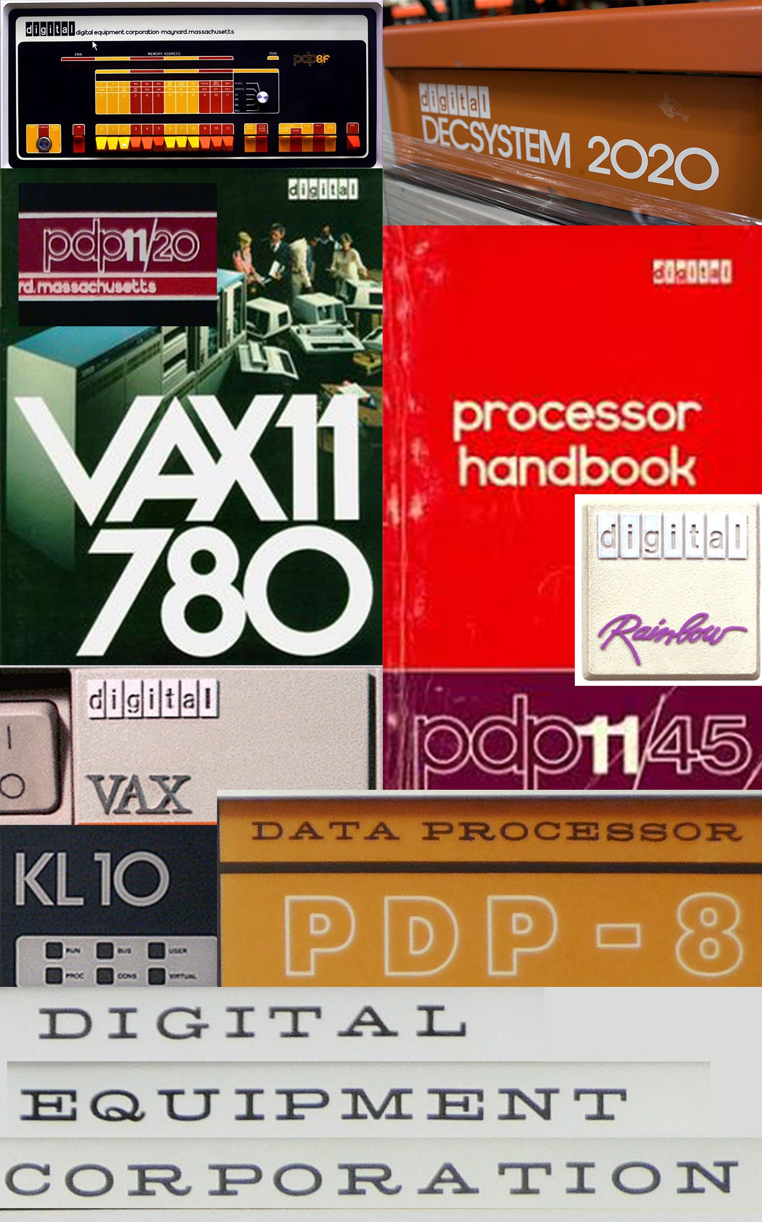
Here's some of the designs of logos from 50 years of DEC products:
![]()
There's a lot going on here, from the strange antique serif type of the Straight-8 to the vaporwave ッゥ横 aesthetic of the DEC Rainbow. The PDP11s had outlined lowercase text, the Vaxxen had oppressively 90s serifed fonts, and between that you had Cold War era Kinda-Futura-But-Not-Futura. There's a lot to pick from here. There is one constant -- the 'digital' in boxes -- that was used from the 60s until acquisition by Compaq. That should be included somewhere, and Ned Batchelder, the guy responsible for digitizing the original photo art, has that all documented. I'm going to use that somewhere, but I need something else for the main logotype and packaging
I've settled on the 'not Futura' logotype (seen below). It's bold enough that it works, it doesn't have the oppressive 90s connotation of the serifed Vax type, and this type is more easily scaled down to PCB silkscreen than the 'outlined lower case' logotype.
![]()
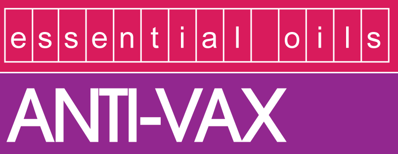
The question is, what's this font? Well, you can ping the dude that was responsible for it on Twitter. The typeface is Avant Garde, and a quick check of WhatTheFont confirms it:
![]()
yes, it's a joke, but the ANTI-VAX is dead-on. I'm using ITC Avant Garde Gothic for the main logotype. There will be a little bit of Helvetica in boxes thrown in for good measure.
The colorway... Blue. Maybe orange. God damn DEC design was so good, and it's a travesty none of it is written down
Ah yes but what about industrial design?
I'm talking about the design of the enclosure here. All industrial design is a function of the machining capabilities available at the time. The most famous industrial design ever, Apple's Snow White design language, featured in the Apple IIc and Mac SE, is a function of two advances made in injection molding at the time: zero draft enclosures and diamond cutting plastic. What is zero draft? Most injection molded parts are tapered one or two degrees, to allow for extraction from the mold. In the late 70s, zero drafting was invented, and Apple spent a god damned fortune buying and building the capability to bring this technique to consumer electronics. Likewise, the use of diamond cutters came into service in the late 70s, and that's why 80s and 90s Apple products had a tiny recess for an embossed rainbow apple logo.
Art is a study of the capabilities of production. Oil paints on panels were invented by Jan van Eyck, a dutch artist, around 1400. Just after that, boom, dutch masters creating oil paintings. The 1940s, and 50s saw an entire field of chemistry dedicated to the creation of pigments, and boom, right after that you've got 'modern art' and rothkos that are just panels of color. Zero draft tooling was invented, then boom frog design apple blah blah blah. Art isn't about art, it's about the implementation of materials and techniques.
With 3D printing and CNC and EDM and all the production techniques available to me, I can call upon any past design language to emulate or replicate. It's really just a question of what I want to go after. So let's look at some stuff
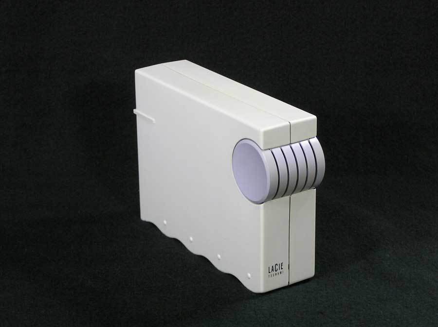
LaCie Ziba design
LaCie is a French manufacturer of external hard drives. Ziba is a design house in Portland. Around 1992, they came out with these:
LaCie Tsunami:
![]()
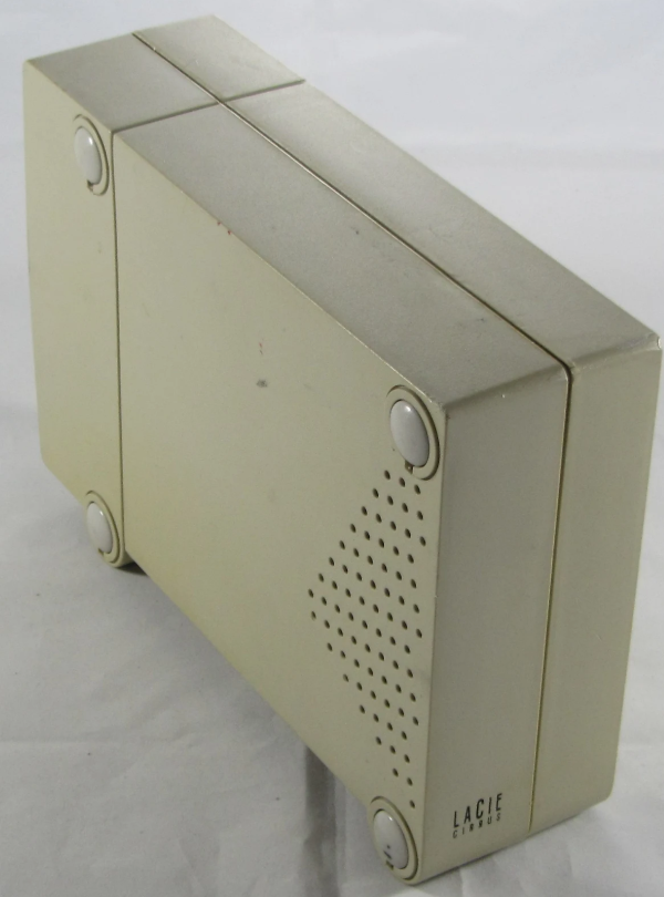
LaCie Cirrus:
![]()
With those two hard drives in mind, you have repeating geometric patterns. The vent holes in the Cirrus form a triangle; much like the drop shadow geometric patterns of Memphis aesthetic, you have the same thing rendered in plastic. Take a look at the bottom of the Tsunami hard drive. You have Memphis squiggles, punctuated with dots. You have completely unnecessary geometric shapes. It's glorious.Apple's Cappuccino
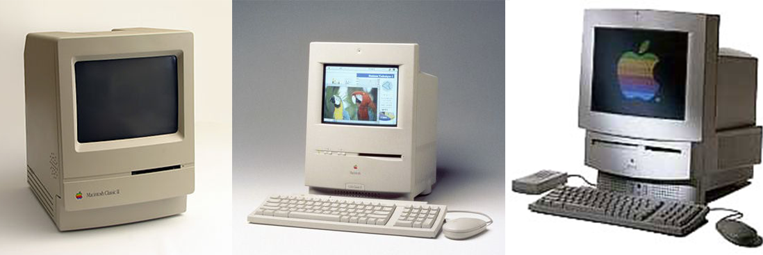
First off, why copy Apple? Because everyone copied them. Remember the translucent polycarbonate everything around 1999? It was happening before that. Here's Apple's Cappuccino, their early 90s design language, rendered in the Mac Classic II, Color Classic, and the LC/Performa 500 series:
![]()
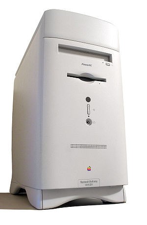
The design is monolithic, with a large radius curved front. There's a vertical line somewhere on the front, and later versions featured small round holes everywhere. The key word here is round. Everything has a fillet. The fillets have fillets. Take a look at the Power Mac 6400:
![]()
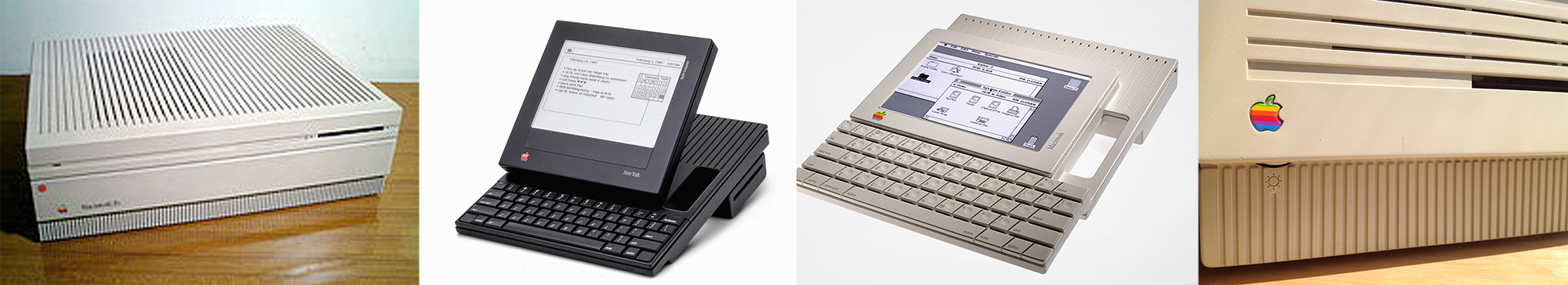
Good god that's round. I'm trying to emulate something much earlier, though, which brings us to Apple's earlier design language, Snow White:
Apple's Snow White
![]()
There are published design guidelines for Snow White:
- Minimal surface texturing
- Zero draft enclosures
- Recessed port icons
- silk screened name badging
- shallow horizontal and vertical lines, 2 mm wide, 2 mm deep, spaced 10 mm apart on center, which run along any and all of the surfaces of the product, some of which act as vents and set back 30 mm from the front and 4 mm from the back
- 3 mm radius, rear and 2 mm radius, front corners
- simple unadorned ports and slots
Think this was an Apple exclusive? Think again:
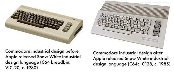
![]()
Compared to the breadbin C64, the C64c and C128 featured the same small radiused corners, horizontal slats that served the dual function of vents, and embossed ports. The 64c is simpler, smoother, and more unadorned. A Snow White-ish design language is a viable choice for anyone looking to replicate the look of mid-80s electronics
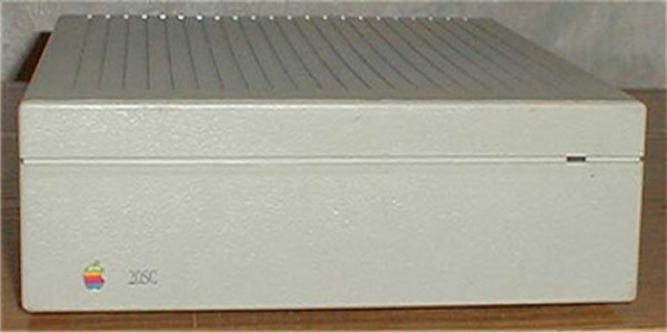
Need some examples? Apple HD20:
![]()
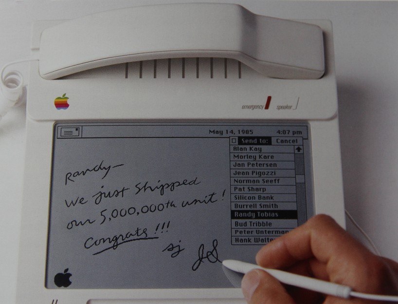
HOWEVER, SNOW WHITE IS LIMITED TO THINGS PEOPLE DON'T HOLD. Everything above isn't meant for the human hand. You don't hold a hard drive, you don't hold a workstation, but is there something that's snow-white ish that allows for some sort of tactile interaction? Well, yes, this phone, by hartmut esslinger:
![]()
Again, you have rounded corners, somewhat set back, inset 'vent holes' that aren't, but you have a very ergonomic phone. Since this project is meant to be held, I'm somewhat trapped by what I can do here. This needs to be something you can hold, but snow white just doesn't do it.
The Just Square design aesthetic
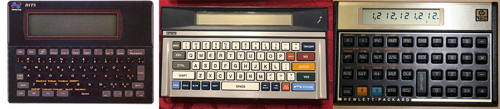
But I'm building a portable device, and there's some design language specifically relevant to portable devices as well:
![]()
This 'just squares' design language is seen in a whole bunch of products from the 70s and 80s. A square is the easiest shape to put electronics in, and these calculators and pocket terminals are no exception. It's all squares, with some design element highlighting the keyboard area, or at least differentiating the keyboard area from the display.
The Greatest Industrial Design Ever
With all that under consideration, there are a few things I'm going for. I want a square, 'this is obviously injection molding technology' aesthetic of Snow White, but that industrial design is somewhat anachronistic for the age I'm trying to capture. I really want a vaporwave Memphis design like the LaCie drives. If only there was a company that produced computers in the mid-90s that captured. It would be even better if it were actually a Frog design.
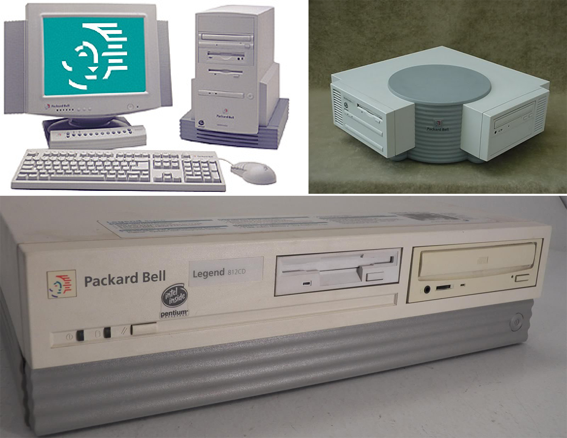
Turns out that exists. It's Packard Bell. Packard Bell had the best industrial design of the mid-90s:
![]()
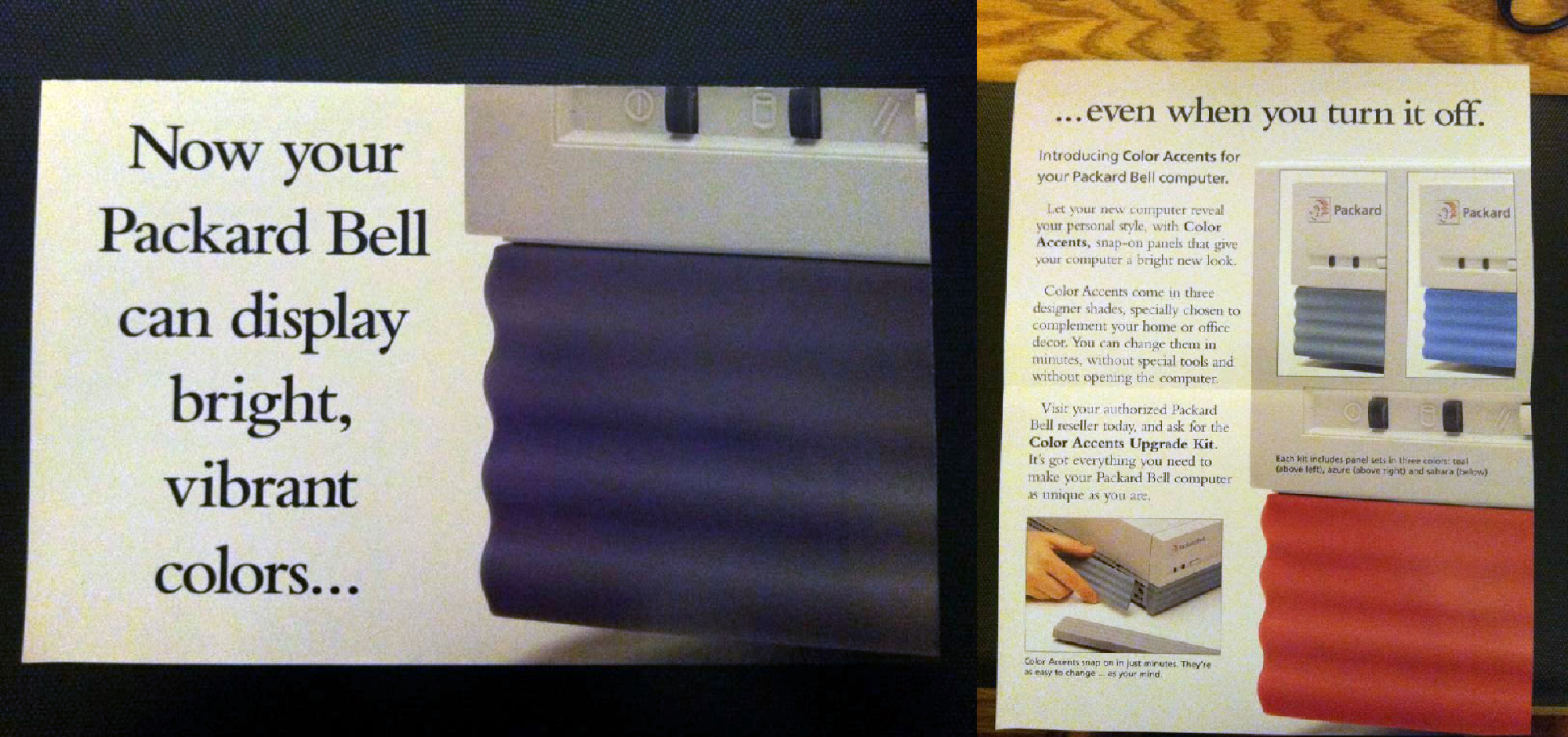
Few things to cover here. You've got a plinth style tower, like the LaCie drives. You have wavy Memphis-style squiggles. You have odd geometries, and you have the corner desktop which is all basic geometries that was meant to serve a purpose (fit a computer in a corner desk). How the corner computer didn't win a design award is beyond me. It's insane. It's the most 90s computer ever. Don't like gray? No problem, because Packard Bell has you covered:
![]()
Yes, you could interchange the wavy panels for something brighter and more colorful. Holy shit. These designs were actually done by Frog Design, the people behind the original Snow White Apple design. It's a masterpiece, and exactly what I'm going for.
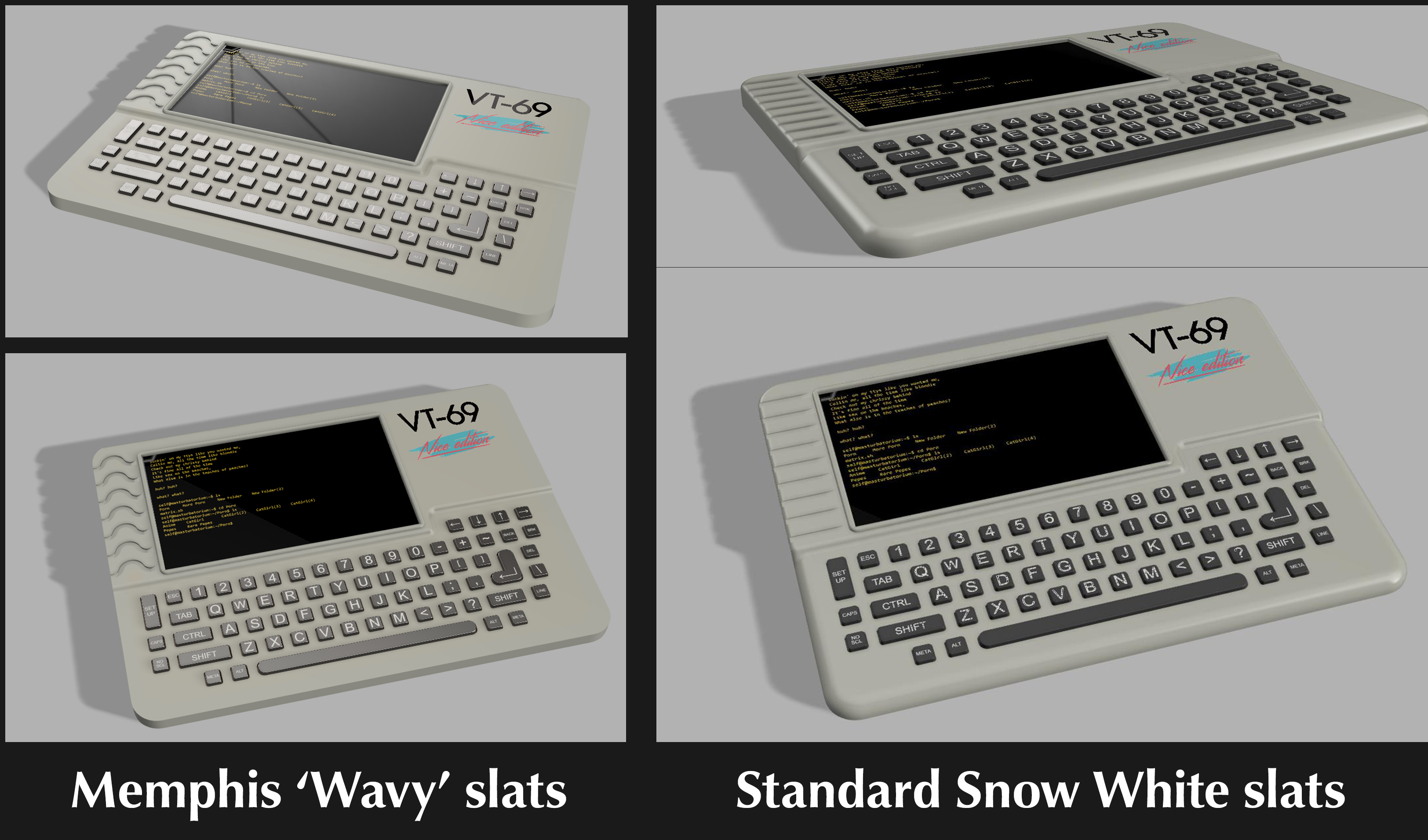
With that said, here's what I got:
![]()
![]()
![]()
This is not a thick piece of plastic. The thickest part, from top to bottom, is just 7mm. I believe the larger fillet on the keyboard vs the smaller fillet on the 'screen half' will be a bit more ergonomic, and the 'snow white' slats to the left of the screen really help out with the aesthetics. The 'keyboard waffle grid' on the back still needs a bit of work, but it's getting there. Everything is held in place with M3 screws, with an affordance for M3 heat set inserts to support a daughter board for a Raspberry Pi.
Important things to consider here are the larger fillets on the keyboard side of the badge, versus the smaller fillets on the 'display' side of the badge. This will be slightly more ergonomic, but is also somewhat functional: there's no circuitry on the keyboard half of the badge, it's just a silicone keyboard. The other side will have various pins and parts and stuff sticking up through the PCB. The next step is to order a blank PCB of the finalized dimensions (done) and order a resin/high quality version of the case (that's next). Now it's really time to start working on the electronics.
I'm not happy with this design. It really doesn't capture the 'memphis' of the Frog design Packard bell. I did this as a test:
![]()
Here, we're running into a fundamental problem of the form factor, and this applies to mid-90s laptops as it does cell phones, and other portable devices. There's simply not enough space to implement the correct design. There is a limit to how much geometry you can put in such a small area, and there's simply not enough space to put Memphis in this design.
It's okay, and this is going to be what I'm running with, but I'm not especially happy about it.
-
The Prototype Keyboard
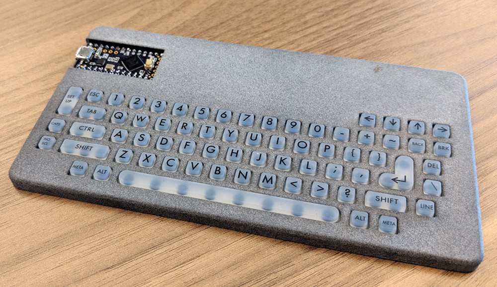
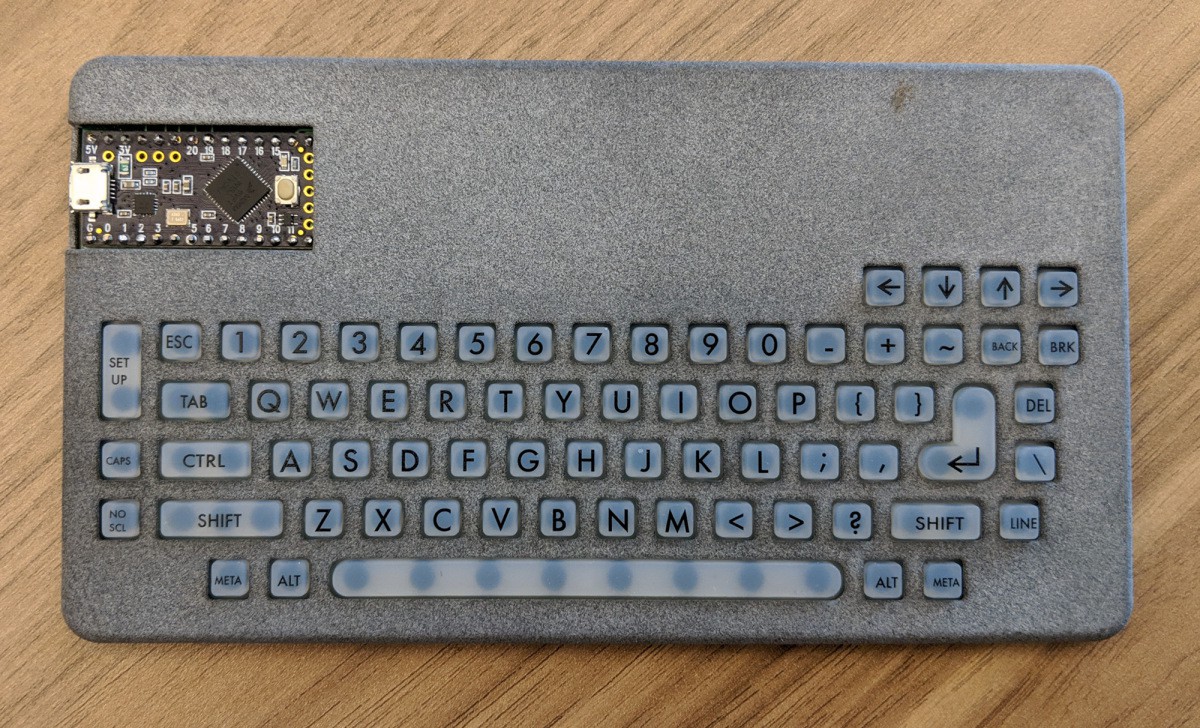
03/02/2019 at 20:05 • 0 commentsI'm buying a thousand silicone keyboards, months before I have finalized hardware. I need a way to test the samples of these keyboards, and the easiest way is to turn them into a USB keyboard.
The TL;DR is that everything is on the Gits
---------- more ----------Building keyboards from scratch, using Cherry MX switches, diodes, and laser-cut plates is well-tread territory. That's basically what I'm doing here; the switches are the PCB and silicone keyboard, the microcontroller is a Teensy LC (because that's what I had sitting around), and there are no diodes because I don't give a fuck about NKRO. There are three basic components of this build:
- The PCB
- The firmware
- The plastic enclosure/bezel
The PCB
As stated in the previous log, there's nothing really special about making silicone touch pads. Yes, everything should be plated in ENIG, but other than that as long as the traces and spaces are reasonable (I'm using 10mil) everything is going to work. The issue is just laying out the matrix. I'm using five rows with 16 columns, arranged thusly: BE WARNED IF YOU COPY THIS SHIT THERE'S GOING TO BE AN OFF-BY-ONE ERROR IN THE DOCUMENTATION
![]()
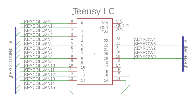
This was wired up to the Teensy LC thusly:
![]()
And the completed Gerber:
![]()
Not a big deal. Eagle file and Gerbers are in the Github.
The Firmware
There are dozens of different firmwares out there for configurable keyboards, all infinitely powerful and capable. This is just a test that isn't going into the final badge, so I just need something quick, dirty, and sloppy. I found a Teensy LC and wrote a little bit of code. The relevant part is below, the entire thing is on the Github.
const byte ROWS = 5; //eight rows
const byte COLS = 16; //sixteen columns

//Don't fucking ask me what this macro is doing here
//I'm just copying and pasting LiKe A sOfTwArE eNgInEeR

#ifdef M
#undef M
#endif

#define M(n) ((n) & KEYCODE_MASK)

char keys[ROWS][COLS] = {
  {M(KEY_ESC),M(KEY_1),M(KEY_2),M(KEY_3),M(KEY_4),M(KEY_5),M(KEY_6),M(KEY_7),M(KEY_8),0,0,0,M(KEY_LEFT),M(KEY_DOWN),M(KEY_UP),M(KEY_RIGHT)},
  {M(MODIFIERKEY_GUI),M(KEY_TAB),M(KEY_Q),M(KEY_W),M(KEY_E),M(KEY_R),M(KEY_T),M(KEY_Y),M(KEY_U),M(KEY_9),M(KEY_0),M(KEY_MINUS),M(KEY_EQUAL),M(KEY_TILDE),M(KEY_BACKSPACE),M(KEY_PAUSE)},
  {0,M(KEY_CAPS_LOCK),M(MODIFIERKEY_CTRL),M(KEY_A),M(KEY_S),M(KEY_D),M(KEY_F),M(KEY_G),M(KEY_H),M(KEY_I),M(KEY_O),M(KEY_P),M(KEY_LEFT_BRACE),M(KEY_RIGHT_BRACE),M(KEY_ENTER),M(KEY_DELETE)},
  {0,M(KEY_SCROLL_LOCK),0,M(MODIFIERKEY_SHIFT),M(KEY_Z),M(KEY_X),M(KEY_C),M(KEY_V),M(KEY_B),M(KEY_J),M(KEY_K),M(KEY_L),M(KEY_SEMICOLON),M(KEY_QUOTE),M(MODIFIERKEY_RIGHT_SHIFT),M(KEY_BACKSLASH)},
  {M(MODIFIERKEY_RIGHT_ALT),M(MODIFIERKEY_RIGHT_GUI),0,M(MODIFIERKEY_GUI),M(MODIFIERKEY_ALT),M(KEY_SPACE),0,0,0,M(KEY_N),M(KEY_M),M(KEY_COMMA),M(KEY_PERIOD),M(KEY_SLASH),0,M(KEY_PRINTSCREEN)}
};
byte rowPins[ROWS] = {19,20,21,22,23};
byte colPins[COLS] = {0,1,2,3,4,5,6,7,8,9,10,11,12,13,14,15};
A quick test with a dupont cable while the Teensy is plugged in told me it was good enough to order the board.
The Bezel
Oh shit here's where it gets fun. This is the section that will also be heavily edited.
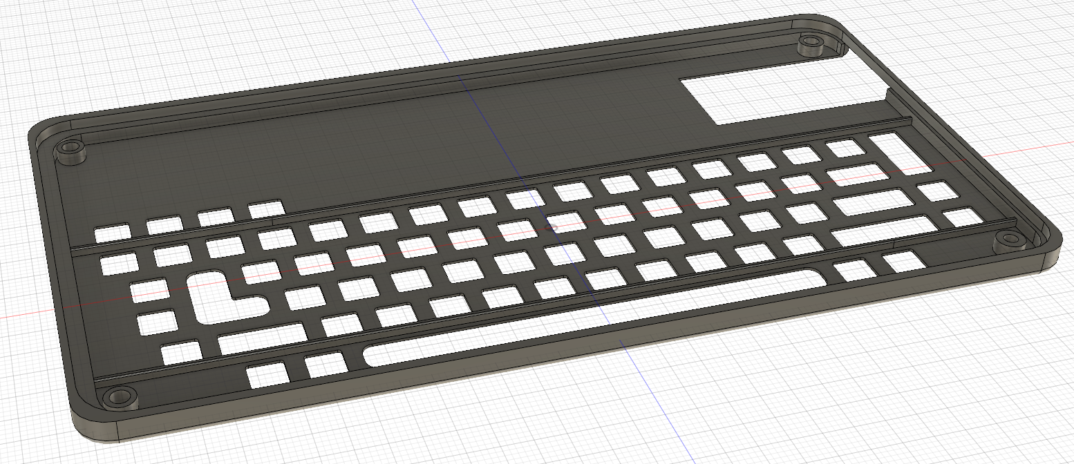
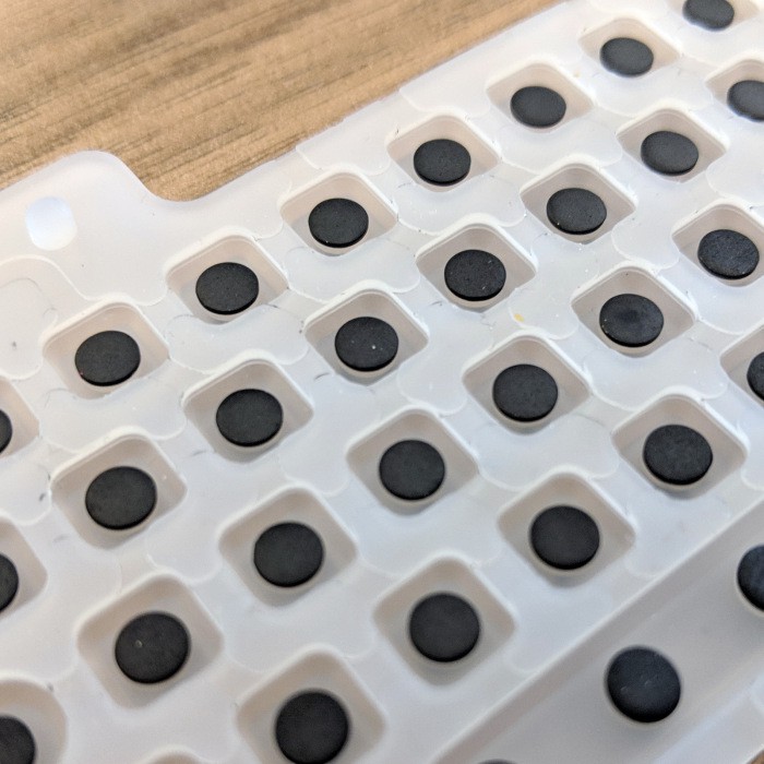
A silicone keypad isn't enough -- you also need a way to hold it down to the PCB so it won't slide away. Part of that is done with the bosses on the underside of the silicone switch and a few well-placed holes on the PCB. The rest of it has to deal with containing the key tops. I'm doing this with a piece of plastic that goes over the PCB and silicone keyboard:
![]()
![]()
This model was sent off to Shapeways, and a little bit later the prototype keyboards arrived from China:
![]()
![]()
![]()
![]()
![]()
![]()
![]()
![]()
![]()
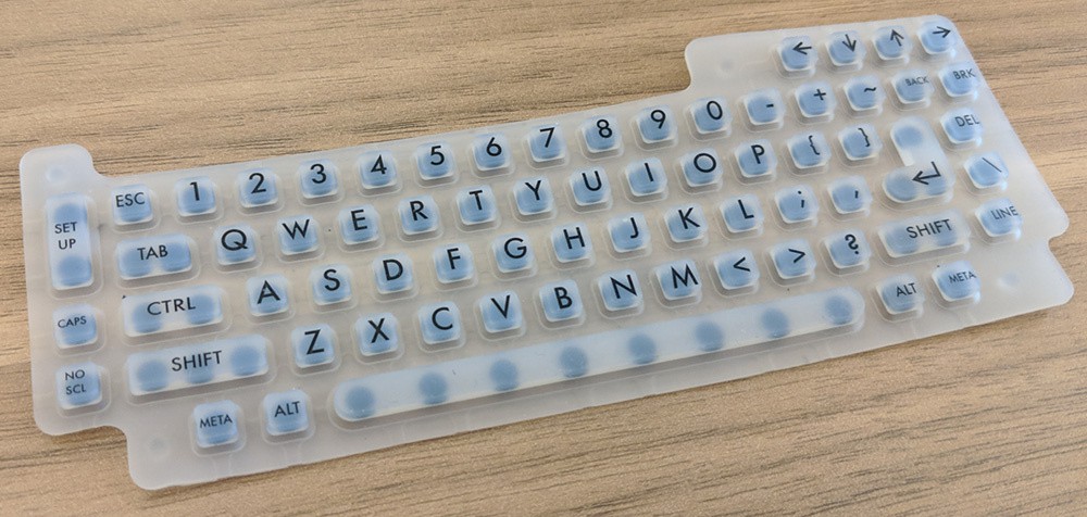
The prototype worked the first time. A few design details of note: there is a 0.3mm setback between the silicone button and the holes of the keyboard; this is what silicone design guides recommend, and it seems to work well. The USB works well, and it looks like this works. Great. That's one prototype down, and now I have to build the whole thing.
-
On the subject of keyboards
02/10/2019 at 18:51 • 3 commentsThe dumb badge requires a keyboard, and I'm doing this with a silicone keyboard like you'd find in a remote control or a ZX Spectrum. That's the easiest and cheapest way to put 100 buttons on something. But what is the layout going to look like? It's time for a review of existing terminal keyboards, how I made my keyboard, and a neat testing apparatus.
---------- more ----------The VT-100
![]()
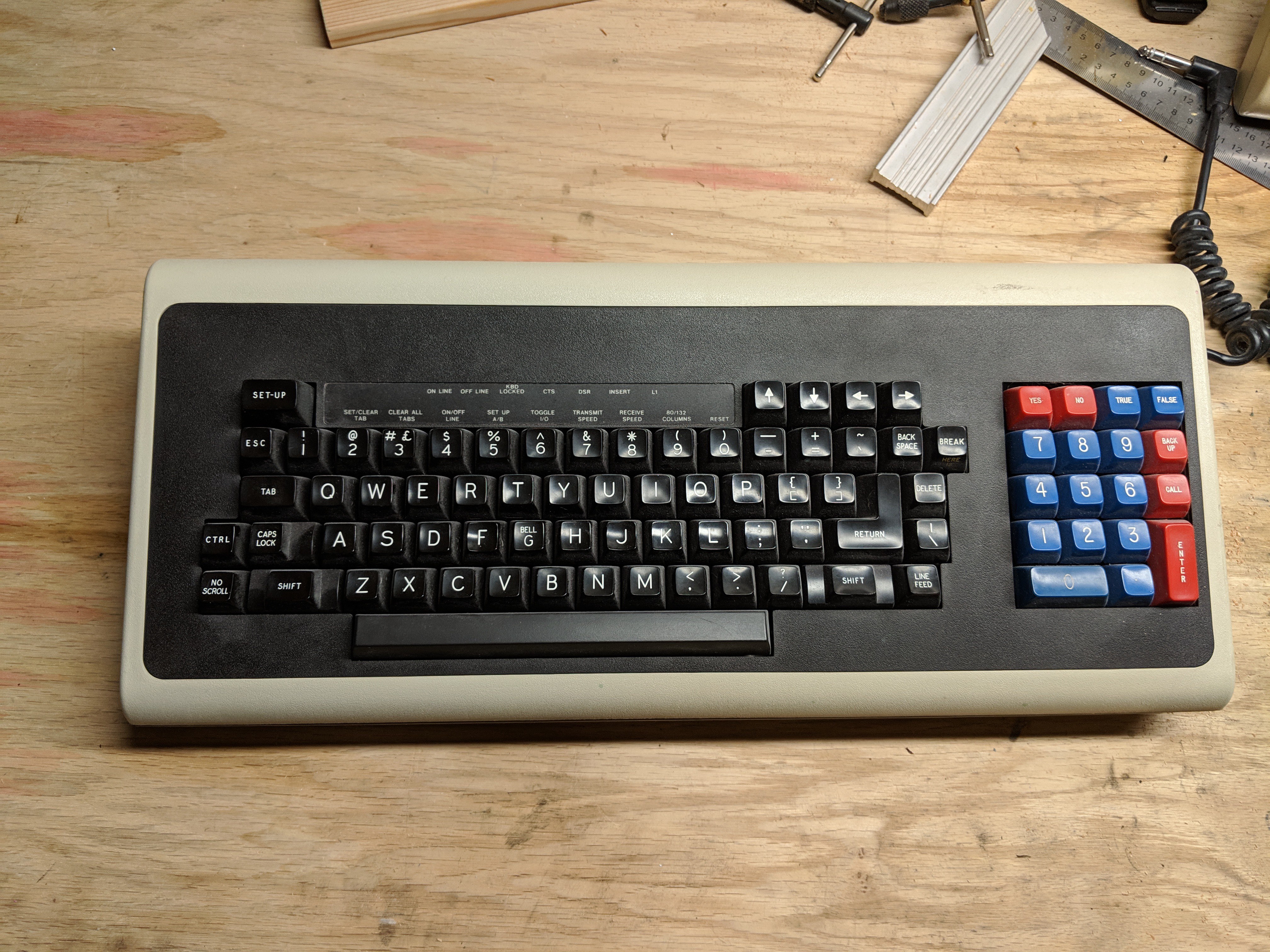
The original VT-100 keyboard. Actually, this is from a VT-102 sold by PsychSystems as an 'in office testing equipment for psychological measures'. Basically, someone under the care of a psychologist would answer questions like, 'do you feel like harming yourself or others' with the Yes and No buttons on the numeric pad. Disregard the numpad, and you have a bone-stock VT-100 keyboard.
Of note, you have a caps lock key, and it's closer to the home row than the Ctrl key. That's dumb; the caps and ctrl should be swapped. You've also got arrow keys, but not in the 'inverted-T' arrangement, because that hadn't been invented yet. The arrow arrangements also are not in the hjkl arrangement of the best text editor of all time. There's an L-shaped return, and the space bar is exceptionally long. Other than that, a pretty standard keyboard.
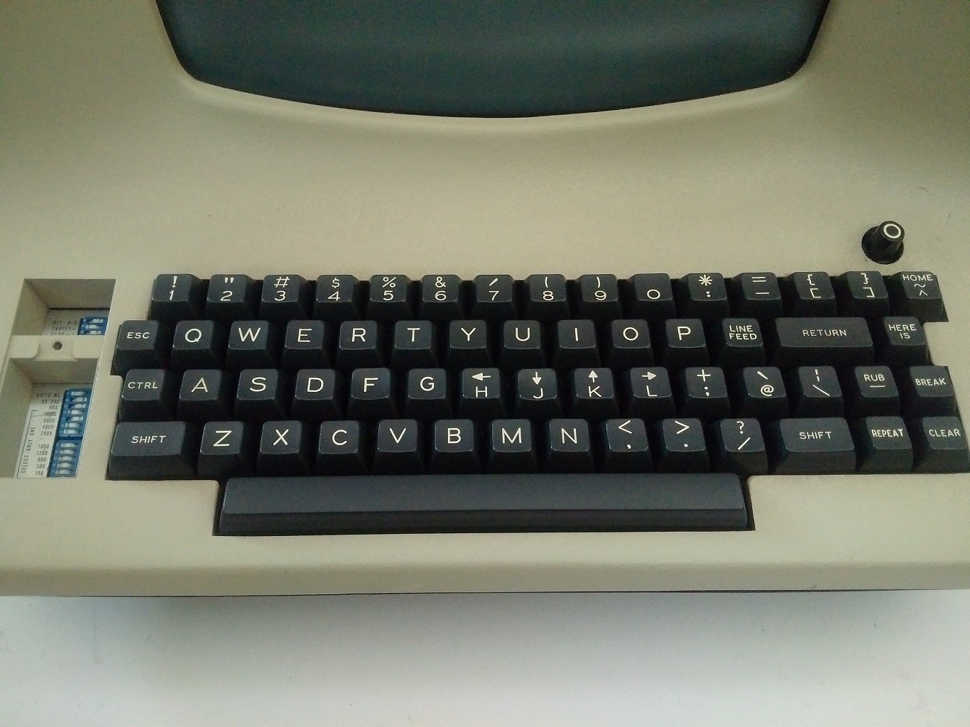
The ADM-3A
![]()
The ADM-3a is the most complex device you can build without a microprocessor. It is the height of TTL design. It's also brilliantly engineered on a single-sided, wave soldered PCB. Anyone who looks at an ADM-3a and remarks on its retro-looking enclosure is wrong; this is not a throw-back aesthetic. This is the pinnacle of designing things purely with logic chips.
It's also the only keyboard I'm referencing that's not in my collection. There's some interesting stuff here; note the arrow keys on the hjkl buttons, that's where vi gets it. Note the colon available without the use of the shift, that's where vi gets it. NOTE THE LACK OF A CAPS LOCK IT'S GENIUS. 59 keys, and it's doing it all without a microprocessor. What you're looking at is the why behind most console/terminal interfaces.
There are a few things I don't like. There's no dedicated button for controlling the terminal, as with the Set Up button on the VT-100. This is understandable; the ADM-3a was 'set up' with dip switches. It doesn't really work well with modern interfaces without alt or meta buttons, and the entire right side of the keyboard, from having the @ symbol next to \ and quotes on the 2, is weird from a modern user's perspective. Yes, the ADM-3a was the height of existing technology for 1976, but as we all know a technology is only perfected after it has been rendered obsolete. It's just too weird from a modern perspective.
Trash-80 Model 100
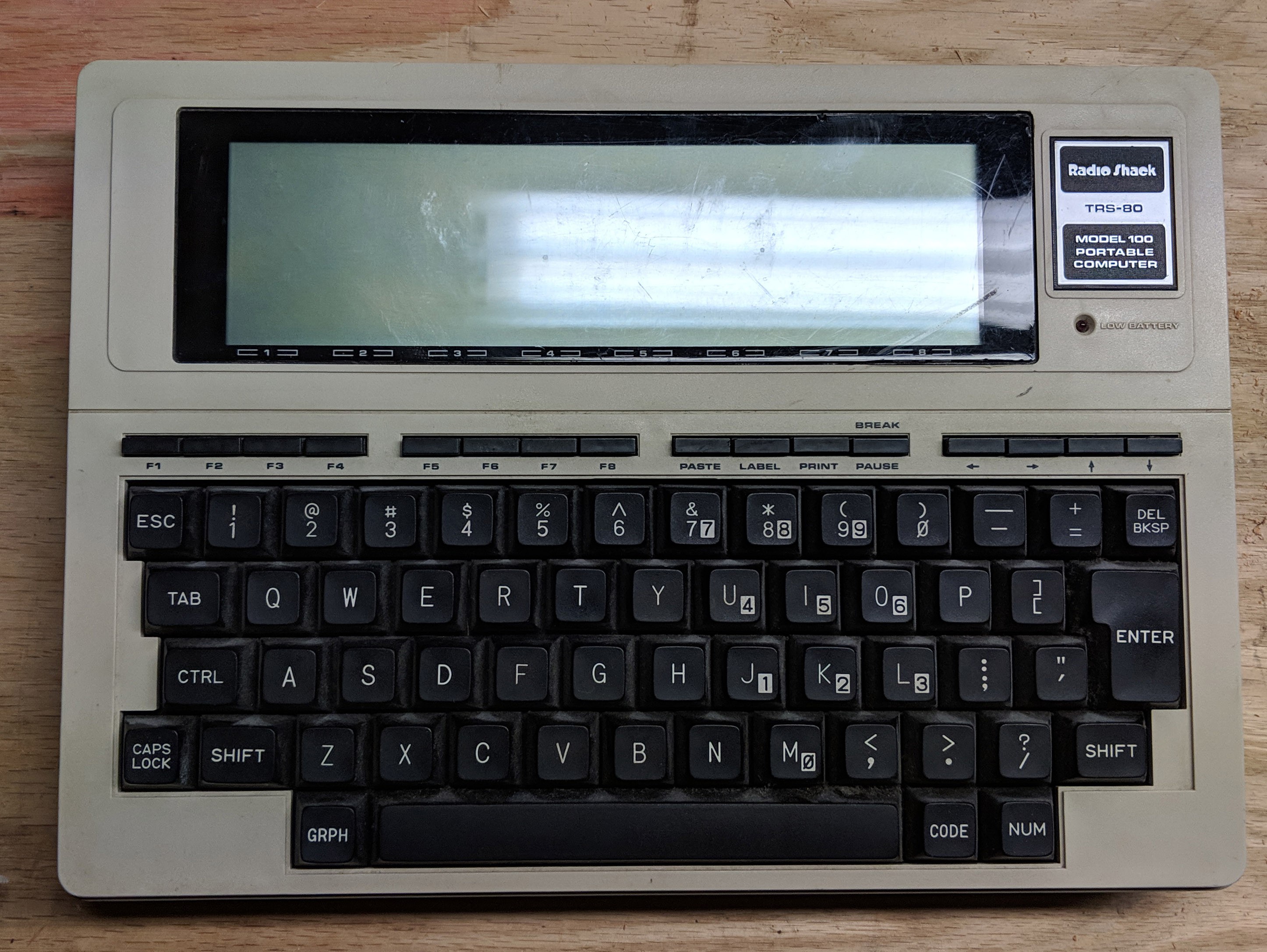
![]()
Yes, the Trash-80 model 100 makes for a really great dumb terminal. Arrow keys are there if you look hard enough, in a similar location as the VT100 keyboard.. Control and caps lock are correct. This is a very compact keyboard, and if you replace the GRPH and CODE buttons with Alt and Meta buttons, you have something that would work well with modern interfaces.
DEC TC 200
![]()
The Trash-80 Model 100 is an awesome portable terminal, but it's not the most portable terminal. That would go to a rare DEC product, the TC 200. This thing is incredibly rare, and if you have one, I'll trade you a dumb badge for it.
For the keyboard, you've got your normal qwerty layout a control where it should be, and various dedicated buttons for how fast the display scrolls. Of course, the screen sucks. This is a novelty, but it does show what's possible when it comes to portable keyboards. You're looking at a chicklet keyboard like the old HP 12c scientific/financial calculators; not silicone, but plastic buttons on metal domes.
I have a feeling this keyboard would be useless in a modern context.
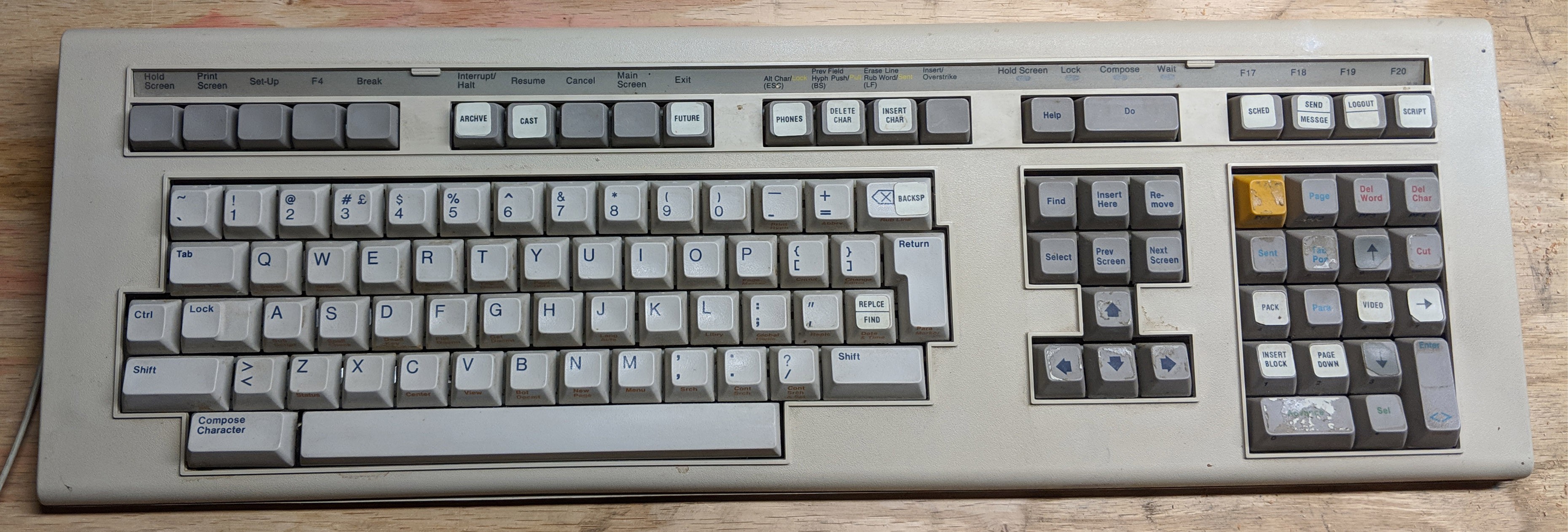
LK-201 / VT-220
![]()
The successor to the VT-100 keyboard, shipped on the VT-220. Note the arrow keys -- it's an inverted 'T' arrangement. This is the first keyboard to use the inverted T arrangement. History, right here. This is also remarkably similar to the Commodore 128 keyboard, because the Commodore 128 was designed on this keyboard. Interesting bit of history there,
Other items of note include function keys, and a numeric pad that's pretty similar to the a modern keyboard. This keyboard was released in 1983, the VT100 in 1978 or thereabouts; you're seeing the evolution of the modern keyboard happen right in front of your eyes.
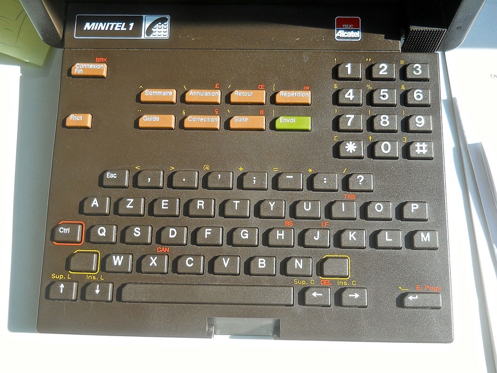
LIBERTÉ, ÉGALITÉ, FRATERNITÉ, AZERTY
![]()
This is a callback to the best headline I've ever written. Seriously, look at this. You can't come up with a better headline than Liberte, egalite, fraternite, azerty..
Anyway, what we're looking at here is a Minitel terminal. Minitel was a weird French Internet of sorts rolled out by France Telecom in the early 80s. It required a Minitel Termianal, the keyboard you see here. It's AZERTY, but whatever. Some of the keyboards have the space button labeled as ESPACE. weird.
You've got control in the right space, and no numbers but a num pad. There are buttons cor dialing and connecting, and not a whole lot of punctuation. There are a lot of problems with this keyboard, but only because it was designed for one specific system. Here, we're getting into the crux of the matter. The modern Linux terminal -- and most terminal applications, for that matter -- are ultimately designed for VT-100, LK-201 , and to a lesser extent, ADM-3a style keyboards. These keyboards are in turn based on teletype keyboards. The modern computer keyboard is about 80 years of design debt, and we've just learned to deal with it. Is the modern keyboard the most efficient? No, but it's what we're used to.
Therefore, the best solution I can come up with for a keyboard design is simply to rip off the design of a VT-100. It provides everything you need, in a layout that looks familiar.
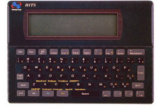
Handyer HIT5 Intelligent Terminal
![]()
Okay, now we're getting weird. The Handyer HIT5 has a silicone keyboard and a 240x64 pixel LCD, sufficient for 8 lines of 40 characters. Basically, this is what I want to build. It's a portable terminal meant for... I dunno, warehouse shit? You can put a barcode scanner on it. It'll send data to places. If the dumb badge is a product, this thing is what it's competing against. Whatever.
Anyway, what do we got here? A normal 4-row qwerty layout with numbers above. There's a stupid caps lock, but otherwise everything is remarkably square. Function keys intrude on the space bar, but the arrow keys are identical to the VT100. This isn't bad. This is a really, really good option. But I want something a little more unique. I'm torn between the efficient packing of the HIT5 and something slightly more vintage and exotic.
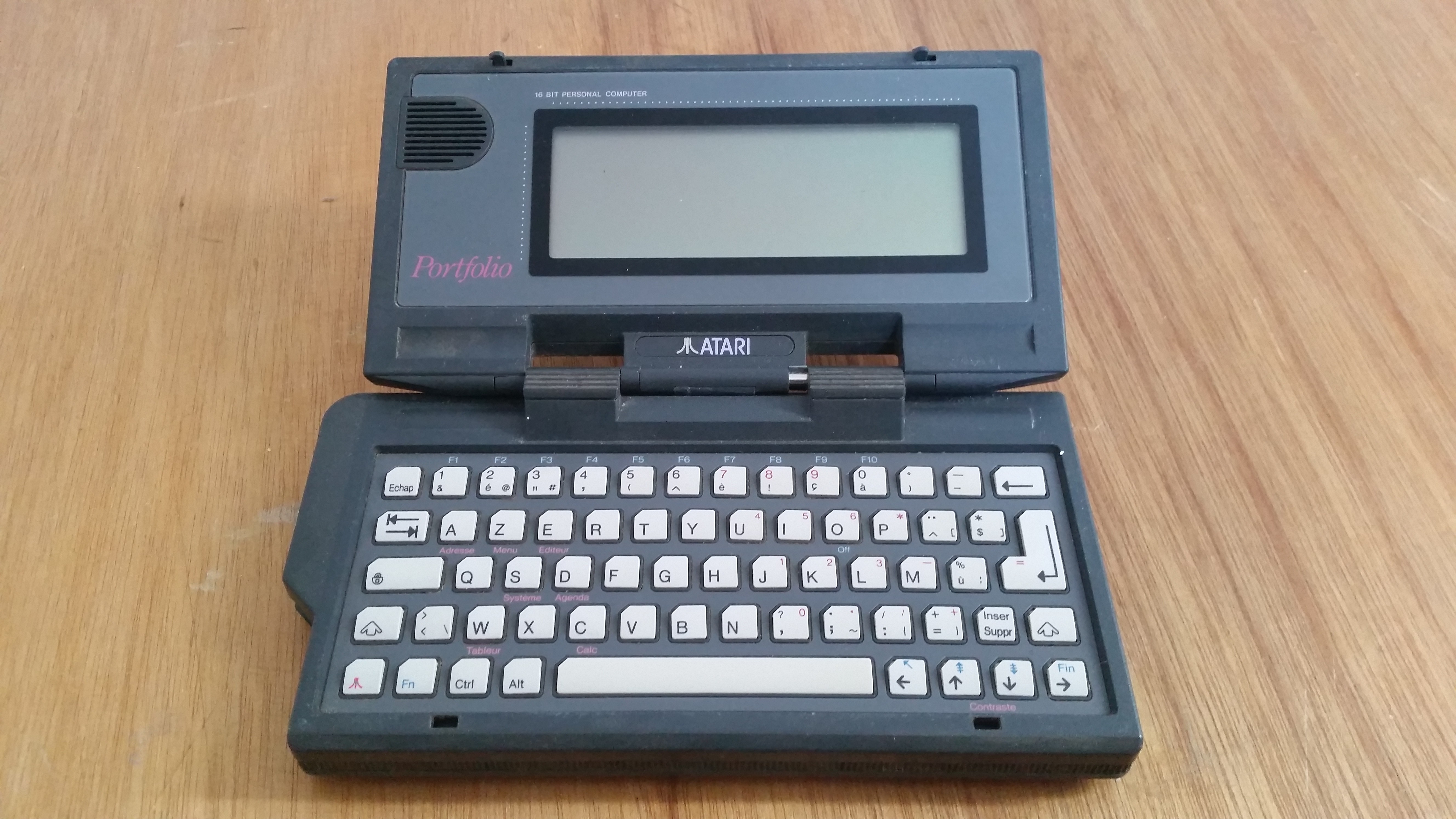
The Atari Portfolio
![]()
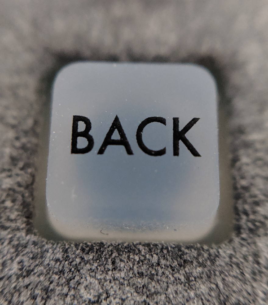
Disregarding the fact that this is a PC-compatible thing running DOS, this is probably the closest to what I'd like to build. This is a silicone keyboard, and unlike all the other silicone/membrane keyboards seen previously, the Enter key is an 'L' shape. I love that, I'm stealing it. There's a caps lock key, and it's more important than control. I hate that.
The keyboard is 63 keys, with alt, control, and a meta-ish button, and would work well as a modern keyboard. There is a lack of terminal-specific keys, like 'line' 'no scroll' and 'break', but this could be worked around. This is a viable layout for a terminal keyboard.
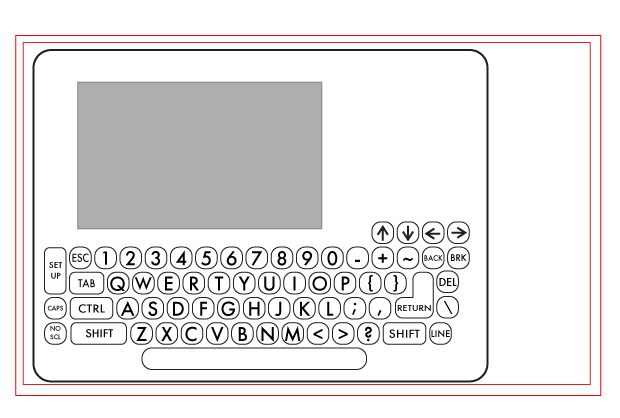
What I came up with
![]()
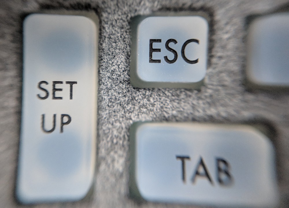
This is a bit of a mock up I came up with to plan everything out. It basically follows the layout of the VT-100 keyboard. The 'SET UP' button is moved down a bit, the caps and ctrl buttons are swapped as God intended, and it retains the arrow key layout of the original. Other than that, it's a VT100 keyboard.
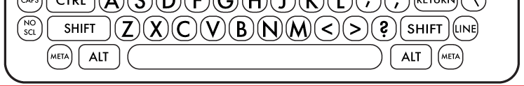
By keeping the layout of the VT100 keyboard, I'm assured that *everything* terminal related will work with this keyboard. However, there could be a bit more planned for this project; I specifically envision using this project as the interface for a small Linux thing. At the very least, recognize that you can attach a Raspberry Pi Zero to this badge and have a fully functioning linux system for five dollars. This means extra keys are needed, specifically Alt and 'meta / windows / command' buttons. Adding buttons is easy, though, so here's something a little more final:
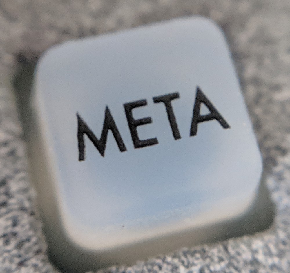
![]()
The addition of Meta (the same key as the Windows key or the option/command key on Mac) and an Alt key turn this into a small, usable keyboard. It also gives this keyboard 69 keys, which is great, because I was planning on calling this project the VT-69 (nice) anyway. Why am I calling it the VT-69? the VT-52 existed, and it's styled after the VT-100, and VT-420 was already taken.
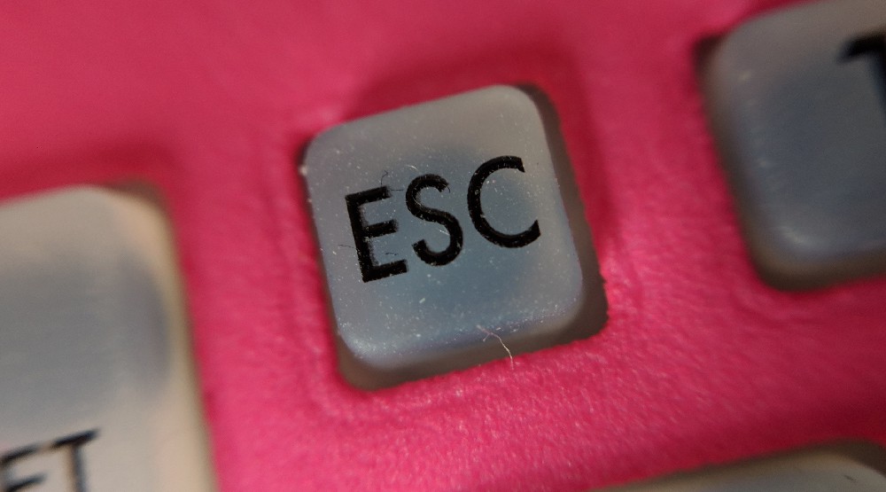
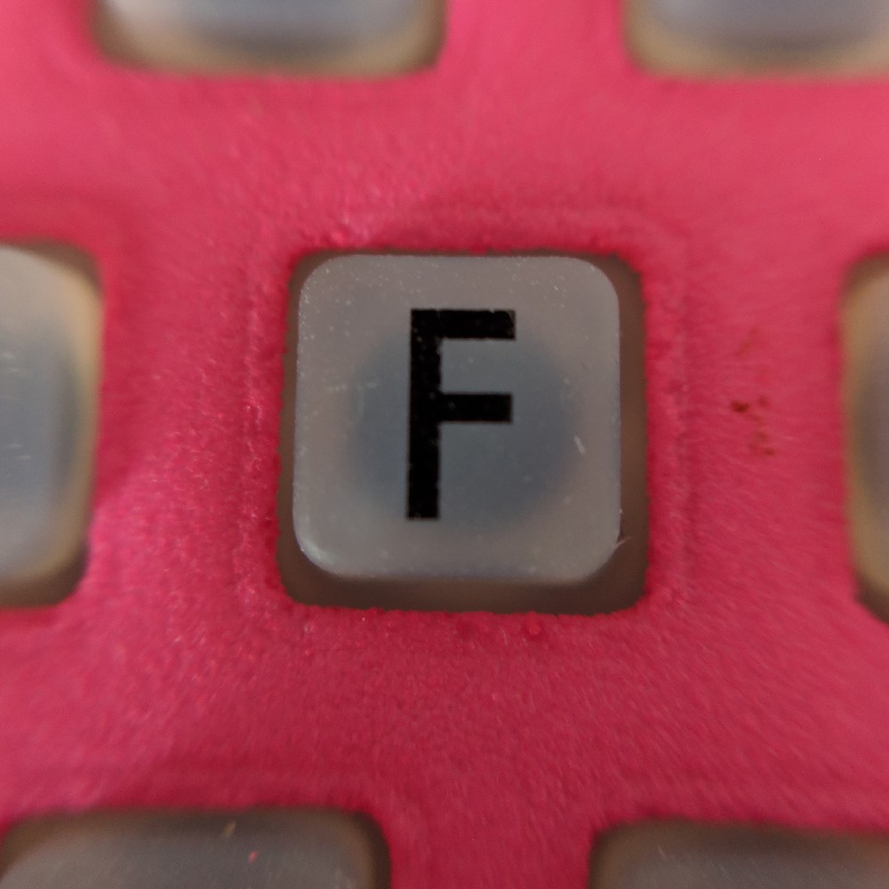
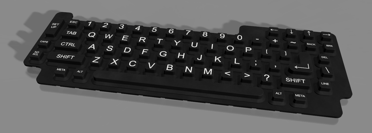
The files are already out to the fab, but here's a render:
![]()
![]()
![]()
This was done in Fusion 360, by taking the original (made in Illustrator) design, exporting a DXF, and extruding everything to the right dimensions. Throw in some fillets, and I can send this off to a factory in China. Right now,
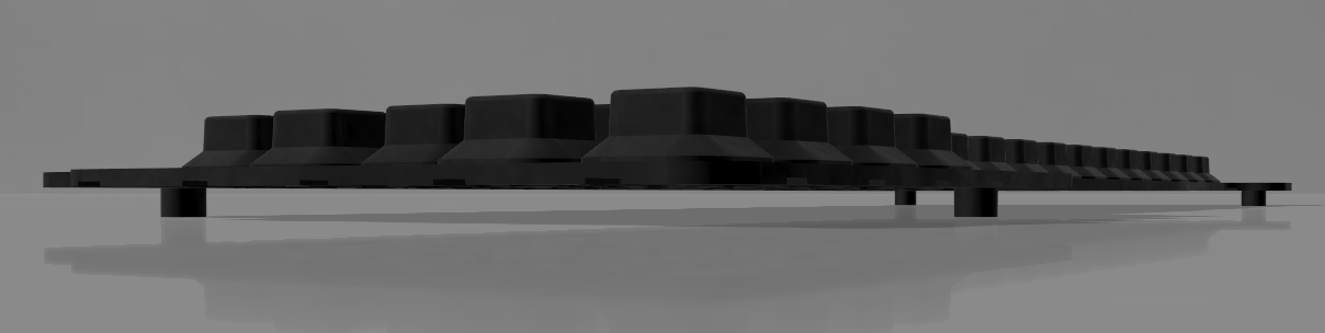
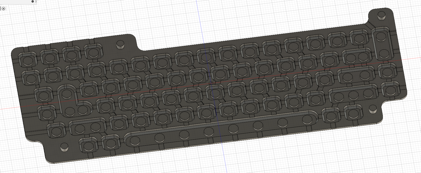
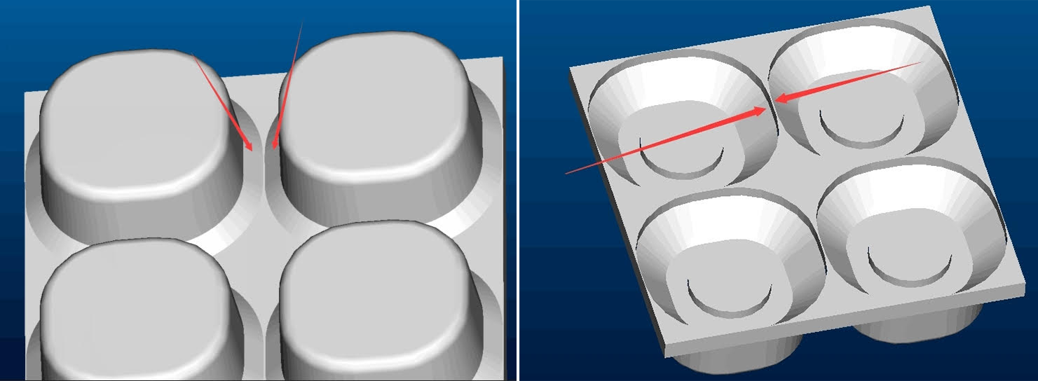
There was a problem with the first revision of this design. I wanted something that would have a maximum button area, with a minimal gap between the buttons. I had initially designed this with ~7mm buttons, with ~2mm in between each button. This is not enough for the silicone to work. After a little bit of back and forth, I got a note from the engineer telling me there needs to be 3.5mm pitch between buttons:
![]()
It's not really a problem to resize the keys and send them a new model, but it does mean the key legends will be smaller.
Okay, so we need a prototype keyboard.
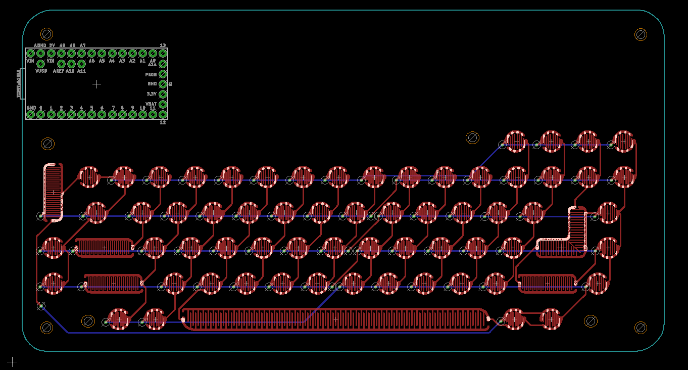
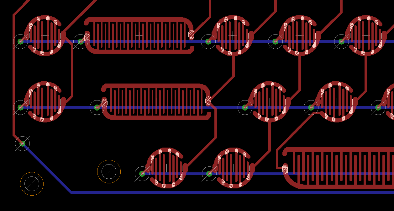
Assuming the silicone keyboard will work and everything will work as it should, I need a device to test this keyboard. For this, I whipped up a quick board in Eagle with touch pads I designed myself. Everything I've read about silicone keyboards is that the design of the touch pad isn't extremely critical, only that the carbon pill makes contact with two traces.
Thus, a keyboard layout and an X-Y matrix. No, there are no diodes, and therefore no NKRO. This keyboard is too small for touch typing anyway, and buying (and placing) 69 diodes would cost a god damned fortune. You get 2KRO with this board stop asking me about it. The micro at the top is a Teensy 3, simply because that's the board all the mechanical keyboard builders are using:
![]()
![]()
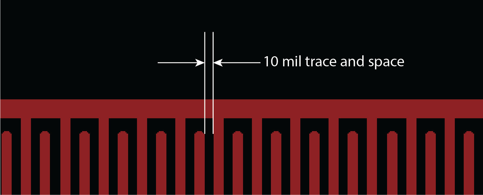
When designing a bunch of traces really, really close together, it's important to think about manufacturability. Most board houses default to 6mil trace and space. In other words, they're able to reliably lay down 6 mil wide traces with 6 mils in between each space. The carbon pill I'm using is 4mm in diameter, so 6/6 might be a bit overkill. To improve my yield, I'm using 10 mil trace and space for each pad:
![]()
The hope is that samples for this keyboard will be on my desk in a month or so. I'll be sending the prototype keyboard PCB off to a board house shortly.
Cost and efficiency
Since I'm being completely open with the design of this project, I should mention how much this costs, and how efficient it is on a per-key basis.
The design costs for this silicone keyboard are:
Tooling $2219 Design cost $600 Bank Fee $58 TOTAL: $2877 This is simply for the tooling and design. Actually manufacturing the silicone keyboards will cost $1.30 at qty 1000. Since I'm making a thousand (why not, even though I'm not going to make a thousand for DefCon), my total cost for the silicone keyboards in this project will be $4177. How does that compare to using tact switches?
If I wanted to make a thousand keyboards, each with 69 keys, using tact switches, I would need to buy reels and reels of switches. The best price I've found for 4mm tact switches is $60 per reel of 4000, and this project would need 18 reels (at least that's what I would buy). 18 * $60 = $1080, or about a quarter of the cost of doing 1000 units with a silicone keyboard. No, it's not cheap, but it will look really good, the buttons will have legends on them, and I'm saving quite a bit of time during assembly. However, doing a production run of 1000 using silicone keyboards doesn't make any sense at all.
How many would I have to make before the silicone keyboard pays for itself? Assuming the $60 reel of 4000 tact switches ($0.015/switch), you will never save money with silicone keyboards if you're paying $1.30 for 69 buttons. The math just doesn't work. However, the quote for 5000 silicone keyboards is a unit price of $0.79, or $0.011/switch. Here, it gets a little better; 345,000 switches would cost $5175, and the tooling and molding of 5000 keyboards would cost $6827. Sure, the silicone keyboard saves a ton of assembly time and looks great, but it comes at a significant financial cost.
Bottom line, the break-even point where silicone keyboards are cheaper than standard tact switches is somewhere around 10,000 units. This doesn't factor in the 'soft' tasks of assembling the final unit, or running around a pick and place machine swapping reels, which would be in the silicone keyboard's favor. Still, silicone keyboards don't make sense for low-volume production.
Basically, this is the stupid way to do things from a financial standpoint. A silicone keyboard isn't going to make financial sense unless I'm making ten thousand of these things. I'm planning on shipping 100-150 at DefCon. This is what the kids call an 'oof'. But it'll look dope as hell.
VT-69 Handheld Terminal
It's a dumb terminal. You can connect a Raspberry Pi to it.