-
1Basic tips and tools
- Do not put graphics over your photos, or, make sure I can crop them out. I **WILL** tag you if the information is available, but I won't share your watermarked image.
- Clean your lens. Especially if you're photographing LEDs or anything with indicator lights. Simply wiping down your lens will stop glare.
- Clean your desk and photography area. The only items in view should be carefully selected and not distracting. Take a moment to wipe down the display surface, or put down a piece of paper, cutting mat, or other backdrop. No keyboards, loose wires, or discarded snacks should be visible.
- Include multiple images.
- Take the time for photography, don't rush it at the end. Its well worth spending 15 minutes getting a good photo, so we can help share it with everyone!
- Simple gifs or animations of light patterns can be very helpful. Using an app like Boomerang for iPhone or Android can make this easy.
- Using "night mode" on your phone settings can be helpful for low light. For this, you may need a tripod or other method of holding your phone. You can use this 3D printed tripod design, this cheap tripod, and i've used wood clamps or bench vices (delicately) to hold my phone successfully.
- Do not use filters, but you can touch up the colour and contrast using apps like SnapSeed.
Seamless background:
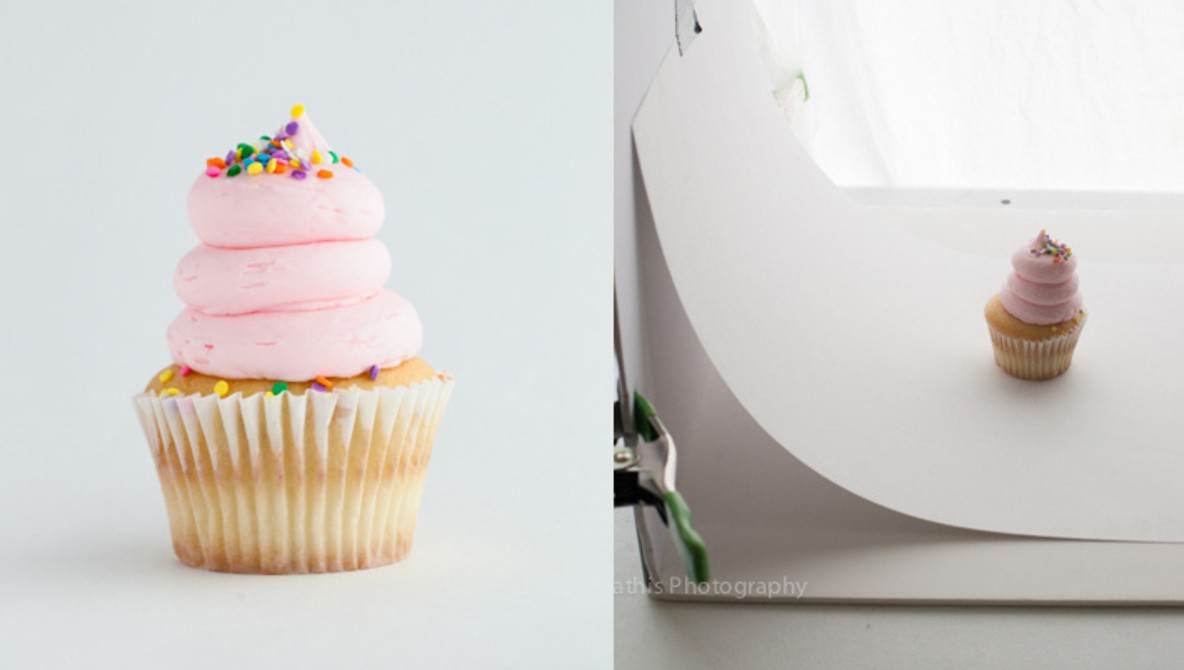
A simple photography setup can use a "sweep" to create seamless backgrounds. This can be as basic as taping a piece of paper behind your work. Heres a brief tutorial. You can also buy a portable lightbox.
![]()
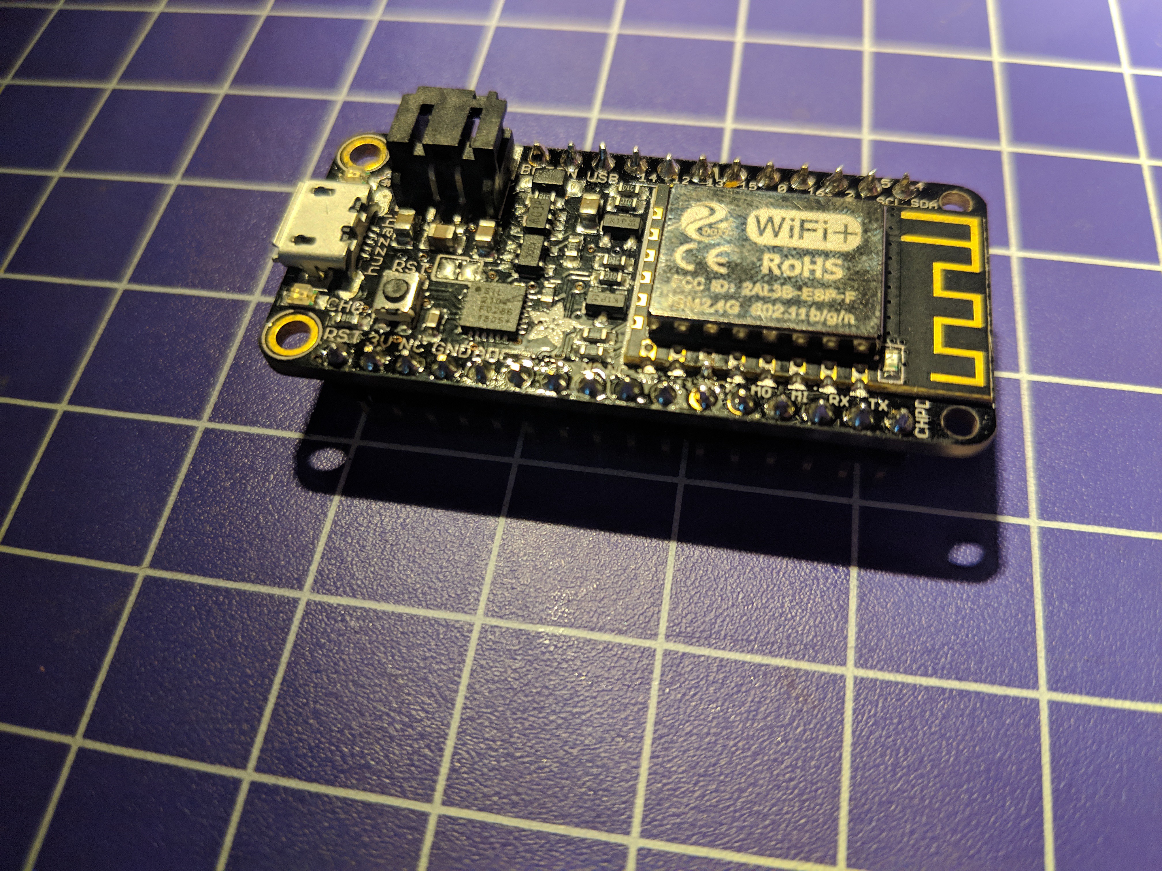
- Lighting: Lighting is the most important aspect of a good photo. I recommend if possible to take your photos using natural light, near to a window, but not with direct light. Avoid direct lamps that cast hard shadows from a single direction. Direct light can also cause reflections on your board, which makes it hard to see. Check out this example of the same shot with a directional lamp and natural light. I’ve put some tips on LED lighting below.
![]()
![]()
- Focus: This might seem basic, but make sure your work is in focus. Sometimes blurring the background can also help bring attention to your piece if its a hype photo, this technique is called Bokeh - but be careful, this should only be done intentionally! For product or kit shots, everything should be evenly in focus. Its well worth the time to find a technique to stabilize your phone wile taking photos, either with a tripod or an ad-hoc system.
![]()
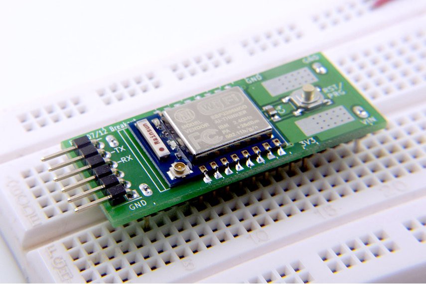
- Background: The background of your photo should be carefully considered. If its a product or kit shot, keep it very simple. Making a white background with either a piece of paper can keep you clear of any distractions. You can also choose any consistent background, just make sure theres nothing distracting. The colours of your background shouldn’t over take your project. Avoid any shots that include your desk/keyboard/work station, unless carefully arranged.
![]()
![]()
- Composition: I’ve got more to say about composition below in each section, but a broad consideration is the platform you’ll be sharing this on. Make sure your entire piece is in at least one photo. Detailed photos can be included as well, but make sure one aspect of your work is clear (A particular chip, connector, or LED?). These days, square images work really well for social media, so even if your image isn’t square, make sure I can crop it into one without missing any important parts. Also, keep straight lines in mind. Make sure your photo is aligned properly, if there is a desk or a table, make sure it is haphazard.
-
2Product, kit, and hype photos
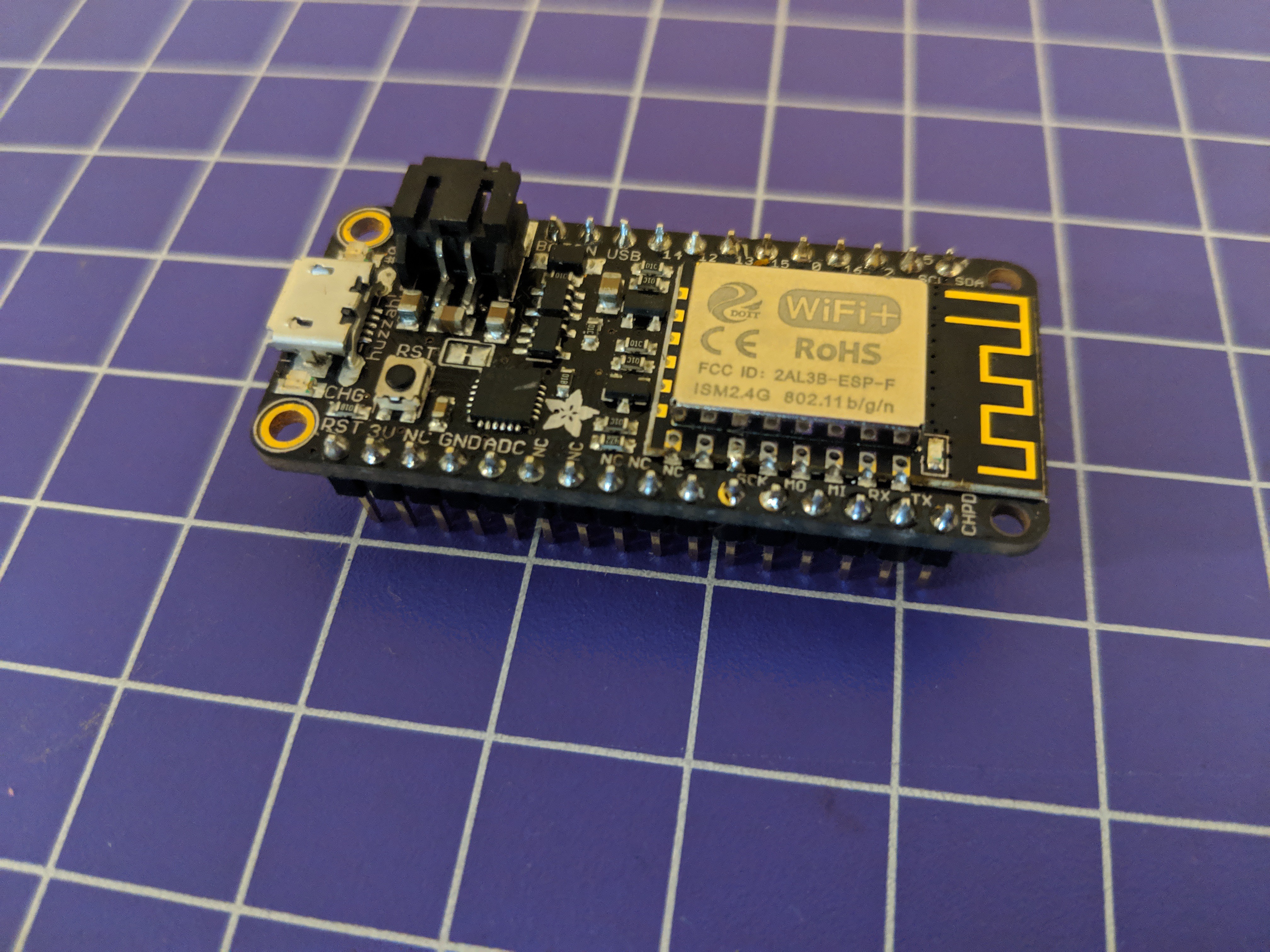
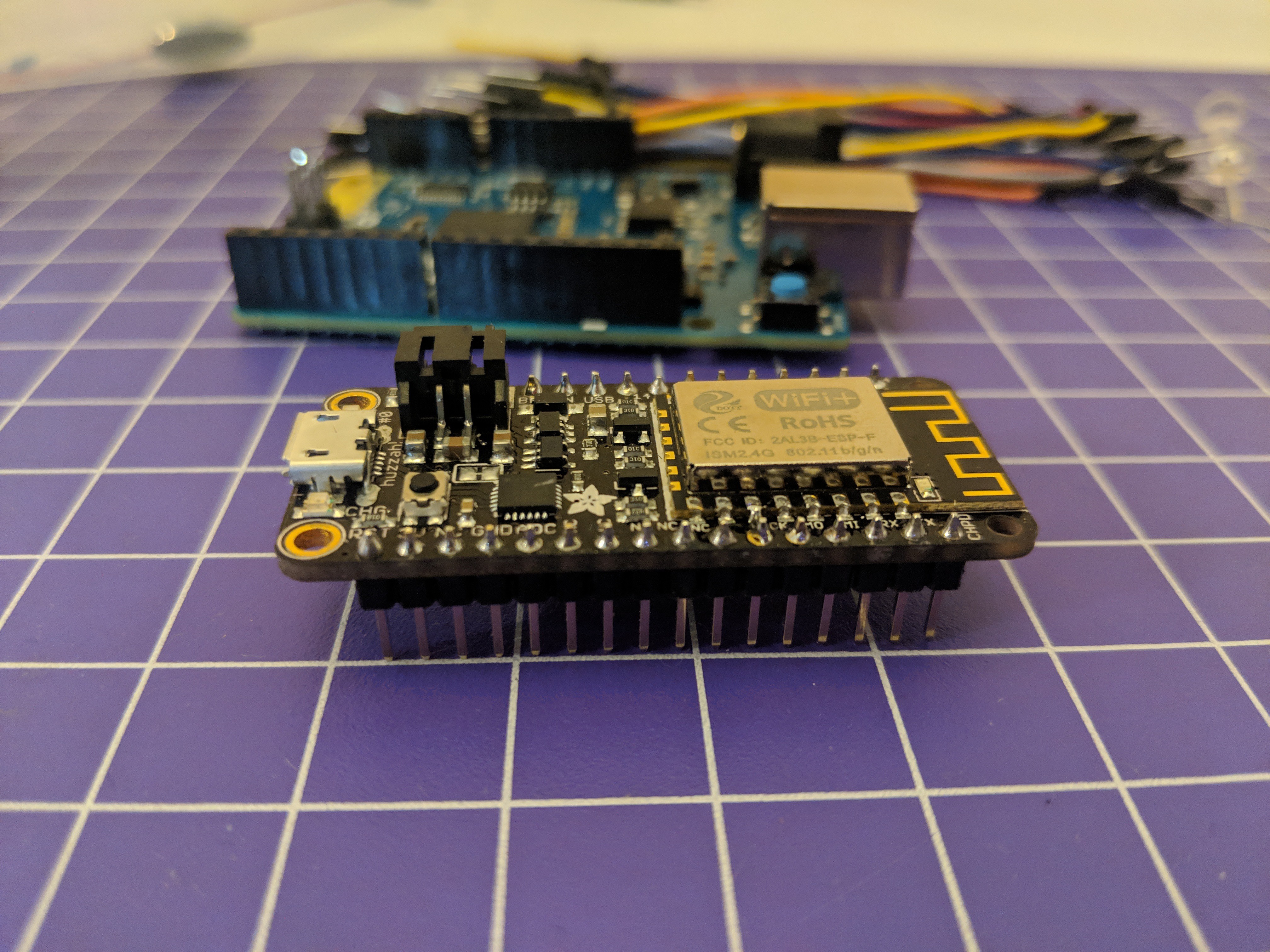
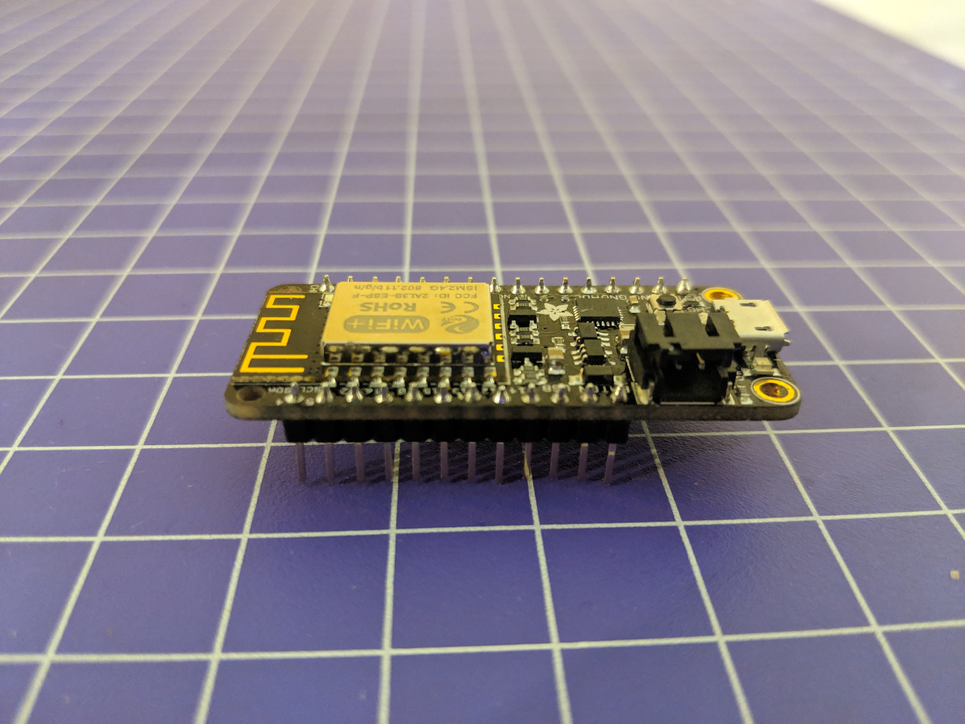
Product Photos:The goal of a product photo is to clearly show your work. These photos should be on a clean (often white) background, in full focus. There should be nothing in the photo that isn’t related to or included in your project. Top and side views may be helpful in documenting your product. These are important if its something you're trying to sell.
![]()
Kit or process Photos:
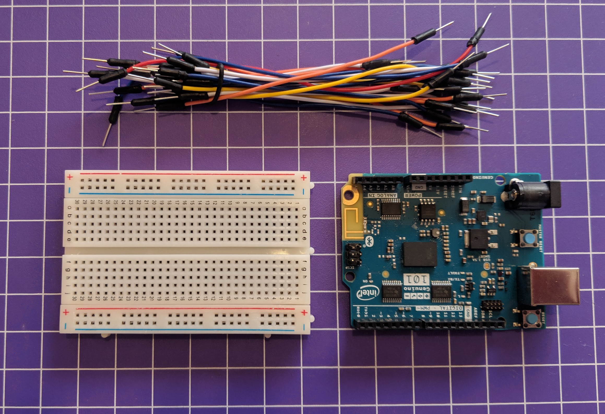
These photos can help explain either a step of a process, or show the contents of a kit. They should be either on a plain white background, or consistent. You can use a ruler or straight edge to line up your pieces. Do not label or put any graphics over this image. A tip for kit photos, os to make sure your shadow isn’t in the picture. Avoid overhead lighting,
![]()
![]()
Hype Photos:
Hype photos are impressive photos of your work that highlight sometime cool about it. Here, you can get creative with colour, composition, focus, and context! If you're board is small, take it next to something for scale. If you're board produces music or lights, take a picture of it in action. Here, you can also be creative! These photos are to grab people's attention, and they can look at product or kit photos after for details.
-
3Photographing LEDs
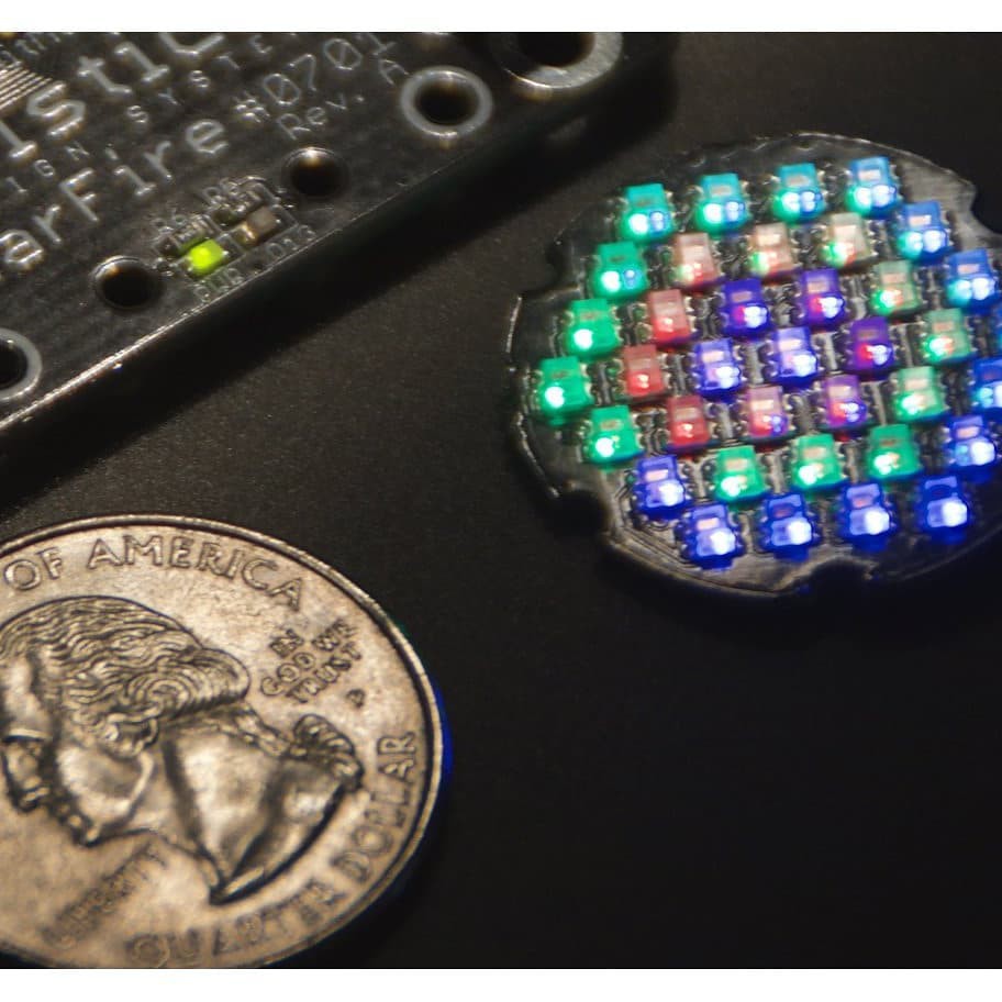
If you've got LEDs in your project it can be difficult to document and will require extra work, but these can be some of the most impressive photos. Generally, for product photos featuring LEDs, try to not photograph them in complete darkness. If you're in total darkness, your LED will be the only source of light and obscure your work.
![]()
- Make sure to clean your lens. This is most important, especially if there are LEDs in focus. Even a simple wipe down can make a huge difference.
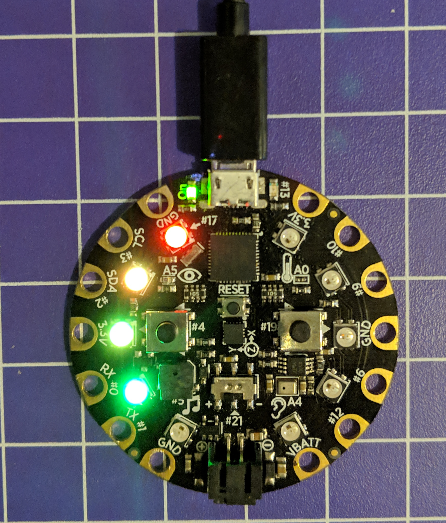
- If there are indicator LEDs on your board, get them in action! These shots can be in full light, and allow the viewer to see your project in action.
- Consider a secondary source of light. This can be a lamp facing the opposite direction from your work that allows the room to have indirect light, or low level ambient light.
- Simple gifs or animations of light patterns can be very helpful. Using an app like Boomerang for iPhone or Android can make this easy.
- Using "night mode" on your phone settings can be helpful. For this, you may need a tripod or other method of holding your phone. You can use this 3D printed tripod design, this cheap tripod, and i've used wood clamps or bench vices (delicately) to hold my phone successfully.![]()
![]()
by @mle_makes
![]()
-
4Colours
Colour: Using colour in your photos can help get people's attention. You can do this in a variety of ways. You can create contrast with your PCB and the background, wires, or components by choosing a very different colour like @davedarko did in this piece. Attention to detail like wire colours and button colours works really well.
![]()
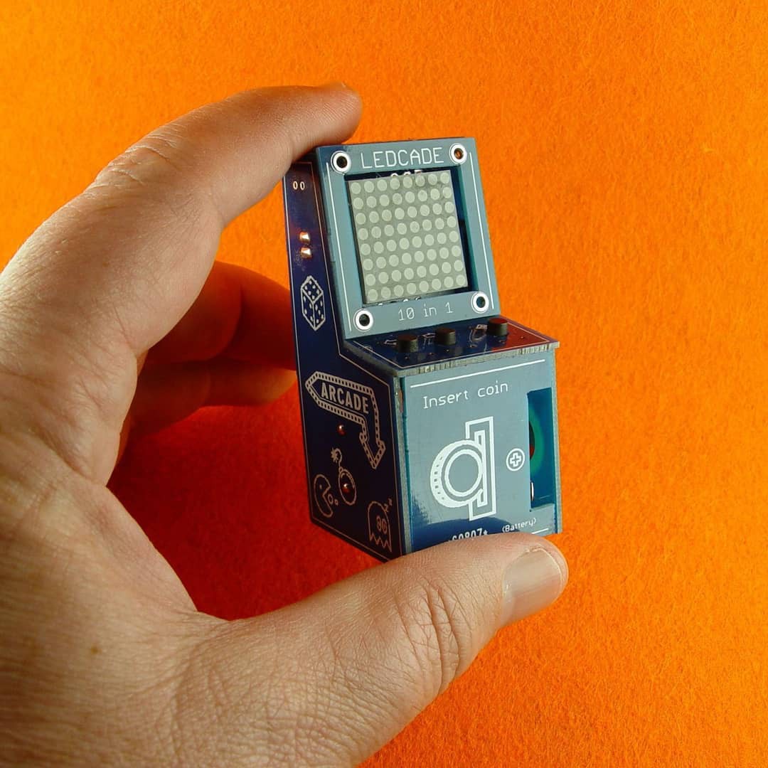
Another technique is using a colourful solid background. The LEDCade by Roger Cheng does this really well!
![]()
🕹️🥰his week's #HackOfTheWeek is the LedCade! A tiny arcade game cabinet with 10 classic retro games on 8x8 led matrix, built from a single PCB!! https://hackaday.io/project/165207-ledcade-arcade-game-cabinet-8x8-led-matrix
-
5Descriptions and social media
I usually look for a twitter, instagram, website, or other social media accounts when I'm sharing work. Make sure these accounts are connected to your Hackaday.io and Tindie profile. Further, make sure these are accounts you want associated with your work. People will follow you if your posts are about the topics you're working with. If you don't want me tagging your personal account, and you'd rather me tag you by name, please don't include that account. Project descriptions are almost as important as photos. Based on your description, I should be able to immediately tell what your project does, why its special, and what you used to make it. Ideally, in 2 concise sentences. Additional description can come after. Have a good one liner in your Hackaday.io project description or tindie product description. This should be as simple as "My project is an X that does Y". Your second line should feature what makes it unique: "The X has a Z type chips that lets it do amazing things!" Also, letting us know what other platforms you used (Arduino, Rasberry Pi, OSHPark etc) can help boost your signal, because we can tag them along with you in any posting we do.
-
6Our Faves
Some of my faves and most successful posts:![]()
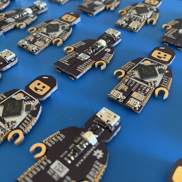
Benjamin Shockley is at it again. This is a SAMD51G based dev board! #freeformFriday ![]()
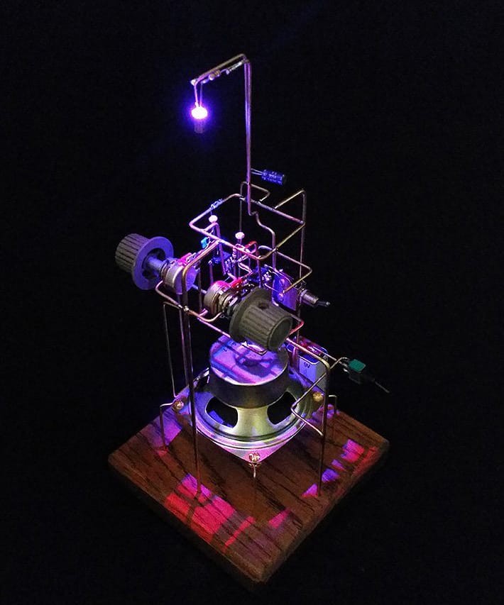
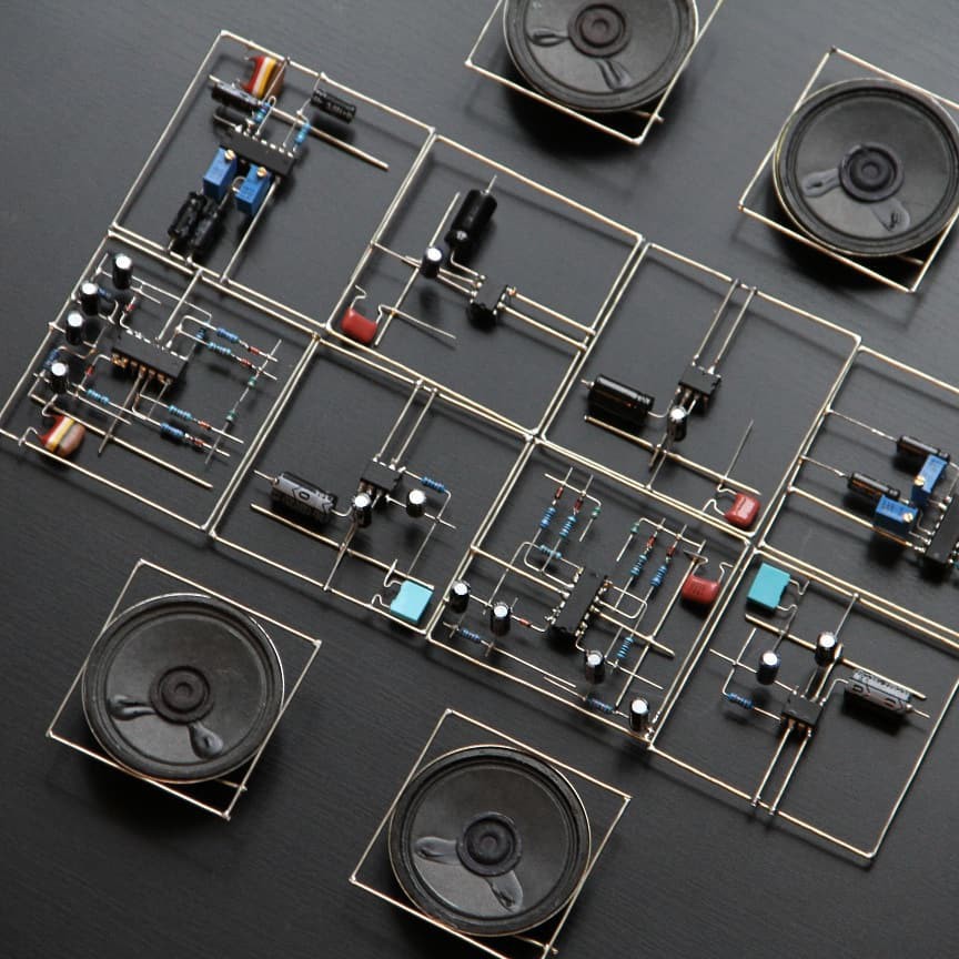
@eirikbrandal kbrandal created this generative music sculpted, "treed" for our Circuit sculpture contest a few weeks ago! We've got more contests on Hackaday.io, including making 3d printed gear and pulley sculptures. #freeformFriday ![]()
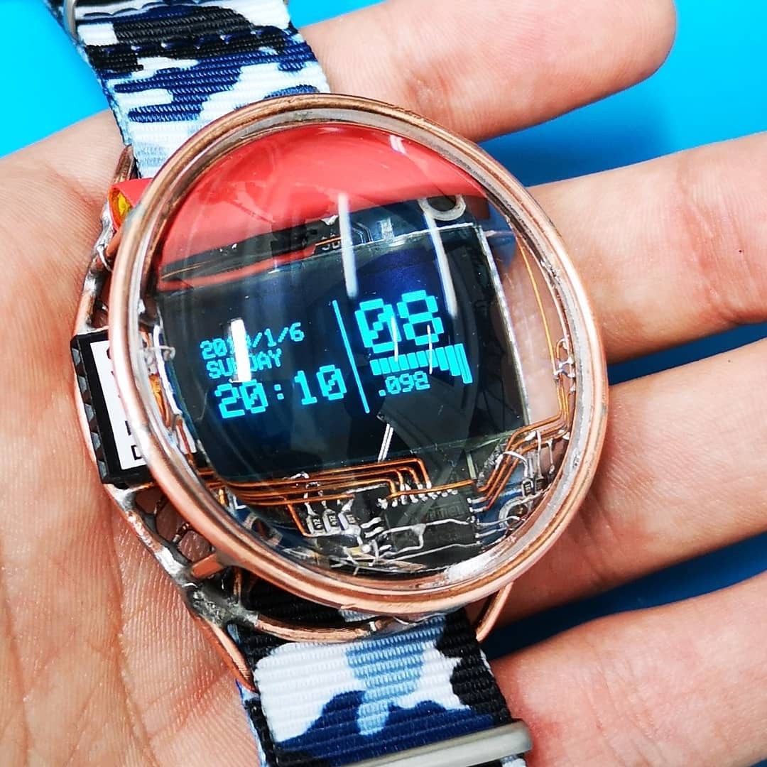
This week's #HackOfTheWeek is a circuit sculpture watch with OLED display by @mile264 ⌚✨ ![]()
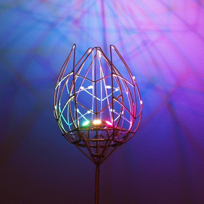
t's #freeformfriday again! This is Jiri Praus's mechanical tulip 🌷⚙️
Making your work social media ready
Some useful tips for taking photos and writing descriptions
 Lee Wilkins




Discussions
Become a Hackaday.io Member
Create an account to leave a comment. Already have an account? Log In.
A trick I tend to use a lot is making ad-hoc softboxes. I wrote a page about this a few months ago(https://hackaday.io/page/6177-kentucky-softbox), but taping a piece of paper over a flashlight or smartphone light can make for a pretty effective softbox if you're on a budget.
Also: +1 to the vise = tripod tip.
Are you sure? yes | no
Good article! Some thoughts:
1. Even more important than have a lot of light is having a lot of *GOOD* (i.e. 'high CRI') light. Here (https://hackaday.com/2018/09/25/diy-studio-lights-to-improve-your-videos/) is a good article on building good quality lights.
2. I can't recommend CHDK (https://chdk.fandom.com/wiki/CHDK) or Magic Lantern (https://magiclantern.fm) enough for adding *insanely* useful features to Canon cameras. With one simple script and a single click, you can take all of the shots you need to create a focus-stacked, exposure-bracketed image--with software like Hugin (http://hugin.sourceforge.net/)--that will make many people think that you are a professional photographer. (Here, for example, is a focus-stacked picture of a Warhammer miniature that I--a complete and utter amateur--took for a friend: https://i.imgur.com/GbB5NKZ.jpg It was taken in 'Super Macro Mode' with a Canon S5 and required 21 shots--taken automatically by a script--to get everything into focus. )
Are you sure? yes | no