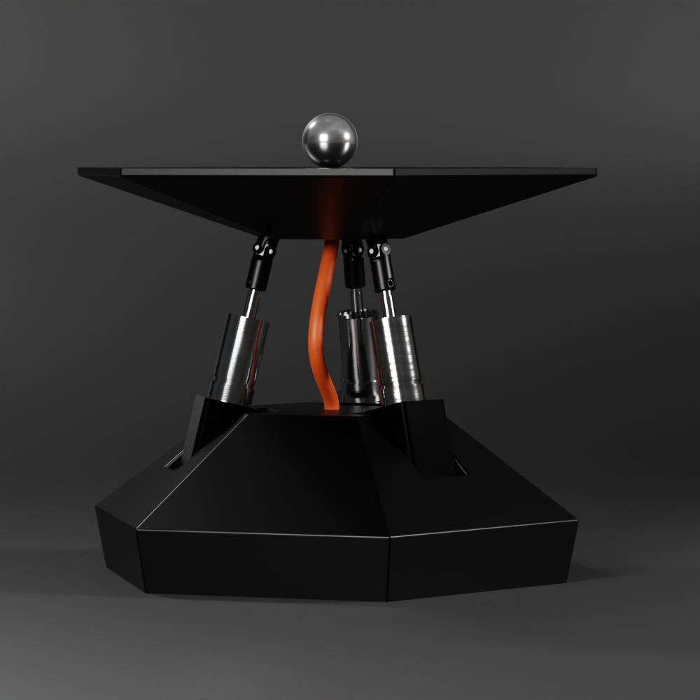
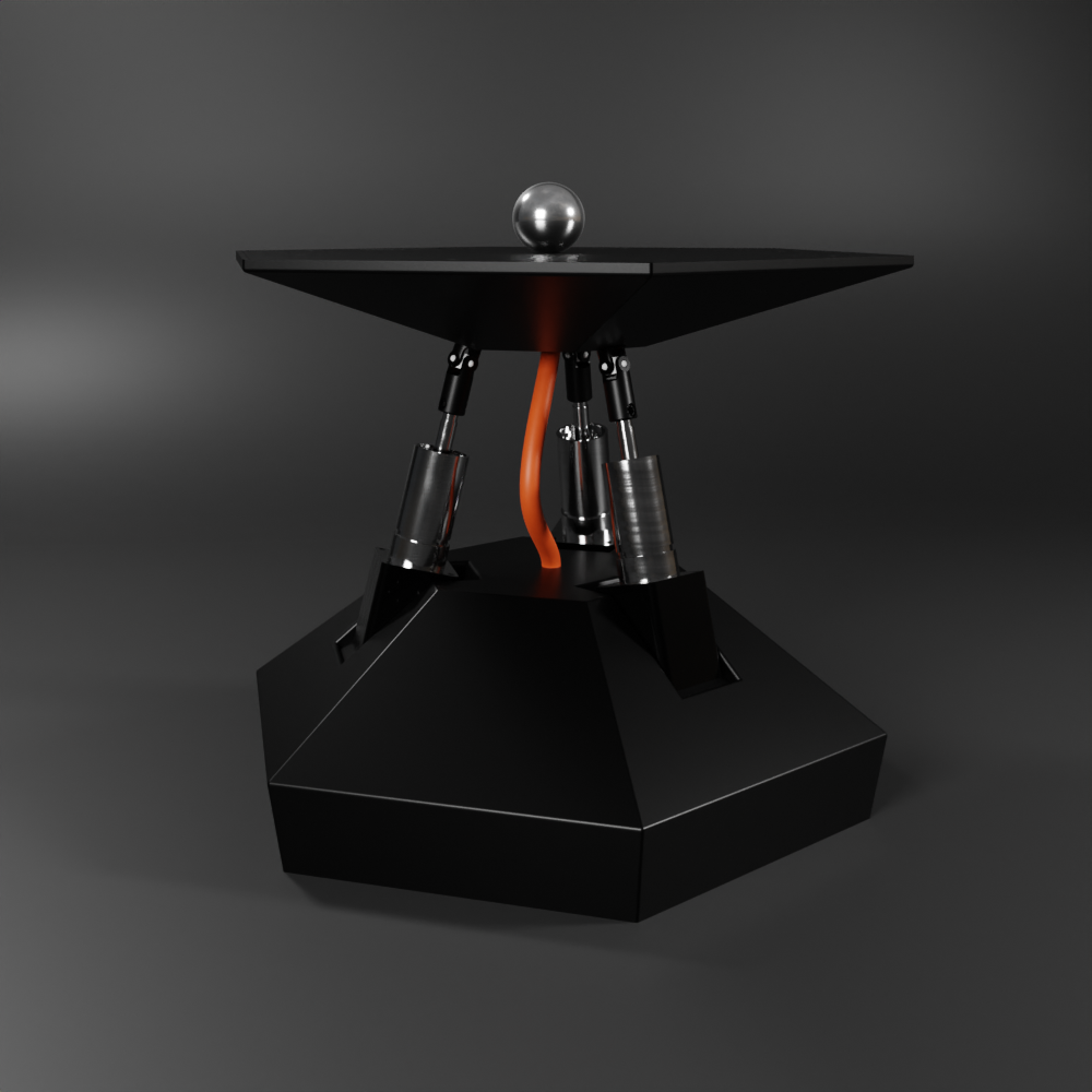
I've made a couple more renders, that elaborates more on the visual identity I envisioned for the project.
Please take a look, and tell me what you think:

The bottom and the top parts are geometric and very clean looking in terms of visual aesthetics. In the meantime the middle layer is unapologeticly exposed, celebrating the raw robotics. It exposes the universal joints, the pistons and a striking cable that flexes as the plates moves around.
The renders were done in Blender by exporting the model from onshape. Here are a couple more setups:


There are still a lot to be designed here, the cable is just a placeholder and the bottom shell is to be detailed further, but this would be the general outline.
Tell me what's your idea to improve the visual identity here.
 Tamas Feher
Discussions
Become a Hackaday.io Member
Create an account to leave a comment. Already have an account? Log In.