Back in 2018 I was (and still am) an avid reader of Hackaday. I opened up the the front page towards the end of the school cycle at my school IT job and stumbled upon an interesting business card design by Mixtela. It was a PCB you could plug in, have it identify itself as a MIDI device and play tunes by creating an analog value when tapping the contacts.
I was so enamored by this design that I wanted to pull out some savings and try to do one myself! This resulted in me taking the first steps in learning how to fabricate custom circuit boards.
My first design had many flaws. Through those flaws, other experiences I gained in other designs, and the fine work performed on the incredibly cost efficient CH32V003 by the open source community, I’ve created a stunner of a business card.
The Original Business Card
![]()
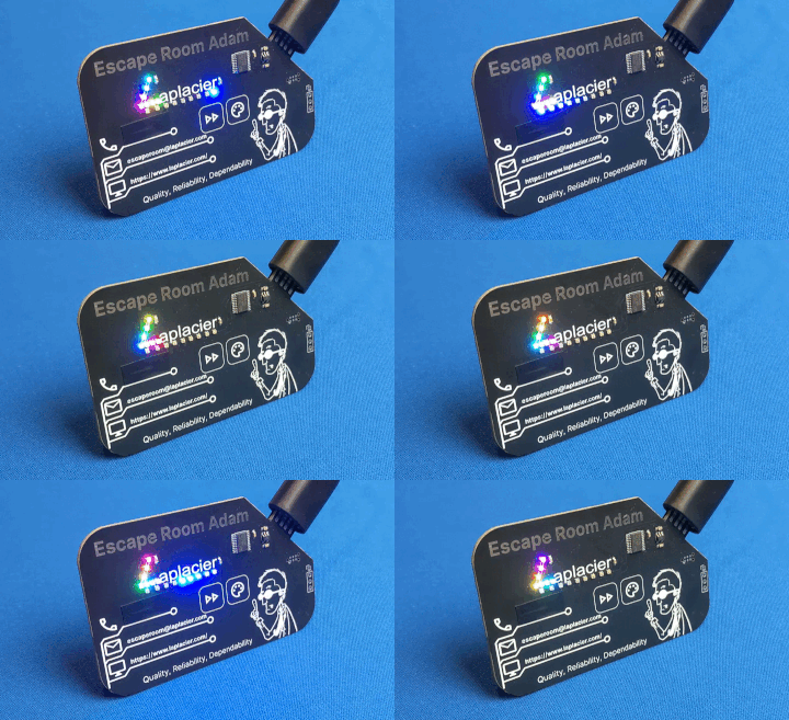
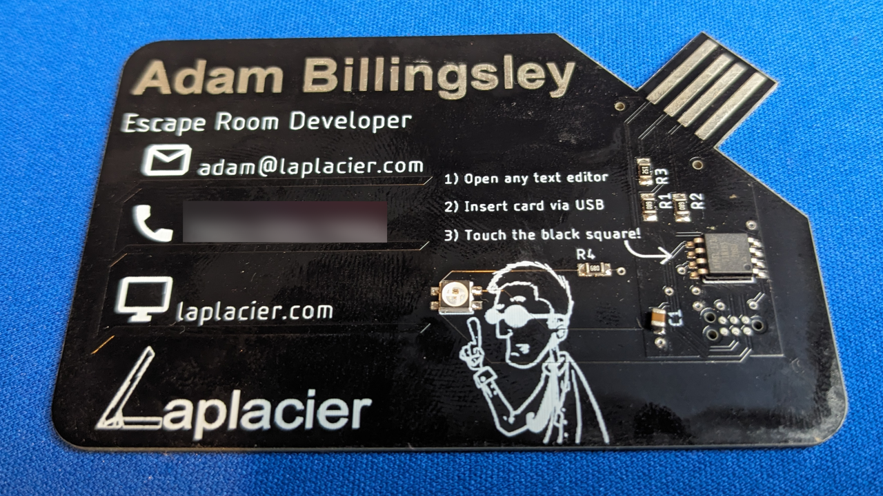
This is the first business card design I came up with based around the ATTINY85. This business card was burned with micronucleus and registered as a keyboard on a computer when plugged in to type a "secret code" via text. Touching the card would trigger the payload and perform a short rainbow animation on the LED. At a staggering parts cost of $4 per board, it was definitely not a card I could hand to others lightly. However, I want to briefly talk about this card because a few PCB techniques are easily viewable on here that I want to share, and I also want to talk about the issues that laid the bedrock for the design decisions of the current card.
Embossing
![]()
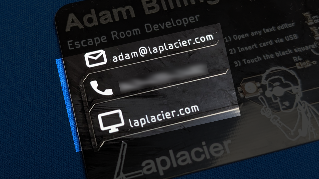
Here you can see my information underlined by a subtle line in a branching path pattern. Anywhere copper is not designated on a PCB, it is removed. Copper has a thickness. Even if you have no purpose for the copper as part of the circuit, you can route designs using copper traces and planes that will leave an embossed look under the silkscreen of the PCB.
Custom Images
![]()
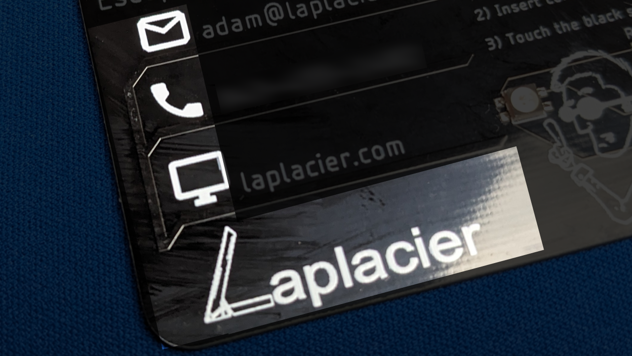
If you have a logo or custom image you’d like to insert on your board, it needs to be vectorized. If you’re like me and not an artist or already have an image that isn’t already in vector format (SVG, DXF, etc), there are free tools online that can help make the transition. Be sure that the image or logo you have in mind will look good in monotone black/white and apply the image on the correct silkscreen layer. If you’re looking for basic icons such as an envelope to accent an email address or a phone for a phone number, Font Awesome has some free icons available in the correct format.
Also, be careful with large vector files. If the file is too large, you'll be waiting until the heat death of the universe for your PCB software to finish drawing it. If you do get hung up this way, just scale down your resolution or reduce the number of lines in the design.
Masking
![]()
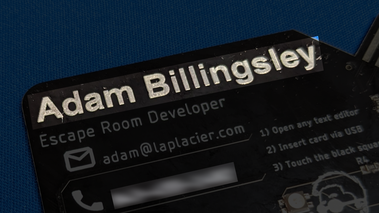
When adding a solder mask to the board, silkscreen is not applied to that portion. An experienced reader may be thinking “duh, this is what solder masking does”, but imagine this concept in the context of text or custom images. If you designate your text or design as a solder mask and place a solid plane underneath, you get a cool metallic look to your design. Neat!
USB Connector
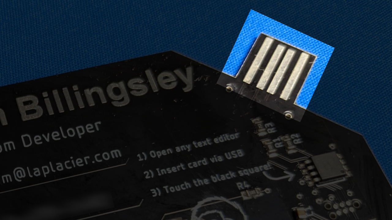
One facet of Mixtela’s design I liked was the cost effective USB connector. It required no additional components, which appealed to me, and the footprint of the connector was applied in the corner in such a way that it maintained pluggability while sacrificing as little of the usable PCB space as possible. I didn’t like how the extra thickness added by Mixtela’s solution looked though. I had access to a 3D printer, so I implemented a similar USB connector but printed out tab thickeners to attach to the back of the PCB. No more bulge was visible from the front, and it still has the required thickness to be inserted.
Design flaws
Let's talk about the issues that hurt this business card:
- As mentioned earlier, the business card was too expensive to produce to hand it out randomly with a parts cost of $4. This...
 Adam Billingsley
 Jack Flynn
 greg
greg