-
First Public Display
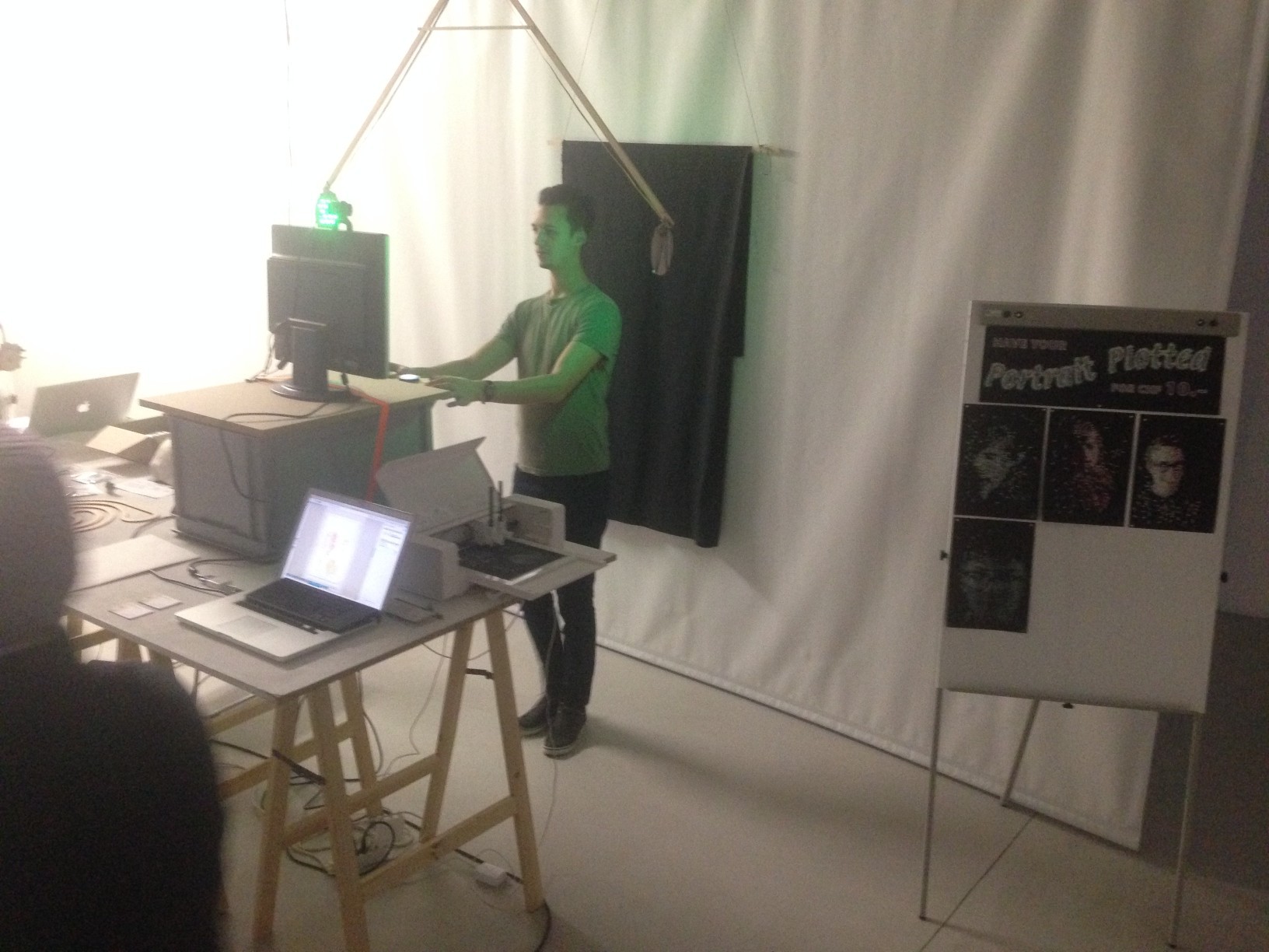
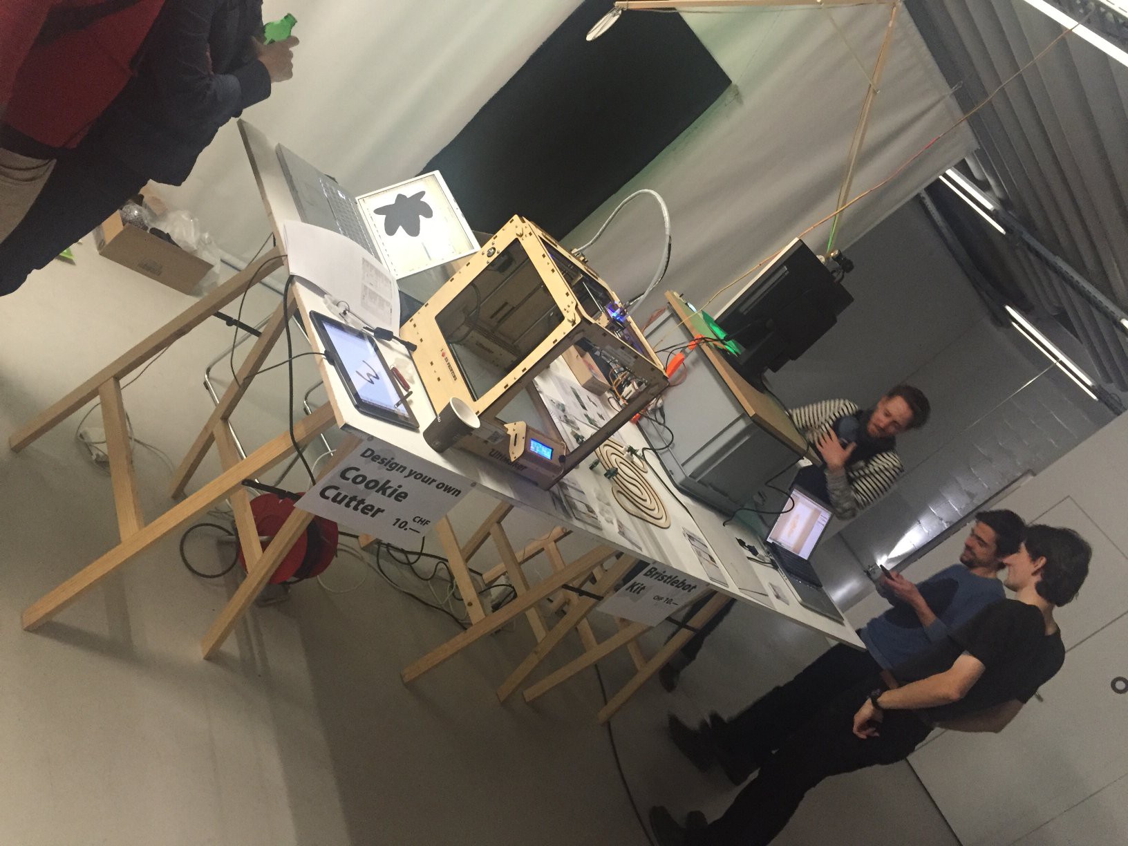
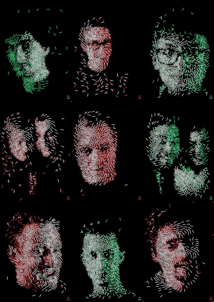
12/12/2017 at 11:56 • 0 commentsThe Digital Holiday Market was a success! The portrait plotter performed nicely and was well received. Many fascinated visitors and 7 plots sold in 3 hours.
![]()
![]()
![]()
Technical insights from this iteration:
- Horizontally centering your face is difficult because there is no clear indication of the right edge in the live preview. Many portraits turn out off-center without the subject initially noticing. Maybe add a gray line down the center of the screen.
- The drawings generally turn out lighter (more densely stroked) in the midtones than the prototypes. Some gamma tweaking may be in order.
- The silver Edding 1200 pen ran out in the middle of the evening (I had spares), after maybe 10 plots in total. I was expecting them to last longer, but they are inexpensive so that’s okay. Might try reviving it with some water, if I can get it open without too much damage.
- I may need a landscape mode for couples.
-
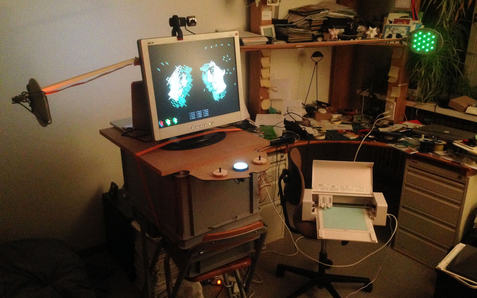
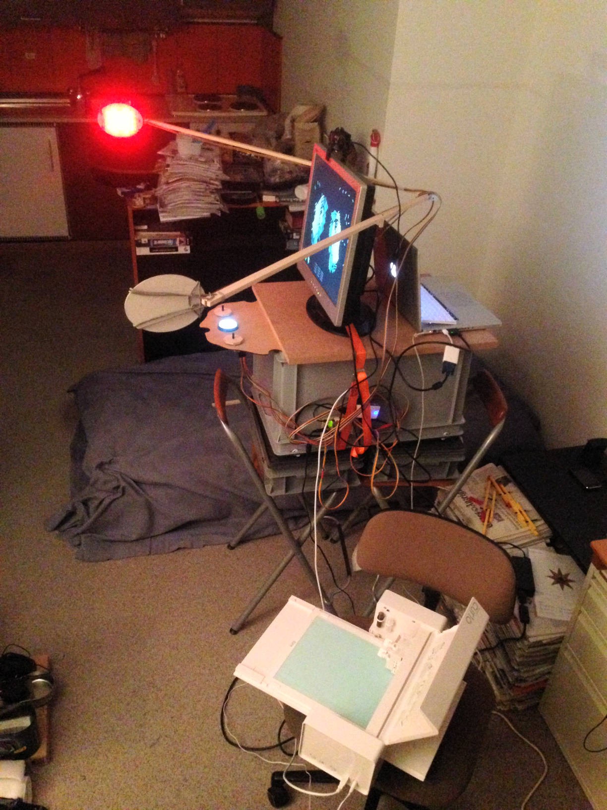
Hardware is taking shape
12/05/2017 at 12:21 • 0 comments![]()
![]()
More details later as I need to spend the remaining two evenings finishing stuff, not writing blog posts.
See me at the MuDA and have your portrait plotted! Digital Holiday Market at the MuDA in Zurich on Thursday 2017-12-07, 19:00–22:00
-
Screen Layout
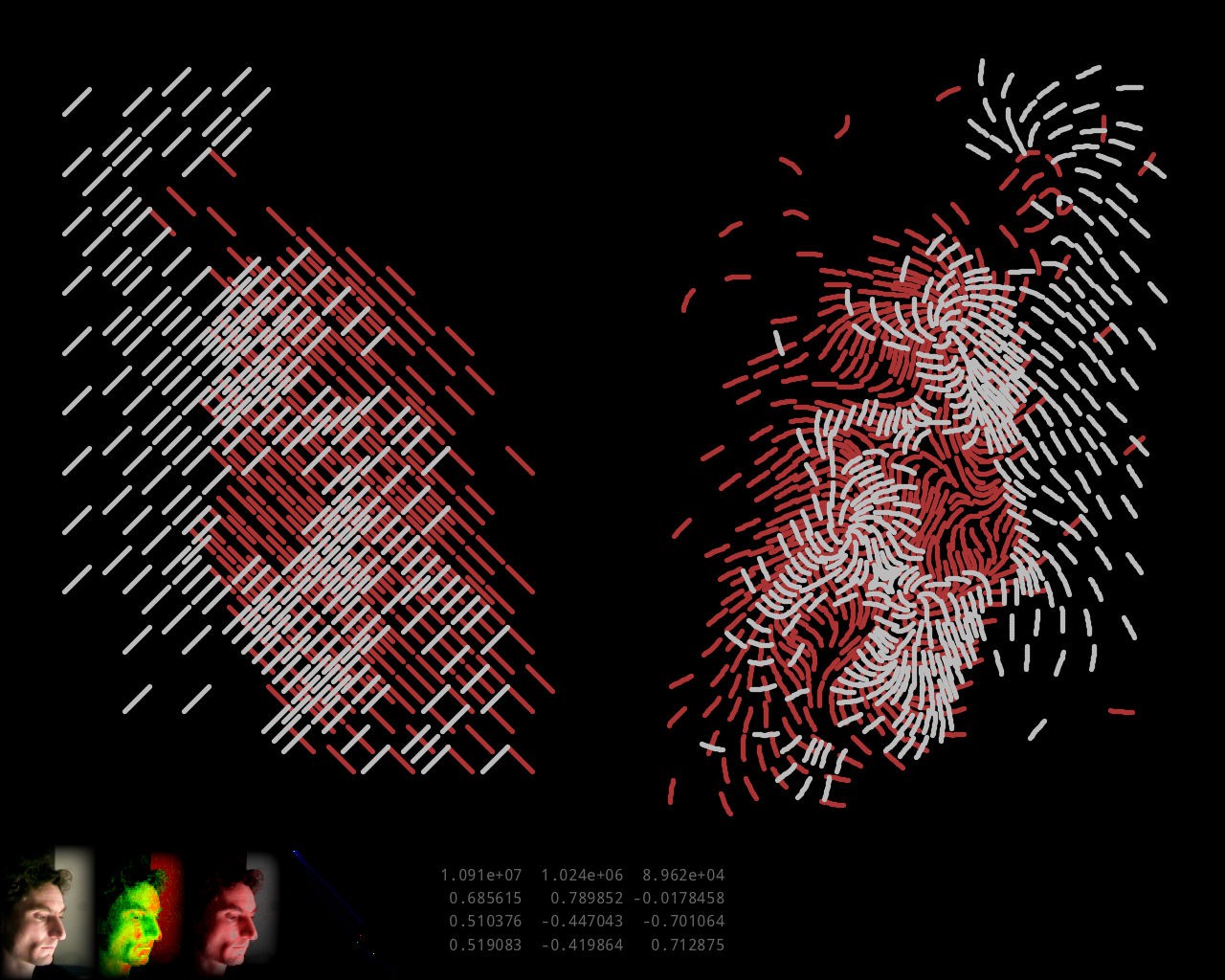
11/25/2017 at 17:32 • 0 commentsThe Processing front end has progressed to match my ideas of what it might look like in the final installation:
![]()
Real-time preview on the left, final drawing on the right, generated in 2 minutes and displayed incrementally while being generated. As expected, the drawing looks clearer than the preview. I wonder if I could improve the preview.
-
MuDA’s Digital Holiday Market
11/22/2017 at 20:42 • 0 commentsExciting news: I may be able to show the portrait plotter to the public sooner than expected! The MuDA is running a “Digital Holiday Market” on December 7th, and I signed up with the portrait plotter, provided that I can get it working well enough by then. That’s only two weeks away, so that means that the project is back on the fast track. Which however is not quite as fast as before, because I am working during the day now, while I was on vacation in October. We’ll see how far I get!
-
Camera and Image Processing Software
11/22/2017 at 20:33 • 0 commentsSo far my experiments had used image data produced by hand in Photoshop. The goal is to have this completely automated, so that a visitor has their picture taken by a webcam and gets a live preview as far as possible, and upon a button press the system spits out a DXF file ready for import into the plotter software (Silhouette Studio).
The algorithm to transform a camera image into two channels for luminance and color accent that I had in mind was as follows: Treat the pixels of the image as a point cloud in the RGB color cube. Throw away the darkest points (background), and with the rest perform a principal component analysis, i.e. find the direction along which the point cloud has the largest extent, the direction perpendicular to it with the second-largest extent, and perpendicular to the two the direction with the smallest extent. The direction of largest extent will usually be something in the general direction of overall brightness, as every portrait has light and dark parts, and projecting the image onto it should yield something suitable for the luminance channel. Perpendicular to it, the direction of second-largest extent corresponds to the largest variations in hue and should be suitable for the color accent channel. Depending on whether it points in a more reddish or more greenish direction, red or green can be chosen for the output color.
The principal component analysis involves diagonalizing a matrix, and I suspected that doing all this number crunching in real time would require writing the software in a language that compiles to machine code. So I went looking for C or C++ libraries that would allow me to capture images from a USB webcam in a platform-independent way. (For now the software would only need to run on my Mac, but later on trying it on my CHIP (Linux) would be nice, and once published someone else might want to run it elsewhere.)
I found two such libraries: libuvc and Video Capture. I first tried libuvc. Building and installing was straightforward, and once I chose suitable format and frame rate settings, the included example program seemed to successfully turn on and capture frames from both the internal camera of my MacBook Pro and the cheap 640x480 USB webcam I had bought from Conrad for this project. However when I added code to output the captured frames, it seemed that I was only getting random garbage instead of a camera image. I considered debugging that, but that would have required spending time learning about how USB cameras work, which was precisely what I was trying to avoid by using a ready-made library, so I abandoned libuvc.
Before trying the other C++ library, I decided to give Processing a try, since a recent exhibit in the MuDA had reminded me that it supported webcams. Maybe JIT-compiled Java wouldn’t be that much worse at number crunching than compiled C. Indeed getting at camera pixels turned out very easy using Processing’s Video library.
I had a vague recollection that the pricipal component analysis involved diagonalizing the covariance matrix, and for that I first tried to refresh my own knowledge of linear algebra, but then discovered that a web search would take me directly to the destination, in the shape of a research paper comparing different methods that came with ready-made C code. I chose its analytical method (dsyevv3) because of its reported performance advantage and because its shortcomings did not seem relevant to my case, and translated it to Java, which mainly involved some search-and-replace processing to expand macros.
Implementing my algorithm with this was then straightforward and, lo and behold, it still performed in real time. Processing therefore seemed the way to go. Adding a histogram of the point cloud in the red-green plane with the found principal component vectors overlaid confirmed that the code was doing what I expected it to.
I had suspected before that to get interesting images I would need red and/or green colored lighting from different directions than the neutral main light. To test this, I did some experiments with a piece of NeoPixel (WS8212B) LED strip connected to a WEMOS D1 mini running MicroPython, programmed to alternatingly light four LEDs (few enough to safely drive off a USB port) red and green. Indeed when photographing just my face with no brightly colored clothing parts in view, the colored lighting from the side increased the second principal component and often made for a recognizable color accent in comparison to the more or less random tinting without it.
A small tweak turned out to improve the choice between red and green as the accent color: Instead of choosing the sign of the second principal component vector such that it pointed away from black, choose it such that the vector has a positive component in the direction (red or green) that is more prevalent in the average color of the image. This made it more consistently choose green when the lighting was green and vice versa.
The two-channel image generated from the two principal components could already be displayed in gray/red or gray/green to give a rough preview, but I still wanted something closer to the final line drawing, to give a better impression of the detail resolution. Generating the actual final drawing in real time was out of the question, as running the procedure in Octave took up to several minutes, depending on the number of lines it had to place. Instead, I decided to use a fixed regular grid of straight, parallel line segments of the correct dimensions, arranged in a brick wall pattern, of which each one could be present or not. Finding which ones should be present then amounted to a halftoning problem as if reducing a grayscale image to black and white pixels, only that my pixels were not squares on a square grid but oblong rectangles on a brick wall grid. Common methods for high-frequency halftoning are error diffusion and ordered dithering. Error diffusion seemed like it could get messy on my non-square pixel grid, but something like ordered dithering should be applicable. I devised a method that covered a unit cell of a 10-by-10 pixel square grid of input with 12 diagonal line segments, each taking input from its 4 most covered pixels (which means that it still discarded 52 of 100 input pixels, but that shouldn’t matter much for my mostly continuous input images), and ordered them in a sequence that made for a nice dithering pattern. Applying this independently to the two channels, with line segments rotated 90°, and overlaying them in the proper colors generated a preview image that should be more representative of the final drawing, and still ran in real time. The hope is that, despite matching line sizes, the final drawing should have even better resolution because it can place the lines adaptively, but that has not been tested yet.
![]()
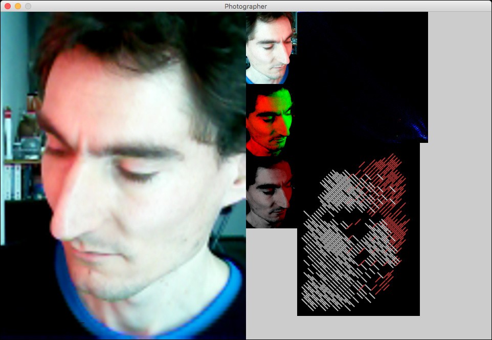
Screenshot of the Processing application: left: flipped camera image; middle: cropped camera image, two-channel image (luminance red, color accent green), silver/red preview; right: point cloud (red down, green right, mean = red dot, first principal component from red to yellow dot, second principal component from red to green dot), line drawing preview
This post concludes catching up with history! What has been described so far is the current state of the project.
-
Vector Fields and Pens
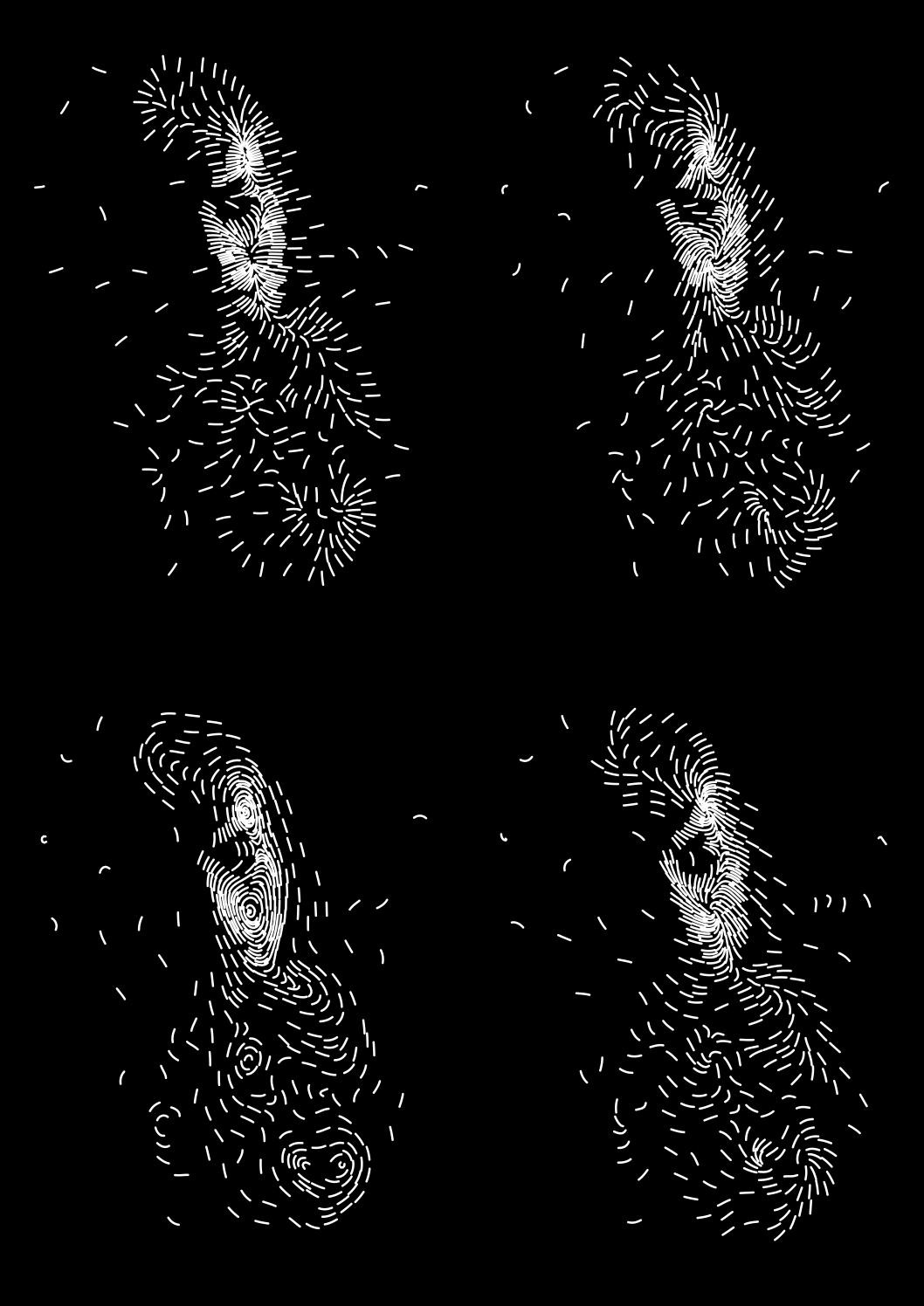
11/12/2017 at 16:57 • 0 commentsNext up was the question of how to generate the vector field that determines the direction of the lines. I wanted it generated from the image rather than random or constant, in hopes that extracting more information from the image would make for more recognizable paintings. An obvious choice is to use the gradient of the luminance of the image, so that’s what I tried first.
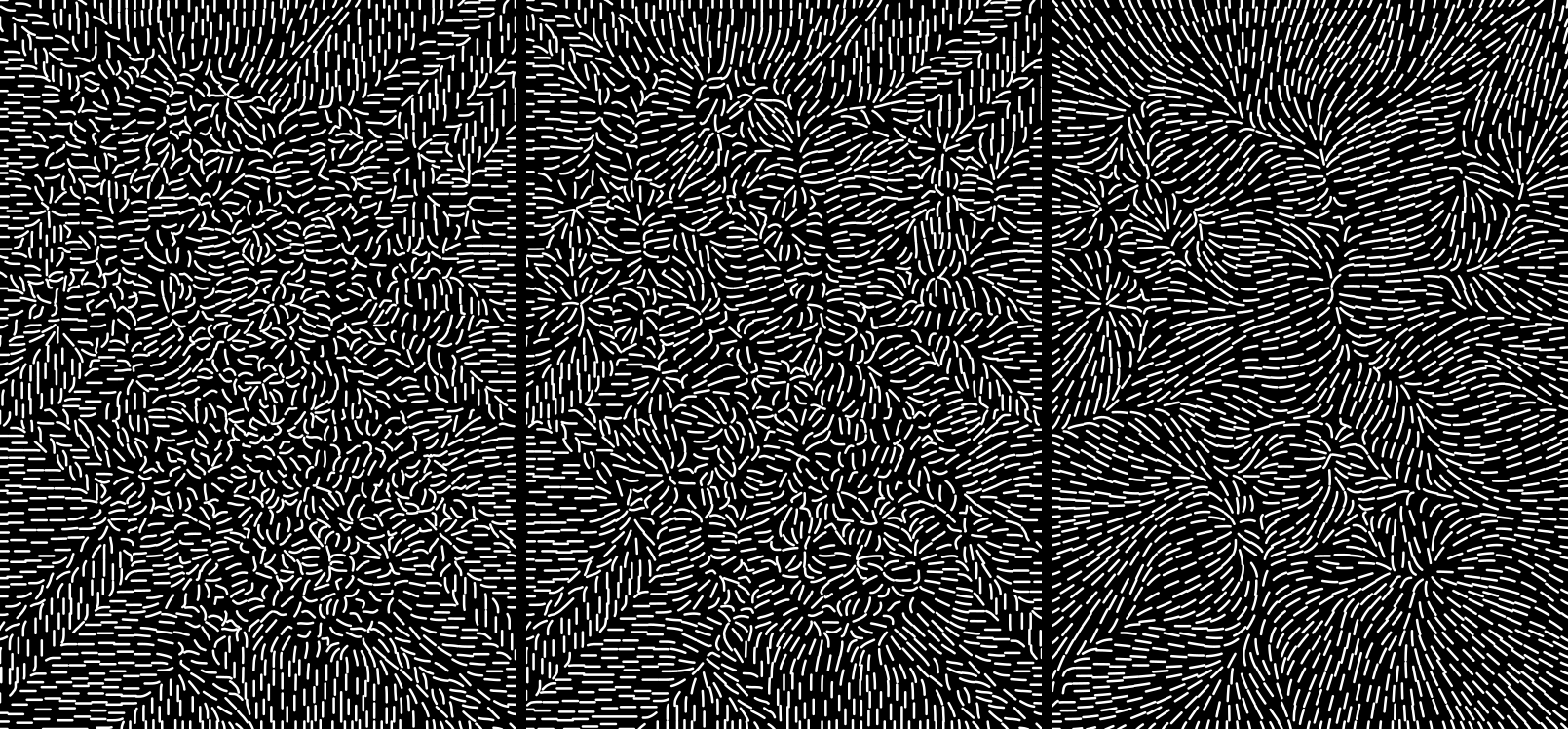
What about areas of zero gradient, in particular most of the background that is a solid black? I don’t generally care about the magnitude of the vector field, only about its direction, but I want it nonzero so that it has a direction everywhere, and a more or less continuous one if possible. I solved that by successively blurring the image until I had a nonzero gradient at every pixel. I experimented with different amounts of initial blurring until I got a nice not-too-chaotic furry-looking field.
![]()
Gradient with less to more initial blurring
The resulting vectors could still be rotated, and assuming that I was to use the same base field for both color channels, it should probably be rotated by different angles for each channel. I didn’t like the look of the 90° rotation with its obvious contour lines, but the ±45° and ±60° ones with their spiraly vortices looked nice. For two channels, ±45° looked best, where lines of different color would always be perpendicular.
![]()
Image traced with different rotations of the basic gradient field
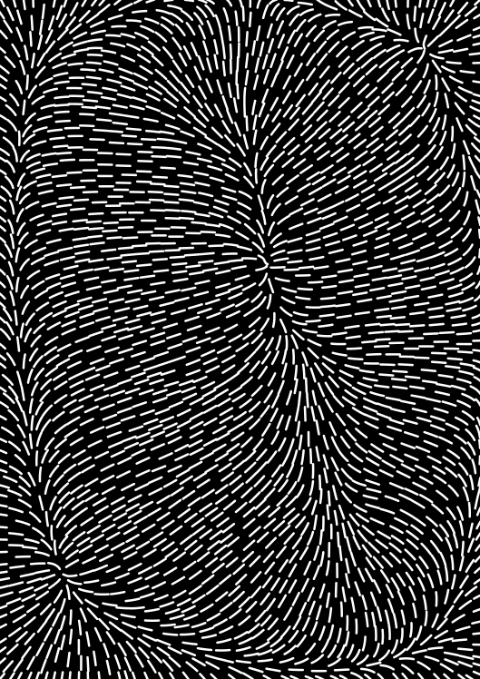
Another idea was to use a vector field whose divergence corresponded to the image luminance, as if electrical charge was distributed according to the image. Results turned out disappointing however, any detail from the image was drowned in a general outward tendency from the total charge. Even offsetting the values to achieve a total charge of zero would just result in a field radiating outward from the middle and toward a ring along the periphery. This idea was therefore quickly abandoned.
![]()
Divergence field with offset
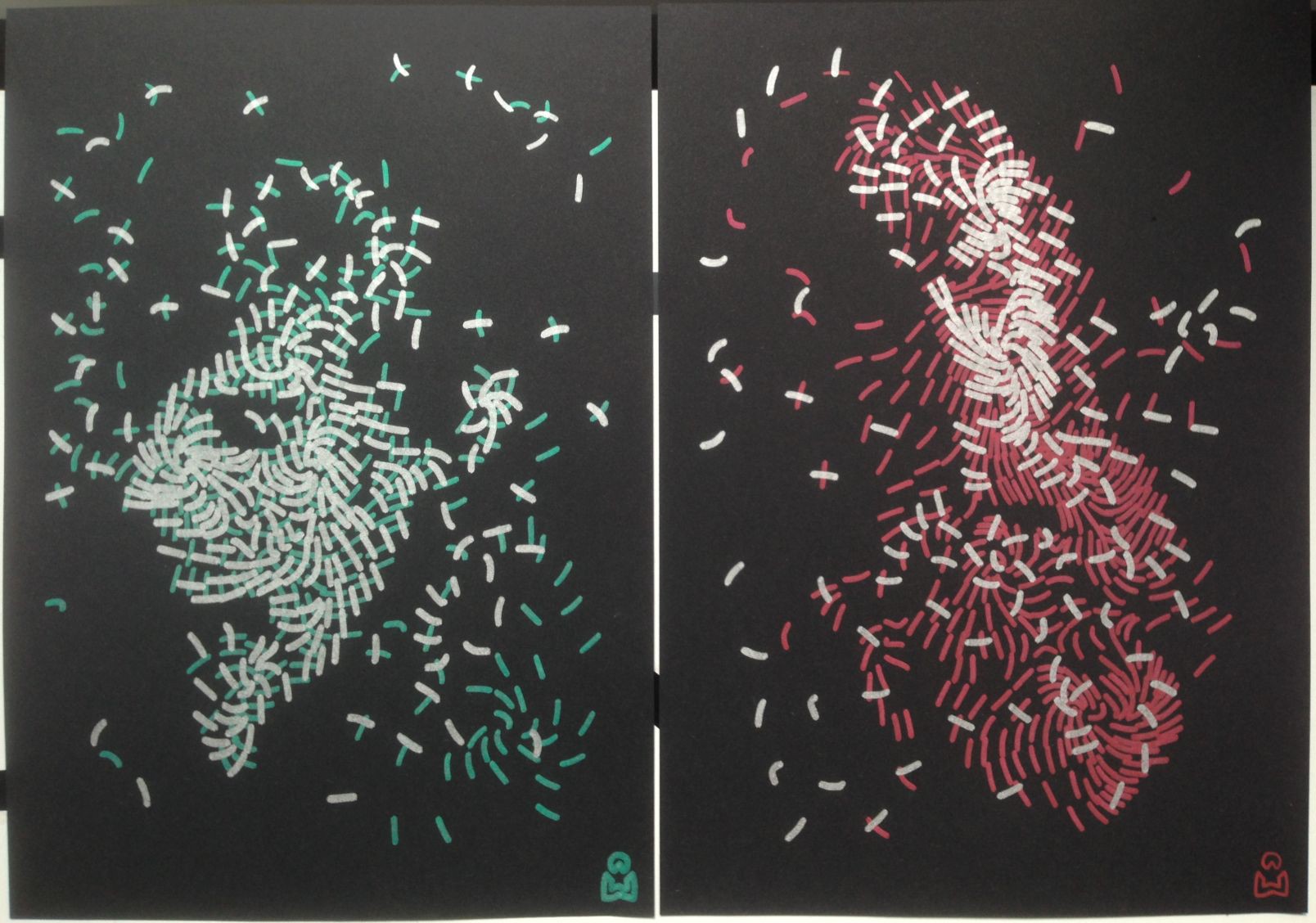
It was time to get the first prototypes actually plotted, in particular to find out how much time that would take – despite some rough estimates, I had really no idea if it would be quick enough for the patience of visitors at an exhibition. To generate the drawings for this, I now had to take into account the stroke width of my pens. Up to now, I had just been arbitrarily using 1 mm. Unfortunately, the Edding 1200 pens turned out to make a much thicker line than that after having endured some pressure on the tip, up to 2 mm, which noticeably reduced the output resolution. I finally put a compromise value of 1.8 into my program.
![]()
First plot!
The prototype plots actually turned out quite nice. I wondered whether that would stay that way when all the hand-tweaking would be automated. The low resolution caused by the thick strokes was unsatisfying, but on the plus side it made for a plotting duration of only 6 and 7 minutes respectively, which seemed very appropriate for an exhibition.
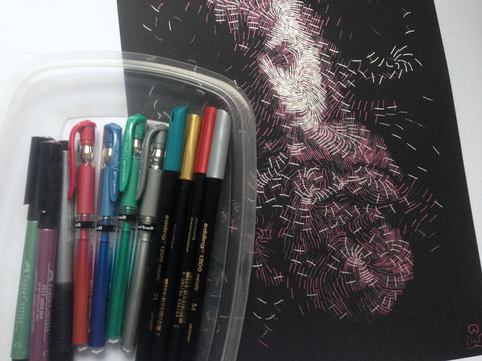
To improve the resolution, I went looking for thinner pens. After scouring the local stationery stores, I brought home two more types in various colors: Uni-Ball Signo Broad and Faber-Castell PITT Artist Pen.
The Uni-Ball Signo Broad is a ball-point gel roller and works very nicely when used by hand, with a stroke width of about 0.7 mm. Like the Edding 1200 or even a bit more so, it is very opaque and makes a bright sparkly color on black paper. Unfortunately, when mounted in the plotter, it seems to have a very uneven ink flow, which causes the stroke width to vary randomly between about 0.2 mm and 0.7 mm. I am not sure why, as I could not reproduce that when holding it by hand, even with different angles, pressures, and speeds.
I did a test plot of the same design with it. Due to the thinner stroke, it needed many more lines (3384 vs. 714 for the Edding), which greatly improved the resolution and recognizability, but also increased the plotting time to about 30 minutes.
The Faber-Castell PITT Artist Pen, a felt-tip pen, makes a stroke of about 0.9 mm. It turned out to be considerably less opaque than the other two, in particular the green one, making for much duller colors on black paper. I therefore dismissed it without even making a full test plot.
Between the other two, I finally decided to stick with the Edding 1200 despite the coarse resolution. I found the Uni-Ball drawing aesthetically less interesting because it was too detailed, in comparison to the more abstract and enigmatic Edding drawing. Something in between would have been best, but this went too far in the other extreme. Together with the uneven stroke width, which also led to a darker appearance on average than intended, and the long plotting time, this tipped the scales in its disfavor.
![]()
Pen collection and the Uni-Ball drawing
-
Beginning
11/06/2017 at 21:26 • 0 commentsThree weeks ago, I was invited to contribute an activity for the side program of a graphic design exhibition. The exhibition presence fell through in the end, but the project I had come up with felt interesting enough that I continued working on it. Let’s see whether blogging about it from the beginning – something I don’t usually do because I like presenting things when they are done – will result in a better documented project than usual.
I didn’t have anything that felt really suitable in my previous repertoire. Inspired by two things I had recently seen in FabLab Zürich, the FabPlot and the robotic drawings by Maria Smigielska, it seemed like something involving a pen plotter would be appropriate for a graphic design context. After mulling it over for a night, I came up with the following idea:
An installation where visitors could photograph themselves, the portraits would be converted into line drawings by an algorithm I had just invented, and plotted out with metallic ink on black paper on my Silhouette Curio plotter.
I had no idea how well that would turn out, and there were only two weeks left before the exhibition, so completing it would be a challenge, but I was eager to give it a try. It seemed doable, if not too many unexpected obstacles would come up. And if not, I could always show it at the next Maker Faire Zürich or at some other occasion. As it turned out, I didn’t have to meet that deadline, so the project is now off the fast track and competing for my time with other projects and interests.
The algorithm I had in mind was based on some previous experiments on vector field visualization. I had written Octave code that would generate uniformly spaced streamlines by successively placing each one at the position that was farthest away from all previously placed ones. It occurred to me that I could use this to approximate an image instead of a uniform distribution by modulating the targeted density of streamlines. The underlying vector field could be generated from the image as well, perhaps as a gradient.
Metallic ink on black paper seemed appealing because it is something you cannot produce on any old office printer, so using the plotter would provide some added value, besides being interesting to watch and giving the result a more physical touch through imperfections. The Curio has two tool holders, allowing to plot in two colors, maybe cyan and magenta. A disadvantage is that it is driven by proprietary software, so the process could not be completely automated. But manual intervention would be needed anyway to change paper and pens, and further out building my own plotter could improve on that.
On my next visit to the supermarket I picked up a set of opaque metallic felt-tip pens (Edding 1200). There was no cyan and magenta, only silver, gold, red, and green, but silver for luminance and red or green for a color accent seemed nice as well.
In my photo library I found two suitable test pictures of a face on a dark background and set to work in Photoshop trying to separate them into a luminance and a color accent channel, using various ad-hoc techniques of contrast and saturation enhancement, gradation curves, and channel arithmetic. In particular, I tried to get the two output channels somewhat linearly independent, so that the resulting plot would have areas of pure silver, areas of pure accent color, and areas of both on top of each other.
With the resulting images, I went into Octave and applied one channel to my streamline placement algorithm, still on a generic example vector field consisting of a point source, a point sink, and a vortex. I also extended the code to produce SVG output instead of just an Octave plot. The result was encouraging, with the face barely recognizable as I had hoped. Some experimentation was required regarding what gamma to interpret the incoming image data with: With the correct value of 2.2, in most of the picture the lines ended up spread out so sparsely that the spatial resolution was too low to recognize anything. Choosing a lower gamma value, i.e. artificially lightening midtones, improved that, and I settled on a value of 1.5.
![]()
There are two faces in this picture, but the lower one is hardly recognizable unless it is lightened by choosing a lower gamma value.
To be continued in a few more installments of catching up with history, followed by ongoing updates!
Portrait Plotter
An interactive installation that takes your photo and paints it on paper.
 Christian Walther