 JasMoH
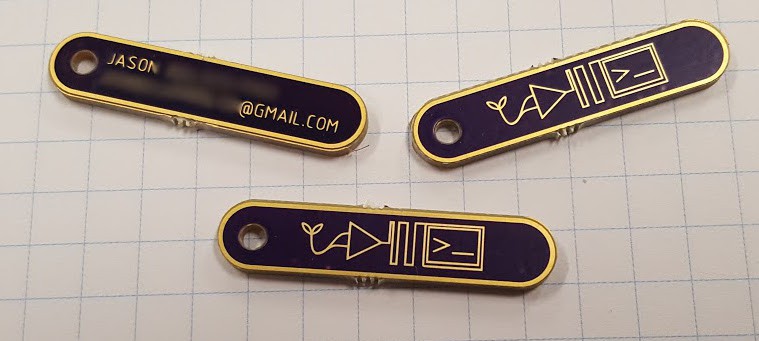
Prototype of my "business chit". I wanted to make a business card-type thing that was fun and memorable. I mocked up a quick logo design. I like the overall shape and the gold contrast. I have concerns that these are too small to be easily kept in a pocket, and hard to read for those without good vision. The logo may be to obtuse for non-technical audiences, and may also get rework. Or I'll just give up and put these in the bin. Who's to say?
Discussions
Become a Hackaday.io Member
Create an account to leave a comment. Already have an account? Log In.
neat idea!
Are you sure? yes | no
that looks almost affordable :)
Are you sure? yes | no