HEATEC (University Group Assignment)
Aim to design a wearable device that has the possibility of being created in either the near or far future.
Aim to design a wearable device that has the possibility of being created in either the near or far future.
To make the experience fit your profile, pick a username and tell us what interests you.
We found and based on your interests.
We had two options for creating the shell and dial for the prototype, we could 3d print them or we could model them carefully by hand. We only had 2 weeks before the deadline so we settled on 3d printing in hopes of having the parts ready faster, it took us 3 days to get the parts printed at the cost of around €40 (or 44.40 us dollars as of writing this). The remaining week was spent sanding the parts down to get a perfect smooth finish, though despite the printed parts being black we decided to spray them with a black paint in order to get a slight gloss look similar to our keyshot renders.
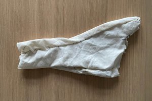
After we had the shell and dial 3d printed, we needed rubber, elastic and foam. We went to various local shops to pick up supplies, we got the rubber in red from a non-stick baking mat we found on one store (this later proved a problem). The elastic proved difficult to find until we were passing through a clothes section and saw a pair of mens boxers (briefs) with black elastic and red trimming on them that matched the red of the elastic, we quickly bought them as a size large in order to get more of the elastic for the price given a size small was half the size at the same price, we went for large. For the foam we intended to make a soft cushion instead for the prototype, so we bought cotton balls to use as stuffing and a silky female top to cut up and use as material as it was soft and felt really nice to the touch.
We had two sheets of the rubber bought as a precaution, we later were thankful for this decision.
Pictured is Tomas cutting out the rubber. The shell was traced out onto the rubber using pen and then 4 extensions added where the elastic would be attached. When later fitted with the shell it had some issues due to the curving causing the rubber to be slightly smaller than needed. We fixed this by adding a 1cm extension to the tracing on the second attempt.
The second attempt on the rubber fit perfectly, we intended to have it glued permanently to the shell during assembly, it is here the rubber started giving us difficulties…..we had various glues and epoxy resins so we decided to test which would work best, we used a small sample of the rubber, not a single type of glue stuck to it, we picked up the rubber for €2, we hadn’t expected it to be literally non-stick to everything past typical foods. We had designed the shell with small pads to the inside to use as points of contact for adhesives. With the rubber failing to stick to anything we had to redesign the shell to use screws.
We had one week left to finish the prototype so we couldn’t get a new version of the shell 3d printed in time so we decided to build up on what we had, we used epoxy to extend the platforms inside the shell so we could use them for screws.
We used multiple drill bits to get the hole size right, we didn’t want to use the largest bit first for fear of damaging the shell so close to the deadline. Sadly the use of the epoxy made the inside of the prototype look scrappy and unappealing but given that the focus was the outside of the design, we accepted it.
We learned from past projects and past mistakes with 3D printed parts on what to do in order to get an ideal finish. We started with sanding. Tomas dedicated an extensive amount of time to this part personally, going through various stages of dry sanding, cleaning, then wet sanding, then polishing, then repeating the process numerous times over until satisfied with the end result.
The main focus was the outside of the shell, any part that was visible, was carefully sanded and polished smooth.
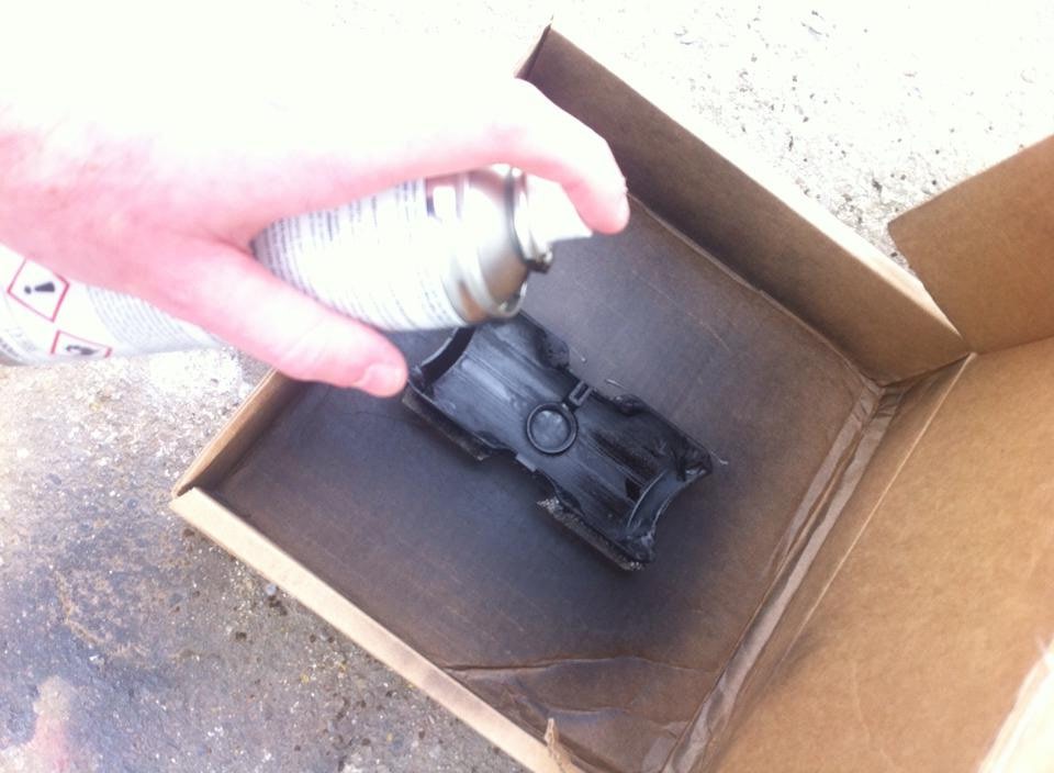
We found ourselves very lucky when it got around to painting the shell and dial pieces, the day was very warm and the weather resulted in each coat of paint being dry within 15 minutes if not 10. We gave the pieces thin coats and built up layers to avoid any paint dripping and to keep an even coat. We didn’t have proper...
Read more »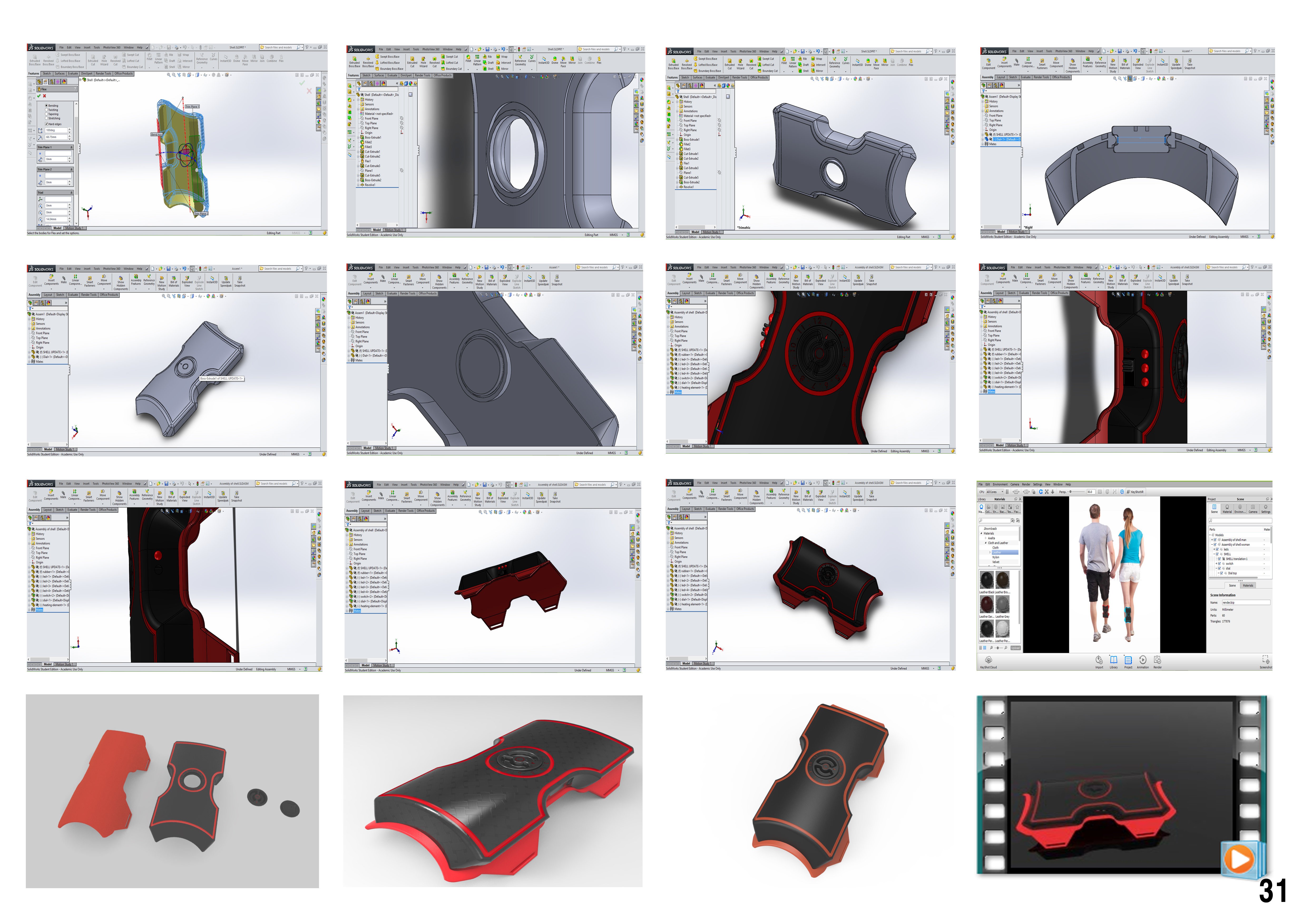
While most devices today are heading towards using apps to control them, we decided to go back to basics, our device was battery powered so it need an on/off switch and a way to indicate remaining power. We settled on a slider switch and three coloured LED’s, red, yellow, green to indicate remaining charge. We then discussed how the max temperature would be set, the concept used cycling heat to soothe pain, but some users may want it set warmer or cooler, we had two options, a slider or a rotating dial, we settled on the rotating dial. A charging port for the battery was also necessary, we added an led that glows red while charging and green when finished.
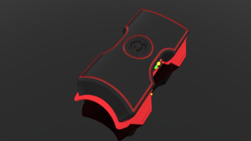
After deciding on the controls and the best way to keep them very simple for users, we had to deal with how best to design the shell to accommodate them, we didn’t want it to be possible to accidentally turn on or off the device while wearing it, if it gets bumped or hidden by clothing so we recessed the switch and leds deep into the centre of the shells side. We wanted the design to be symmetrical so we added an identical recess on the opposite side and placed the charging port and led there. Next was positioning and designing the shape of the temperature control dial. Given the symmetrical layout, we decided to place it on top of the shell, flush with the surface, centre between the two recesses. Large grooved cuts were added to the dial to allow for easy rotating.
We debated the main colour we wanted the shell to be, we decided to avoid white so went with the other extreme and chose black, while the shell was nicely shaped, and curved to conform to the lower legs profile, we were finding it to be looking rather plane, we added some engraved designs but it remained looking plain to us, we played around with the design until we coloured the engravings and found It to look appealing to us and those we showed it to. We tested various colours and found they all looked great with black as the dominant colour.
Using solidworks we designed every other part around the shell and carefully inspected everything for fitting to ensure everything is scaled right and all parts will fit together perfectly. We also intended to use the same cad files in Keyshot5 for rendering both images and a video simulation so we modelled the switch and led’s and created an assembly of the entire model. This is the finished video simulation for the project.
We had limited time for rendering as well as limited experience with the software so the end quality is not exactly what we wanted, while the animation worked perfect for us, we had to break it up into segments to run across 2 standard laptops with core i3s in order to get the renders finished in time for the projects deadline (the animation was finished and upload the night before the deadline). Neither of us had any experience with video editing at the time beyond windows movie maker, this did the job though of stitching the video renders together but came at the cost of the quality of the footage. We wish we had experience with premiere pro at the time like we do now for this part of the project as we feel it would have drastically improved the end quality of the video.
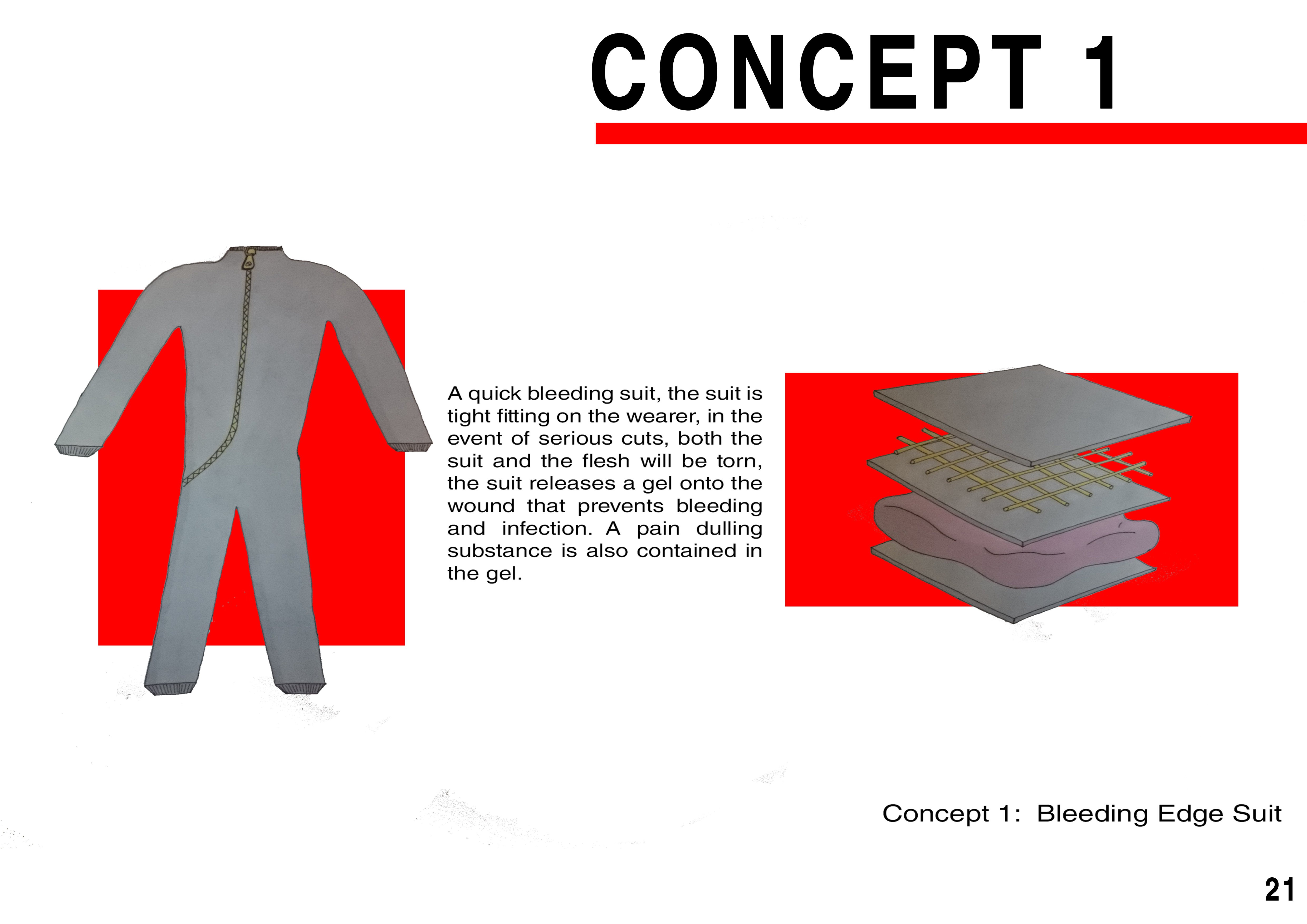
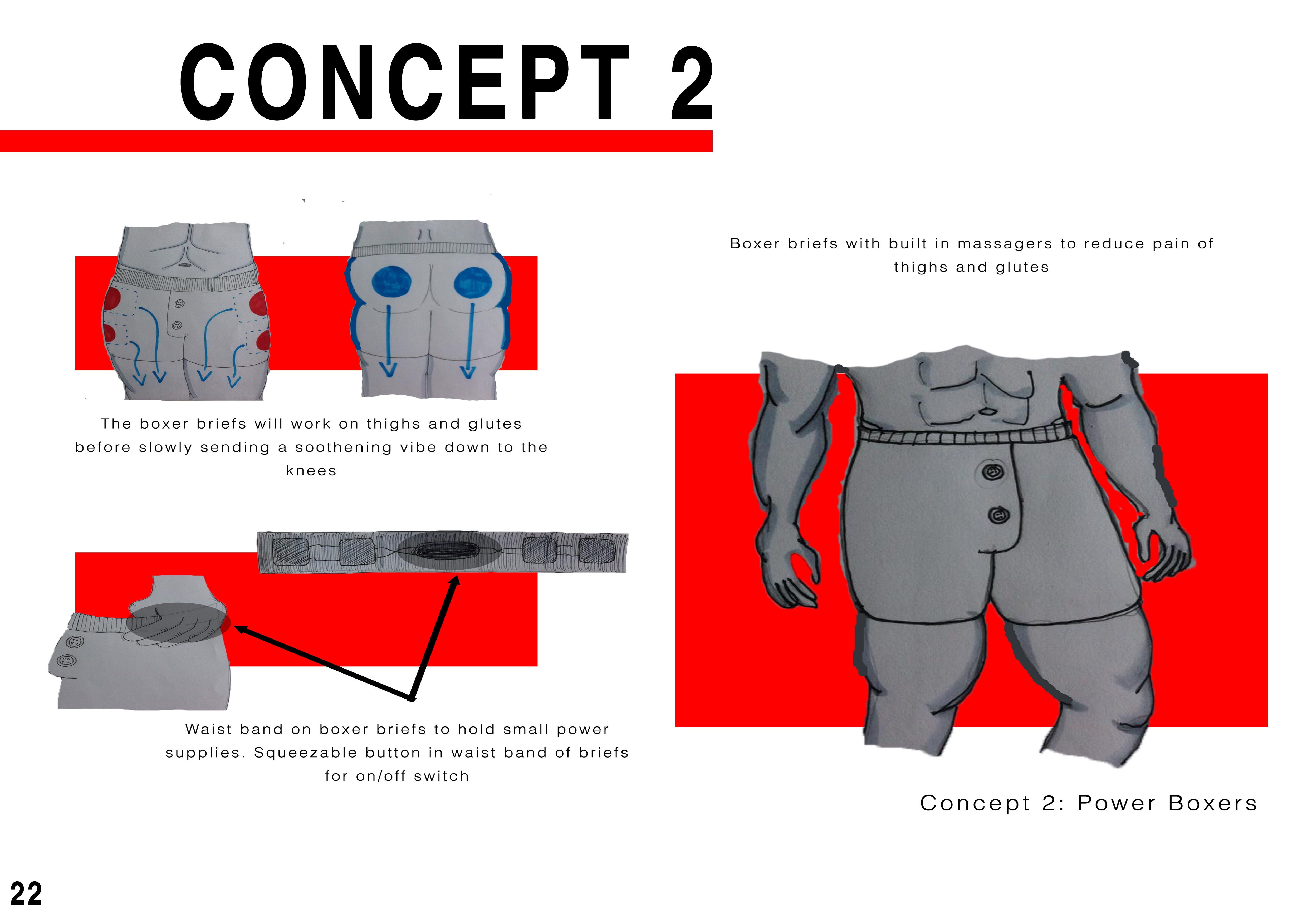
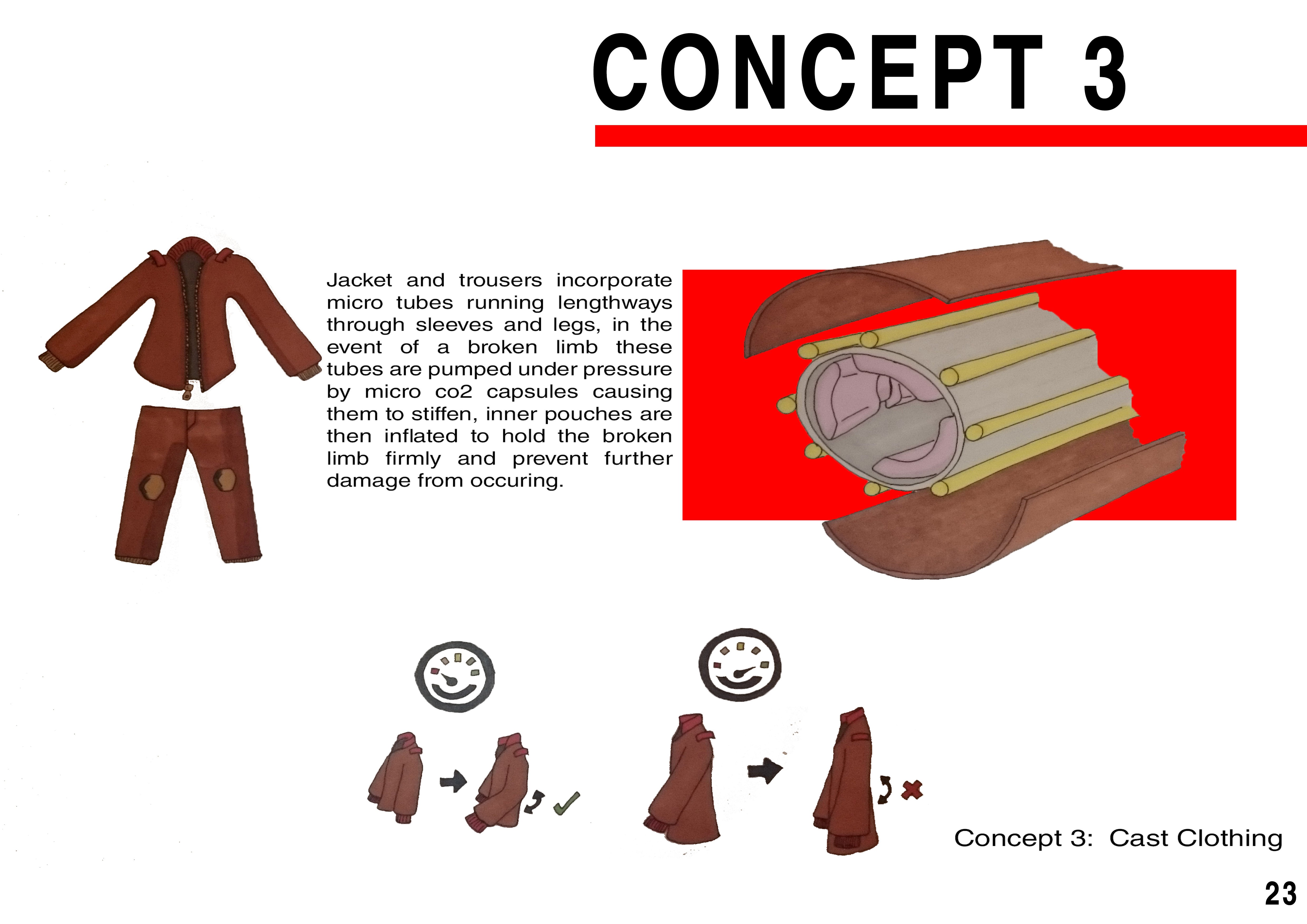
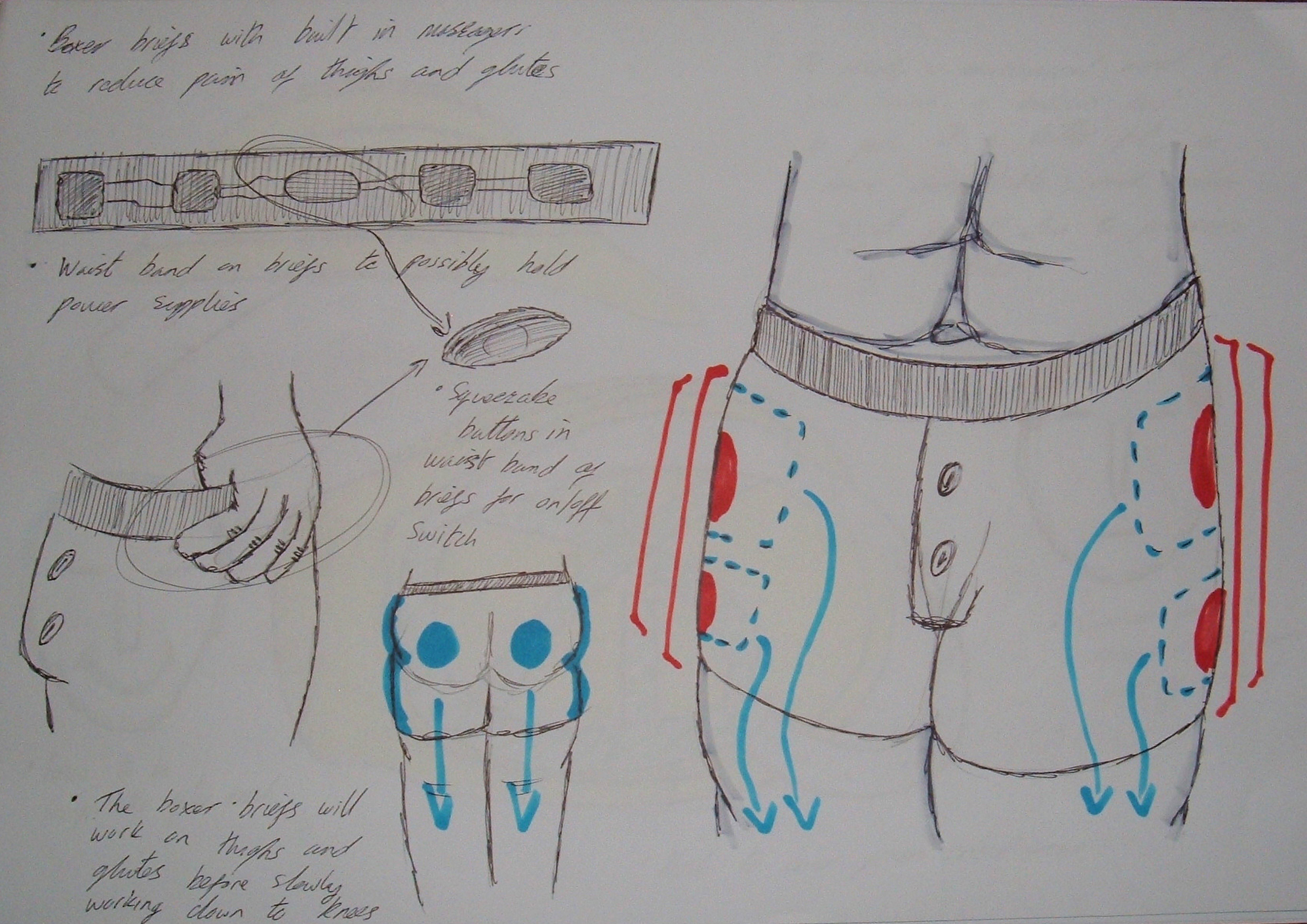
After our ideation phase we narrowed our ideas down to three, all focused on pain in some form, be it preventing pain or responding to what causes pain. Concept 1 was a suit for emergency situations that responds to cuts and injuries that could lead to bleed out of the individual. Concept 2 was briefs designed as smart clothing with methods built in to soothe leg pain and possibly lower back pain indirectly, this concept was also expandable to other forms of clothing. Concept 3 was a jacket (also could have been trousers) that had built in inflatable pads and tubing that would be flooded with pressurised air to work as a temporary cast in an emergency, such as when out hiking, the jacket would respond instantly.
With three concepts to choose from and after discussion with our lecturer we went with concept 2 as it was more feasible and served a wider demographic as well as being closer to the type of project we wanted to work on.
The original concept was going to be designed into clothing, but after more narrowed research on what methods could be used to soothe pain, we settled on applied heat being the best one for both bruising and muscle pain. Cramps and pinched nerves were best served using cycling heat, where it would gradually heat up then cool down, because of this research we decided to alter the concept to be a solid device that would be attached to the body. We wanted to focus on aesthetics and simplicity of use, we wanted the end design to avoid the typical look of a medical aid device, our first step for that was to decide to avoid the colour white for the main product but have an array of colours available.
With the concept changed, we still decided to keep the main focus for the design towards the legs, like in the initial concept, though we kept in mind the possibility that the design was expandable to function on other areas of the body.
Aesthetics were our main focus, as well as comfort of wearing the device, we decided on a curved shell shape that would conform to the shape of the lower leg. Given that the device would be worn for long periods, we decided padding would be ideal to have as plastic on skin for extended periods can lead to sweating and on some individuals, rashes and sores.
We settled on a 3 material design, plastic outer shell, foam padding for comfort and a flexible rubber sheeting between the shell and padding that would allow elastic straps to attach. After everything was finalised, we moved onto using cad software to design a final shape for the concept as well as figure out controls and layout.
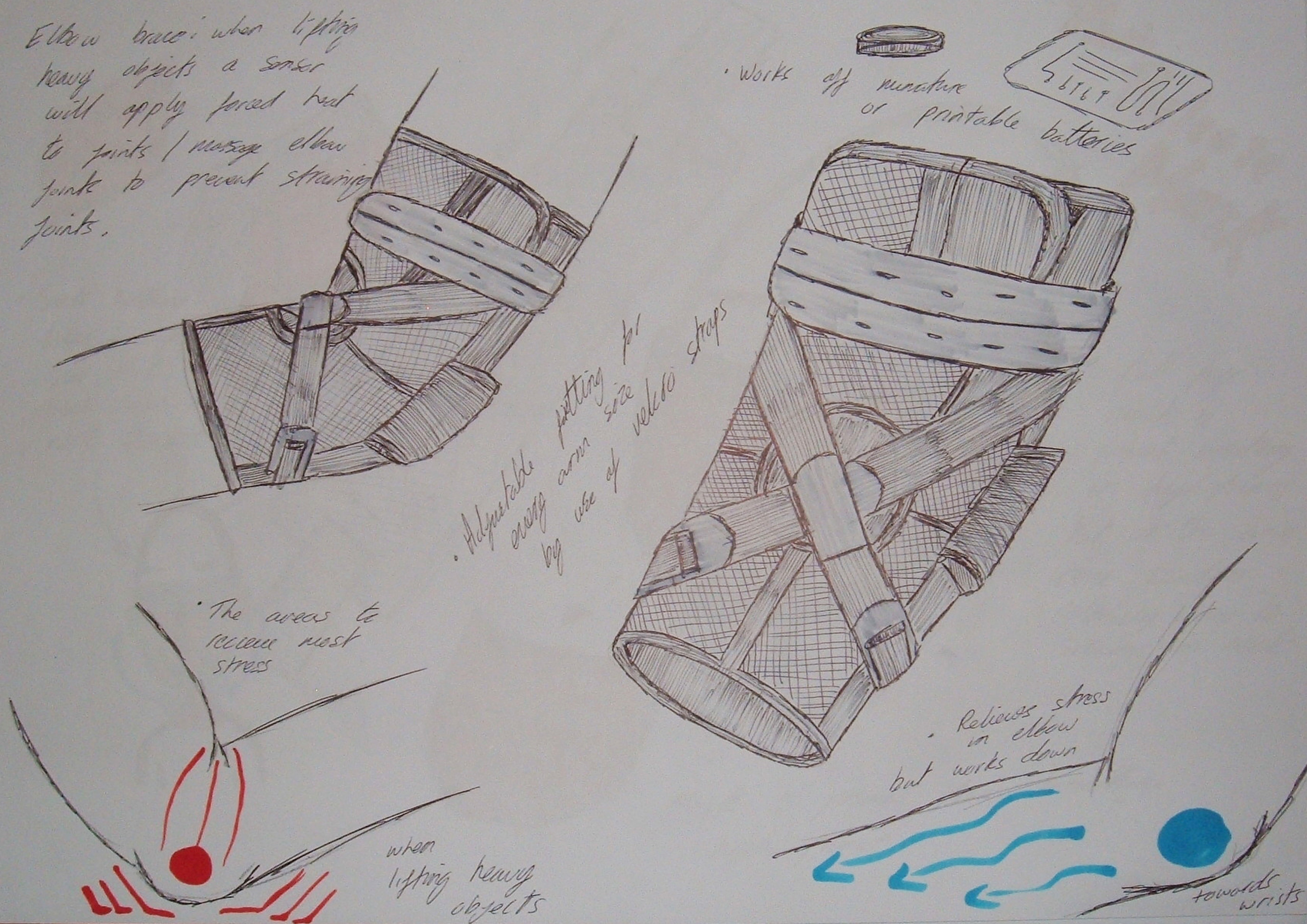
This stage is often the most difficult, here we sketched out on paper ideas we have related to the area of focus, we don’t particularly limit ourselves with an ideas feasibility at this stage, the aim is to think outside the box, use knowledge gained from the research stage and draw out all the ideas we have.
For us personally, a lot of time is invested here, it is not uncommon for either of use to spend up to and beyond 8 hours straight just sketching, coming up with an idea and drawing it in dozens of different forms and styles. To make the long haul of drawing easier and more enjoyable we often listen to music through headphones. We draw ideas mostly in pen, the reason for this is because pen cannot be rubbed out like pencil, this stops us from falling into the trap of wasting time rubbing out lines over and over in order to get the shape or sketch of a rough idea perfect, sketches at this stage are often crude and rough, if not often messy. This is ok though as dozens of ideas will be generated but only one will be picked to be further refined into a final product.
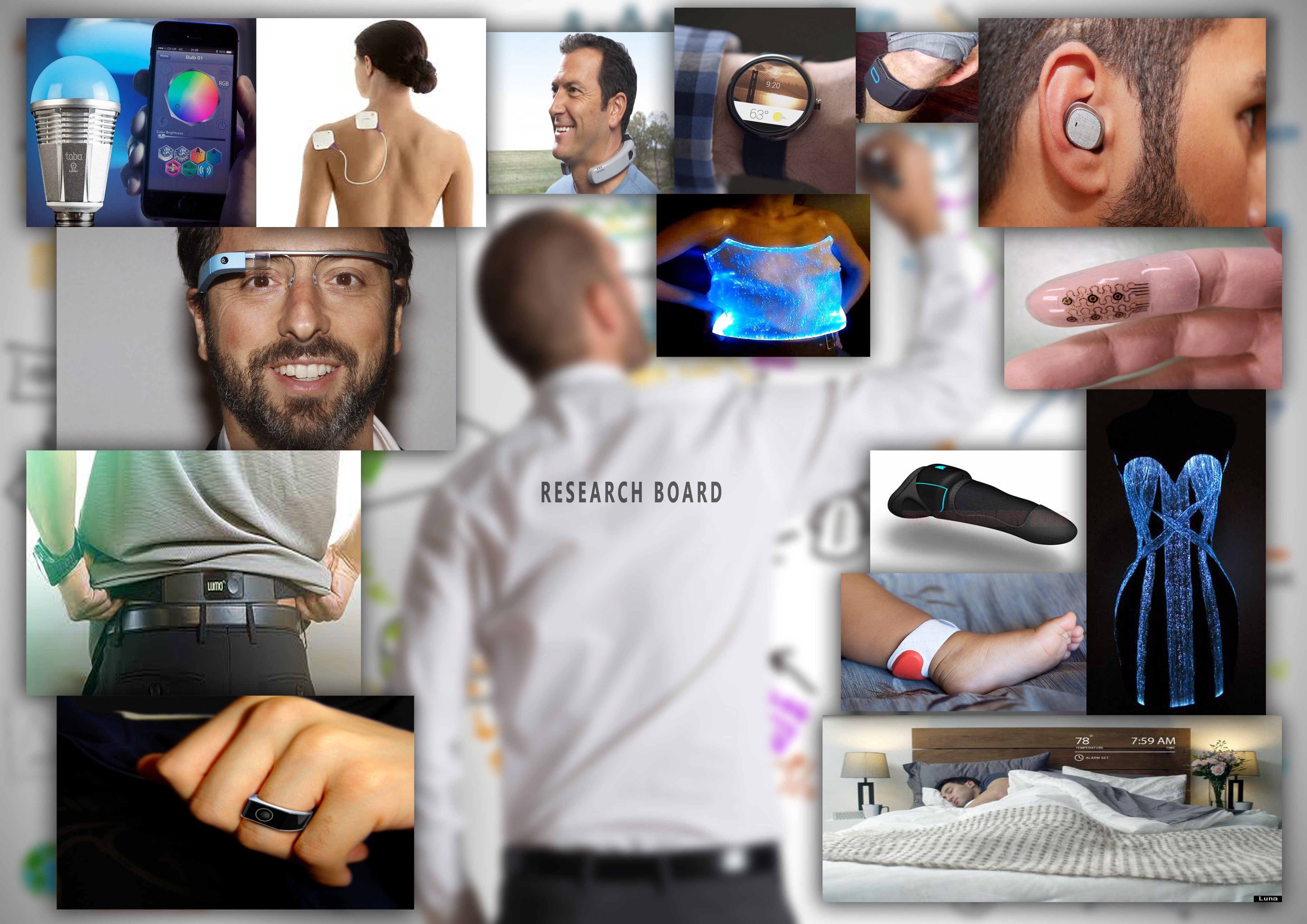

The first step of our design process always starts with intricate research, most of this is done using the net given the vast amount of information available. We researched existing products, existing technologies, watched tech review videos on youtube in order to find any issues with existing products we could focus on addressing.
The next step of our research was to identify areas we would like to make our main focus, for this project the following areas are what we were considering working on, (body pain being the one we went with in the end).
With areas of focus identified, now we needed to key in our research and learn about each area and how it relates to a person / consumer, to do this we carried out interviews with people and compiled journey maps and empathy boards which can be seen bellow.
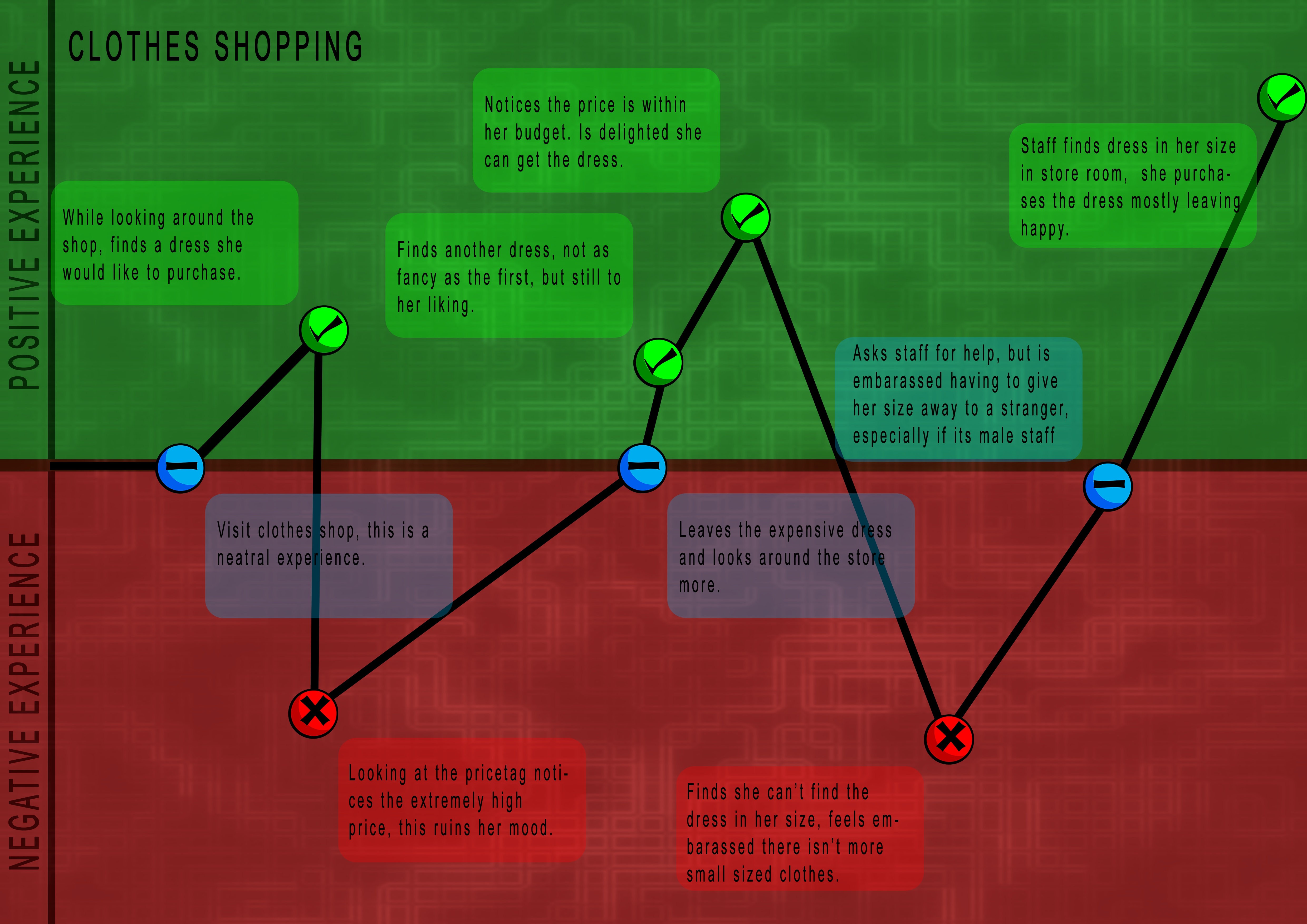
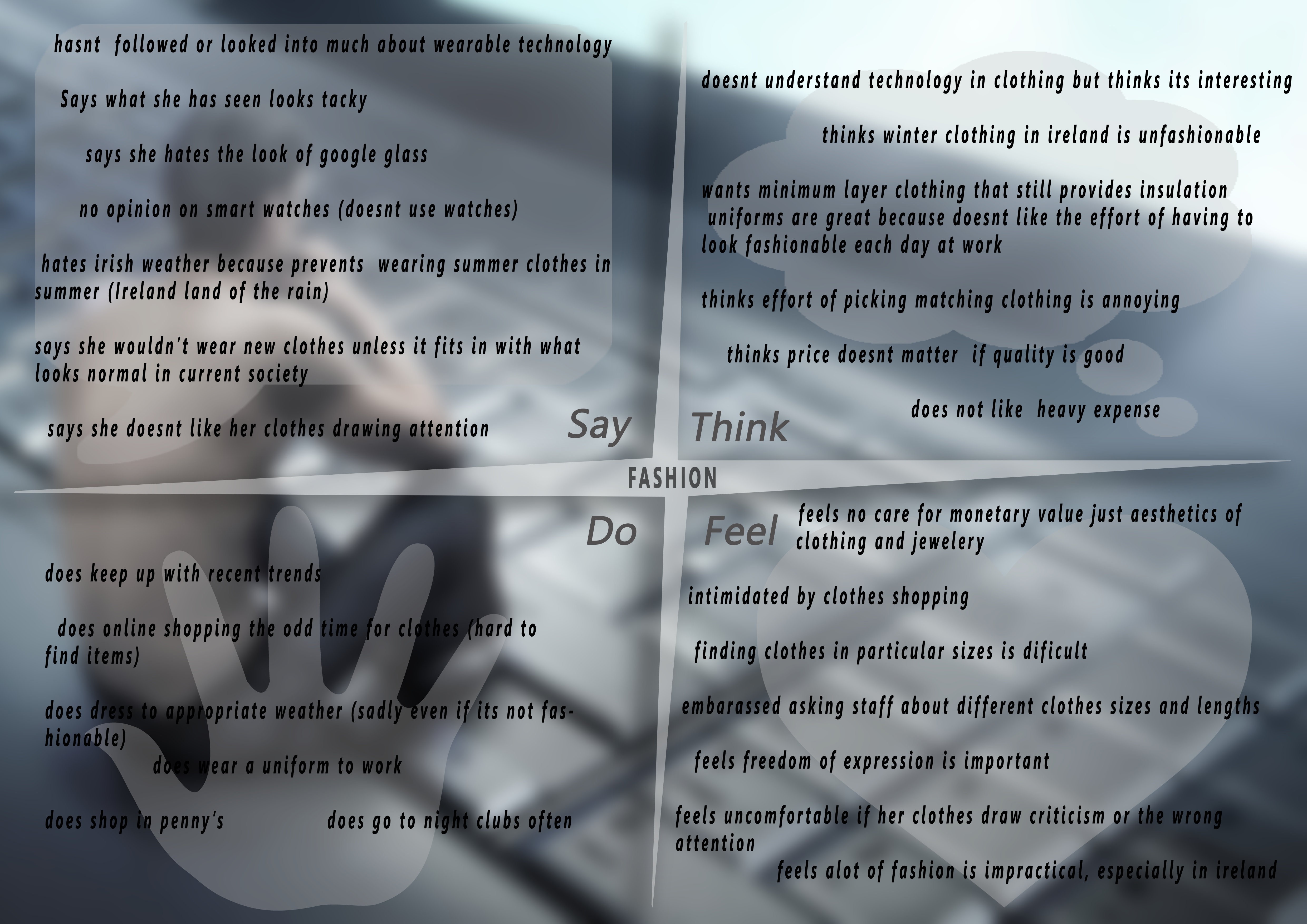
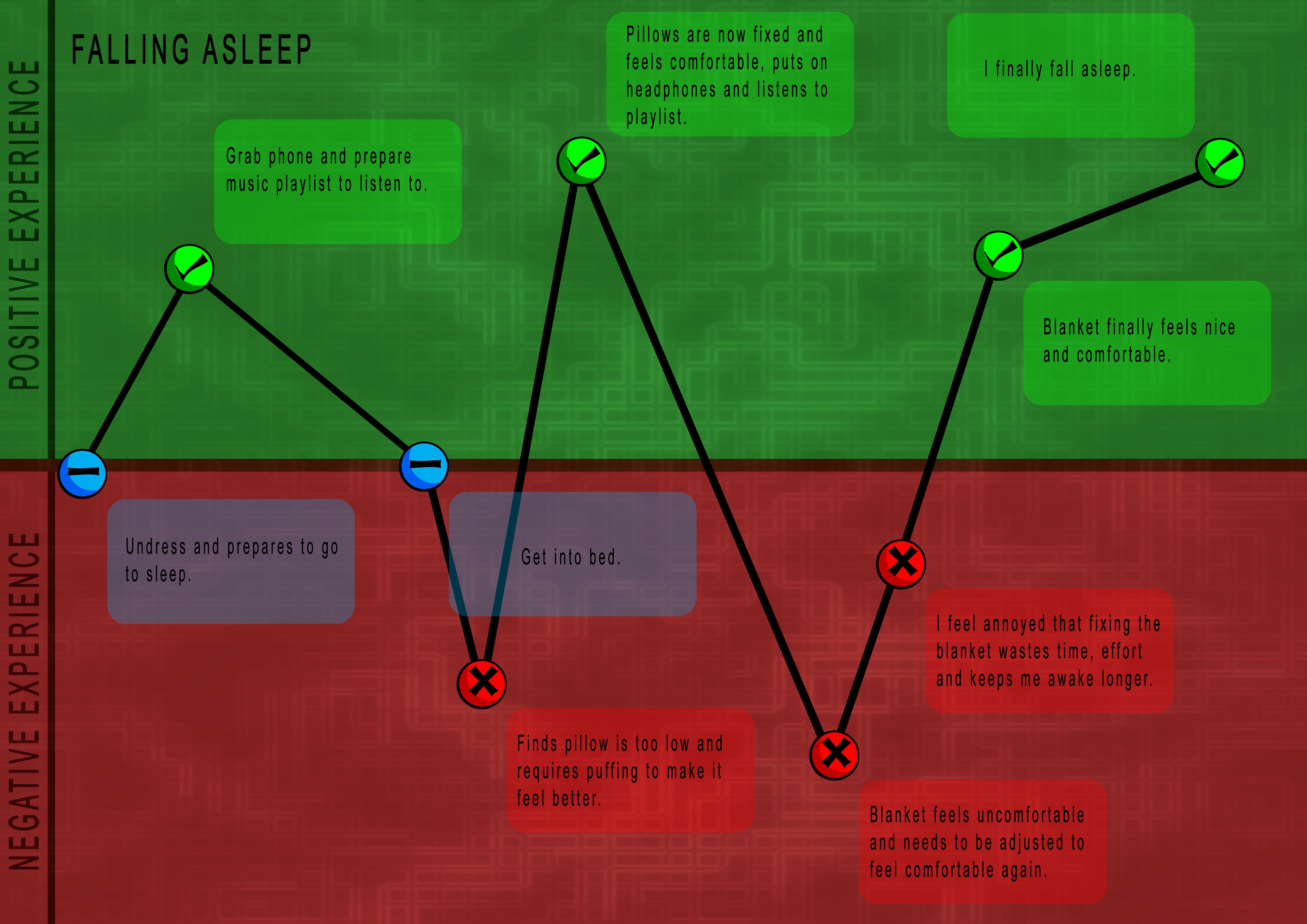
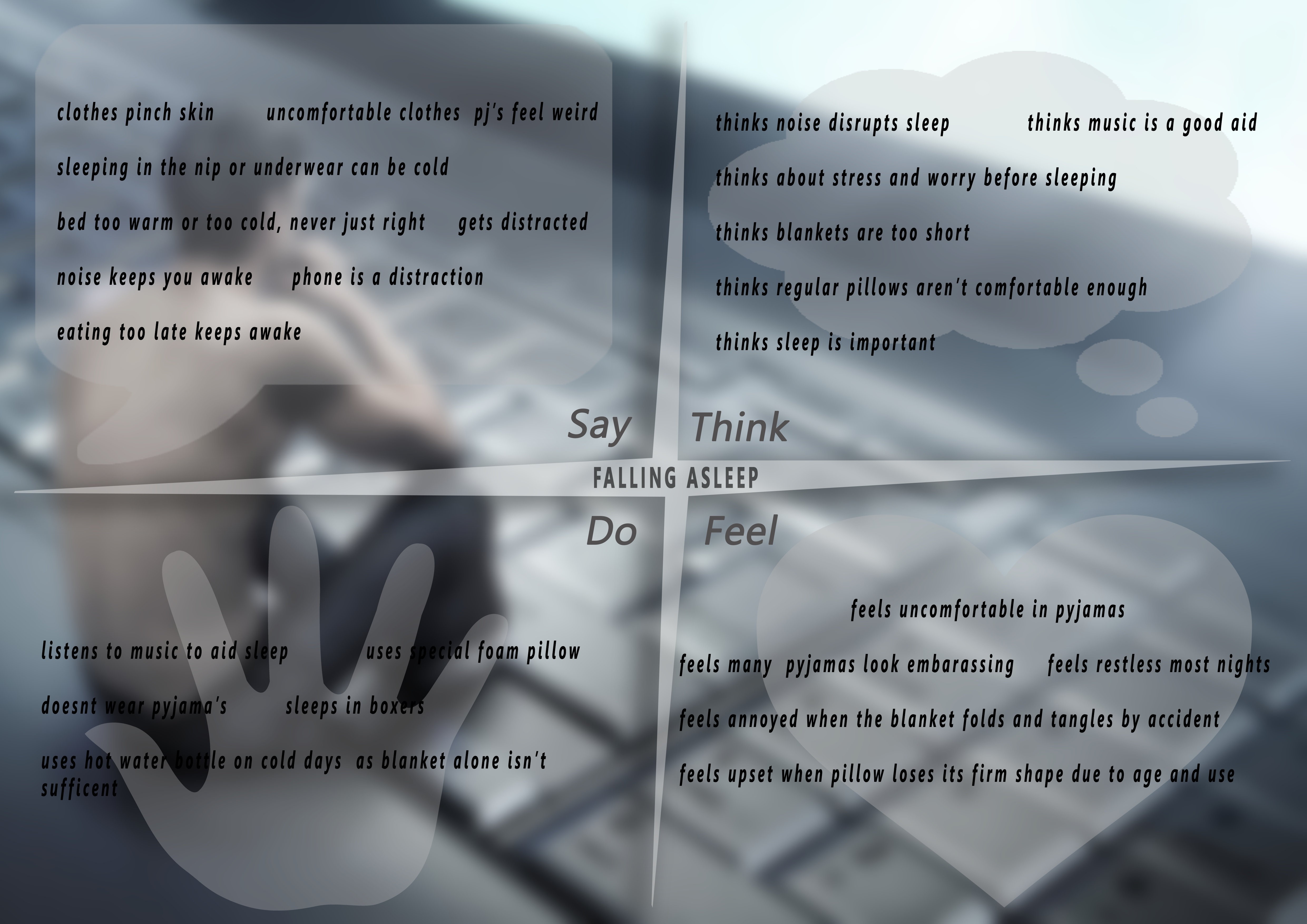
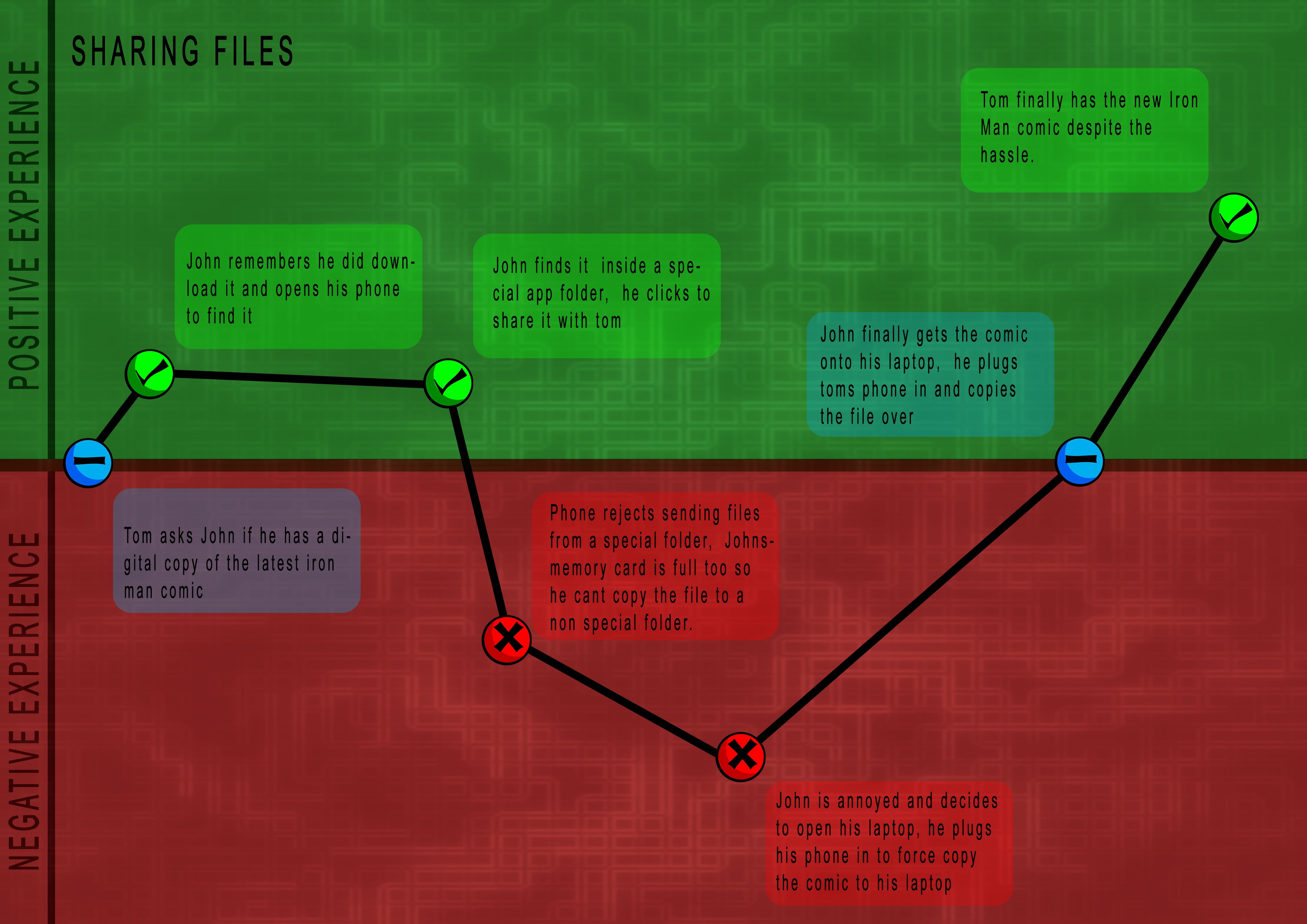
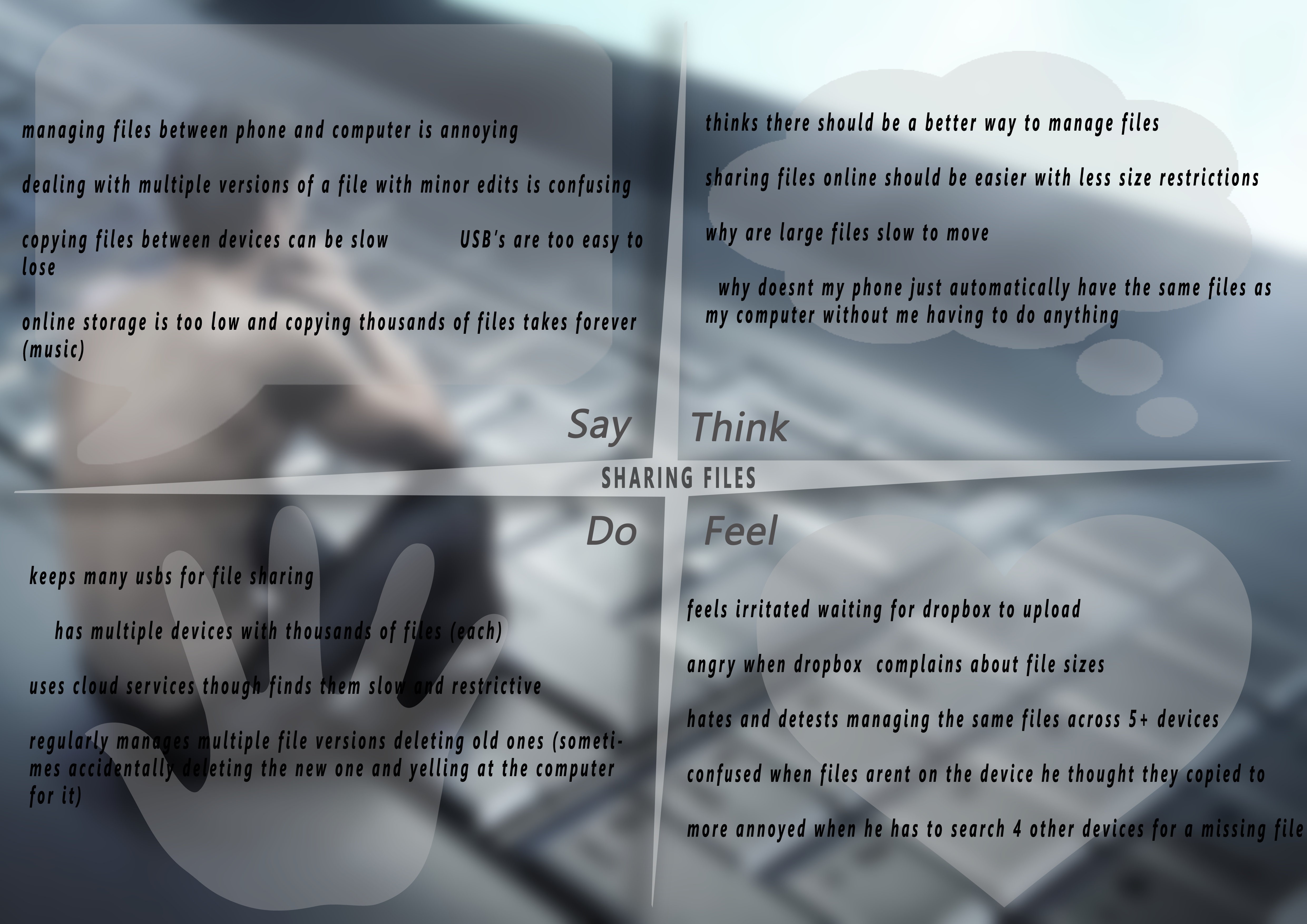
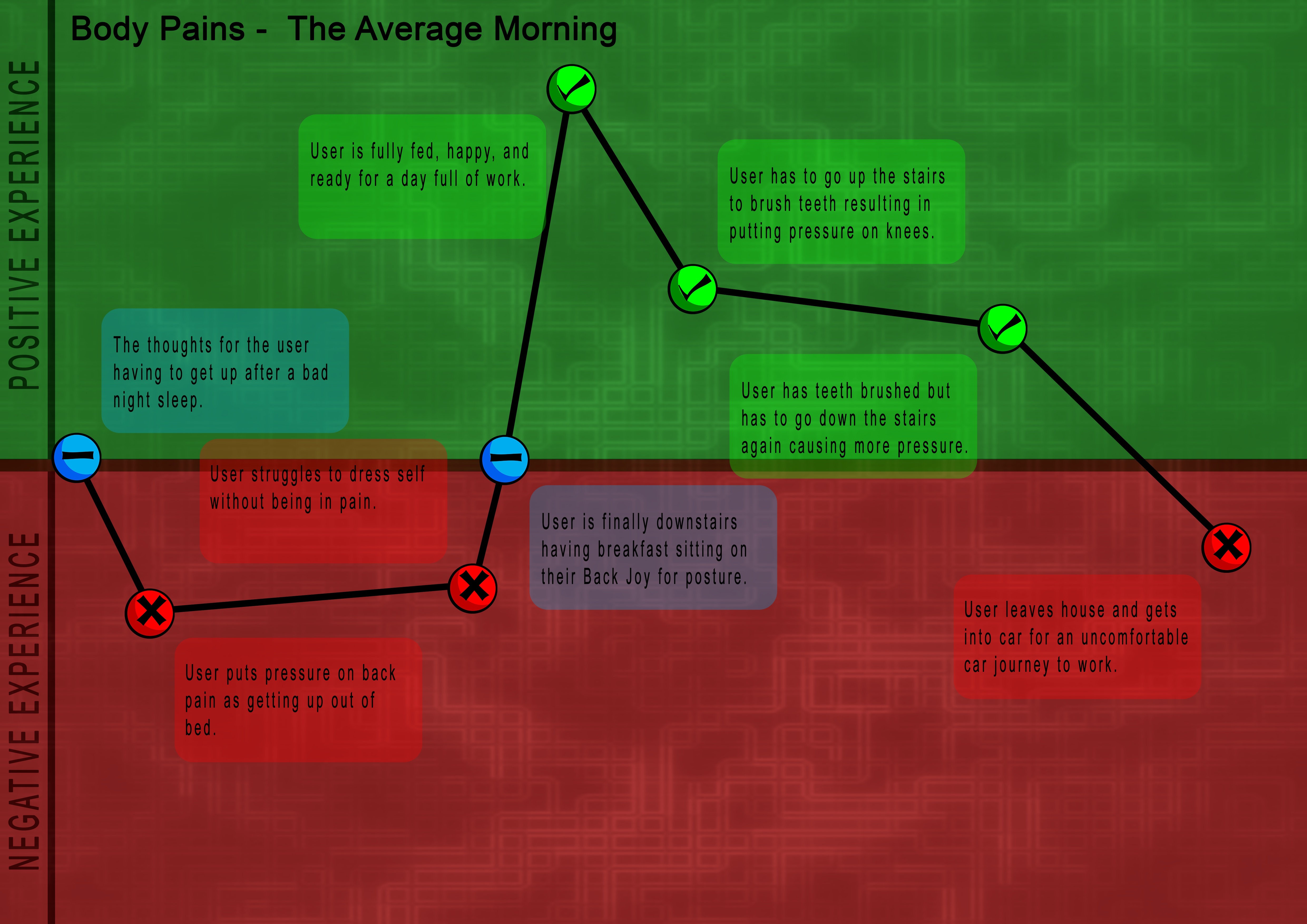
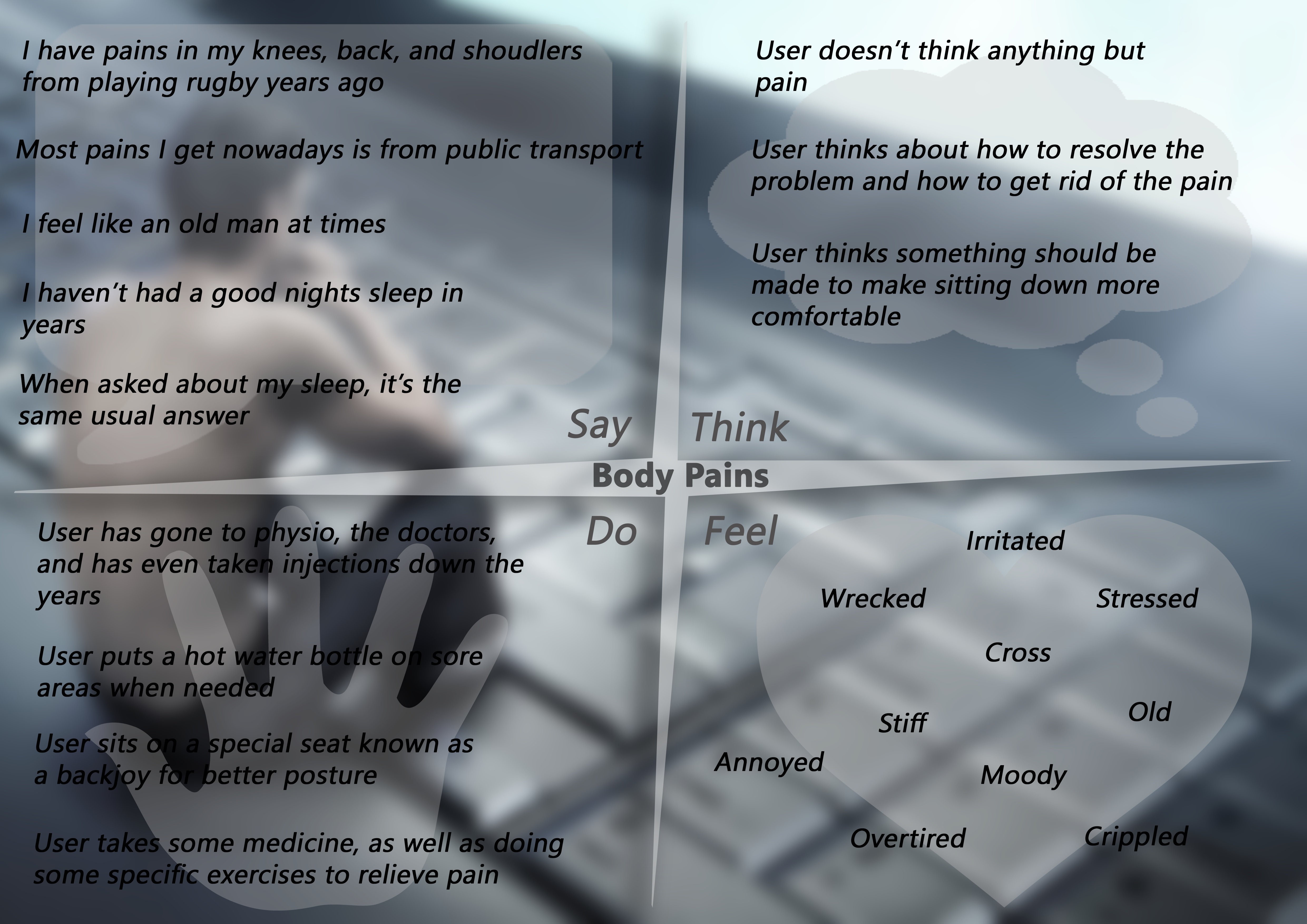
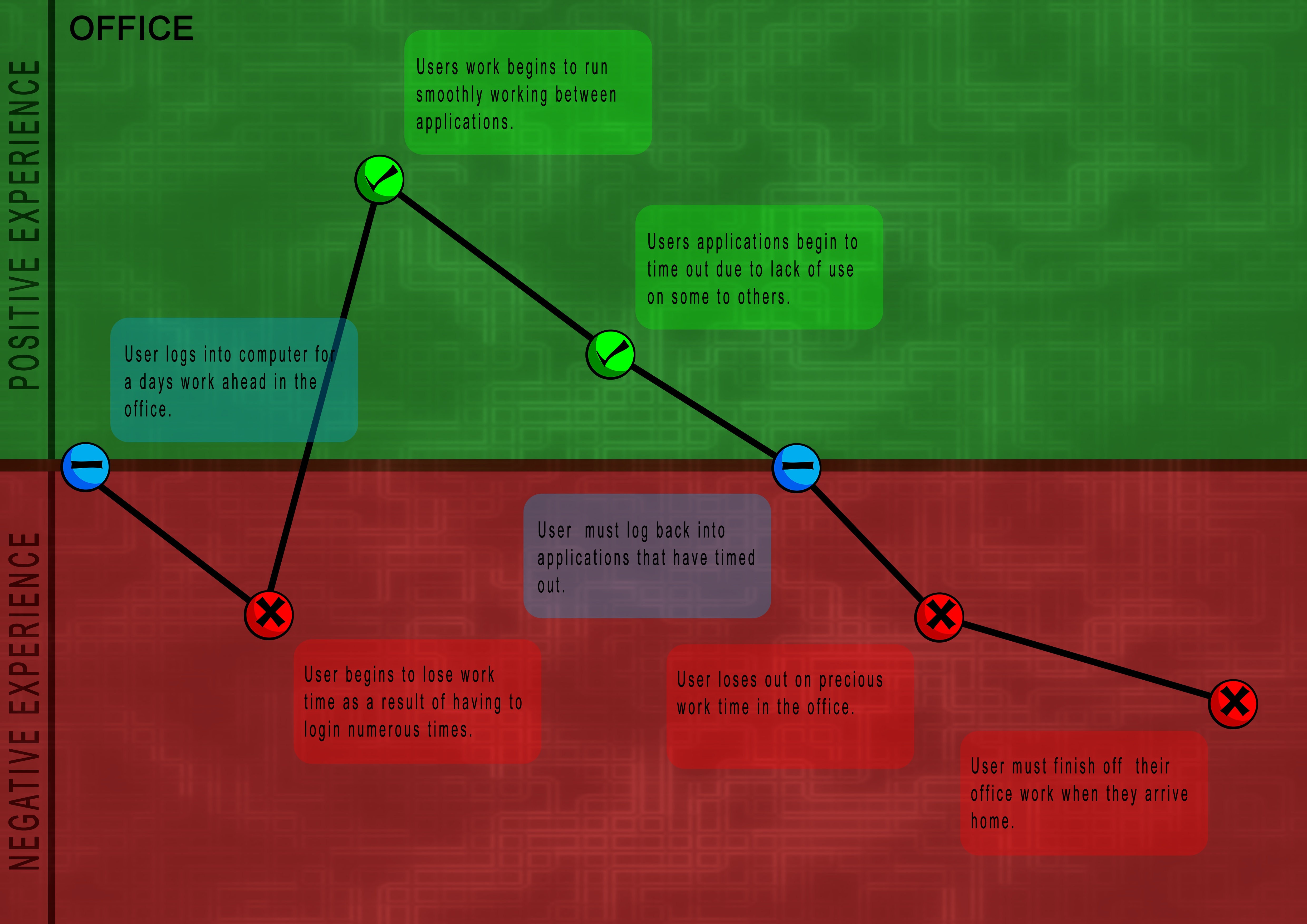
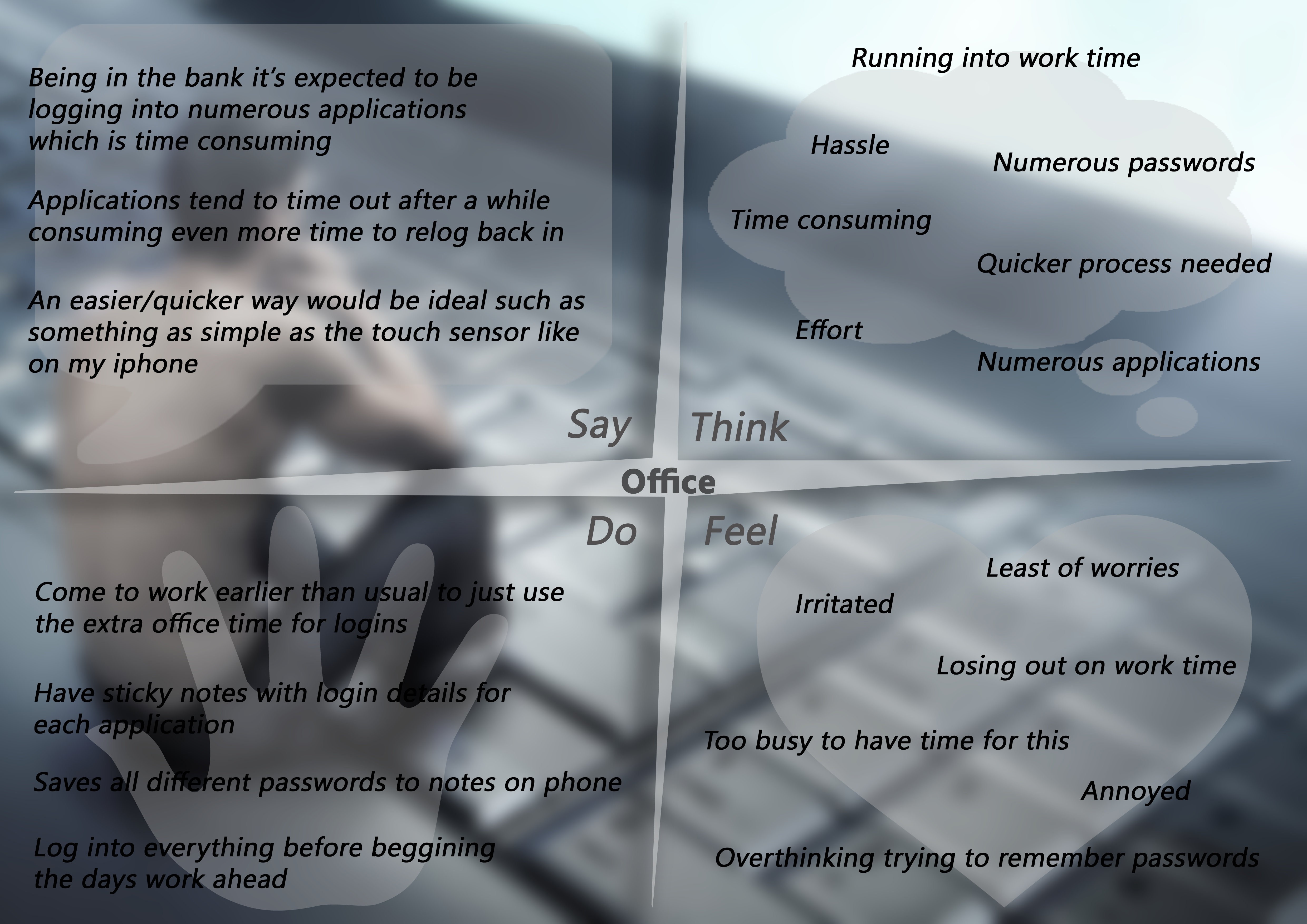
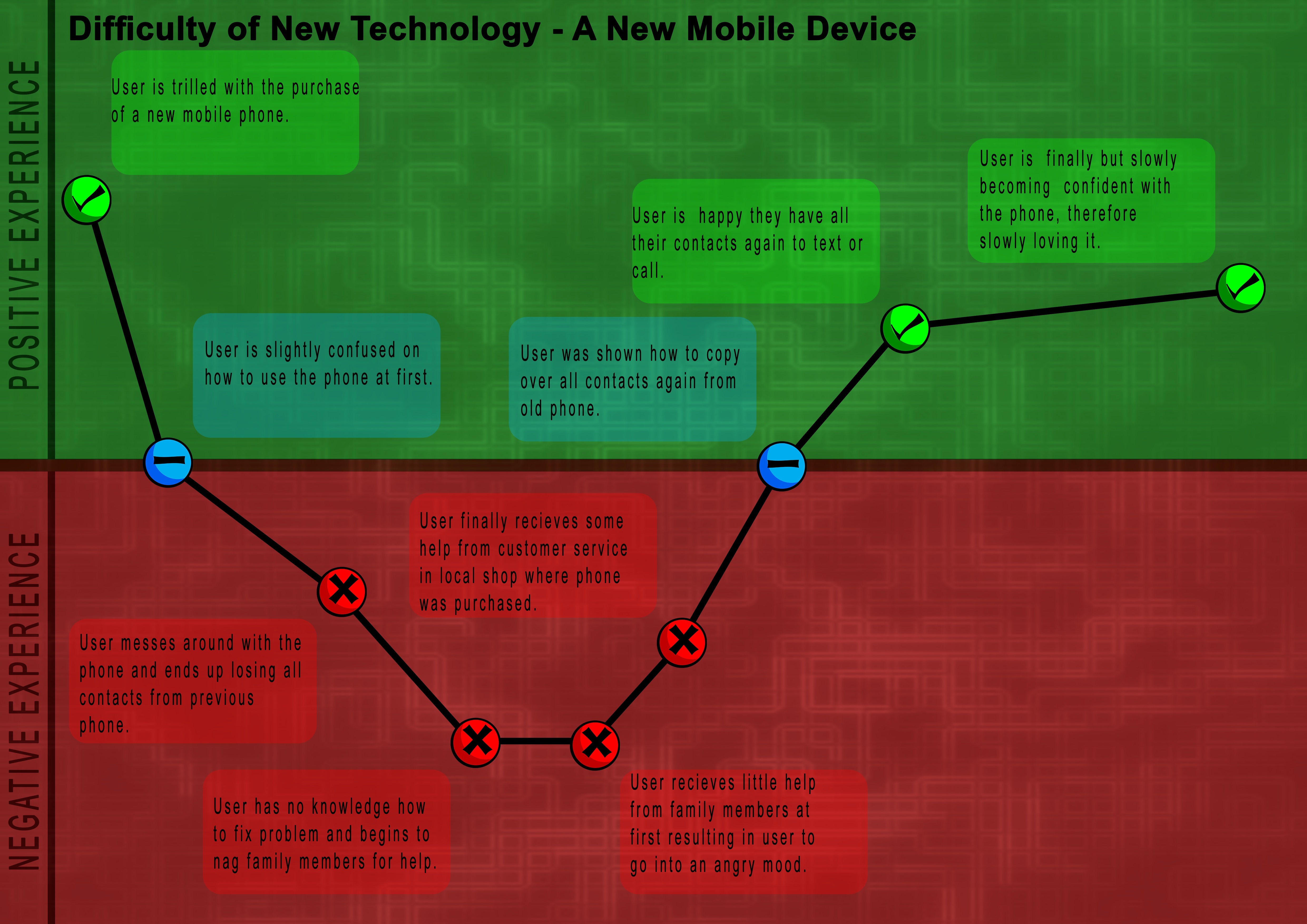
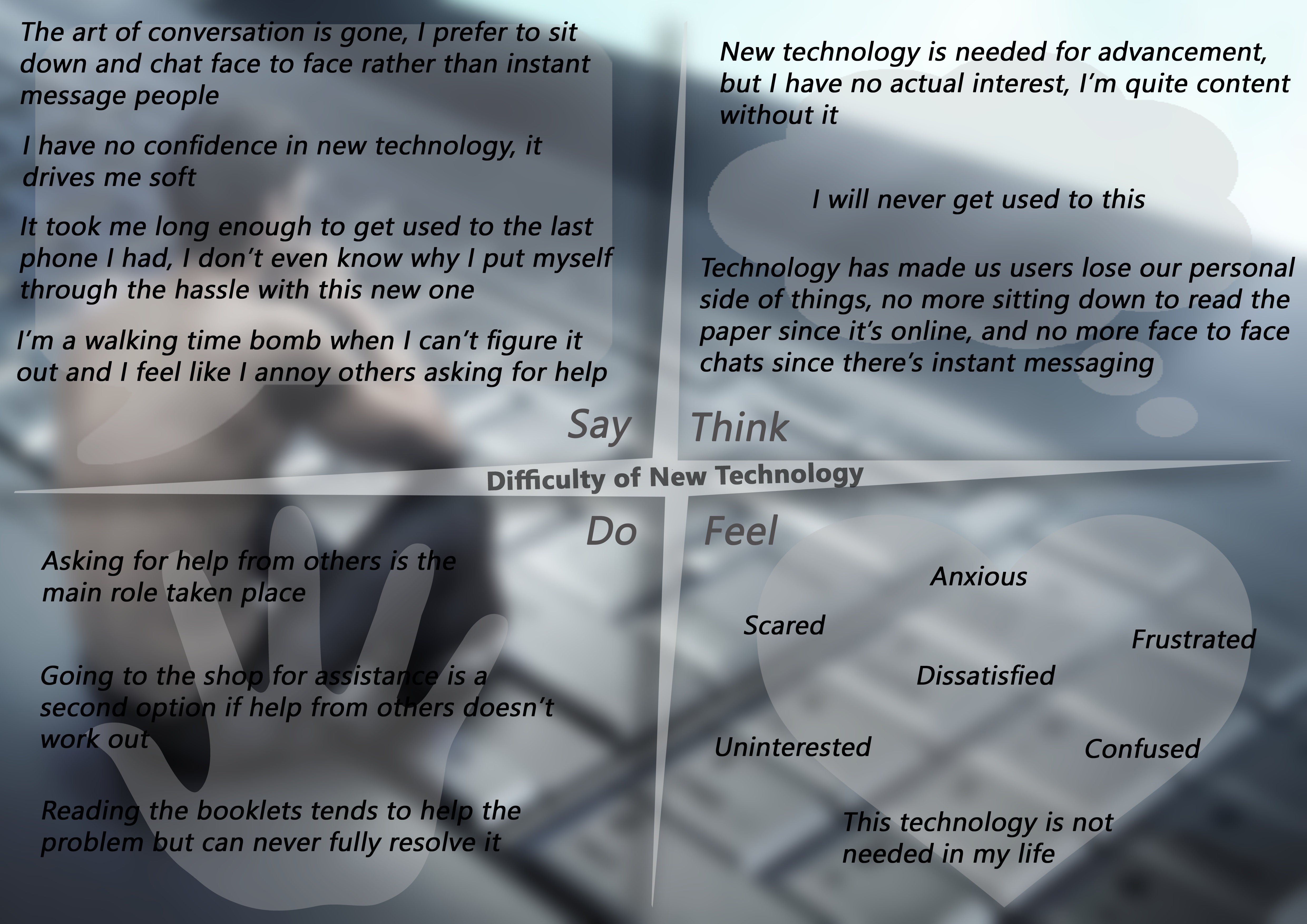
After compiling and looking over
the journey maps and empathy boards, we discussed which single area we would
proceed with. We had originally intended to go with file sharing with the aim
of creating a solution for data access from anywhere and any device but after
talking with our lecturer about the idea and the limitations the idea would
have at our prototyping stage given the resources needed we went back and
decided on picking a different area to focus on, in the end, we went with body
pain as we both had personal issues with dealing with regular pain.
This was a second year design
project assigned to us, the aim was to design a concept for a future wearable
device, beyond that the brief was pretty open and open to interpretation (does
a smart blanket count as a wearable device). This was a group project of two
and was started and completed long before any of these logs were written so
everything is being logged now from memory and previous notes.
Create an account to leave a comment. Already have an account? Log In.
Become a member to follow this project and never miss any updates
 Thøger Kappel
 Jason Cho
 Junzhe Guo (Sebastian)