-
System Component 3: Fabricating Accessible Augmented Layer
10/09/2016 at 22:20 • 0 commentsLabels are used to generate a 3D model for a tactile and pressable button layer, matching the original controls, and the users can specify settings of the printed overlay in the Facade iOS app once labeling is completed. Informed by our study, we allow individual buttons to be customized using Braille, embossed letters, or embossed symbols. This allows users to mark specific buttons with their own conventions with the VoiceOver functions on iOS. Although embossed capital letters were not mentioned in our study, blind participants did mention using shared machines at home and at work with sighted people, which embossed letters allows for co-located access. Embossed letters also improve access for non-Braille readers, who can recognize capital letters almost as well as Braille readers recognize Braille. Finally, users can customize the abbreviation strategy (i.e., which letters are used to represent a word or phrase); whether a legend is generated; which buttons are labeled or which buttons will remain flat; and the shape of buttons (useful for differentiating special buttons such as numbers).
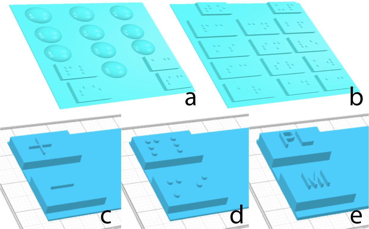
Based on the results from our formative studies, we decide by default to detect and use different shapes for function (rectangular) and number (spherical) buttons when generating the 3D tactile overlay. Following common numeric keyboard or button pad accessibility conventions, by default we only label number 5 with a dot on the spherical button for the numbers.
The settings and the crowd-generated labels are then passed to our automated design tool. We implemented an OpenJSCAD script to generate the final STL files of 3D models of the augmented buttons for printing. The input to the program is a generated JSON object including the dimensions of the tactile overlay, average button size, as well as the dimensions, positions, labels and preferences of each button. With this data, the script first generates groups of 3D buttons with labels.
We determine the depth of the buttons to be proportional to the size of the buttons. To get the scale factor for Braille and letters, we first divided the button width by two to situate two characters, and divided each area to hold two columns and three rows of dots including spacing. Compared to the standard dot radius and spacing size, the proportion is defined by this scale factor, and applied to the size of letters and symbols.
If short acronyms are not provided for each button label, the program automatically generates the abbreviations. By default, when adding Braille on top of the buttons, we use two characters for each button due to the limited surface area and the size of Braille characters: a word (e.g., `Clock') is abbreviated by the first two letters (e.g., `CL'); and multiple words (e.g., `Power Level') are abbreviated by the initial letters of the first two words (e.g., `PL'). When requested, a separate STL file is generated containing a legend detailing the abbreviations of the button labels, with the first column being acronyms, and the second column being the full words for a button label.
Our automated design tool then places buttons on top of a thin (2 layers in Gcode, 0.8mm) flat sheet, which creates a flat surface below the buttons that is easily attached to appliances with adhesives. Then, the program splits the tactile overlay into separate groups according to the 3D printer's print bed size limit, and combines all sheets, buttons and embossed labels in each group into one piece for printing. The script can also merge multiple pieces as one print job based on print bed size to reduce print time. Our system exports files in ready-to-print STL format, which can be printed at the blind user's home or through a commercial 3D printing service. The overlay design was finalized after several design iterations as we detail in the other logs.
-
System Component 2: Crowdsourced Segmenting and Labeling
10/09/2016 at 22:16 • 0 commentsFacade uses a two-step workflow to label the area of the image that contains the interface and then label the individual visual elements. Crowd workers are first asked to rate the image quality, and segment the interface region. To assist with later attachment, we asked crowd workers to segment the interface region aligned with the physical boundaries of the appliance interface, so that blind people can feel that boundary and align the overlay themselves at attachment time.
Then, they are instructed to draw bounding boxes around all of the individual buttons within the interface area, and provide a text annotation for each element (such as labeling buttons as `baked potato', `start/pause'). Similar to RegionSpeak and VizLens, Facade has multiple workers label in parallel to ensure high quality of the labels, and complete labeling all of the buttons within a very short time.
-
System Component 1: Capture and Perspective Transformation
10/09/2016 at 22:15 • 0 commentsThe first time a user encounters an interface, he uses the Facade iOS app to take a photo of the interface with a dollar bill, and sends the image to be processed and pushed to the crowd for manual labeling. The dollar bill is used to produced an image of the interface warped to appear as if from the front perspective, and to recover size information. We use a dollar bill as the fiducial marker because of its ubiquity, its standard size and appearance, and its richness in details and texture to provide sufficient feature points for tracking.
Facade uses SURF (Speeded-Up Robust Features) feature detector to compute key points and feature vectors in both the standard image of the dollar bill and the input image. Then the feature vectors are matched using FLANN (Fast Library for Approximate Nearest Neighbors) based matcher. By filtering matches and finding the perspective transformation between the two images using RANSAC (Random Sample Consensus), our system is able to localize the standard dollar bill image in the input image, and warp the input image to the front perspective for further labeling. The Facade app streams images to the backend server, which then localizes either side of the dollar bill in the image and provides real-time feedback on the aiming of camera relative to the dollar bill to blind users. By reading out instructions such as ``not found'', ``move phone to left/right/up/down/further'' and ``aiming is good'', the app guides the blind user to more easily take a photo from the front perspective, which will result in better warped image after the perspective transformation. The computer vision components are implemented using C++ and the OpenCV Library.
It is important to note that our system only has knowledge of the dollar bill and provides guidance based on its location, without knowing where the interface is. Blind users take advantage of the guidance provided by the app, combined with their knowledge of the relative location of the interface and the dollar bill, to aim the camera and take photos. However, if the appliance interface is partially cropped in the photo, in the next step, crowd workers will provide feedback to the user for taking another photo. Using a second marker could address this problem, but appliances might not have enough space to fit two markers.
-
Material examples
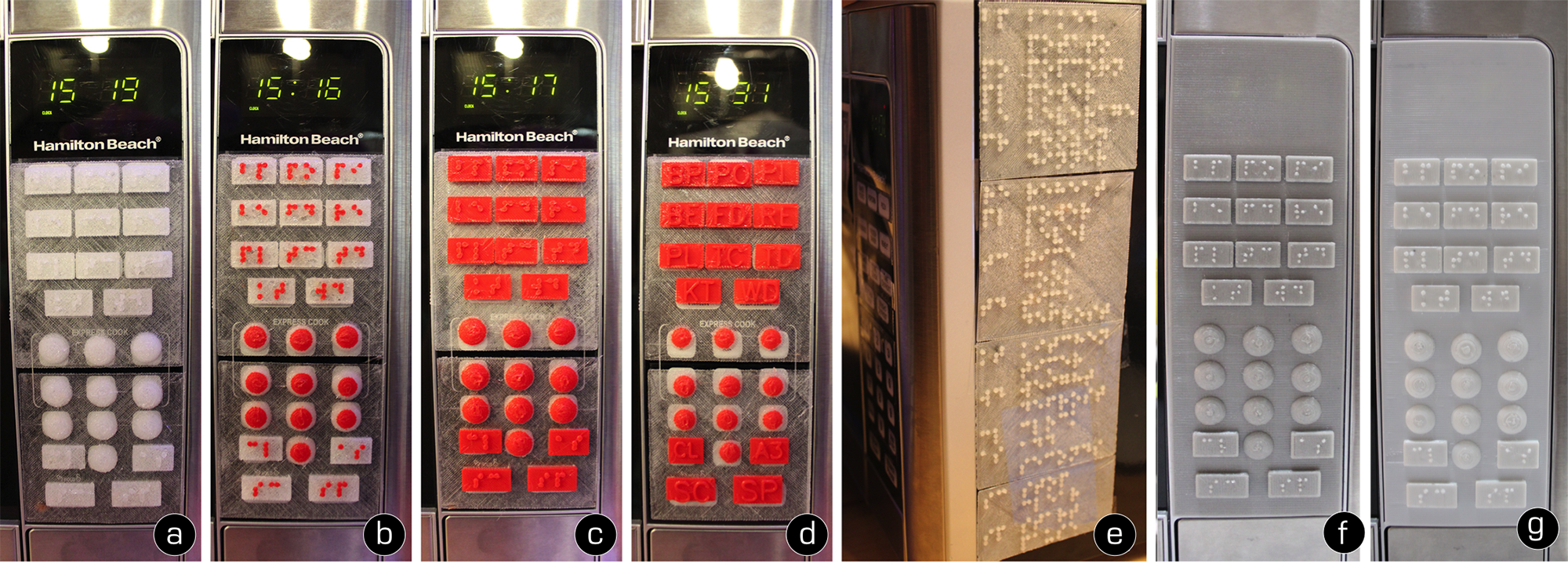
10/09/2016 at 22:07 • 0 commentsExample printed overlays and legends generated by Facade. (a)-(d) demonstrate the different material combinations we tested in the design iterations (NinjaFlex with Braille, Flex+PLA Braille label, Flex+PLA Braille cover, and Flex+PLA embossed letter cover). Facade users can choose to print a legend for the abbreviations (e). If a user does not have a 3D printer at home, models can also be printed through commercial printing services and mail-ordered. (f) and (g) shows two example prints ordered from 3D Hubs using PolyFlex and SemiFlex materials.
![]()
-
Tactile button shapes
10/09/2016 at 22:06 • 0 commentsShapes inform users of different functionalities. For example, half spherical buttons without Braille label indicates number buttons (a), while rectangular buttons with Braille labels indicate function buttons (b). Users are also able to change settings to use symbols (c), Braille (d), or embossed letters (e) for buttons labels such as plus and minus.
![]()
-
Example Applications
10/09/2016 at 22:04 • 0 commentsFacade is a crowdsourced fabrication pipeline that enables blind people to make flat physical interfaces accessible by independently producing a 3D-printed overlay of tactile buttons. From left to right, we demonstrate example applications including microwave, refrigerator door, copier, and another microwave. Insets shows close views of individual embossed buttons.
![]()
-
Facade system infrastructure
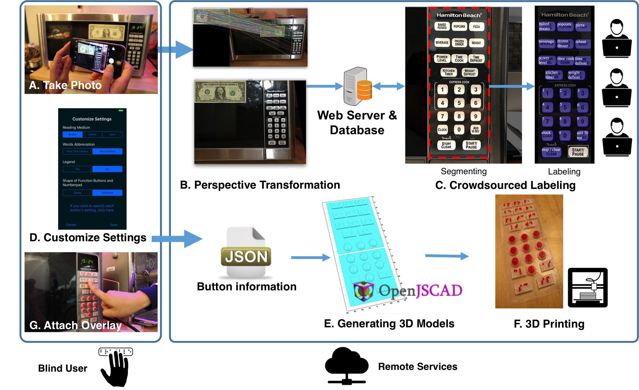
10/09/2016 at 22:00 • 0 commentsFacade users capture a photo of an interface they would like to use with a standard marker attached to it (we use a dollar bill). Using perspective transformation, the interface image is warped to the front view and absolute measurements are calculated. Then this image is sent to multiple crowd workers, who work in parallel to quickly label and describe elements of the interface. Blind users can then customize settings of the labeling strategy, and these labels and preferences are used to generate the 3D models of a tactile layer matching the original controls. Finally, an off-the-shelf 3D printer fabricates the layer, which is then attached to the interface using adhesives.
![]()
-
Design Iteration #3: Improved Legibility
09/28/2016 at 22:02 • 0 commentsSince the NinjaFlex version of printed Braille has enough detail and so is easily readable by a user, we printed the entire overlay in pure NinjaFlex including Braille. As guided by the user who tested our second design above, we also improved our design of the embossed letter version to make the letters thinner with larger gaps between letters for distinction.
For this improved design, we further tested the legibility of the Braille labels with two blind individuals (one female), both of whom provided formative feedback on the design. One suggested making the Braille dots more distinctive by raising the dots higher or reducing the button height. The other Braille expert, who works for a Braille publisher, suggested that Braille dots with a convex top are easier to read by touch than with a flat cylindrical top because convex tops provide a more salient separation between adjacent dots. Therefore, we changed the Braille dots from cylinders to domes, and finalized our design for the user evaluation we present next.
-
Design Iteration #2 Material Exploration
09/28/2016 at 22:02 • 0 commentsInformed by the participants' feedback to our initial design probe, we modified the design of the tactile overlay, and tested different combinations of materials to improve attacheability, legibility, and pressibility. Using a flat and thin sheet printed in flexible NinjaFlex as the base of the overlay can make the augmentation much easier to attach to the appliance interface with adhesive. The flexible material also made it much easier to press than using only PLA for the design probe.
While using NinjaFlex can improve attachability and pressability, it sometimes leaves undesired artifacts in the form of fine threads between Braille dots (think of melted cheese threads between pizza slices). These threads could reduce Braille legibility. One solution is to print Braille using solid material such as PLA (which we denote as Flex+PLA label). A problem that occurred with this design is that these Braille dots may become dislodged from the button surface over time, due to the combination of heterogeneous materials. Another solution for this is to print several layers of the button together with Braille dots in PLA, while printing the rest of the bottom layers in NinjaFlex, resulting in a larger contact area between the two materials to allow them to stick together nicely (which we denote as Flex+PLA cover).
We then performed a qualitative examination of the example applications with a blind individual (female, 24 years old, college student). In three different settings (i.e., pure NinjaFlex, Flex+PLA label, and Flex+PLA cover), the participant said all three testing material combinations were equally legible. Interestingly, she was most comfortable with reading the pure NinjaFlex version of the tactile overlay, despite the fine threads across dots. Unfortunately, both Flex+PLA label and Flex+PLA cover versions required her to press the button a lot harder to trigger the original interface. Overall, the NinjaFlex version of the tactile overlay had the best pressability and attachability among all material combinations we explored.
-
Design Iteration #1 Design Probe
09/28/2016 at 21:59 • 0 commentsTo test the 3D printed Facade overlay, we first created a design probe---a 3D printed sheet in PLA plastic of buttons labeled with Braille acronyms, attached to the microwave. We used an inverted cone shape for buttons, with the radius of the top surface corresponding to the actual size of the original button, and the radius of the bottom surface smaller. Thus, the design reduces the pressure required for blind users to press on the top surface to activate the original buttons on the microwave. To minimize assembly time, we attached the buttons in a grid with connectors between buttons, so that they could be batch printed, and also attached to the physical interface as a whole. We also made the connectors very thin so that the plastic buttons deform more easily when pressed. All of this design work was done by hand, but in a style that can be automatically generated for Facade.
We tested this design with the same participants from our formative study, and identified the following issues:
- Some unexpected 3D printed artifacts on the edges of the top surface made the Braille dots feel overly rough, reducing readability.
- Due to print resolution, Braille dots had different heights, reducing readability.
- The plastic buttons were too hard to push.
- The button set did not attach to the microwave panel well and fell off after several times of use, due to the small contact regions.
- Because PLA does not deform, the connector bridges broke after pressing for a few times.
Facade: Tactile Interfaces to Appliances
Facade is a crowdsourced fabrication pipeline to automatically generate tactile interfaces to appliances for blind people.
 Anhong Guo


