Close
0%
0%

Color Compass

Providing humans a sense of magnetoception through our visual field.

Similar projects worth following
Many animals and even plants exhibit magnetoception, an ability to sense magnetic fields, though it has been reasonably well established experimentally that humans don't. It is believed that, in at least some cases, magnetoception manifests within the organism's visual field. If magnetoception is in fact visual in nature, then it should be easy enough to augment the human visual sense with the capability of perceiving magnetism as well. Without building a whole mixed reality rig to overlay a grid or provide a heads-up display on the visual field Terminator style, I propose to provide that sense by simply presenting the user a color that corresponds to compass heading.

Background

The KidRobot Munny is a do-it-yourself vinyl figurine for making one of a kind art toys. Most of the time, people color them with markers or paint. Sometimes they augment the figures with polymer clay, building ears, tails, and weapons. But most of these customizations have been along the same lines—making a figurine that sits on a shelf—impressive though they may be.

But, as an engineer, I thought "how can I make these interactive?"

Meanwhile, I read that some scientists believe that pigeons may see magnetic fields, possibly overlaid in their visual field. One theory is that a light-sensitive protein, called cryptochrome, found in the retinas of many animals is actually responsive to magnetic fields. Interestingly, it takes extremely strong magnetic fields to affect change in a "normal" chemical reaction (fields much stronger than that of the Earth). However, there is the case of something called a radical pair wherein the fates of two electrons are entangled (yes, we're talking about quantum mechanics here), resulting in magnetic field-dependent outcomes of reactions with these radical pairs.

That lead to some daydreaming on my part about how that would work for a human. In the case of birds, though no one has been able to see it for themselves yet, we have an idea of how the magnetic field might look.

Lastly, at more or less the same time, it occurred to me that hue in the HSL (hue, saturation, and level) color model, represented as an angle, is analogous to compass heading which is also represented as an angle. Why not display heading as a color on the color wheel?

On a more conceptual level, I've been interested for some time in using our existing senses at the edge of conscious awareness such that they provide a new form sensory perception. In other words, though the device described in this paper uses one's sense of sight, the user really gets an extra sense. The important part is that when we use an existing sense but become unaware of it (that is, at the edge of conscious awareness or beyond), we basically earn a new sense. In a way, this is not really a new concept—we've grown used to watches providing us with a more precise sense of time than we have biologically. As technology makes seamless human-machine interface easier and less expensive, we can expect these kinds of extrasensory perception to become more like senses and less like carrying a gadget around and looking at it from time to time.

Implementation

Those of us that use computers for drawing likely know that colors can be represented in quite a few ways from a mix of red, green, and blue to an angle around the color wheel. The latter, often referred to as HSV (hue, saturation, and value) or HSL (hue, saturation, and luminance or level) represents colors as polar coordinates in a three-dimensional space. But if you just look at it in one plane, from above, you see the same old color wheel from elementary school art class, with red on top, or zero degrees; green on the lower right, or 120 degrees; blue on the lower left, or 240 degrees; and blending back to red again on top at 360 degrees. (For the pickier, more technically minded of you out there, you might know that the artists’ color wheel and the HSV color wheel are different, but for the purposes of this project those differences are small enough as to be irrelevant.)

Now, if you’ve ever watched a movie where pilots or ship captains bark out headings, you will have noted that they issue commands in degrees around the compass rose, where zero degrees is north, ninety degrees is east, 180 degrees is south, and so on.

Why not, then, make a color compass? If you’ve been maintaining mental images of the last two paragraphs, and can lay them on top of each other, you’ll see that red is north, yellow-green is east, aqua is south, indigo is west, easing through violet as we get back to north.

Note that in mathematics and engineering, angles...

Read more »

ColorCompass.ino

The Arduino code for the Color Compass.

ino - 4.78 kB - 08/15/2018 at 03:38

Download

ColorCompass.fzz

The Fritzing file (schematic and breadboard layout) for the Color Compass.

fzz - 25.65 kB - 08/15/2018 at 03:26

Download

  • 1 × Arduino Uno Could really be pretty much any Arduino.
  • 1 × Adafruit Triple-Axis Accelerometer+Magnetometer Board - LSM303 https://www.adafruit.com/product/1120
  • 1 × Common Cathode RGB LED Common anode is OK, but requires some rewiring and reprogramming.
  • 1 × Breadboard I used a Sparkfun shield-type unit, but that is not critical.
  • 1 × Wires You'll need a few wires to hook everything up.

View all 7 components

  • Sensor Smoothing

    Andy Oliver08/26/2018 at 19:49 0 comments

    Let's talk about how the program works to gather the heading information for later use to generate colors.

    First off, the hard part was already taken care of by the kind people at Adafruit. The compass I used was their LSM303 breakout board. This device has a magnetometer to find heading, plus an accelerometer to find out which way is down (or whatever else you want to use them for). This is important because it allows us (really the Adafruit library I downloaded) to compensate for tilting of the device as it figures out where it is pointed.

    By the way, there is no shame in using pre-made libraries. They are great for prototyping, and when you find yourself limited by them, you can then go program your own. There's usually no need to optimize to that level unless you are building something for production in the millions, where moving down to a thirty-cent cheaper microcontroller might save you big bucks.

    OK, so given that we have read through the documentation and set up our Arduino to generate compass heading data from the magnetometer, that information can be pretty jittery. One relatively easy (if a little processor-intensive) way of doing this is with something called an infinite impulse response, or IIR, filter. This particular one is an exponential smoothing filter. In short, with this kind of filter, your new "answer" is your last answer and your new input data, blended with some sort of formula. You can imagine that, with each new data point, you still have some factor leftover from old data. That's more or less the "infinite" in IIR.

    Here's how it looks in the code:

    // Load up new heading components with smoothed values.
    newHeadingX = ALPHA*event.magnetic.x + (1-ALPHA)*oldHeadingX;
    newHeadingY = -ALPHA*event.magnetic.y + (1-ALPHA)*oldHeadingY;
    // Store the new headings under the old headings for future smoothing.
    oldHeadingX = newHeadingX;
    oldHeadingY = newHeadingY;

    You can see there that I'm generating X and Y components of the compass heading to convert to an angle later. I smooth each component as it comes in with the formula seen in the second and third line. ALPHA is a number between zero and one defined elsewhere that serves as our filter constant (a larger number here is less filtering).

    Since ALPHA is a decimal, all these numbers are floats. We could do some integer math here -- basically like considering ALPHA as a percentage, or like talking about cents instead of fractions of a dollar -- but I'm not doing much else with the Arduino in this project, so floating point math is just fine for now.

    That said, I hope to refactor this project to use the FastLED library to generate nicer colors, and FastLED uses the byte as its main data type, so I could likely write all or part of the program using integer math. I'll have to think on that one...

  • "I mayd a jiff," or "On photographing RGB LEDs"

    Andy Oliver08/26/2018 at 19:46 0 comments

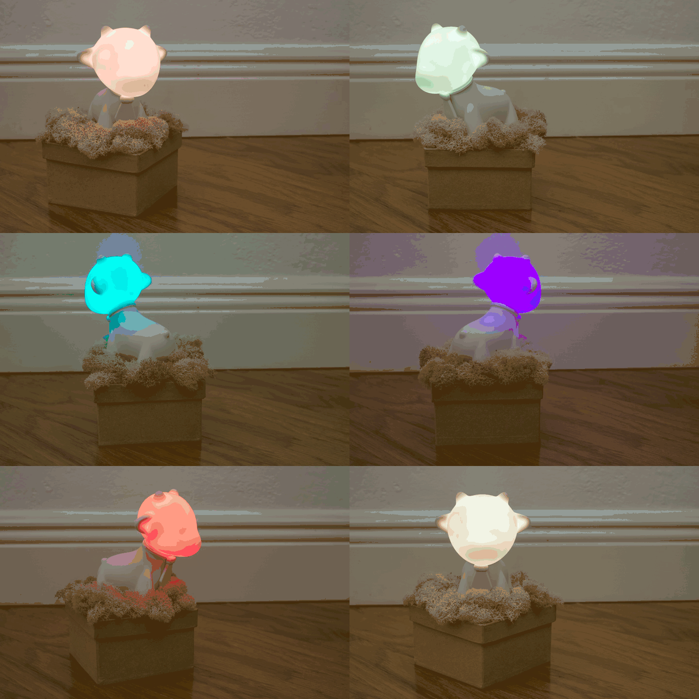
    I made a GIF for fun:

    To make this not a complete bold-faced play to get my four log entries to stay in the contest, I'll mention how I did it. There's actually a little bit to it, even though it didn't come out all that great with those wild reflections and blotchy colors.

    Knowing that I might want to make an animated GIF some day, I took a bunch of pictures of the project, each one after rotating it a little, stop-motion movie style. Of course you need to keep the camera steady, so I put it on a tripod. But here's the fun part:

    Put your camera in manual mode

    If you leave a normal camera on full automatic mode, it will adjust the exposure based on how much light it thinks is hitting the sensor. It can be wrong, or your ambient conditions can change, and it might expose the entire shot differently from one frame to the next, resulting in notable dim or bright frames. You can see a similar effect in the image above, but this is instead an artifact of the GIF encoding. If you have a fancy app or a camera with full manual control, set it to a good film speed, aperture, and shutter speed and don't change it. This will ensure that everything looks about the same from frame to frame, especially the background, even if your camera's sensor is confused by the varying light coming off of the LEDs.

    Underexpose most of the shot

    Here's another thing you need to keep in mind: LEDs, even when diffused through the head of a vinyl toy, are very bright when viewed directly. Combine this with color, and you can get some weird effects not unlike the patchiness you see in the GIF above. Again, this particular case is because of the GIF encoding, but a similar effect happens if you let your camera's image sensor get overexposed. So when capturing the source images, I dialed the exposure down pretty far. That's why it looks dark in the background. It was in fact fairly bright in the room, but I was trying to limit the amount by which the direct RGB LED light would overexpose in the toy's head.

    You can also get fancy and use a flash to brighten the scene so it balances better against the LEDs. But that's probably beyond the scope of this little article. Plus I didn't use it here, so I don't have anything to show for it.

    Shut off white balance

    Now, this last part is probably the most important thing to keep in mind when photographing a subject like this. Your camera, even in manual exposure mode, probably does automatic white balance. Here's what that means:

    When we look at a real, live scene with our eyes, we process it in such a way that colors look more or less the same always. That is, your blue shirt looks to be about the same blue whether you are in your house with warm white incandescent bulbs or in full sun in the middle of the day. You may be aware of slight changes in color cast, but we know that the shirt didn't change color, so we perceive it as the same color.

    However, the light from the mid-day sun is definitely different than the light from a light bulb. And it's not just brighter, but its color content is different. So the actual photons coming off your shirt have a different color content depending on the incident light.

    When we look at a photo, however, we become so much more aware of the color cast imparted by the incident light. In order to make that photo look more like how we would see the scene in real life, most cameras have what is called white balance. They "observe" the scene and try to figure out what the actual colors are behind the reflected colors we see. In the most basic white balance algorithms, the system just slides the overall color cast one way or another until the average of the whole image is neutral. That works in a lot of cases, but when you are taking a picture of an RGB LED, the system may try to average out the scene even though you have a single spot of color and the rest is neutral. That can cause your LED's color to become very dull and the rest of the image a weird shade opposite your LED's color.

    This is why...

    Read more »

  • Details Updated - What's Next?

    Andy Oliver08/23/2018 at 17:14 0 comments

    I finally scrounged up time to update the project details with just about everything I have written about it in my notes and elsewhere. So you can read that if you have more than a few minutes to waste. It's pretty long, with a lot of poetic waxing.

    What this also means is that I can, hopefully, get started on implementing improved color rendition before the contest is over. Just a short few days, but maybe I can do it. I'll keep you all informed as I go.

    First, Hackaday actually had an article about two months ago about using HSV for nice fades. That's basically what I'm already doing here since I started at HSV, given that the whole idea is that we're talking about color and heading both as angles around a circle.

    Now, where it gets more interesting is in this Hackaday article where we learn about gamma. In short, our eyes are more sensitive to changes when the LED is dim versus when the LED is bright. That is more or less easy to account for, at least if your microcontroller can do the math (just one math -- the math, in fact). But it also turns out that the function that would account for this peculiarity of human vision would need to be a little different for each of the three colors in our RGB LED. This can be noticeable when we're dealing with colors, especially when we want them to represent something specific, like compass heading.

    So to not bog down my eight-bit Arduino to a crawl (I already have it -- unnecessarily -- running floating point math to smooth things out), I might just do this as a lookup table. It seems like a cop out, but as far as I can tell it's the way it's done in the real world because it's efficient and effective.

  • First Post

    Andy Oliver08/16/2018 at 02:03 0 comments

    I've been putting up a little bit of stuff here to get the project page filled out, so now I guess it's time to talk about it.

    Some time ago I was on a kick tossing around ideas for using color to communicate information. At around the same time, I got a few Kidrobot Munnys and was trying to figure out what to do with them. (The one in this project is a Raffy, for all you pedants out there.) Also at the same time, more or less, I read an article or two about how pigeons might see magnetic fields. And last but not least, I remember thinking about white balance on cameras and the way our minds seem to use color information to tell what time it is (or really where the sun is).

    So, I managed to somehow squeeze all that into one project.

    And that's the history, pretty much. Now that we're up to speed, my next posts will be about this specific project, what we're doing now, and where we'll go next.

View all 4 project logs

Enjoy this project?

Share

Discussions

Similar Projects

Does this project spark your interest?

Become a member to follow this project and never miss any updates