-
Development ceased (for now)
01/12/2019 at 22:29 • 0 commentsI've decided to stop working on this project for the time being. I had planned to release a source code version 1.0, but I just can't seem to find the motivation to start working on the code again. I guess I've fallen out of love with the project. Also there's some other stuff I'd rather be working on right now.
The main thing I wanted for version 1.0 was to change how the chord editor works in order to make it a bit more flexible. However I want to point out that the current version (0.8) is fully functional, and has no known bugs.
All resources necessary for building a FATCAT device are available in the files section. The project page also has detailed build instructions. There's also a link to a Youtube tutorial in the project details section.
If you decide to make one I encourage you to send me suggestions for improvements or new features. And also let me know if you find any bugs. Any feedback is welcome.
-
Source code version 1.0 delay
12/02/2018 at 08:21 • 0 commentsNovember came and went, and while I've been able to do some work on the project, I haven't yet had time to put the final touches to the source code. There's really not much work needed, I probably only need 3 to 4 days for doing the necessary changes and testing. I just have to find the time.
So I'm giving myself another month to work on the project. Hopefully I'll find some time between now and the end of 2018 to get it done.
On the bright side I'm now satisfied with the PCB layout and the 3D-printed parts, and I can focus my attention on coding.
-
Final prototype
11/15/2018 at 20:12 • 0 commentsI've now made the "final" prototype for FATCAT. Of course there could always be some changes in the future, but they will probably be very minor in that case.
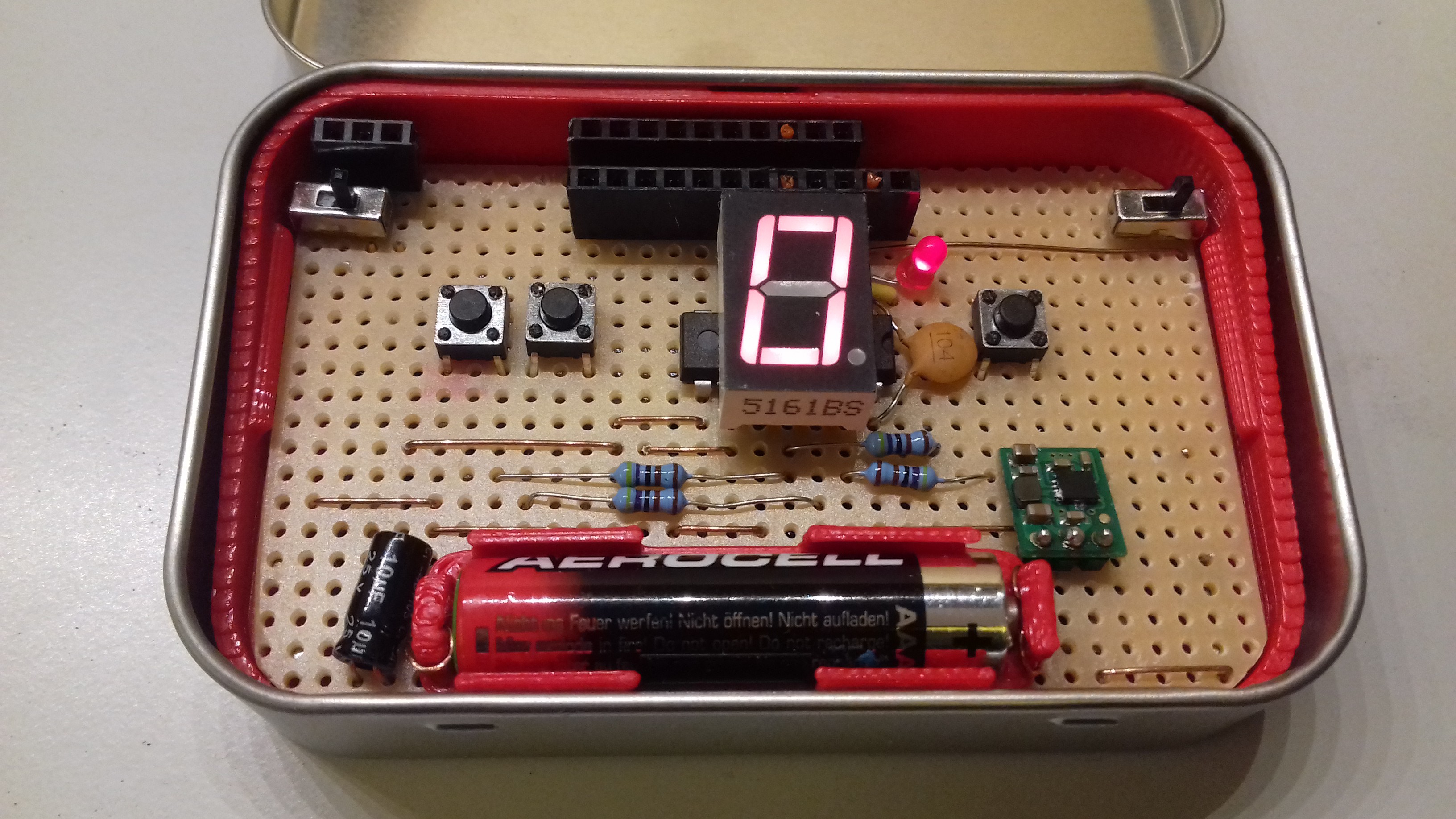
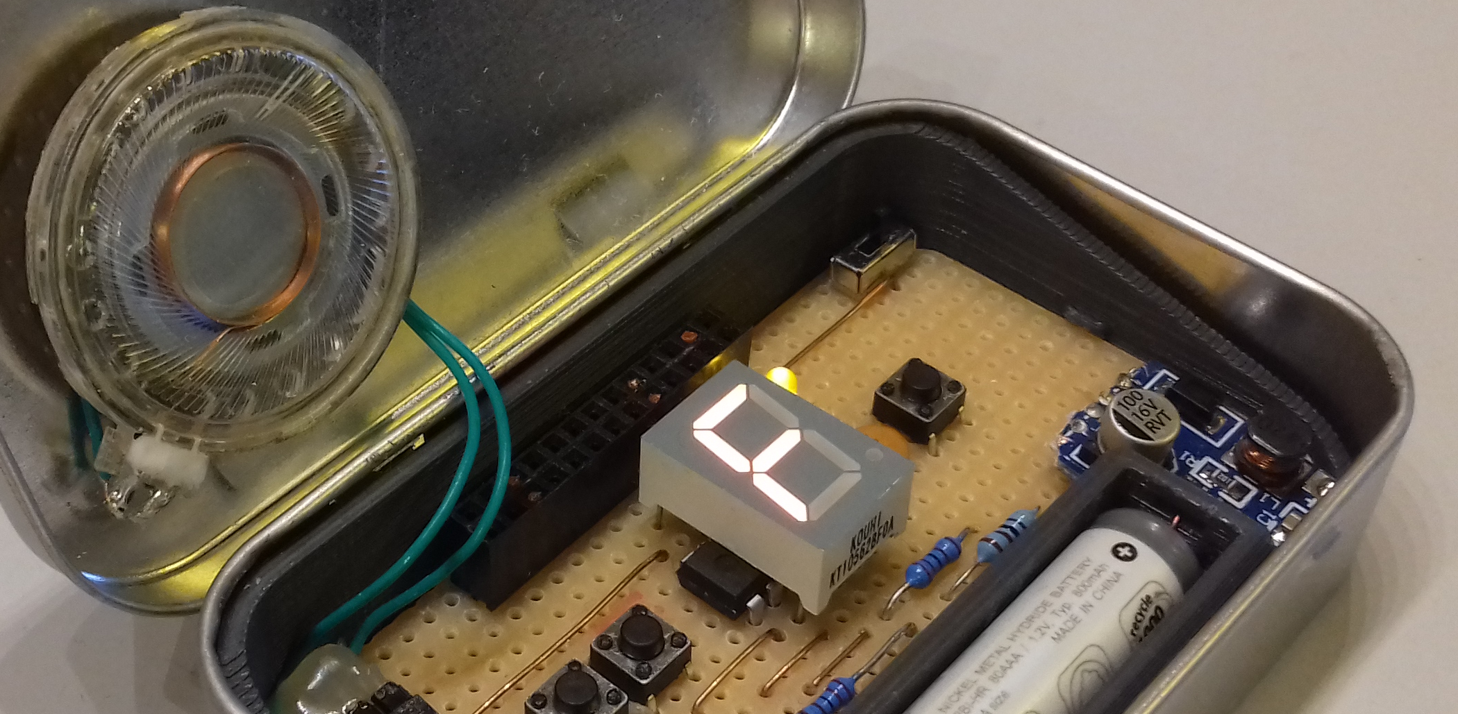
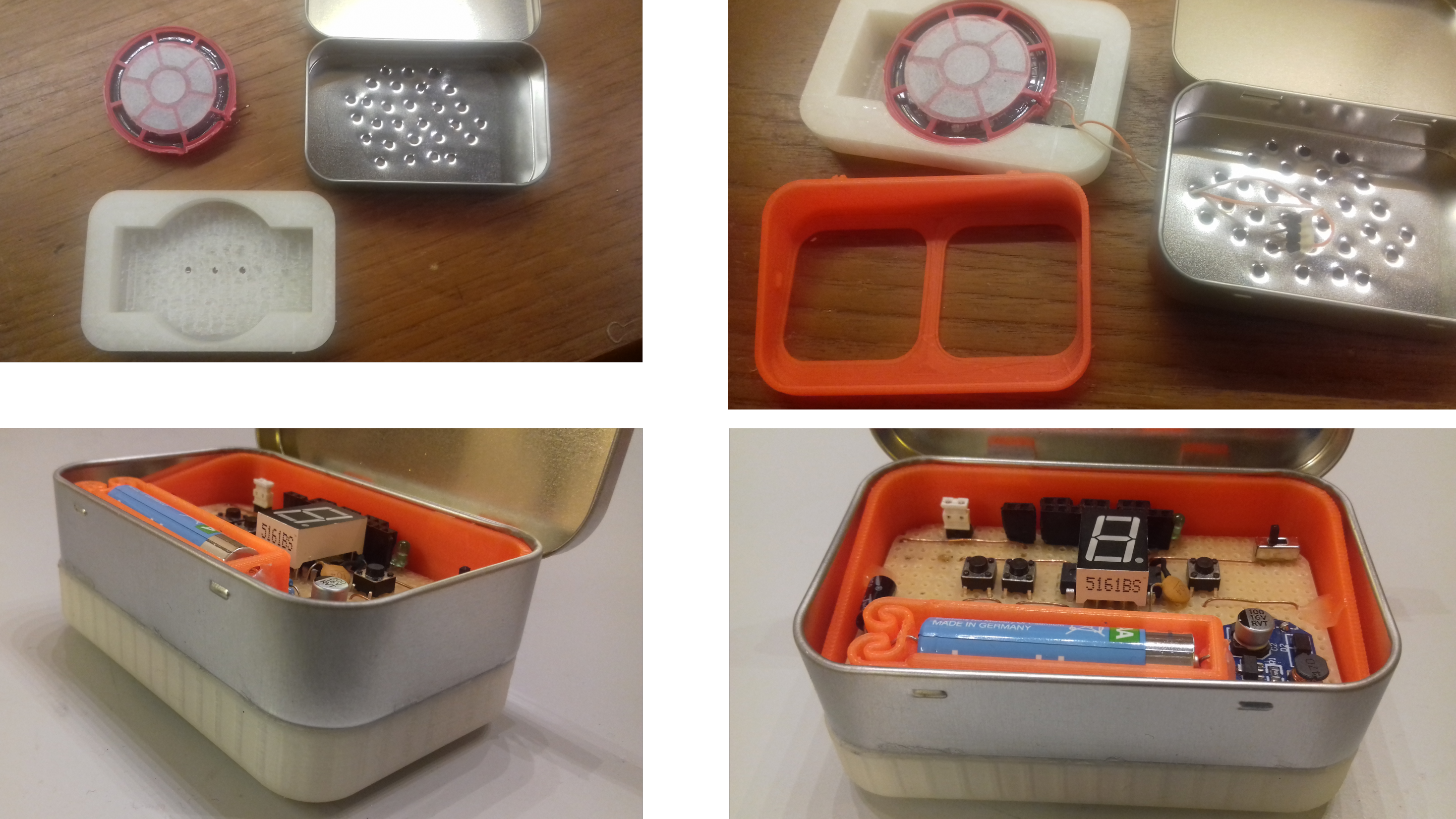
As discussed previously the major change with this build is that I've hidden the speaker below the PCB. I also added an extra pin header (top left) for connecting to external speakers or headphones:
![]()
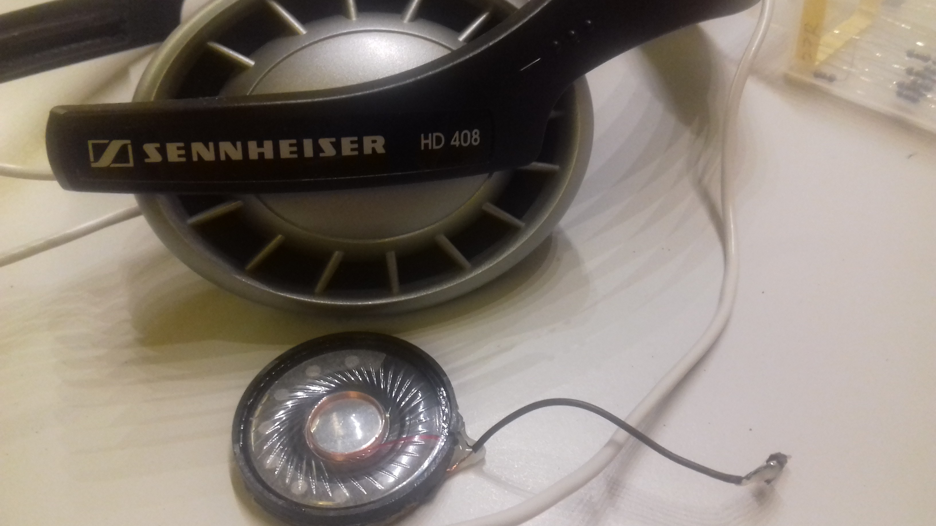
To get a speaker element of a suitable size I sacrificed a pair of old Sennheiser headphones:
![]()
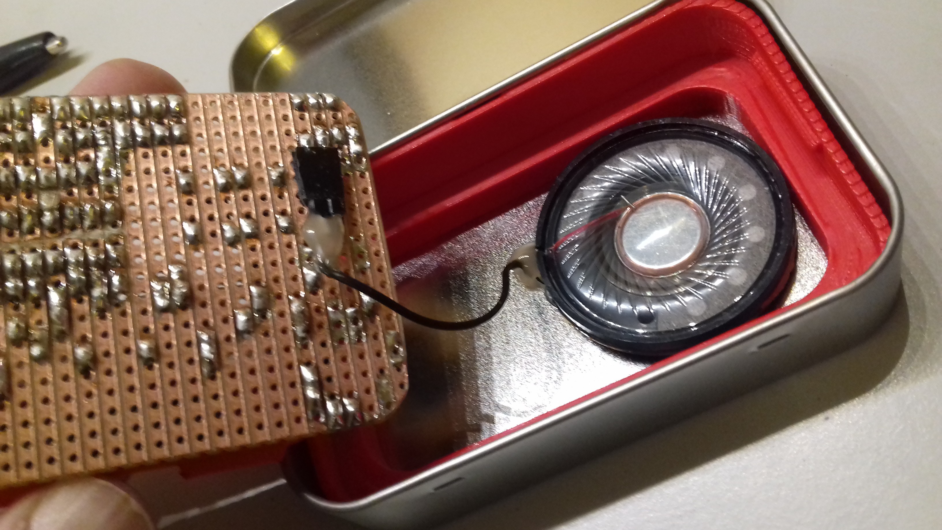
I found that It's not really necessary to use any adhesive to fix the speaker to the tin, since its magnet itself is strong enough to hold it in place.
![]()
Using the original configuration, with dual inverted OCR pins for audio output, this speaker pulled quite a bit more than 40 mA out of each pin. One option would be to use a resistor to limit the current but that would be a bit wasteful. Instead I connected only one of the OCR outputs to the speaker, and tied the other speaker terminal to ground. With that configuration the speaker pulled about 38 mA, which should be fine. However dual outputs will still be useful for certain speaker elements, and especially for piezo speakers, which generally seems to draw less power.
I found that battery efficiency is a bit of an issue: When the battery is down to about 1.2 V the MCU brownout detection kicks in and resets the MCU whenever audio output is activated. I can't disable the brownout detection, since it's necessary to avoid EEPROM corruption.
In this build I tried using the Pololu U1V10F5 boost regulator, hoping it could pull a bit more power out of the battery. But the result was pretty much the same as with the no-name brand I had used before. Using two AAA cells in series would've been a better solution, but that simply won't fit on the PCB.
As a small measure to reduce idle power consumption I've replaced the discrete LED (originally green) with a red one, which in turn allows me to replace the two 2k2 resistors connecting to MCU pin 11 with 4k7 ones.
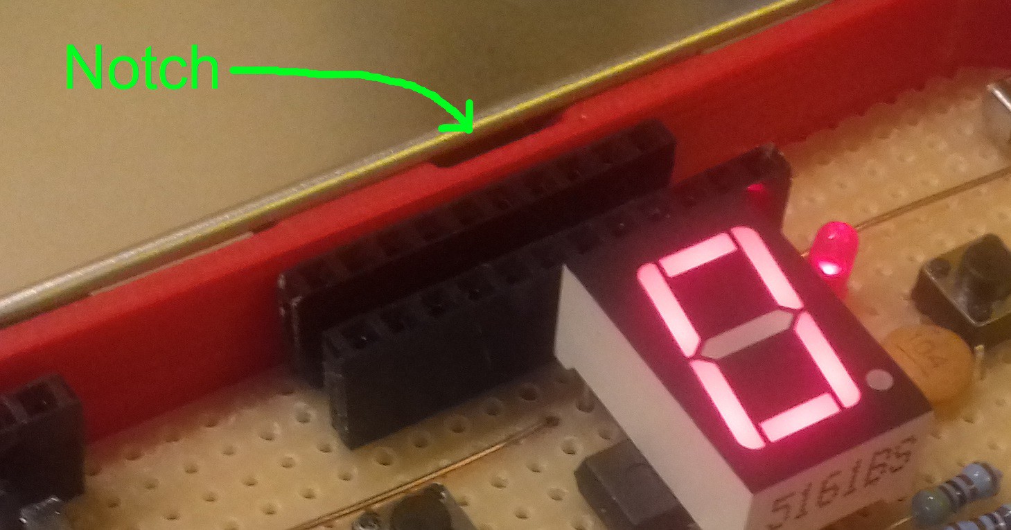
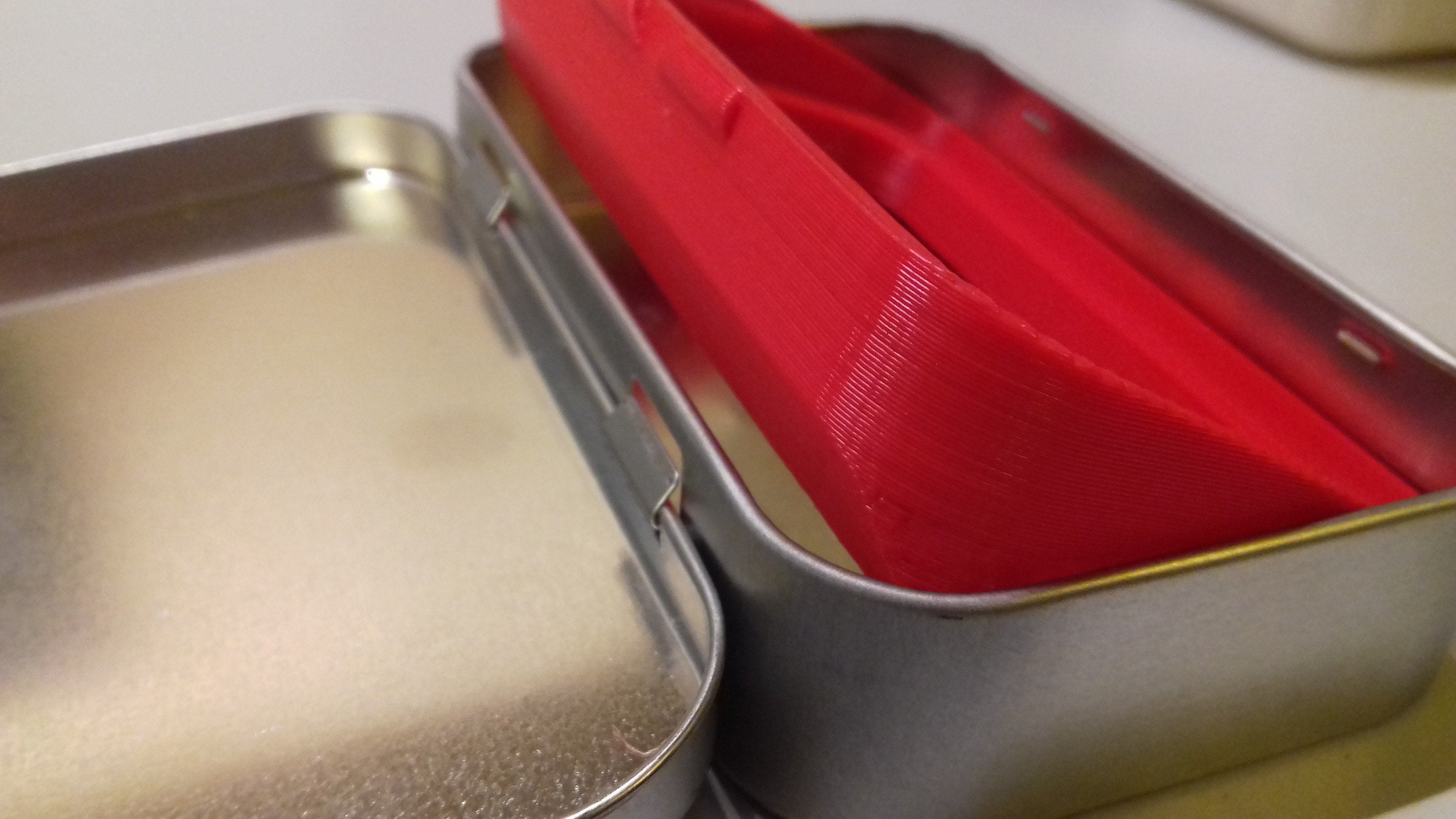
I had added a small notch to the PCB holder 3D-model, to make it easier to pry it back out of the Altoids tin if necessary. But I found that the action of prying it out could damage the battery holder, since it would get pinched between the PCB and the inside of the tin. To remedy this problem I added a gradual cutoff to the base of the PCB holder, in order to give it more room to slide out without getting caught on anything.
![]()
![]()
-
New PCB layout
11/07/2018 at 06:05 • 0 commentsThis is a short log to document some changes I made to the PCB layout. I haven't yet built the new prototype.
The new speaker placement has led to changing the layout on two main points:
- The speaker terminals now connects to different PCB traces. In the previous layout these were spaced out a few traces apart to allow for soldering a piezo speaker directly onto the PCB. In this layout the speaker terminals connects to two adjacent traces through a female pinheader, soldered to the bottom of the PCB. The leftmost trace cannot be too close to the edge of the PCB, or the pinheader will get squeezed between the PCB and the threshold of the inner case.
- The new battery holder has a smaller PCB footprint. This allows for moving all components and wires down one step on the vertical axis. This is done in order to space the two parallel patchbay pinheaders apart vertically. This should allow for easier user access.
Since I was changing the layout anyway, I took the opportunity to reorganize the patchbay pins slightly—the leftmost "gap" in the pinheader row is now eliminated.
Here's the PCB layout before and after:
![]()
I'm not convinced that the electrolytic capacitor is really doing anything useful at this point. I originally put it there to prevent DC current to flow across speaker terminals indefinitely. Since then I've tried to make sure the MCU will disable its speaker outputs at any time when sound isn't actually being produced. But I'm keeping it in there for the time being, mostly because I've seen other similar designs use a cap there, and I want to play it safe.
-
New 3D-models
11/06/2018 at 10:35 • 0 commentsAs I discussed in the previous log I've decided to modify the build to fit the speaker below the PCB, instead of gluing it to the lid of the Altoids tin.
The first thing to do was to determine how much vertical clearance inside the tin I had to work with. The two tallest components on the PCB are the 7-segment display and the battery. To measure how much I could elevate the PCB i stuck pieces of blu-tack on top of those components and squeezed the lid shut. I then measured the squeezed blu-tack pieces with a caliper. The display had a 5.5 mm clearance. The battery clearance was about 4 mm.
The PCB rests on top of a 3D-printed inner case, which at that point had a 1 mm thick "floor". So if I could make the battery the same height as the display there would be room for a 6.5 mm tall floor compartment for the speaker.
Battery holder
For my previous builds I've been using the excellent "flexing battery holder" model by Thingiverse user [enif]. Since it's a quite sturdy design I thought I could probably get away with shaving 1.5 mm off the bottom, which would make it the same height as the display.
But it turned out Tinkercad broke the model when I imported it—the integrated spring would print as two separate pieces. I have once in the past stumbled through the confusing process of fixing a broken model in FreeCAD, but I didn't want to put myself through learning all that stuff again.
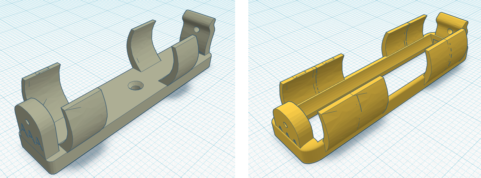
Instead I found this battery holder by Thingiverse user [Morpheus0010]. It was the same height as the other one, but it did import properly into Tinkercad. I subtracted the base of the model which lowered it by about 2 mm. To hold the remaining pieces together I added some material around the bottom perimeter of the model. Now the battery would rest flush against the PCB. Since my printer isn't particularly reliable at printing thin details, I widened the "wings" of the model to make them less prone to breaking off. Here's the before and after:
![]()
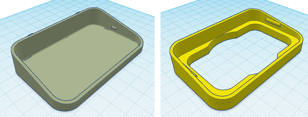
Inner case:
The new inner case has a 6.5 mm tall compartment in its base to fit the speaker inside of. But you probably don't want to put a speaker that's thicker that 6 mm in there. It's wide enough to fit a 50 mm speaker, but most speakers of that diameter will probably be too thick. There should be plenty of smaller diameter speakers that fits though.
To save on material, I only left a small threshold around the edges for the PCB to rest on.
Another change I made was to lengthen the ridges on the sides that holds the PCB in place. I've had some problems before with the PCB sometimes getting loose.
![]()
Note: The model is based on this design by Thingiverse user [mussy].
The next step
I'm feeling quite optimistic about this design. I'll need to make some minor changes to the PCB layout to accommodate for the new speaker placement. I'll check back when I've built and tried out the prototype.
-
Where does the speaker go?
11/03/2018 at 13:50 • 0 commentsFor sound output, I initially designed FATCAT with a small PCB mounted piezo speaker in mind. While that's still an option I've found it difficult to source piezos of that size that can achieve high enough sound volume. I've had some luck with piezos I've desoldered from old PC motherboards, but I find that the new ones I've bought sounds very tinny and quiet. Guess they don't make them like they used to.
A larger 35 mm type piezo speaker gets loud enough, but is very difficult to fit inside the Altoids tin together with the rest of the components.
![]()
With the last prototype I made I used a small dynamic speaker element glued to the inside of the lid. A speaker element of this size can achieve a respectable sound volume, but it's a bit tricky to position it correctly. If you glue it to the wrong spot, you might be unable to close the lid. Also you need to give the wires running to the PCB just the right slack: Not too short but not too long either, or they might get caught in something. The whole thing is a bit tricky and it doesn't feel like the ideal solution to the problem.
"The beast"
Today I wanted to try out a beefier speaker element I'd scavenged from a pair of crappy over-ear headphones. It was far too big to fit inside the case. So instead I drilled a bunch of holes in the bottom of the tin, and printed out a housing for the speaker and glued that to the underside of the tin. The sound can then pass through the holes in the PCB.
![]()
I call it "the beast"! It gets quite loud actually. But of course having an external housing for the speaker is cheating. All components should really fit inside the tin.
Where to go from here
Cheating aside, this seems like the proper place for the speaker—below the PCB. You can fit a larger speaker, it's not as finicky to build, and the speaker membrane gets protected.
So for my next prototype I'll apply the same principle, but ditch the external housing. Instead I'll elevate the "floor" of the inner case 3D-model, and make a cylindrical compartment in it to fit a speaker element. There's barely more than a 5 mm clearance between the tallest component and the lid—so it will be a tight fit—but it might just work.
-
Far from frugal future for FAT feline finalist
11/02/2018 at 04:04 • 0 commentsThe 2018 Hackaday Prize contest will be over next week and that also marks the deadline I've set for this project.
I was blown away to see FATCAT make it to the semi-finals, as one of 20 entries from the Musical Instrument Challenge. I never would've expected that when signing up. Because of it, I feel super encouraged to get started on some other projects I've been thinking about doing.
But since I've actually gotten pretty close to the goals I'd set up for this project I feel it'd be a shame not to tie up the final loose ends. Mainly I want to make some changes to how the chord editor works. For that reason I'll extend the project deadline to the end of November. At that point I'll release firmware version 1.0, I'll put the final touches to the project documentation and build instructions, and after that I'll walk away.
At least for now...
Mega-FATCAT
In this section I'll speculate a bit on how the FATCAT project might evolve if I decide to pick it up again at some point in the future.
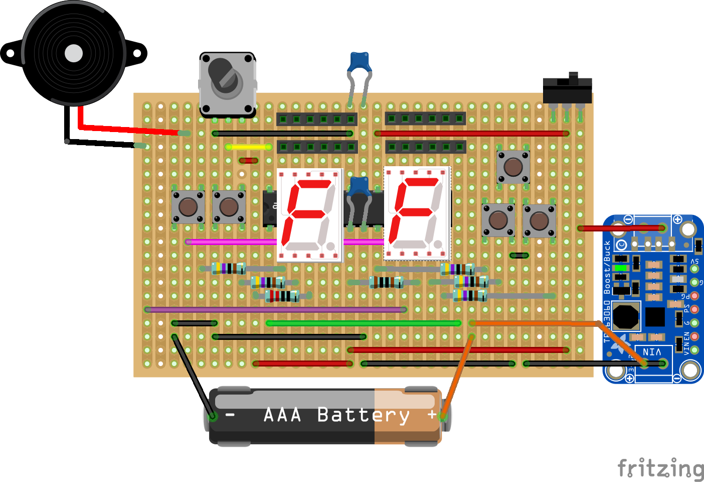
In the planning stages of this project I briefly considered a slightly more elaborate design for FATCAT. The basic hardware design concept would've been the same, but Instead of building the system around the ATtiny84, this alternate design would've used the notorious ATmega328p. The increased number of GPIO pins would allow for having two 7-segment displays, as well as more buttons. The MCU could even accommodate a potentiometer on pin 28 (ADC5).
Here's a sketch of what that might look like:
![]()
In the sketch I've put the two 7-segment displays behind the MCU, since I wanted to show all the pins clearly. Also some PCB traces needs to be cut and some pins left floating, which isn't shown in the diagram; Check out the current build instructions to get an idea on how that would work.
There were a few reasons why I didn't end up going with this design:
- All those components probably wouldn't fit inside an Altoids tin. And it definitely wouldn't fit a large speaker.
- The larger amount of components would make the device messier to build by hand.
- Because of the bigger MCU, the buttons would have to be placed close to the edges of the Altoids tin, which might make the device uncomfortable to operate.
- The bottom LED segment of the right display would be unreadable any time there's audio output, since it shares its GPIO pin with one of the speaker terminals (not really a big deal).
- The hardware design was supposed to be frugal. And I wanted to restrict myself to designing for the most limited system resources possible (within reason).
But now that I've actually implemented that frugal ATtiny design, the ATmega version appears to be the next logical step forward nonetheless.
The ATmega328p has four times the RAM, four times the FLASH, twice the EEPROM of the ATtiny84 and a bunch more GPIO pins. That would provide me a lot more freedom to implement all those features I've had to leave on the drawing board in the current project:
- The added FLASH would leave ample room for a respectable wavetable sound bank, as well as drum samples. It would also fit code for syncing of two FATCATs connected through the patchbay (discussed in this log).
- The added EEPROM would fit more song data.
- The added RAM would allow for more complex patch effects. And the effect states wouldn't need to be binary: Using the potientiometer, the degree of each effect could be tweaked.
- At least 10 GPIO pins can be dedicated to the patchbay (current nr is 6). This allows for 45 unique patches (as opposed to current nr of 15).
And what's equally important: The physical UI would be less restricted. As demonstrated in the recent video tutorial I made, a lot of the song editing process consists of alternating between the "Row select" and "Note select" tasks. With two displays and more buttons, those two tasks could be merged into one: The current row would be selected on the left display (using the left hand buttons) and it's note value would be selected on the right display (with the right hand buttons).
On the Mega-FATCAT Fritzing sketch, the components actually sort of fits on the original PCB. But I'm not so sure about the 3d-aspect of the build, or the button ergonomics. But then again, maybe the Altoids form factor just isn't the right fit for Mega-FATCAT.
Tiny FATCAT
I still feel the current ATtiny84 design was the right choice for this project. I believe the hardware limitations of that MCU has forced me write more effective code than I would've otherwise. And all those possibilities for "Mega" features would definitely have resulted in increased development time. Ultimately I'd probably ended up leaving that project in an unfinished state.
Tiny FATCAT can't do everything, and it's a bit of a one trick pony. But it does everything I wanted it to do—it does fit neatly inside an Altoids tin—and I believe it makes for a quite fun and capable music toy. And the design will reach a finalized state.
If I ever start working on Mega-FATCAT, it will probably have to be at least a year from now. There's one or two other project I want to do before that.
But a hiatus will probably be for the best. If I start right away I'll probably repeat some of the "less than optimal" code design choices I've made with this project. Hopefully, a year from now I will have become a better C programmer and will be able to tackle those same problems more competently.
Here's the sketch again with the displays in their proper place on top of the MCU:
![]()
-
Circuit diagram revised & pdf:ed
11/01/2018 at 06:59 • 0 commentsThis past weekend I noticed the project had started getting a lot more views all of a sudden. Turned out the reason was [Brian Benchoff] had covered it on the Hackaday blog.
In the article comments I saw a couple of requests for a pdf / png version of the FATCAT circuit diagram.
After I opened it up in KiCad I noticed I'd made a silly error. I'd connected pin 1 of the patchbay to the wrong thing (It should really connect to ground).
The error has been fixed, and the circuit diagram has been updated to revision 1.1. There's now also a pdf of it in the files section.
-
Video tutorial finally complete
10/29/2018 at 17:05 • 0 commentsAt last I've finished making a tutorial for FATCATs song editor. I've been meaning to do it for the last couple of weeks now, but I didn't realize how much work it would be until I actually got started.
I tried to ad-lib it a couple of times but the result was just a mess. I ended up actually writing a four page script, and even then I had to redo some parts.
Anyways, here it is. It doesn't cover every single feature in detail. But for anyone who wants to build the device, this should definitely be enough to get you started with making some music on it.
-
The buttons
10/23/2018 at 04:36 • 0 commentsI settled on the current button input scheme for FATCAT pretty early on in the design process. But since I realized I've only mentioned it in passing so far, I'll just write this short log specifically on that subject.
How it works
The input scheme is super simple. There are three buttons: Left, Right and Enter. Each button can be used for two input actions: The first action is just a short button press. The second is press and hold. The system response to those actions will depend on the current system context.
Button Short press Action Press & Hold Action Left L LH Right R RH Enter E EH That's it! There are no button combinations or double-clicks or anything like that. Just three buttons, used to perform a total of six input actions.
The reason why
There are few parts of the UI where it would've been tempting to use a more creative input scheme. One such part is the PLAY mode (see the "User Operations Flowchart" in project files). In that mode, E is used for cycling between playing individual tracks solo. But sometimes you'd also want the option to cycle between muting individual track. But alas, there's not enough buttons for that. One way to activate muting would be by using a double-click or some combination of buttons.
Another use for extra input actions would be as shortcuts to functions that currently requires navigating the MENU mode. Such shortcuts could be used to speed up the song editing process somewhat.
However, there are two reasons against implementing those kind of solutions:
The first reason is consistency: The UI outputs very sparse information, and it doesn't explicitly tell the user what information is shown at the moment. It's all fine as long you remembers what op mode you're in. But once you get "lost" things can get confusing, especially if you're in the process of learning how to operate the device. The UI will give you subtle hints on what the current op mode is, but an inexperienced user might rely on trial end error in trying to navigate back to a familiar state. Such a process would certainly be more frustrating with a large number of possible actions at your disposal. It would also become less appealing to attempt using trial and error as a method of learning the UI, for the same reason.
The second reason is performance: FATCATs hardware design demands that button inputs are registered by means of polling. For the UI to remain responsive during playback, polling must periodically interrupt the program loop that generates the playback audio stream. A higher number of possible input actions makes these interruptions longer, which in turn increases the risk of audible distortions. Although it's unlikely that polling of a few more input actions would result in any substantial difference in that respect, I still find it prudent to keep polling duration at a minimum as part of an effort to minimize CPU workload in time-crucial parts of the main loop.
Side note: I implemented the feature for individual muting of tracks by dedicating a special patchbay connection to it, which modifies the behavior of the E action.
Triggering of input actions
In general, Left and Right are used for cycling through values, while Enter is used either for selecting the current value (using E) or to activate an alternate function (using EH).
For that reason—although the input actions are the same for all buttons—they way they are triggered works differently for Left and Right as opposed to Enter:
- The L / R action will trigger immediately after the corresponding button is pressed. After a short delay the LH / RH action will trigger repeatedly for as long as the button is held.
- The E action will only trigger once Enter is released. If the button is held for a certain time, EH will trigger instead of E. Holding the button after that point will not trigger any more actions.
Since the system response to E is generally of a different nature than EH, only one of them can be allowed to trigger on any press of Enter. For that reason the system must await Enter release before interpreting the action.
L / R will generally result in the same system response as LH / RH. While editing a song for example, R will advance you to the next step of the song, while RH will auto-scroll forward through the song. Because of this, it doesn't make sense to wait until Right is released before registering the R action; That would only make the UI unnecessarily unresponsive.
There's one exception to that rule though: In PLAY mode, L / R is used for changing patterns, while LH / RH is used for changing the song tempo. The systems way of handling that is to first switch pattern when L / R triggers; Then if the button is held long enough to trigger LH / RH, the pattern switches back and the tempo starts changing instead. That's an ugly solution, but I use it nevertheless since I put a higher value on UI responsiveness.
FATCAT: Altoids Tin Mod Tracker
A drum machine, base synth and arpeggiator that fits in your pocket. User interface inspired by classic mod tracker software.
