kelvinA
Navigation
The title tag system is explained here, and the table is updated when a change occurs. Notable logs have bold L# text.
| L1 [T] First use intro | L2 [T] Why the fixation on UI/UX? | L3 [T] Liquid glitter background |
| L4 [T] Installation UI appearance |
Preface
[2022 - April 12]
Continuing from what I said in the description, I'm making this project as I expect that the installer would be seen enough times to warrant a custom look. For example, the installer is both seen when either MatterControl or Cura is updated. I also believe that it sets a more positive first user experience.
The coolest installer in recent memory is Intel's graphic driver:
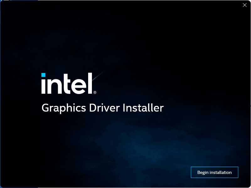 It's got a modern look and the background is animated with a thundercloud effect.
 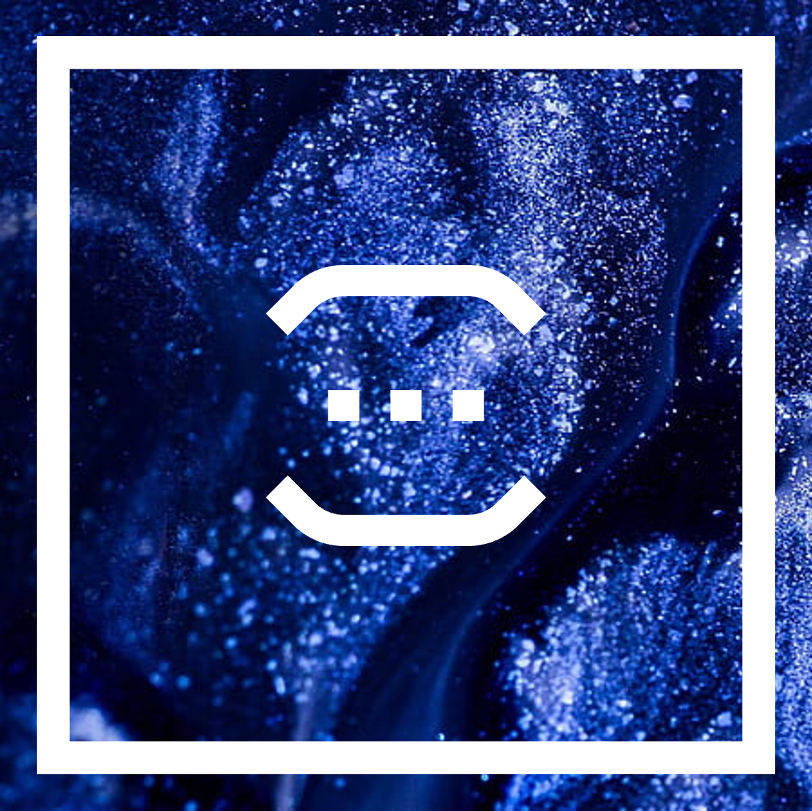 The general idea is that the window is going to be a square and there's going to be a smaller, hollow square inside of it that gives the window a visible edge.
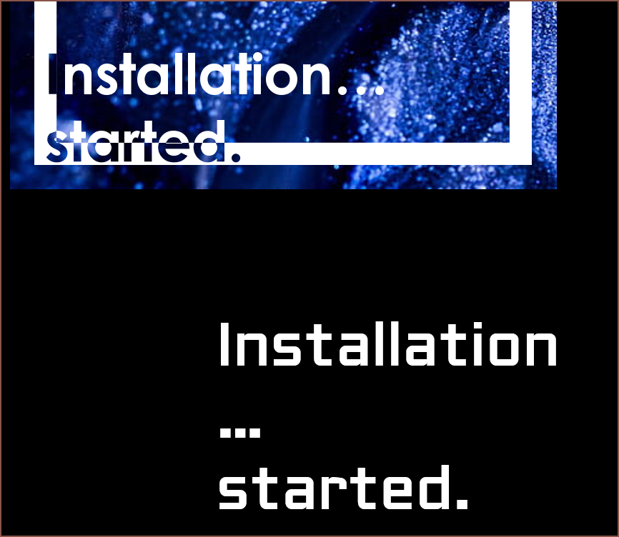 The first font I tried was Century Gothic because it was the closest to the font I had in my mind, but the issue is that the dots were circular.
 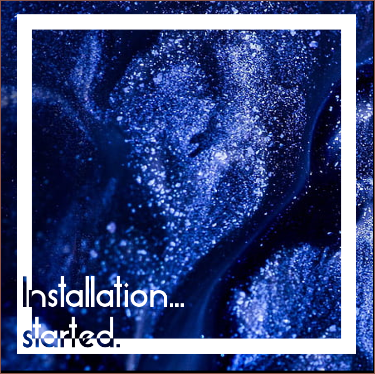 Next was Essense Sans (the font used on
 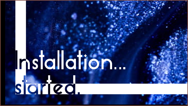 I don't think this is quite the vibe I was going for here.
 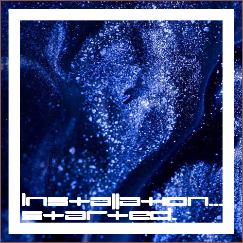 I tried umopMedium because I thought it'd look cool, which it does. The width of the characters also makes it impractical.
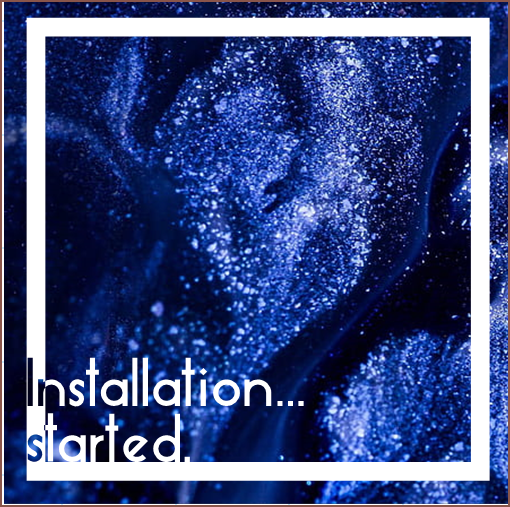 This might work, though it doesn't look as "fresh" (refridgeration feeling) as when more of "started" cut into the hollow square.
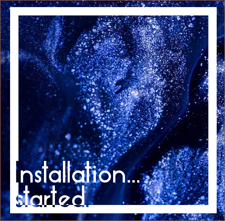 This also might work? However, I start to creep back into the readability issue.
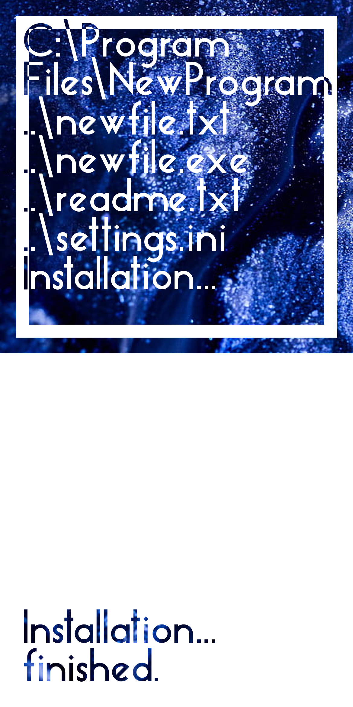 I'm imagining that any video intro I'd create will start with a full white frame with the text in the lower left corner, where the animated glitter liquid can be seen (essentially, a 16:9 of the white panel). Thus, it makes 100% sense to include it in the installer.
 The above is also the splash screen for any desktop programs; part of the reason I decided on the logo that I have now is because I like loading screens and thought it'll be cool to have the logo as one.
  I searched "liquid glitter" in Google and this is what I'm imagining. I'm hoping there's a way to procedually generate something that looks like this that is still light enough to include in the installer and software that I hope to write in the future.