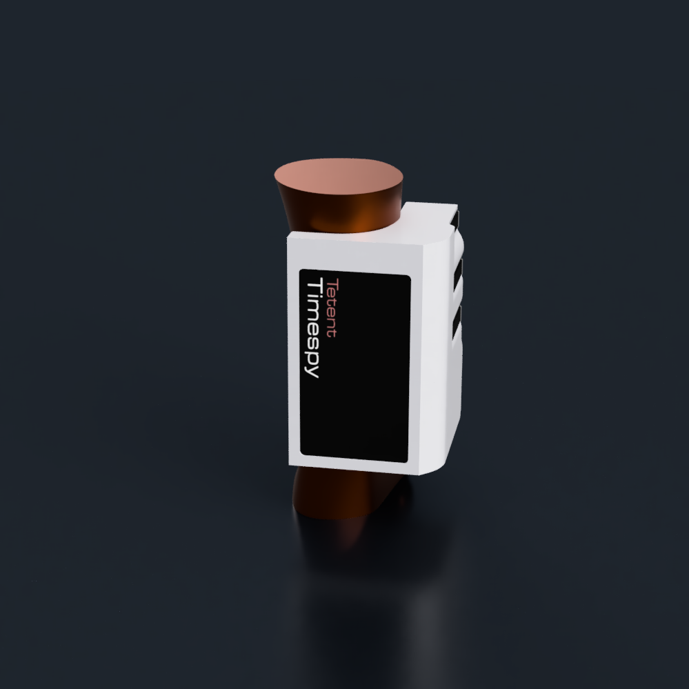
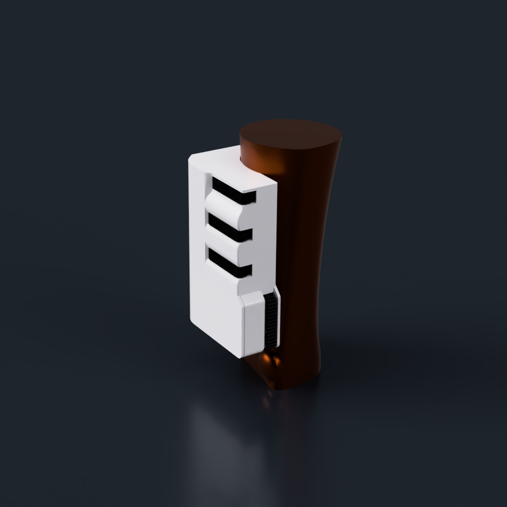
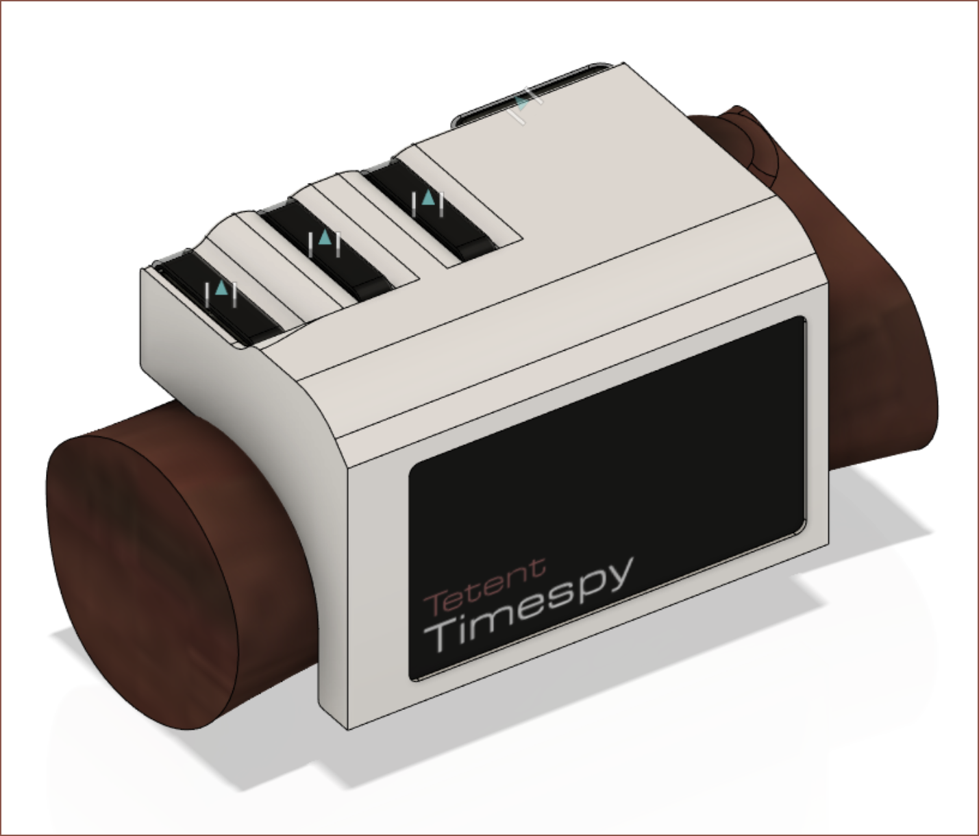
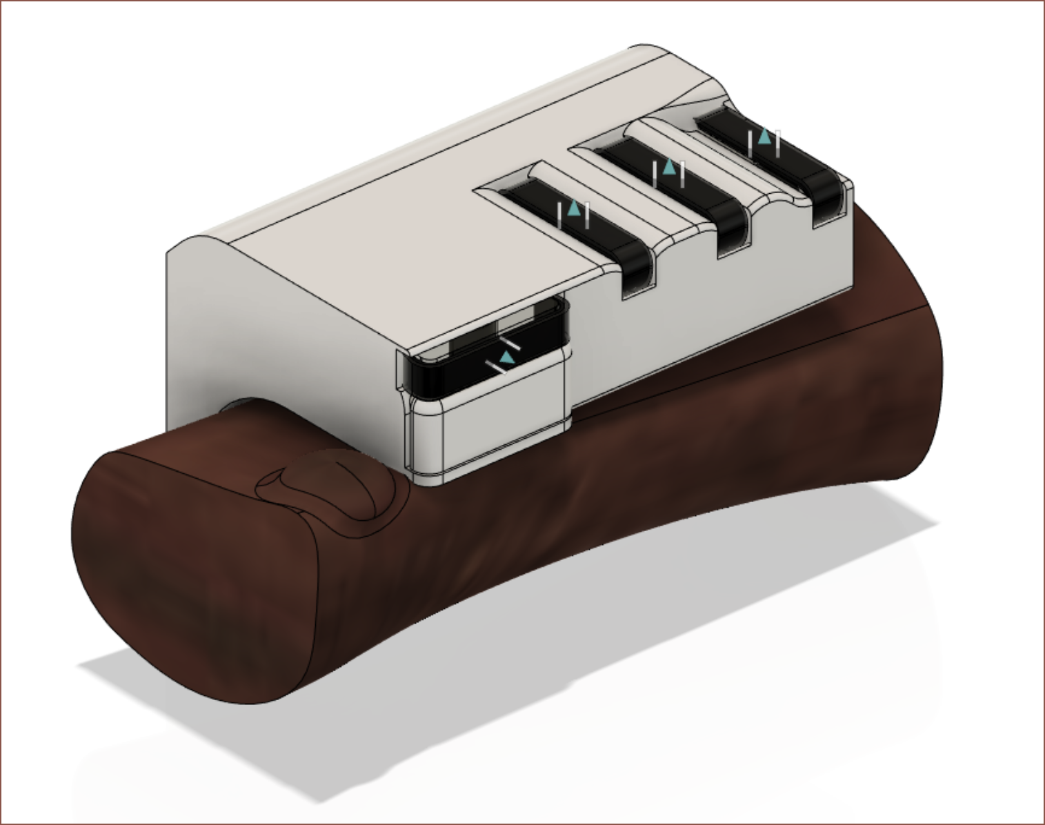
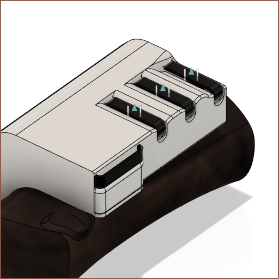
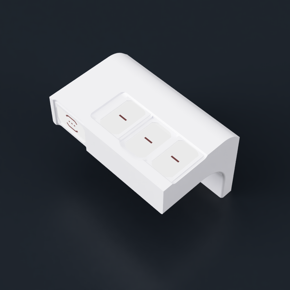
I've moved the thumb back to the top side of the Timespy, and placed my logo in the otherwise white void. Trying out the first version with these new motorised switches, as well as Tetent's version, I've moved the key closer to the main body instead of further away.
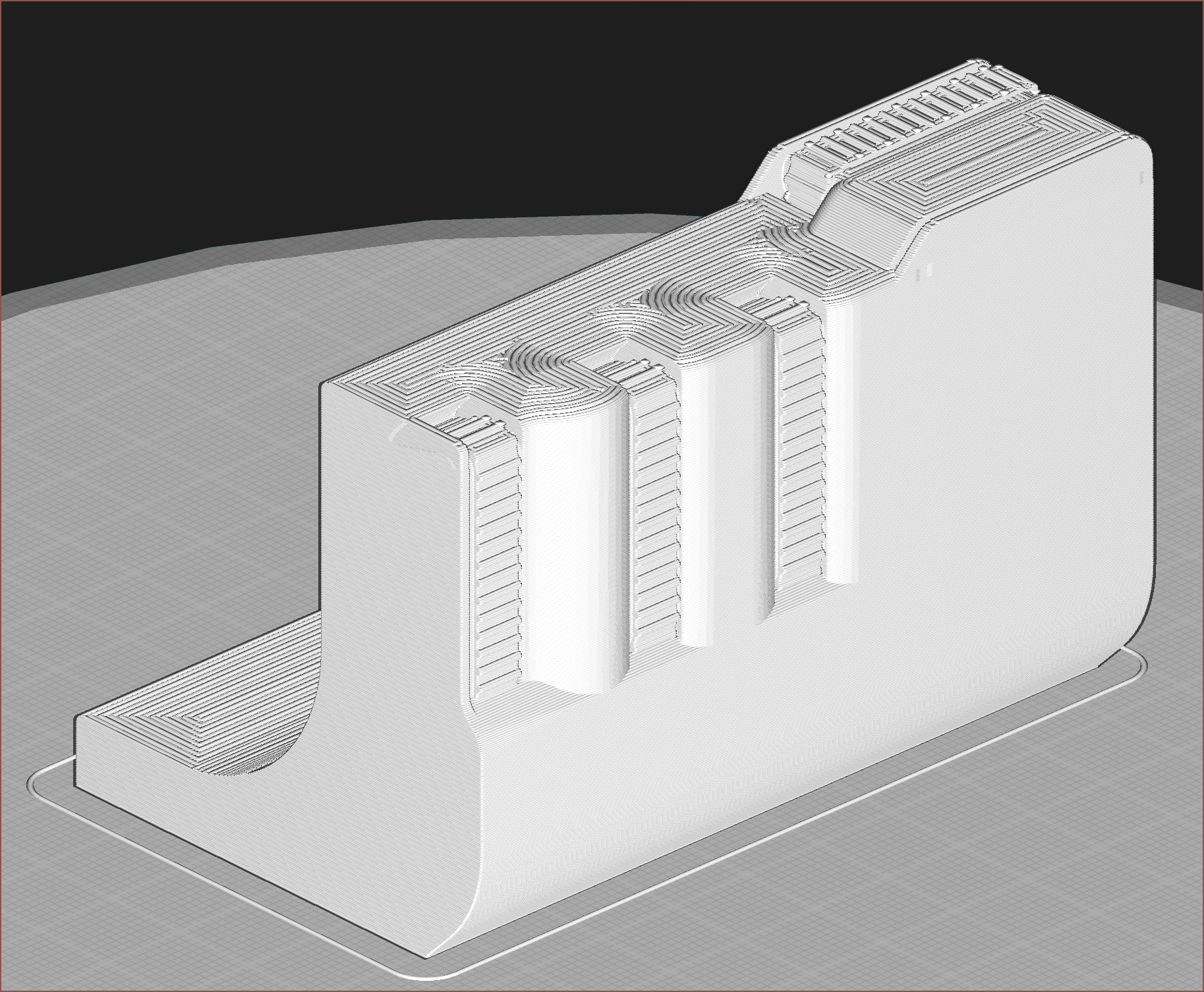
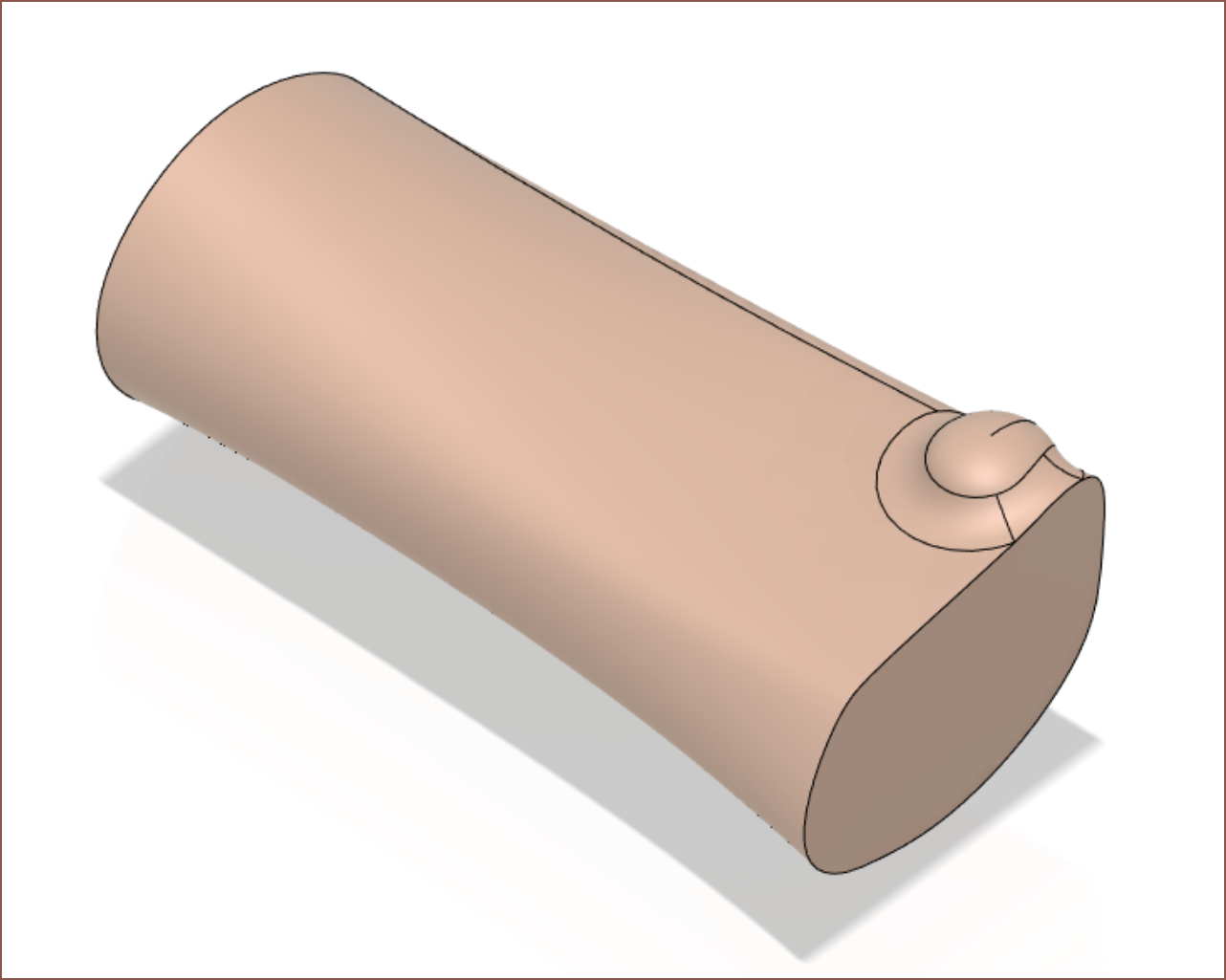
Ok I'm ready to send the next concept to the printer. Fusion 360 sheet metal didn't want to work with me. First I had to create a "flat pattern" before I could "unfold" the belt. Then, refolding either failed or created mysterium geometry like the above. I eventually just did one side and mirrored the teeth.
It seems that the most comfortable finger position is not the fingertips perpendicular to the surface, but such that the joints at the base of the fingers do the bulk of the movement work.
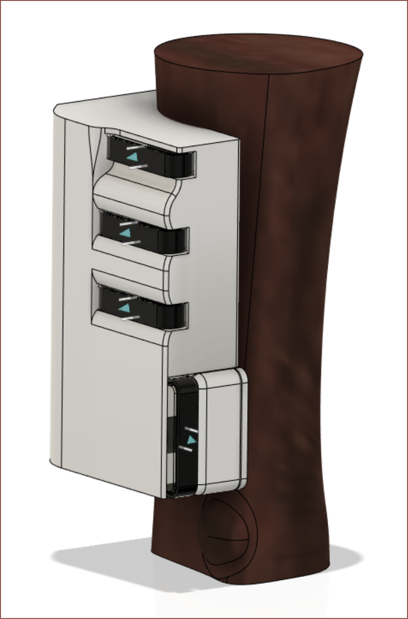
Thus, the hand is located lower. This, along with the shape of the thumb, means that it's much better if the thumb belt is on the bottom side.
Other things that I learned from the print was that
The design is tolerant to finger distance and angle.
Approx angles and positions of my fingers. Finger2 was slightly off centre, closer to Finger3. Finger4 has a much more significant angle, and the shape of the curve meshes well to create a nice resting position.
The "homing gesture" is only going to work for the top of the key since I can't feel anything at the bottom and my finger slides off.
The belt needed for the keys is 72mm (36T). Not sure how hard that's going to be to source since I've only found a 96mm (48T) belt so far. I might print it in TPU.
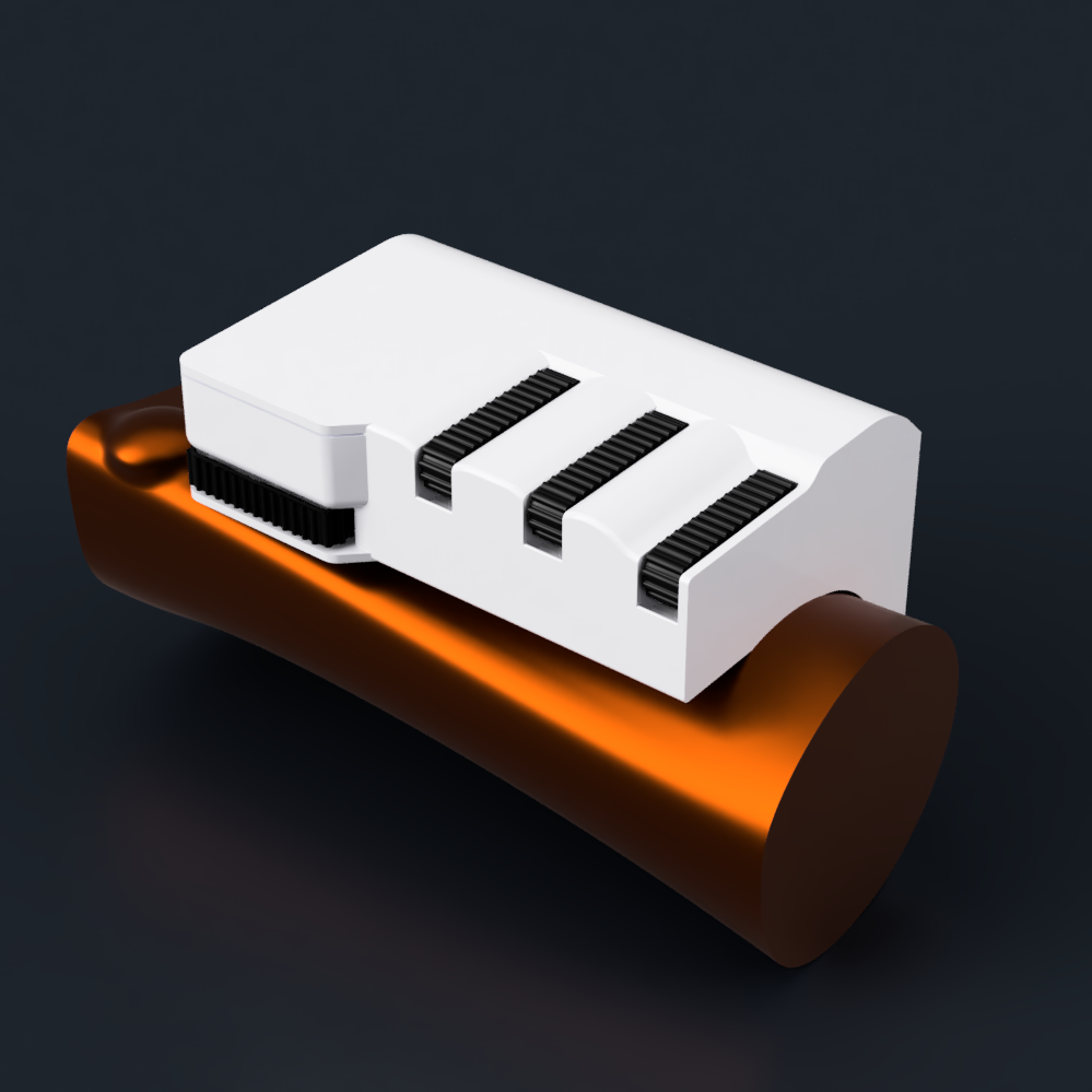
Renders
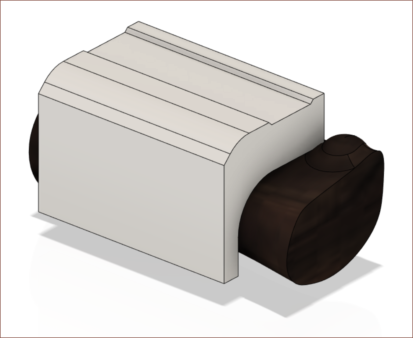
The wallnut appearance was too low rez and the 3D wood appearances didn't work for some reason, so I used "Titanium Nitride" with a dark orange tint.
If there's anything I can tell from my limited ergonomics education, it's that it's probably more ergonomic if the design looks more melty/wavy/putty-like. I mean, this design already looks more comfortable and I haven't even tried it yet.
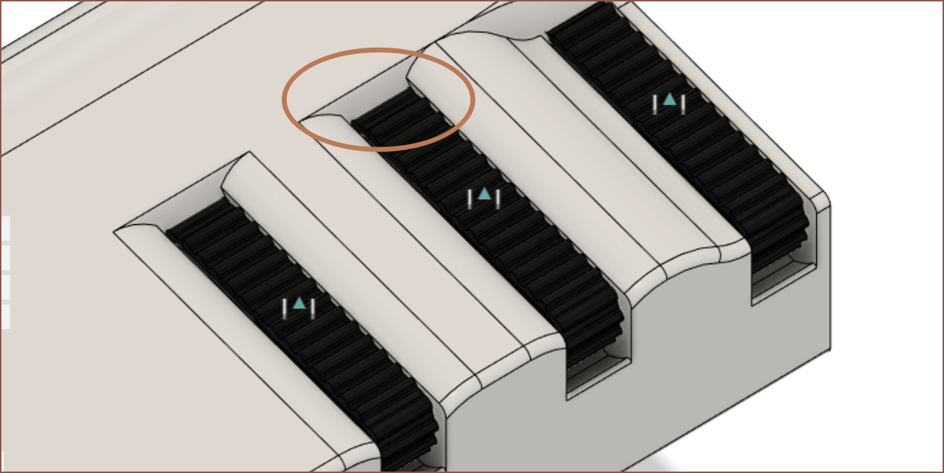
I like the horizontal but micro-filleted cutouts for the keys more than the slot cutout alternative I thought of:
The filleted cutouts make the design look more compressed and remind me of refinement, like a piano.
The motorised strat is really going to make this solution BetterTM than my earlier ones. The motor can create virtual endstops so that I always know when I hit the limits. It can also have weak dedents for accurate finger positioning. Actually, it might mean that users could manage 5 or dare I say 6 discrete zones on the finger keys and/or 3+ on the thumb button. I'm imagining that the extra thumb zones would be used for accents in other languages. I might have the "MouseChord" use dedents to get finer mouse positioning than the standard 4 zones.
(5 zones results in a Base16 (hex) number system, which might be pretty cool. Imagine LED backlighting where the colour is determined by the chord. Idunno if anyone would need the equivalent of a 4095 button keyboard though -- a Chinese/Japanese speaker maybe?)
Obviously, it's going to be an eye-grabber (if such a large, white wearable wasn't grabbing enough) if some kind of idle movement animation is enabled. If I learned anything from Apple's event yesterday, it's that good animations sell "the future is now, thanks to science".
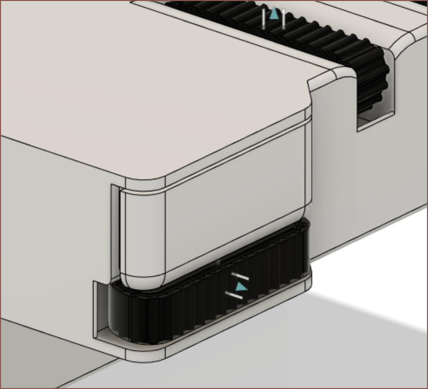
I'm also glad I slept on a solution instead of thinking that I'd never be able to get a motorised key without making Turntable (and #Tetent Tiny [gd0040]) drastically thicker. Having the belt offset to the side instead of the centre actually helps because now the 4th digit can come in from an angle without any obstructions.
I also hope that the belt and motor assist means that I could actually walk while typing. I think the current set of features allows it to be possible.
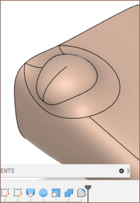
I'm currently not a fan of the look of the thumb when I put it in my "standing visualisation" file:
What if I use a filleted chamfer?
Yeah that works. Why does it look like an Aperture Labs prop now though?
I found out that this project just released the CAD files, and one of the things I was interested in was the arm scan. A while ago, I skimmed through GrabCAD and yeggi for an arm model (because I can't "section view" my arm IRL) and found nothing.
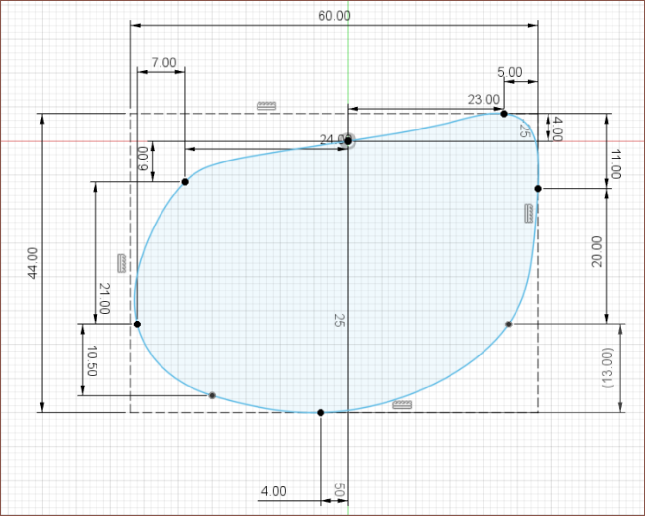
Cross section sketch of my arm just after the wrist bump
This process would've been easier with something like stickers/masking tape/markers to mark points, but I just tried to memorise the measurement points and rounded to the nearest mm. I'm just going for the general shape as this cross section changes based on wrist angle or finger locations. I eventually settled on a straight fist.
I memorised the location of the top centre of my arm and set that as the origin point. Then I put a spline point wherever it seemed like there was a sharper bend on my arm. The bottom "10.50" point and the point connected to "20.00" and "11.00" are there to get the correct spline shape.
I should've done this earlier, but I measured the max XY of my arm and created a construction bounding rectangle.
This process took about 30 minutes.
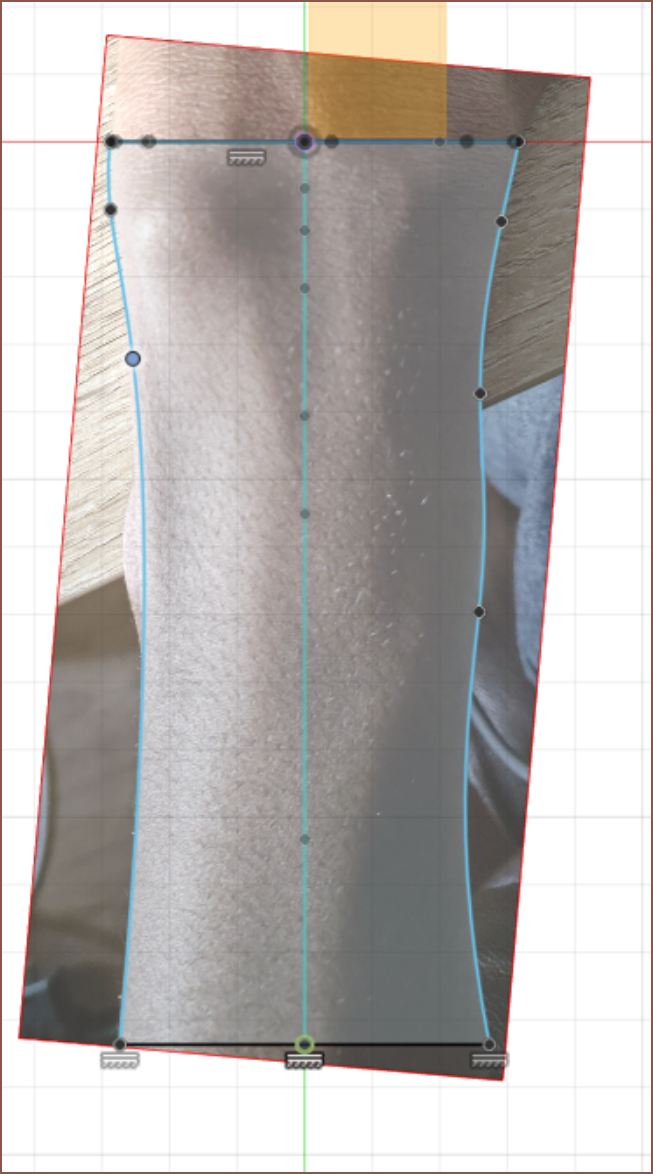
Sketch of top and side views
I took 2 pictures where the images were almost centered where the cross sectional areas were. This is to reduce fiducial error. Then I cropped them, imported into Fusion, scaled them and started sketching. As with all things splines, the fewer splinepoints the better.
Time: 16 mins
End-side cross section
This side was a lot smoother and so I just got the general shape by eye-balling it. I kept the amount of splinepoints around the same to give the loft a better chance of success.
Time: 15 mins
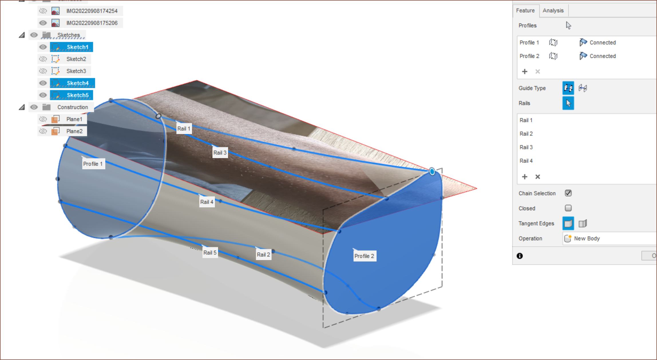
3D Splines
The top/left sketches were so that I had an easier time getting the 3D sketch of splines to look right. Seems to have paid off because I did 5 rails and the loft without any hurdles. Time taken was only 13 minutes.
Wrist bone bump thing
Wikipedia says it's called the pisiform bone. Anyway, I just measured the general diameter, made a sphere in that location (as new body, from the XY plane) with the help of the top canvas image, non-uniformally scaled the height down, combined bodies and lastly added a generous fillet.
(I didn't time this, but I'd imagine it'll be in the 15 minute ballpark)
Final result
Copper appearance:
Zebra Appearance:
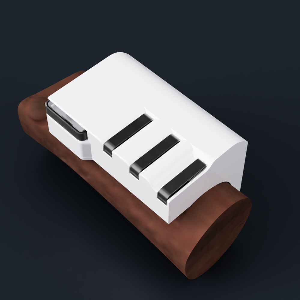
Walnut Appearance to match my skintone, imported into the concept model:
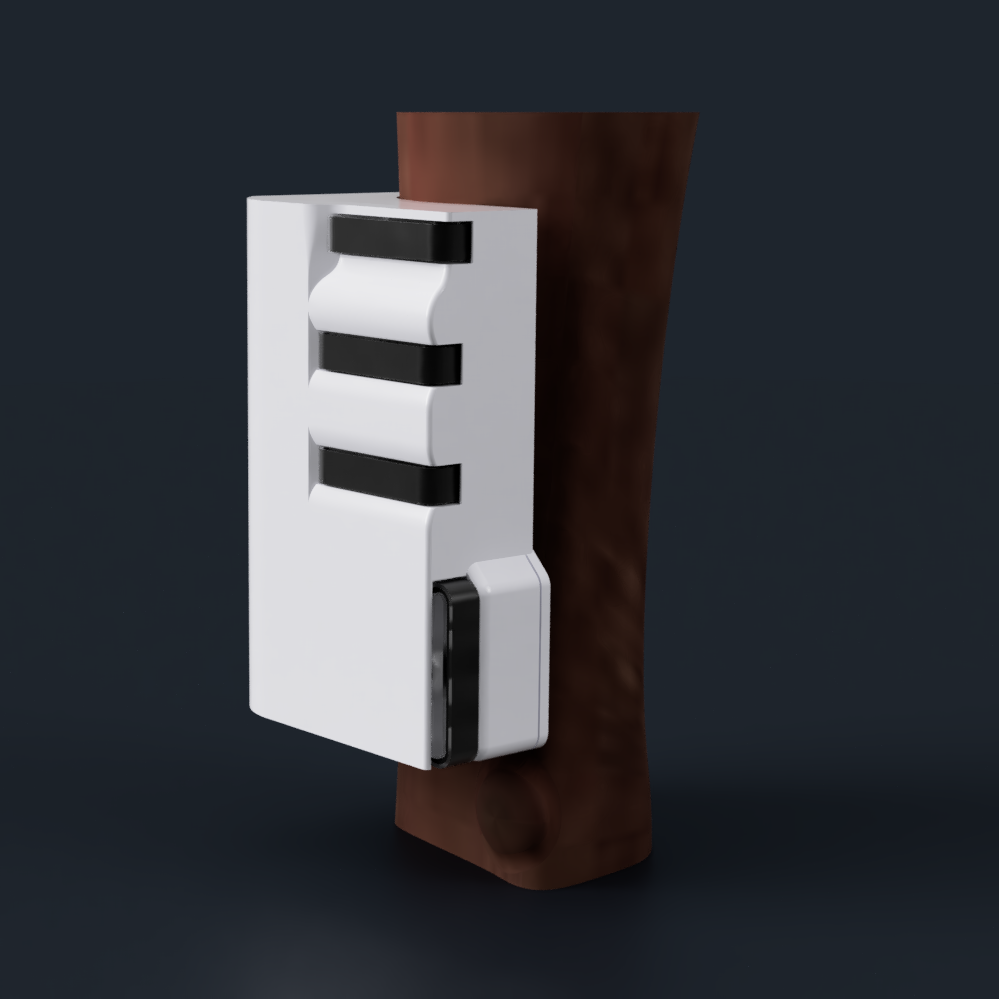
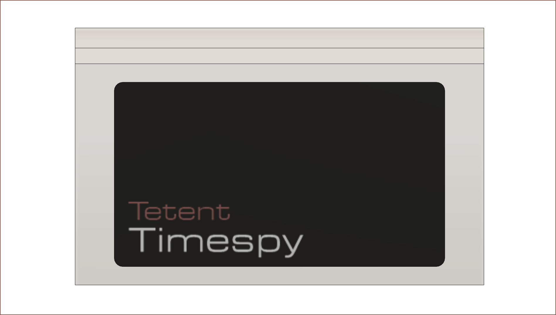
If I bend my thumb, I can reach the button, though it still needs to be extended out. I'm thinking of increasing the length of the Timespy to 95mm both for that and so that the left and right screen bezels are the same 9mm size.
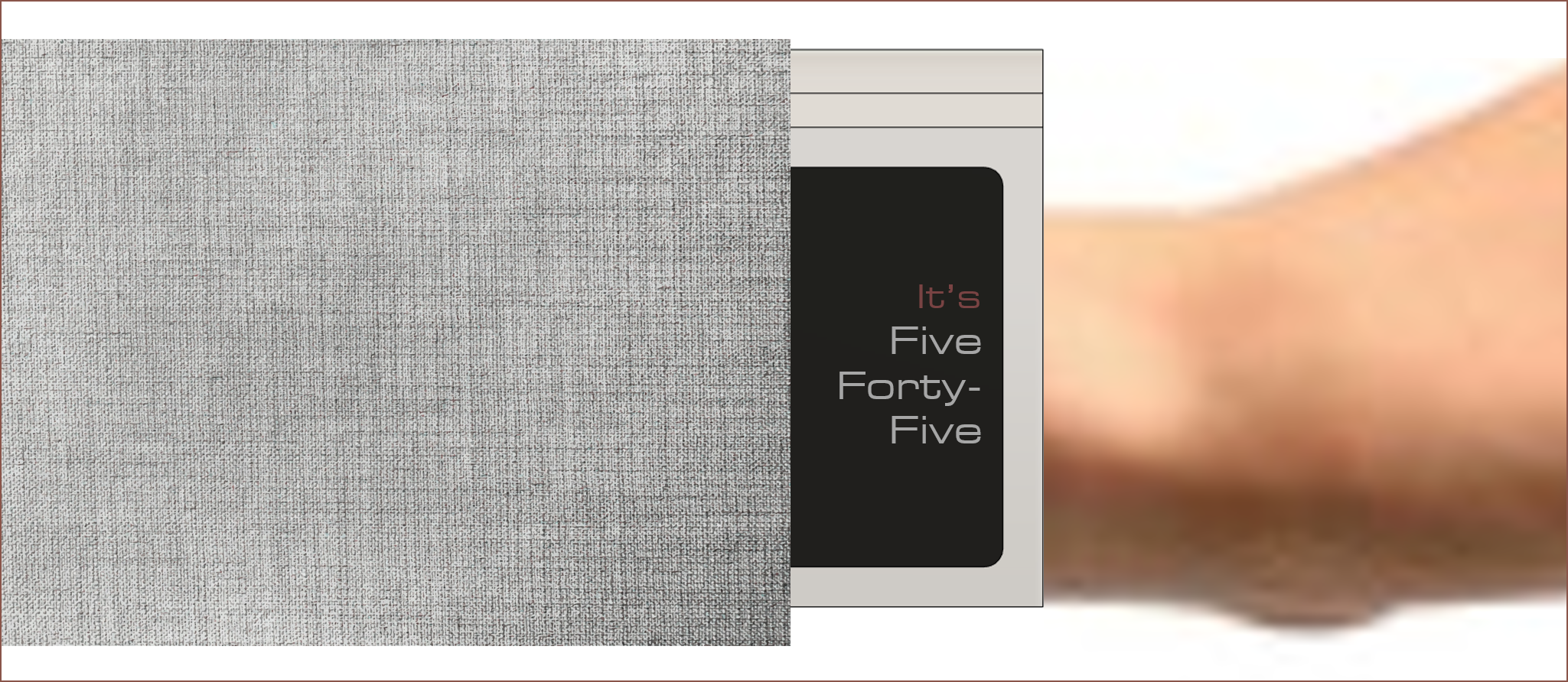
I wore the Timespy under a long sleeved jumper and the sleeve had no issue going over it. While the equal bezels looks nicer than the alternative (see below), it also means that less screen would be visible when a sleeve is over it so it would look bulkier in practice.While the LCD keys are nice, the extended thumb button won't allow for it. I also still haven't been able to compute a solution that lets me access the adjustment screws. I was also thinking about using force sensors on the upper and bottom edge of the keys to detect where a key was pressed, but that is unlikely to work when using the keys as sliders. Highly sensitive capacitive sliders still seems like the best option.
This concept has also given me an idea on how to shape the redesign of #Tetent [gd0090] and I hope to model a concept shortly. I might use the thumb button as the trackpad, but for ergonomics it's more likely that the XY is controlled with 2 fingers instead. Either way, the blackberry trackpads I bought just in-case are unlikely to be implemented at all, which is the reason why I try and hold off any BOM purchases until I'm ready to buy all. It was only £13ish for 9 so it's not like I'm not gonna financially recover from it.
So I fixed up the Anycubic Linear Plus I haven't printed on in years to get this. The image above is my hand in it's natural position. Can you see how standard watches would have their screens pointing away from a user's line of sight? The inside curve is comfortable on my wrist, and 25mm is plenty of length for the keys.This is it next to the watch I'm replacing. Yeah it looks large compared to that, but the size is mainly dependent on ergonomics. I'm here trying to get 100wpm on a wearable, not 10. Another nice bonus feature of this design is that the screen is still facing my line of site when resting on a table, which would be very useful for use when not worn on the forearm.
Required changes
The top image is the heights of the finger keys (from the front) currently, and the bottom is more or less what it actually needs to be. I reduced the drop of the centre button from 3.2mm to 2mm in this design, but even that is not enough and it's closer to 1mm or even level with the one on the right.Unfortunately, the thumb button is both too close to the fingers and doesn't stick out far enough from my arm. I think I'm off by >12mm (half the key). There goes my 90x60mm run. Maybe this is an opportunity to include some stereo speakers, or maybe some kind of sliding mechanism can save this form factor.
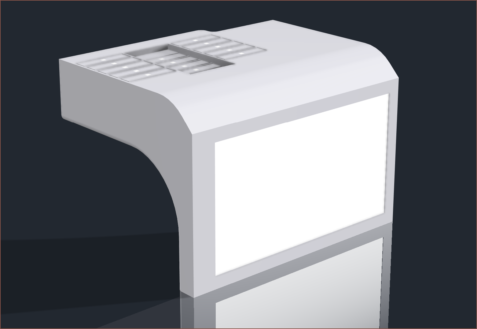
I think a 2mm fillet around the main display and some filleted chamfers around the LCD switches looks nicer than squared corners. The LCD filleted chamfers were done to make the centre button look better with the cutout for finger 2.
The main thickness has been increased to 22mm and the radius of the inside curve is down from 23mm to 21mm.
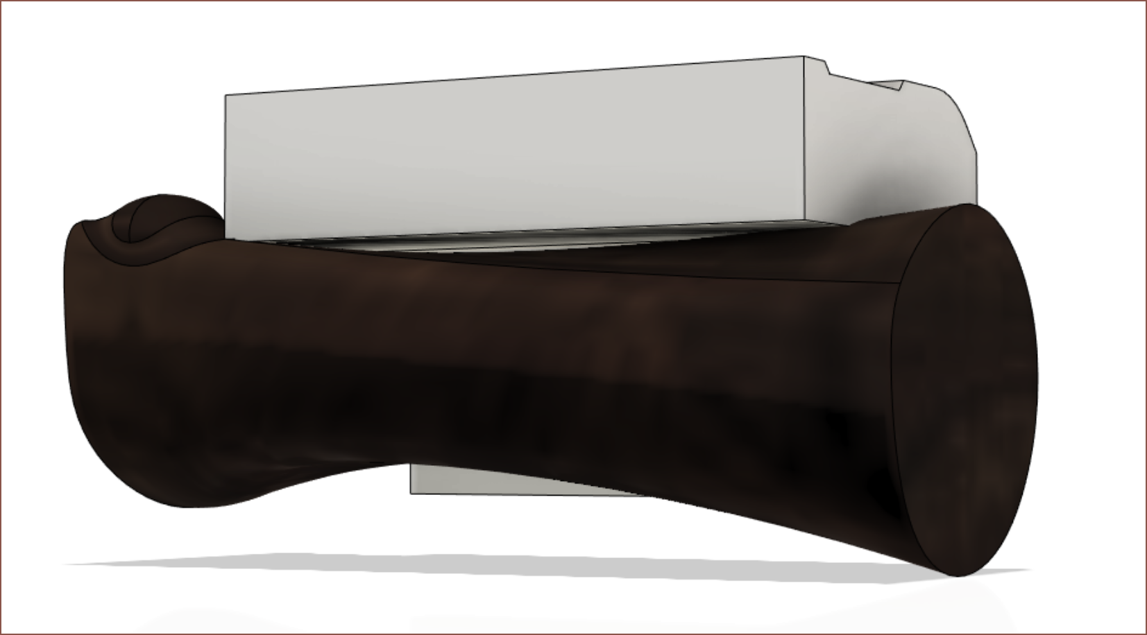
The design of the finger keys stems from the thumb key, which needs the top and bottom material of the enclosure cut away so that the thumb can press it without obstructions. Also, the depth distance between the top of the key and the screen is 0.8mm, but it looks larger than expected.
The distance between keys is 20mm, which doesn't leave much space around the 17.6mm LCD screen after the minimum wall thickness and clearances.
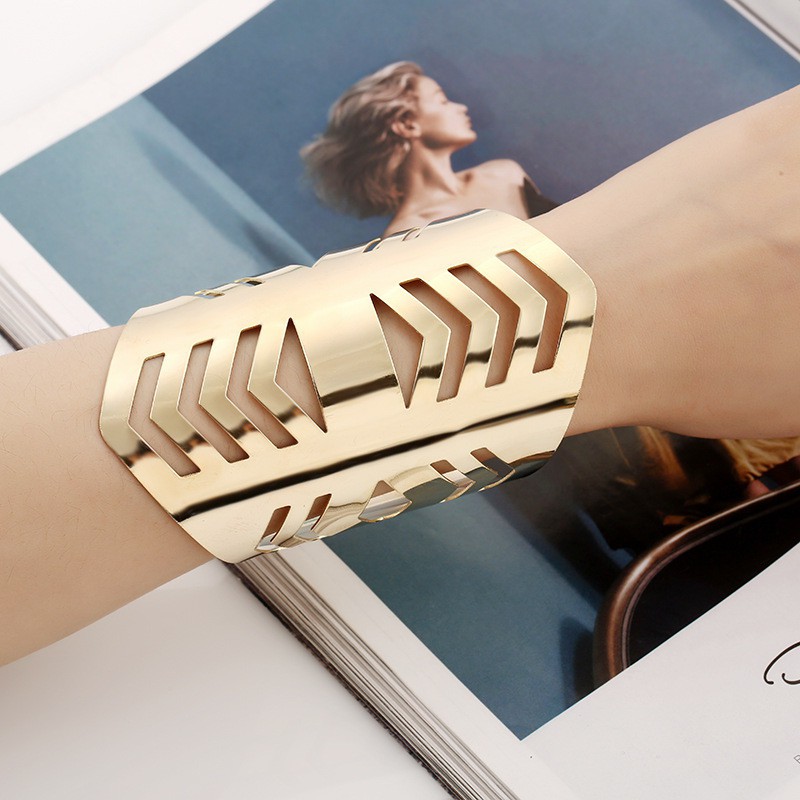
It might be possible to fit everything into a nicely rounded 90x60x60mm (LWH) package. Putting a caliper to my arm, it's more compact that I was imagining. It's more like a long bracelet:The listing says that this one is 110mm.
This project just got upgraded from researching to ongoing, since it should be possible and apparently, 1 additional project helps with moving all projects forward`. #TeTwin Switches [gd0041] is going from a 5-zone, 2 action switch to a 4-zone, 3 action, increasing column states from 11 to 13. Since the keyboard on the Timespy is one handed, it likely means that a single column implementation of this idea is possible.
Thus, the clickable areas on the screen would be a 13x13 grid. The good news is that I have enough space in this new key layout to include the entire layer without having to switch to some "mouse mode". My main concern is the 76mm long axis, which would be split into 5.85mm zones. This is probably the same sized zone that a finger would have when using a touchscreen, though I think the precision would be half at under 3mm.
A solution is to use the thumb keys. I was wondering about dual-screen use anyway since the OLED screen I'm currently using would be almost the size of 2 standard smartwatch screens side-by-side. The 2 buttons could be for left or right click, and the layers could be left half, right half and a third option, like "don't click", double click or middle click. This solution would have a click area of 2.92 x 3.31 mm, which should be precise enough.
I'm thinking of attempting to squeeze in a 21700 cell over a 18650 as I can increase battery capacity from 3.4Ah to 4.8Ah. For consistency, all other Tetent projects will use the same battery.
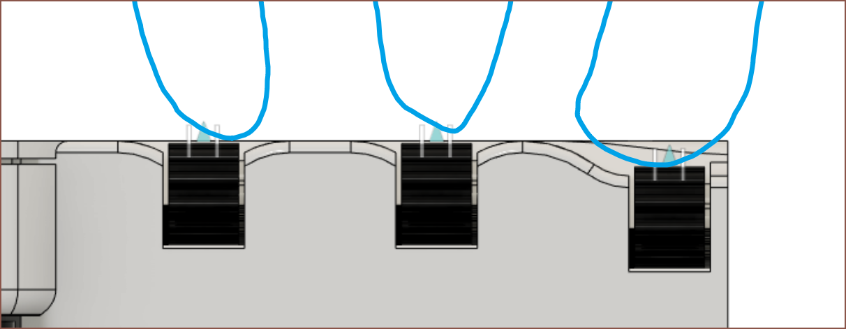
I need to think of a way to know where my fingers are without seeing the keys. The "endstop" walls on Tetent didn't seem to work that well, and required extra height.
The 2 large thumb buttons already look way more comfortable than the 5-button column. I wouldn't be suprised if the reason I went all the way to 5 was because of the #Tetent Turntable [gd0038].
 kelvinA
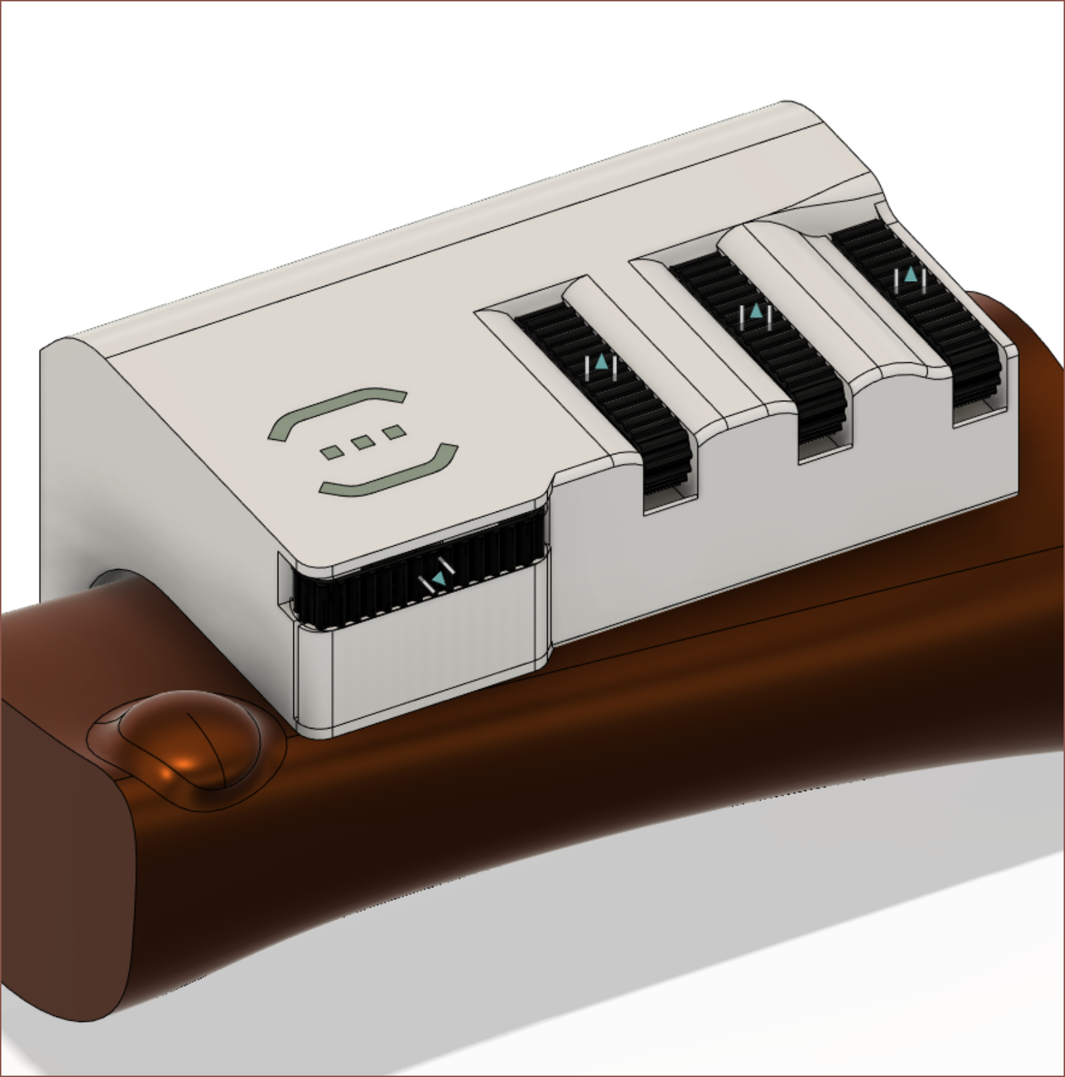
 Ok I'm ready to send the next concept to the printer.
 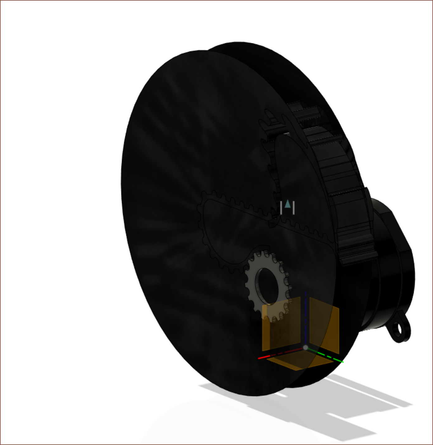 Fusion 360 sheet metal didn't want to work with me. First I had to create a "flat pattern" before I could "unfold" the belt. Then, refolding either failed or created mysterium geometry like the above. I eventually just did one side and mirrored the teeth.
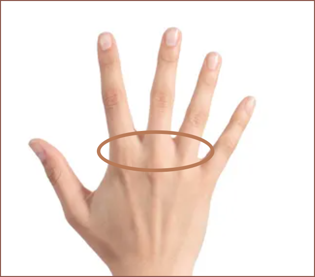
 Yeah that works. Why does it look like an Aperture Labs prop now though?
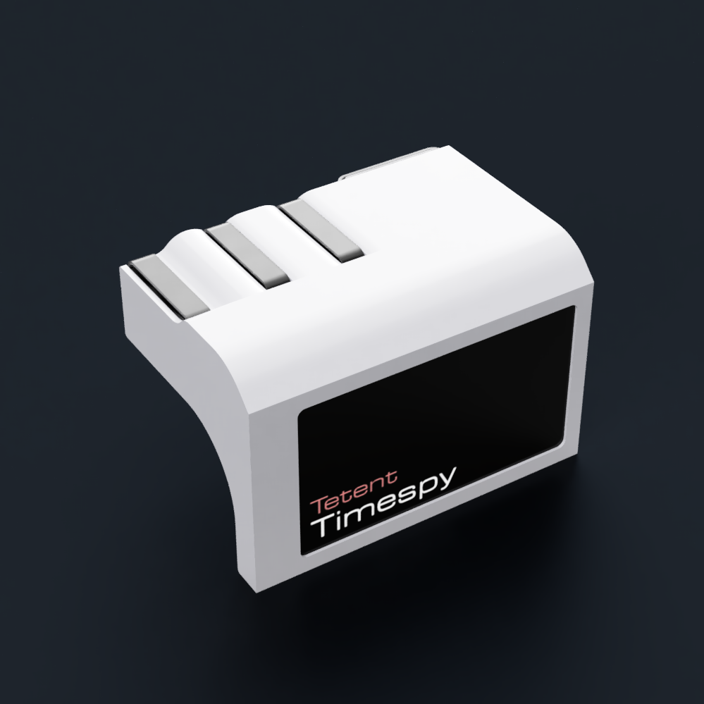
 This process would've been easier with something like stickers/masking tape/markers to mark points, but I just tried to memorise the measurement points and rounded to the nearest mm. I'm just going for the general shape as this cross section changes based on wrist angle or finger locations. I eventually settled on a straight fist.
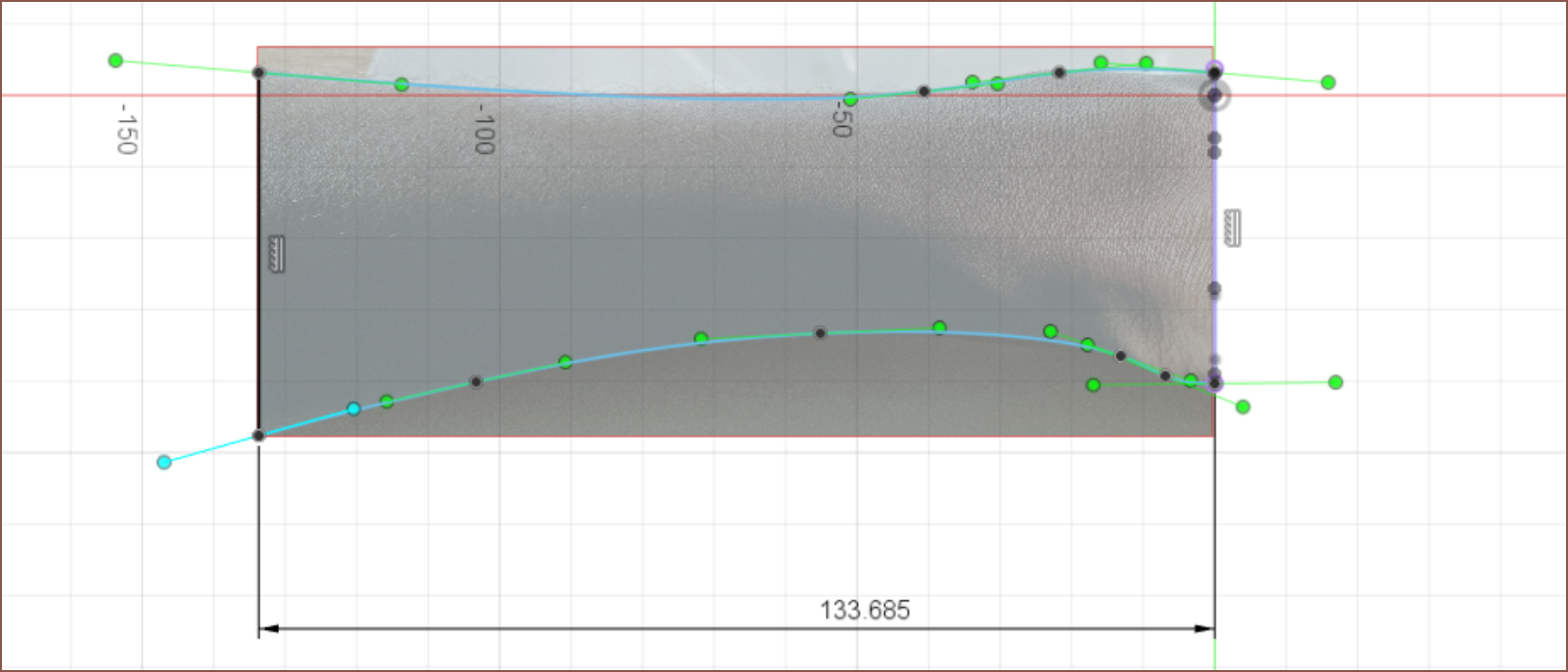
 I took 2 pictures where the images were almost centered where the cross sectional areas were. This is to reduce fiducial error. Then I cropped them, imported into Fusion, scaled them and started sketching. As with all things splines, the fewer splinepoints the better.
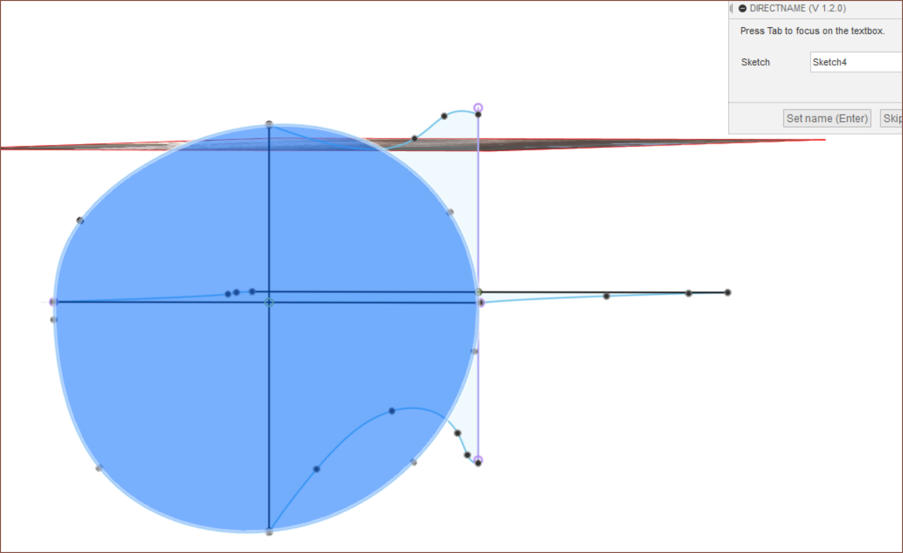
 I wore the Timespy under a long sleeved jumper and the sleeve had no issue going over it. While the equal bezels looks nicer than the alternative (see below), it also means that less screen would be visible when a sleeve is over it so it would look bulkier in practice.
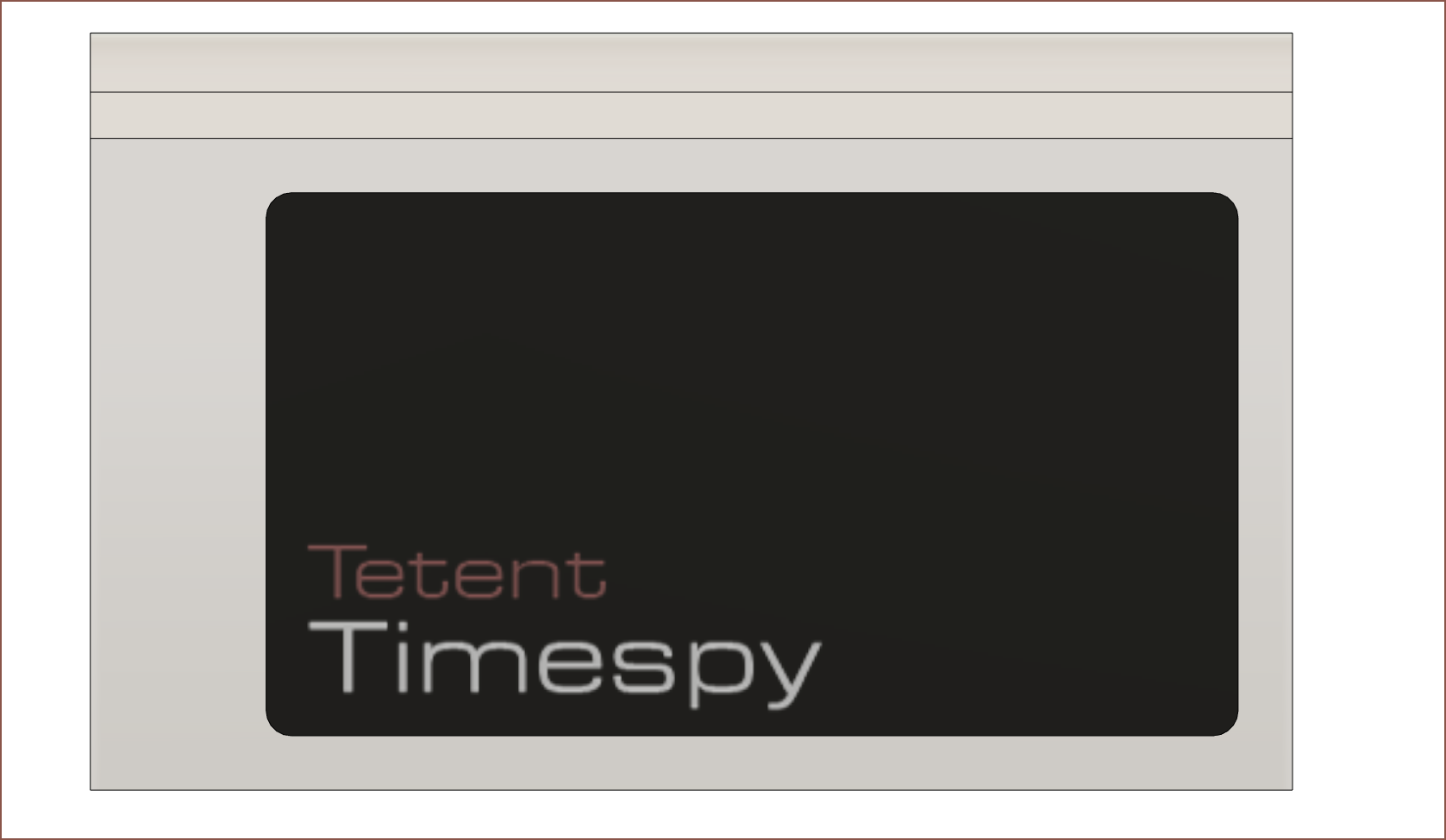
 So I
So I 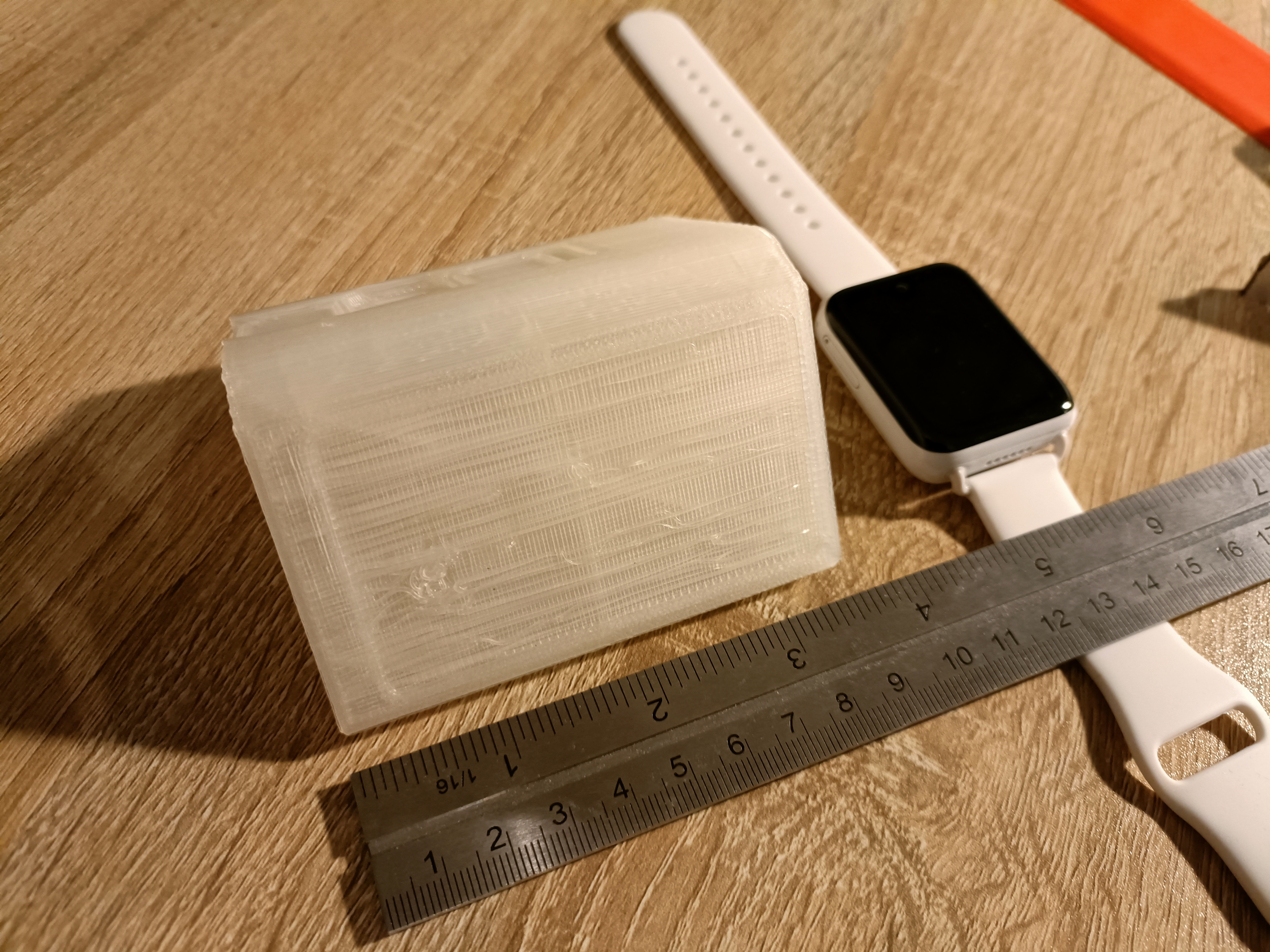 This is it next to the watch I'm replacing. Yeah it looks large compared to that, but the size is mainly dependent on ergonomics. I'm here trying to get 100wpm on a wearable, not 10. Another nice bonus feature of this design is that the screen is still facing my line of site when resting on a table, which would be very useful for use when not worn on the forearm.
 The top image is the heights of the finger keys (from the front) currently, and the bottom is more or less what it actually needs to be. I reduced the drop of the centre button from 3.2mm to 2mm in this design, but even that is not enough and it's closer to 1mm or even level with the one on the right.
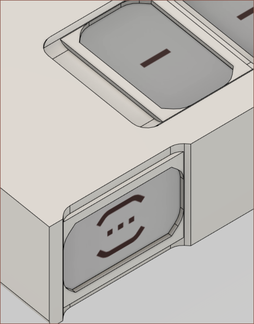 Unfortunately, the thumb button is both too close to the fingers and doesn't stick out far enough from my arm. I think I'm off by >12mm (half the key). There goes my 90x60mm run. Maybe this is an opportunity to include some stereo speakers, or maybe some kind of sliding mechanism can save this form factor.
 I think a 2mm fillet around the main display and some filleted chamfers around the LCD switches looks nicer than squared corners. The LCD filleted chamfers were done to make the centre button look better with the cutout for finger 2.
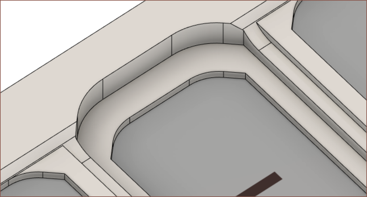
 The design of the finger keys stems from the thumb key, which needs the top and bottom material of the enclosure cut away so that the thumb can press it without obstructions. Also, the depth distance between the top of the key and the screen is 0.8mm, but it looks larger than expected.
 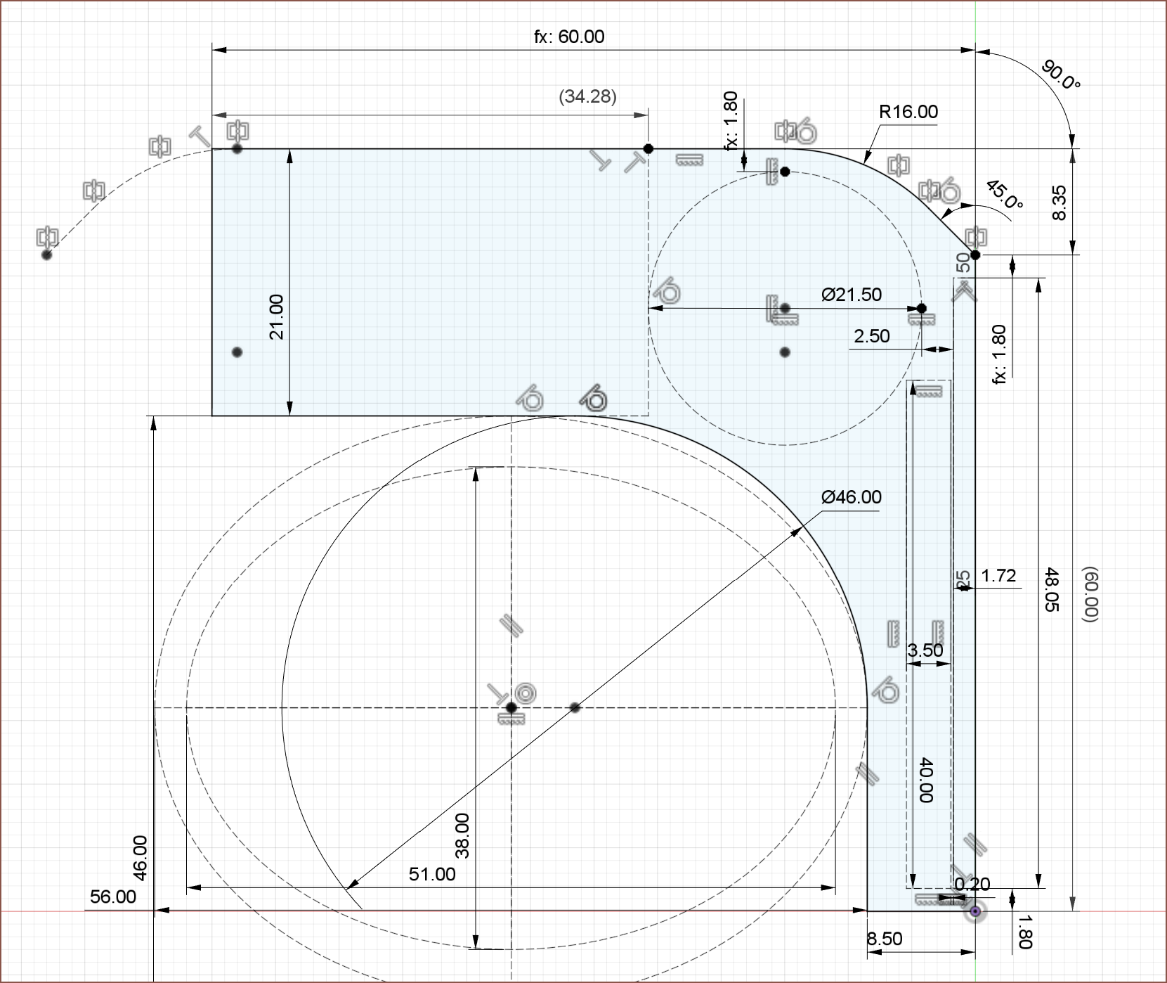 It might be possible to fit everything into a nicely rounded 90x60x60mm (LWH) package. Putting a caliper to my arm, it's more compact that I was imagining. It's more like a long bracelet: