Linear RGB LED Clock
A unique way to display time. Designed to be easily readable. Just count the colored dots!
A unique way to display time. Designed to be easily readable. Just count the colored dots!
To make the experience fit your profile, pick a username and tell us what interests you.
We found and based on your interests.
RGB-Uhr-V2.0_UploadedToHackaday.inoWorking program of the clock. Beware: NOT translated to English, not cleaned too much...ino - 12.36 kB - 11/05/2018 at 19:30 |
|
Just a quick info: I wanted to translate, clean, better the program and upload it here. Haven't done any of it but the uploading part. It's just the program, which works well. Comments are in German.
Use it, modify it, do whatever you want with it.
Have fun, Jan
My recent version of the software does not support auto-brightness. The clocks' LEDs light up at value 64 of a possible 255. This is what I found suitable in a quite bright room, plus you can set the brightness +/- with the buttons on the back.
So, that's not very user-friendly at all. I don't want to manually walk up to the clock, set the brightness to be able to read the time and then be annoyed by the bright, colorful light later at night...
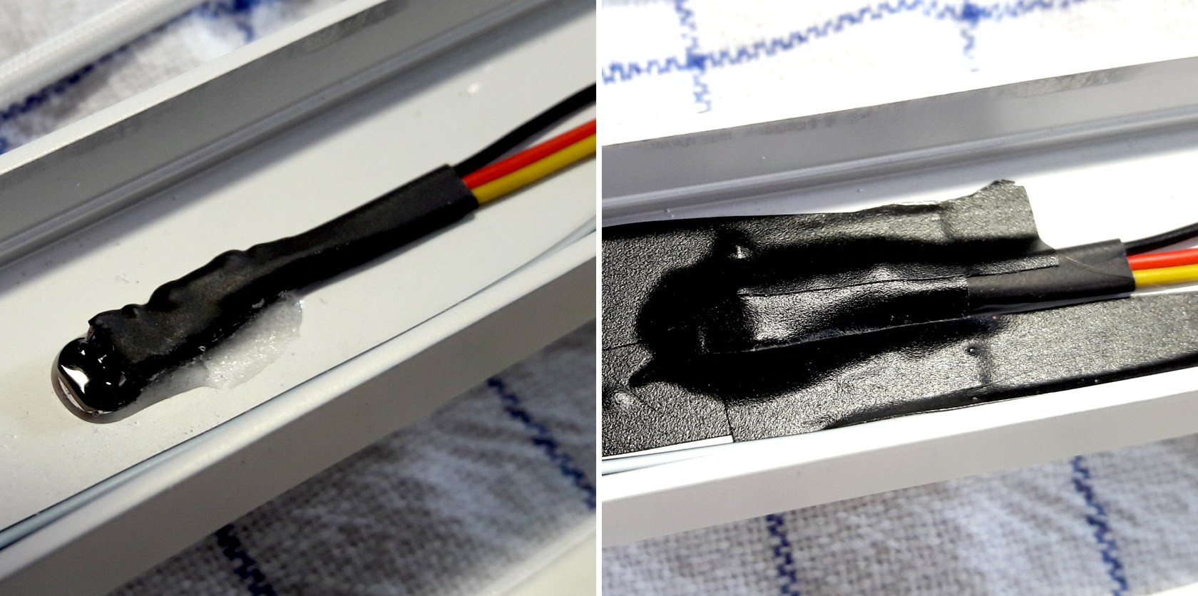
So, I added a LDR/resistor-divider to "control" the LEDs. It's really just four settings:
The LDR is a A905014 type, the resistor is a 5% 11K type. The sensor is mounted in the back of the clock because I don't want it to be visible. This means the value has some offset because it's always more or less "in the shade": no problem at all.
Implementation is straight-forward. NO smoothing of the sensor-value, the routine just looks if the value is within one of the four value ranges. Interval is set to 5 seconds, so bright/sudden changes of light won't trigger a brightness-change. There is a hysteresis anyway. It checks if the recent value is at least "amount x" lower/higher than the last reading. All values were found by trial and error. I found the LDR datasheet of no real use. The stated values are all widely spread.
The sensor is glued in and covered with black tape to make sure that no light from the strip or Arduino LEDs gets to it...
Today I'd like to talk about what really annoyed me while building the clock. There were a few occasions I'd rather throw everything into the next corner than continue working. It's always worth looking at those mistakes to not make them again, right?
That's about it. Won't make these mistakes again. I hope.
After a long time of absence (and other projects in abeyance) I present you my latest, finished project. To keep it short - a detailed build log is in the works - I'll just show you the finished clock. It's as simple as counting a few dots and summarize them.
Yes I know, nothing beats a nice, round standard clock in terms of readability, but if I wanted a standard clock I would've bought one...

The system is simple: from left to right: Red = hours 1 - 12, green = decadic minutes 10 - 50, blue = single minutes 1 - 9. Better pics will follow, I promise! See gallery for a few additional pics. The ones I took are a bit washed out color-wise and really don't do it justice.
Those were the first few thoughts I wrote down. Of course everything got more refined as time went by. But the fundamental mode of operation has been in my mind for a long time:
Read more »
Create an account to leave a comment. Already have an account? Log In.
Hi Brian. I'm using WS2813 leds. I read somewhere that the timing of recent batches has changed and might not work as expected. I had problems using the WS2812b prototype in fastled, maybe it works better with recent batches!
Glad it works for you. Code needs some serious work one day :)
Hi there! I just saw your comment. I will do that but I want to tidy it up a bit first!
I've started to design my own version of your clock: https://hackaday.io/page/2840-ideas-for-my-linear-rgb-clock
Nice work! Idea for v2: ESP8266-version with NTP-support, enabling it to set itself.
A good idea, this was on my list at first. But I wanted the clock to be totally independent from some kind of external source. I don't like so called smart devices which rely on wifi etc...
I agree, but it could be both: most DCF-clocks on the market usually also offer a manual setting. You could tell your code to check for an NTP source every X time to set the RTC. If no time server can be reached, get your information from the RTC instead and light one of the LEDs in a different colour. If all else fails, set the clock using the buttons. :)
Become a member to follow this project and never miss any updates
Hi can you tell me if you are useing WS2813 or WS2812 as in your sketch you have Led typ WS2813 and it will not work for me. !!! But when I change to WS2812 the sketch works ok thank you till next time all the best from Brian.