Maave
Maave-
editing .glif, already stuck
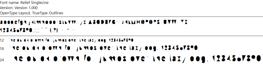
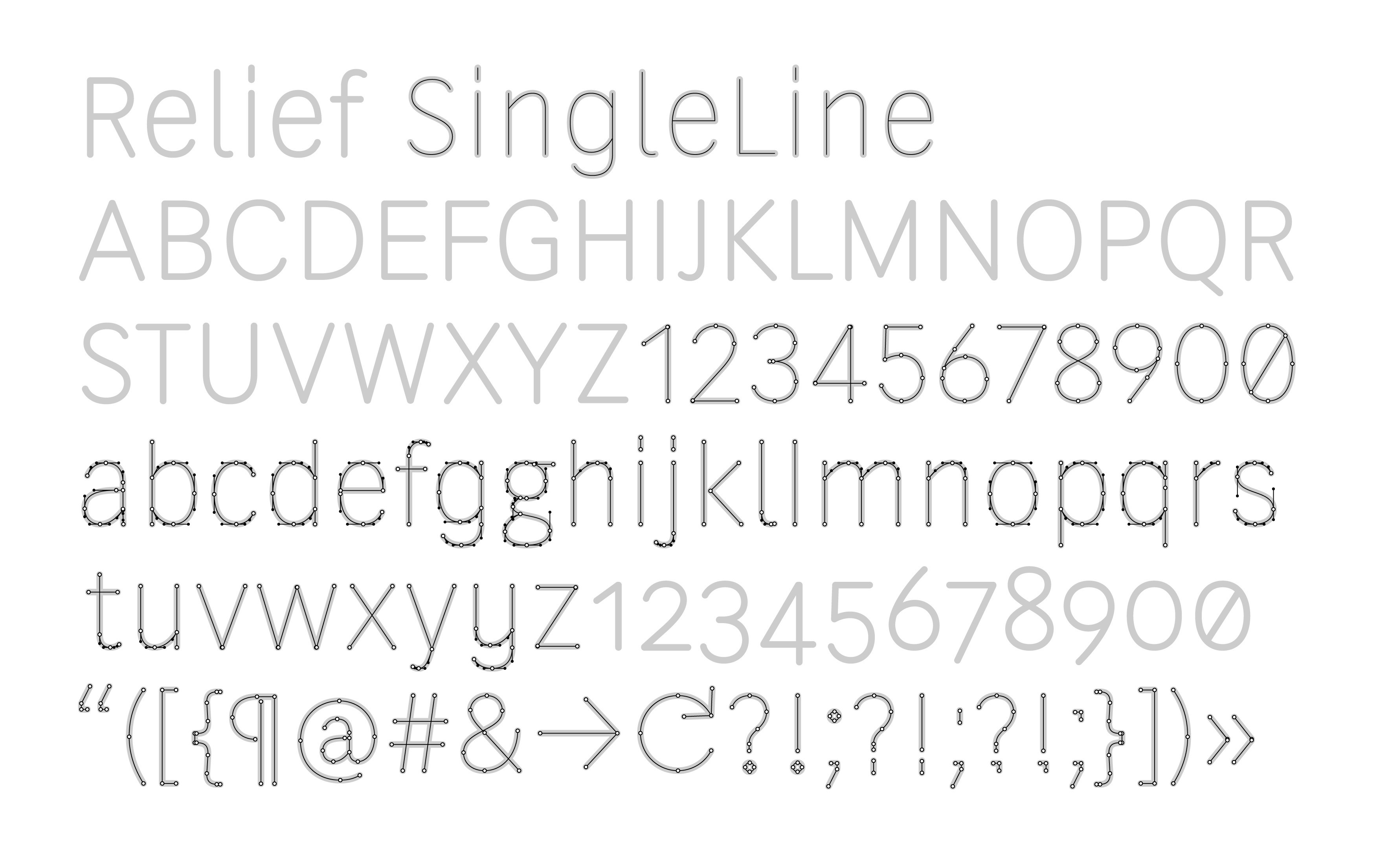
07/11/2024 at 17:09 • 0 commentsRelief SingleLine seems like the start for a laser-cut font. It's already designed as a single-line stroke for CNC engraving. We just have to replace the cutout "islands" with "cul-de-sacs". "Cul-de-sac SingleLine" might be a good font name.
Editing individual glyphs is rather easy. FontForge's UI is clunky compared to Inkscape - "panning" the view isn't a dedicated mouse button??? - but it's usable. The best part is that .glif files are XML and I can edit them in Notepad++. Too bad FontForge can't hot-reload the .glif
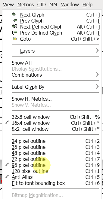
Load the .ufo source, set the stroke width, and zoom in the preview:

set the stroke width 10-40 to see the preview ![]()
increase font preview size ![]()
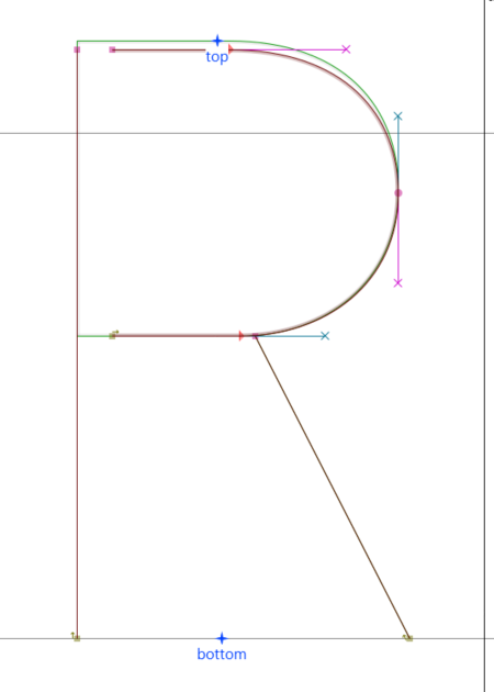
modified B, D, O, Q, R I edit the .glif XML to precisely edit the coordinates. I'm leaving a 40-unit gap in all the letters. No scientific reason, 40 just looks good. Some of that gap gets eaten by the font stroke. "R" is a simple example.
![]()
![]()
The first contour is a vertical line where X=140. I leave it as-is. The last contour is the curved shape. I change the start and end points from X=140 to X=180. If I have any issue interpreting the XML I just move a point in FontForge, export, and see which coordinates change in XML. Characters B, D, R, and P were all this simple.
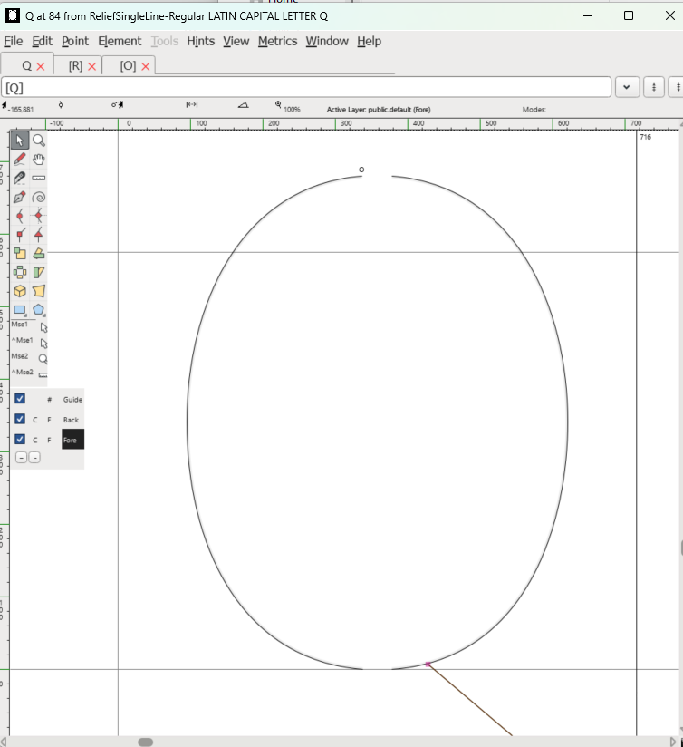
<?xml version="1.0" encoding="UTF-8"?>
<glyph name="R" format="2">
    <advance width="604"/>
    <unicode hex="0052"/>
    <anchor x="305" y="0" name="bottom"/>
    <anchor x="300" y="680" name="top"/>
    <outline>
        <contour>
            <point x="140" y="0" type="move"/>
            <point x="140" y="670" type="line"/>
        </contour>
        <contour>
            <point x="519" y="0" type="move"/>
            <point x="343" y="344" type="line"/>
        </contour>
        <contour>
            <point x="180" y="344" type="move"/>
            <point x="325" y="344" type="line" smooth="yes"/>
            <point x="423" y="344"/>
            <point x="506" y="404"/>
            <point x="506" y="507" type="curve" smooth="yes"/>
            <point x="506" y="594"/>
            <point x="447" y="670"/>
            <point x="313" y="670" type="curve" smooth="yes"/>
            <point x="180" y="670" type="line" smooth="yes"/>
        </contour>
    </outline>
    <lib>
        <dict>
            <key>com.schriftgestaltung.Glyphs.leftMetricsKey</key>
            <string>H</string>
        </dict>
    </lib>
</glyph>
"O" was trickier. I had to split it into two contours. Moving the points significantly affected the curve shape. I used FontForge's editor to closely match the original profile, then Notepad to truncate digits.
Some letters are build as combinations of others. This is convenient for O variants like umlaut Ö. In other cases like Q or slashed-O Ø, the re-use is functional and acceptable but not cool looking enough. It looks like the lazy vertical slices used on every bland stencil font. Q's cut should go next to the tail. Ø's cuts should go near the slash. I'll revise the combo glyphs later.
![]()
I wish I could comment the XML but comments are not displayed in editors and get wiped out upon save. Aside from that, editing the font source by hand is easily doable and git is able to track it.
On a bad note, I cannot finish with open source tools at this time. FontForge can't load the .UFO source properly, there is an error in the .fea feature file that defines what letters are in the font. It doesn't load several glyphs. The utility fontmake can read the .fea but can't render the stroked open shapes. The author of Relief SingleLine recommended some paid tools but that's not open-source enough for me.
fontmake --validate-ufo Relief-SingleLine.ufo --keep-overlapsfontmake --keep-overlaps -u Relief-SingleLine.ufo![]()
-
prototype arrived, not bad
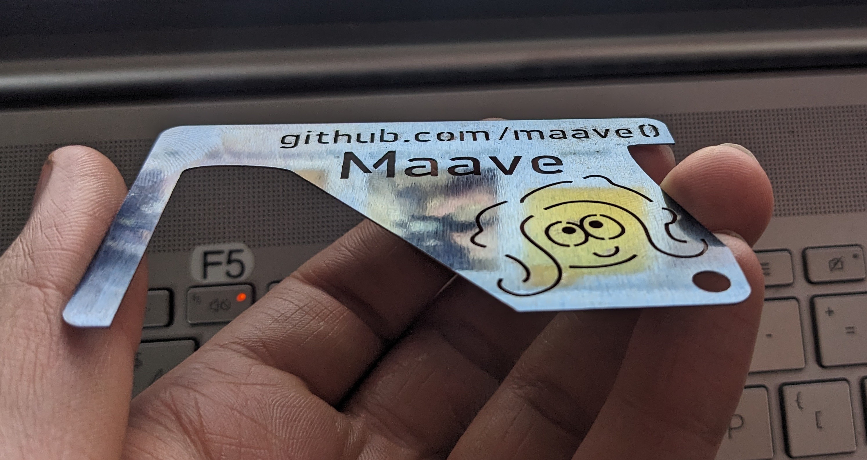
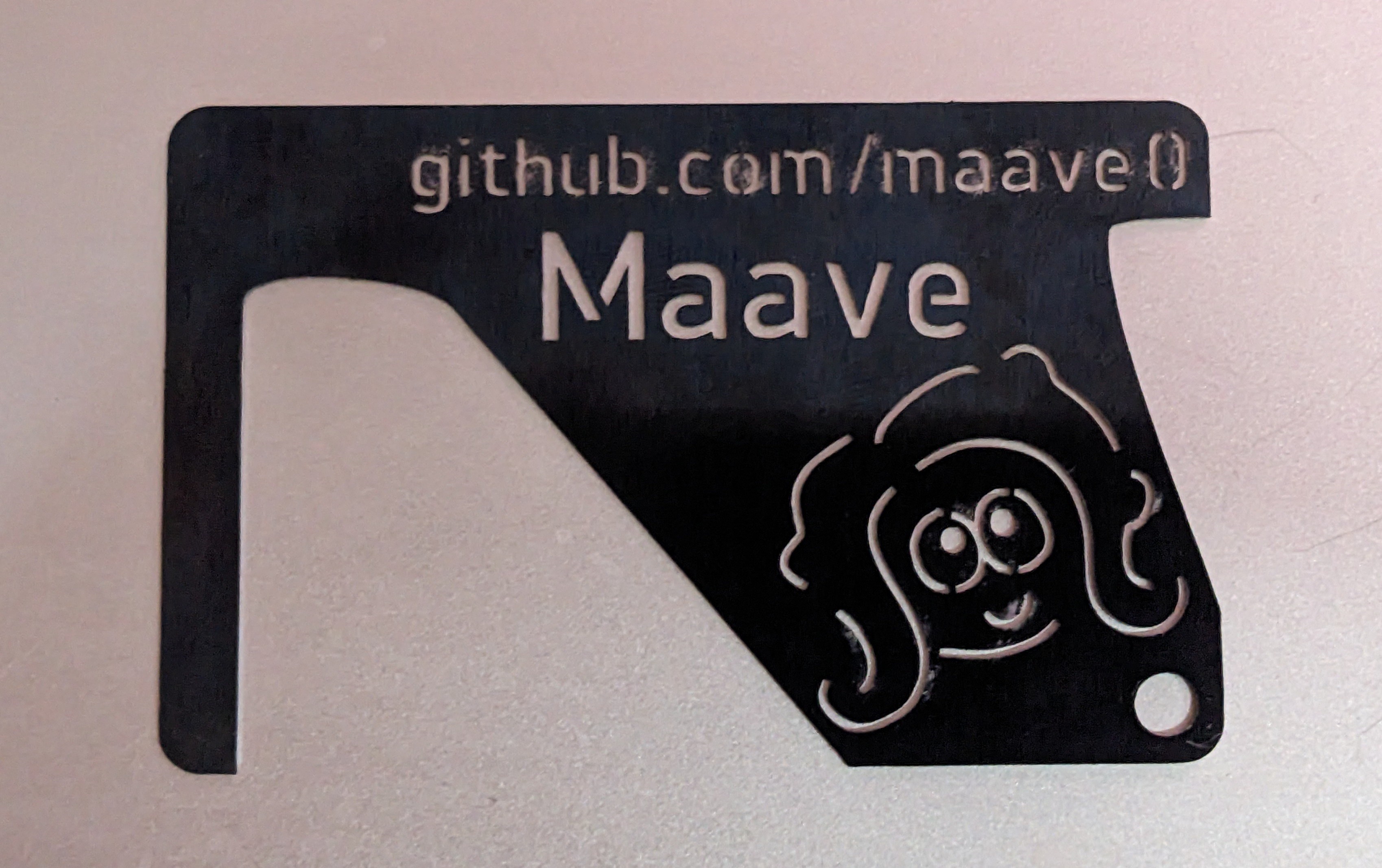
06/30/2024 at 20:21 • 0 commentsThe prototype arrived from SendCutSend and I like it. This material feels like a good choice - 1075 spring steel @ 0.4mm thick. The letters look nice, all the tiny cuts were made perfectly. The shim performs well with this material. It's nice in the wallet - it weighs 8.3g vs a credit card weighing 5.4g.
![]()
The steel has a blue color from tempering. In some areas it got blasted off. I may give it a new finish.
![]()
The standard attack works well. I do think it needs a softer edge to slip on the latch though. I tried deburring to smooth the edge but the deburring tool skates across, it's so hard. I'll have to sand.
Attacking the front of the latch is not effective in this stiff material. This only works on the simple double-door scenario, where you would usually have a push-bar anyway.
-
picking a font to modify
06/19/2024 at 16:23 • 0 commentsI'm thoroughly disappointed by the available free laser fonts. They're all fake/lookalike or paid. I'm going to make an open source font so I can slap-on text without worry. Can I complete it in a week for the contest? Let's find existing open source fonts to modify.
Features I want:
- sans-serif
- even line width
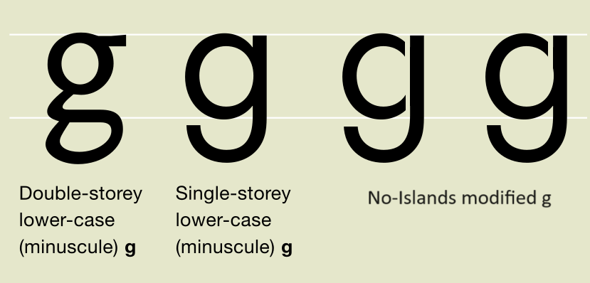
- no extra "islands" like double-storey lower-case "g"
- soft edges (the water jet / laser dot is round)
"Neo-grotesque" fonts are pretty good. Single line / Hershey fonts are good.
![]()
This paid font really shows what I want. Although it doesn't have any lowercase ...
![]()
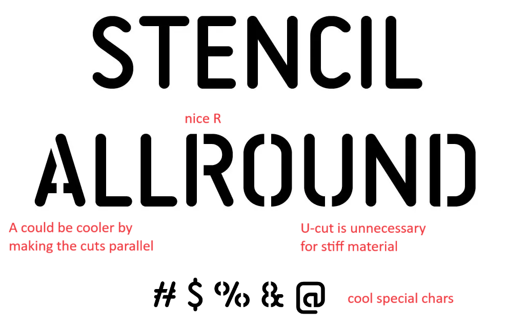
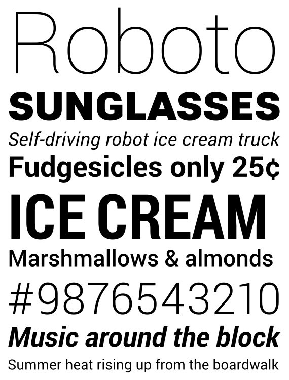
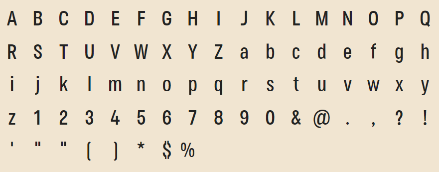
Open source optionsRoboto, the default font in Android. Really good. I like stuff like the dollar sign $ and cent sign which don't have any islands in them (tbh I don't need dollar sign). Capital "R" is a little funny, and the slanted tail on lowercase "a" bothers me.
https://en.wikipedia.org/wiki/Roboto
https://fonts.google.com/specimen/Roboto
![]()
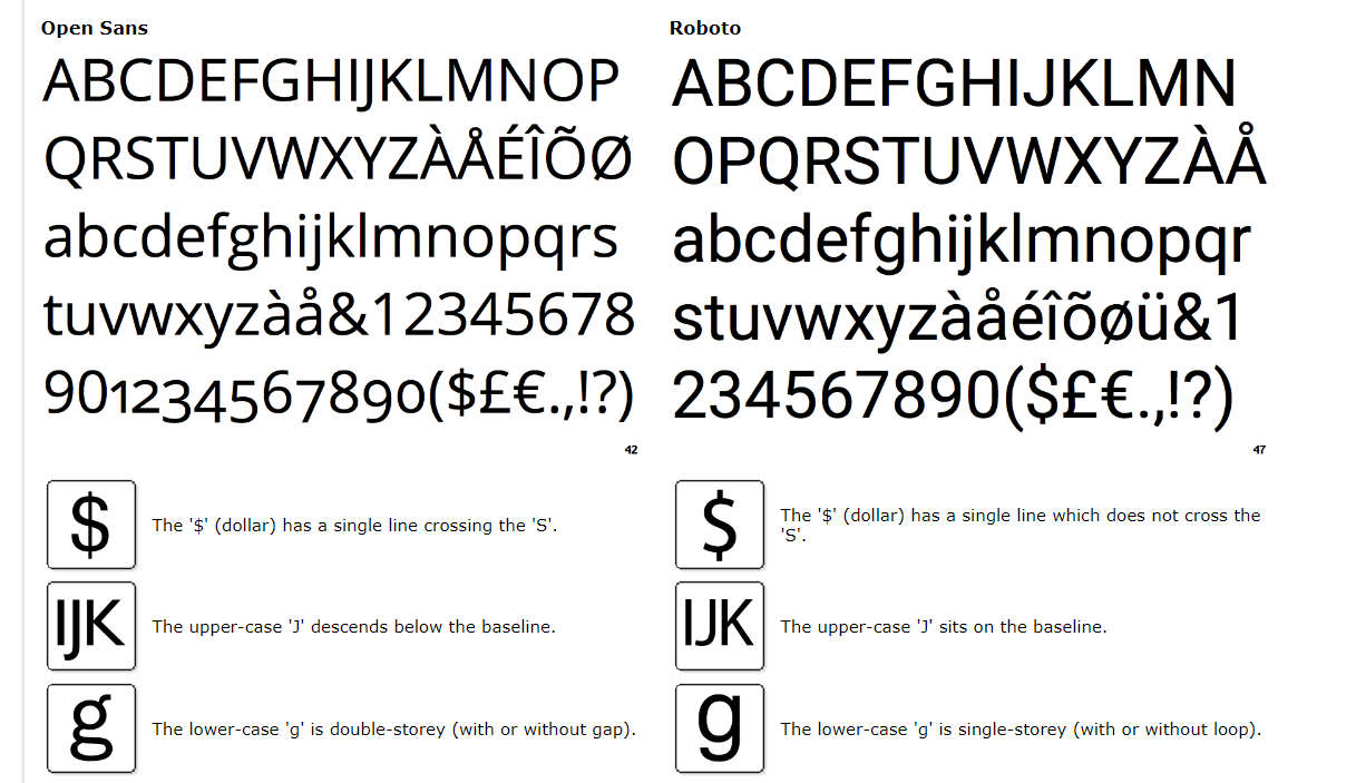
Open Sans. Decent but a couple things bug me: lowercase "g" has an extra island (double-storey), $ has islands (which Roboto simplified), and capital "J" descends below the baseline.
https://fonts.google.com/specimen/Open+Sans
![]()
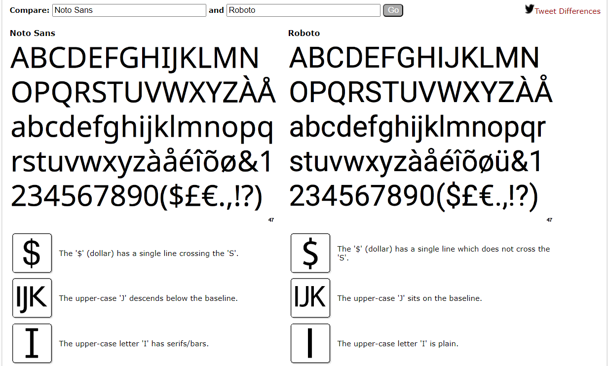
Noto Sans. Decent, really close to Open Sans except the lowercase "g" is simpler.
![]()
Hauora Sans. Not bad, kinda blocky and not quite the aesthetic I wanted
https://wcys-co.github.io/Hauora-Sans/
![]()
Relief SingleLine. Normally SendCutSend requires closed shapes, but it's not too hard to convert the text objects to Paths in Inkscape. I really like the look of this one and similar single-line fonts such as Hershey Meteorology
https://github.com/isdat-type/Relief-SingleLine
It looks like SendCutSend has a mode to support open paths. Just add it as another layer with a special name. So I may be able to use single-line fonts.
![]()
Secuela. Pretty good sans font. Cool dollar sign
https://github.com/defharo/secuela-variable
![]()
More options. I'm tired of copy-pasting now:
HK Grotesk
Source Sans 3
Nunito (rounded)
Teko (less round, more blocky)
Saint George Stencil Font (actually sentcilized, extravagantly serif, lowercase only)
Manrope (really nice, all characters are simple, similar to Roboto)
Muli (another simplified sans-serif)
-
order placed
06/19/2024 at 02:08 • 0 commentsI made tiny tweaks, adjusting the shim shape and adding an angle for attacking from the front of the latch. Order sent to SendCutSend. I chose 1075 spring steel, 0.015" (0.4mm). That's rather thin, I hope it works.
I'll upload the SVG Inkscape file to the project files.
![]()
Thickness references:
LINE2design Shove Knife: 5/64" (2mm)
SHOVE-R: 1.4mm
credit card: 0.8mm
SendCutSend material options and price estimate:
chromoly 4130
0.050" - 1.3mm
$19.89 /ea
$13.92 /ea @2spring 1075
0.015" - 0.4mm
$16.47 /ea
$12.85 /ea @2stainless 304
0.030" - 0.8mm
$12.84 /ea
$8.99 /ea @2stainless 316
0.060" - 1.5mm
$20.10 /ea
$14.07 /ea @2titanium grade 2
0.040" - 1.0mm
$17.21 /ea
$12.05 /ea @2 -
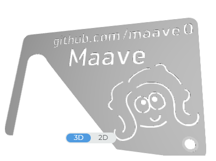
Prototyping
06/18/2024 at 20:10 • 0 commentsThat wasn't so hard. I already have the prototype done. I haven't used Inkscape in a while so watched some beginner tutorials. I'm using Inkscape v1.3.2
![]()
Previewing in SendCutSend:
![]()
The size I need is CR80 aka ISO/IEC 7810 ID-1
https://en.wikipedia.org/wiki/ISO/IEC_7810
85.60 mm × 53.98 mm (3.370 in × 2.125 in)
Rounded corners with a radius of 2.88–3.48 mm (about 1/8 in). Thickness of . 76 mm thick (I can ignore thickness).Fortunately the size that I need is already built into Inkscape.
Files > Document Properties
Format: ID card, then rotateThe general shape was easy. Enable snapping, make a rectangle the full size of the document, then round the corners (Rx and Ry input boxes) to 3.5mm. Yay it's a credit card. Path > Object to Path. Then use the node editor to add nodes and create the shim shape.
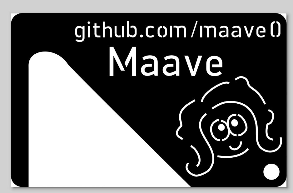
The art is a trace of some Splatoon splatfest art. I used Inkscape's "freehand" tool to draw over a PNG. These were all open paths (lines that don't connect to a closed shape) so I thicken the line by setting the Stroke width, then Path > Stroke to Path.
Text is handled similarly. Create the text using the text tool. Then Path > Object to Path.
After all the funny shapes are converted to paths, they can be combined together. Now with 1 big Path for all the cutouts, I use Path > Difference to subtract the shapes from the shim shape.
Nice, done!
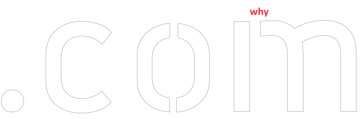
The biggest pain in the butt was the font. I had a lot of difficulty finding a good free and open source font that was compatible with laser cutting. The font needs to be a stencil with no free-floating islands. Everything that looked good was paid.
There are an infinite number of useless stencil-looking fonts online. I found one called "LaserCut", couldn't find any licensing details, and I had to modify the piece of crap anyway. The "m" has an unnecessary cut just to look cool, while the "o" and "0" had no cuts at all and caused error in SendCutSend! I manually edited the paths to fix "o" and "0".
![]()
I'm strongly considering making this myself now. As a follow-up to this project I'll make a laser-cutter-compatible font, free and open source.
FYI there is an open-source font for CNC engraving, but this is not the same requirements as cutting through the object.
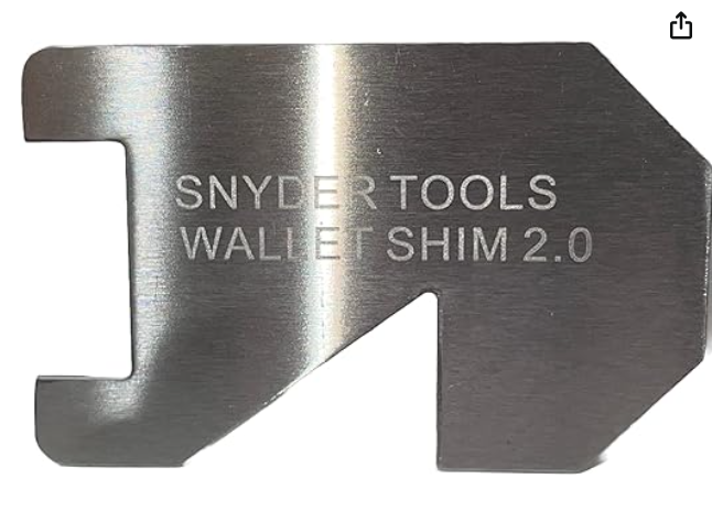
Here's some of the prior art that I looked at for design inspiration. The product exists already, even commercially and wallet-sized.
https://www.amazon.com/Wallet-Shim-Credit-Gadgets-Stainless/dp/B0BNM9H776/
![]()
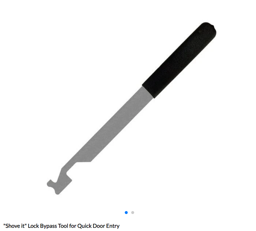
https://www.lockpickworld.com/products/shove-it-lock-bypass-tool-for-quick-entry
![]()
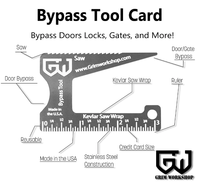
diff shape with a longer shimming edge, but less grabbing edge, also has a hole
https://grimworkshop.com/products/door-lock-bypass-card![]()
plastic flexible version. I should consider making another out of plastic, the flex could allow it to snaking around door trim and attack the front of the latch
https://modernwarriorproject.com/product/lock-picking-thin-flexible-shims/![]()
Credit card door entry tools
Door entry tools about the size of a credit card.