-
Unclutter the Feed page
02/05/2017 at 15:00 • 8 commentsRant
Last week I made a big mistake: I clicked a button on the My Feed page (from hackaday.io). The button was named something like "See if you like our New Feed" or something. Well, I didn't liked the new feed, but also I found myself locked out from the old feed format, the one which I liked and wanted back. There was no way to go back to the old Feed format.
Since then, I have no idea what exactly I am notified about on my Feed page.
:o(
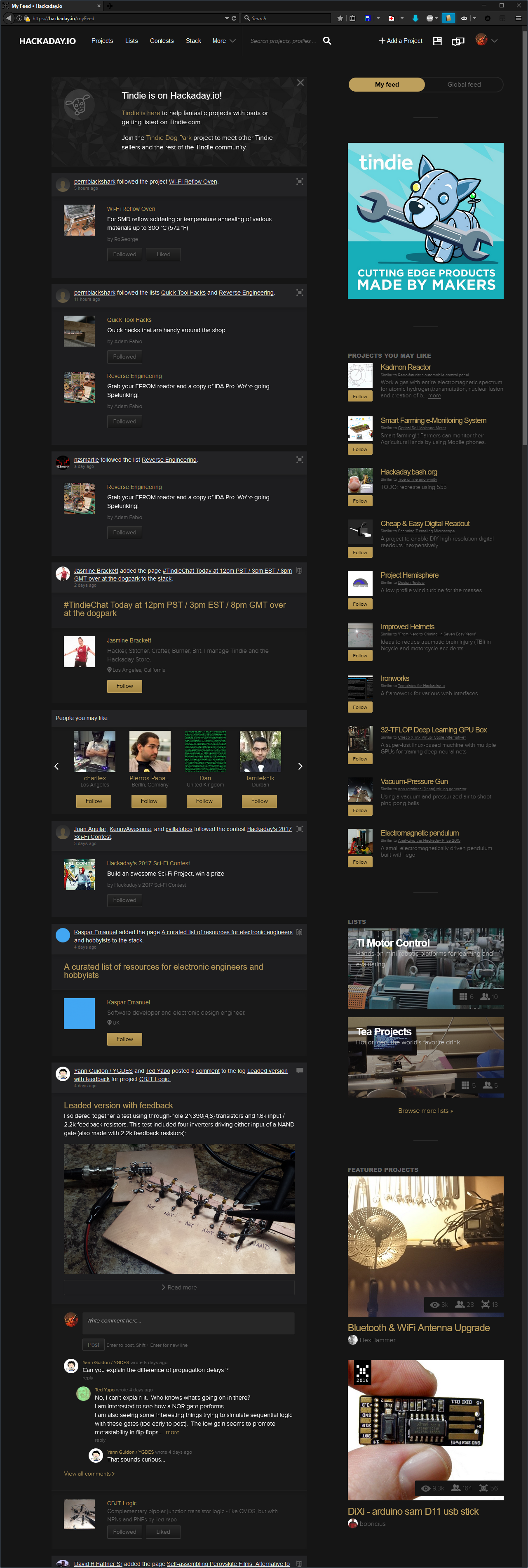
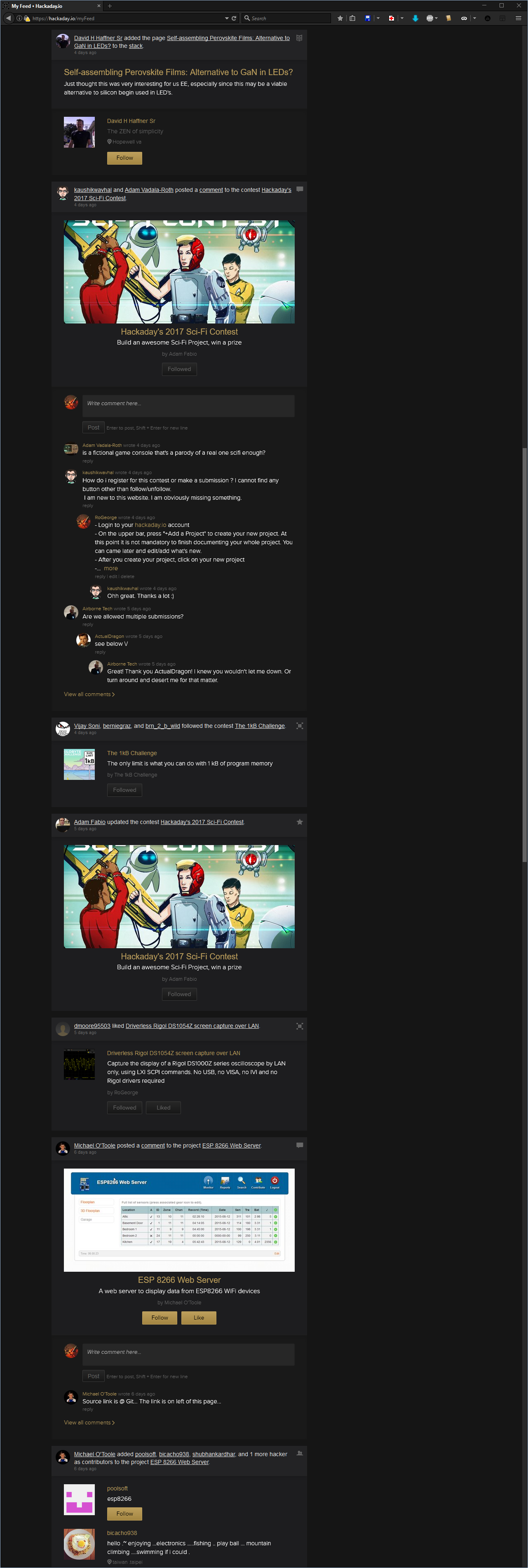
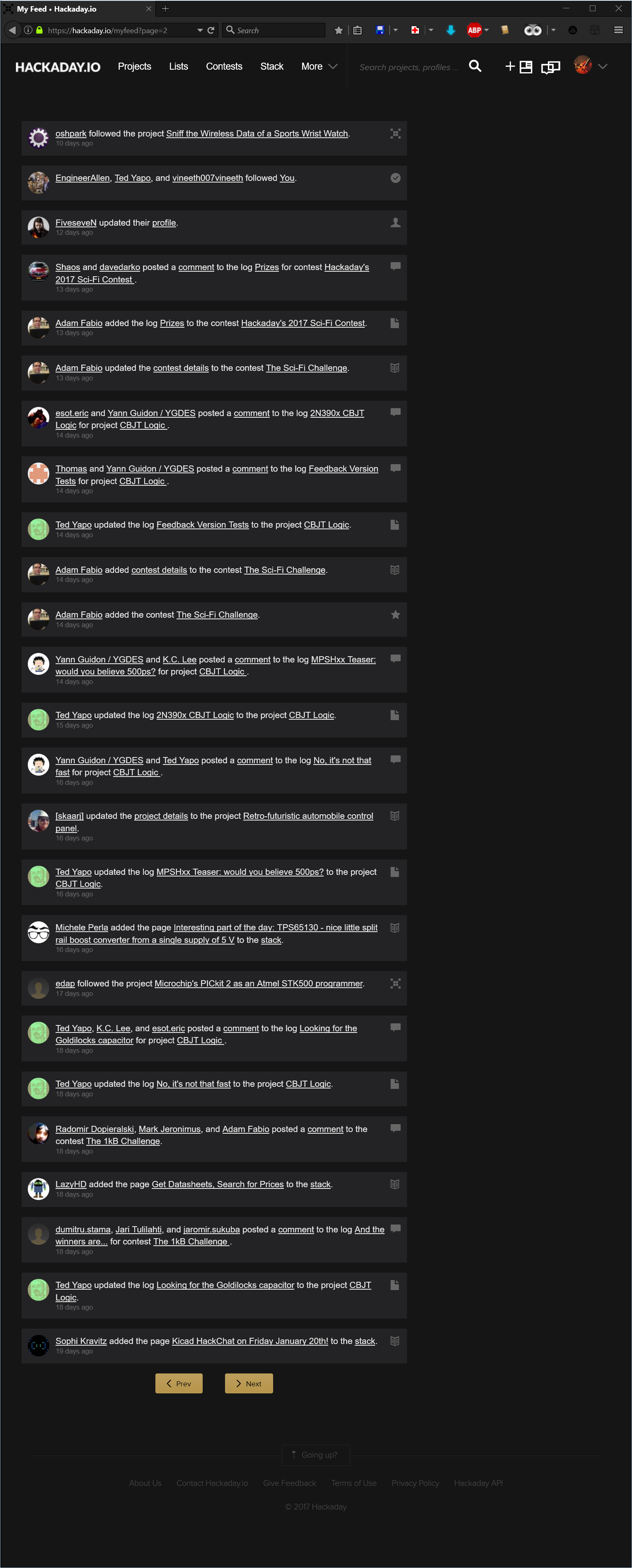
The Feed page is now totally cluttered with buttons, pictures, icons, descriptions, recommendations, comment boxes and so many other unwanted elements. Over the top, the items of interest are grouped by some inconsistent criteria that I couldn't figure out yet.
The Feed is so cluttered that the only question this page should answer, "What are the last x things I am notified about?", remains a mystery:
![]()
So what exactly I am notified about?
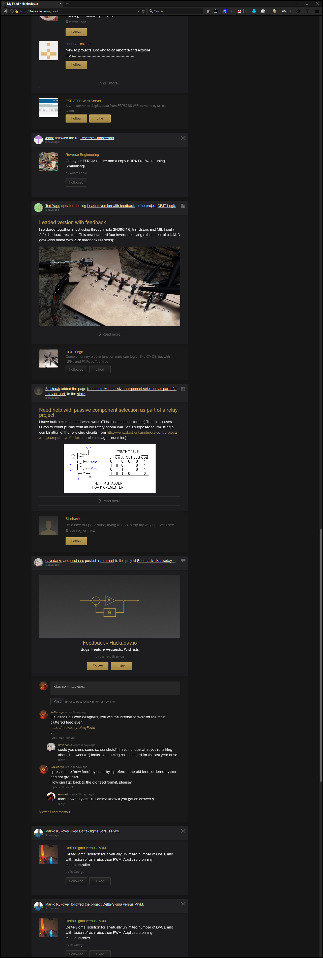
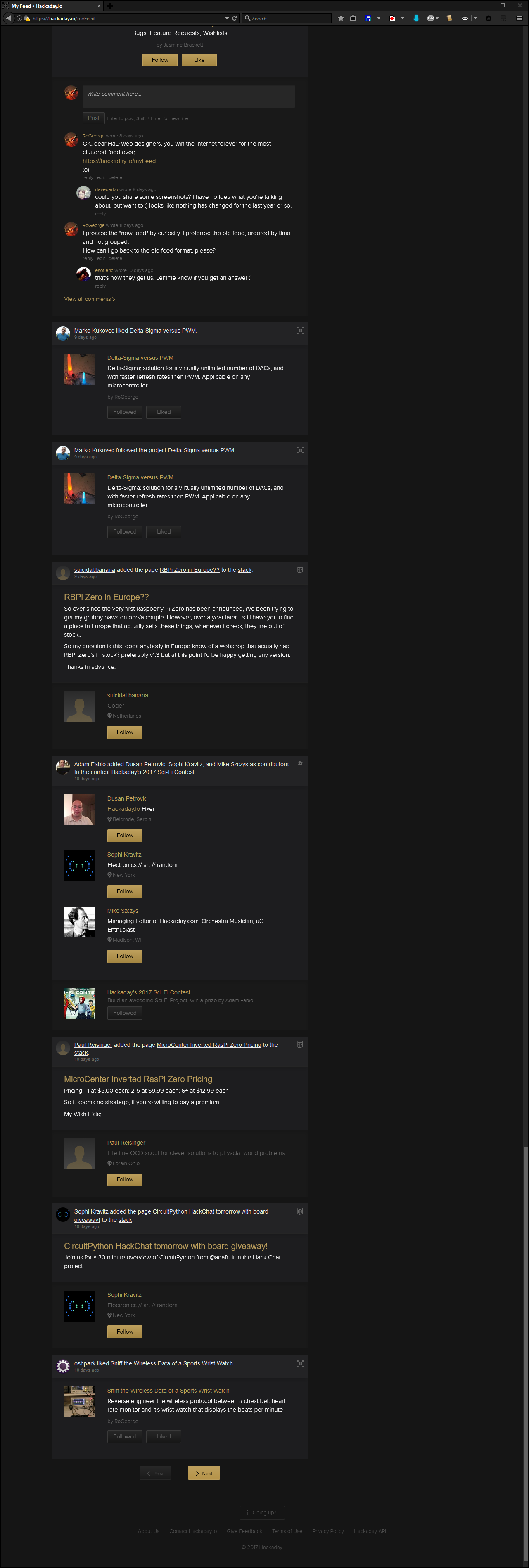
I have no idea, but wait, there's more:![]()
![]()
![]()
What can I say. Don't know.
Maybe there are reasons why some people refuse to have a Facebook account. Please note that I am not even complaining here about the "Skulls" being replaced by the dumbed "Likes", but it just crossed my mind now, when I realized the Feed page looks like a black themed Facebook page.
.
Anyway, given the look of the "new" Feed page, I asked if I could get the old format back, but no answer: https://hackaday.io/project/37-feedback-hackadayio/discussion-75327
Then, an Internet Award was granted to the web designers that designed the "new" feed look, but still no answer from them: https://hackaday.io/project/37-feedback-hackadayio/discussion-75570
OK, so "Life's hard, and then you die", now what?
tl;dr: Workarounds
- Use a custom AddBlockPlus filter to get rid of the unwanted elements. The notifications will still be grouped, but the 'Feed' will be much clear.
- Use a custom JavaScript for GreaseMonkey (or Tampermonkey) to rearrange the 'Feed' pages upon wish. This one is not trivial.
First workaround: Add a custom AddBlockFilter
- Install AddBlockPlus
- Go to 'Filter preferences... Ctrl+Shift+E'
- Check 'Element Hiding Rules' and show the filters list 'Action' -> 'Show/hide filters Ctrl+R'
- Add the following filters:
hackaday.io##.feed-group.beta
hackaday.io##.object-list
hackaday.io##.object-content
hackaday.io##.object-images
hackaday.io##.slider-holder
hackaday.io##.comment-section
hackaday.io##.show-more
hackaday.io##.cover-padding
hackaday.io##.content-right-other
That should do it. The 'Feed' page will look like this:
![]()
The last entry in the filter removes all the right-side column, so it also removes the "My Feed / Global Feed" switch buttons. If you need those buttons, then remove the line
hackaday.io##.content-right-other
Note: the above steps to add a custom filter are for Mozilla Firefox. For Chrome, the AddBlockPlus filter is the same, and can be added in the AddBlockPlus menu 'Options' -> 'Add your own filters'
Second workaround: Custom JavaScript for GreaseMonkey
This one allows to select what kind of notifications to display, and how much clutter to display.
:o)
Still playing with it, but not polished enough to be published.
-
Even worst then skulling yourself: Follow Yourself
07/16/2015 at 14:48 • 0 commentsThis is just to alleviate the guilt for skulling yourself.
:o)
How to follow yourself
- Hover the mouse over your profile icon and remember your ID number
- Go to your profile page (e.g. by clicking on your profile icon)
- Similar with the previous log entry, where you gave yourself a Skull, type the following in your browser's Address Bar:
JavaScript:$.ajax({url : "/hacker/10287/follow", method : "POST", timeout : 15e3, data : {_csrf : csrftoken}})Note: Some browsers use to mangle the word "JavaScript:" from the Address Bar. If you use copy/paste, before pressing Enter, check that the first word in the Address Bar is indeed "JavaScript:". If not, add it manually, so the text in the Address Bar will be the same as in the example. You may want to change the profile ID with your own profile number.
-
Give yourself a Skull
07/10/2015 at 16:12 • 9 commentsYour project is beautiful,
You should give yourself a skull!See, a poem!
:o)How you can do it (the skull, not the poem)
- Click on one of your projects
- After your project page is displayed:
- Delete all text (the URL) from the browser's Address Bar
- Type the following text in the empty Address Bar of your browser:
JavaScript:$.ajax({url : "/project/6621/event/skull", method : "POST", timeout : 15e3, data : { _csrf : csrftoken }})
Note: Some browsers use to mangle the word "JavaScript:" from the Address Bar. If you use copy/paste, before pressing Enter, check that the first word in the Address Bar is indeed "JavaScript:". If not, add it manually, so the text in the Address Bar will be the same as in the example. You may want to change the project ID with your own project number. -
A list inside another list & template to copy/paste
07/08/2015 at 06:42 • 2 commentsFor the project Wi-Fi Reflow Oven, a list inside another list was necessary to describe all the steps for Setting up the Freescale software development tools.
Embedded lists template
- level 1.a
- level 1.b
- level 2.a
- level 2.b
- level 3.a
- level 3.b
- level 4.a
- level 4.b
- level 5.a
- level 5.b
How you can do it
- right click on the list and choose Inspect element
- in the element's HTML code window, identify where your list start.
The list is delimited by the "ul" tag.
Each item in your list is delimited by "li" tags.
A list should look like this
<ul>
    <li>level 1.a</li>
    <li>level 1.b</li>
    <li>level 2.a</li>
    <li>level 2.b</li>
    <li>level 3.a</li>
    <li>level 3.b</li>
    <li>level 4.a</li>
    <li>level 4.b</li>
    <li>level 5.a</li>
    <li>lrvrl 5.b</li>
</ul>
Modify the code to look like this
<ul>
    <li>level 1.a</li>
    <li>level 1.b
        <ul>
            <li>level 2.a</li>
            <li>level 2.b
                <ul>
                    <li>level 3.a</li>
                    <li>level 3.b
                        <ul>
                            <li>level 4.a</li>
                            <li>level 4.b
                                <ul>
                                    <li>level 5.a</li>
                                    <li>level 5.b</li>
                                </ul>
                            </li>
                        </ul>
                    </li>
                </ul>
            </li>
        </ul>
    </li>
</ul>
Or, you can copy/paste a template
Most of the time, the HaD Editor will try to keep the formatting when doing a copy/paste from another page. That is why you can simply copy paste a list from another webpage into your project log, then modify it as you wish.
Alternately, you can
- create a .htm text file with the HTML code for your ideal list, then
- run the HTML code by opening the .htm file with an Internet browser, then
- copy/paste from there to your new log entry.
Or, you can simply press TAB, as [Matt] pointed out
This log entry is a perfect example of how Retardo DaVinci was I.
Just press TAB, and you will have a nested list.
Thanks [Matt], for bringing me back to Planet Earth!:o)
-
[Matt]'s experiment: short links, keep only what's needed
07/06/2015 at 09:00 • 1 comment[Matt] didn't liked long links. He experimented to see what is really needed, and found out you can drop the name-title part. Keep only the ID number.
So always use
https://hackaday.io/project/4731/log/20286
instead of
https://hackaday.io/project/4731-esplux-smarts-for-your-downlights/log/20286-scope-resultsMore then that, [Matt] found out that the text doesn't really matter at all:
https://hackaday.io/project/4731-you-can-write-here-whatever-you-want/log/20286-hack-a-day-will-look-at-the-numbers-only
-
[Stefan Lochbrunner]'s idea: Side by side images
07/06/2015 at 07:33 • 3 commentsIn a log entry I could not reproduce the alignment from his page: https://hackaday.io/page/1082-test, because the editor was eating some of the style attributes when the log was saved. Still, side by side can be done as a table, but it doesn't look to good:
![]()
![]()
You can further stretch the idea, and make a log entry to look like a gallery.
How you can do it
Apply the steps described in the first log entry but instead, right click on your first picture and adjust your code to look something like that:
<tbody>
    <tr>
        <td style="width:50%; text-align:center; vertical-align:middle">
            <a href="https://cdn.hackaday.io/images/your_image_number_1_here.png" target="_blank">
                <img src="https://cdn.hackaday.io/images/your_image_number_2_here.png">
            </a>
        </td>
        <td style="width: 50%; text-align:center; vertical-align:middle">
            <a href="https://cdn.hackaday.io/images/your_image_number_2_here.png" target="_blank">
                <img src="https://cdn.hackaday.io/images/your_image_number_2_here.png">
            </a>
        </td>
    </tr>
</tbody>
Note: The editor thinks he's smarter then you are, so he's applying all kinds of different unsolicited formatting, depending on what part of the project you are editing. Didn't figure out yet why the editor is sometimes mangling styles.Or you can do it from the HaD Editor
- Write your text as usual, then insert first image.
- Click on the newly inserted image. The picture will enter in edit mode.
- Resize the picture from the lower-right white box, and make it smaller then half of the page.
- Click on the picture again, then click on the small, black "Edit" text written in the middle of the picture.
- From the 'Position' drop-down box, pick 'Left', then save.
- Insert the second picture and do the same, but align it to the right.
![]()
![]()
- Adjust the sizes of the two images
- Continue editing, then 'Publish'.
Note: In fact, it is possible all the time to do it from the HaD Editor, just that it never cross my mind to try it from the GUI. Too bad the smaller image is top aligned with the bigger image, instead of middle aligned.
:o(
-
Add animated pictures: no hack, just a how-to
07/05/2015 at 14:56 • 4 commentsFor the project Delta-Sigma versus PWM it was necessary to show how the two waveforms vary with the duty cycle, something like this:
![]()
How it was done
- save on your disk a sequence of similar pictures. For the above animation, the pictures were first saved as .PNG
- upload the pictures to an online GIF animator site. I like http://ezgif.com/maker, but there are many others
- adjust the animation upon your wish. You can change the speed, resize, crop and so on
- save the animated result to your disk
- open a new browser tab, then drag and drop the saved animation to it, to check the result
- if you like it, drag and drop it to your Hack A Day log. You should see the picture animated in your HaD log.
Note: Use the Animated GIF format. Do not use Animated PNG. Most of the browsers does not play APNG. After you end editing your HaD log, you may want to open your log with 2-3 different Internet browsers, just to be sure that most of the people will see an animation, not just a static picture.
-
[Matt]'s request: Italics, centered, under picture
07/04/2015 at 07:53 • 1 comment![]()
<DIV align="center"><I>LED turned on full brightness. You can see I get about 5v ripple current. Ouch.</I></DIV>Well, it seems like it doesn't worked
:o)Let's try harder:
LED turned on full brightness. You can see I get about 5v ripple current. Ouch.
Yeee, it's working! Italics and centered!
Back to normal
How it was done
Use Chrome Version 43.0.2357.130 m. It should work with other browsers too, but I didn't test them.
- Right click on the text you want to modify and choose "Inspect element". A new window will open in the same page.
- If it's not already selected, click on the "Elements" tab from the new window.
- In the new window, the selected row is your element you want to modify.
- Right click in the selected row from the new window, and choose "Edit as HTML". A text box will open in the new window, with the HTML code corresponding to your selected element.
- In the new opened text box, add or remove HTML tags to format your text as you wish.
- If you don't know what tag to add/modify/delete, open a new Chrome tab and google it. For this example, google http://lmgtfy.com/?q=HTML+center for text centering, or http://lmgtfy.com/?q=HTML+italics for italics.
- Click back on the Hack A Day page. You should instantly see the result of your HTML code injection.
- Now, you can continue with your Hack A Day log page editing, then press the "Publish" button.
Note: If you continue editing the Hack A Day page after you made a HTML code injection, the next paragraph will keep the modified format, so you need to apply the same technique to come back to normal.
Hack the Hack A Day Editor
A hack based on "HTML Injection". Useful when you want an online editing feature that is not available otherwise. Might work on any Website.
 RoGeorge