Ken Yap
-
Yet another tweak to the font
02/02/2026 at 08:03 • 0 comments![]()
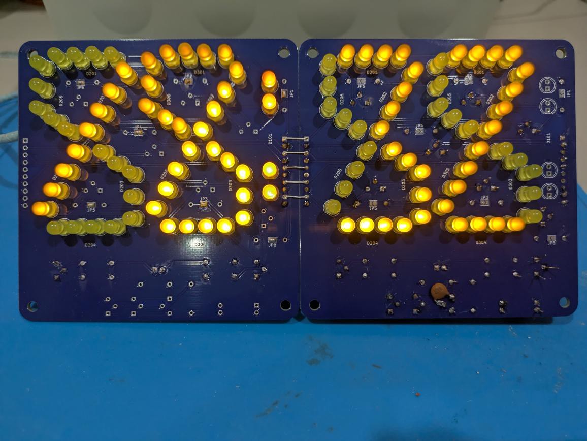
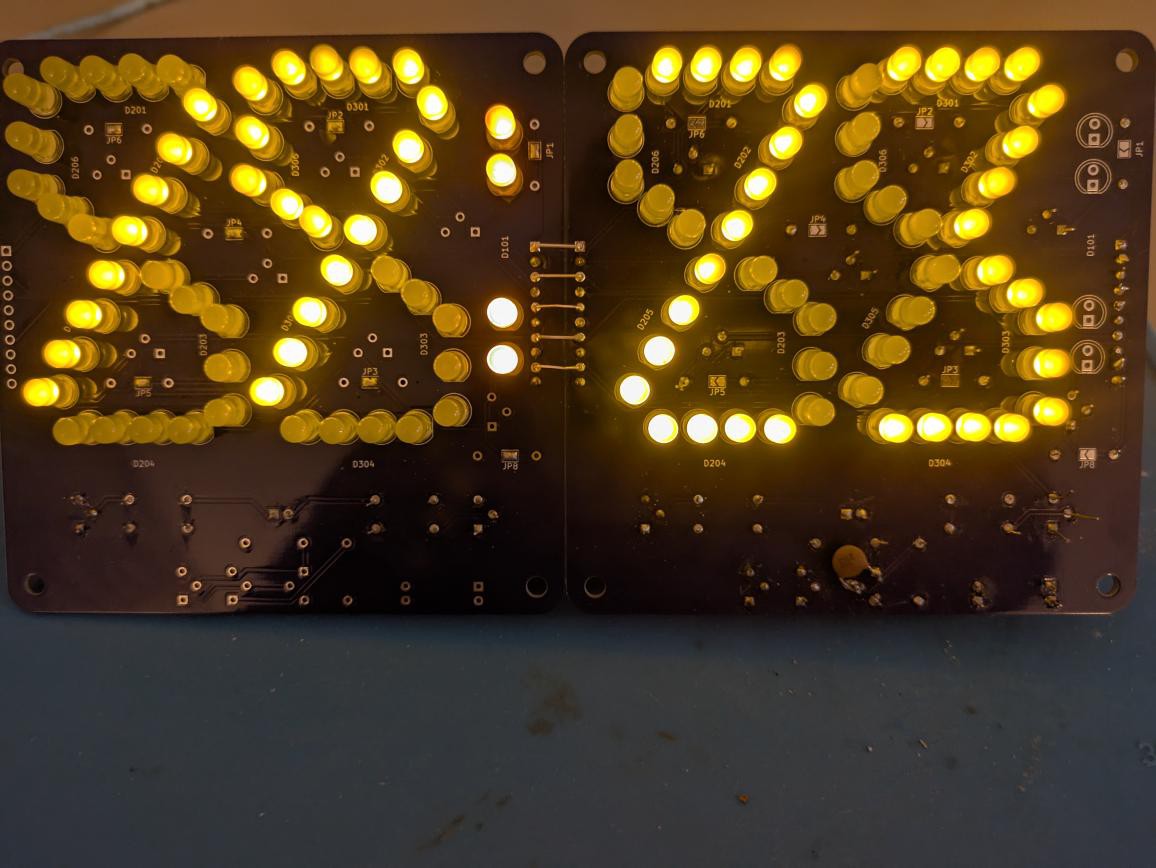
I keep saying I'm done with this font, but I couldn't resist one more tweak. I added one more LED to make 5 for segments C and F, as the gaps due to the longer length of those segments detracted. This required a constant current circuit for the LED chains so the brightness would be uniform. Sorry about the lack of contrast in the photo, the time is 18:32. I really need to think of tinted perspex windows for the display. Ok, here's another photo with the ambient light dimmed.
![]()
As a matter of interest, I had to use the long exposure feature of my phone as the camera can detect the LED multiplexing.
There were the usual teething problems: a mistake in the pinout for the TL431, a missing feedback capacitor, one dud high side transistor, several bad solder joints, but I got it working.
Unfortunately the half-height zero is irremediable. The only mitigation I could apply is to use the upper loop.
-
6 segments reloaded
02/05/2022 at 12:34 • 0 commentsA final go at a 6 segment font
Some time after I published my experiment in a 6 segment font I decided to see if I could apply the lessons learnt and improve the font a little before closing off this line of experimentation for good.
I decided that:
- Curved segments with only a few dots were er, pointless. I decided to make all the segments straight lines. Somehow viewers are more forgiving if the lines are constrained to be straight.
- Keep the digit upright, a slant doesn't look good.
- Use symmetry.
- Close the gap in the middle, most visible in the 5 in the initial attempt.
- Implement a high-zero, which would partly compensate for the half-height zero. This was the one change that spurred me to make another attempt.
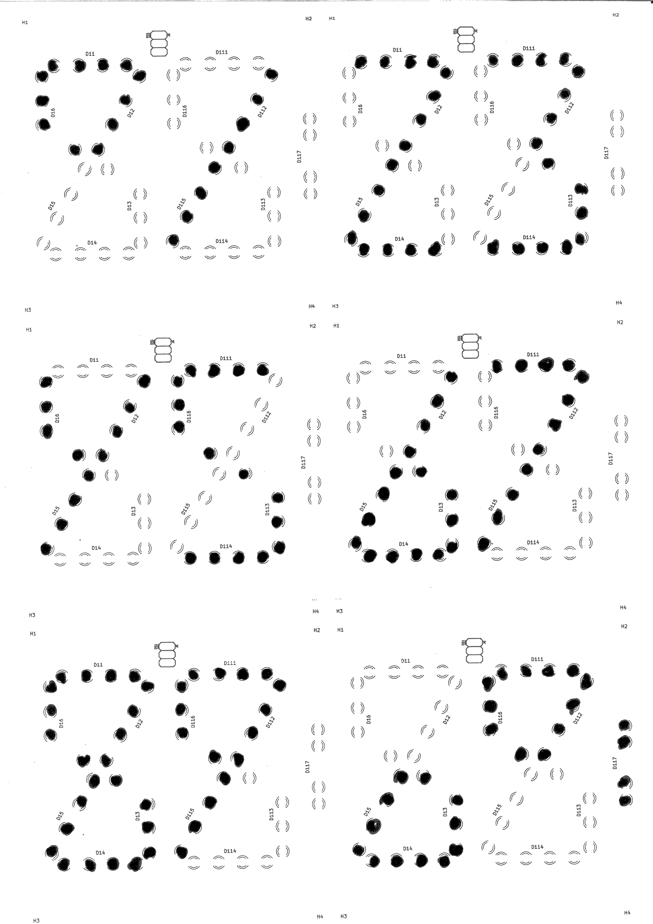
I first laid out the LED positions in KiCad and made a print of the silk screen layer of the PCB. Then I filled in the dots with a marker pen to give me a preview of how the font would look. It was promising so I went ahead and ordered 5 boards from ALLPCB.
![]()
In addition, the positions of the LEDs on the board made it possible to have a reasonable colon again, although this is not demonstrated here.
The link to the design files for the board on GitHub are in the links section.
I do think it's an improvement over my initial effort. It's too late to displace the 7-segment font, and high-resolution displays are so much more attractive wherever they can be deployed, so this is just me tinkering. I think the best I can hope for is for a futurepunk film or video to make use of this strange looking font. 🤗
6 segments suffice
A rethink of the number of segments required to display a digit