-
Vision for the Future - October 2022
10/23/2022 at 06:19 • 0 commentsJust as a cliffhanger for a possible future:
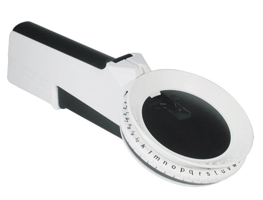
I see a big potential for E-TKT to transform into an accessible open source braile label maker.https://www.maxiaids.com/reizen-rl-350-braille-labeler
Reizen RL350 is a Braille label maker that's pretty much analog to how E-TKT's daisywheel works.
Just think how better the labelling user experience could be for the blind not only by all the features already present in the E-TKT, but also by incorporating voice commands and other things that might be uncovered?
To begin with, I even think that the whole system might be simpler by using a rotating encoder with a 6 pin in matrix instead of a daisy wheel.
Yeah, that's a radical change but lets keep that in mind ;)
That's it for now, let's see what future holds!
-
Hackaday Prize 2022 Video - October 2022
10/23/2022 at 06:05 • 0 commentsLots of work putting the video up, but I feel that it was worth it.
And I've also added subtitles just in case ;)
-
Documentation & V1.0 release - October, 2022
10/23/2022 at 05:08 • 0 commentsThe past weeks have been super intense, and much of that thanks to the detailed documentation that I've been consolidating.
The E-TKT's GitHub page was getting too long and I felt that moving for a dedicated web page would be great.
Inspired by Voron, I've adopted Just the Docs, a solution based on Jekyll that automatically builds pages based on GitHub repositories.
Click here to access the new documentation page.
What you fill find there (most of the things are mirrored from whats already here in the Hackaday page):
- 🎯 news: what's going on;
- 🤓 about: how it started, and why?
- ⚙️ how does it work?: a more in depth explanation;
- 💡 features: device and app details;
- 📷 gallery: misc. photos of the device and labeled things;
- 🛠️ do it yourself: a super detailed guide for you to buy the parts and make your own E-TKT;
- 🧬 iterations: a log of development so far;
- ⚖️ license: for firmware, hardware and documentation itself;
- 🏅 credits: people that made a difference for the project;
- 📺 media: where and when it's already been featured.
I hope you enjoy!
-
Last call for an Easter egg - October, 2022
10/23/2022 at 04:53 • 0 commentsIch bin der musikant mit taschenrechner in der hand.
Well, I'm a convict nerd and I couldn't avoid adding some Kraftwerk inspiration into the E-TKT. I'm a big fan of the Düsseldorf group since I was a child. At the time, I was afraid of them robots.
While I was composing for the original track in the first video, I felt that tags could relate to musical notations.
I have, in parallel to all other developments and thanks to the addition of a buzzer in the PCB, explored some ideas and suddenly I've remembered this:
![]()
This was a cheat sheet for playing some of their music on a Casio VL-80, a small synthesizer.
Yes, you guessed right, it's all about "I'm the operator with a pocket calculator".
If you have a VL-80, you can be the operator, and apart from looking like a calculator, it is really a synthesizer.
Here is some more info about it.
Inspired by that, I researched some docs for that model and looked for the correlations between numbers and notes, and transposed that into the E-TKT. Check this cool manual for playing diverse songs into that little synth.
As the E-TKT has more characters than the VL-80, I've completed the table.
Then each label, for having specific individual characters, plays a unique melody before printing. It is cute. ♪
And of course, there are Easter eggs... I challenge you to discover them without scanning the source code. There is a tip below, though.
![]()
♪
-
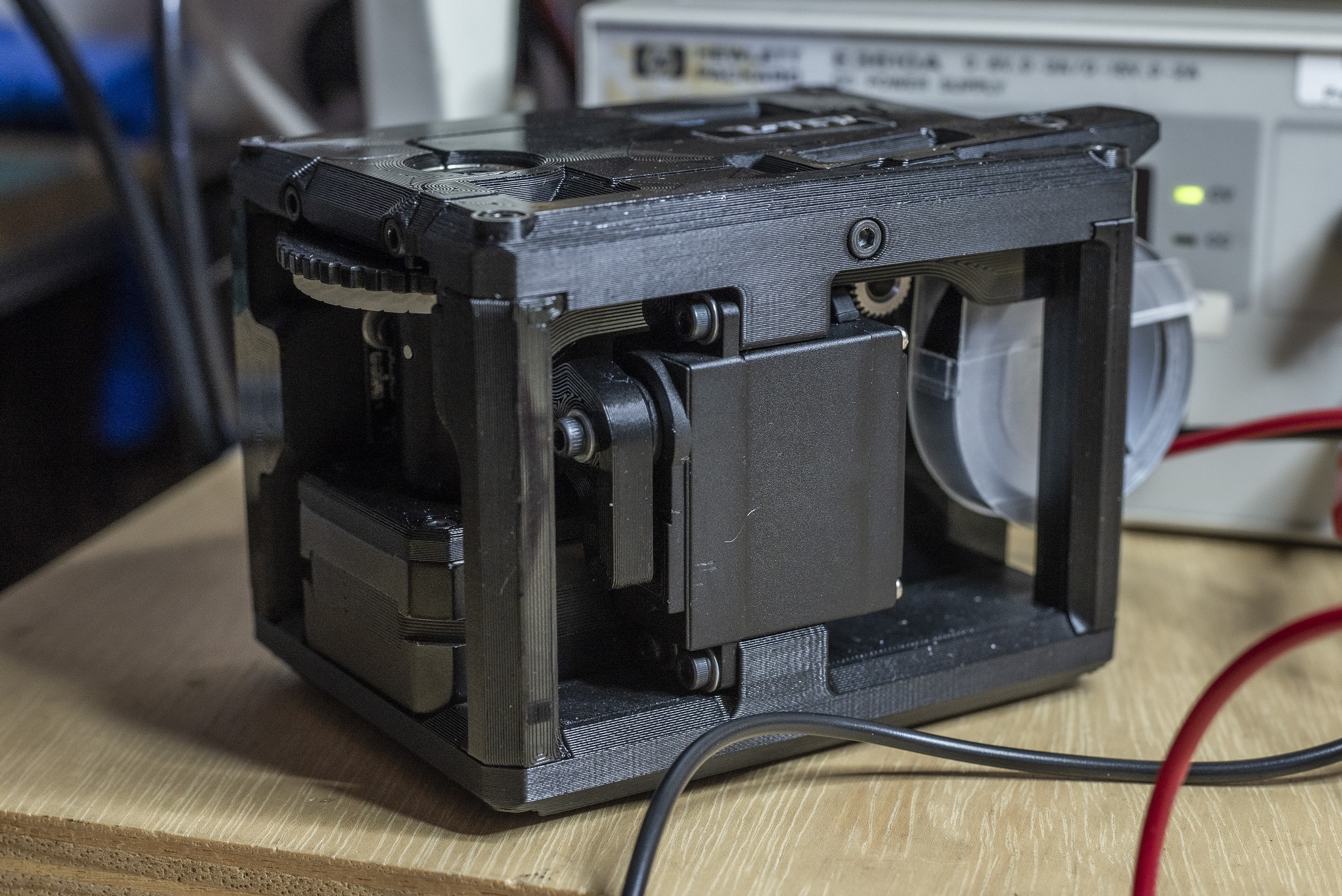
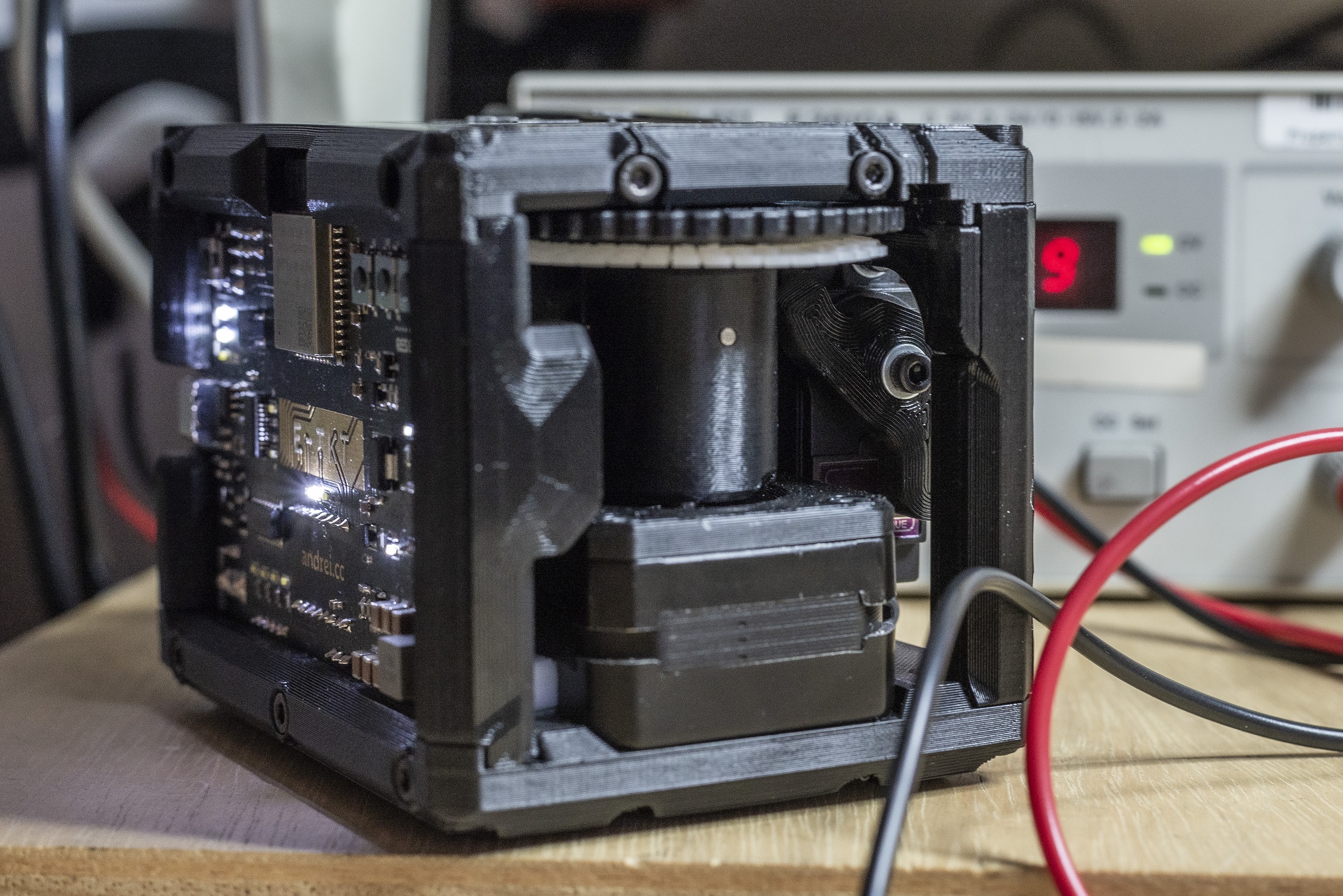
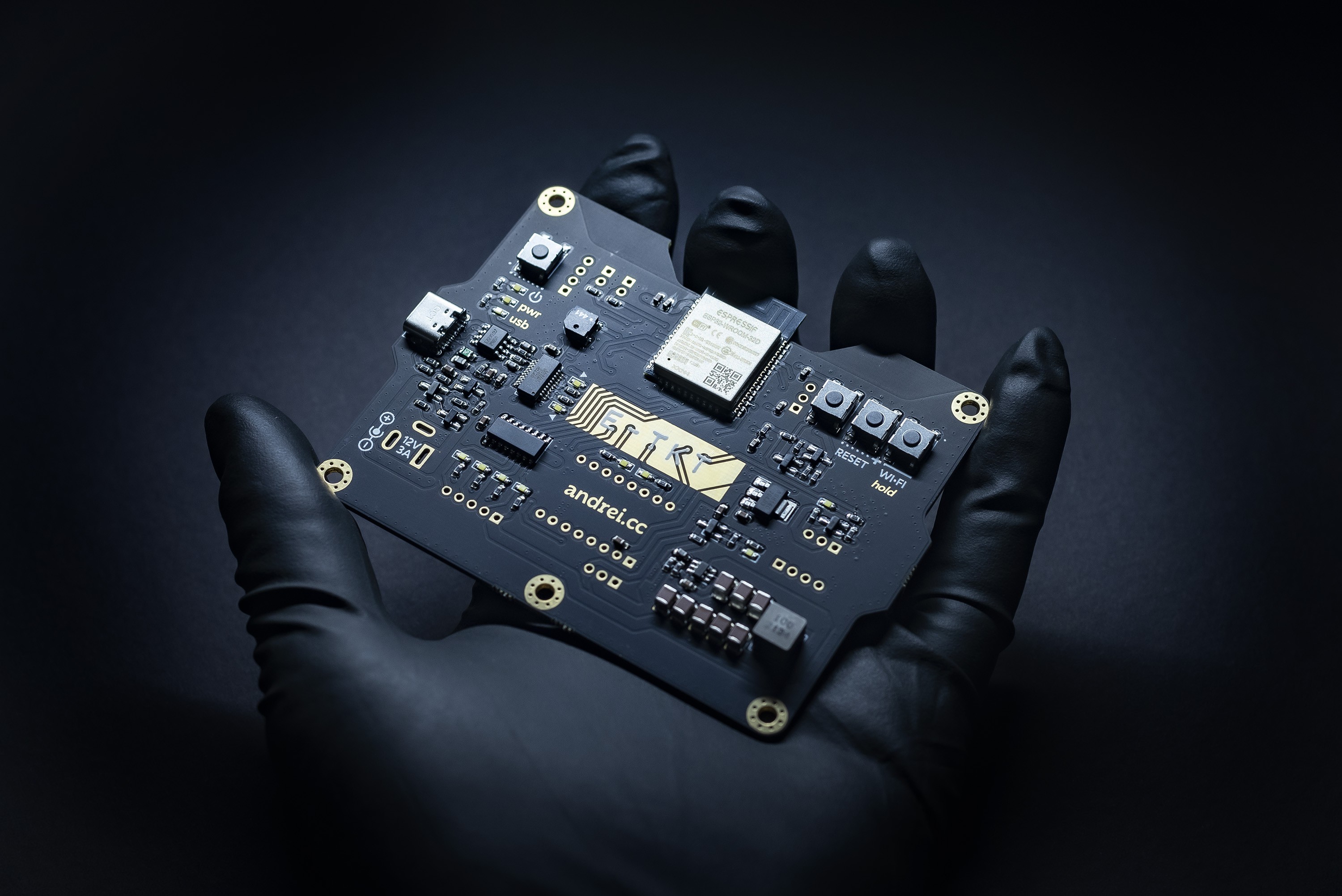
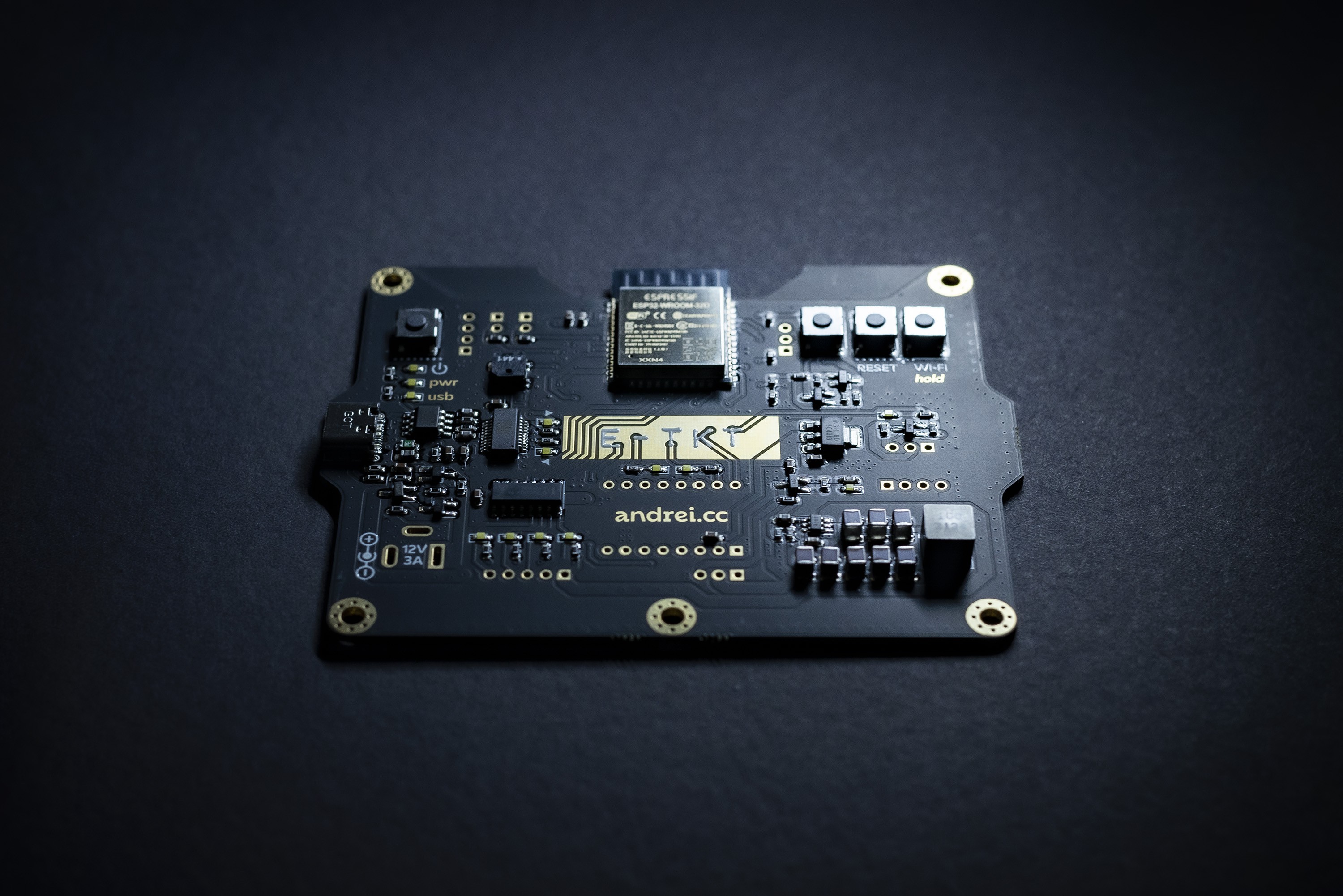
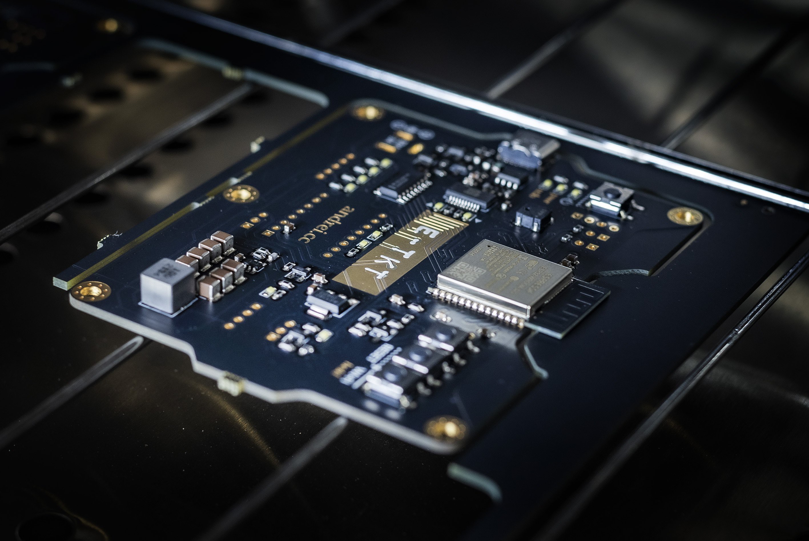
V1.0 Photos - October, 2022
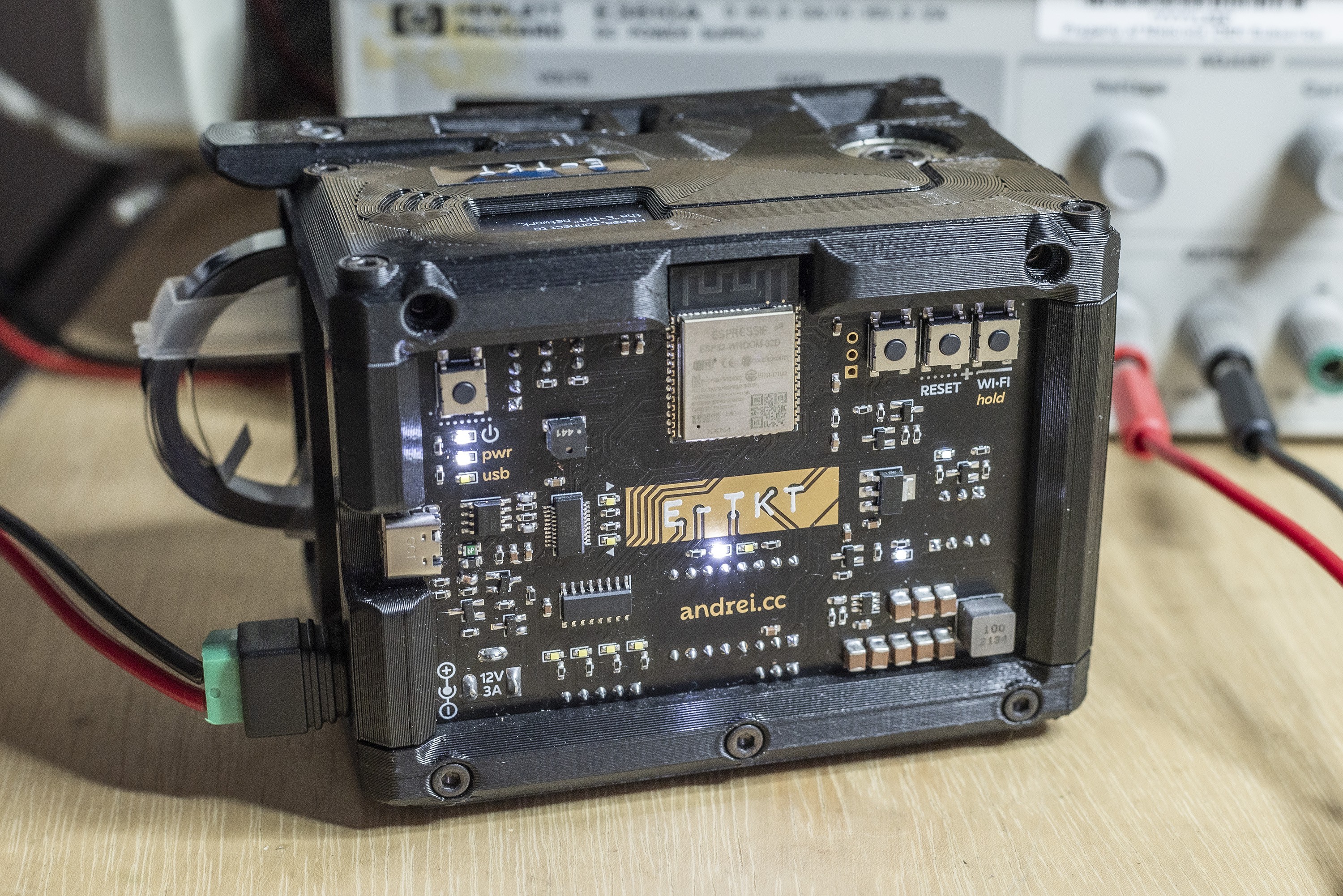
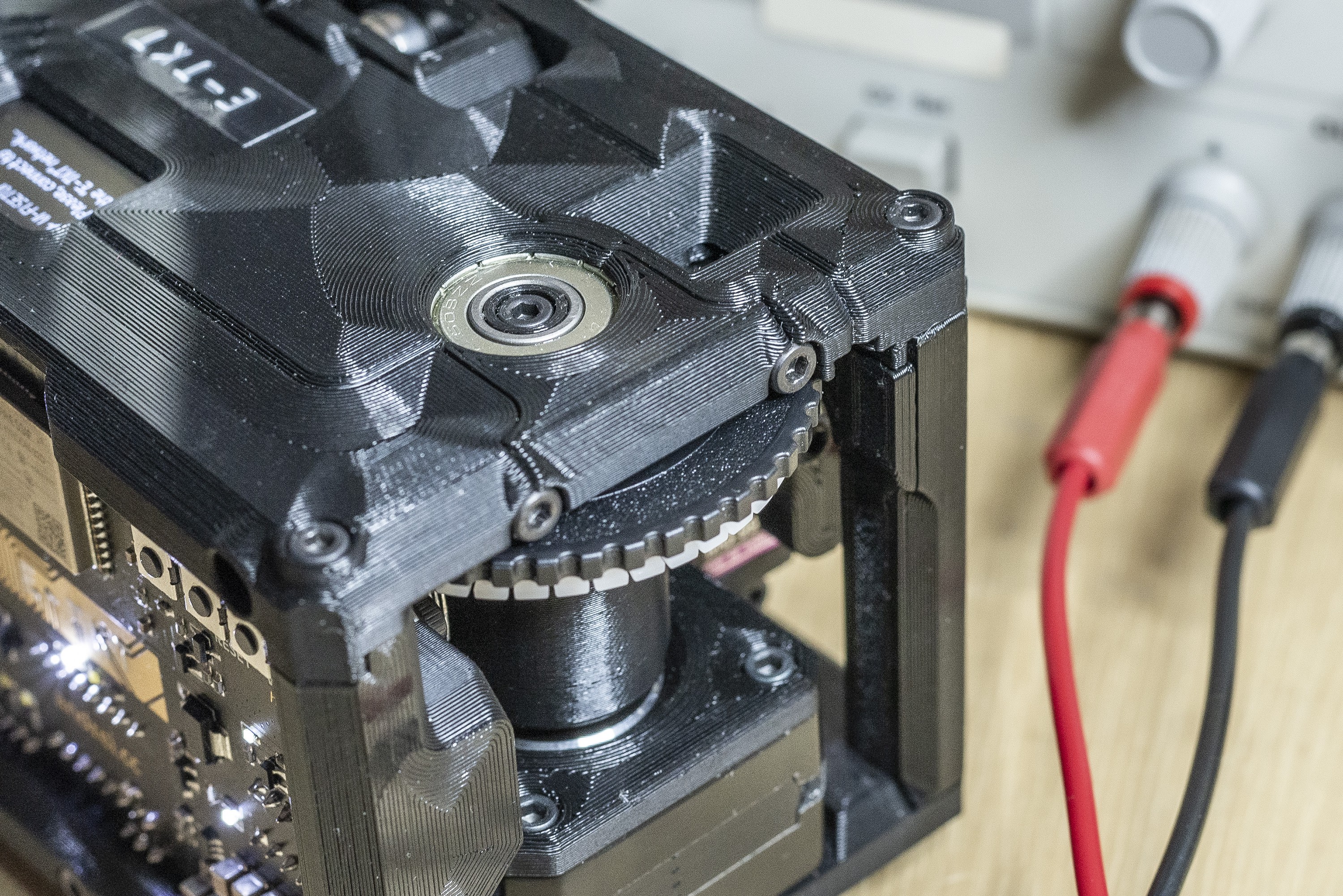
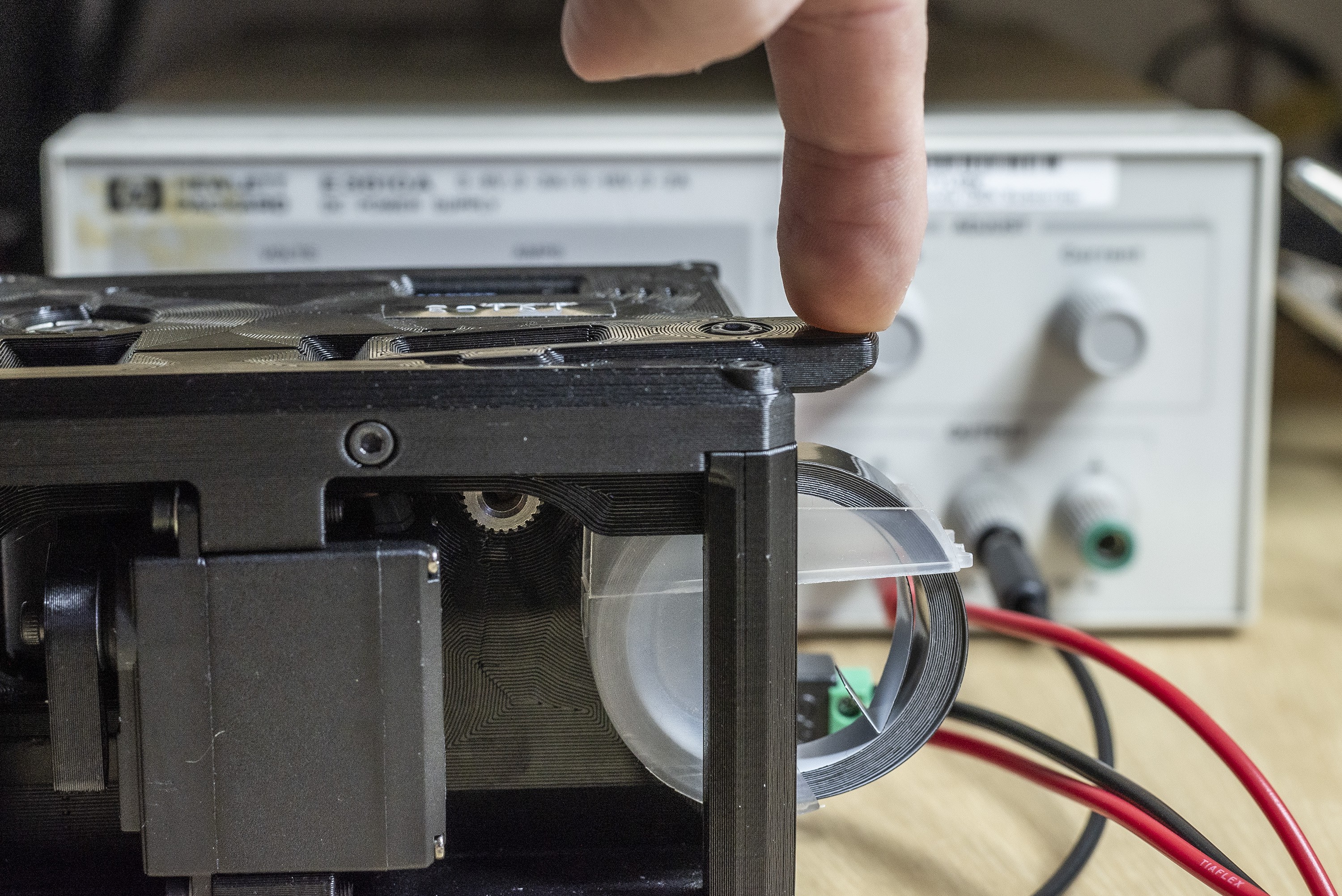
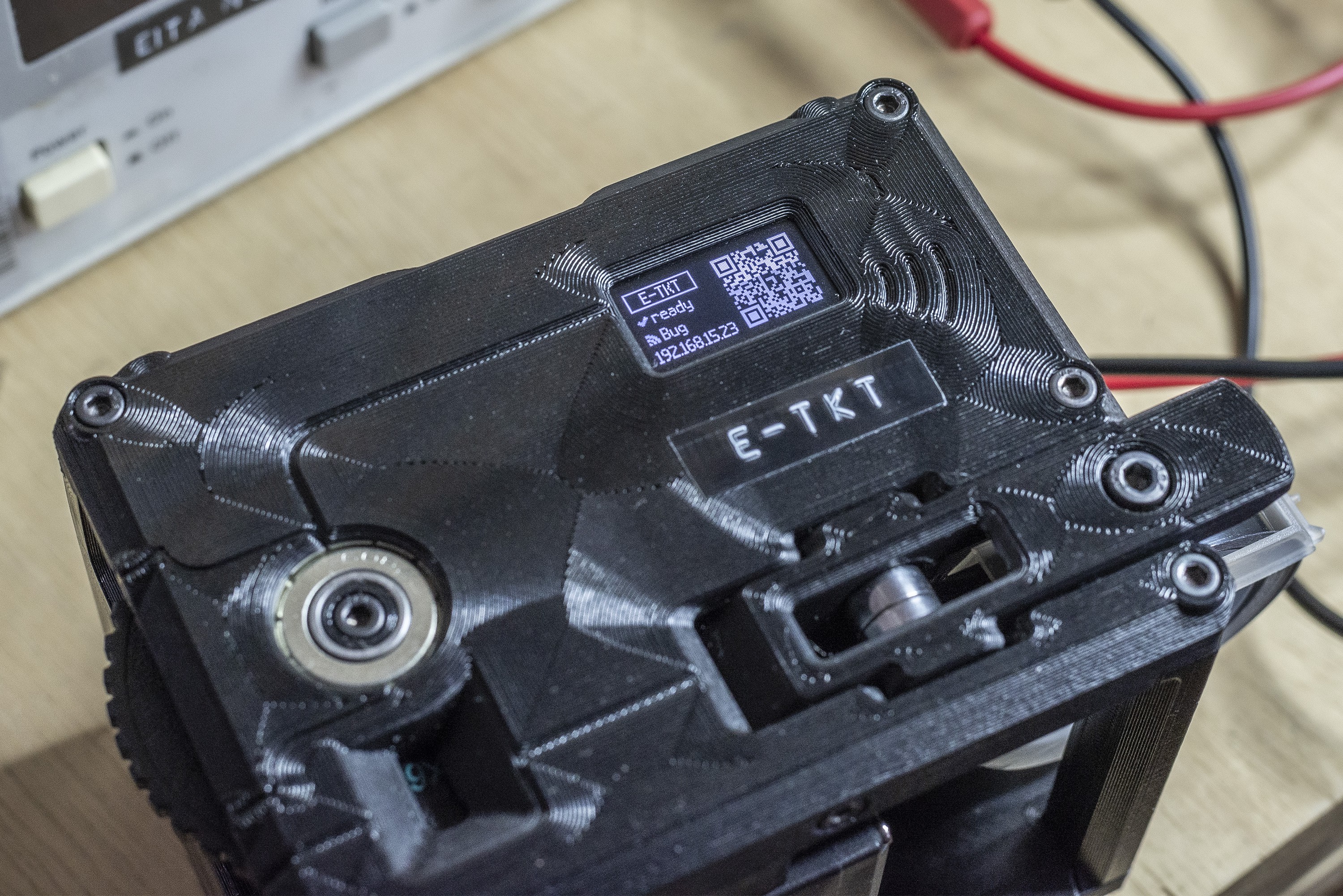
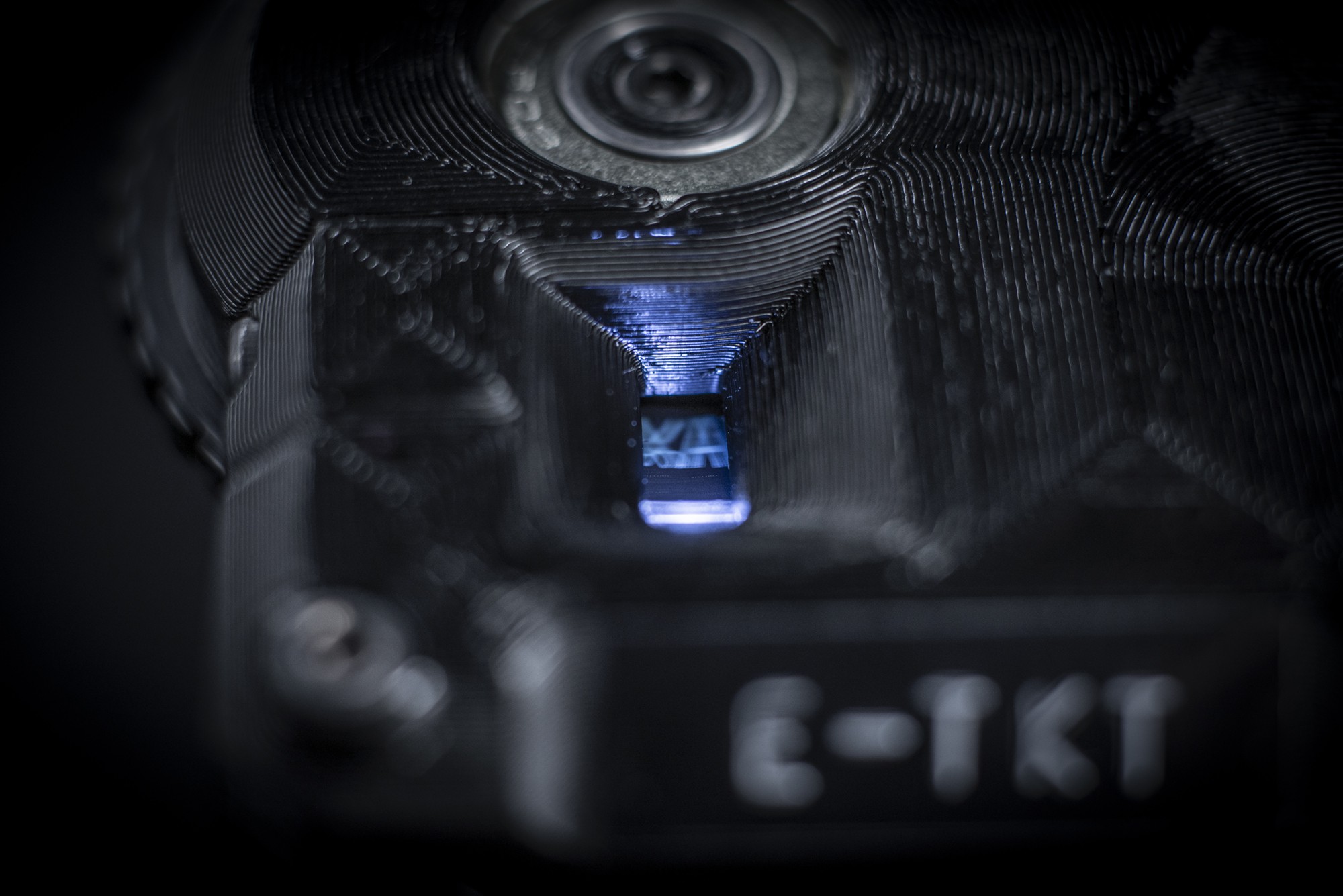
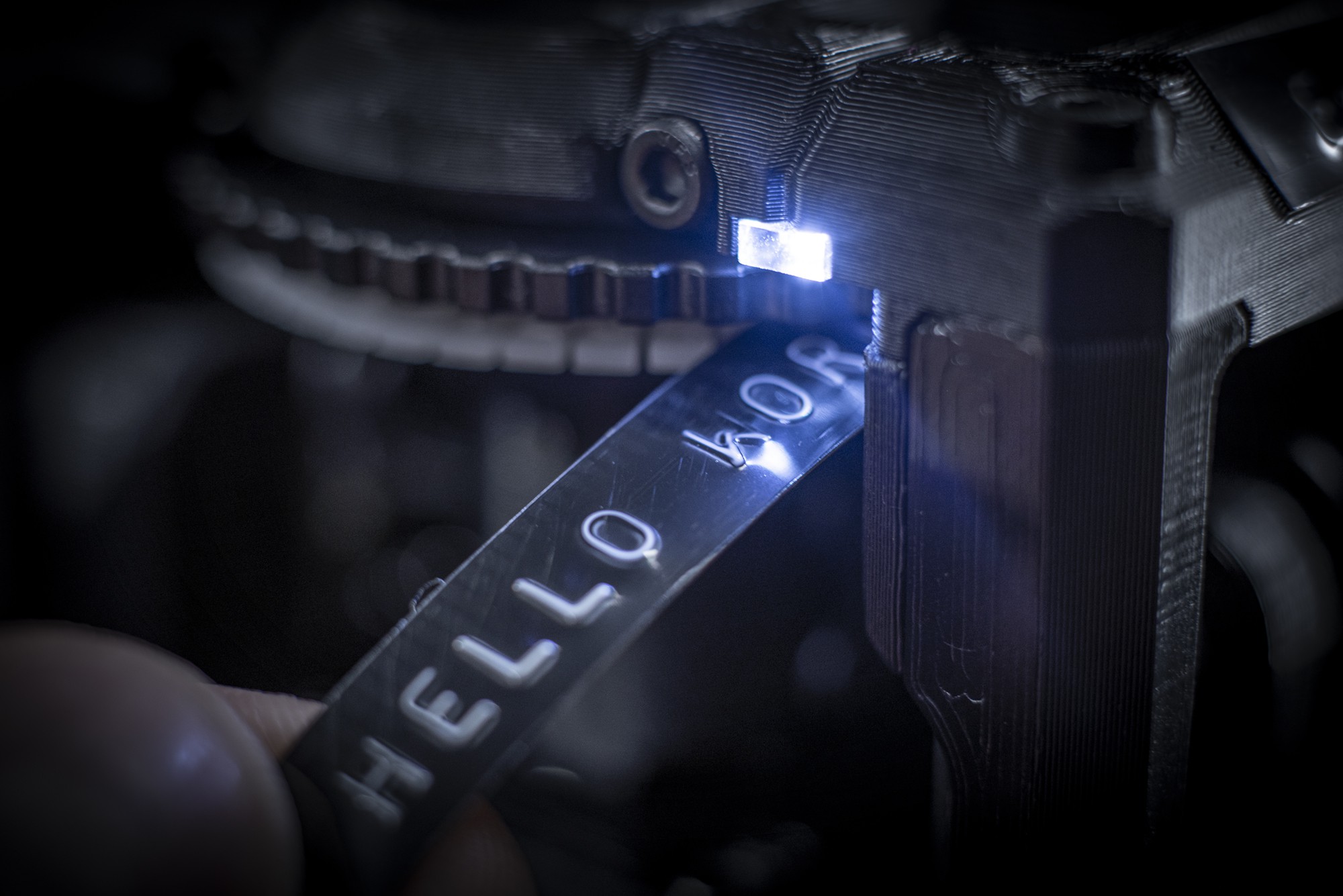
10/23/2022 at 04:25 • 0 commentsI definitely can say that I had some fun photographing the E-TKT v1.0 last week.
Overview
![]()
![]()
![]()
![]()
![]()
Orthographic
![]()
![]()
![]()
![]()
![]()
Details
![]()
![]()
![]()
![]()
![]()
![]()
![]()
![]()
![]()
![]()
![]()
![]()
![]()
![]()
I hope you enjoy!
-
Calibration Setup - October, 2022
10/07/2022 at 19:37 • 0 commentsThe embossing process has been undoubtedly the most challenging part of the project, so I wanted to make sure that anyone making their own E-TKT would not struggle as I did.
These are the most critical steps:
- the targeted daisy wheel tooth must be perpendicular to the tape;
![]()
- the press head must be aligned to the middle of that tooth;
![]()
- the pressing needs to happen with the right force;
![]()
Now for the involved components:
Hall sensor
![]()
Depending on the hall's lateral position, the rotating magnet might activate the sensor earlier or later, impacting lateral character alignment.
The main issue that happens with that misalignment is the skewed / italic aspect for the character, because the letter is not pressed when perpendicular to the tape (remember it is a rotating wheel). This is the first issue that must be solved.
![]()
⚠️ It will be highlighted on the instructions the need to make sure the hall is as centered as possible visually before moving on the assembly.
Servo & Press (3D printed)
![]()
There are three factors into the equation:
- the part's intrinsic imprecision (especially on cheap servos);
- the assembly position of the servo itself on the structure;
- the coupling of 3d printed part that does the pressing job into the servo might affect the angle, and for that I have changed the parts design to help with that alignment.
Also, depending on the servo used, the distance from the servo to the daisy wheel tooth might change. I'm providing different models that can be experimented to address that. Or, since the STEP files are open, anyone can modify it to match their needs.
Calibration Process
In general, all factors above can make the letters vanish on their sides.
![]()
For addressing that (and the skewed / italic effect), I have created a calibration procedure that have two main moments:
1 - During assembly / firmware, where the parts' rough imprecisions are to be visually adjusted (without wasting tape).
Both `assemblyCalibrationAlign` and `assemblyCalibrationForce` are hardcoded variables that make sure there is a good starting point for further tuning.
The standard values are working on a cheap MG996-R servo (I'm pretty sure mine is a ripoff).
2 - After assembly, by testing with the actual embossed label with more precise adjusts.
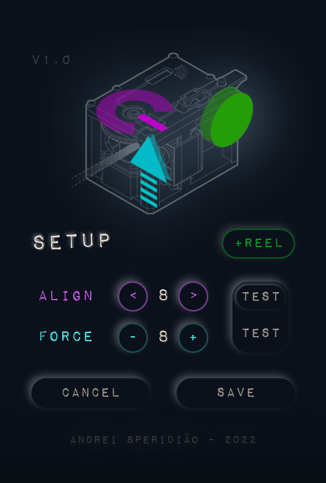
The fine tuning is possible thanks to the SETUP menu in the web app. It is very frustrating adjusting values every time by code and flashing and that's why I though about that easily accessed screen.
![]()
Alignment + test (light): it's possible to choose a value between 1 and 9 (5 is the default neutral). By picking a number, there is a test button on the right that when pressed, starts a routine that reaches to the letter "M" (widest character available) and very slowly moves the press towards the tooth until it lightly touches it. It is possible to check if the press is aligned when hitting the tooth.
Force + test (full): this parameter controls how much the servo will press the tooth against the tape, and of course, the tape should be already reeled. Again, values from 1 to 9, but this time 1 is the default, lighter pressure. To test, there is a big test button on the right that will end up testing both the force and alignment.
![]()
(force tests, from 1 to 9)Cancel: if there was any unsaved changes it will pop up a warning, otherwise it goes back to the main screen.
Save: by hitting save, the machine will save the values in memory then reboot and the app will automatically refresh in 15 seconds.
PS: the "+ reel" button has been brought from the main screen.
ready to label? 😀
- the targeted daisy wheel tooth must be perpendicular to the tape;
-
Design Inspiration & UI - October, 2022
10/06/2022 at 19:51 • 0 commentsIf you just want to see the final UI design for the app in detail, please scroll to the bottom ;)
![]()
🍷 Now for a conceptual and reflective update to discuss a bit about design...
First, remember that E-TKT is all about anachronism, which means it aims on manipulating the order things logically have/are occurring in an unusual way while presenting something odd but logically plausible. Think of "what could have happened if ______?"
Expanding that further on, I wanted to incorporate that approach into the digital interface accessed through the smartphone.
Physical informs the digital
Green characters on black, dull gray boxes, overwhelming gradients, shinny reflective icons and long shadows over colorful flat interface elements were some of the visual design trends we've been interacting with for the past 50 years (well, not all that time in my case :P ).
But there is a theme that resurfaces from time to time: skeuomorphism, which in a nutshell is the idea of emulating characteristics of original artifacts as ornaments in derivative ones. A well-known example is Apple iCal (calendar), which had leather textures in its interface to create familiarity with the traditional physical calendar that used that material for functional and aesthetic reasons.
![]() source: Ars Technica
source: Ars TechnicaDieter Rams, an industrial designer best known for his Braun creations, had a great influence on Apple products, both physical and digital. That includes the ET66 calculator that inspired Apple's software version that came together with Mac OSX.
What should we keep?
When looking to the E-TKT device and more specifically its daisy wheel, I've got some "typewriter" vibes from it. And, there is no doubt that Olivetti came to mind as one of the major Italian design symbols of the XX century. My parents still have an 80s electric typewriter from the brand.
I've then remembered my industrial design classes when I first knew about Divisumma 18) and its simple and monolithic yellow aspect. It was designed by Mario Bellini in 1972.
![]()
source: MoMA
Apart from its great shape that was very contrasting to the bulky machines at the time, perhaps the most attractive characteristic is on the buttons that almost BEG to be pressed. That was well though by Bellini, that based it on anthropomorphic concepts, which means attributing human characteristics to non-human things.
The boundaries of our body are made of skin-covered meat. What is our touch to be sensibilized and actuated back with?
Well, displays are hard to the touch, but nowadays we can cheaply "borrow the screen" for things that are not critical, thus having a world of possibilities by using visual, audible and/or haptic cues to emulate the juicy physical stuff.
PS: as an "accidental" philosophical loophole, Olivetti was(is) based in Ivrea, Italy. Yes, the same place where Arduino got born many decades later.
...anachronism as tool for finding atemporal loopholes! 🤓
...wait a minute, but what about E-TKT's UI?
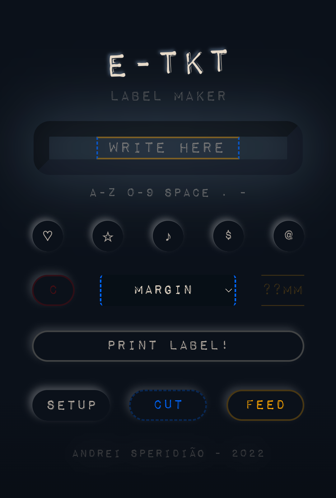
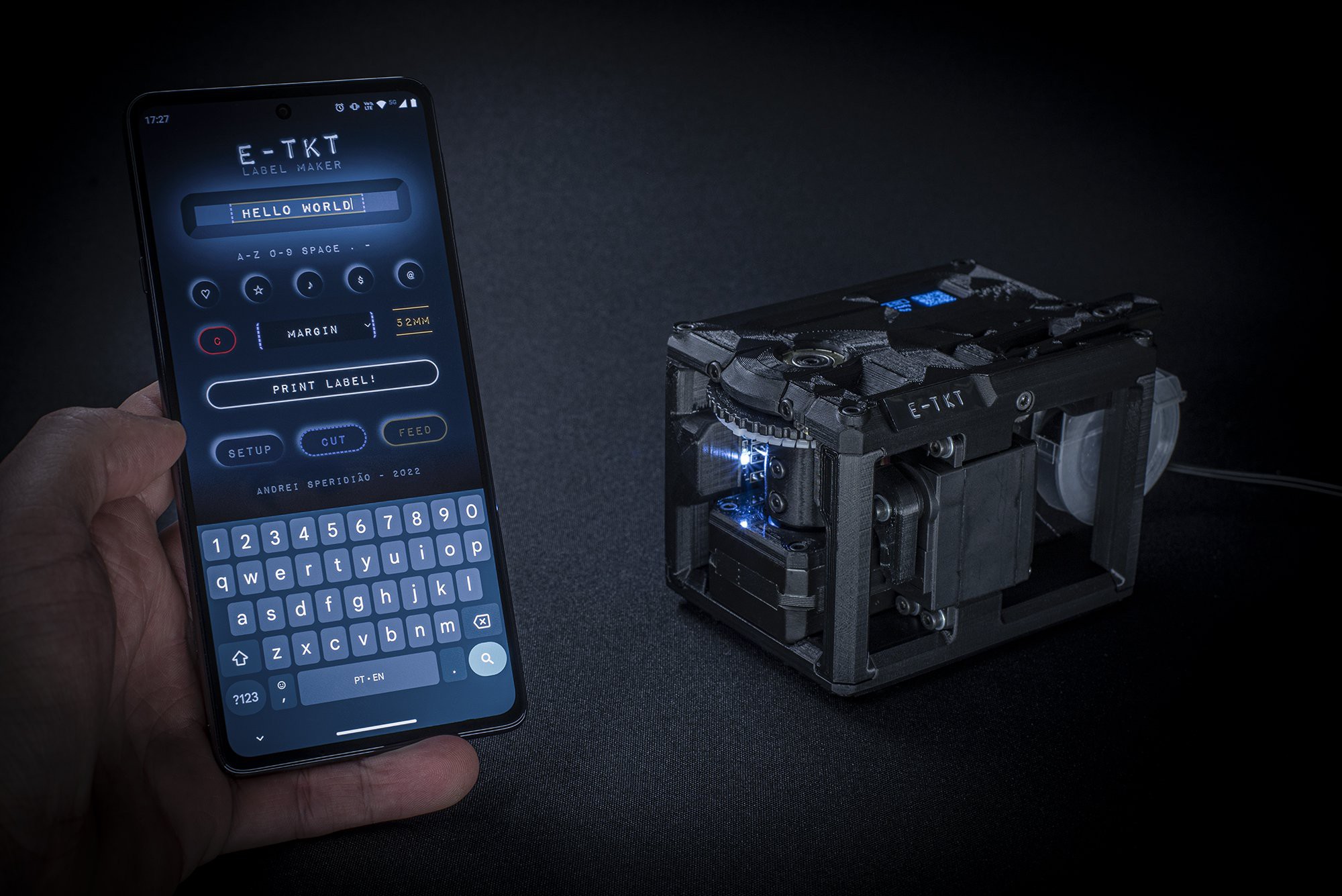
All of that to say that I have reached a final version for the user interface for the web app by extracting the essence of the concepts discussed above.
The color palette is now following a blue-yellowish duet. The buttons were rounded and for the color-coded functions, there is a light halo that glows when pressed.
A new addition is the setup screen, which I will talk a bit more in another update.
![]()
![]()
The soft pressing and illumination effects were both achieved by using pure CSS & JavaScript to minimize the data storage and transfer.
![]()
-
Device GUI - October, 2022
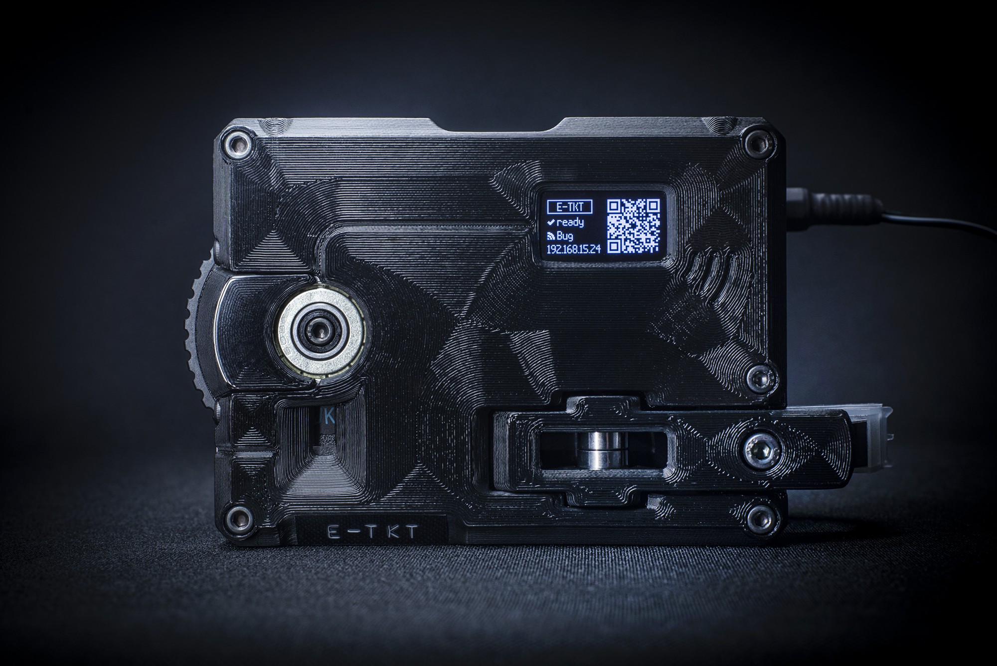
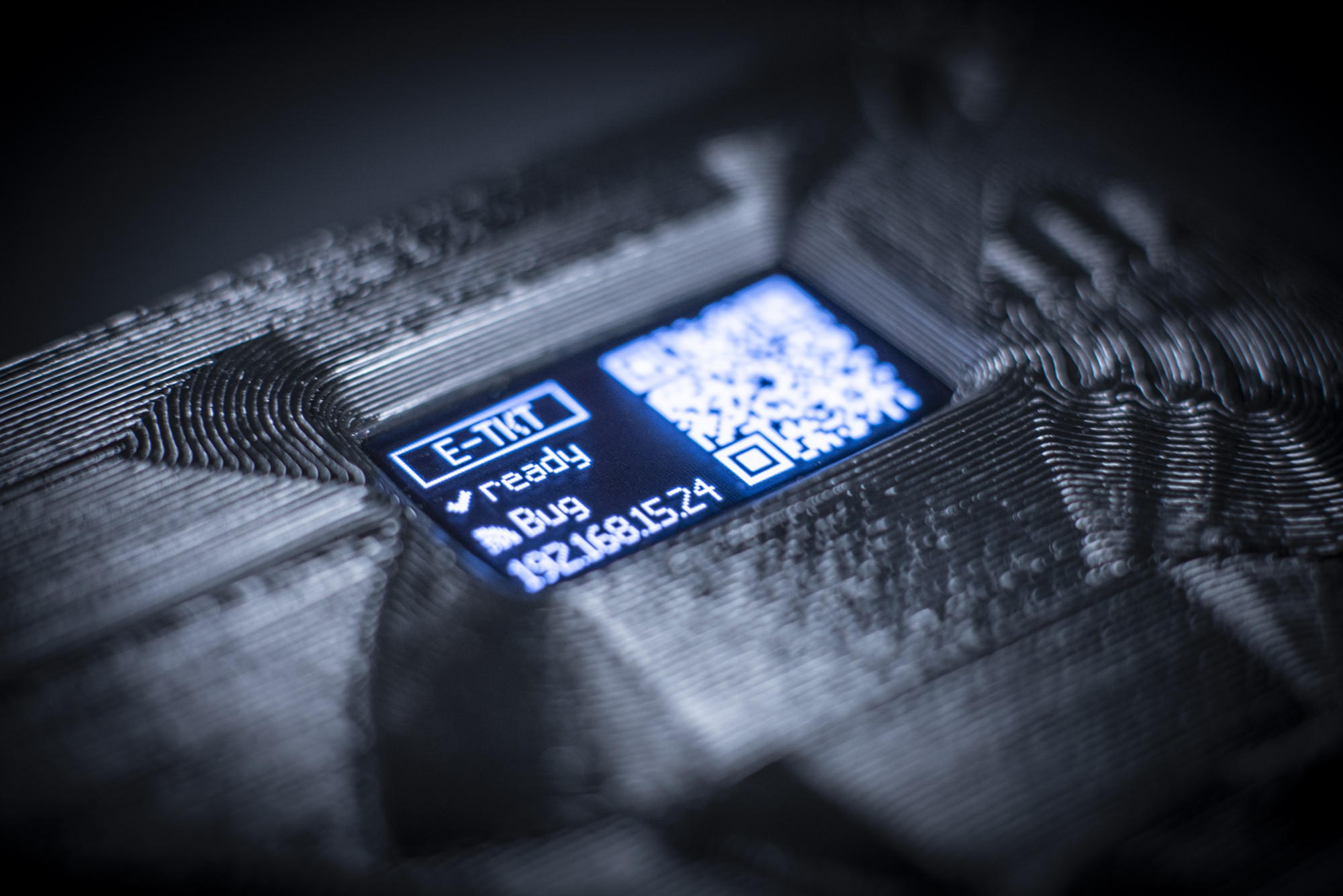
10/05/2022 at 15:48 • 0 commentsThe previous OLED display was really cute for its small 128x32px size, but it wasn't working well for the QR code.
Imagine a square with less than 10x10mm, shinning bright (OLED). It was really hard to focus with the smartphone camera.
I've then decided to switch for a similar but bigger I2C OLED display, now with 128x64px:
![]()
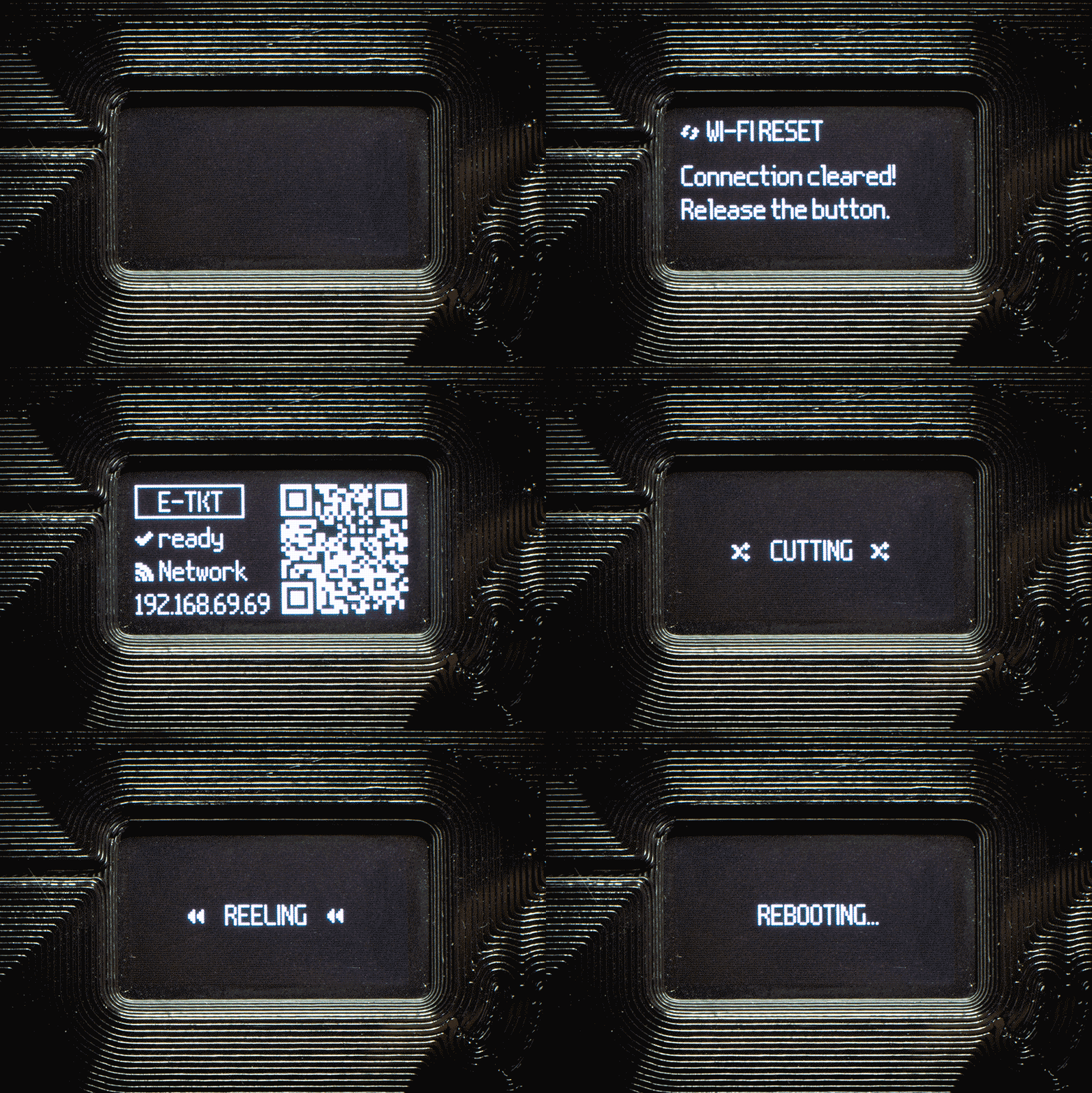
Then I've took advantage of its taller real state to improve and/or implement new screens:
- splash: more about that soon, with an nerdy extra feature;
- wi-fi reset;
- wi-fi setup: cold start or after reset;
- E-TKT ready state: QR code + text of the local assigned IP to access the web app;
- printing progress;
- printing finished;
- cutting, feeding and reeling: requested manually from the web app);
- saving settings: more about that in the following updates;
- rebooting;
It turns out that having not so many pixels to push around is pretty funny. Also, I've used symbols with a dedicated font to improve the meaning and communication.
Thanks to olikraus for the amazing U8g2 library that is super useful.
-
Improved Structure - September, 2022
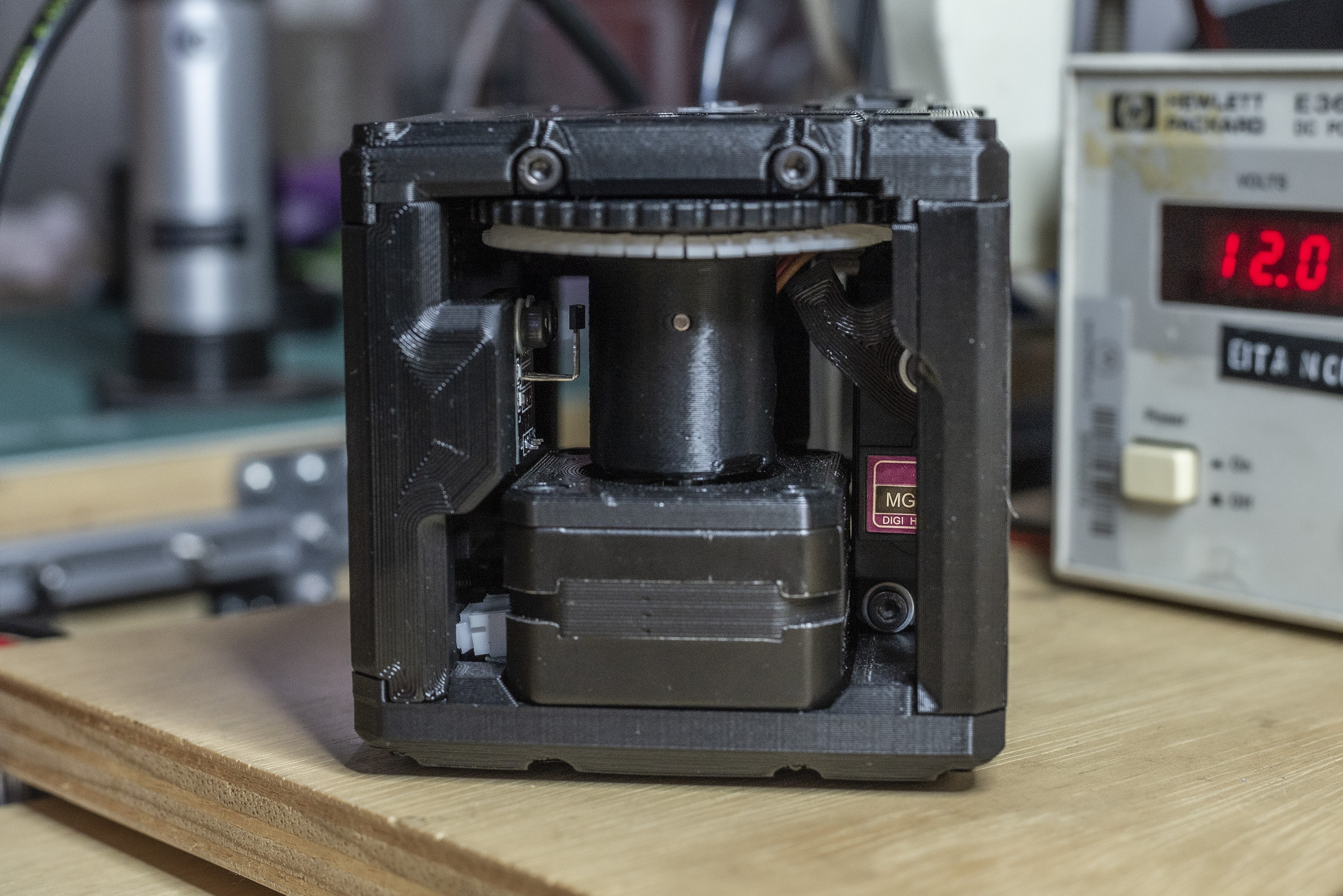
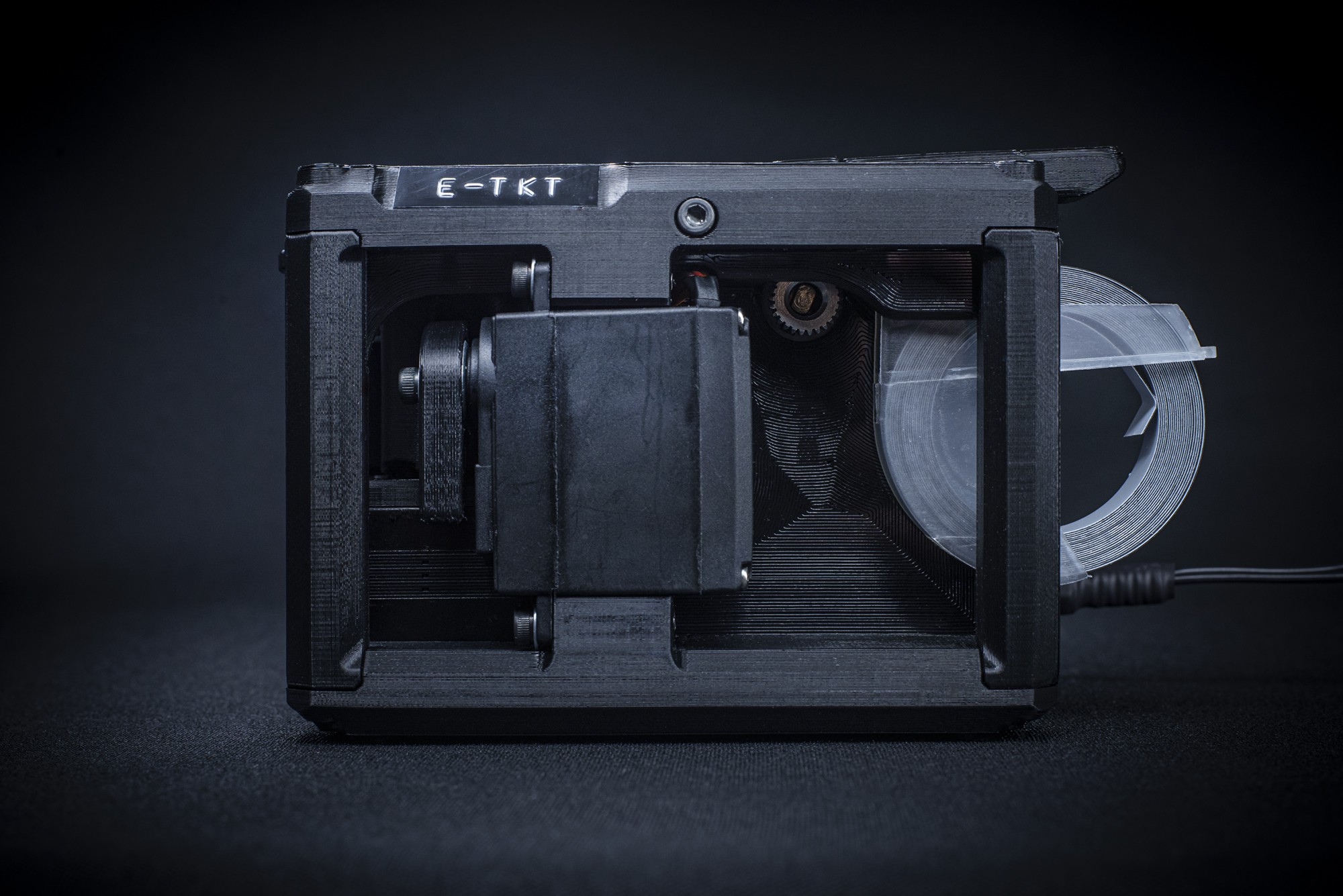
09/30/2022 at 15:33 • 0 commentsSince the beginning of the month I've been exhaustively testing and improving the 3D printed structure and now it is working nicely together with the manufactured PCB. The overall shape is now a little bit rounder, still not final though!
Major changes:
- Hall sensor: the new support for the breakout hall sensor is now provided by the pillar, making it easier to attach as the PCB is attached to it (and taking advantage of the 3 pin 2.54mm female header on the PCB);
- PCB: is locked tightly on both surrounding pillars and 6 screws and helps the overall rigidity;
- Daisy wheel: attending several feedbacks (including from David Knochenhauer, thank you!), I've made it removable and as a bonus, the initial assembly process is now much easier!
- Feeder: its new design takes advantage of the PETG's own flexibility, removing one pesky item from the B.O.M., the spring;
- Display: the bigger OLED with 128x64 pixels made the QR code totally straightforward to read (was pretty hard to focus) and also the overall GUI reading is much better (more updates on the GUI soon);
- Press: with this new shape the initial alignment when assembling is easier now, and its structural rigidity is greatly improved too. Also, it uses a M6 washer in contact with the servo to make sure it doesn't bend when pressed, while at the same time allowing it to rotate freely.
![]()
![]()
![]()
![]()
![]()
![]()
![]()
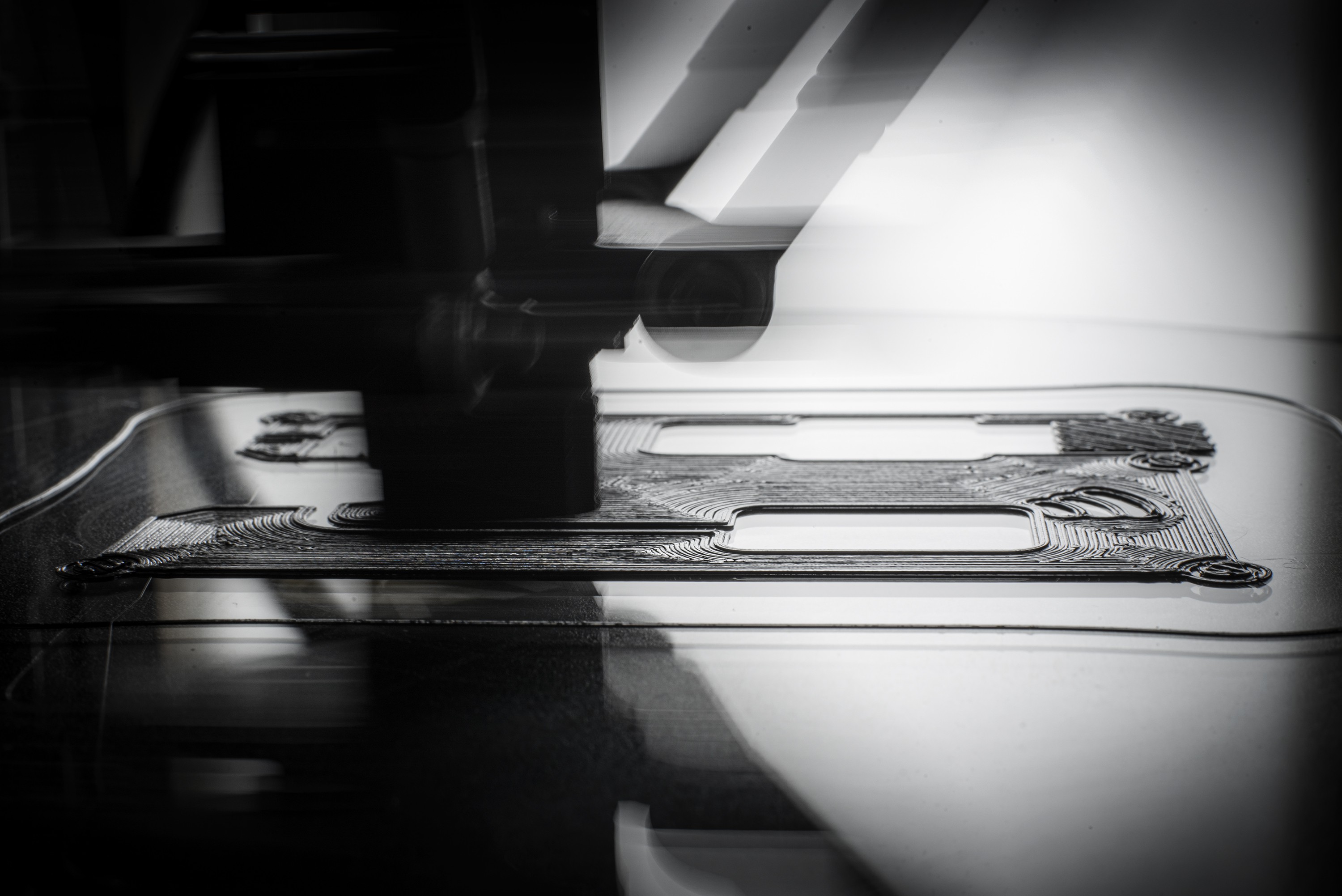
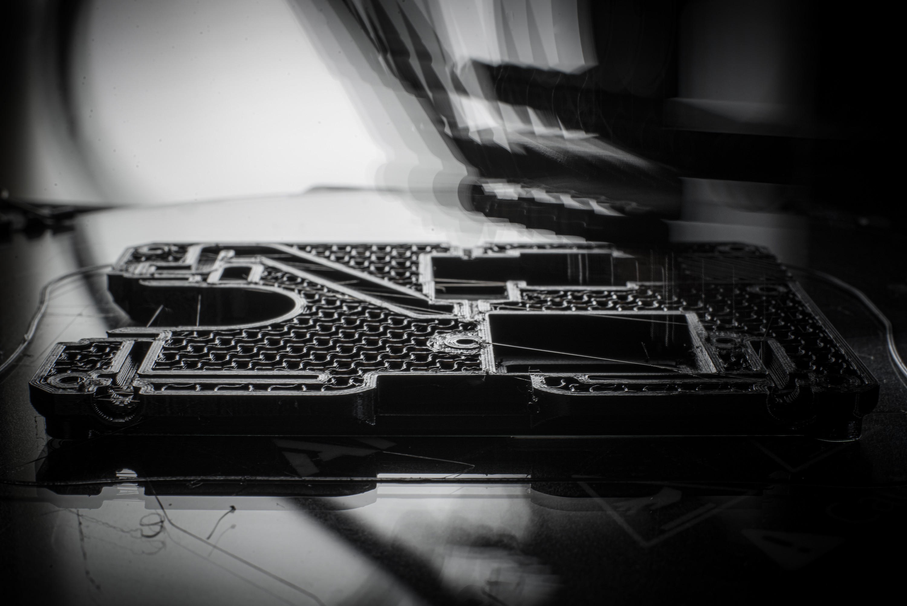
Some photos of the printing process, aiming for that sharp first layer.
![]()
![]()
PS: the revised v1.0 PCB with several adjusts has already shipped, more about that soon!
-
PCB v0.9 Assembly - September, 2022
09/09/2022 at 14:20 • 0 commentsMy first PCB ever is the E-TKT's alpha version.
I've been thinking of that moment for a decade and I am pretty happy with the result! Thanks again for Wes for providing the manufacture and components' order in one of his batches. He even assisted me on assembling and baking the board at his place.
![]()
![]()
![]()
Now for the list of fixes for v1.0:
- I've mistakenly switched the Reset and Flash button position/labels;
- The latch power circuit didn't work, so I will be changing it to a compact SMD switch + MOSFET;
- Remove 3V3 from the FTDI;
- Several LEDs are logically inverted (on when they should be off): hall, servo, a4988 enable signals;
- Some LED brightness are too high;
- The manufacturer put the "E-TKT" letters on white silk, when it should be in black solder mask. In the end, I've liked it better, so I will consider to incorporate this happy accident on the project;
- Insert OSHWA label & certification;
- Invert RX/TX silk arrows on FTDI LEDs.
Apart from these minor issues, the circuit has been working great and soon there will be more work in progress. Right now I'm working on the improved 3d printed parts with new features, together with the web app.
Stay tuned!
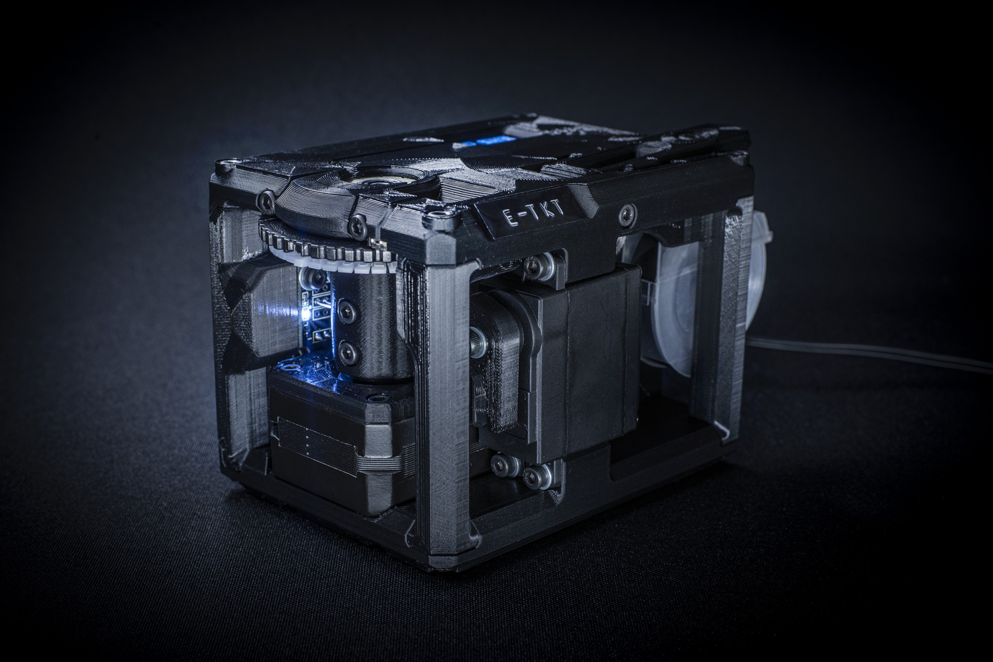
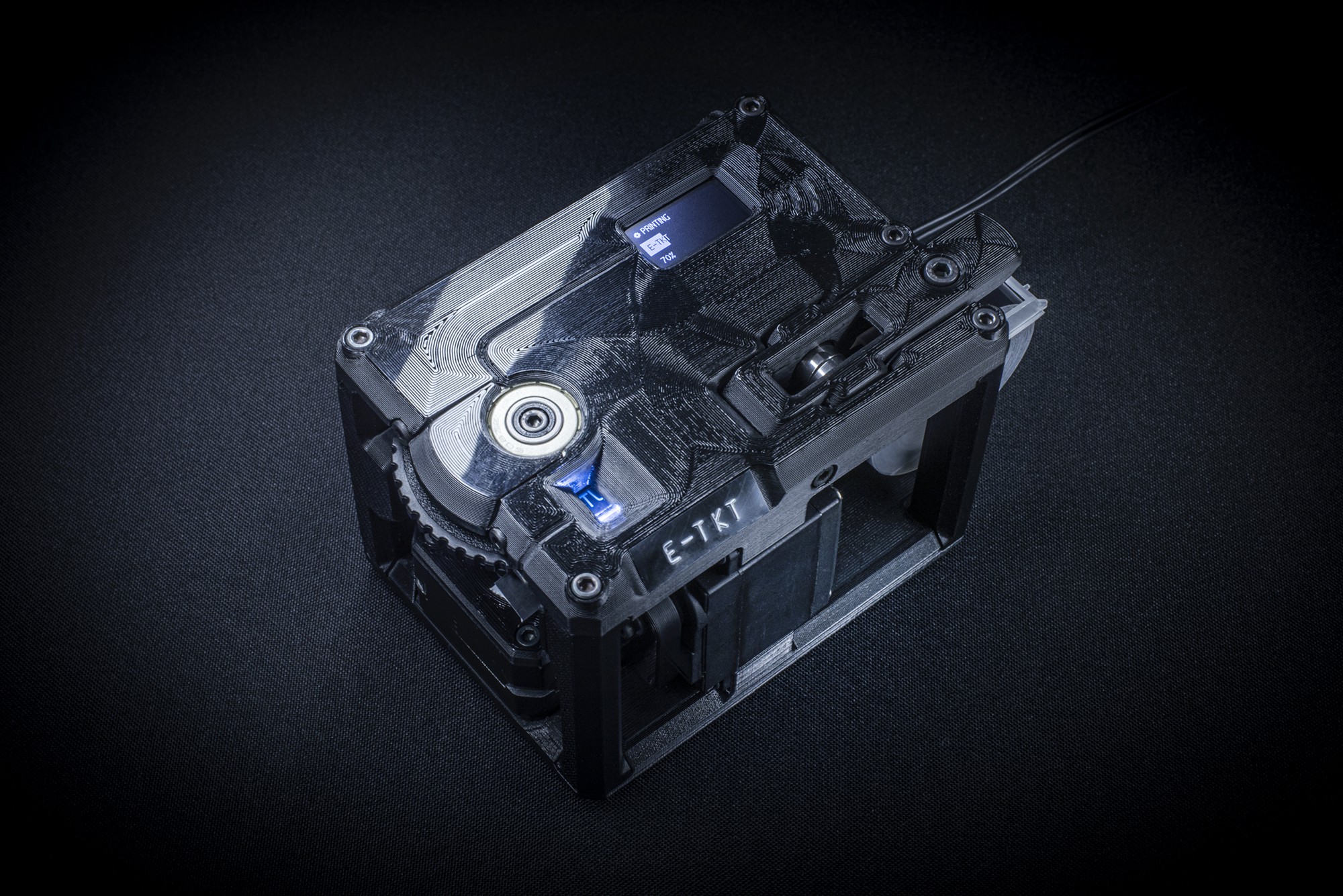
E-TKT: anachronic label maker
An open source label maker that fuses together both old and contemporary technology to create something as ubiquitous as... EMBOSSED LABELS!
 Andrei Speridião













 source: Ars Technica
