Close
0%
0%

Hack the Hack A Day Editor

A hack based on "HTML Injection". Useful when you want an online editing feature that is not available otherwise. Might work on any Website.

Similar projects worth following
This is a project that stretches the HaD Editor's limitations.
It explains how to do things that are not possible from the normal editor webpage interface.

Let's say you want to write the picture name centered, with italics, under the picture. Is this possible? [Matt] needed that for he's project log, https://hackaday.io/project/4731-esplux-smarts-for-your-downlights/log/20286-scope-results, but it was not possible. At least not from the HaD editor's buttons.

But is it possible at all?
Maybe, if you try some "HTML code injection" hacks.

These tricks might work in many other places, not only on Hack A Day.

If you have new requests or alternative solutions, please post them in the comments.
I will love to give them a try.

Table of Contents

  • 1 × PC with Internet connection PC, Laptop, etc. with any OS

  • Unclutter the Feed page

    RoGeorge02/05/2017 at 15:00 8 comments

    Rant

    Last week I made a big mistake: I clicked a button on the My Feed page (from hackaday.io). The button was named something like "See if you like our New Feed" or something. Well, I didn't liked the new feed, but also I found myself locked out from the old feed format, the one which I liked and wanted back. There was no way to go back to the old Feed format.

    Since then, I have no idea what exactly I am notified about on my Feed page.

    :o(

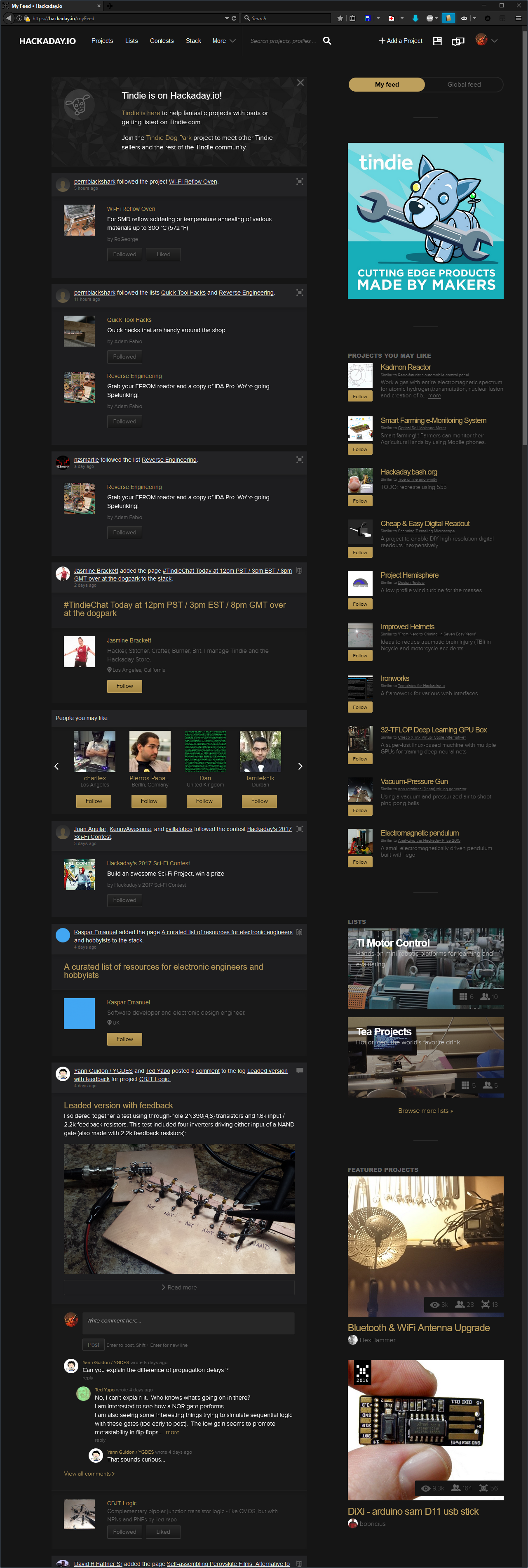
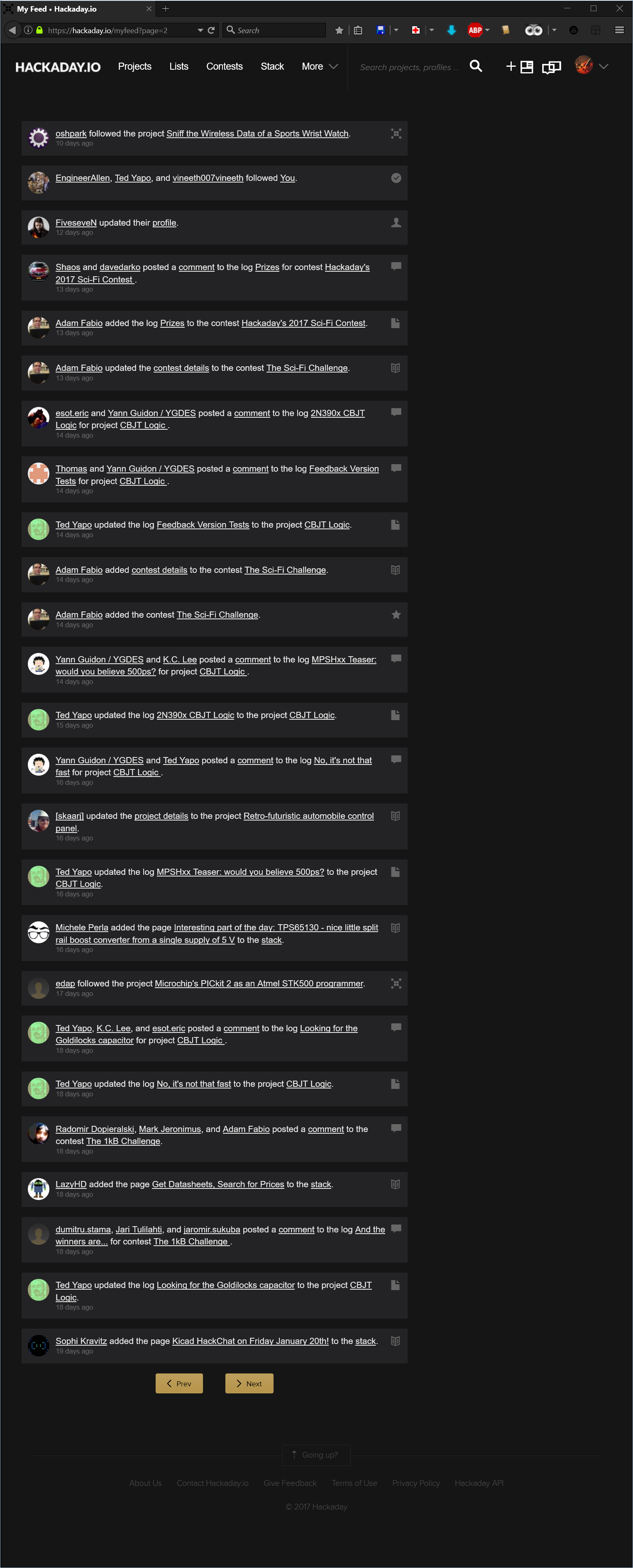
    The Feed page is now totally cluttered with buttons, pictures, icons, descriptions, recommendations, comment boxes and so many other unwanted elements. Over the top, the items of interest are grouped by some inconsistent criteria that I couldn't figure out yet.

    The Feed is so cluttered that the only question this page should answer, "What are the last x things I am notified about?", remains a mystery:

    So what exactly I am notified about?
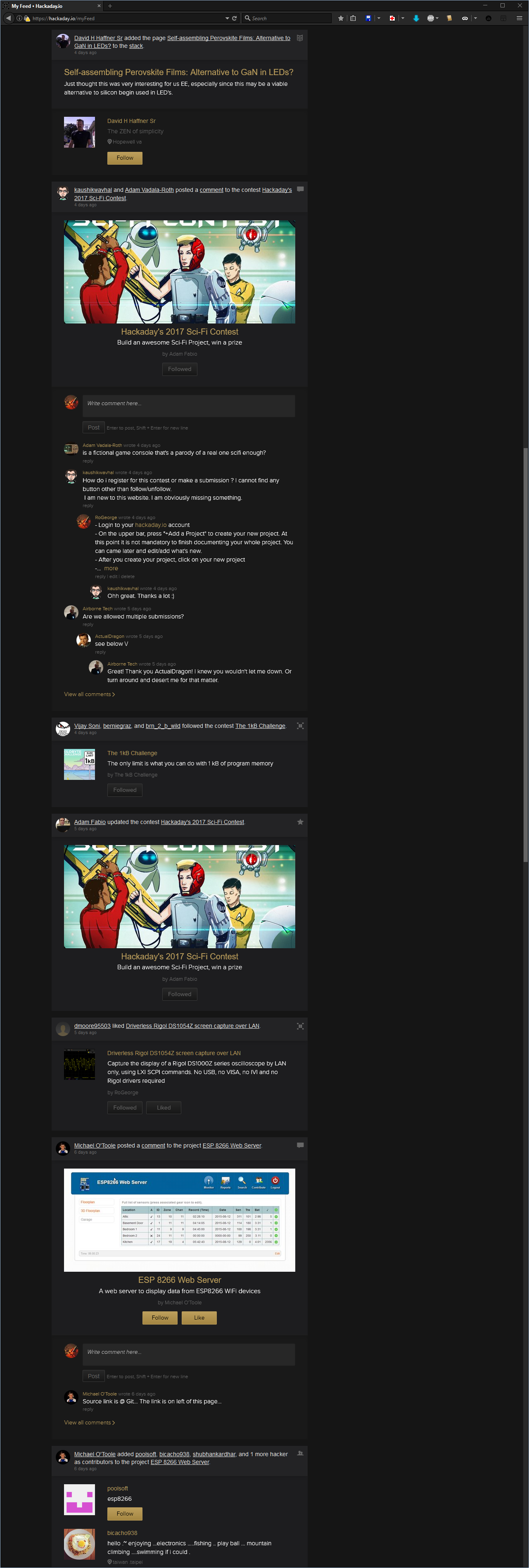
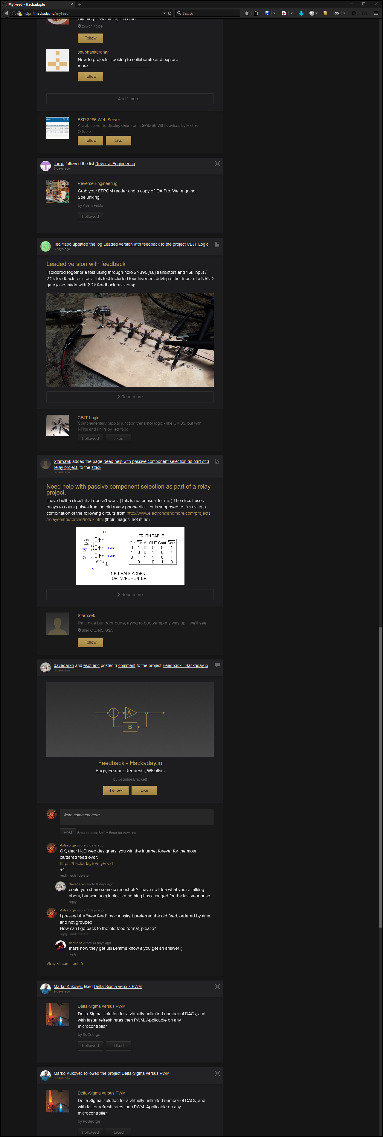
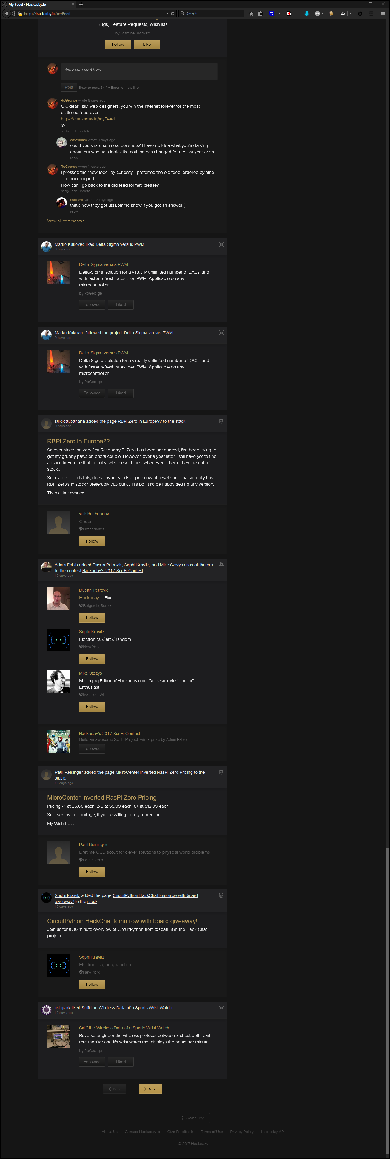
    I have no idea, but wait, there's more:

    What can I say. Don't know.

    Maybe there are reasons why some people refuse to have a Facebook account. Please note that I am not even complaining here about the "Skulls" being replaced by the dumbed "Likes", but it just crossed my mind now, when I realized the Feed page looks like a black themed Facebook page.

    .

    Anyway, given the look of the "new" Feed page, I asked if I could get the old format back, but no answer: https://hackaday.io/project/37-feedback-hackadayio/discussion-75327

    Then, an Internet Award was granted to the web designers that designed the "new" feed look, but still no answer from them: https://hackaday.io/project/37-feedback-hackadayio/discussion-75570

    OK, so "Life's hard, and then you die", now what?


    tl;dr: Workarounds

    1. Use a custom AddBlockPlus filter to get rid of the unwanted elements. The notifications will still be grouped, but the 'Feed' will be much clear.
    2. Use a custom JavaScript for GreaseMonkey (or Tampermonkey) to rearrange the 'Feed' pages upon wish. This one is not trivial.

    First workaround: Add a custom AddBlockFilter

    • Install AddBlockPlus
    • Go to 'Filter preferences... Ctrl+Shift+E'
    • Check 'Element Hiding Rules' and show the filters list 'Action' -> 'Show/hide filters Ctrl+R'
    • Add the following filters:
      hackaday.io##.feed-group.beta
      hackaday.io##.object-list
      hackaday.io##.object-content
      hackaday.io##.object-images
      hackaday.io##.slider-holder
      hackaday.io##.comment-section
      hackaday.io##.show-more
      hackaday.io##.cover-padding
      hackaday.io##.content-right-other
      	

    That should do it. The 'Feed' page will look like this:

    The last entry in the filter removes all the right-side column, so it also removes the "My Feed / Global Feed" switch buttons. If you need those buttons, then remove the line

    hackaday.io##.content-right-other

    Note: the above steps to add a custom filter are for Mozilla Firefox. For Chrome, the AddBlockPlus filter is the same, and can be added in the AddBlockPlus menu 'Options' -> 'Add your own filters'


    Second workaround: Custom JavaScript for GreaseMonkey

    This one allows to select what kind of notifications to display, and how much clutter to display.

    :o)

    Still playing with it, but not polished enough to be published.


  • Even worst then skulling yourself: Follow Yourself

    RoGeorge07/16/2015 at 14:48 0 comments

    This is just to alleviate the guilt for skulling yourself.

    :o)

    How to follow yourself

    • Hover the mouse over your profile icon and remember your ID number
    • Go to your profile page (e.g. by clicking on your profile icon)
    • Similar with the previous log entry, where you gave yourself a Skull, type the following in your browser's Address Bar:
    JavaScript:$.ajax({url : "/hacker/10287/follow", method : "POST", timeout : 15e3, data : {_csrf : csrftoken}})

    Note: Some browsers use to mangle the word "JavaScript:" from the Address Bar. If you use copy/paste, before pressing Enter, check that the first word in the Address Bar is indeed "JavaScript:". If not, add it manually, so the text in the Address Bar will be the same as in the example. You may want to change the profile ID with your own profile number.

  • Give yourself a Skull

    RoGeorge07/10/2015 at 16:12 9 comments

    Your project is beautiful,
    You should give yourself a skull!

    See, a poem!
    :o)

    How you can do it (the skull, not the poem)

    • Click on one of your projects
    • After your project page is displayed:
      • Delete all text (the URL) from the browser's Address Bar
      • Type the following text in the empty Address Bar of your browser:
    JavaScript:$.ajax({url : "/project/6621/event/skull", method : "POST", timeout : 15e3, data : { _csrf : csrftoken }})


    Note:
    Some browsers use to mangle the word "JavaScript:" from the Address Bar. If you use copy/paste, before pressing Enter, check that the first word in the Address Bar is indeed "JavaScript:". If not, add it manually, so the text in the Address Bar will be the same as in the example. You may want to change the project ID with your own project number.

  • A list inside another list & template to copy/paste

    RoGeorge07/08/2015 at 06:42 2 comments

    For the project Wi-Fi Reflow Oven, a list inside another list was necessary to describe all the steps for Setting up the Freescale software development tools.

    Embedded lists template

    • level 1.a
    • level 1.b
      • level 2.a
      • level 2.b
        • level 3.a
        • level 3.b
          • level 4.a
          • level 4.b
            • level 5.a
            • level 5.b

    How you can do it

    • right click on the list and choose Inspect element
    • in the element's HTML code window, identify where your list start.
      The list is delimited by the "ul" tag.
      Each item in your list is delimited by "li" tags.
      A list should look like this
      <ul>
          <li>level 1.a</li>
          <li>level 1.b</li>
          <li>level 2.a</li>
          <li>level 2.b</li>
          <li>level 3.a</li>
          <li>level 3.b</li>
          <li>level 4.a</li>
          <li>level 4.b</li>
          <li>level 5.a</li>
          <li>lrvrl 5.b</li>
      </ul>
      
      Modify the code to look like this
      <ul>
          <li>level 1.a</li>
          <li>level 1.b
              <ul>
                  <li>level 2.a</li>
                  <li>level 2.b
                      <ul>
                          <li>level 3.a</li>
                          <li>level 3.b
                              <ul>
                                  <li>level 4.a</li>
                                  <li>level 4.b
                                      <ul>
                                          <li>level 5.a</li>
                                          <li>level 5.b</li>
                                      </ul>
                                  </li>
                              </ul>
                          </li>
                      </ul>
                  </li>
              </ul>
          </li>
      </ul>

    Or, you can copy/paste a template

    Most of the time, the HaD Editor will try to keep the formatting when doing a copy/paste from another page. That is why you can simply copy paste a list from another webpage into your project log, then modify it as you wish.

    Alternately, you can

    • create a .htm text file with the HTML code for your ideal list, then
    • run the HTML code by opening the .htm file with an Internet browser, then
    • copy/paste from there to your new log entry.

    Or, you can simply press TAB, as [Matt] pointed out

    This log entry is a perfect example of how Retardo DaVinci was I.
    Just press TAB, and you will have a nested list.

    Thanks [Matt], for bringing me back to Planet Earth!

    :o)

  • [Matt]'s experiment: short links, keep only what's needed

    RoGeorge07/06/2015 at 09:00 1 comment

    [Matt] didn't liked long links. He experimented to see what is really needed, and found out you can drop the name-title part. Keep only the ID number.

    So always use

    https://hackaday.io/project/4731/log/20286
    instead of
    https://hackaday.io/project/4731-esplux-smarts-for-your-downlights/log/20286-scope-results

    More then that, [Matt] found out that the text doesn't really matter at all:

    https://hackaday.io/project/4731-you-can-write-here-whatever-you-want/log/20286-hack-a-day-will-look-at-the-numbers-only

  • [Stefan Lochbrunner]'s idea: Side by side images

    RoGeorge07/06/2015 at 07:33 3 comments

    In a log entry I could not reproduce the alignment from his page: https://hackaday.io/page/1082-test, because the editor was eating some of the style attributes when the log was saved. Still, side by side can be done as a table, but it doesn't look to good:

    You can further stretch the idea, and make a log entry to look like a gallery.

    How you can do it

    Apply the steps described in the first log entry but instead, right click on your first picture and adjust your code to look something like that:

    <tbody>
        <tr>
            <td style="width:50%; text-align:center; vertical-align:middle">
                <a href="https://cdn.hackaday.io/images/your_image_number_1_here.png" target="_blank">
                    <img src="https://cdn.hackaday.io/images/your_image_number_2_here.png">
                </a>
            </td>
            <td style="width: 50%; text-align:center; vertical-align:middle">
                <a href="https://cdn.hackaday.io/images/your_image_number_2_here.png" target="_blank">
                    <img src="https://cdn.hackaday.io/images/your_image_number_2_here.png">
                </a>
            </td>
        </tr>
    </tbody>
    Note: The editor thinks he's smarter then you are, so he's applying all kinds of different unsolicited formatting, depending on what part of the project you are editing. Didn't figure out yet why the editor is sometimes mangling styles.

    Or you can do it from the HaD Editor

    • Write your text as usual, then insert first image.
    • Click on the newly inserted image. The picture will enter in edit mode.
    • Resize the picture from the lower-right white box, and make it smaller then half of the page.
    • Click on the picture again, then click on the small, black "Edit" text written in the middle of the picture.
    • From the 'Position' drop-down box, pick 'Left', then save.
    • Insert the second picture and do the same, but align it to the right.

    • Adjust the sizes of the two images
    • Continue editing, then 'Publish'.

    Note: In fact, it is possible all the time to do it from the HaD Editor, just that it never cross my mind to try it from the GUI. Too bad the smaller image is top aligned with the bigger image, instead of middle aligned.

    :o(

  • Add animated pictures: no hack, just a how-to

    RoGeorge07/05/2015 at 14:56 4 comments

    For the project Delta-Sigma versus PWM it was necessary to show how the two waveforms vary with the duty cycle, something like this:

    How it was done

    • save on your disk a sequence of similar pictures. For the above animation, the pictures were first saved as .PNG
    • upload the pictures to an online GIF animator site. I like http://ezgif.com/maker, but there are many others
    • adjust the animation upon your wish. You can change the speed, resize, crop and so on
    • save the animated result to your disk
    • open a new browser tab, then drag and drop the saved animation to it, to check the result
    • if you like it, drag and drop it to your Hack A Day log. You should see the picture animated in your HaD log.

    Note: Use the Animated GIF format. Do not use Animated PNG. Most of the browsers does not play APNG. After you end editing your HaD log, you may want to open your log with 2-3 different Internet browsers, just to be sure that most of the people will see an animation, not just a static picture.

  • [Matt]'s request: Italics, centered, under picture

    RoGeorge07/04/2015 at 07:53 1 comment


    <DIV align="center"><I>LED turned on full brightness. You can see I get about 5v ripple current. Ouch.</I></DIV>

    Well, it seems like it doesn't worked
    :o)

    Let's try harder:

    LED turned on full brightness. You can see I get about 5v ripple current. Ouch.


    Yeee, it's working! Italics and centered!

    Back to normal

    How it was done

    Use Chrome Version 43.0.2357.130 m. It should work with other browsers too, but I didn't test them.

    • Right click on the text you want to modify and choose "Inspect element". A new window will open in the same page.
    • If it's not already selected, click on the "Elements" tab from the new window.
    • In the new window, the selected row is your element you want to modify.
    • Right click in the selected row from the new window, and choose "Edit as HTML". A text box will open in the new window, with the HTML code corresponding to your selected element.
    • In the new opened text box, add or remove HTML tags to format your text as you wish.
    • If you don't know what tag to add/modify/delete, open a new Chrome tab and google it. For this example, google http://lmgtfy.com/?q=HTML+center for text centering, or http://lmgtfy.com/?q=HTML+italics for italics.
    • Click back on the Hack A Day page. You should instantly see the result of your HTML code injection.
    • Now, you can continue with your Hack A Day log page editing, then press the "Publish" button.

    Note: If you continue editing the Hack A Day page after you made a HTML code injection, the next paragraph will keep the modified format, so you need to apply the same technique to come back to normal.

View all 8 project logs

Enjoy this project?

Share

Discussions

heloselex wrote 07/24/2021 at 13:11 point

Very nice and impressive idea that you gave here I am also working on a similar task you can  click here and read about it hope it will help you to clear some of your issues.

  Are you sure? yes | no

Arya wrote 12/10/2017 at 04:33 point

If you're putting Python code blocks in your worklogs and you write a lot of comments for people to read, only to find they're as grey as the surrounding code is - fear no more! Just paste the HTML into an external editor and replace all occurences of "hljs-comment" with "hjls-number", and watch the comments in light up in pink-ish red!

  Are you sure? yes | no

Xylitol wrote 09/08/2016 at 21:28 point

Hi Matt, do you have a hack for the background banner in project to center it perfectly? (like your hack for the project picture, nice btw, thanks)

  Are you sure? yes | no

Amar wrote 07/12/2016 at 17:29 point

Great project!  I'm one of the engineers that works on hackaday.io.  We're constantly working on improvements, and this project gives us some valuable insights.

I wanted to point out that we've recently enabled HTML in the WYSIWYG editor (for a limited set of tags). You can enable this by clicking the `< >` icon on the top left of the menu bar. This also converts the output to HTML, so if something isn't formatting the way you want it, you can switch over to HTML and see exactly what's going on.

  Are you sure? yes | no

RoGeorge wrote 07/13/2016 at 04:23 point

These are great news!
Easy access to some HTML tags will be very useful.

Thank you very much to you and to the whole team for continuously improving HaD.

  Are you sure? yes | no

Arya wrote 03/22/2016 at 01:39 point

Pro tip - if your camera photos are over 3MB and thus won't load to Hackaday, open them in Paint, press "Save" button and close. Idk what it does but it shrinks the size dramatically while preserving the resolution.

  Are you sure? yes | no

Matt wrote 07/24/2015 at 10:34 point

Howdy all! I've been messing around with my project picture, and found that it zooms in. I made a template, check it out here: http://imgur.com/FguVmLA

If you put any content you are interested in inside the red square, you'll be sweet. The green area initially shows on the projects grid, but disappears when you hover over it. The blue is pretty much a no go zone, it wont be shown anywhere except a small slither on your main project page.

I've got it on my project here: https://hackaday.io/project/6785-ignore-me

I figured it would be best to post it here, more people will see it than my page!

  Are you sure? yes | no

Matt wrote 07/24/2015 at 10:39 point

Here are some screenshots of it in action, so you don't have to search for it


  Are you sure? yes | no

RoGeorge wrote 07/25/2015 at 06:57 point

Hi Matt, and thanks!

It will be redundant and time consuming for me to re-post comments as logs.

This project was all the time a collaborative one, so would you mind to be added as a contributor to this project, please? I guess this will give you the possibility to post log entries any time you found something interesting.

  Are you sure? yes | no

Matt wrote 07/25/2015 at 10:51 point

for sure, I've just hit request now  thanks

  Are you sure? yes | no

RoGeorge wrote 07/25/2015 at 12:08 point

Thanks & Welcome!

  Are you sure? yes | no

Stefan Lochbrunner wrote 07/05/2015 at 17:26 point

This is pretty cool, I've been looking for something like this to show images side by side. I gave it a shot (https://hackaday.io/page/1082-test) but I figure you might be able to do a better job and a how-to would fit in here better then if I wrote about it separately. Btw: I think I made side by side images work before with just the normal editor. It didn't display right on different monitor sizes and/or browsers but this seems to work.

  Are you sure? yes | no

RoGeorge wrote 07/06/2015 at 07:54 point

Indeed, side by side images could be very useful. Added it to this project:

[Stefan Lochbrunner]'s idea: Side by side images

Can you put side by side images in a log entry too, instead of a profile page, please? So far I couldn't manage to make the pictures stay side by side in a log entry.

  Are you sure? yes | no

Stefan Lochbrunner wrote 07/06/2015 at 11:04 point

It does "work" in logs, but it's not pretty: https://hackaday.io/project/6332/log/19828

As you know, the height of the paragraph gets set to 0 which messes up the formatting. I tried using the settings of a span that contains a single image to make a span with two but that didn't work either. Inserting line breaks without any symbol doesn't help either since those are deleted when the log is published.

Inserting the images in a table isn't pretty either but more convenient than editing the html. The table doesn't seem to scale with the monitor/window size though.

Edit: The table does scale. In my previous test I resized the images which gave them a fixed size.

  Are you sure? yes | no

RoGeorge wrote 07/06/2015 at 13:06 point

Seems like we were looking for the same thing, and in the same time. I didn't had much success either. The page looks perfect during edit, but all the nice hand crafted formatting is mangled when saving.

  Are you sure? yes | no

Stefan Lochbrunner wrote 07/06/2015 at 14:10 point

lol, yes. That's gotta be one of the oldest tricks with word processors: If arranging images just doesn't work, put them in a table :)

It's strange that the formatting is lost upon saving. I've just recreated the log where I did some testing here: https://hackaday.io/project/6332/log/20518

After editing the html and inserting empty lines (empty except for a space) to make up for the 0-height <p> that contains the images, I "updated" the editor by writing and deleting something in the text as Matt already mentioned. Except for a minor bug it turned out alright (figuring out the percentages was a pain though).

  Are you sure? yes | no

Matt wrote 07/04/2015 at 11:17 point

Thanks a bunch for your help! I was trying to do the same thing before I posted the request up on the HAD suggestion line. I found out what the problem was!

If you are doing any of these changes above you *have* to make a change within the WYSIWYG editor as well. Just modifying the html and hitting publish doesn't work! All you need to do is add a character and then remove it again, and it must flip a flag in the editor saying something has changed, and it will then save as you'd expect.

As you can see now, everything is centered nicely! 

https://hackaday.io/project/4731/log/20286

Thanks again for your help, without seeing that you succeeded, I probably would have not bothered looking into it any further.

  Are you sure? yes | no

RoGeorge wrote 07/04/2015 at 12:55 point

Glad to hear you nailed it.
By the way, nice project you have there, and very, very well documented!

  Are you sure? yes | no

Matt wrote 07/05/2015 at 03:47 point

Thanks! This is my first electronics project of any kind of significance. I figured I'd document it as best I can so others don't make the same mistakes as me! Haha. 

  Are you sure? yes | no

RoGeorge wrote 07/06/2015 at 07:13 point

I just learned from the above post of yours that the HaD links can be shorter, with the number only and without the whole title, like this:

https://hackaday.io/project/4731/log/20286
instead of
https://hackaday.io/project/4731-esplux-smarts-for-your-downlights/log/20286-scope-results

Thanks!

  Are you sure? yes | no

Matt wrote 07/06/2015 at 07:34 point

ah yeah! I hate long URLs, so I experimented and found what I needed to keep :) no worries

  Are you sure? yes | no

RoGeorge wrote 07/06/2015 at 08:48 point

Yes, and not only they are too long, but if the title will change, all the old long links will become broken links. Very good find! Added to the trick's list.

  Are you sure? yes | no

Matt wrote 07/06/2015 at 08:59 point

I found that the text is neither here nor there. It can be whatever you'd like! For example, https://hackaday.io/project/4731-esplux-fair-dinkum-light-controller/log/20286-my-first-scope

That'll take you to the same place as the links above. 

Edit - the text just makes it human readable!

  Are you sure? yes | no

RoGeorge wrote 07/06/2015 at 09:06 point

LOL, never thought of that, thanks!

  Are you sure? yes | no

Matt wrote 07/06/2015 at 09:11 point

anytime

  Are you sure? yes | no

Similar Projects

Does this project spark your interest?

Become a member to follow this project and never miss any updates